WARM UP Which of the following samples would










- Slides: 178

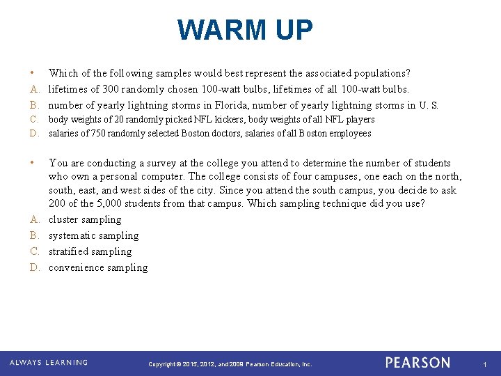
WARM UP • Which of the following samples would best represent the associated populations? A. lifetimes of 300 randomly chosen 100 -watt bulbs, lifetimes of all 100 -watt bulbs. B. number of yearly lightning storms in Florida, number of yearly lightning storms in U. S. C. body weights of 20 randomly picked NFL kickers, body weights of all NFL players D. salaries of 750 randomly selected Boston doctors, salaries of all Boston employees • A. B. C. D. You are conducting a survey at the college you attend to determine the number of students who own a personal computer. The college consists of four campuses, one each on the north, south, east, and west sides of the city. Since you attend the south campus, you decide to ask 200 of the 5, 000 students from that campus. Which sampling technique did you use? cluster sampling systematic sampling stratified sampling convenience sampling Copyright © 2015, 2012, and 2009 Pearson Education, Inc. 1

Dear Teacher Write a letter to Mr Rider on a blank sheet of paper telling him what you know about organizing and displaying data. Copyright © 2015, 2012, and 2009 Pearson Education, Inc. 2

Descriptive Statistics Copyright © 2015, 2012, and 2009 Pearson Education, Inc. 3

Frequency Distributions and Their Graphs Copyright © 2015, 2012, and 2009 Pearson Education, Inc. 4

Learning Goals • How to construct a frequency distribution including limits, midpoints, relative frequencies, cumulative frequencies, and boundaries • How to construct frequency histograms, frequency polygons, relative frequency histograms, and ogives Copyright © 2015, 2012, and 2009 Pearson Education, Inc. 5

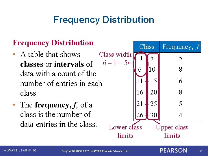
Frequency Distribution Class Frequency, f Class width • A table that shows 1 – 5 5 classes or intervals of 6 – 1 = 5 6 – 10 8 data with a count of the 11 – 15 6 number of entries in each 16 – 20 8 class. 21 – 25 5 • The frequency, f, of a class is the number of 26 – 30 4 data entries in the class. Lower class Upper class limits Copyright © 2015, 2012, and 2009 Pearson Education, Inc. limits 6

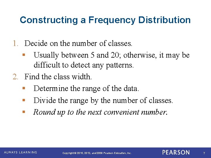
Constructing a Frequency Distribution 1. Decide on the number of classes. § Usually between 5 and 20; otherwise, it may be difficult to detect any patterns. 2. Find the class width. § Determine the range of the data. § Divide the range by the number of classes. § Round up to the next convenient number. Copyright © 2015, 2012, and 2009 Pearson Education, Inc. 7

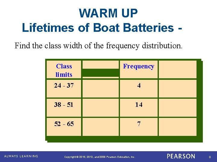
WARM UP Lifetimes of Boat Batteries Find the class width of the frequency distribution. Class limits Frequency 24 - 37 4 38 - 51 14 52 - 65 7 Copyright © 2015, 2012, and 2009 Pearson Education, Inc. 8

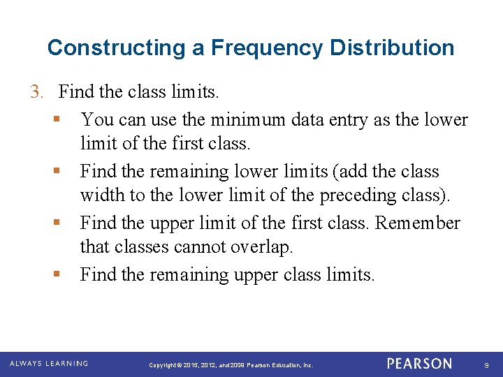
Constructing a Frequency Distribution 3. Find the class limits. § You can use the minimum data entry as the lower limit of the first class. § Find the remaining lower limits (add the class width to the lower limit of the preceding class). § Find the upper limit of the first class. Remember that classes cannot overlap. § Find the remaining upper class limits. Copyright © 2015, 2012, and 2009 Pearson Education, Inc. 9

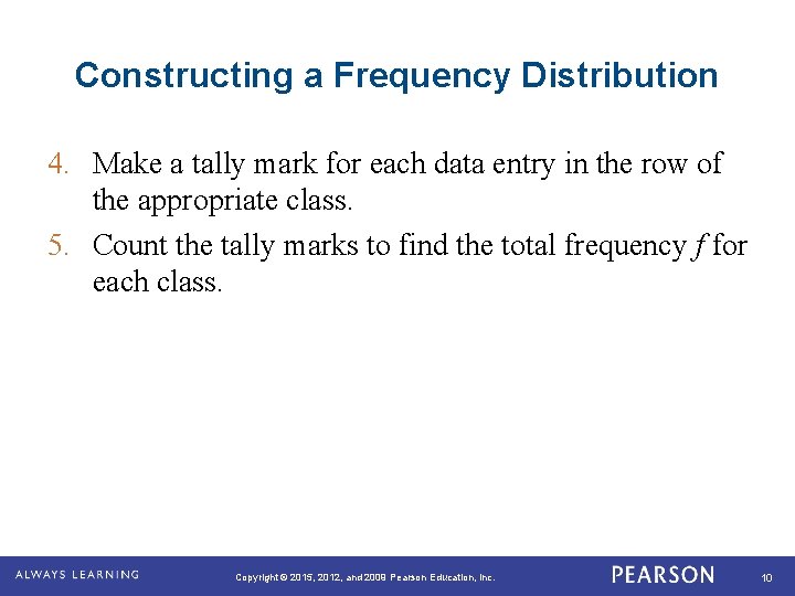
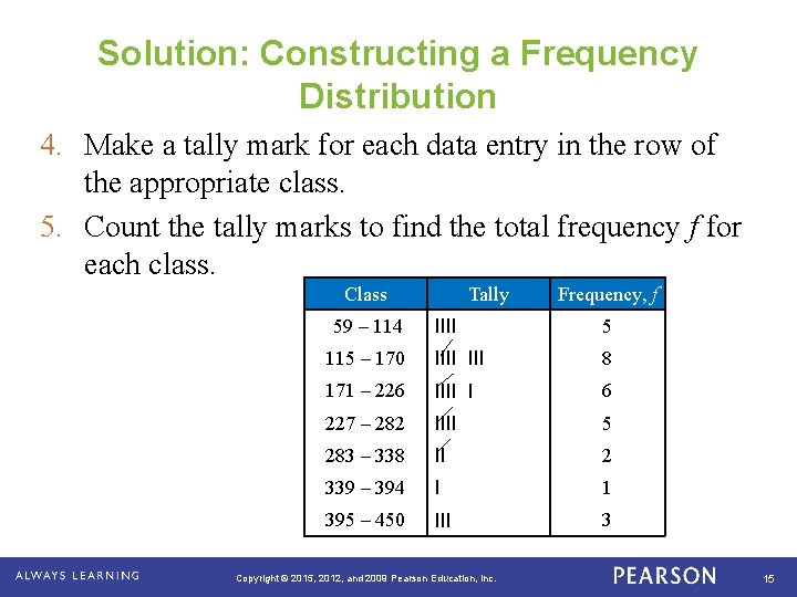
Constructing a Frequency Distribution 4. Make a tally mark for each data entry in the row of the appropriate class. 5. Count the tally marks to find the total frequency f for each class. Copyright © 2015, 2012, and 2009 Pearson Education, Inc. 10

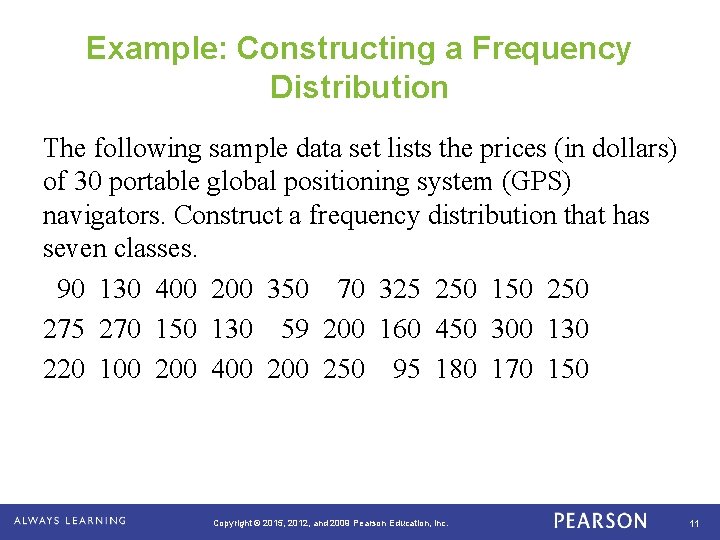
Example: Constructing a Frequency Distribution The following sample data set lists the prices (in dollars) of 30 portable global positioning system (GPS) navigators. Construct a frequency distribution that has seven classes. 90 130 400 200 350 70 325 250 150 275 270 150 130 59 200 160 450 300 130 220 100 200 400 250 95 180 170 150 Copyright © 2015, 2012, and 2009 Pearson Education, Inc. 11

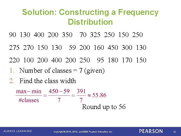
Solution: Constructing a Frequency Distribution 90 130 400 200 350 70 325 250 150 275 270 150 130 59 200 160 450 300 130 220 100 200 400 250 95 180 170 150 1. Number of classes = 7 (given) 2. Find the class width Round up to 56 Copyright © 2015, 2012, and 2009 Pearson Education, Inc. 12

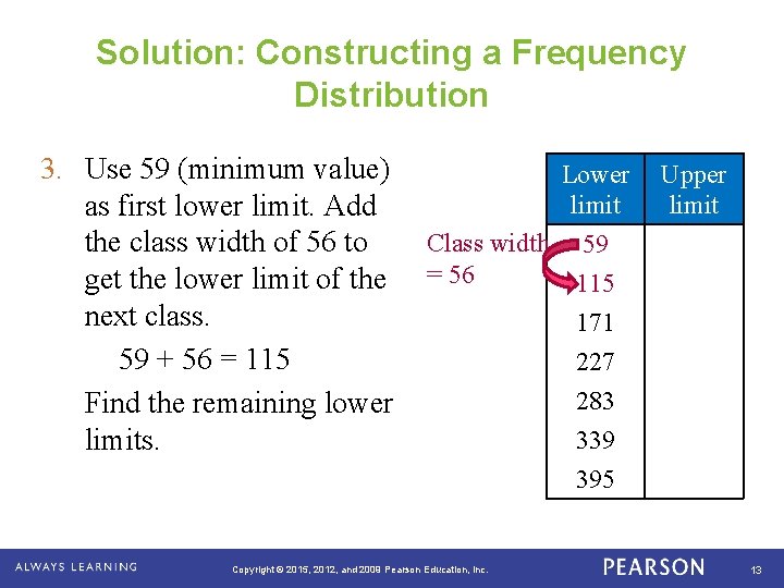
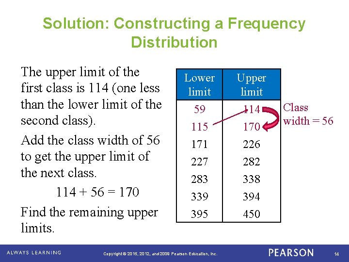
Solution: Constructing a Frequency Distribution 3. Use 59 (minimum value) Lower Upper limit as first lower limit. Add Class width 59 the class width of 56 to get the lower limit of the = 56 115 next class. 171 59 + 56 = 115 227 283 Find the remaining lower 339 limits. 395 Copyright © 2015, 2012, and 2009 Pearson Education, Inc. 13

Solution: Constructing a Frequency Distribution The upper limit of the first class is 114 (one less than the lower limit of the second class). Add the class width of 56 to get the upper limit of the next class. 114 + 56 = 170 Find the remaining upper limits. Lower limit 59 115 Upper limit 114 170 171 227 283 339 395 226 282 338 394 450 Copyright © 2015, 2012, and 2009 Pearson Education, Inc. Class width = 56 14

Solution: Constructing a Frequency Distribution 4. Make a tally mark for each data entry in the row of the appropriate class. 5. Count the tally marks to find the total frequency f for each class. Class Tally Frequency, f 59 – 114 IIII 5 115 – 170 IIII 8 171 – 226 IIII I 6 227 – 282 IIII 5 283 – 338 II 2 339 – 394 I 1 395 – 450 III 3 Copyright © 2015, 2012, and 2009 Pearson Education, Inc. 15

You Try It The number of World Series appearances by each Major League Baseball Team is listed below. Construct a frequency distribution using 5 classes. 40 19 14 20 12 18 9 7 11 9 7 6 5 10 7 5 4 2 2 3 1 1 2 2 1 1 0 0 Copyright © 2015, 2012, and 2009 Pearson Education, Inc. 16

SC Unemployment Rates Using the Unemployment Rate by County Table, create a frequency distribution with 5 classes for November 2014. Note: Round the class width calculation up to the next tenth. After creating the frequency distribution, color code the counties on the South Carolina map by their class. (You will need a separate color for each class. ) Copyright © 2015, 2012, and 2009 Pearson Education, Inc. 17

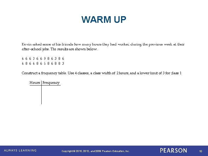
WARM UP Copyright © 2015, 2012, and 2009 Pearson Education, Inc. 18

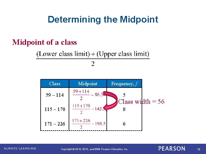
Determining the Midpoint of a class Class Midpoint 59 – 114 Frequency, f 5 Class width = 56 115 – 170 8 171 – 226 6 Copyright © 2015, 2012, and 2009 Pearson Education, Inc. 19

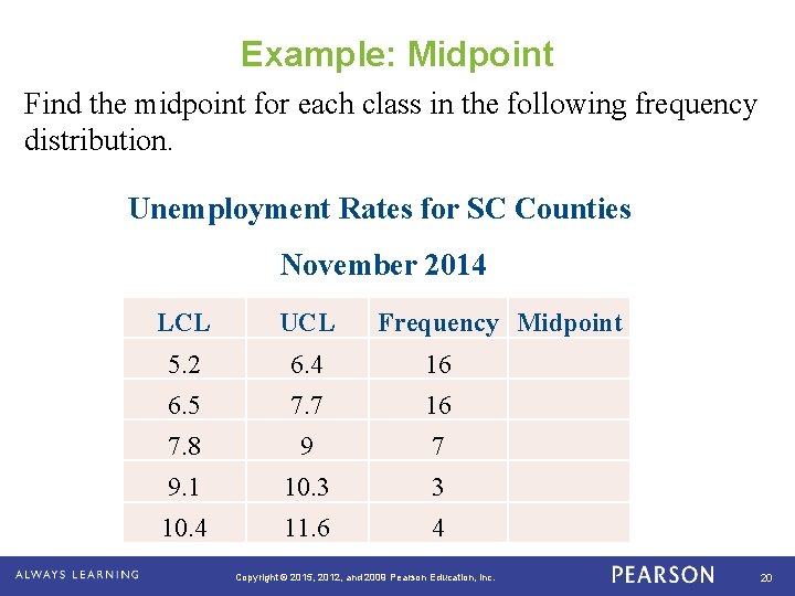
Example: Midpoint Find the midpoint for each class in the following frequency distribution. Unemployment Rates for SC Counties November 2014 LCL UCL Frequency Midpoint 5. 2 6. 4 16 6. 5 7. 7 16 7. 8 9 7 9. 1 10. 3 3 10. 4 11. 6 4 Copyright © 2015, 2012, and 2009 Pearson Education, Inc. 20

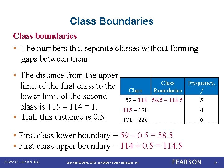
Class Boundaries Class boundaries • The numbers that separate classes without forming gaps between them. • The distance from the upper limit of the first class to the Class lower limit of the second 59 – 114 class is 115 – 114 = 1. 115 – 170 • Half this distance is 0. 5. 171 – 226 Class Frequency, Boundaries f 58. 5 – 114. 5 5 8 6 • First class lower boundary = 59 – 0. 5 = 58. 5 • First class upper boundary = 114 + 0. 5 = 114. 5 Copyright © 2015, 2012, and 2009 Pearson Education, Inc. 21

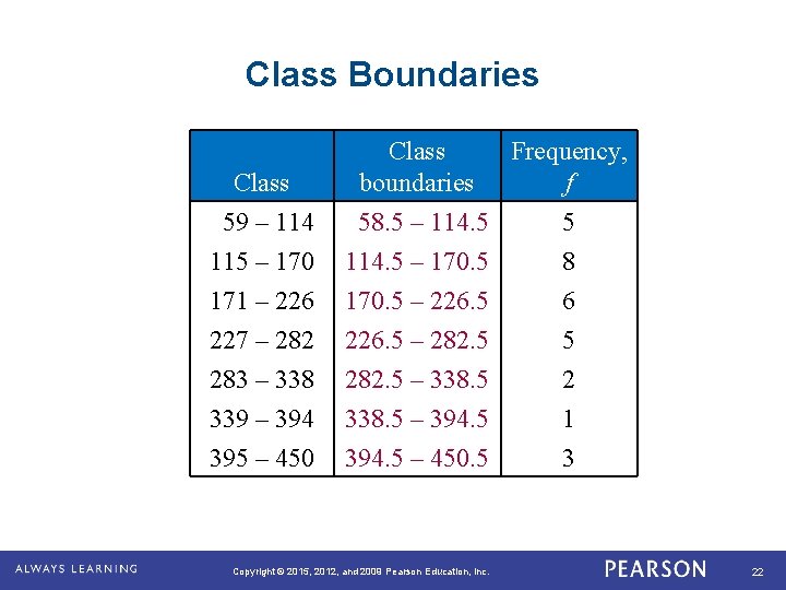
Class Boundaries Class 59 – 114 115 – 170 Class Frequency, boundaries f 58. 5 – 114. 5 5 114. 5 – 170. 5 8 171 – 226 227 – 282 283 – 338 339 – 394 395 – 450 170. 5 – 226. 5 – 282. 5 – 338. 5 – 394. 5 – 450. 5 Copyright © 2015, 2012, and 2009 Pearson Education, Inc. 6 5 2 1 3 22

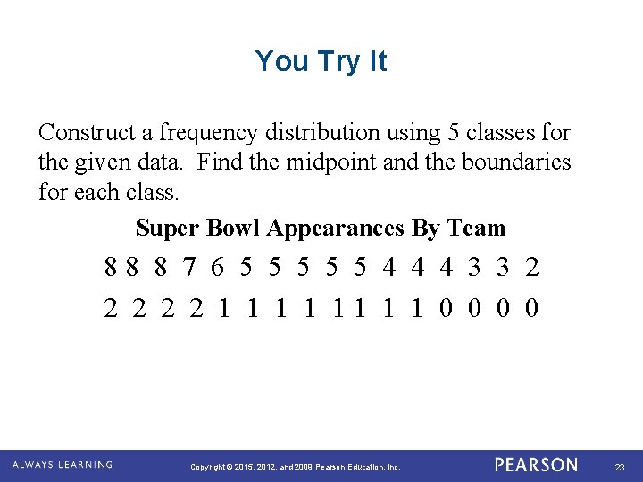
You Try It Construct a frequency distribution using 5 classes for the given data. Find the midpoint and the boundaries for each class. Super Bowl Appearances By Team 8 8 8 7 6 5 5 5 4 4 4 3 3 2 2 2 1 1 1 1 0 0 Copyright © 2015, 2012, and 2009 Pearson Education, Inc. 23

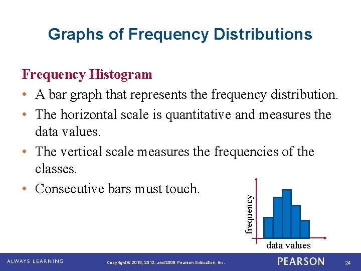
Graphs of Frequency Distributions frequency Frequency Histogram • A bar graph that represents the frequency distribution. • The horizontal scale is quantitative and measures the data values. • The vertical scale measures the frequencies of the classes. • Consecutive bars must touch. data values Copyright © 2015, 2012, and 2009 Pearson Education, Inc. 24

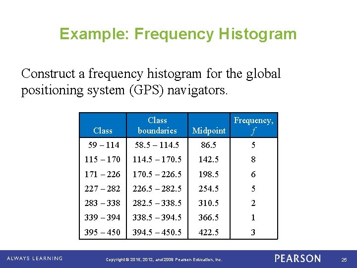
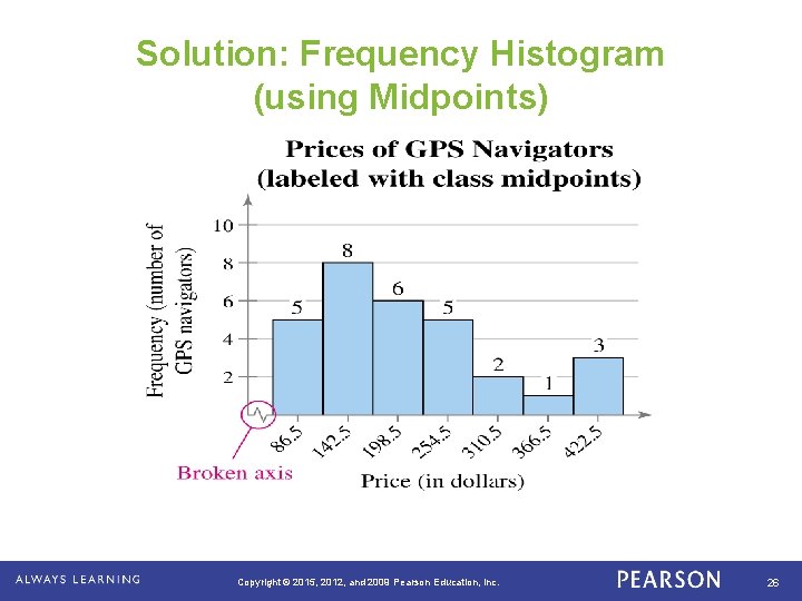
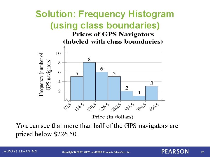
Example: Frequency Histogram Construct a frequency histogram for the global positioning system (GPS) navigators. Class boundaries Frequency, Midpoint f 59 – 114 58. 5 – 114. 5 86. 5 5 115 – 170 114. 5 – 170. 5 142. 5 8 171 – 226 170. 5 – 226. 5 198. 5 6 227 – 282 226. 5 – 282. 5 254. 5 5 283 – 338 282. 5 – 338. 5 310. 5 2 339 – 394 338. 5 – 394. 5 366. 5 1 395 – 450 394. 5 – 450. 5 422. 5 3 Copyright © 2015, 2012, and 2009 Pearson Education, Inc. 25

Solution: Frequency Histogram (using Midpoints) Copyright © 2015, 2012, and 2009 Pearson Education, Inc. 26

Solution: Frequency Histogram (using class boundaries) You can see that more than half of the GPS navigators are priced below $226. 50. Copyright © 2015, 2012, and 2009 Pearson Education, Inc. 27

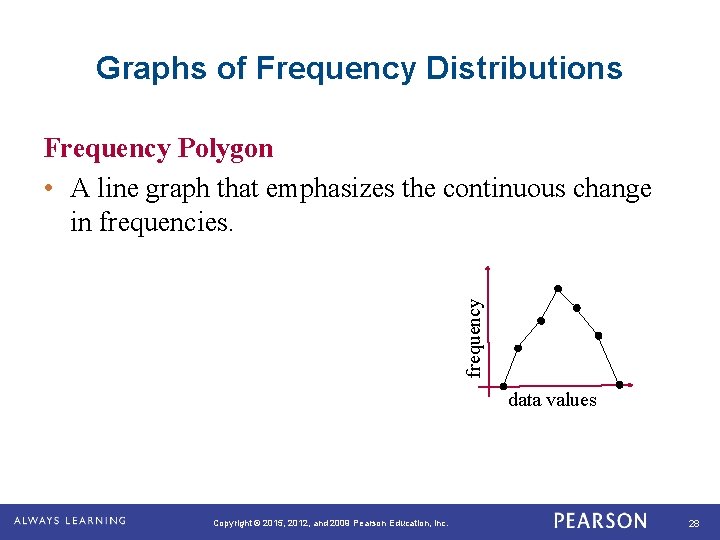
Graphs of Frequency Distributions frequency Frequency Polygon • A line graph that emphasizes the continuous change in frequencies. data values Copyright © 2015, 2012, and 2009 Pearson Education, Inc. 28

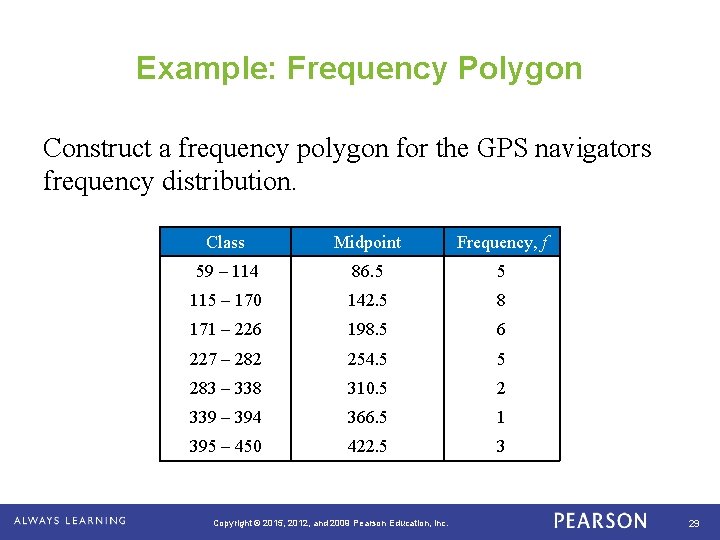
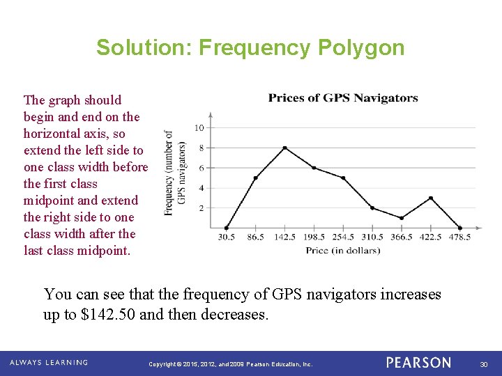
Example: Frequency Polygon Construct a frequency polygon for the GPS navigators frequency distribution. Class Midpoint Frequency, f 59 – 114 86. 5 5 115 – 170 142. 5 8 171 – 226 198. 5 6 227 – 282 254. 5 5 283 – 338 310. 5 2 339 – 394 366. 5 1 395 – 450 422. 5 3 Copyright © 2015, 2012, and 2009 Pearson Education, Inc. 29

Solution: Frequency Polygon The graph should begin and end on the horizontal axis, so extend the left side to one class width before the first class midpoint and extend the right side to one class width after the last class midpoint. You can see that the frequency of GPS navigators increases up to $142. 50 and then decreases. Copyright © 2015, 2012, and 2009 Pearson Education, Inc. 30

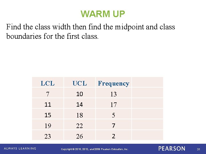
WARM UP Find the class width then find the midpoint and class boundaries for the first class. LCL UCL Frequency 7 10 13 11 14 17 15 18 5 19 22 7 23 26 2 Copyright © 2015, 2012, and 2009 Pearson Education, Inc. 31

Copyright © 2015, 2012, and 2009 Pearson Education, Inc. 32

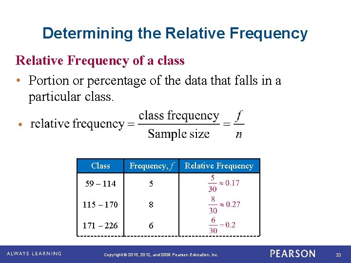
Determining the Relative Frequency of a class • Portion or percentage of the data that falls in a particular class. • Class Frequency, f 59 – 114 5 115 – 170 8 171 – 226 6 Relative Frequency Copyright © 2015, 2012, and 2009 Pearson Education, Inc. 33

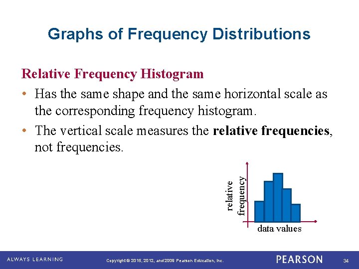
Graphs of Frequency Distributions relative frequency Relative Frequency Histogram • Has the same shape and the same horizontal scale as the corresponding frequency histogram. • The vertical scale measures the relative frequencies, not frequencies. data values Copyright © 2015, 2012, and 2009 Pearson Education, Inc. 34

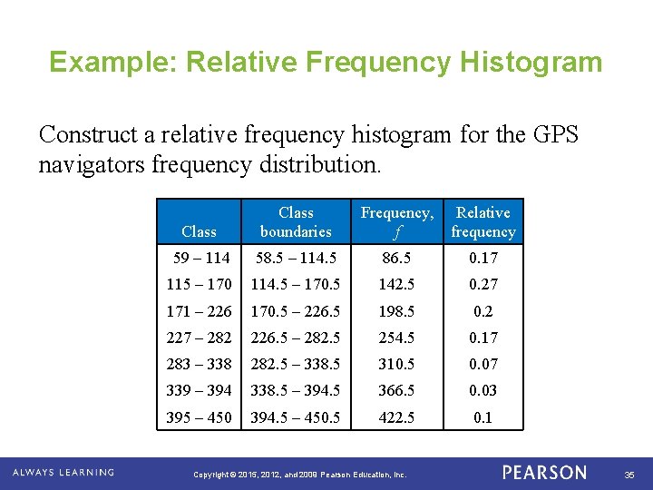
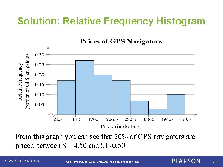
Example: Relative Frequency Histogram Construct a relative frequency histogram for the GPS navigators frequency distribution. Class boundaries Frequency, Relative f frequency 59 – 114 58. 5 – 114. 5 86. 5 0. 17 115 – 170 114. 5 – 170. 5 142. 5 0. 27 171 – 226 170. 5 – 226. 5 198. 5 0. 2 227 – 282 226. 5 – 282. 5 254. 5 0. 17 283 – 338 282. 5 – 338. 5 310. 5 0. 07 339 – 394 338. 5 – 394. 5 366. 5 0. 03 395 – 450 394. 5 – 450. 5 422. 5 0. 1 Copyright © 2015, 2012, and 2009 Pearson Education, Inc. 35

Solution: Relative Frequency Histogram 6. 5 18. 5 30. 5 42. 5 54. 5 66. 5 78. 5 90. 5 From this graph you can see that 20% of GPS navigators are priced between $114. 50 and $170. 50. Copyright © 2015, 2012, and 2009 Pearson Education, Inc. 36

AIR TIME Find some material to read quietly. Copyright © 2015, 2012, and 2009 Pearson Education, Inc. 37

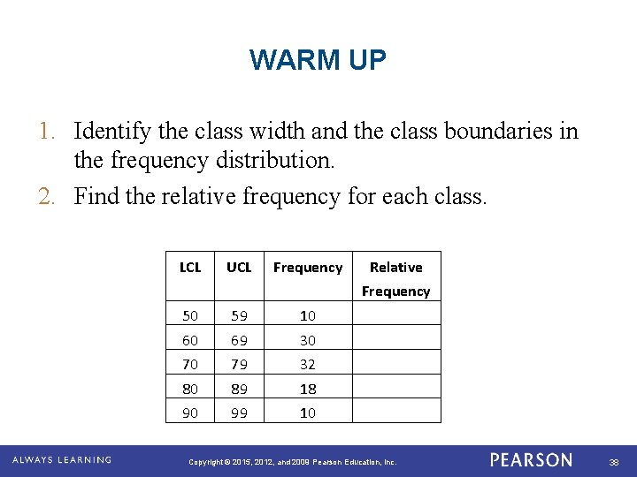
WARM UP 1. Identify the class width and the class boundaries in the frequency distribution. 2. Find the relative frequency for each class. LCL UCL Frequency Relative Frequency 50 59 10 60 69 30 70 79 32 80 89 18 90 99 10 Copyright © 2015, 2012, and 2009 Pearson Education, Inc. 38

and X Cards After each statement made, raise your card. A check means you agree with the statement. An X means you disagree with the statement. Copyright © 2015, 2012, and 2009 Pearson Education, Inc. 39

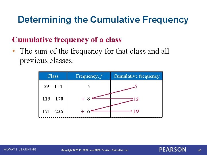
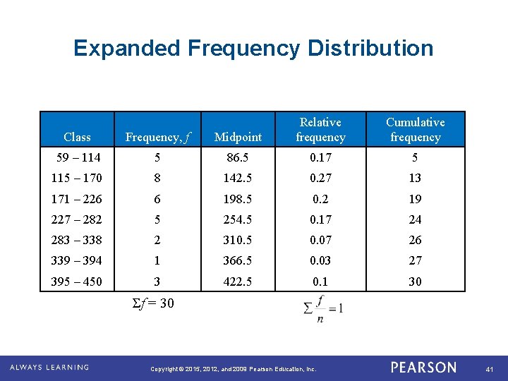
Determining the Cumulative Frequency Cumulative frequency of a class • The sum of the frequency for that class and all previous classes. Class Frequency, f Cumulative frequency 59 – 114 5 5 115 – 170 + 8 13 171 – 226 + 6 19 Copyright © 2015, 2012, and 2009 Pearson Education, Inc. 40

Expanded Frequency Distribution Class Frequency, f Midpoint Relative frequency Cumulative frequency 59 – 114 5 86. 5 0. 17 5 115 – 170 8 142. 5 0. 27 13 171 – 226 6 198. 5 0. 2 19 227 – 282 5 254. 5 0. 17 24 283 – 338 2 310. 5 0. 07 26 339 – 394 1 366. 5 0. 03 27 395 – 450 3 422. 5 0. 1 30 Σf = 30 Copyright © 2015, 2012, and 2009 Pearson Education, Inc. 41

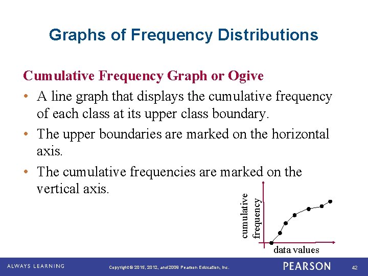
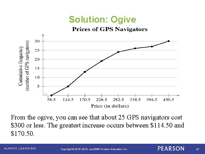
Graphs of Frequency Distributions cumulative frequency Cumulative Frequency Graph or Ogive • A line graph that displays the cumulative frequency of each class at its upper class boundary. • The upper boundaries are marked on the horizontal axis. • The cumulative frequencies are marked on the vertical axis. data values Copyright © 2015, 2012, and 2009 Pearson Education, Inc. 42

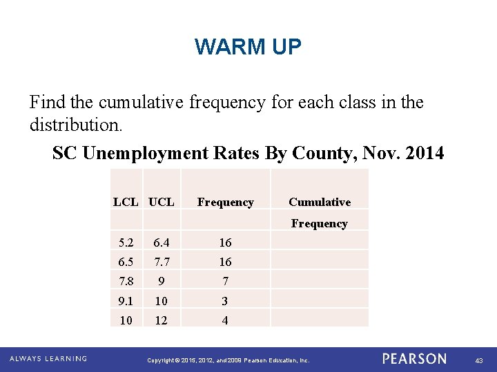
WARM UP Find the cumulative frequency for each class in the distribution. SC Unemployment Rates By County, Nov. 2014 LCL UCL Frequency Cumulative Frequency 5. 2 6. 4 16 6. 5 7. 7 16 7. 8 9 7 9. 1 10 3 10 12 4 Copyright © 2015, 2012, and 2009 Pearson Education, Inc. 43

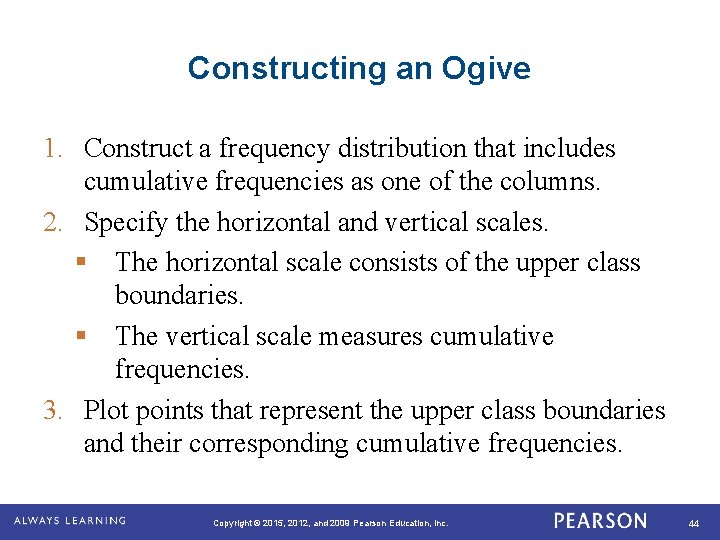
Constructing an Ogive 1. Construct a frequency distribution that includes cumulative frequencies as one of the columns. 2. Specify the horizontal and vertical scales. § The horizontal scale consists of the upper class boundaries. § The vertical scale measures cumulative frequencies. 3. Plot points that represent the upper class boundaries and their corresponding cumulative frequencies. Copyright © 2015, 2012, and 2009 Pearson Education, Inc. 44

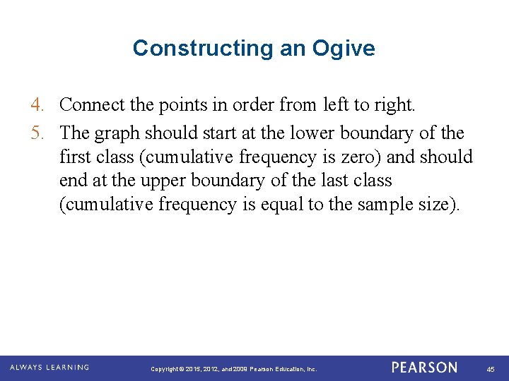
Constructing an Ogive 4. Connect the points in order from left to right. 5. The graph should start at the lower boundary of the first class (cumulative frequency is zero) and should end at the upper boundary of the last class (cumulative frequency is equal to the sample size). Copyright © 2015, 2012, and 2009 Pearson Education, Inc. 45

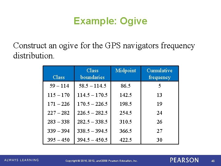
Example: Ogive Construct an ogive for the GPS navigators frequency distribution. Midpoint Class boundaries Cumulative frequency 59 – 114 58. 5 – 114. 5 86. 5 5 115 – 170 114. 5 – 170. 5 142. 5 13 171 – 226 170. 5 – 226. 5 198. 5 19 227 – 282 226. 5 – 282. 5 254. 5 24 283 – 338 282. 5 – 338. 5 310. 5 26 339 – 394 338. 5 – 394. 5 366. 5 27 395 – 450 394. 5 – 450. 5 422. 5 30 Copyright © 2015, 2012, and 2009 Pearson Education, Inc. 46

Solution: Ogive 6. 5 18. 5 30. 5 42. 5 54. 5 66. 5 78. 5 90. 5 From the ogive, you can see that about 25 GPS navigators cost $300 or less. The greatest increase occurs between $114. 50 and $170. 50. Copyright © 2015, 2012, and 2009 Pearson Education, Inc. 47

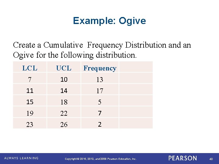
Example: Ogive Create a Cumulative Frequency Distribution and an Ogive for the following distribution. LCL UCL Frequency 7 10 13 11 14 17 15 18 5 19 22 7 23 26 2 Copyright © 2015, 2012, and 2009 Pearson Education, Inc. 48

Copyright © 2015, 2012, and 2009 Pearson Education, Inc. 49

ASSIGNMENT Use the Federal Report Card Data Sheet to create a cumulative frequency distribution and an ogive for the Total Column. Use 5 classes to create the frequency distribution. Round the class width up to the next tenth. Copyright © 2015, 2012, and 2009 Pearson Education, Inc. 50

Section 2. 1 Summary • Constructed frequency distributions • Constructed frequency histograms, frequency polygons, relative frequency histograms and ogives Copyright © 2015, 2012, and 2009 Pearson Education, Inc. 51

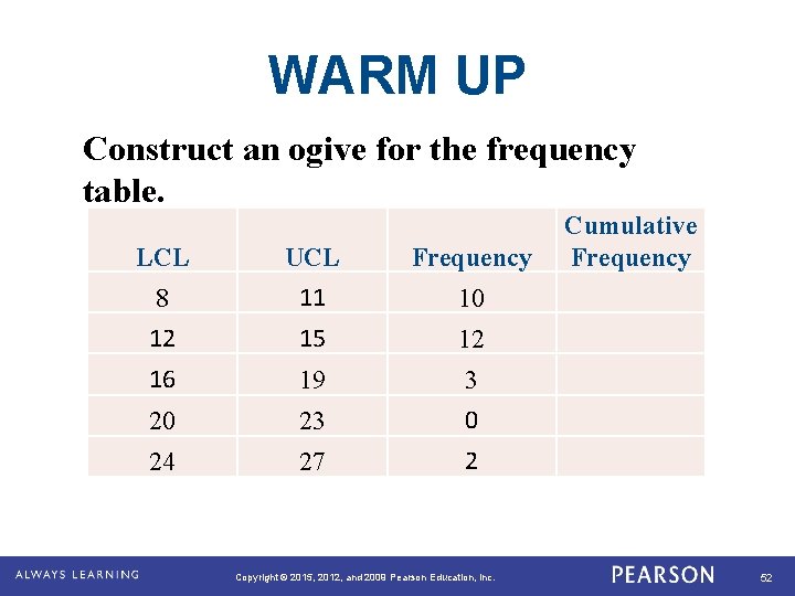
WARM UP Construct an ogive for the frequency table. LCL UCL Frequency 8 11 10 12 15 12 16 19 3 20 23 0 24 27 2 Copyright © 2015, 2012, and 2009 Pearson Education, Inc. Cumulative Frequency 52

THINK-PAIR-WRITE With a partner, brainstorm about other types of graphs that are used to display data. Each student should write a response with a list of the types of graphs that was discussed with a partner. Copyright © 2015, 2012, and 2009 Pearson Education, Inc. 53

More Graphs and Displays Copyright © 2015, 2012, and 2009 Pearson Education, Inc. 54

Learning Goals • How to graph and interpret quantitative data using stem-and-leaf plots and dot plots • How to graph and interpret qualitative data using pie charts and Pareto charts • How to graph and interpret paired data sets using scatter plots and time series charts Copyright © 2015, 2012, and 2009 Pearson Education, Inc. 55

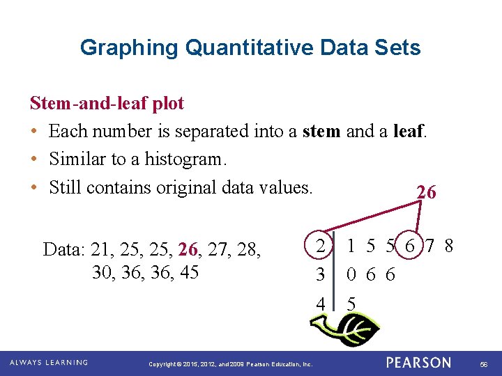
Graphing Quantitative Data Sets Stem-and-leaf plot • Each number is separated into a stem and a leaf. • Similar to a histogram. • Still contains original data values. 26 Data: 21, 25, 26, 27, 28, 30, 36, 45 . Copyright © 2015, 2012, and 2009 Pearson Education, Inc. 2 3 1 5 5 6 7 8 0 6 6 4 5 56

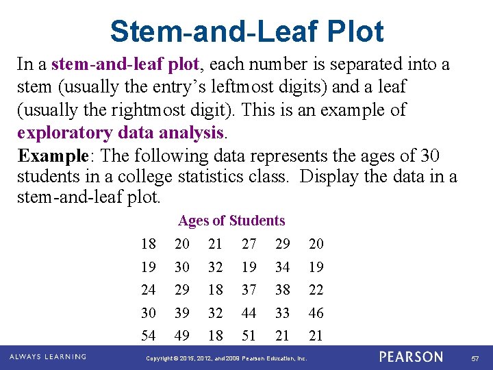
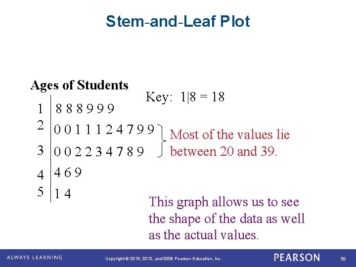
Stem-and-Leaf Plot In a stem-and-leaf plot, each number is separated into a stem (usually the entry’s leftmost digits) and a leaf (usually the rightmost digit). This is an example of exploratory data analysis. Example: The following data represents the ages of 30 students in a college statistics class. Display the data in a stem-and-leaf plot. Ages of Students 18 20 21 27 29 20 19 30 32 19 34 19 24 29 18 37 38 22 30 39 32 44 33 46 54 49 18 51 21 21 Copyright © 2015, 2012, and 2009 Pearson Education, Inc. 57

Stem-and-Leaf Plot Ages of Students Key: 1|8 = 18 1 8 8 8 9 9 9 2 0 0 1 1 1 2 4 7 9 9 3 0 0 2 2 3 4 7 8 9 4 4 6 9 5 1 4 Most of the values lie between 20 and 39. This graph allows us to see the shape of the data as well as the actual values. Copyright © 2015, 2012, and 2009 Pearson Education, Inc. 58

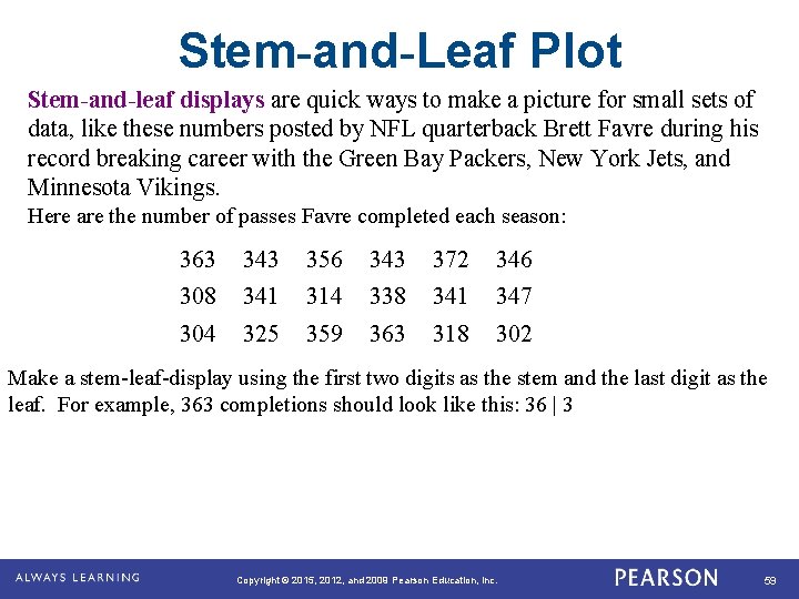
Stem-and-Leaf Plot Stem-and-leaf displays are quick ways to make a picture for small sets of data, like these numbers posted by NFL quarterback Brett Favre during his record breaking career with the Green Bay Packers, New York Jets, and Minnesota Vikings. Here are the number of passes Favre completed each season: 363 343 356 343 372 346 308 341 314 338 341 347 304 325 359 363 318 302 Make a stem-leaf-display using the first two digits as the stem and the last digit as the leaf. For example, 363 completions should look like this: 36 | 3 Copyright © 2015, 2012, and 2009 Pearson Education, Inc. 59

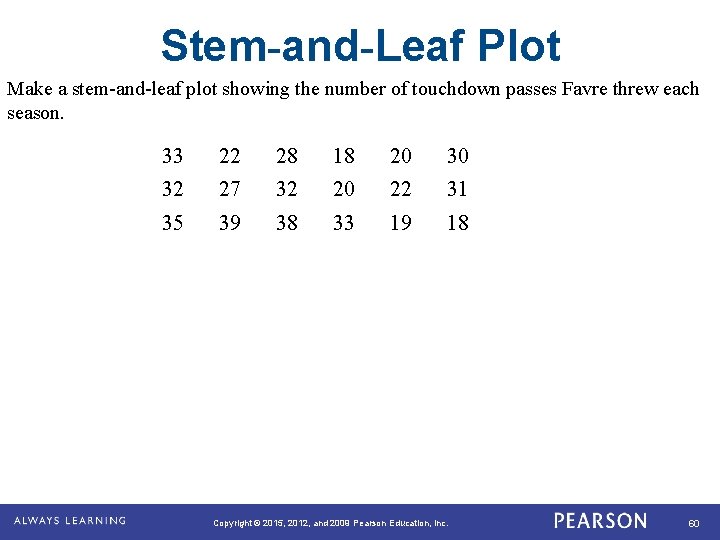
Stem-and-Leaf Plot Make a stem-and-leaf plot showing the number of touchdown passes Favre threw each season. 33 22 28 18 20 30 32 27 32 20 22 31 35 39 38 33 19 18 Copyright © 2015, 2012, and 2009 Pearson Education, Inc. 60

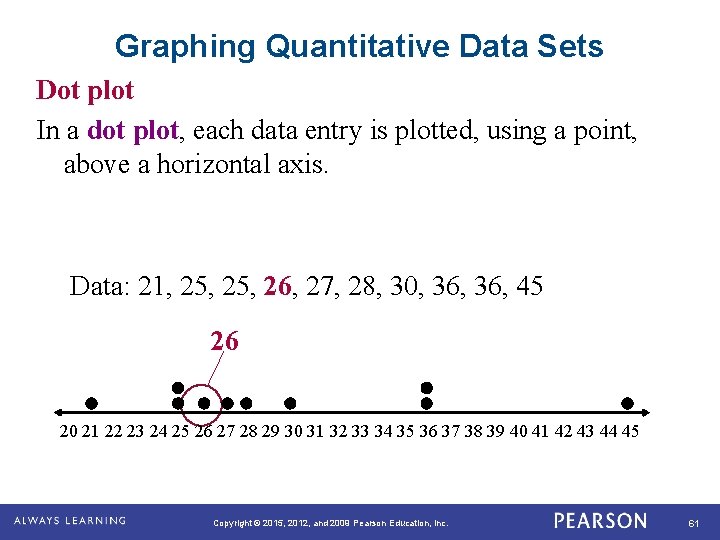
Graphing Quantitative Data Sets Dot plot In a dot plot, each data entry is plotted, using a point, above a horizontal axis. Data: 21, 25, 26, 27, 28, 30, 36, 45 26 20 21 22 23 24 25 26 27 28 29 30 31 32 33 34 35 36 37 38 39 40 41 42 43 44 45 . Copyright © 2015, 2012, and 2009 Pearson Education, Inc. 61

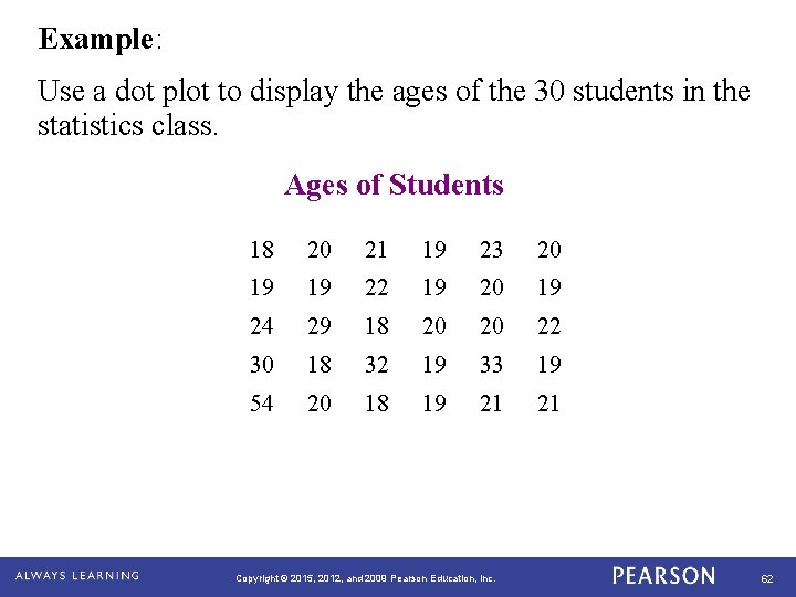
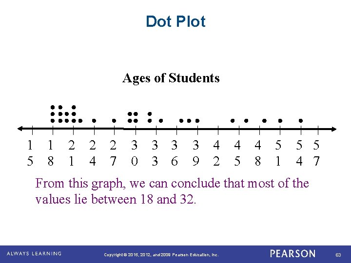
Example: Use a dot plot to display the ages of the 30 students in the statistics class. Ages of Students 18 20 21 19 23 20 19 19 22 19 20 19 24 29 18 20 20 22 30 18 32 19 33 19 54 20 18 19 21 21 Copyright © 2015, 2012, and 2009 Pearson Education, Inc. 62

Dot Plot Ages of Students 1 1 5 8 2 1 2 2 4 7 3 0 3 3 3 6 3 9 4 2 4 5 4 8 5 1 5 5 4 7 From this graph, we can conclude that most of the values lie between 18 and 32. Copyright © 2015, 2012, and 2009 Pearson Education, Inc. 63

Dot Plot Using the rosters of the two Super Bowl teams, create a dot plot of the ages for players from each team. You will have two dot plots; one for the Patriots and one for the Seahawks. Turn the rosters back in because we will use them again later. Copyright © 2015, 2012, and 2009 Pearson Education, Inc. 64

WARM UP Create a stem-and-leaf plot for the data. 15 15 17 19 22 25 27 27 27 29 30 30 32 35 41 Copyright © 2015, 2012, and 2009 Pearson Education, Inc. 65

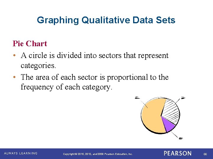
Graphing Qualitative Data Sets Pie Chart • A circle is divided into sectors that represent categories. • The area of each sector is proportional to the frequency of each category. Copyright © 2015, 2012, and 2009 Pearson Education, Inc. 66

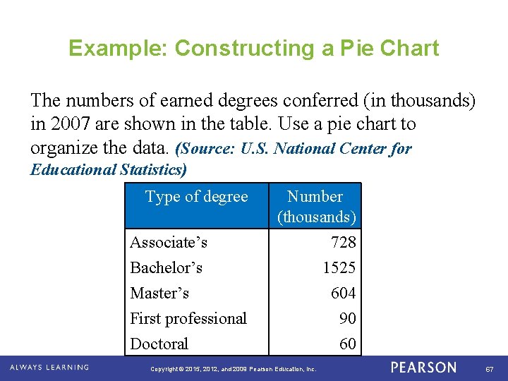
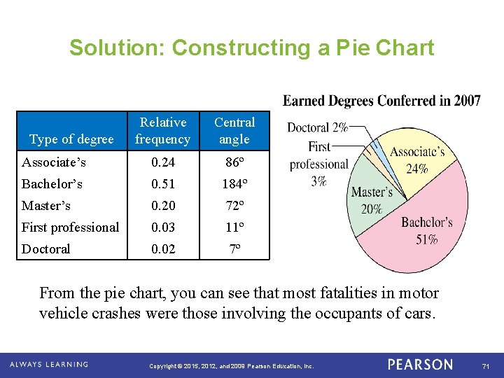
Example: Constructing a Pie Chart The numbers of earned degrees conferred (in thousands) in 2007 are shown in the table. Use a pie chart to organize the data. (Source: U. S. National Center for Educational Statistics) Type of degree Associate’s Bachelor’s Master’s First professional Doctoral. Number (thousands) 728 1525 604 90 60 Copyright © 2015, 2012, and 2009 Pearson Education, Inc. 67

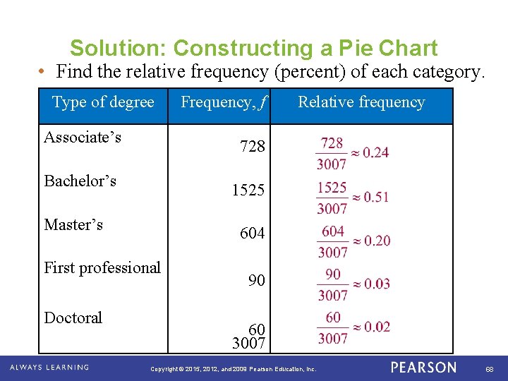
Solution: Constructing a Pie Chart • Find the relative frequency (percent) of each category. Type of degree Associate’s 1525 Master’s 604 First professional . Relative frequency 728 Bachelor’s Doctoral Frequency, f 90 60 3007 Copyright © 2015, 2012, and 2009 Pearson Education, Inc. 68

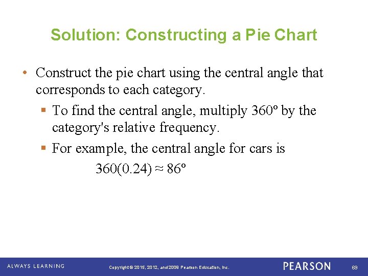
Solution: Constructing a Pie Chart • Construct the pie chart using the central angle that corresponds to each category. § To find the central angle, multiply 360º by the category's relative frequency. § For example, the central angle for cars is 360(0. 24) ≈ 86º . Copyright © 2015, 2012, and 2009 Pearson Education, Inc. 69

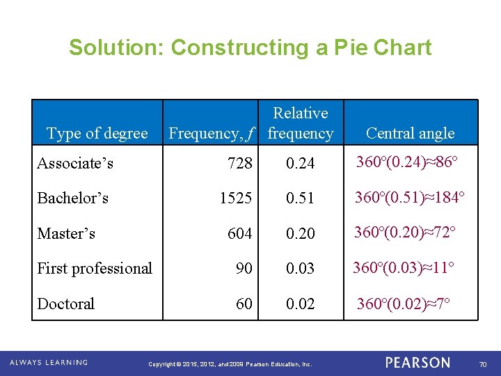
Solution: Constructing a Pie Chart Relative Frequency, f frequency Type of degree Associate’s 728 0. 24 360º(0. 24)≈86º Bachelor’s 1525 0. 51 360º(0. 51)≈184º 604 0. 20 360º(0. 20)≈72º First professional 90 0. 03 360º(0. 03)≈11º Doctoral 60 0. 02 360º(0. 02)≈7º Master’s . Central angle Copyright © 2015, 2012, and 2009 Pearson Education, Inc. 70

Solution: Constructing a Pie Chart Relative frequency Central angle Associate’s 0. 24 86º Bachelor’s 0. 51 184º Master’s 0. 20 72º First professional 0. 03 11º Doctoral 0. 02 7º Type of degree From the pie chart, you can see that most fatalities in motor vehicle crashes were those involving the occupants of cars. . Copyright © 2015, 2012, and 2009 Pearson Education, Inc. 71

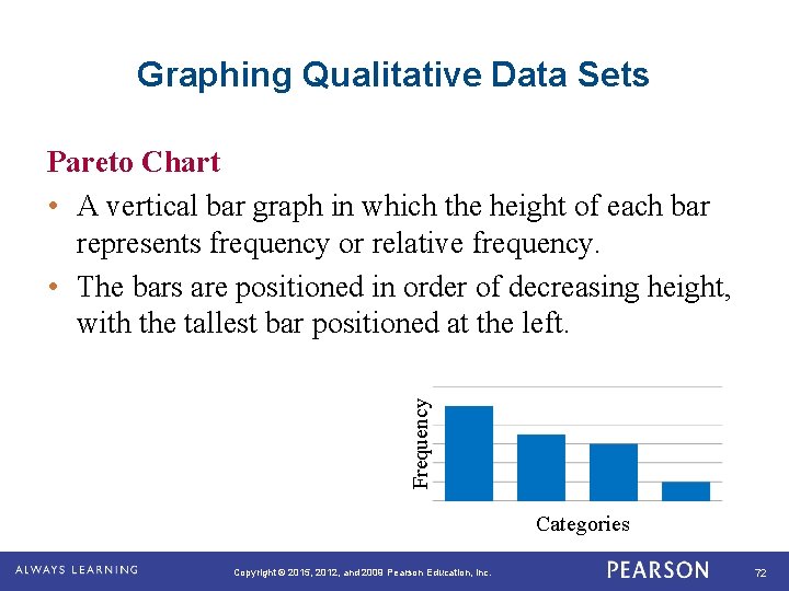
Graphing Qualitative Data Sets Frequency Pareto Chart • A vertical bar graph in which the height of each bar represents frequency or relative frequency. • The bars are positioned in order of decreasing height, with the tallest bar positioned at the left. Categories. Copyright © 2015, 2012, and 2009 Pearson Education, Inc. 72

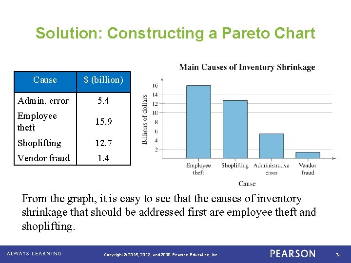
Example: Constructing a Pareto Chart In a recent year, the retail industry lost $36. 5 billion in inventory shrinkage. Inventory shrinkage is the loss of inventory through breakage, pilferage, shoplifting, and so on. The causes of the inventory shrinkage are administrative error ($5. 4 billion), employee theft ($15. 9 billion), shoplifting ($12. 7 billion), and vendor fraud ($1. 4 billion). Use a Pareto chart to organize this data. (Source: National Retail Federation and Center for Retailing Education, University of Florida) . Copyright © 2015, 2012, and 2009 Pearson Education, Inc. 73

Solution: Constructing a Pareto Chart Cause $ (billion) Admin. error 5. 4 Employee theft 15. 9 Shoplifting 12. 7 Vendor fraud 1. 4 From the graph, it is easy to see that the causes of inventory shrinkage that should be addressed first are employee theft and shoplifting. . Copyright © 2015, 2012, and 2009 Pearson Education, Inc. 74

Assignment Create a question with 4 possible responses that will give you qualitative data. Have classmates respond to the question. Create a Pie Chart and a Pareto Chart for the responses to the question. Copyright © 2015, 2012, and 2009 Pearson Education, Inc. 75

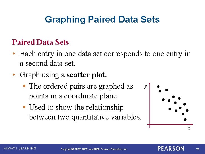
Graphing Paired Data Sets • Each entry in one data set corresponds to one entry in a second data set. • Graph using a scatter plot. § The ordered pairs are graphed as y points in a coordinate plane. § Used to show the relationship between two quantitative variables. x . Copyright © 2015, 2012, and 2009 Pearson Education, Inc. 76

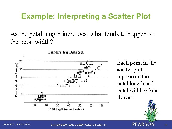
Example: Interpreting a Scatter Plot The British statistician Ronald Fisher introduced a famous data set called Fisher's Iris data set. This data set describes various physical characteristics, such as petal length and petal width (in millimeters), for three species of iris. The petal lengths form the first data set and the petal widths form the second data set. (Source: Fisher, R. A. , 1936) . Copyright © 2015, 2012, and 2009 Pearson Education, Inc. 77

Example: Interpreting a Scatter Plot As the petal length increases, what tends to happen to the petal width? Each point in the scatter plot represents the petal length and petal width of one flower. . Copyright © 2015, 2012, and 2009 Pearson Education, Inc. 78

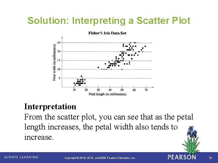
Solution: Interpreting a Scatter Plot Interpretation From the scatter plot, you can see that as the petal length increases, the petal width also tends to increase. . Copyright © 2015, 2012, and 2009 Pearson Education, Inc. 79

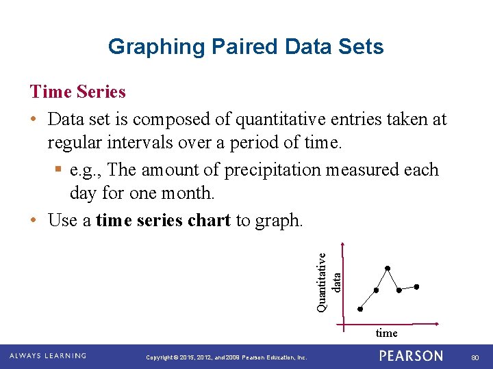
Graphing Paired Data Sets Quantitative data Time Series • Data set is composed of quantitative entries taken at regular intervals over a period of time. § e. g. , The amount of precipitation measured each day for one month. • Use a time series chart to graph. time. Copyright © 2015, 2012, and 2009 Pearson Education, Inc. 80

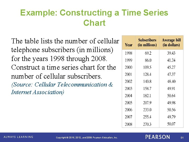
Example: Constructing a Time Series Chart The table lists the number of cellular telephone subscribers (in millions) for the years 1998 through 2008. Construct a time series chart for the number of cellular subscribers. (Source: Cellular Telecommunication & Internet Association) . Copyright © 2015, 2012, and 2009 Pearson Education, Inc. 81

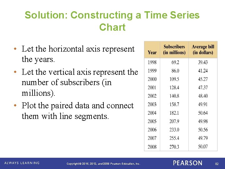
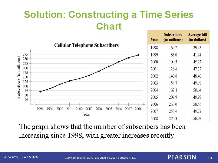
Solution: Constructing a Time Series Chart • Let the horizontal axis represent the years. • Let the vertical axis represent the number of subscribers (in millions). • Plot the paired data and connect them with line segments. . Copyright © 2015, 2012, and 2009 Pearson Education, Inc. 82

Solution: Constructing a Time Series Chart The graph shows that the number of subscribers has been increasing since 1998, with greater increases recently. . Copyright © 2015, 2012, and 2009 Pearson Education, Inc. 83

Section 2. 2 Summary • Graphed and interpreted quantitative data using stemand-leaf plots and dot plots • Graphed and interpreted qualitative data using pie charts and Pareto charts • Graphed and interpreted paired data sets using scatter plots and time series charts . Copyright © 2015, 2012, and 2009 Pearson Education, Inc. 84

AIR TIME Find some material to read quietly. Copyright © 2015, 2012, and 2009 Pearson Education, Inc. 85

Section 2. 3 Measures of Central Tendency . Copyright © 2015, 2012, and 2009 Pearson Education, Inc. 86

Learning Goals • How to find the mean, median, and mode of a population and of a sample • How to find the weighted mean of a data set and the mean of a frequency distribution • How to describe the shape of a distribution as symmetric, uniform, or skewed and how to compare the mean and median for each . Copyright © 2015, 2012, and 2009 Pearson Education, Inc. 87

Measures of Central Tendency Measure of central tendency • A value that represents a typical, or central, entry of a data set. • Most common measures of central tendency: § Mean § Median § Mode . Copyright © 2015, 2012, and 2009 Pearson Education, Inc. 88

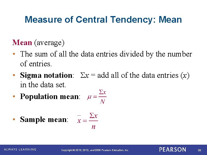
Measure of Central Tendency: Mean (average) • The sum of all the data entries divided by the number of entries. • Sigma notation: Σx = add all of the data entries (x) in the data set. • Population mean: • Sample mean: . Copyright © 2015, 2012, and 2009 Pearson Education, Inc. 89

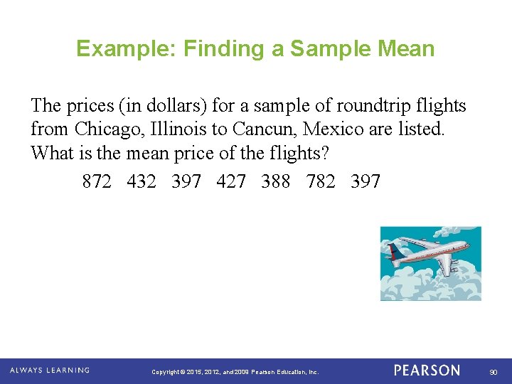
Example: Finding a Sample Mean The prices (in dollars) for a sample of roundtrip flights from Chicago, Illinois to Cancun, Mexico are listed. What is the mean price of the flights? 872 432 397 427 388 782 397 . Copyright © 2015, 2012, and 2009 Pearson Education, Inc. 90

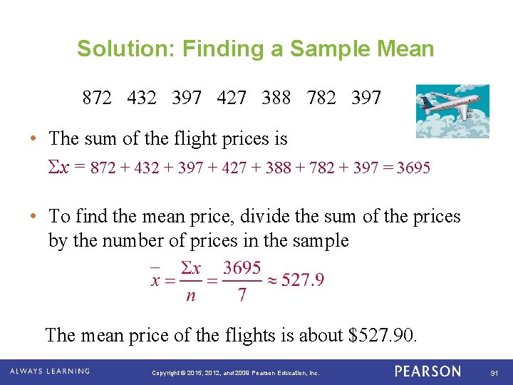
Solution: Finding a Sample Mean 872 432 397 427 388 782 397 • The sum of the flight prices is Σx = 872 + 432 + 397 + 427 + 388 + 782 + 397 = 3695 • To find the mean price, divide the sum of the prices by the number of prices in the sample The mean price of the flights is about $527. 90. . Copyright © 2015, 2012, and 2009 Pearson Education, Inc. 91

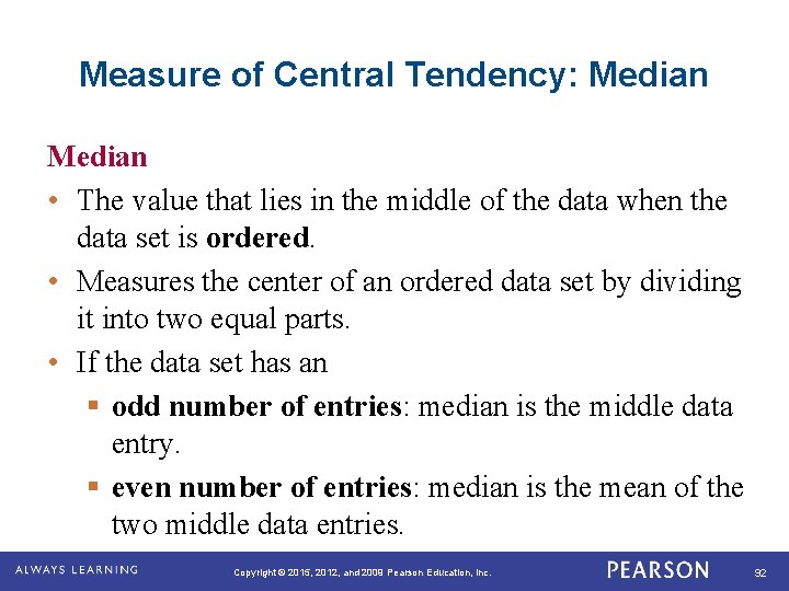
Measure of Central Tendency: Median • The value that lies in the middle of the data when the data set is ordered. • Measures the center of an ordered data set by dividing it into two equal parts. • If the data set has an § odd number of entries: median is the middle data entry. § even number of entries: median is the mean of the two middle data entries. . Copyright © 2015, 2012, and 2009 Pearson Education, Inc. 92

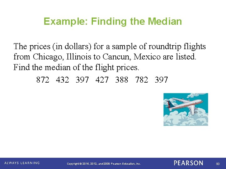
Example: Finding the Median The prices (in dollars) for a sample of roundtrip flights from Chicago, Illinois to Cancun, Mexico are listed. Find the median of the flight prices. 872 432 397 427 388 782 397 . Copyright © 2015, 2012, and 2009 Pearson Education, Inc. 93

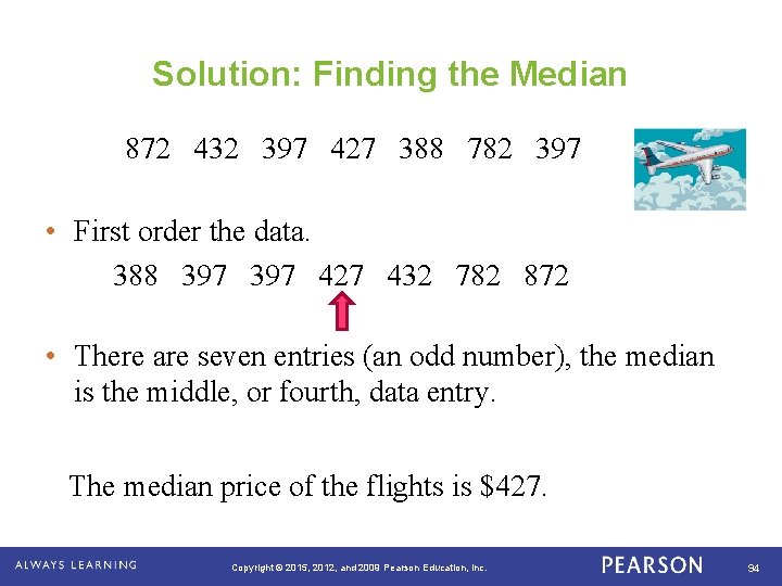
Solution: Finding the Median 872 432 397 427 388 782 397 • First order the data. 388 397 427 432 782 872 • There are seven entries (an odd number), the median is the middle, or fourth, data entry. The median price of the flights is $427. . Copyright © 2015, 2012, and 2009 Pearson Education, Inc. 94

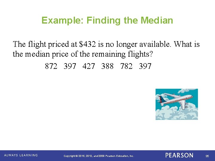
Example: Finding the Median The flight priced at $432 is no longer available. What is the median price of the remaining flights? 872 397 427 388 782 397 . Copyright © 2015, 2012, and 2009 Pearson Education, Inc. 95

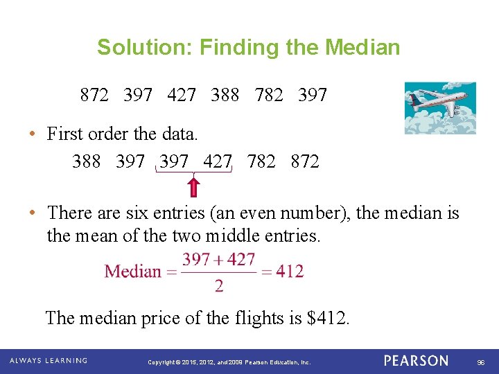
Solution: Finding the Median 872 397 427 388 782 397 • First order the data. 388 397 427 782 872 • There are six entries (an even number), the median is the mean of the two middle entries. The median price of the flights is $412. . Copyright © 2015, 2012, and 2009 Pearson Education, Inc. 96

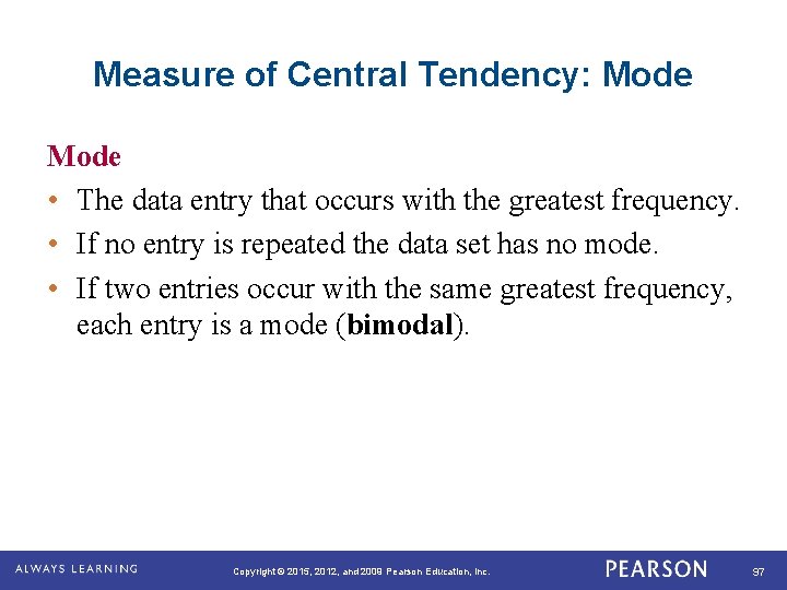
Measure of Central Tendency: Mode • The data entry that occurs with the greatest frequency. • If no entry is repeated the data set has no mode. • If two entries occur with the same greatest frequency, each entry is a mode (bimodal). . Copyright © 2015, 2012, and 2009 Pearson Education, Inc. 97

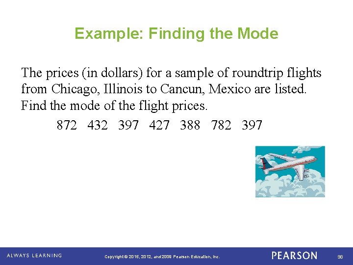
Example: Finding the Mode The prices (in dollars) for a sample of roundtrip flights from Chicago, Illinois to Cancun, Mexico are listed. Find the mode of the flight prices. 872 432 397 427 388 782 397 . Copyright © 2015, 2012, and 2009 Pearson Education, Inc. 98

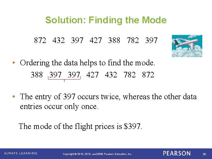
Solution: Finding the Mode 872 432 397 427 388 782 397 • Ordering the data helps to find the mode. 388 397 427 432 782 872 • The entry of 397 occurs twice, whereas the other data entries occur only once. The mode of the flight prices is $397. . Copyright © 2015, 2012, and 2009 Pearson Education, Inc. 99

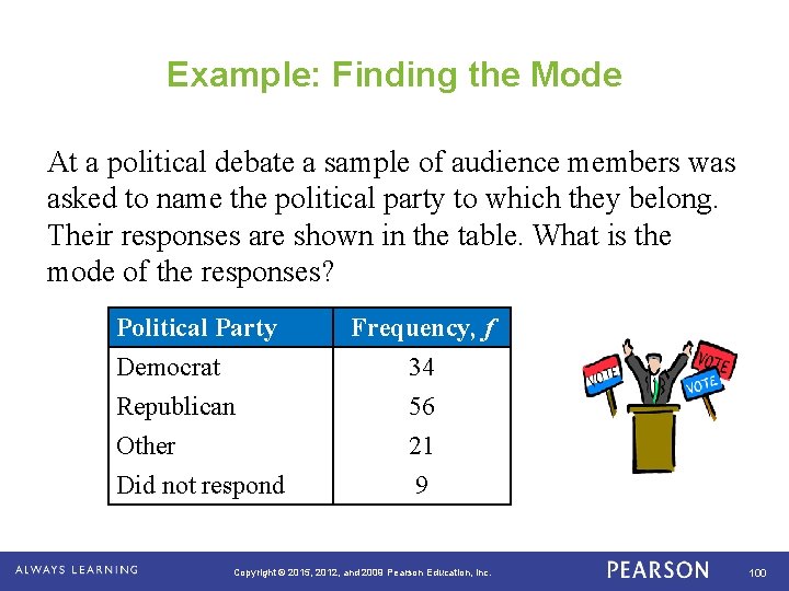
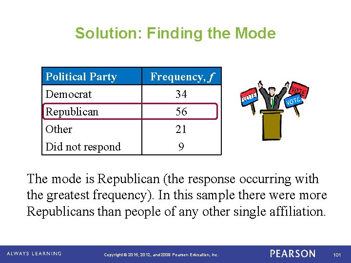
Example: Finding the Mode At a political debate a sample of audience members was asked to name the political party to which they belong. Their responses are shown in the table. What is the mode of the responses? . Political Party Democrat Republican Other Frequency, f 34 56 21 Did not respond 9 Copyright © 2015, 2012, and 2009 Pearson Education, Inc. 100

Solution: Finding the Mode Political Party Democrat Republican Other Frequency, f 34 56 21 Did not respond 9 The mode is Republican (the response occurring with the greatest frequency). In this sample there were more Republicans than people of any other single affiliation. . Copyright © 2015, 2012, and 2009 Pearson Education, Inc. 101

Comparing the Mean, Median, and Mode • All three measures describe a typical entry of a data set. • Advantage of using the mean: § The mean is a reliable measure because it takes into account every entry of a data set. • Disadvantage of using the mean: § Greatly affected by outliers (a data entry that is far removed from the other entries in the data set). . Copyright © 2015, 2012, and 2009 Pearson Education, Inc. 102

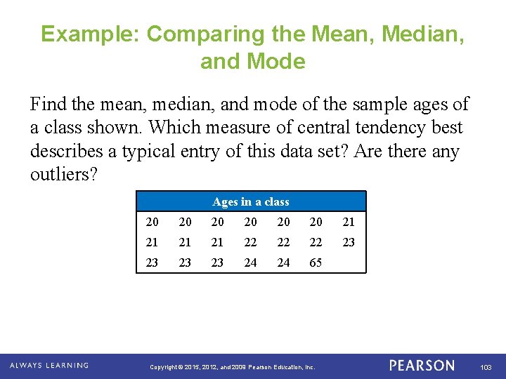
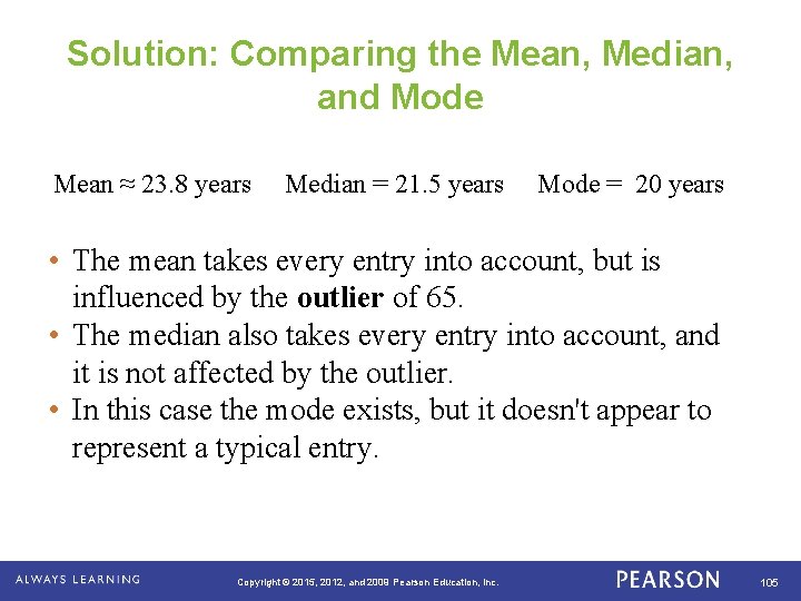
Example: Comparing the Mean, Median, and Mode Find the mean, median, and mode of the sample ages of a class shown. Which measure of central tendency best describes a typical entry of this data set? Are there any outliers? Ages in a class . 20 20 20 21 21 22 22 22 23 23 24 24 65 Copyright © 2015, 2012, and 2009 Pearson Education, Inc. 103

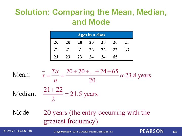
Solution: Comparing the Mean, Median, and Mode Ages in a class 20 20 20 21 21 22 22 22 23 23 24 24 65 Mean: Median: Mode: . 20 years (the entry occurring with the greatest frequency) Copyright © 2015, 2012, and 2009 Pearson Education, Inc. 104

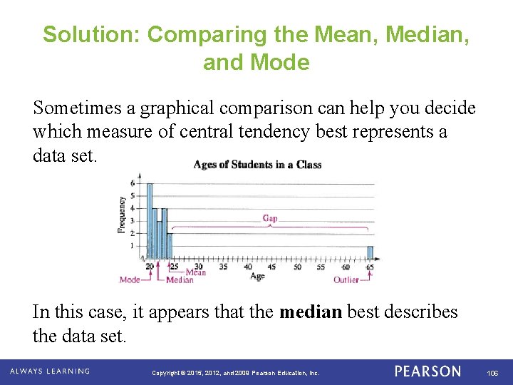
Solution: Comparing the Mean, Median, and Mode Mean ≈ 23. 8 years Median = 21. 5 years Mode = 20 years • The mean takes every entry into account, but is influenced by the outlier of 65. • The median also takes every entry into account, and it is not affected by the outlier. • In this case the mode exists, but it doesn't appear to represent a typical entry. . Copyright © 2015, 2012, and 2009 Pearson Education, Inc. 105

Solution: Comparing the Mean, Median, and Mode Sometimes a graphical comparison can help you decide which measure of central tendency best represents a data set. In this case, it appears that the median best describes the data set. . Copyright © 2015, 2012, and 2009 Pearson Education, Inc. 106

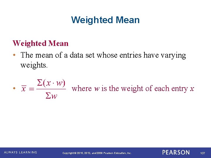
Weighted Mean • The mean of a data set whose entries have varying weights. • where w is the weight of each entry x . Copyright © 2015, 2012, and 2009 Pearson Education, Inc. 107

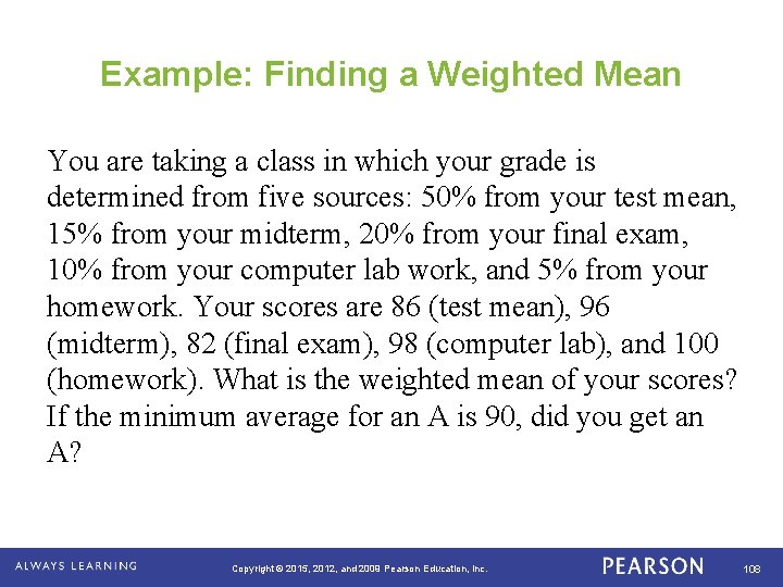
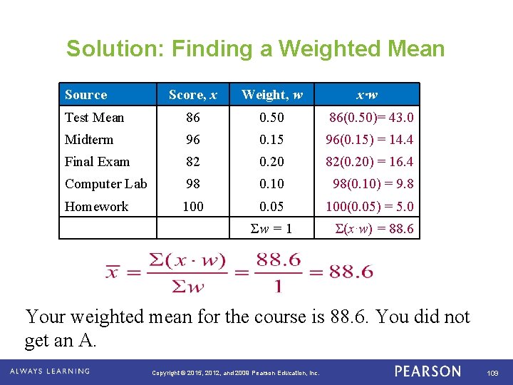
Example: Finding a Weighted Mean You are taking a class in which your grade is determined from five sources: 50% from your test mean, 15% from your midterm, 20% from your final exam, 10% from your computer lab work, and 5% from your homework. Your scores are 86 (test mean), 96 (midterm), 82 (final exam), 98 (computer lab), and 100 (homework). What is the weighted mean of your scores? If the minimum average for an A is 90, did you get an A? . Copyright © 2015, 2012, and 2009 Pearson Education, Inc. 108

Solution: Finding a Weighted Mean Source Score, x Weight, w Test Mean 86 0. 50 86(0. 50)= 43. 0 Midterm 96 0. 15 96(0. 15) = 14. 4 Final Exam 82 0. 20 82(0. 20) = 16. 4 Computer Lab 98 0. 10 98(0. 10) = 9. 8 Homework 100 0. 05 100(0. 05) = 5. 0 Σw = 1 x∙w Σ(x∙w) = 88. 6 Your weighted mean for the course is 88. 6. You did not get an A. . Copyright © 2015, 2012, and 2009 Pearson Education, Inc. 109

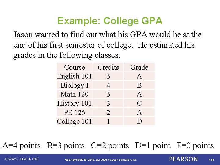
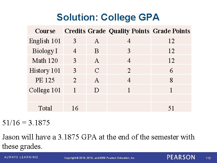
Example: College GPA Jason wanted to find out what his GPA would be at the end of his first semester of college. He estimated his grades in the following classes. Course Credits English 101 3 Biology I 4 Math 120 3 History 101 3 PE 125 2 College 101 1 Grade A B A C A D A=4 points B=3 points C=2 points D=1 point F=0 points Copyright © 2015, 2012, and 2009 Pearson Education, Inc. 110

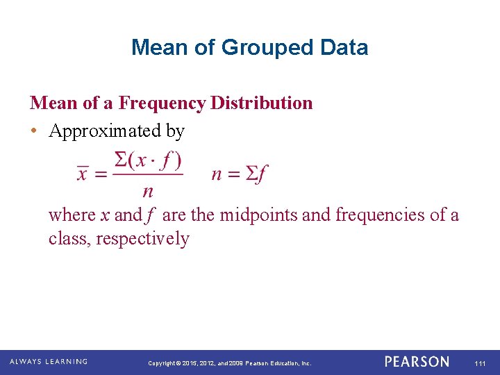
Mean of Grouped Data Mean of a Frequency Distribution • Approximated by where x and f are the midpoints and frequencies of a class, respectively . Copyright © 2015, 2012, and 2009 Pearson Education, Inc. 111

Solution: College GPA Course Credits Grade Quality Points Grade Points English 101 3 A 4 12 Biology I 4 B 3 12 Math 120 3 A 4 12 History 101 3 C 2 6 PE 125 2 A 4 8 College 101 1 D 1 1 Total 16 51 51/16 = 3. 1875 Jason will have a 3. 1875 GPA at the end of the semester with these grades. Copyright © 2015, 2012, and 2009 Pearson Education, Inc. 112

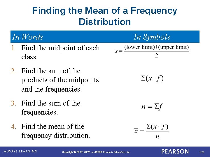
Finding the Mean of a Frequency Distribution In Words In Symbols 1. Find the midpoint of each class. 2. Find the sum of the products of the midpoints and the frequencies. 3. Find the sum of the frequencies. 4. Find the mean of the frequency distribution. . Copyright © 2015, 2012, and 2009 Pearson Education, Inc. 113

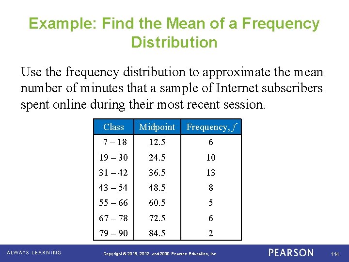
Example: Find the Mean of a Frequency Distribution Use the frequency distribution to approximate the mean number of minutes that a sample of Internet subscribers spent online during their most recent session. . Class Midpoint Frequency, f 7 – 18 12. 5 6 19 – 30 24. 5 10 31 – 42 36. 5 13 43 – 54 48. 5 8 55 – 66 60. 5 5 67 – 78 72. 5 6 79 – 90 84. 5 2 Copyright © 2015, 2012, and 2009 Pearson Education, Inc. 114

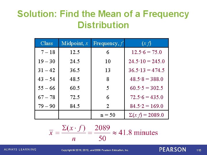
Solution: Find the Mean of a Frequency Distribution Class . Midpoint, x Frequency, f (x∙f) 7 – 18 12. 5 6 12. 5∙ 6 = 75. 0 19 – 30 24. 5 10 24. 5∙ 10 = 245. 0 31 – 42 36. 5 13 36. 5∙ 13 = 474. 5 43 – 54 48. 5 8 48. 5∙ 8 = 388. 0 55 – 66 60. 5 5 60. 5∙ 5 = 302. 5 67 – 78 72. 5 6 72. 5∙ 6 = 435. 0 79 – 90 84. 5 2 84. 5∙ 2 = 169. 0 n = 50 Σ(x∙f) = 2089. 0 Copyright © 2015, 2012, and 2009 Pearson Education, Inc. 115

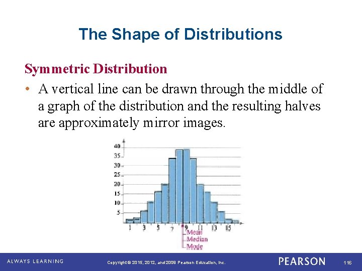
The Shape of Distributions Symmetric Distribution • A vertical line can be drawn through the middle of a graph of the distribution and the resulting halves are approximately mirror images. . Copyright © 2015, 2012, and 2009 Pearson Education, Inc. 116

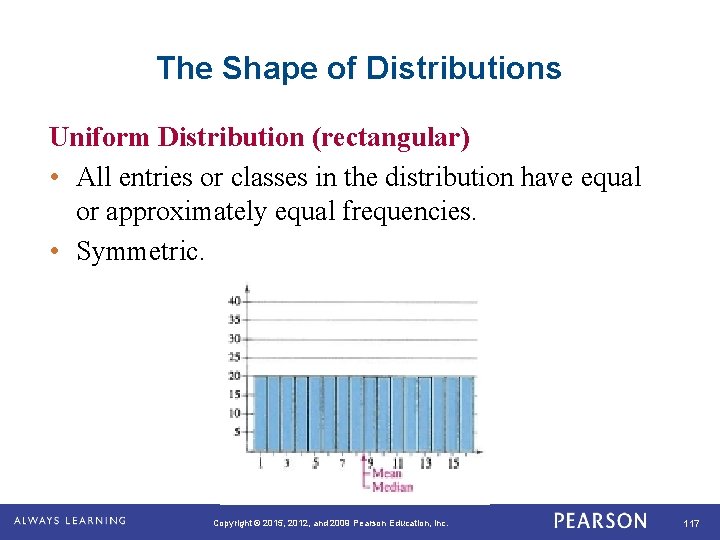
The Shape of Distributions Uniform Distribution (rectangular) • All entries or classes in the distribution have equal or approximately equal frequencies. • Symmetric. . Copyright © 2015, 2012, and 2009 Pearson Education, Inc. 117

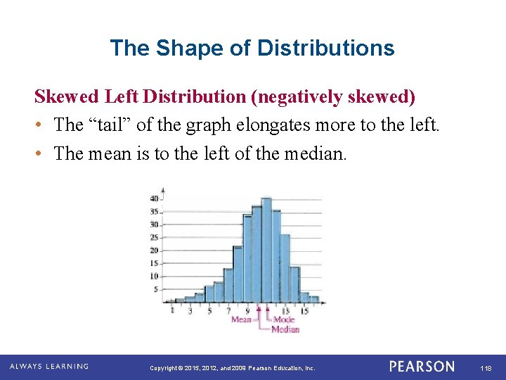
The Shape of Distributions Skewed Left Distribution (negatively skewed) • The “tail” of the graph elongates more to the left. • The mean is to the left of the median. . Copyright © 2015, 2012, and 2009 Pearson Education, Inc. 118

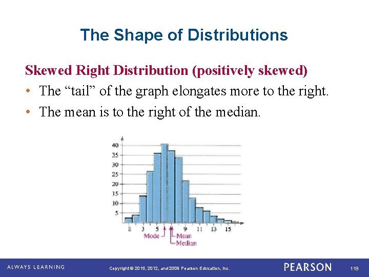
The Shape of Distributions Skewed Right Distribution (positively skewed) • The “tail” of the graph elongates more to the right. • The mean is to the right of the median. . Copyright © 2015, 2012, and 2009 Pearson Education, Inc. 119

Section 2. 3 Summary • Found the mean, median, and mode of a population and of a sample • Found the weighted mean of a data set and the mean of a frequency distribution • Described the shape of a distribution as symmetric, uniform, or skewed and compared the mean and median for each . Copyright © 2015, 2012, and 2009 Pearson Education, Inc. 120

Measures of Variation . Copyright © 2015, 2012, and 2009 Pearson Education, Inc. 121

Learning Goals • How to find the range of a data set • How to find the variance and standard deviation of a population and of a sample • How to use the Empirical Rule and Chebychev’s Theorem to interpret standard deviation • How to approximate the sample standard deviation for grouped data • How to use the coefficient of variation to compare variation in different data sets. Copyright © 2015, 2012, and 2009 Pearson Education, Inc. 122

Range • The difference between the maximum and minimum data entries in the set. • The data must be quantitative. • Range = (Max. data entry) – (Min. data entry) . Copyright © 2015, 2012, and 2009 Pearson Education, Inc. 123

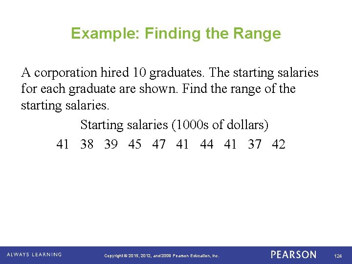
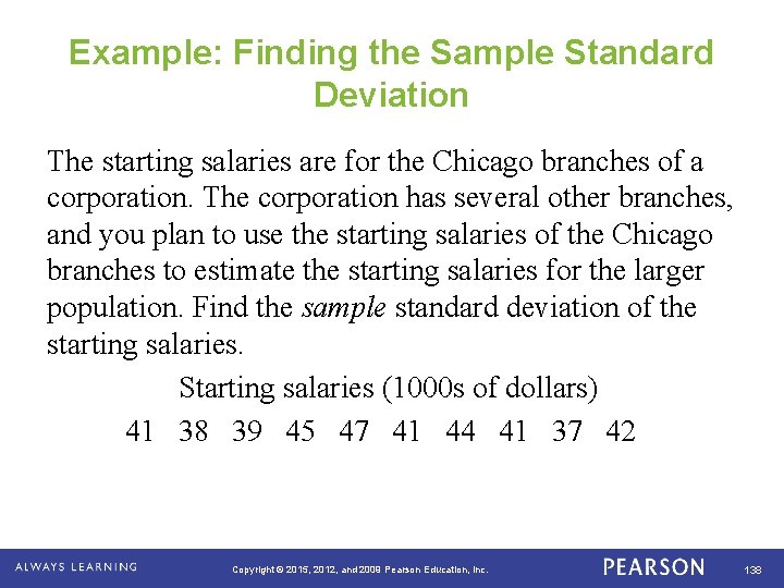
Example: Finding the Range A corporation hired 10 graduates. The starting salaries for each graduate are shown. Find the range of the starting salaries. Starting salaries (1000 s of dollars) 41 38 39 45 47 41 44 41 37 42 . Copyright © 2015, 2012, and 2009 Pearson Education, Inc. 124

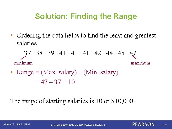
Solution: Finding the Range • Ordering the data helps to find the least and greatest salaries. 37 38 39 41 41 42 44 45 47 minimum maximum • Range = (Max. salary) – (Min. salary) = 47 – 37 = 10 The range of starting salaries is 10 or $10, 000. . Copyright © 2015, 2012, and 2009 Pearson Education, Inc. 125

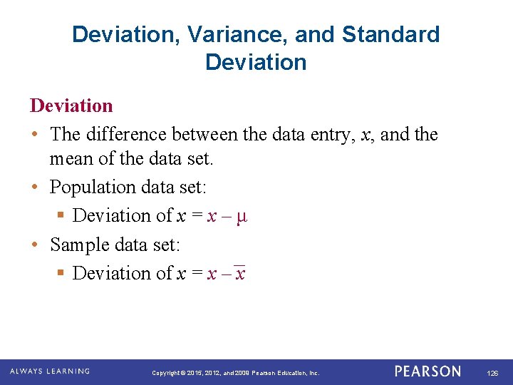
Deviation, Variance, and Standard Deviation • The difference between the data entry, x, and the mean of the data set. • Population data set: § Deviation of x = x – μ • Sample data set: § Deviation of x = x – x . Copyright © 2015, 2012, and 2009 Pearson Education, Inc. 126

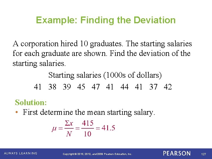
Example: Finding the Deviation A corporation hired 10 graduates. The starting salaries for each graduate are shown. Find the deviation of the starting salaries. Starting salaries (1000 s of dollars) 41 38 39 45 47 41 44 41 37 42 Solution: • First determine the mean starting salary. . Copyright © 2015, 2012, and 2009 Pearson Education, Inc. 127

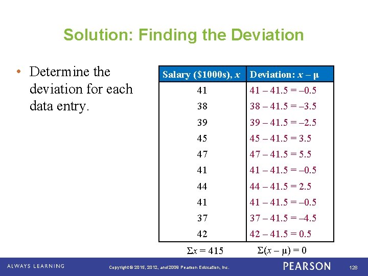
Solution: Finding the Deviation • Determine the deviation for each data entry. . Salary ($1000 s), x Deviation: x – μ 41 41 – 41. 5 = – 0. 5 38 38 – 41. 5 = – 3. 5 39 39 – 41. 5 = – 2. 5 45 45 – 41. 5 = 3. 5 47 47 – 41. 5 = 5. 5 41 41 – 41. 5 = – 0. 5 44 44 – 41. 5 = 2. 5 41 41 – 41. 5 = – 0. 5 37 37 – 41. 5 = – 4. 5 42 42 – 41. 5 = 0. 5 Σx = 415 Σ(x – μ) = 0 Copyright © 2015, 2012, and 2009 Pearson Education, Inc. 128

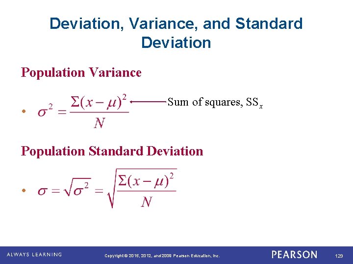
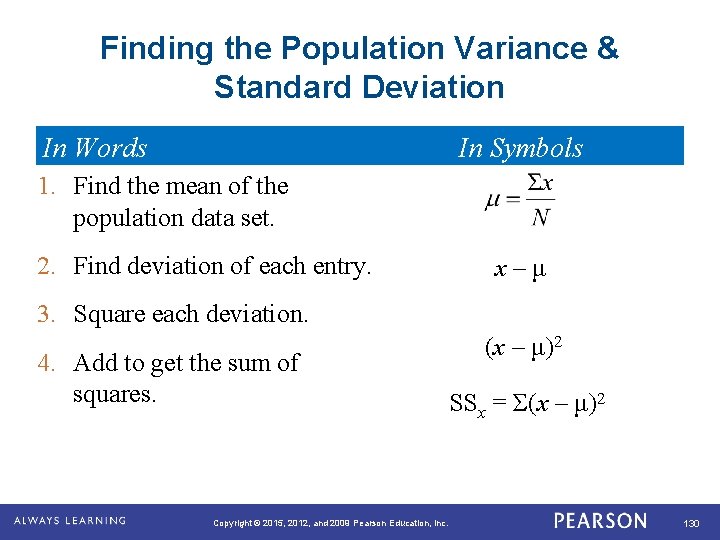
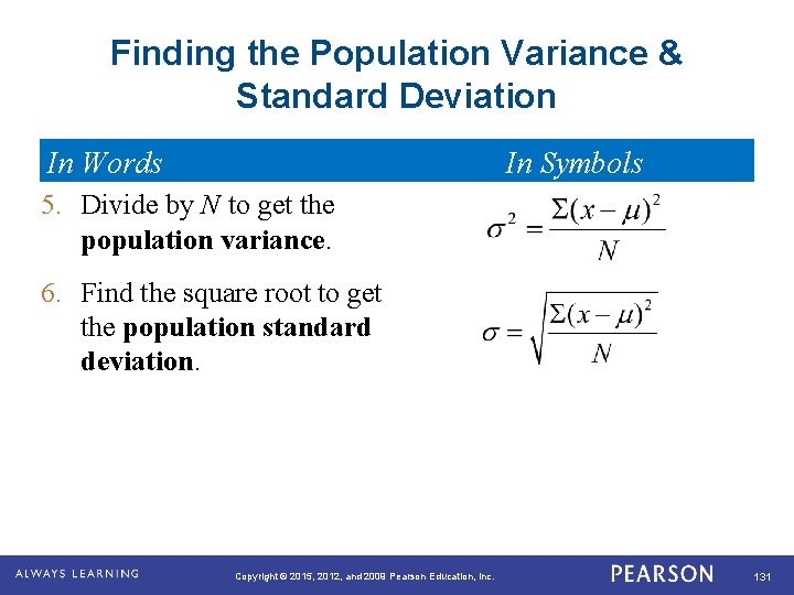
Deviation, Variance, and Standard Deviation Population Variance • Sum of squares, SSx Population Standard Deviation • . Copyright © 2015, 2012, and 2009 Pearson Education, Inc. 129

Finding the Population Variance & Standard Deviation In Words In Symbols 1. Find the mean of the population data set. 2. Find deviation of each entry. x – μ 3. Square each deviation. 4. Add to get the sum of squares. . Copyright © 2015, 2012, and 2009 Pearson Education, Inc. (x – μ)2 SSx = Σ(x – μ)2 130

Finding the Population Variance & Standard Deviation In Words In Symbols 5. Divide by N to get the population variance. 6. Find the square root to get the population standard deviation. . Copyright © 2015, 2012, and 2009 Pearson Education, Inc. 131

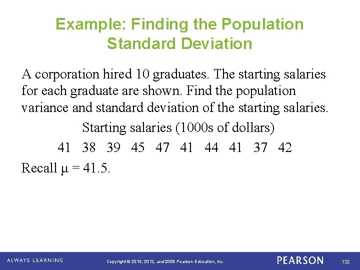
Example: Finding the Population Standard Deviation A corporation hired 10 graduates. The starting salaries for each graduate are shown. Find the population variance and standard deviation of the starting salaries. Starting salaries (1000 s of dollars) 41 38 39 45 47 41 44 41 37 42 Recall μ = 41. 5. . Copyright © 2015, 2012, and 2009 Pearson Education, Inc. 132

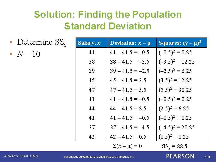
Solution: Finding the Population Standard Deviation • Determine SSx • N = 10 . Salary, x Deviation: x – μ Squares: (x – μ)2 41 41 – 41. 5 = – 0. 5 (– 0. 5)2 = 0. 25 38 38 – 41. 5 = – 3. 5 (– 3. 5)2 = 12. 25 39 39 – 41. 5 = – 2. 5 (– 2. 5)2 = 6. 25 45 45 – 41. 5 = 3. 5 (3. 5)2 = 12. 25 47 47 – 41. 5 = 5. 5 (5. 5)2 = 30. 25 41 41 – 41. 5 = – 0. 5 (– 0. 5)2 = 0. 25 44 44 – 41. 5 = 2. 5 (2. 5)2 = 6. 25 41 41 – 41. 5 = – 0. 5 (– 0. 5)2 = 0. 25 37 37 – 41. 5 = – 4. 5 (– 4. 5)2 = 20. 25 42 42 – 41. 5 = 0. 5 (0. 5)2 = 0. 25 Σ(x – μ) = 0 SSx = 88. 5 Copyright © 2015, 2012, and 2009 Pearson Education, Inc. 133

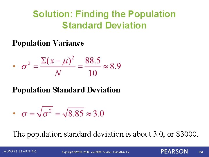
Solution: Finding the Population Standard Deviation Population Variance • Population Standard Deviation • The population standard deviation is about 3. 0, or $3000. . Copyright © 2015, 2012, and 2009 Pearson Education, Inc. 134

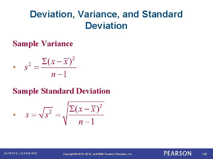
Deviation, Variance, and Standard Deviation Sample Variance • Sample Standard Deviation • . Copyright © 2015, 2012, and 2009 Pearson Education, Inc. 135

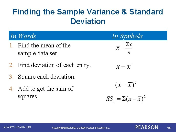
Finding the Sample Variance & Standard Deviation In Words In Symbols 1. Find the mean of the sample data set. 2. Find deviation of each entry. 3. Square each deviation. 4. Add to get the sum of squares. . Copyright © 2015, 2012, and 2009 Pearson Education, Inc. 136

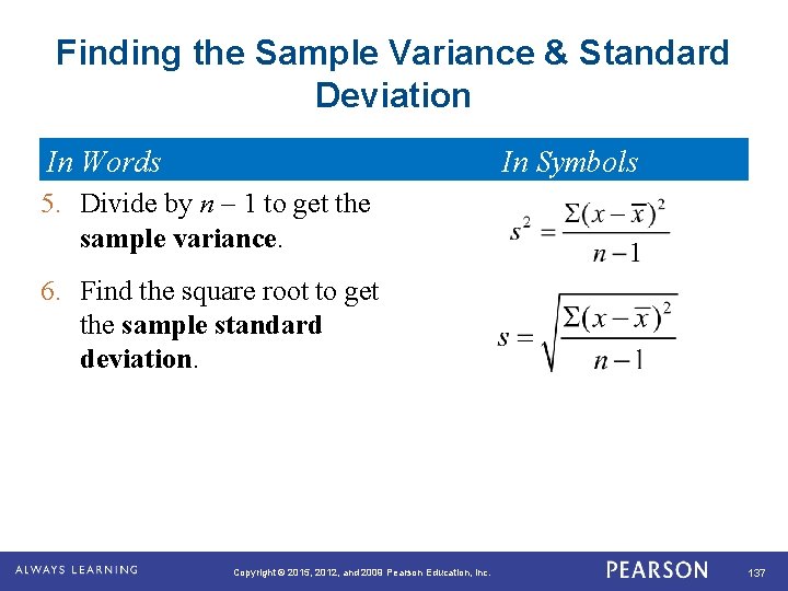
Finding the Sample Variance & Standard Deviation In Words In Symbols 5. Divide by n – 1 to get the sample variance. 6. Find the square root to get the sample standard deviation. . Copyright © 2015, 2012, and 2009 Pearson Education, Inc. 137

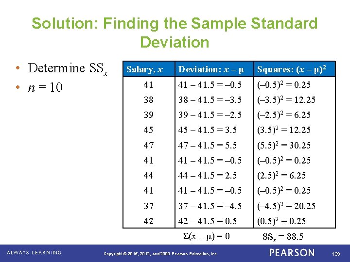
Example: Finding the Sample Standard Deviation The starting salaries are for the Chicago branches of a corporation. The corporation has several other branches, and you plan to use the starting salaries of the Chicago branches to estimate the starting salaries for the larger population. Find the sample standard deviation of the starting salaries. Starting salaries (1000 s of dollars) 41 38 39 45 47 41 44 41 37 42 . Copyright © 2015, 2012, and 2009 Pearson Education, Inc. 138

Solution: Finding the Sample Standard Deviation • Determine SSx • n = 10 . Salary, x Deviation: x – μ Squares: (x – μ)2 41 41 – 41. 5 = – 0. 5 (– 0. 5)2 = 0. 25 38 38 – 41. 5 = – 3. 5 (– 3. 5)2 = 12. 25 39 39 – 41. 5 = – 2. 5 (– 2. 5)2 = 6. 25 45 45 – 41. 5 = 3. 5 (3. 5)2 = 12. 25 47 47 – 41. 5 = 5. 5 (5. 5)2 = 30. 25 41 41 – 41. 5 = – 0. 5 (– 0. 5)2 = 0. 25 44 44 – 41. 5 = 2. 5 (2. 5)2 = 6. 25 41 41 – 41. 5 = – 0. 5 (– 0. 5)2 = 0. 25 37 37 – 41. 5 = – 4. 5 (– 4. 5)2 = 20. 25 42 42 – 41. 5 = 0. 5 (0. 5)2 = 0. 25 Σ(x – μ) = 0 SSx = 88. 5 Copyright © 2015, 2012, and 2009 Pearson Education, Inc. 139

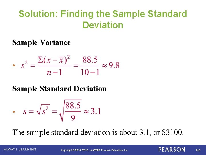
Solution: Finding the Sample Standard Deviation Sample Variance • Sample Standard Deviation • The sample standard deviation is about 3. 1, or $3100. . Copyright © 2015, 2012, and 2009 Pearson Education, Inc. 140

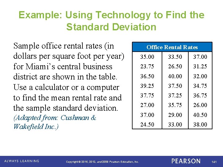
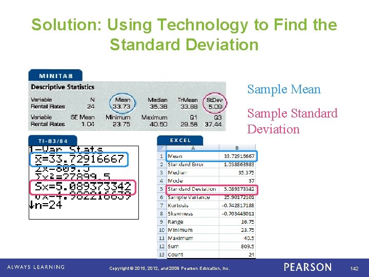
Example: Using Technology to Find the Standard Deviation Sample office rental rates (in dollars per square foot per year) for Miami’s central business district are shown in the table. Use a calculator or a computer to find the mean rental rate and the sample standard deviation. (Adapted from: Cushman & Wakefield Inc. ) . Copyright © 2015, 2012, and 2009 Pearson Education, Inc. Office Rental Rates 35. 00 33. 50 37. 00 23. 75 26. 50 31. 25 36. 50 40. 00 32. 00 39. 25 37. 50 34. 75 37. 25 36. 75 27. 00 35. 75 26. 00 37. 00 29. 00 40. 50 24. 50 33. 00 38. 00 141

Solution: Using Technology to Find the Standard Deviation Sample Mean Sample Standard Deviation . Copyright © 2015, 2012, and 2009 Pearson Education, Inc. 142

WARM UP Find the population standard deviation and the sample standard deviation for the data set. Graduation Rates for Southeastern States, 2010 -2011 86 83 80 75 75 75 70 72 71 Copyright © 2015, 2012, and 2009 Pearson Education, Inc. 143

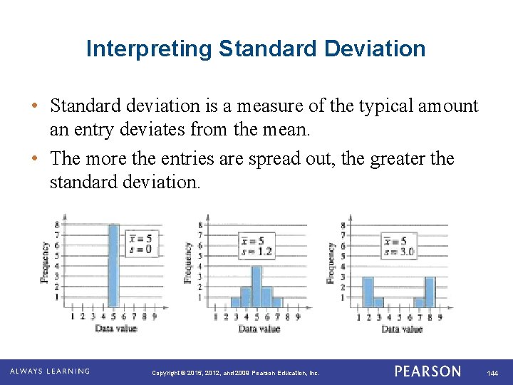
Interpreting Standard Deviation • Standard deviation is a measure of the typical amount an entry deviates from the mean. • The more the entries are spread out, the greater the standard deviation. . Copyright © 2015, 2012, and 2009 Pearson Education, Inc. 144

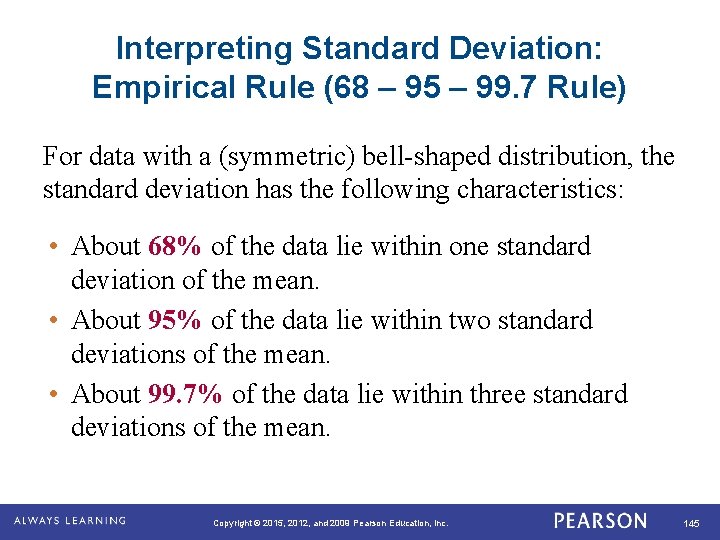
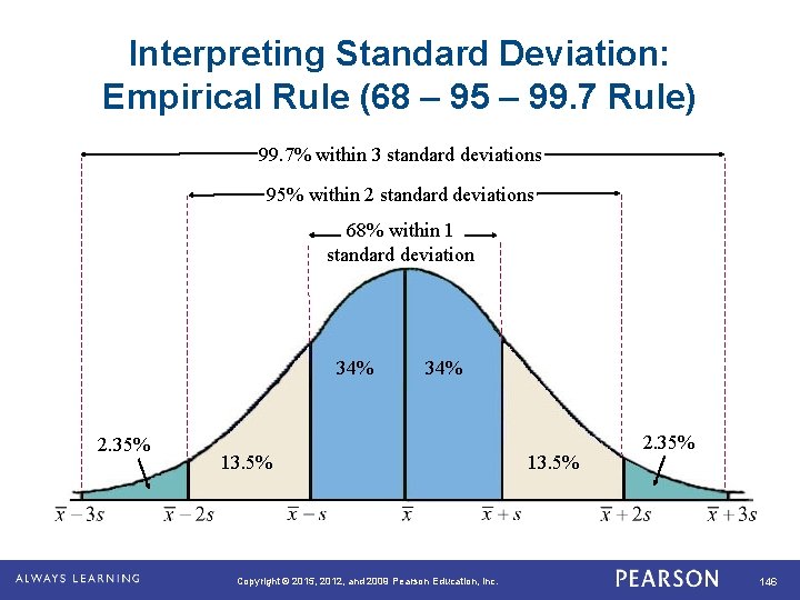
Interpreting Standard Deviation: Empirical Rule (68 – 95 – 99. 7 Rule) For data with a (symmetric) bell-shaped distribution, the standard deviation has the following characteristics: • About 68% of the data lie within one standard deviation of the mean. • About 95% of the data lie within two standard deviations of the mean. • About 99. 7% of the data lie within three standard deviations of the mean. . Copyright © 2015, 2012, and 2009 Pearson Education, Inc. 145

Interpreting Standard Deviation: Empirical Rule (68 – 95 – 99. 7 Rule) 99. 7% within 3 standard deviations 95% within 2 standard deviations 68% within 1 standard deviation 34% 2. 35% . 34% 13. 5% Copyright © 2015, 2012, and 2009 Pearson Education, Inc. 13. 5% 2. 35% 146

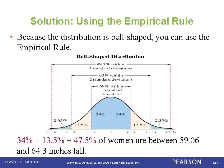
Example: Using the Empirical Rule In a survey conducted by the National Center for Health Statistics, the sample mean height of women in the United States (ages 20 -29) was 64. 3 inches, with a sample standard deviation of 2. 62 inches. Estimate the percent of the women whose heights are between 59. 06 inches and 64. 3 inches. . Copyright © 2015, 2012, and 2009 Pearson Education, Inc. 147

Solution: Using the Empirical Rule • Because the distribution is bell-shaped, you can use the Empirical Rule. 34% + 13. 5% = 47. 5% of women are between 59. 06 and 64. 3 inches tall. . Copyright © 2015, 2012, and 2009 Pearson Education, Inc. 148

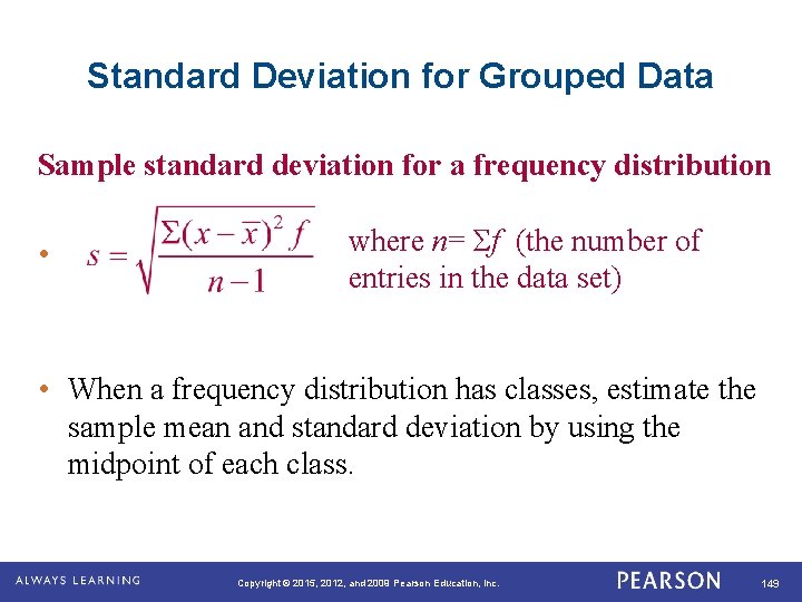
Standard Deviation for Grouped Data Sample standard deviation for a frequency distribution • where n= Σf (the number of entries in the data set) • When a frequency distribution has classes, estimate the sample mean and standard deviation by using the midpoint of each class. . Copyright © 2015, 2012, and 2009 Pearson Education, Inc. 149

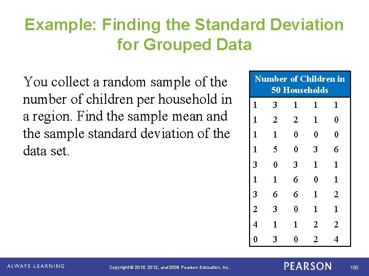
Example: Finding the Standard Deviation for Grouped Data You collect a random sample of the number of children per household in a region. Find the sample mean and the sample standard deviation of the data set. . Copyright © 2015, 2012, and 2009 Pearson Education, Inc. Number of Children in 50 Households 1 3 1 1 2 2 1 0 1 1 0 0 0 1 5 0 3 6 3 0 3 1 1 6 0 1 3 6 6 1 2 2 3 0 1 1 4 1 1 2 2 0 3 0 2 4 150

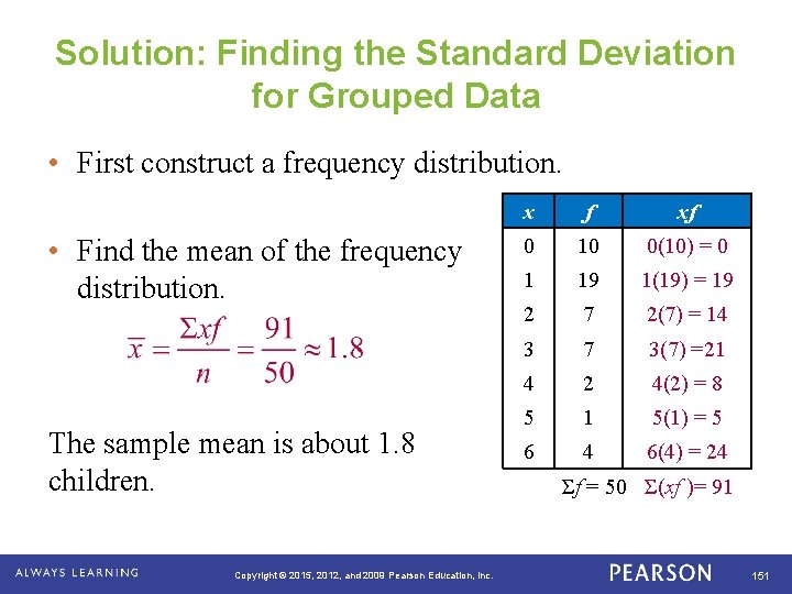
Solution: Finding the Standard Deviation for Grouped Data • First construct a frequency distribution. • Find the mean of the frequency distribution. The sample mean is about 1. 8 children. . Copyright © 2015, 2012, and 2009 Pearson Education, Inc. x f xf 0 10 0(10) = 0 1 19 1(19) = 19 2 7 2(7) = 14 3 7 3(7) =21 4 2 4(2) = 8 5 1 5(1) = 5 6 4 6(4) = 24 Σf = 50 Σ(xf )= 91 151

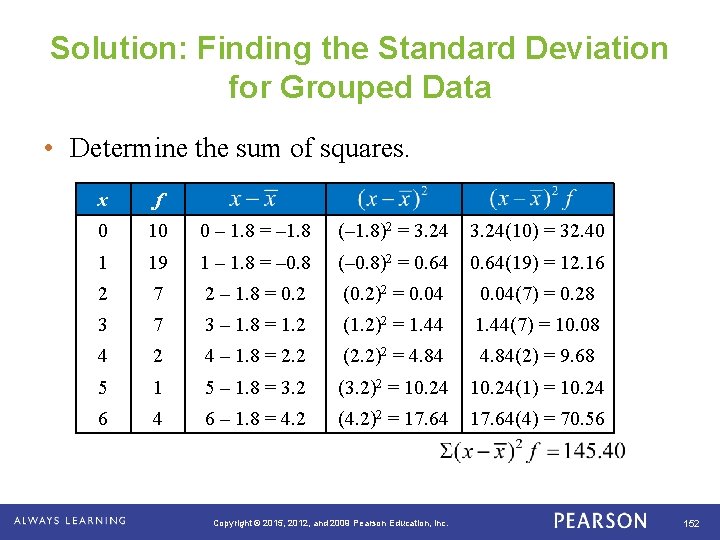
Solution: Finding the Standard Deviation for Grouped Data • Determine the sum of squares. . x f 0 10 0 – 1. 8 = – 1. 8 (– 1. 8)2 = 3. 24(10) = 32. 40 1 19 1 – 1. 8 = – 0. 8 (– 0. 8)2 = 0. 64(19) = 12. 16 2 7 2 – 1. 8 = 0. 2 (0. 2)2 = 0. 04(7) = 0. 28 3 7 3 – 1. 8 = 1. 2 (1. 2)2 = 1. 44(7) = 10. 08 4 2 4 – 1. 8 = 2. 2 (2. 2)2 = 4. 84(2) = 9. 68 5 1 5 – 1. 8 = 3. 2 (3. 2)2 = 10. 24(1) = 10. 24 6 – 1. 8 = 4. 2 (4. 2)2 = 17. 64(4) = 70. 56 Copyright © 2015, 2012, and 2009 Pearson Education, Inc. 152

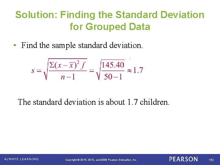
Solution: Finding the Standard Deviation for Grouped Data • Find the sample standard deviation. The standard deviation is about 1. 7 children. . Copyright © 2015, 2012, and 2009 Pearson Education, Inc. 153

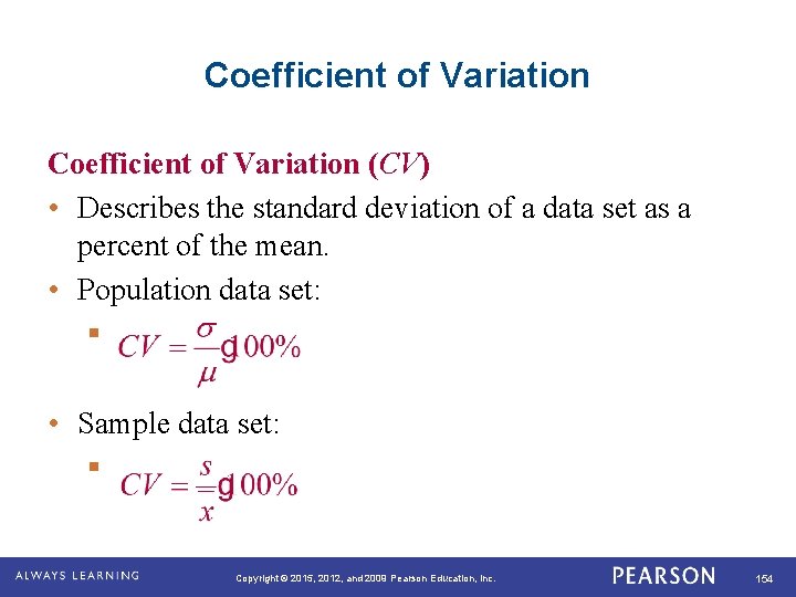
Coefficient of Variation (CV) • Describes the standard deviation of a data set as a percent of the mean. • Population data set: § • Sample data set: § . Copyright © 2015, 2012, and 2009 Pearson Education, Inc. 154

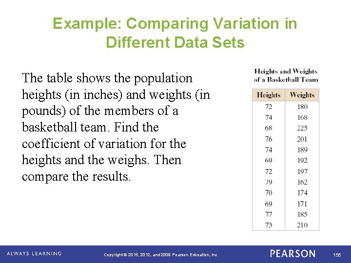
Example: Comparing Variation in Different Data Sets The table shows the population heights (in inches) and weights (in pounds) of the members of a basketball team. Find the coefficient of variation for the heights and the weighs. Then compare the results. . Copyright © 2015, 2012, and 2009 Pearson Education, Inc. 155

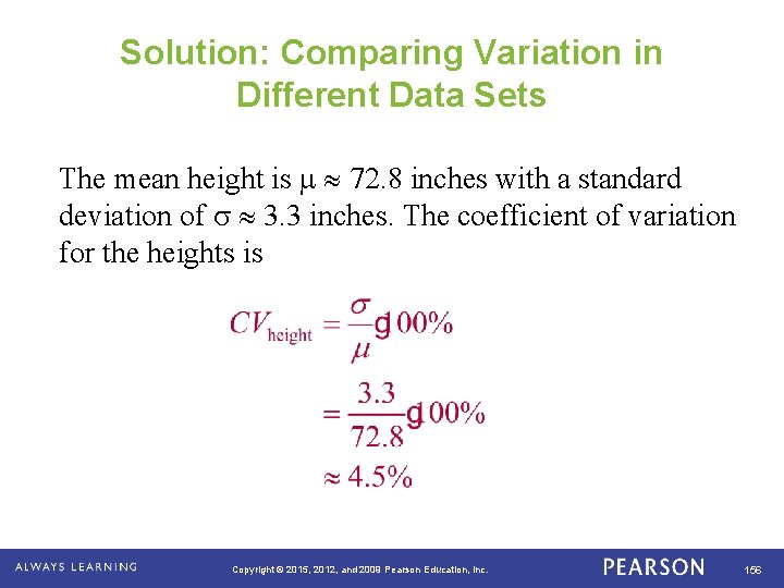
Solution: Comparing Variation in Different Data Sets The mean height is 72. 8 inches with a standard deviation of 3. 3 inches. The coefficient of variation for the heights is . Copyright © 2015, 2012, and 2009 Pearson Education, Inc. 156

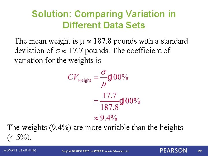
Solution: Comparing Variation in Different Data Sets The mean weight is 187. 8 pounds with a standard deviation of 17. 7 pounds. The coefficient of variation for the weights is The weights (9. 4%) are more variable than the heights (4. 5%). . Copyright © 2015, 2012, and 2009 Pearson Education, Inc. 157

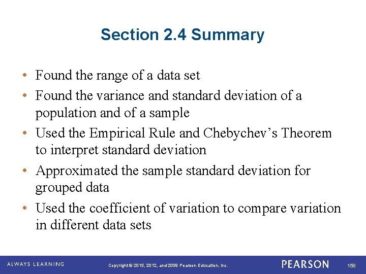
Section 2. 4 Summary • Found the range of a data set • Found the variance and standard deviation of a population and of a sample • Used the Empirical Rule and Chebychev’s Theorem to interpret standard deviation • Approximated the sample standard deviation for grouped data • Used the coefficient of variation to compare variation in different data sets. Copyright © 2015, 2012, and 2009 Pearson Education, Inc. 158

Measures of Position . Copyright © 2015, 2012, and 2009 Pearson Education, Inc. 159

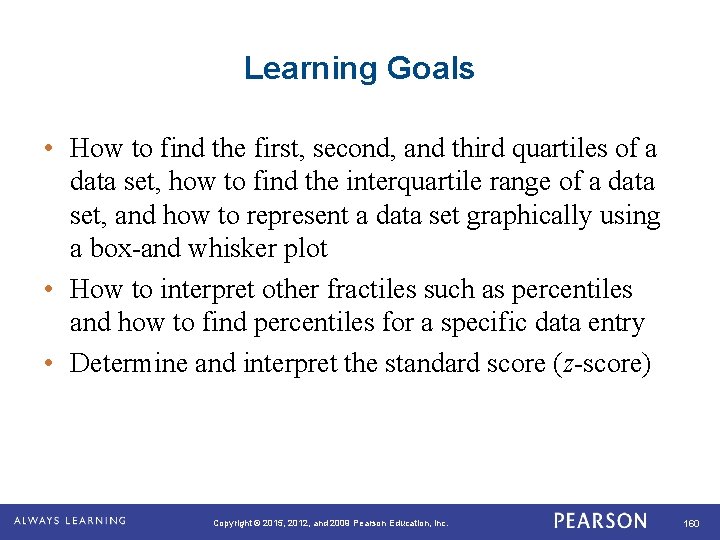
Learning Goals • How to find the first, second, and third quartiles of a data set, how to find the interquartile range of a data set, and how to represent a data set graphically using a box-and whisker plot • How to interpret other fractiles such as percentiles and how to find percentiles for a specific data entry • Determine and interpret the standard score (z-score) . Copyright © 2015, 2012, and 2009 Pearson Education, Inc. 160

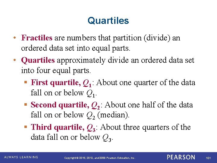
Quartiles • Fractiles are numbers that partition (divide) an ordered data set into equal parts. • Quartiles approximately divide an ordered data set into four equal parts. § First quartile, Q 1: About one quarter of the data fall on or below Q 1. § Second quartile, Q 2: About one half of the data fall on or below Q 2 (median). § Third quartile, Q 3: About three quarters of the data fall on or below Q 3. . Copyright © 2015, 2012, and 2009 Pearson Education, Inc. 161

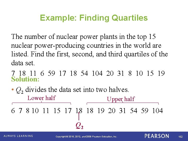
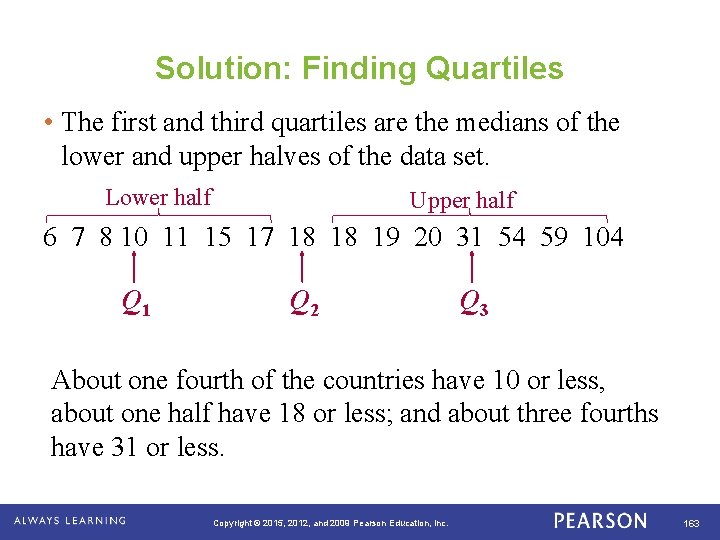
Example: Finding Quartiles The number of nuclear power plants in the top 15 nuclear power-producing countries in the world are listed. Find the first, second, and third quartiles of the data set. 7 18 11 6 59 17 18 54 104 20 31 8 10 15 19 Solution: • Q 2 divides the data set into two halves. Lower half Upper half 6 7 8 10 11 15 17 18 18 19 20 31 54 59 104 Q 2. Copyright © 2015, 2012, and 2009 Pearson Education, Inc. 162

Solution: Finding Quartiles • The first and third quartiles are the medians of the lower and upper halves of the data set. Lower half Upper half 6 7 8 10 11 15 17 18 18 19 20 31 54 59 104 Q 1 Q 2 Q 3 About one fourth of the countries have 10 or less, about one half have 18 or less; and about three fourths have 31 or less. . Copyright © 2015, 2012, and 2009 Pearson Education, Inc. 163

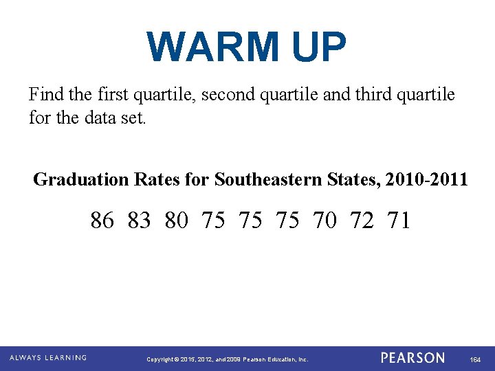
WARM UP Find the first quartile, second quartile and third quartile for the data set. Graduation Rates for Southeastern States, 2010 -2011 86 83 80 75 75 75 70 72 71 Copyright © 2015, 2012, and 2009 Pearson Education, Inc. 164

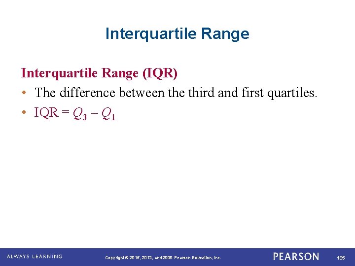
Interquartile Range (IQR) • The difference between the third and first quartiles. • IQR = Q 3 – Q 1 . Copyright © 2015, 2012, and 2009 Pearson Education, Inc. 165

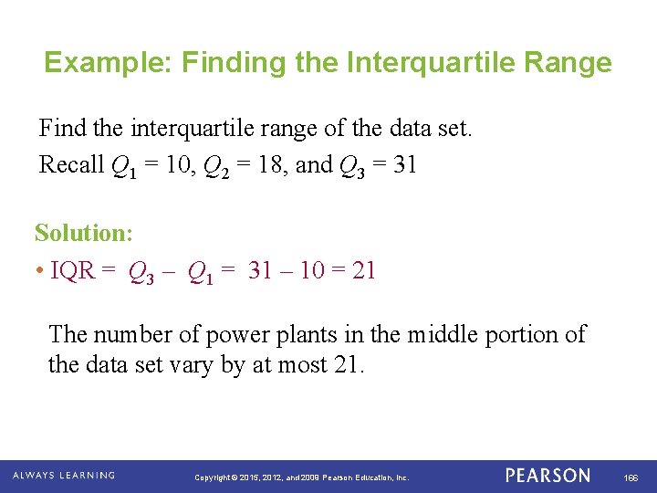
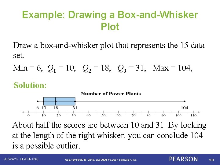
Example: Finding the Interquartile Range Find the interquartile range of the data set. Recall Q 1 = 10, Q 2 = 18, and Q 3 = 31 Solution: • IQR = Q 3 – Q 1 = 31 – 10 = 21 The number of power plants in the middle portion of the data set vary by at most 21. . Copyright © 2015, 2012, and 2009 Pearson Education, Inc. 166

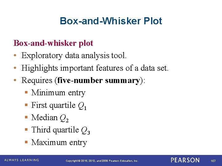
Box-and-Whisker Plot Box-and-whisker plot • Exploratory data analysis tool. • Highlights important features of a data set. • Requires (five-number summary): § Minimum entry § First quartile Q 1 § Median Q 2 § Third quartile Q 3 § Maximum entry. Copyright © 2015, 2012, and 2009 Pearson Education, Inc. 167

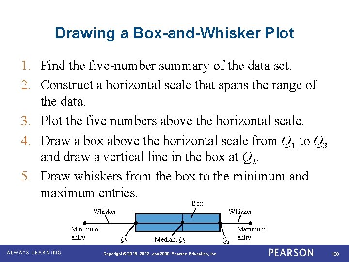
Drawing a Box-and-Whisker Plot 1. Find the five-number summary of the data set. 2. Construct a horizontal scale that spans the range of the data. 3. Plot the five numbers above the horizontal scale. 4. Draw a box above the horizontal scale from Q 1 to Q 3 and draw a vertical line in the box at Q 2. 5. Draw whiskers from the box to the minimum and maximum entries. Box Whisker Minimum entry. Whisker Q 1 Median, Q 2 Copyright © 2015, 2012, and 2009 Pearson Education, Inc. Q 3 Maximum entry 168

Example: Drawing a Box-and-Whisker Plot Draw a box-and-whisker plot that represents the 15 data set. Min = 6, Q 1 = 10, Q 2 = 18, Q 3 = 31, Max = 104, Solution: About half the scores are between 10 and 31. By looking at the length of the right whisker, you can conclude 104 is a possible outlier. . Copyright © 2015, 2012, and 2009 Pearson Education, Inc. 169

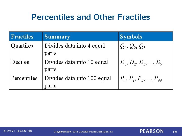
Percentiles and Other Fractiles Quartiles Deciles Percentiles . Summary Divides data into 4 equal parts Divides data into 100 equal parts Copyright © 2015, 2012, and 2009 Pearson Education, Inc. Symbols Q 1, Q 2, Q 3 D 1, D 2, D 3, …, D 9 P 1, P 2, P 3, …, P 99 170

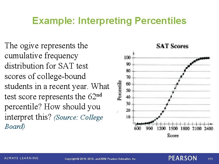
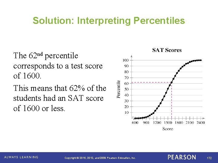
Example: Interpreting Percentiles The ogive represents the cumulative frequency distribution for SAT test scores of college-bound students in a recent year. What test score represents the 62 nd percentile? How should you interpret this? (Source: College Board) . Copyright © 2015, 2012, and 2009 Pearson Education, Inc. 171

Solution: Interpreting Percentiles The 62 nd percentile corresponds to a test score of 1600. This means that 62% of the students had an SAT score of 1600 or less. . Copyright © 2015, 2012, and 2009 Pearson Education, Inc. 172

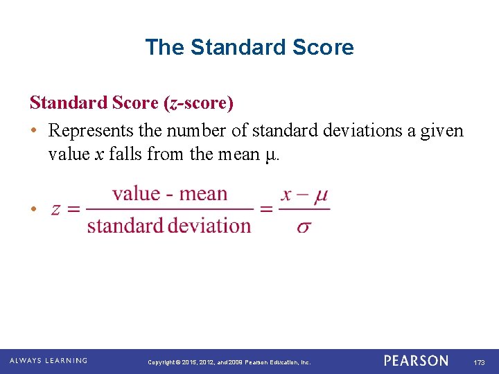
The Standard Score (z-score) • Represents the number of standard deviations a given value x falls from the mean μ. • . Copyright © 2015, 2012, and 2009 Pearson Education, Inc. 173

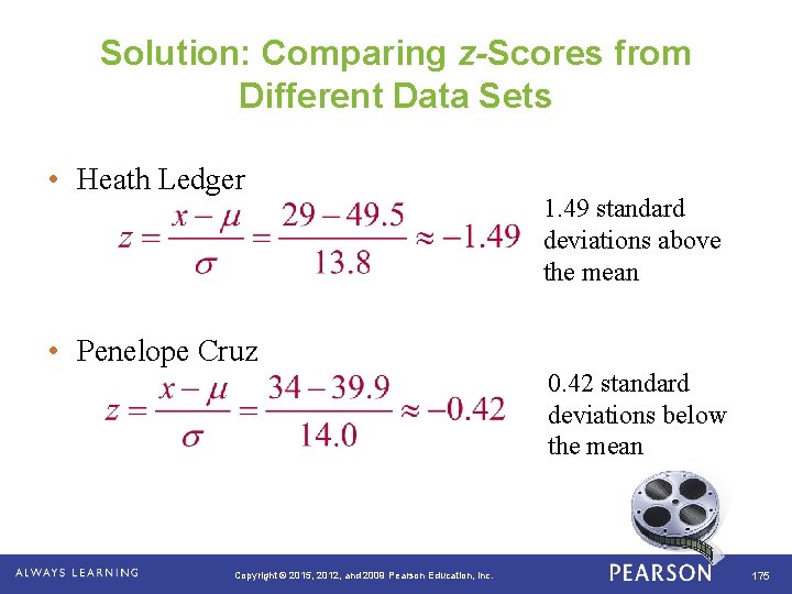
Example: Comparing z-Scores from Different Data Sets In 2009, Heath Ledger won the Oscar for Best Supporting Actor at age 29 for his role in the movie The Dark Knight. Penelope Cruz won the Oscar for Best Supporting Actress at age 34 for her role in Vicky Cristina Barcelona. The mean age of all Best Supporting Actor winners is 49. 5, with a standard deviation of 13. 8. The mean age of all Best Supporting Actress winners is 39. 9, with a standard deviation of 14. 0. Find the z-score that corresponds to the ages of Ledger and Cruz. Then compare your results. . Copyright © 2015, 2012, and 2009 Pearson Education, Inc. 174

Solution: Comparing z-Scores from Different Data Sets • Heath Ledger 1. 49 standard deviations above the mean • Penelope Cruz 0. 42 standard deviations below the mean . Copyright © 2015, 2012, and 2009 Pearson Education, Inc. 175

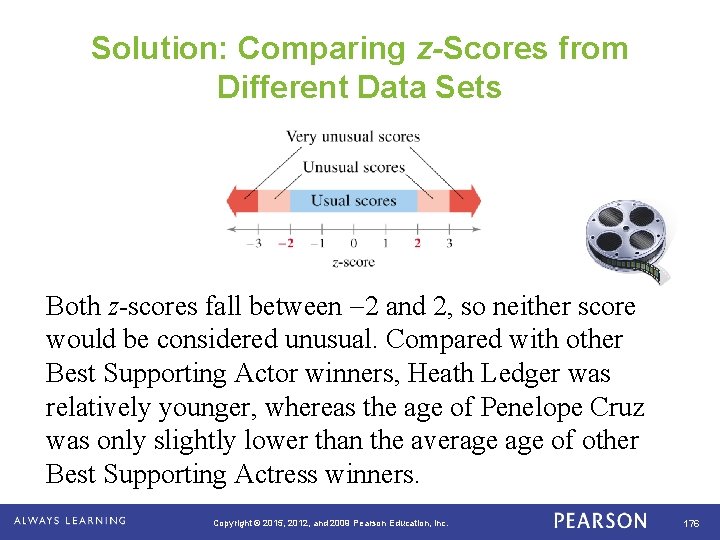
Solution: Comparing z-Scores from Different Data Sets Both z-scores fall between 2 and 2, so neither score would be considered unusual. Compared with other Best Supporting Actor winners, Heath Ledger was relatively younger, whereas the age of Penelope Cruz was only slightly lower than the average of other Best Supporting Actress winners. . Copyright © 2015, 2012, and 2009 Pearson Education, Inc. 176

Assignment Use the US Album Sales By Year Statistics to create a box-and-whisker plot for the Physical Units Sold column. Also, find the mean and the population standard deviation for the Physical Units Sold column. Find the z-score for 362. 6 Copyright © 2015, 2012, and 2009 Pearson Education, Inc. 177

Section 2. 5 Summary • Found the first, second, and third quartiles of a data set, how to find the interquartile range of a data set, and represented a data set graphically using a box-and whisker plot • Interpreted other fractiles such as percentiles and percentiles for a specific data entry • Determined and interpreted the standard score (z-score) . Copyright © 2015, 2012, and 2009 Pearson Education, Inc. 178