CSS 3 Cascading Style Sheets Adding Style to






















- Slides: 162

CSS 3 Cascading Style Sheets Adding Style to your Pages

Browser default styling • The same html file may look different when viewed on different browsers. • Some tags are supported, some aren’t • Browsers may have different default styles • In general, default looks are plain.

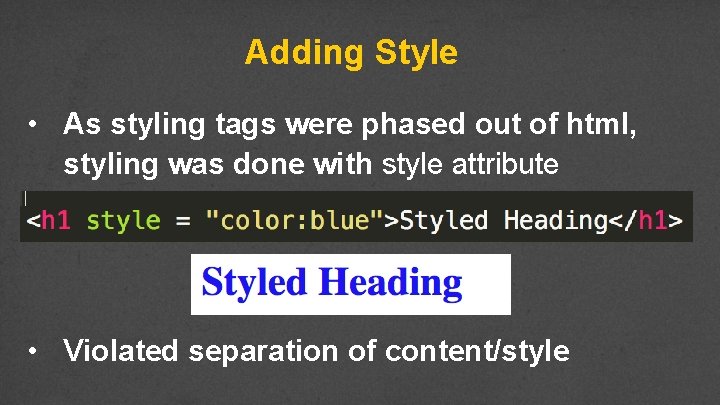
Adding Style • As styling tags were phased out of html, styling was done with style attribute • Violated separation of content/style

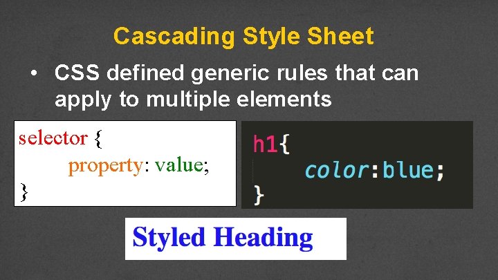
Cascading Style Sheet • CSS defined generic rules that can apply to multiple elements selector { property: value; }

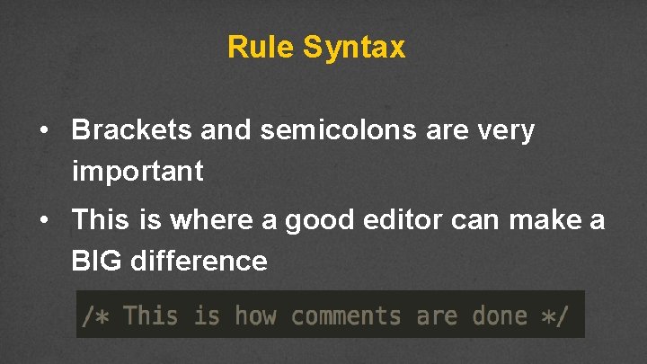
Rule Syntax • Brackets and semicolons are very important • This is where a good editor can make a BIG difference

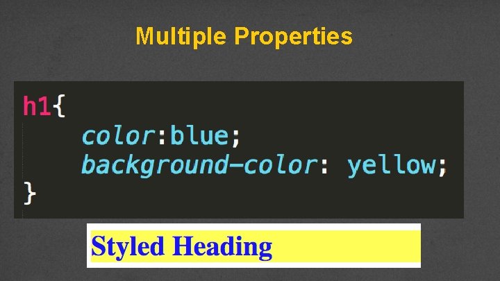
Multiple Properties

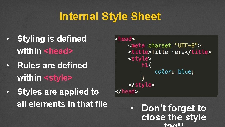
Internal Style Sheet • Styling is defined within <head> • Rules are defined within <style> • Styles are applied to all elements in that file • Don’t forget to close the style

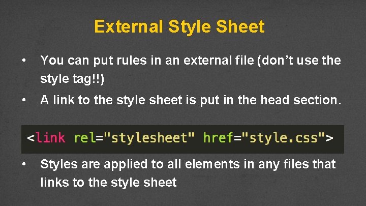
External Style Sheet • You can put rules in an external file (don’t use the style tag!!) • A link to the style sheet is put in the head section. • Styles are applied to all elements in any files that links to the style sheet

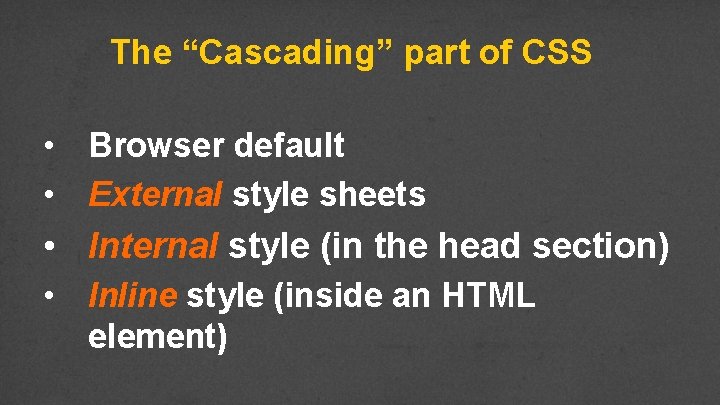
The “Cascading” part of CSS • Browser default • External style sheets • Internal style (in the head section) • Inline style (inside an HTML element)

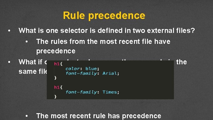
Rule precedence • What is one selector is defined in two external files? • • The rules from the most recent file have precedence What if one selector has more than one rule in the same file? • The most recent rule has precedence

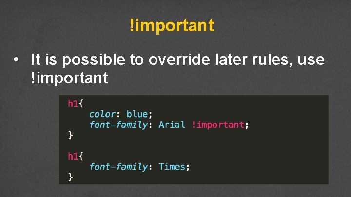
!important • It is possible to override later rules, use !important

Example • • style. Attribute. html internal. Style. html external. Style. html/external. Style. css rule. Precedence. html/precedence. css

Review • Why do we want/need to separate content from formatting? • How does this also tie in to external/internal style sheets? • Understand that this is very powerful. See http: //www. csszengarden. com/

Colors Using the best colors for your site

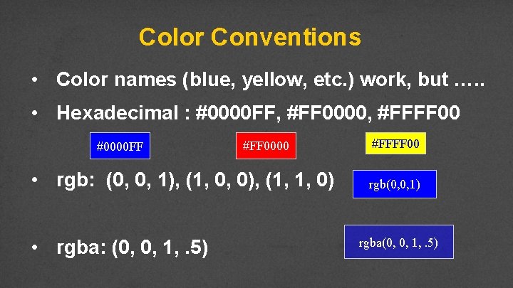
Color Conventions • Color names (blue, yellow, etc. ) work, but …. . • Hexadecimal : #0000 FF, #FF 0000, #FFFF 00 #0000 FF #FF 0000 • rgb: (0, 0, 1), (1, 0, 0), (1, 1, 0) • rgba: (0, 0, 1, . 5) #FFFF 00 rgb(0, 0, 1) rgba(0, 0, 1, . 5)

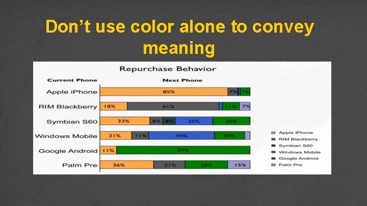
Colors and Accessibility • Appropriate use of critical to web accessibility • Many more people are visually impaired or color blind than are legally blind

What is color contrast? • You intuitively know when something has poor contrast • There are tools that quantify the contrast between text and its background • http: //wave. webaim. org/ • http: //webaim. org/resources/contrastcheck er/

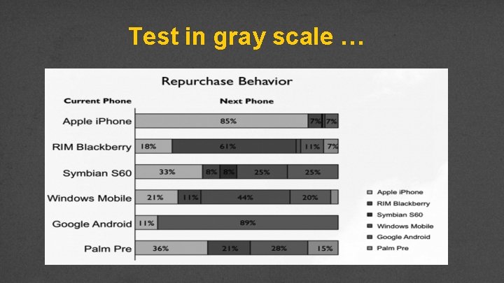
Don’t use color alone to convey meaning

Test in gray scale …

Review • Use web safe colors and use an accepted convention • Test your site using a contrast checker • Avoid using color to convey meaning

Styling Your Text

Options • Many options for styling your text: • font (family, style, variant, size) • color and background • alignment • line-height

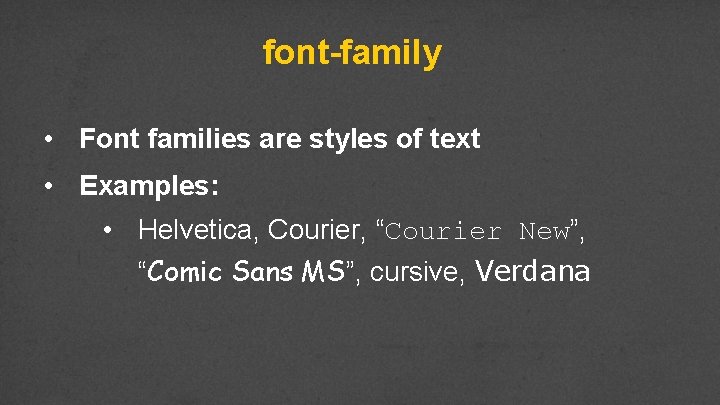
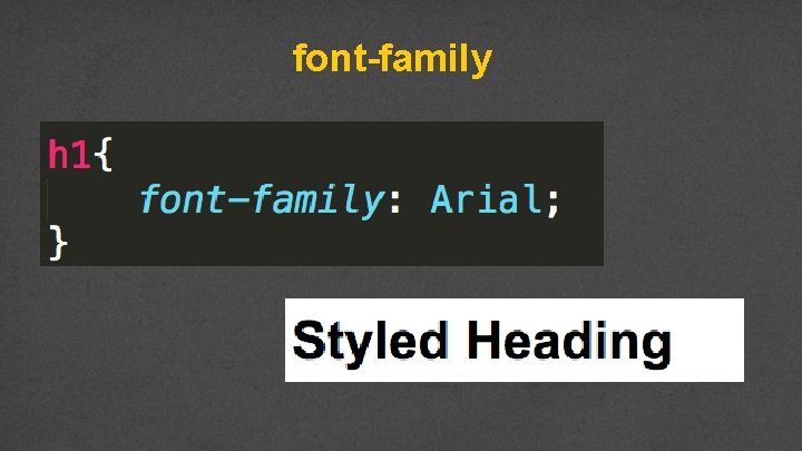
font-family • Font families are styles of text • Examples: • Helvetica, Courier, “Courier New”, “Comic Sans MS”, cursive, Verdana

font-family

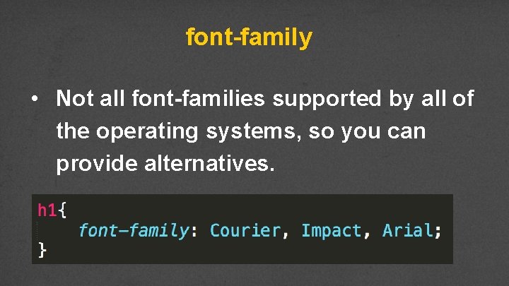
font-family • Not all font-families supported by all of the operating systems, so you can provide alternatives.

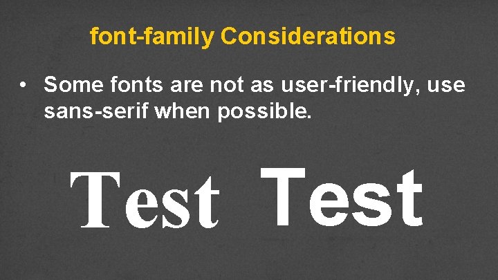
font-family Considerations • Some fonts are not as user-friendly, use sans-serif when possible. Test

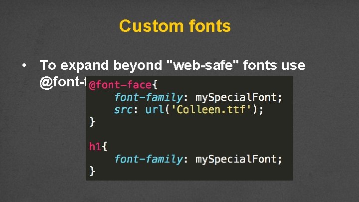
Custom fonts • To expand beyond "web-safe" fonts use @font-face

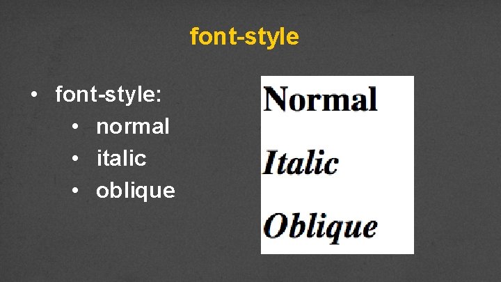
font-style • font-style: • normal • italic • oblique

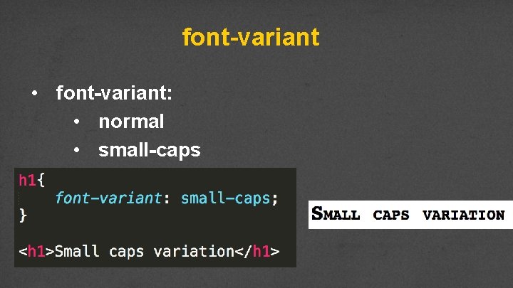
font-variant • font-variant: • normal • small-caps

font-size • This is only the beginning of our discussion on sizes… • Options • • xx-small, smaller medium larger, x-large, xx-large, larger pixels, percentages, em, and rem

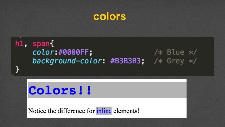
color and background-color • The color attribute is the color of the text itself. • The background-color is the color of the background

colors

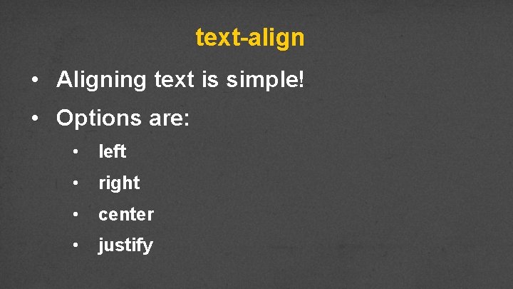
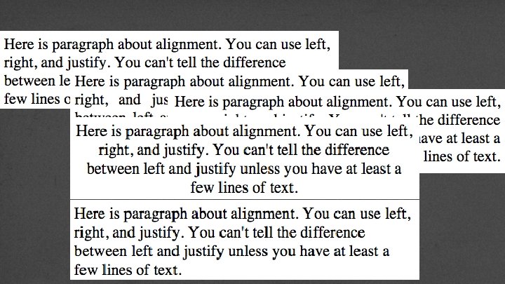
text-align • Aligning text is simple! • Options are: • left • right • center • justify


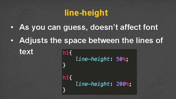
line-height • As you can guess, doesn’t affect font • Adjusts the space between the lines of text

Example • fonts. html /fonts. css

Review • The number of options for styling text can seem overwhelming. • Practice on toy problems! • Design larger projects on paper first!!!

Code Together! • together-1. css

Display and Visibility

Display is key to layout • Every element is a box • Display affects the layout of neighboring elements

Common values • inline: sits next to other elements • takes up “just enough” width and height • block: forces line break • default: take up all horizontal width and “just enough” height • rules can set height and width

Common values • inline-block: • same as inline, but accepts height and width • none: removed from page • Still in DOM, but not visual (even to SRs)

Example • div. Display. html /div. Display. css

Complementary properties • float • • • Reposition elements to the right or left. Elements are aware of one another and will not overlap. Values: left, right • clear • • Used to keep floating elements away Values: left, right, both

Example • div. Display 2. html / div. Display. 2 acss

Element Overflow • What happens when you set a height/width and the content doesn’t fit any longer? • Use overflow to determine access

Overflow • • visible: Can cause text to show up “on top” of other text hidden: Hides anything that goes beyond bounding box – This can cause problems since if the user increases font size, they may not be able to see content • • scroll: Gives horizontal and vertical scrollbars auto: Adds scrollbars as needed

Example • http: //csstricks. com/examples/Overflow. Example/

Other display Values • New display properties are available, but not always supported: • • • Table Grid Flexbox

display: table • Sometimes you want to have table-like layout without using table structure, use display: table along with display: tablecell for elements.

Example • div. Display 2. html / div. Display. 2 bcss

Visibility • Specifies whether or not element is visible • Options include: • • • visible hidden collapse (only for table elements) • Unlike display: none a hidden element is still part of the DOM and still takes up

Review • Display is just one tool for positioning our elements on the page • Early design will make the coding easier • Utilize tools to see the different options

Box Model Sizing your elements

Height and Width • The default width of most elements is the content • Elements that are not inline can take width and height properties – we saw this in the Display lecture.

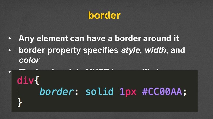
border • Any element can have a border around it • border property specifies style, width, and color • The border style MUST be specified

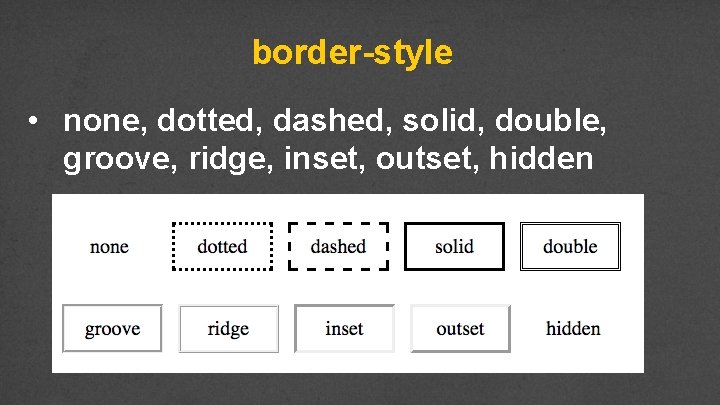
border-style • none, dotted, dashed, solid, double, groove, ridge, inset, outset, hidden

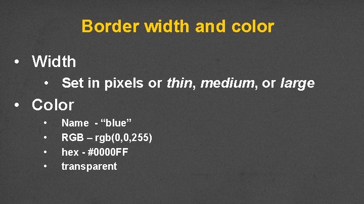
Border width and color • Width • Set in pixels or thin, medium, or large • Color • • Name - “blue” RGB – rgb(0, 0, 255) hex - #0000 FF transparent

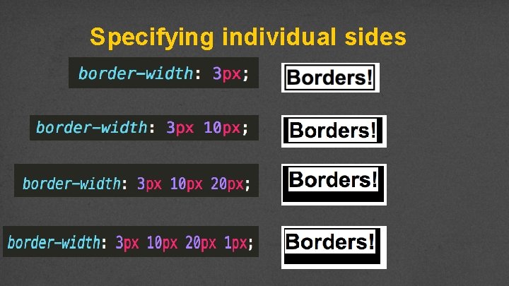
Specifying individual sides

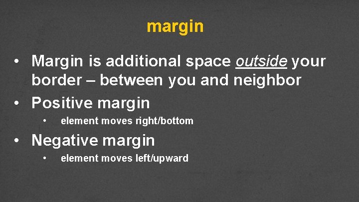
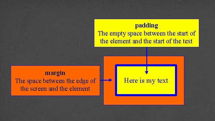
margin • Margin is additional space outside your border – between you and neighbor • Positive margin • element moves right/bottom • Negative margin • element moves left/upward

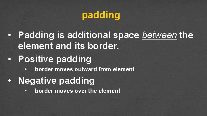
padding • Padding is additional space between the element and its border. • Positive padding • border moves outward from element • Negative padding • border moves over the element

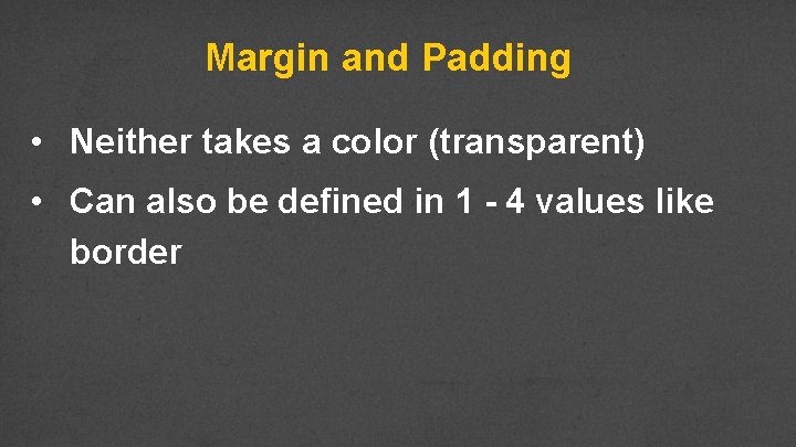
Margin and Padding • Neither takes a color (transparent) • Can also be defined in 1 - 4 values like border

padding The empty space between the start of the element and the start of the text margin The space between the edge of the screen and the element Here is my text

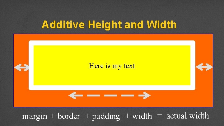
Additive Height and Width Here is my text margin + border + padding + width = actual width

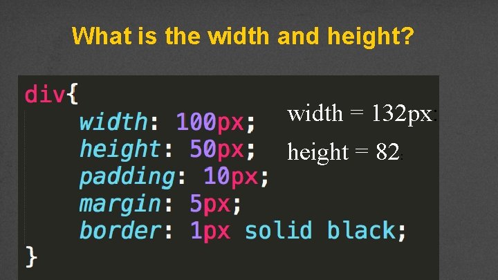
What is the width and height? width = 132 px: height = 82:

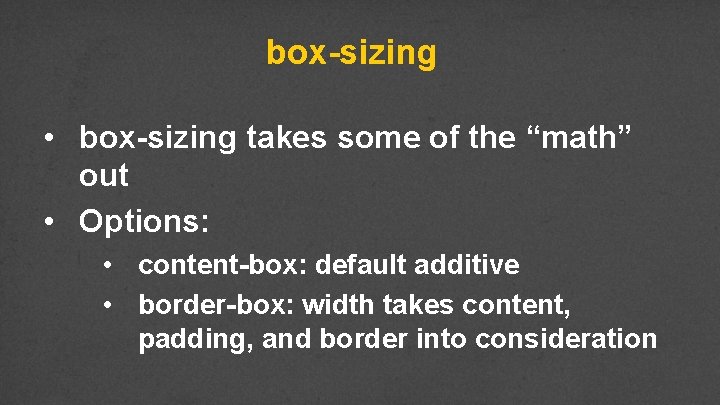
box-sizing • box-sizing takes some of the “math” out • Options: • content-box: default additive • border-box: width takes content, padding, and border into consideration

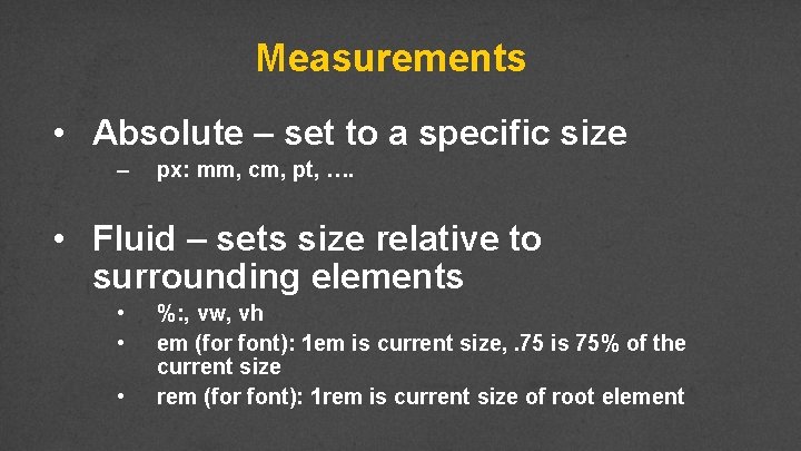
Measurements • Absolute – set to a specific size – px: mm, cm, pt, …. • Fluid – sets size relative to surrounding elements • • • %: , vw, vh em (for font): 1 em is current size, . 75 is 75% of the current size rem (for font): 1 rem is current size of root element

Example • box. Model. html / box. Model. css

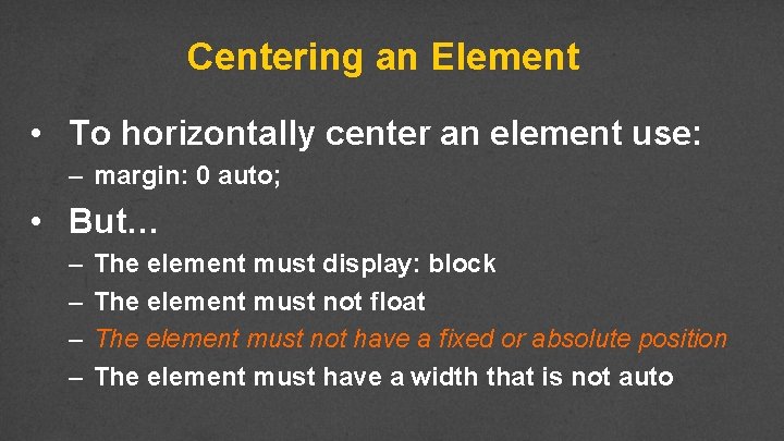
Centering an Element • To horizontally center an element use: – margin: 0 auto; • But… – – The element must display: block The element must not float The element must not have a fixed or absolute position The element must have a width that is not auto

Example • box. Model. html / box. Model. css

Review • Design sketches should be done with box model (margin, border, padding, content) in mind. • Use box-model to reduce complexity • Margin must always be considered • Use fluid sizes for best viewing

Styling Links and Lists

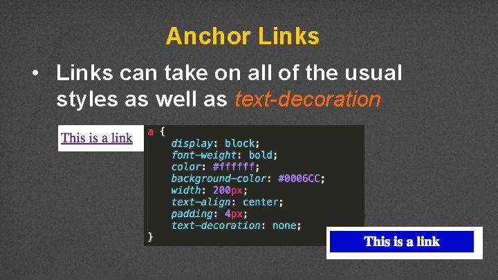
Anchor Links • Links can take on all of the usual styles as well as text-decoration

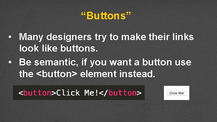
“Buttons” • Many designers try to make their links look like buttons. • Be semantic, if you want a button use the <button> element instead.

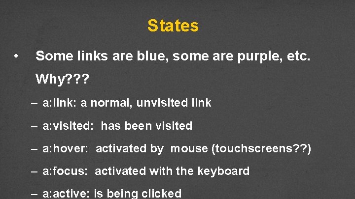
States • Some links are blue, some are purple, etc. Why? ? ? – a: link: a normal, unvisited link – a: visited: has been visited – a: hover: activated by mouse (touchscreens? ? ) – a: focus: activated with the keyboard – a: active: is being clicked

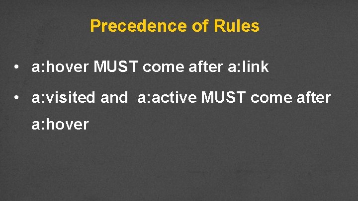
Precedence of Rules • a: hover MUST come after a: link • a: visited and a: active MUST come after a: hover

Example • links. html / links. css

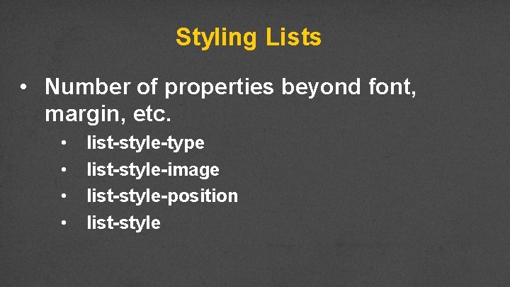
Styling Lists • Number of properties beyond font, margin, etc. • • list-style-type list-style-image list-style-position list-style

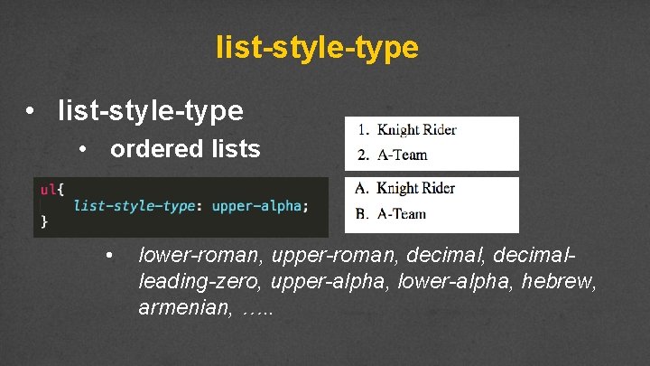
list-style-type • ordered lists • lower-roman, upper-roman, decimalleading-zero, upper-alpha, lower-alpha, hebrew, armenian, …. .

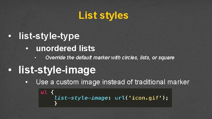
List styles • list-style-type • unordered lists • Override the default marker with circles, lists, or square • list-style-image • Use a custom image instead of traditional marker

Example • lists. html / lists. css

Review • At this point you have learned how to write rules for the tags. • Embrace the many tools that are available to help you design your site. • http: //chrispederick. com/work/web-developer/ • http: //css 3 generator. com/ • Do web search for “Developer Tools”

Advanced Selectors

Styling specific objects • We have focused on type selectors. • What if you don’t want to style all of the links, just some? Or just some of the lists? • CSS gives you options

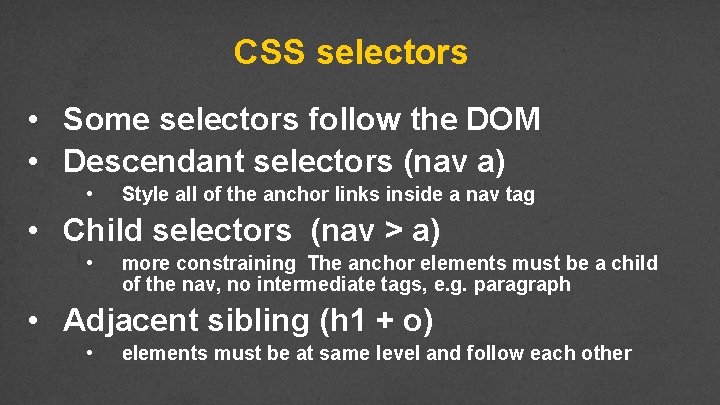
CSS selectors • Some selectors follow the DOM • Descendant selectors (nav a) • Style all of the anchor links inside a nav tag • Child selectors (nav > a) • more constraining The anchor elements must be a child of the nav, no intermediate tags, e. g. paragraph • Adjacent sibling (h 1 + o) • elements must be at same level and follow each other

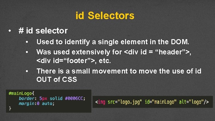
id Selectors • # id selector • • • Used to identify a single element in the DOM. Was used extensively for <div id = “header”>, <div id=“footer”>, etc. There is a small movement to move the use of id OUT of CSS

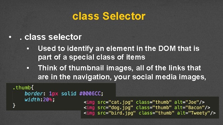
class Selector • . class selector • • Used to identify an element in the DOM that is part of a special class of items Think of thumbnail images, all of the links that are in the navigation, your social media images, etc….

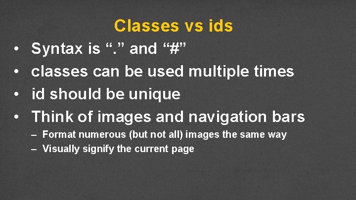
Classes vs ids • • Syntax is “. ” and “#” classes can be used multiple times id should be unique Think of images and navigation bars – Format numerous (but not all) images the same way – Visually signify the current page

Example

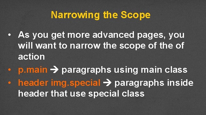
Narrowing the Scope • As you get more advanced pages, you will want to narrow the scope of the of action • p. main paragraphs using main class • header img. special paragraphs inside header that use special class

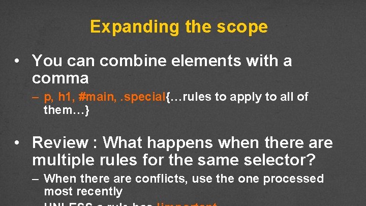
Expanding the scope • You can combine elements with a comma – p, h 1, #main, . special{…rules to apply to all of them…} • Review : What happens when there are multiple rules for the same selector? – When there are conflicts, use the one processed most recently

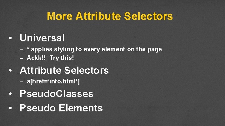
More Attribute Selectors • Universal – * applies styling to every element on the page – Ackk!! Try this! • Attribute Selectors – a[href=‘info. html’] • Pseudo. Classes • Pseudo Elements

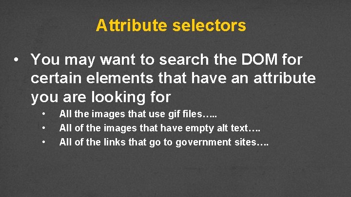
Attribute selectors • You may want to search the DOM for certain elements that have an attribute you are looking for • • • All the images that use gif files…. . All of the images that have empty alt text…. All of the links that go to government sites….

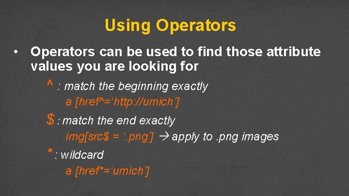
Using Operators • Operators can be used to find those attribute values you are looking for ^ : match the beginning exactly a [href^=‘http: //umich’] $ : match the end exactly img[src$ = ‘. png’] apply to. png images * : wildcard a [href*=‘umich’]

Example

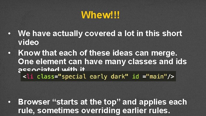
Whew!!! • We have actually covered a lot in this short video • Know that each of these ideas can merge. One element can have many classes and ids associated with it • Browser “starts at the top” and applies each rule, sometimes overriding earlier rules.

The Good News • You can use style sheets from others to style your code, just by adding class!! • You can override style sheets from others just by rewriting the class, or making your own version of it and linking it last.

Review • Type selectors can be combined to narrow the scope of where rules are applied • An id is used to specify a specific element in a page • Classes can be used to associate elements that should treated in a similar

Browser Capabilities Designing for consistent appearance

Browsers Differ • Even though browsers are moving to a consistent implementation of HTML, they differ in display and adherence. • It is your responsibility to make sure your page works for a wide audience.

Handling Stylistic Differences • Easiest way to rest browser differences is to use a default style sheet • Default style sheets reset all of the values for the page • Will make your page look worse!

Handling Unsupported Styles • Not all browsers support all HTML 5 tags • Not all browsers support all CSS 3 properties • Browser prefixes (or vendor prefixes) provide a quick fix for handling unsupported options.

Often Unsupported Properties • column-count • border-radius • gradient

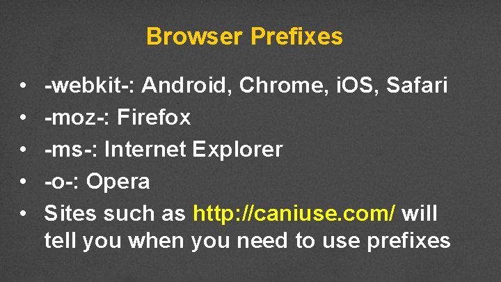
Browser Prefixes • • • -webkit-: Android, Chrome, i. OS, Safari -moz-: Firefox -ms-: Internet Explorer -o-: Opera Sites such as http: //caniuse. com/ will tell you when you need to use prefixes

Example

Automated Ways to include Prefixes • For now, add the prefixes by hand • There are ways to automate the addition of prefixes • • Editor add-ons (You have most of the control) Use outside programs to dynamically add appropriate prefix based on browser

Review • Default style sheets remove stylistic differences • • Should default style sheet be internal or external? Where should it go in relation to other style sheets? • Browser prefixes can help remove some differences caused by unsupported options

Code Together 3

Pseudo Classes and Elements Designing for consistent appearance

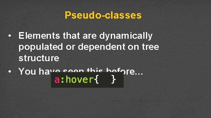
Pseudo-classes • Elements that are dynamically populated or dependent on tree structure • You have seen this before…

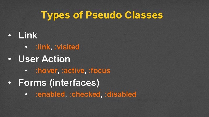
Types of Pseudo Classes • Link • : link, : visited • User Action • : hover, : active, : focus • Forms (interfaces) • : enabled, : checked, : disabled

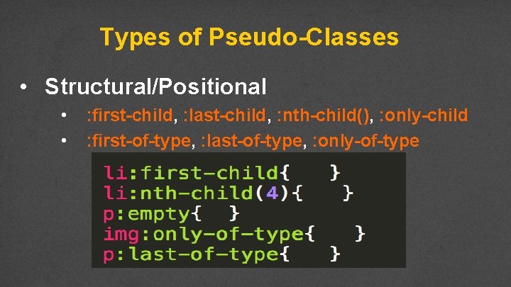
Types of Pseudo-Classes • Structural/Positional • • : first-child, : last-child, : nth-child(), : only-child : first-of-type, : last-of-type, : only-of-type

Example

Pseudo-Elements • These elements aren’t part of the DOM • Can be used to style specific (unique) parts of the page

Types of Pseudo-Elements • Textual • : first-letter, : first-line • Positional/Generated • : before, : after • Fragments • : : selection

Example

Review • Pseudo-elements and classes are just one more way to add style to your page • I haven’t covered every combination so make sure to do some investigation on your own

Transitions

Transitions • When elements transition from one state to another, you can alter their appearance • If you hover the link, change the color • If an image comes into focus, change the size,

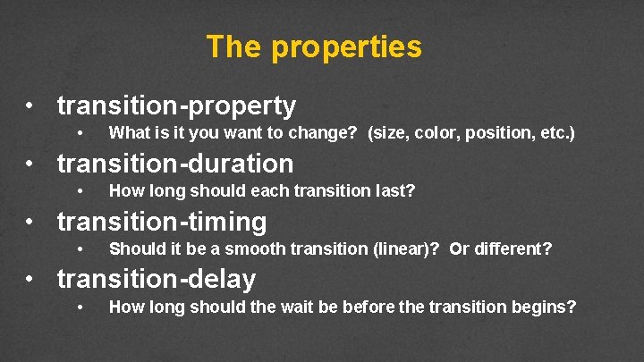
The properties • transition-property • What is it you want to change? (size, color, position, etc. ) • transition-duration • How long should each transition last? • transition-timing • Should it be a smooth transition (linear)? Or different? • transition-delay • How long should the wait be before the transition begins?

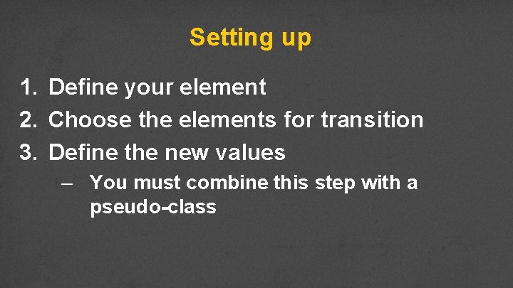
Setting up 1. Define your element 2. Choose the elements for transition 3. Define the new values – You must combine this step with a pseudo-class

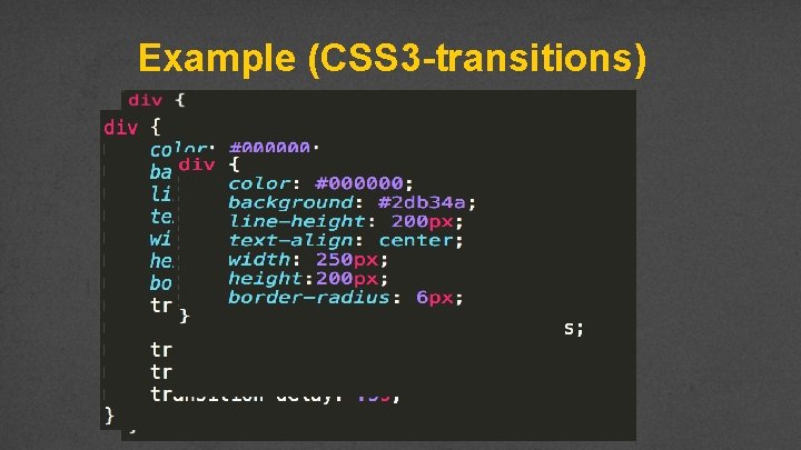
Example (CSS 3 -transitions)

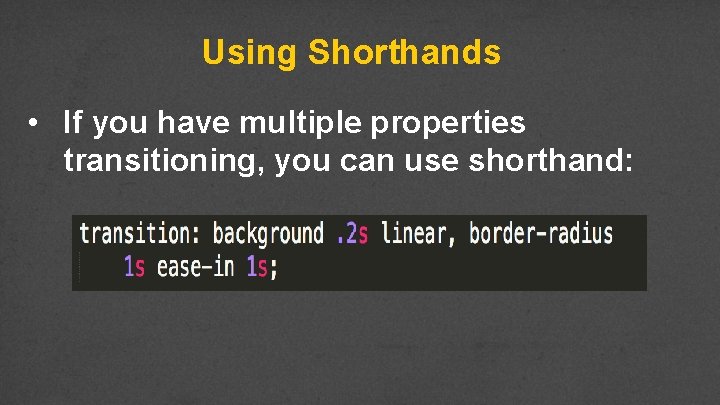
Using Shorthands • If you have multiple properties transitioning, you can use shorthand:

Review

Transforms

Transforms • Provide option for changing the appearance of elements • Two-dimensional • Three-dimensional

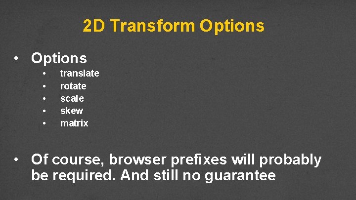
2 D Transform Options • • • translate rotate scale skew matrix • Of course, browser prefixes will probably be required. And still no guarantee

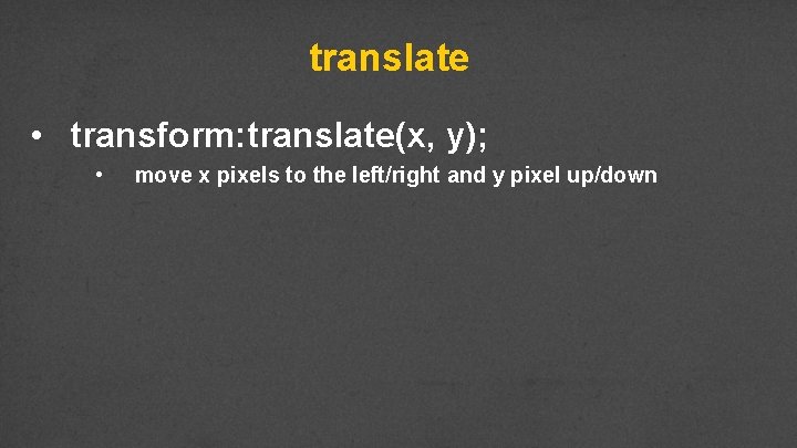
translate • transform: translate(x, y); • move x pixels to the left/right and y pixel up/down

rotate • transform: rotate(30 deg);

scale • transform: scale(2, 4);

skew • transform: skew(30 deg, 20 deg); • skew() - element turns in a given angle, depending on the parameters given for the horizontal (X-axis) and the vertical (Y-axis) lines

matrix • transform: matrix(0. 866, 0. 5, -0. 5, 0. 866, 0, 0); • matrix() - combines all of the 2 D transform methods into one.

3 D Transforms

3 D rotate

3 D scale

3 D transform

Review

Positioning Hey Cy, would love to do something with an easel or some kind of canvas here. I want to show sticky notes

Positioning! • Putting elements where you want them can be time-consuming and frustrating • Why not tables?

Position Properties • The four position properties are: • • static relative absolute fixed • Position properties are modified by the properties: top, right, bottom, left

Static • Default value for elements • Place in the next available position • Not affected by the top, bottom, left, and right properties.

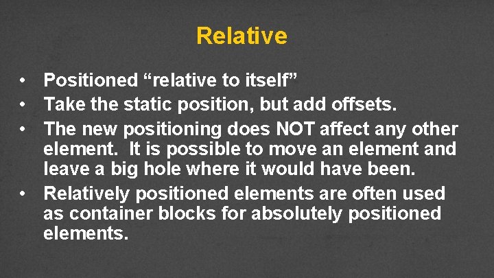
Relative • Positioned “relative to itself” • Take the static position, but add offsets. • The new positioning does NOT affect any other element. It is possible to move an element and leave a big hole where it would have been. • Relatively positioned elements are often used as container blocks for absolutely positioned elements.

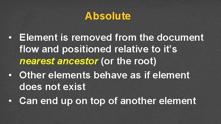
Absolute • Element is removed from the document flow and positioned relative to it’s nearest ancestor (or the root) • Other elements behave as if element does not exist • Can end up on top of another element

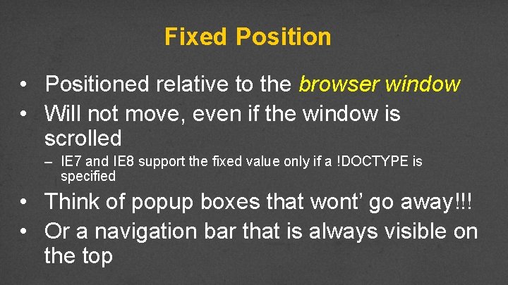
Fixed Position • Positioned relative to the browser window • Will not move, even if the window is scrolled – IE 7 and IE 8 support the fixed value only if a !DOCTYPE is specified • Think of popup boxes that wont’ go away!!! • Or a navigation bar that is always visible on the top

Example

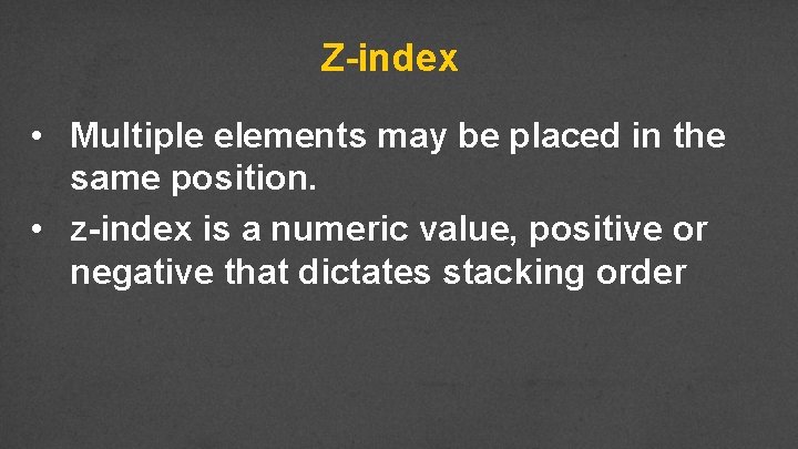
Z-index • Multiple elements may be placed in the same position. • z-index is a numeric value, positive or negative that dictates stacking order

Example

Review • Positioning elements is key to achieving desired layouts • Proper planning will make this easier

Styling Tables

Styling with Background Images Fonts

Creating Navigation Menus

Accessible Navigation

Navigation • • Navigation is a critical aspect of accessibility Sighted users have tried and true visual cues to orient them on a page – – • Banner Search box Main navigation box Content well Blind and low-vision users rely on proper coding of page for orientation

What if you can’t see? • • • Title of page lets you know what page you’re on when page loads Proper heading placement and hierarchy conveys organization of page and allows SR users to skip navigation Link descriptions convey content of page and organization of site

Skip-to-content links • • Consider links to allow those who cannot use a mouse avoid tabbing through entire menu and sidebar Jump to <h 1> tag, which should directly precede main content Must be visible on keyboard focus so sighted keyboard users will know it’s there Not favored by screen reader users (!)

Proper <h 1> heading • • Screen readers can find and list headings <h 1> heading uniquely identifies the page in the website Should be placed directly in front of the main content of the page The <h 1> header should also match at least a subset of the page <title>

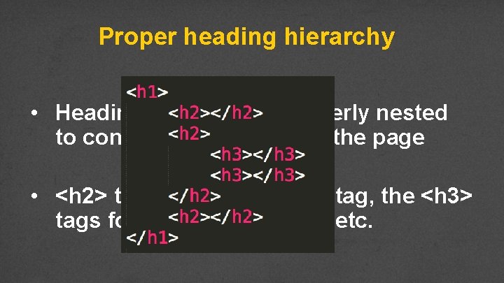
Proper heading hierarchy • Headings need to be properly nested to convey organization of the page • <h 2> tags follow the <h 1> tag, the <h 3> tags follow the <h 2> tags, etc.

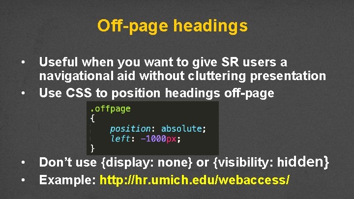
Off-page headings • • Useful when you want to give SR users a navigational aid without cluttering presentation Use CSS to position headings off-page • • Don’t use {display: none} or {visibility: hidden} Example: http: //hr. umich. edu/webaccess/

Meaningful link text • Screen readers can find and list links • Descriptions for the links must be meaningful out of context, via tabbing or presented in a list • Don’t use “here”, “click here”, “read this”, and “more” • Don’t use URL as a link description—will sound like gibberish, unless very short and intuitive

Review • How easy is it to navigate your page? • What would happen if the colors weren’t there? • What would happen if you couldn’t use a mouse? • Plan for everyone

“Sticky” Footers

Conclusion