Cascading Style Sheets CSS CSS CSS is a
- Slides: 32

Cascading Style Sheets (CSS)

CSS � CSS is a language that describes the style of an HTML document. � CSS describes how HTML elements should be displayed. � Cascading Style Sheets 3 that allows to specify the presentation of elements on a web page (e. g. , fonts, spacing, sizes, colors, positioning) separately from the document’s structure and content (section headers, body text, links, etc. ).

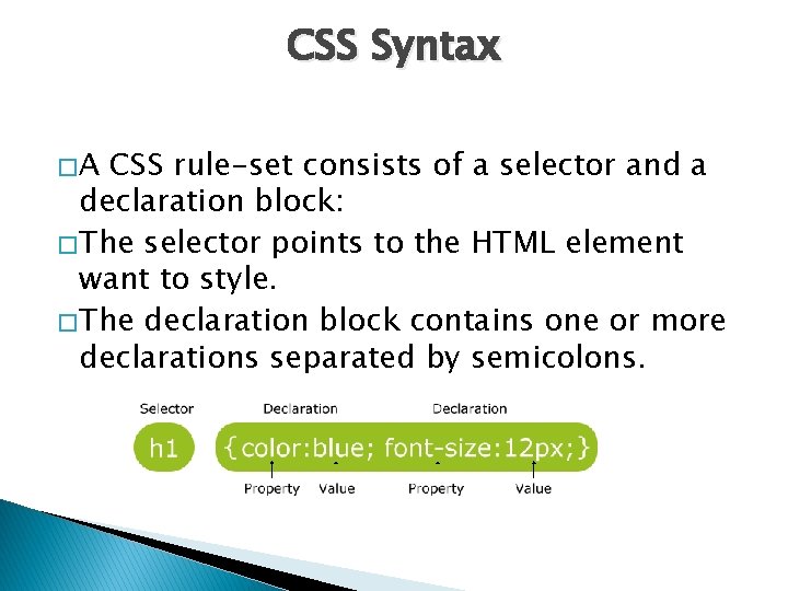
CSS Syntax �A CSS rule-set consists of a selector and a declaration block: � The selector points to the HTML element want to style. � The declaration block contains one or more declarations separated by semicolons.

CSS � Three different ways to insert CSS 1. inline styles 2. Embedded Style Sheets 3. External style sheet

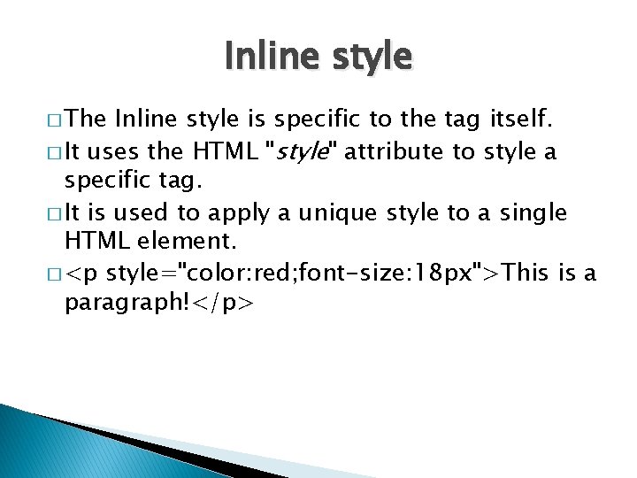
Inline style � The Inline style is specific to the tag itself. � It uses the HTML "style" attribute to style a specific tag. � It is used to apply a unique style to a single HTML element. � <p style="color: red; font-size: 18 px">This is a paragraph!</p>

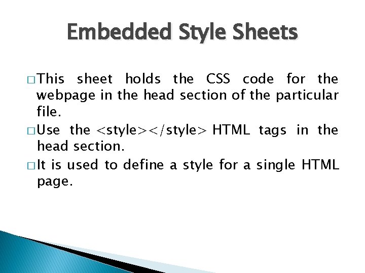
Embedded Style Sheets � This sheet holds the CSS code for the webpage in the head section of the particular file. � Use the <style></style> HTML tags in the head section. � It is used to define a style for a single HTML page.

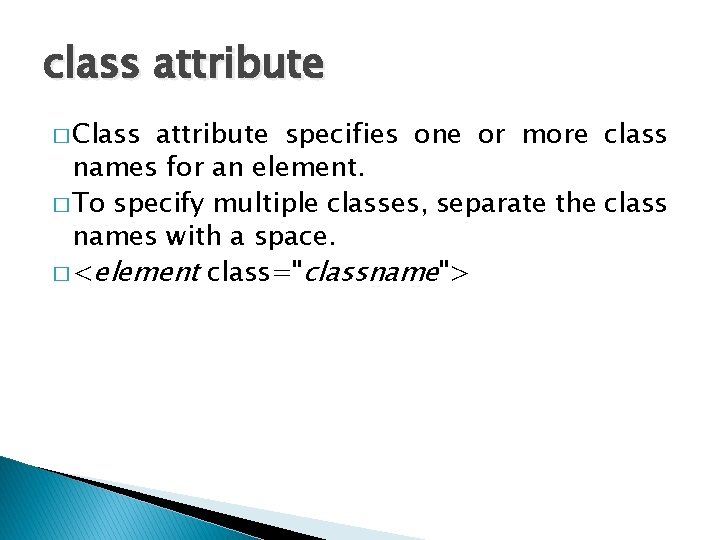
class attribute � Class attribute specifies one or more class names for an element. � To specify multiple classes, separate the class names with a space. � <element class="classname">

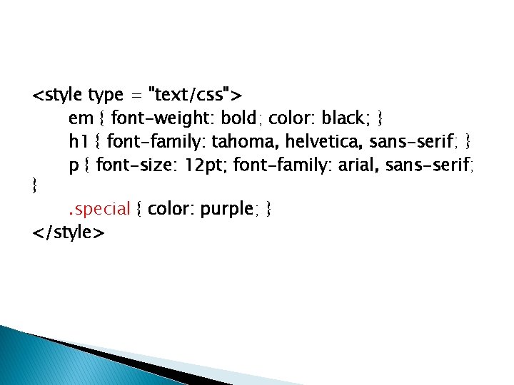
<style type = "text/css"> em { font-weight: bold; color: black; } h 1 { font-family: tahoma, helvetica, sans-serif; } p { font-size: 12 pt; font-family: arial, sans-serif; }. special { color: purple; } </style>

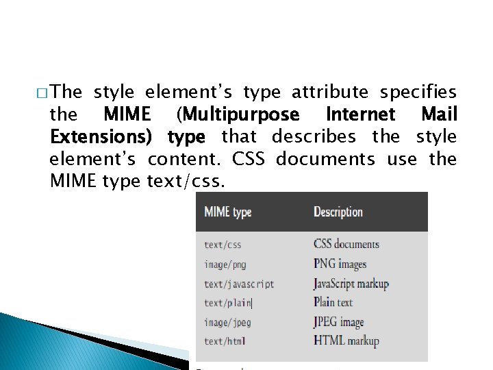
� The style element’s type attribute specifies the MIME (Multipurpose Internet Mail Extensions) type that describes the style element’s content. CSS documents use the MIME type text/css.

� selector for a style class named special. � Style-class declarations are preceded by a period (. ) � Define styles that can be applied to any element

Applying a style class � <h 1 class = "special">Deitel & Associates, Inc. </h 1> � The styles applied to an element (the parent or ancestor element) also apply to the element’s nested elements (child or descendant elements).

Conflicting styles � Styles may be defined by a user, an author or a user agent. � A user is a person viewing the web page. � author—the person who writes the document � the user agent is the program used to render and display the document (e. g. , a web browser)

Conflicting styles … � Styles cascade (and hence the term “Cascading Style Sheets”), or flow together, such that the ultimate appearance of elements on a page results from combining styles defined in several ways. � Styles defined by the user take precedence over styles defined by the user agent. � Styles defined by authors take precedence over styles defined by the user.

Conflicting styles … � <p> example<em> for internal </em>style <p>. � the child em element has a color property that conflicts with (i. e. , has a different value than) the color property of its parent p element � Properties defined for child and descendant elements have a higher specificity than properties defined for parent and ancestor elements.

Linking External Style Sheets � Using external CSS file � It is used to define the style for many HTML pages. � When changes to the styles are required, you need to modify only a single CSS file to make style changes across all the pages that use those styles. This concept is sometimes known as skinning. � To use an external style sheet, add a link to it in the <head> section of the HTML page.

External style sheet � An external style sheet can be written in any text editor. The file must not contain any HTML code, and must be saved with a. css extension Eg: <link rel="stylesheet" href="styles. css">

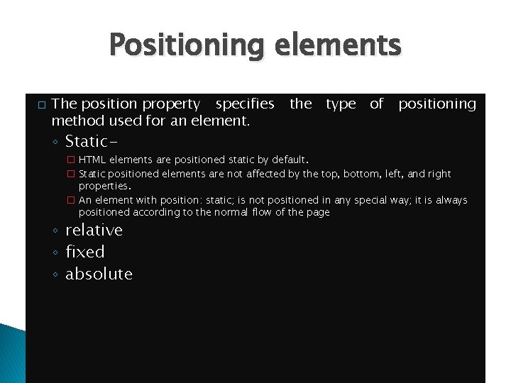
Positioning elements � The position property specifies method used for an element. ◦ Static- the type of positioning � HTML elements are positioned static by default. � Static positioned elements are not affected by the top, bottom, left, and right properties. � An element with position: static; is not positioned in any special way; it is always positioned according to the normal flow of the page ◦ relative ◦ fixed ◦ absolute

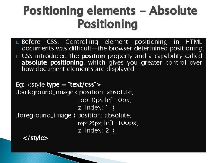
Positioning elements - Absolute Positioning � � Before CSS, Controlling element positioning in HTML documents was difficult—the browser determined positioning. CSS introduced the position property and a capability called absolute positioning, which gives you greater control over how document elements are displayed. Eg: <style type = "text/css">. background_image { position: absolute; top: 0 px; left: 0 px; z-index: 1; }. foreground_image { position: absolute; top: 25 px; left: 100 px; z-index: 2; } </style>

Absolute Positioning. . . � Normally, elements are positioned on the page in the order in which they appear in the HTML 5 document. � Specifying an element’s position as absolute removes the element from the normal flow of elements on the page, instead positioning it according to the distance from the top, left, right or bottom margins of its containing block-level element.

Z-index � The z-index property allows you to layer overlapping elements. � Elements that have higher z-index values are displayed in front of elements with lower z-index values. � The default z-index value is 0.

Positioning Elements: Relative Positioning � Relative positioning keeps elements in the general flow of elements on the page, so positioning is relative to other elements in the flow.

span � Element span is a grouping element—by default, it does not apply any formatting to its contents. � Its primary purpose is to apply CSS rules to a section of text. � Element span is an inline-level element—it does not change the flow of elements in the document. � Examples of inline elements include span, img, a, em and strong. � The div element is also a grouping element, but it’s a block-level element.

Background � CSS can set a background color or add background images to HTML elements. ◦ background-image Property-specifies the image URL for the image. ◦ background-color property-fills the area the image does not cover ◦ The background-position property places the image on the page. The keywords top, bottom, center, left and right are used individually or in combination for vertical and horizontal positioning. ◦ The background-repeat property places multiple copies of the image next to each other to fill the background. ◦ background-attachment: fixed fixes the image in the position specified by background-position.

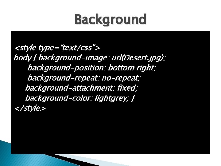
Background <style type=“text/css”> body { background-image: url(Desert. jpg); background-position: bottom right; background-repeat: no-repeat; background-attachment: fixed; background-color: lightgrey; } </style>

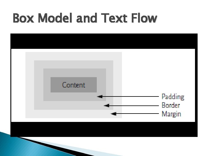
Box Model and Text Flow block-level HTML 5 elements have a virtual box drawn around them, based on what is � All known as the box model. � When the browser renders an element using the box model, the content is surrounded by padding, a border and a margin � CSS controls the border using three properties: border-width, border-color and border-style.

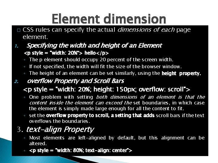
� 1. 2. Element dimension CSS rules can specify the actual dimensions of each page element. Specifying the width and height of an Element <p style = "width: 20%“> hello</p> ◦ The p element should occupy 20 percent of the screen width. ◦ If not specified, the width will fit the size of the browser window. ◦ The height of an element can be set similarly, using the height property. overflow Property and Scroll Bars <p style = "width: 20%; height: 150 px; overflow: scroll"> ◦ One problem with setting both dimensions of an element is that the content inside the element can exceed the set boundaries, in which case the element is simply made large enough for all the content to fit. ◦ set the overflow property to scroll, a setting that adds scroll bars if the text overflows the boundaries. 3. text-align Property ◦ Most elements are left-aligned by default, but this alignment can be altered. ◦ <p style = "width: 80%; text-align: center">

Box Model and Text Flow

Floating Elements � Floating allows to move an element to one side of the screen; other content in the document then flows around the floated element.

Media Types and Media Queries � � � � CSS media types allow to decide what a page should look like, depending on the kind of media being used to display the page. The most common media type for a web page is the screen media type, which is a standard computer screen. Other media types in CSS include handheld, braille, speech and print. The handheld medium is designed for mobile Internet devices such as smartphones. Braille -is for machines that can read or print web pages in braille. Speech styles allow to give a speech-synthesizing web browser more information about the content of a page. The print media type affects a web page’s appearance when it’s printed.

Media Types … � Most of these styles conflict with the declarations in the section for all media types. � Since the print media type has higher specificity than the all media type, the print styles override the all media type’s styles when the page is printed. � The h 1’s font-family property not overridden in the print section, so it retains its old value when the page is printed. is

� � � Media Queries Media queries allow you to format your content to specific output devices. Media queries include a media type and expressions that check the media features of the output device. Some of the common media features include: ◦ width—the width of the part of the screen on which the document is rendered, including any scrollbars ◦ height—the height of the part of the screen on which the document is rendered, including any scrollbars ◦ device-width—the width of the screen of the output device ◦ device-height—the height of the screen of the output device ◦ orientation—if the height is greater than the width, orientation is portrait, and if the width is greater than the height, orientation is landscape ◦ aspect-ratio—the ratio of width to height ◦ device-aspect-ratio—the ratio of device-width to deviceheight

Drop-Down Menus � Drop-down menus are a good way to provide navigation links without using a lot of screen space. � Display- which allows you to decide whether an element is rendered on the page or not. � Possible values include block, inline and none. � The block and inline values display the element as a block element or an inline element, while none stops the element from being rendered.