CSc 337 LECTURE 4 POSITIONING The CSS float
- Slides: 36

CSc 337 LECTURE 4: POSITIONING

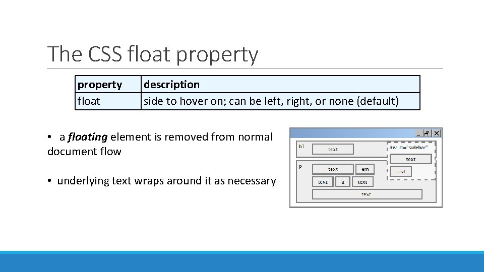
The CSS float property float description side to hover on; can be left, right, or none (default) • a floating element is removed from normal document flow • underlying text wraps around it as necessary

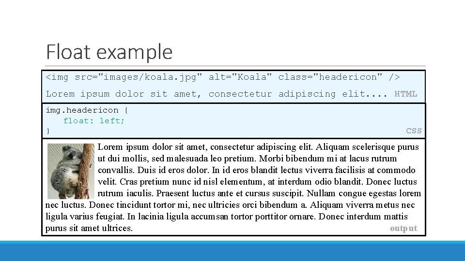
Float example <img src="images/koala. jpg" alt="Koala" class="headericon" /> Lorem ipsum dolor sit amet, consectetur adipiscing elit. . HTML img. headericon { float: left; } CSS Lorem ipsum dolor sit amet, consectetur adipiscing elit. Aliquam scelerisque purus ut dui mollis, sed malesuada leo pretium. Morbi bibendum mi at lacus rutrum convallis. Duis id eros dolor. In id eros blandit lectus viverra facilisis at commodo velit. Cras pretium nunc id nisl elementum, at interdum odio blandit. Donec luctus rutrum iaculis. Praesent luctus ante et cursus suscipit. Nullam congue egestas lorem nec luctus. Donec tincidunt tortor mi, nec ultricies orci bibendum a. Aliquam viverra metus nec ligula varius feugiat. In lacinia ligula accumsan tortor porttitor ornare. Donec interdum mattis purus sit amet ultrices. output

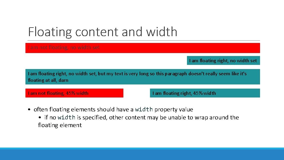
Floating content and width I am not floating, no width set I am floating right, no width set, but my text is very long so this paragraph doesn't really seem like it's floating at all, darn I am not floating, 45% width I am floating right, 45% width • often floating elements should have a width property value • if no width is specified, other content may be unable to wrap around the floating element

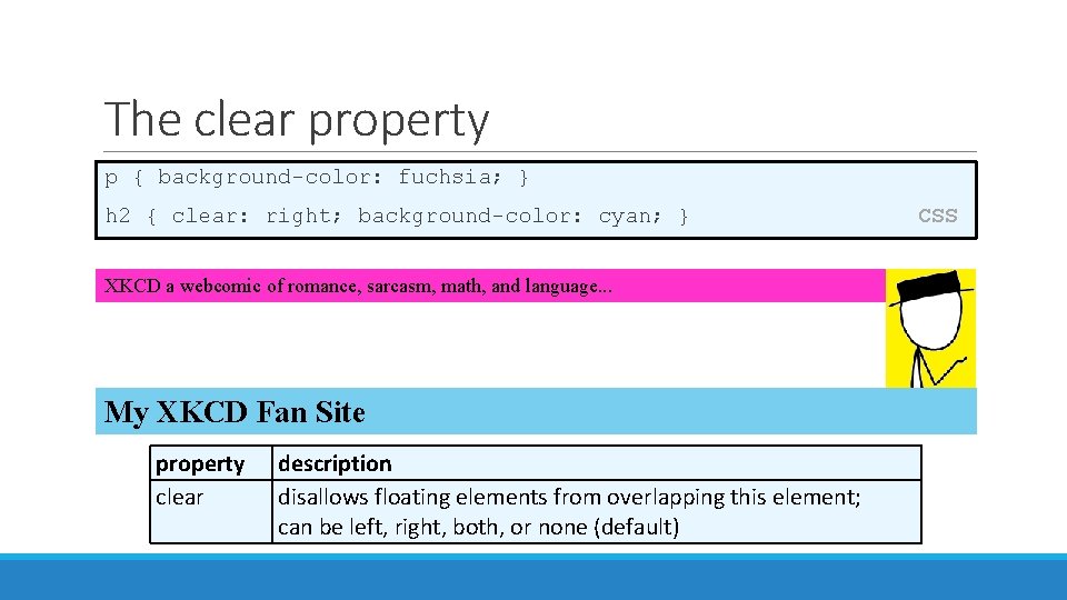
The clear property p { background-color: fuchsia; } h 2 { clear: right; background-color: cyan; } XKCD a webcomic of romance, sarcasm, math, and language. . . My XKCD Fan Site property clear description disallows floating elements from overlapping this element; can be left, right, both, or none (default) CSS

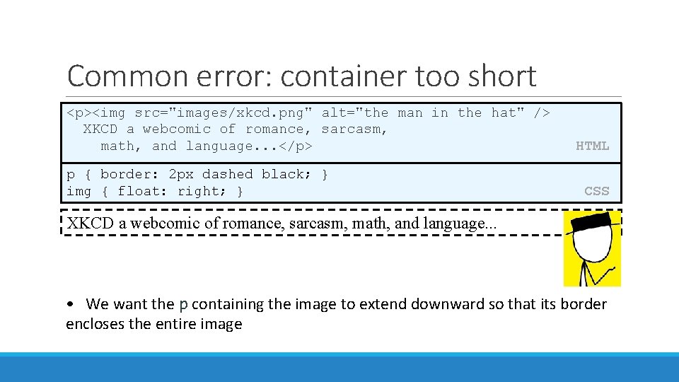
Common error: container too short <p><img src="images/xkcd. png" alt="the man in the hat" /> XKCD a webcomic of romance, sarcasm, math, and language. . . </p> p { border: 2 px dashed black; } img { float: right; } HTML CSS XKCD a webcomic of romance, sarcasm, math, and language. . . • We want the p containing the image to extend downward so that its border encloses the entire image

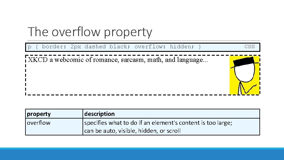
The overflow property p { border: 2 px dashed black; overflow: hidden; } XKCD a webcomic of romance, sarcasm, math, and language. . . property overflow description specifies what to do if an element's content is too large; can be auto, visible, hidden, or scroll CSS

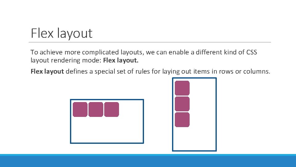
Flex layout To achieve more complicated layouts, we can enable a different kind of CSS layout rendering mode: Flex layout defines a special set of rules for laying out items in rows or columns.

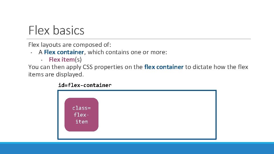
Flex basics Flex layouts are composed of: - A Flex container, which contains one or more: - Flex item(s) You can then apply CSS properties on the flex container to dictate how the flex items are displayed. id=flex-container class= flexitem

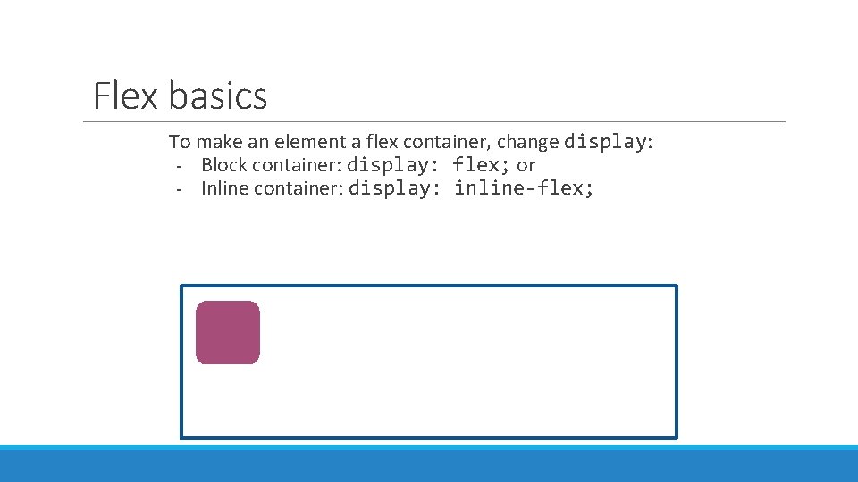
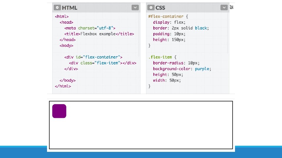
Flex basics To make an element a flex container, change display: - Block container: display: flex; or - Inline container: display: inline-flex;


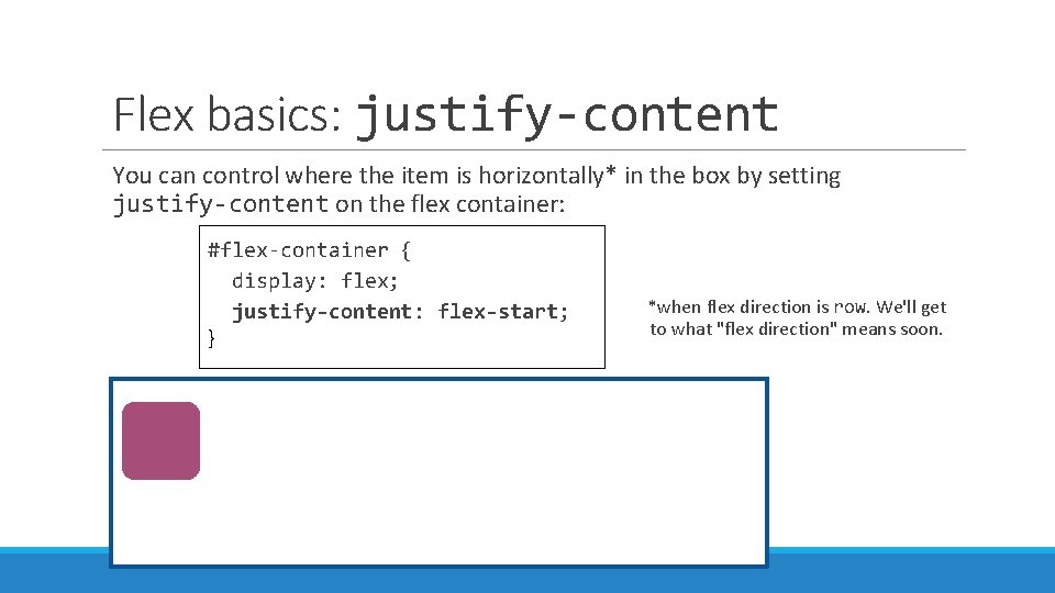
Flex basics: justify-content You can control where the item is horizontally* in the box by setting justify-content on the flex container: #flex-container { display: flex; justify-content: flex-start; } *when flex direction is row. We'll get to what "flex direction" means soon.

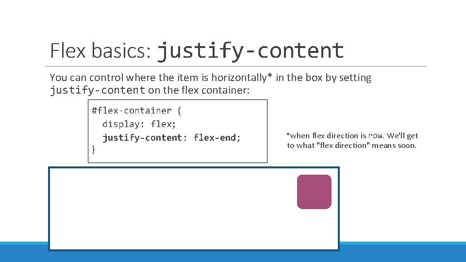
Flex basics: justify-content You can control where the item is horizontally* in the box by setting justify-content on the flex container: #flex-container { display: flex; justify-content: flex-end; } *when flex direction is row. We'll get to what "flex direction" means soon.

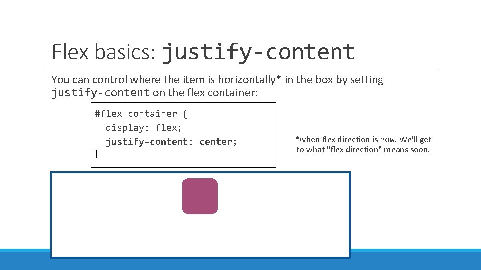
Flex basics: justify-content You can control where the item is horizontally* in the box by setting justify-content on the flex container: #flex-container { display: flex; justify-content: center; } *when flex direction is row. We'll get to what "flex direction" means soon.

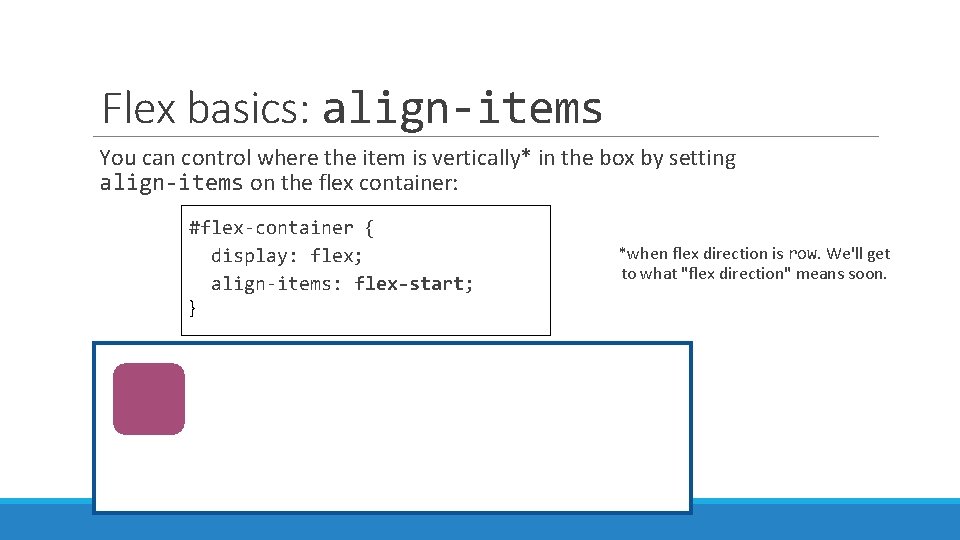
Flex basics: align-items You can control where the item is vertically* in the box by setting align-items on the flex container: #flex-container { display: flex; align-items: flex-start; } *when flex direction is row. We'll get to what "flex direction" means soon.

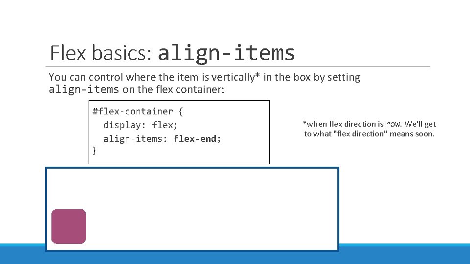
Flex basics: align-items You can control where the item is vertically* in the box by setting align-items on the flex container: #flex-container { display: flex; align-items: flex-end; } *when flex direction is row. We'll get to what "flex direction" means soon.

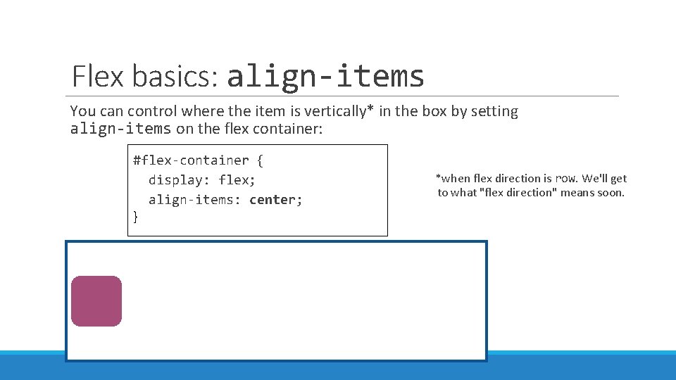
Flex basics: align-items You can control where the item is vertically* in the box by setting align-items on the flex container: #flex-container { display: flex; align-items: center; } *when flex direction is row. We'll get to what "flex direction" means soon.

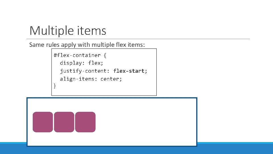
Multiple items Same rules apply with multiple flex items: #flex-container { display: flex; justify-content: flex-start; align-items: center; }

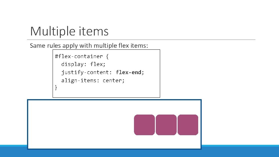
Multiple items Same rules apply with multiple flex items: #flex-container { display: flex; justify-content: flex-end; align-items: center; }

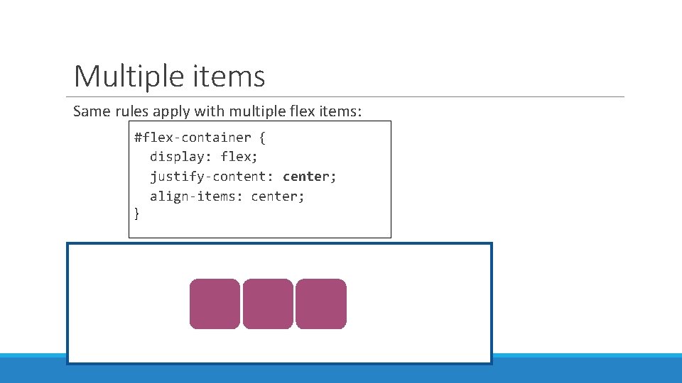
Multiple items Same rules apply with multiple flex items: #flex-container { display: flex; justify-content: center; align-items: center; }

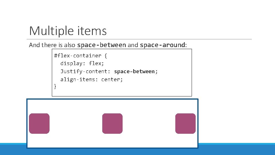
Multiple items And there is also space-between and space-around: #flex-container { display: flex; Justify-content: space-between; align-items: center; }

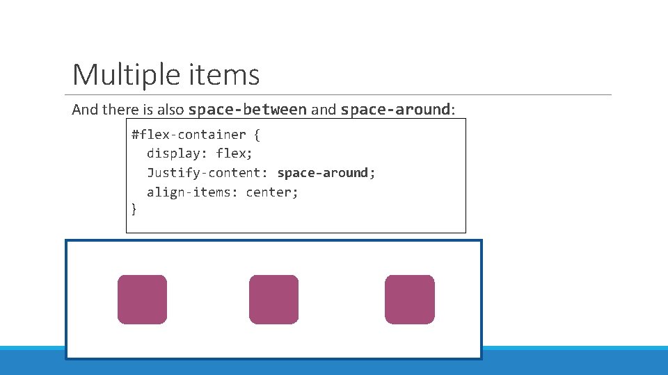
Multiple items And there is also space-between and space-around: #flex-container { display: flex; Justify-content: space-around; align-items: center; }

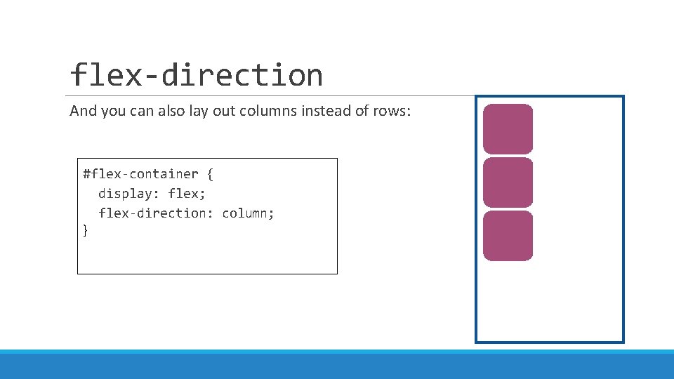
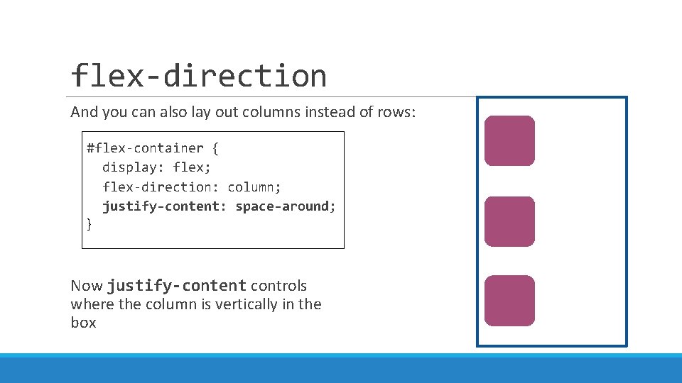
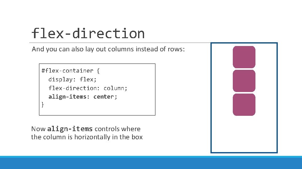
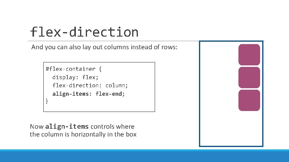
flex-direction And you can also lay out columns instead of rows: #flex-container { display: flex; flex-direction: column; }

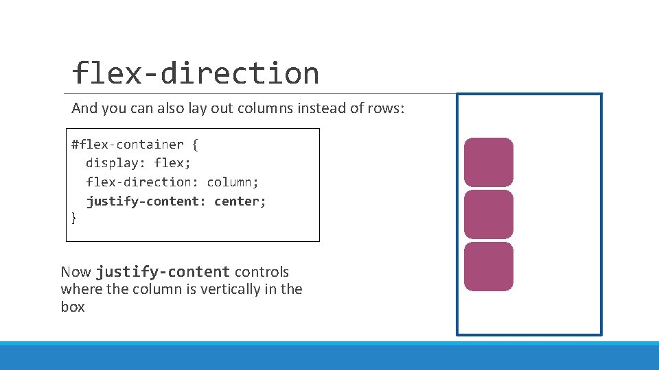
flex-direction And you can also lay out columns instead of rows: #flex-container { display: flex; flex-direction: column; justify-content: center; } Now justify-content controls where the column is vertically in the box

flex-direction And you can also lay out columns instead of rows: #flex-container { display: flex; flex-direction: column; justify-content: space-around; } Now justify-content controls where the column is vertically in the box

flex-direction And you can also lay out columns instead of rows: #flex-container { display: flex; flex-direction: column; align-items: center; } Now align-items controls where the column is horizontally in the box

flex-direction And you can also lay out columns instead of rows: #flex-container { display: flex; flex-direction: column; align-items: flex-end; } Now align-items controls where the column is horizontally in the box

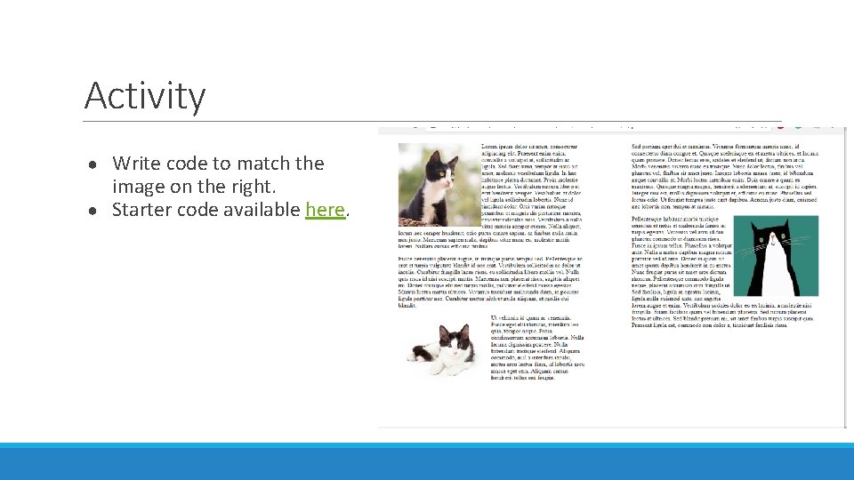
Activity Write code to match the image on the right. ● Starter code available here. ●

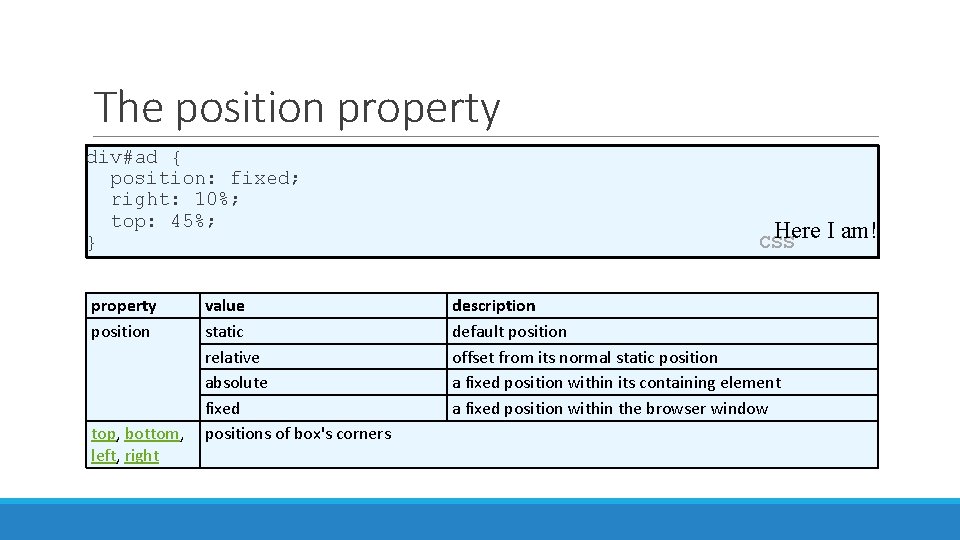
The position property div#ad { position: fixed; right: 10%; top: 45%; } property position value static relative absolute fixed top, bottom, positions of box's corners left, right Here I am! CSS description default position offset from its normal static position a fixed position within its containing element a fixed position within the browser window

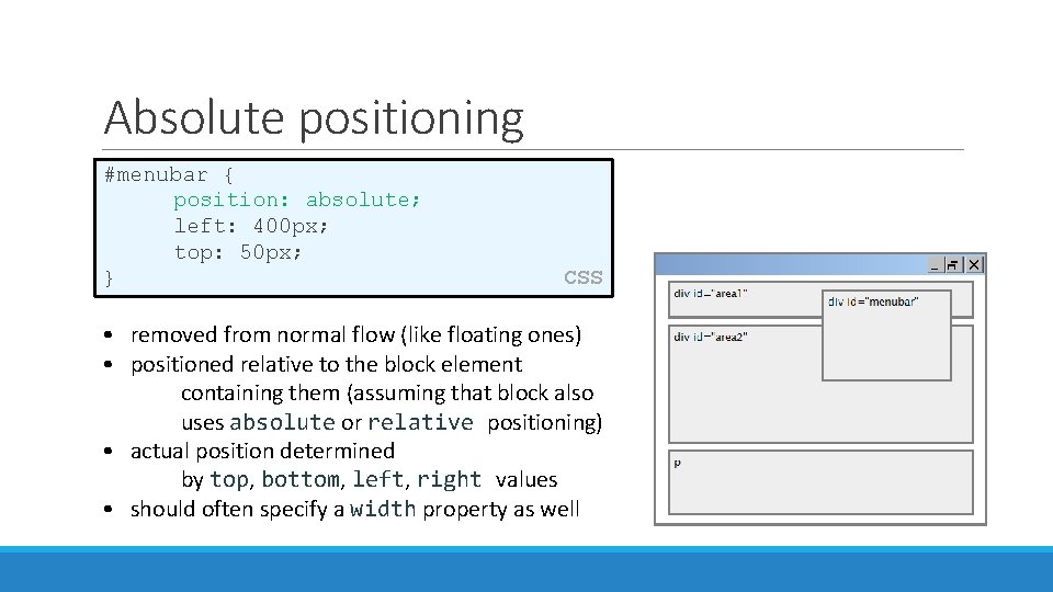
Absolute positioning #menubar { position: absolute; left: 400 px; top: 50 px; } CSS • removed from normal flow (like floating ones) • positioned relative to the block element containing them (assuming that block also uses absolute or relative positioning) • actual position determined by top, bottom, left, right values • should often specify a width property as well

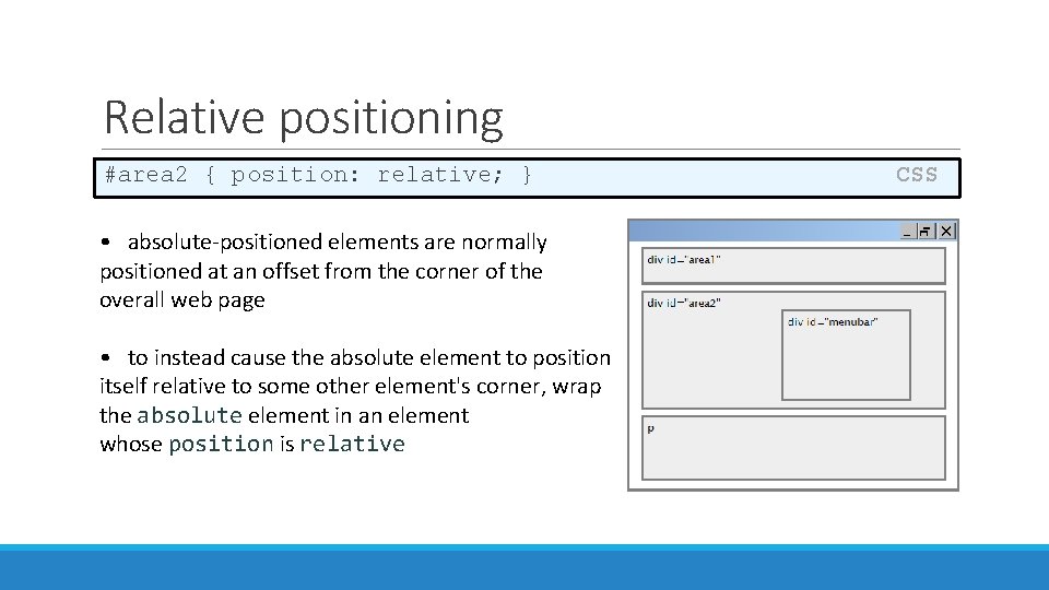
Relative positioning #area 2 { position: relative; } • absolute-positioned elements are normally positioned at an offset from the corner of the overall web page • to instead cause the absolute element to position itself relative to some other element's corner, wrap the absolute element in an element whose position is relative CSS

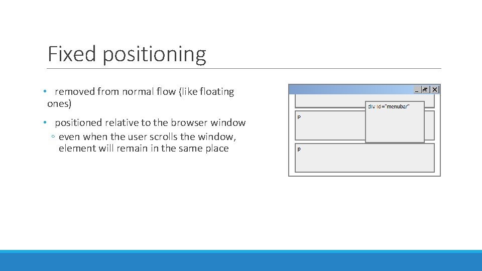
Fixed positioning • removed from normal flow (like floating ones) • positioned relative to the browser window ◦ even when the user scrolls the window, element will remain in the same place

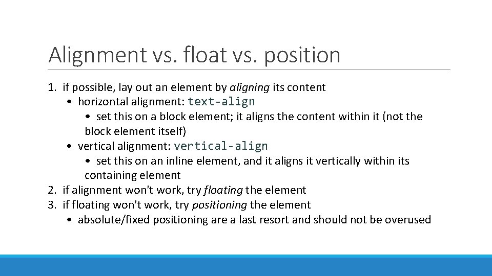
Alignment vs. float vs. position 1. if possible, lay out an element by aligning its content • horizontal alignment: text-align • set this on a block element; it aligns the content within it (not the block element itself) • vertical alignment: vertical-align • set this on an inline element, and it aligns it vertically within its containing element 2. if alignment won't work, try floating the element 3. if floating won't work, try positioning the element • absolute/fixed positioning are a last resort and should not be overused

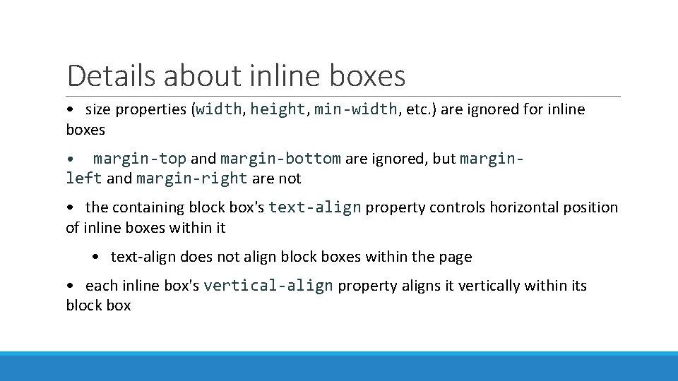
Details about inline boxes • size properties (width, height, min-width, etc. ) are ignored for inline boxes • margin-top and margin-bottom are ignored, but marginleft and margin-right are not • the containing block box's text-align property controls horizontal position of inline boxes within it • text-align does not align block boxes within the page • each inline box's vertical-align property aligns it vertically within its block box

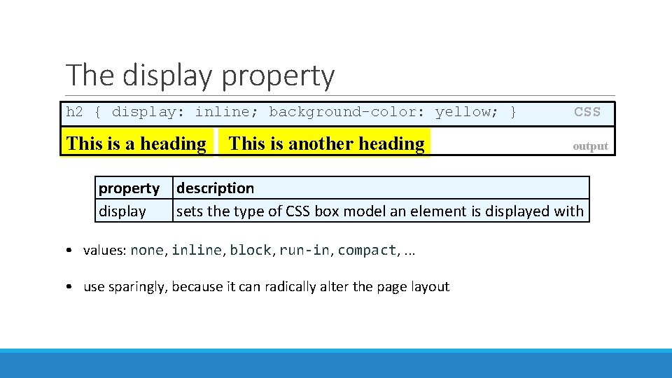
The display property h 2 { display: inline; background-color: yellow; } This is a heading This is another heading property display CSS output description sets the type of CSS box model an element is displayed with • values: none, inline, block, run-in, compact, . . . • use sparingly, because it can radically alter the page layout

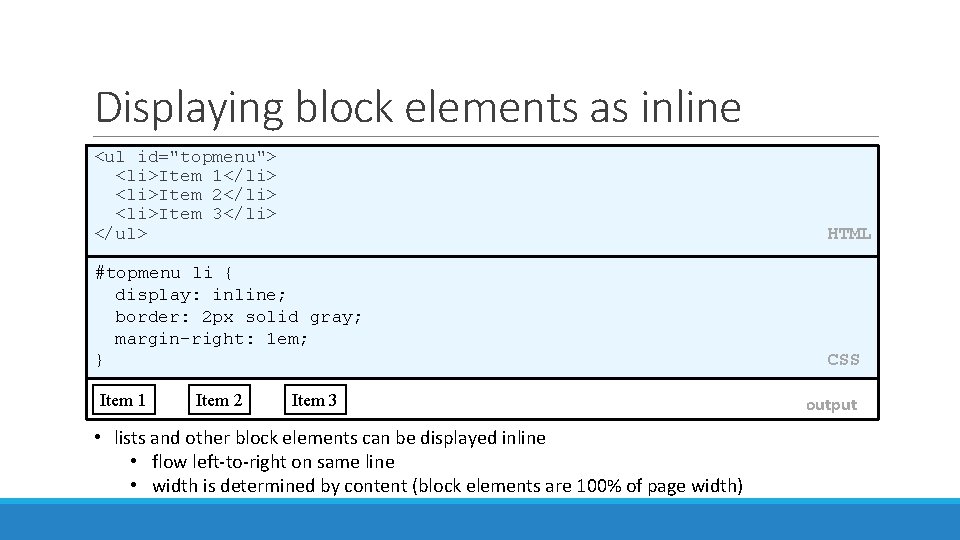
Displaying block elements as inline <ul id="topmenu"> <li>Item 1</li> <li>Item 2</li> <li>Item 3</li> </ul> HTML #topmenu li { display: inline; border: 2 px solid gray; margin-right: 1 em; } CSS Item 1 Item 2 Item 3 output • lists and other block elements can be displayed inline • flow left-to-right on same line • width is determined by content (block elements are 100% of page width)