Workshop 8 EGH 404 Workshop Visualising Data 8


")


 = True negative False positive")
 = 90. 4% 9. 6%")


 =")


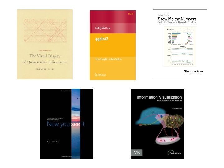


 Show Me the Numbers.")
. Information visualization: perception for design (3 rd ed)")
 Show Me the Numbers. Used with permission.")
 Show")

 Show Me the Numbers")

 Show Me the Numbers")

. Information visualization: perception for design (3 rd ed)")
. Information visualization: perception for design (3 rd ed)")

 Show Me the Numbers")
 Show Me the Numbers")
 Show Me the Numbers")

")
")


 Show Me the Numbers")
 Show Me the Numbers")


 Show Me the Numbers")
 Show Me the Numbers")
 Show Me the Numbers")

. Information visualization: perception for design (3 rd ed)")
 Show Me the Numbers. Used with permission.")

 Show Me the Numbers")

 Show Me the Numbers")
 Show Me the Numbers")
 Show Me the Numbers")
 Show Me the Numbers")
 Show Me the Numbers")
 Show Me the Numbers")
 Show Me the Numbers")

 Show Me the Numbers")
 Show Me the Numbers")
 Show Me the Numbers")
 Show Me the Numbers")
 Show Me the Numbers")


? • Graphics can lie by")

")
? • Graphics can lie by")
 Show Me the Numbers")
? • Graphics can lie by")
 Show Me the Numbers")
 Show Me the Numbers")
 Show Me the Numbers")
 Show Me the Numbers")
 Show Me the Numbers")
 Show Me the Numbers")
? • Graphics can lie by")
 Now you see it")
 Now you see it")
 Now you see it")
? • Graphics can lie by")


 Show Me the Numbers")
 Show Me the Numbers")

 Show Me the Numbers")
 Show Me the Numbers")

 Show Me the Numbers")
 Show Me the Numbers")
 Show Me the Numbers")


 Now you see it")
 Now you see it")
 Now you see it")

. Ggplot 2: elegant graphics for data analysis. New York: Springer.")


 Show Me the Numbers")
 Show Me the Numbers")
 Show Me the Numbers")


 Show Me the Numbers")


 Show Me the Numbers")

 Show Me the Numbers")
 Show Me the Numbers")


 Show Me the Numbers")
 Show Me the Numbers")


- Slides: 175
Workshop 8 EGH 404
Workshop Visualising Data 8 EGH 404
Visualising Data
“The greatest value of a picture is when it forces us to notice what we never expected to see. “When communicating results to nontechnical types there is nothing better than a clear visualization to make your point. —John Tukey “Visualization is often used for evil twisting insignificant data changes and making them look meaningful. Don't do that crap if you want to be my friend. Present results clearly and honestly. If something isn't working those reviewing results need to know.
“The greatest value of a picture is when it forces us to notice what we never expected to see. “When communicating results to nontechnical types there is nothing better than a clear visualization to make your point. —John Tukey “Visualization is often used for evil twisting insignificant data changes and making them look meaningful. Don't do that crap if you want to be my friend. Present results clearly and honestly. If something isn't working those reviewing results need to know.
“The greatest value of a picture is when it forces us to notice what we never expected to see. “When communicating results to nontechnical types there is nothing better than a clear visualization to make your point. “Visualization is often used for evil, twisting insignificant data changes and making them look meaningful. Don't do that crap if you want to be my friend. Present results clearly and honestly. If something isn't working those reviewing results need to know. —John Tukey
What is the aim of this workshop? • To introduce you to key ideas in the visual display of quantitative data – Not to make you an expert in visual design – But to alert you to excellence in graphical display
Last week in EGH 404… • Remember what we covered? • Question: should we change door choice?
Most importantly - How can we be fooled by conditional probabilities? • If P(B) > 0 then the conditional probability of A given B is Joint probability of A and B Conditional probability of A given B P(AB) P(A|B) = P(B) Unconditional probability of B
• Your engineering firm has developed a test T for damage D in a component – The test has two outcomes • T+ indicating that the test diagnoses damage • T- indicating that the test does not diagnose damage – In reality, the component can be • D+ damaged • D- not damaged
• The probability – That a component is damaged is 1% – That the test correctly diagnoses damage is 80% – That the test misdiagnoses damage is 9. 6% • What is the probability that a component diagnosed as damaged is actually damaged? • 0%-30% 30%-60% 60%-100%
Probability that there really is damage, and that the test is positive Probability that there is damage, given that the test is positive P(D+|T+) = P(D+T+) P(T+) Probability that the test is positive (whethere is damage or not)
For damaged components D+ For undamaged components D- T- T-D+ T-D- T- T+ T+D- T+ D+ D- For all components
False negative True positive T-D+ T-D- T+D+ T+D- P(D+|T+) = True negative False positive P(D+T+) P(T+)
20% 80% T-D+ T-D- T+D+ T+D- 1% 99% P(D+|T+) = 90. 4% 9. 6% P(D+T+) P(T+)
20% 80% T-D+ T-D- T+D+ T+D- 1% 99% 90. 4% 9. 6% 0. 8 × 0. 01 P(D+|T+) = P(T+)
20% 80% T-D+ T-D- T+D+ T+D- 1% 99% 90. 4% 9. 6% 0. 8 × 0. 01 P(D+|T+) = 0. 8× 0. 01 + 0. 096× 0. 99
20% 80% T-D+ T-D- T+D+ T+D- 1% 99% 90. 4% 9. 6% P(D+|T+) = 0. 07764
• The probability – That a component is damaged is 1% – That the test correctly diagnoses damage is 80% – That the test misdiagnoses damage is 9. 6% • What is the probability that a component diagnosed as damaged is actually damaged? • 7. 8%
This week in EGH 404… 1. 2. 3. 4. Why use graphics? How do we make sense of graphics? How can graphics tell the truth (or lie)? How can graphics better reveal the truth of our data? 5. What are some common pitfalls, and how can we avoid them?
Why use Graphics? • To critically interpret the graphics of others – So we aren’t fooled or misled by other people’s graphs • To present quantitative information effectively – So we don’t fool or mislead others with our graphs • These are two important aspects of – Being a critical thinker – Being a trusted expert (e. g. , a professional engineer)
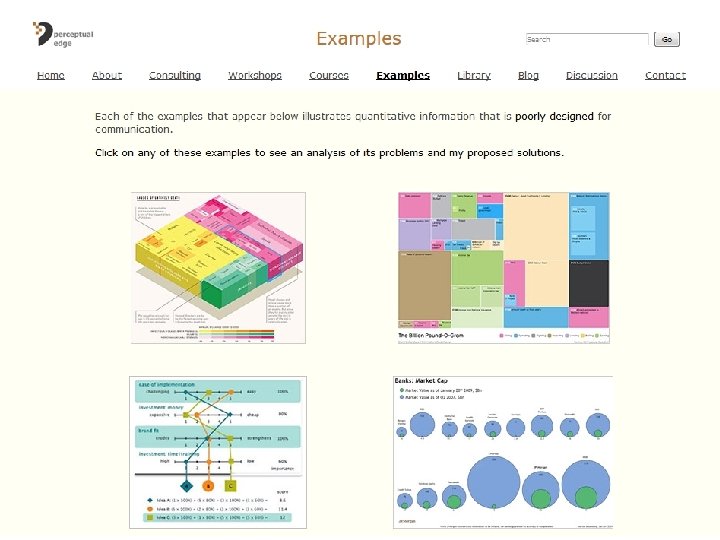
• Please visit Perceptual. Edge. com – Click through the examples to see an analysis of graphical problems and Stephen’s proposed solutions • Part of Assessment 2 b asks you to identify problems with and propose solutions for different graphics – Stephen Few’s examples show an expert would do this. – You will be asked to respond more briefly in your Assessment, but you should take note of the types of problems Stephen identifies
Please read and make sense of the examples at http: //www. perceptualedge. com/examples. php
Further reading from Stephen Few: http: //www. perceptualedge. com/blog • Statisticians, Remember Your Native Tongue – Critique and redesign of paired bubble chart and bar graph • To Err Is Human – Redesign of a dashboard that used two scales • Avoiding Quantitative Scales That Make Graphs Hard to Read – Advice on how to make good choices for y-axis scales • Is the Avoidance of 3 -D Bar Graphs a Knee-Jerk Reaction? – Discusses the errors that people make in interpreting 3 -D bar graphs • When Are 100% Stacked Bar Graphs Useful? – Explores some of the problems of stacked bar graphs, and situations where they can work well
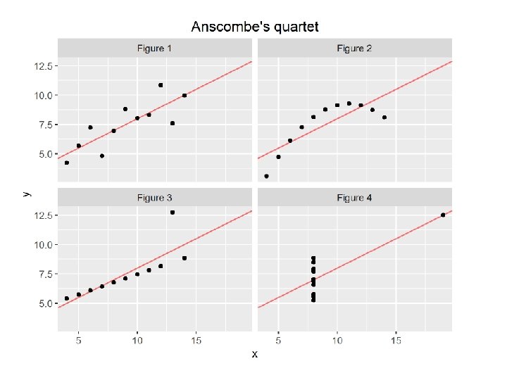
Tufte says: Graphics reveal data I II IV x y x y 10. 0 8. 04 10. 0 9. 14 10. 0 7. 46 8. 0 6. 58 8. 0 6. 95 8. 0 8. 14 8. 0 6. 77 8. 0 5. 76 13. 0 7. 58 13. 0 8. 74 13. 0 12. 74 8. 0 7. 71 9. 0 8. 81 9. 0 8. 77 9. 0 7. 11 8. 0 8. 84 11. 0 8. 33 11. 0 9. 26 11. 0 7. 81 8. 0 8. 47 14. 0 9. 96 14. 0 8. 10 14. 0 8. 84 8. 0 7. 04 6. 0 7. 24 6. 0 6. 13 6. 08 8. 0 5. 25 4. 0 4. 26 4. 0 3. 10 4. 0 5. 39 19. 0 12. 50 12. 0 10. 84 12. 0 9. 13 12. 0 8. 15 8. 0 5. 56 7. 0 4. 82 7. 0 7. 26 7. 0 6. 42 8. 0 7. 91 5. 0 5. 68 5. 0 4. 74 5. 0 5. 73 8. 0 6. 89
Tufte says: Graphics reveal data Property Value Mean of x in each case 9 Sample variance of x in each case 11 Mean of y in each case 7. 5 Sample variance of y in each case 4. 1 Correlation between x and y in each case 0. 82 Linear regression line in each case y = 3 + 0. 5 x
• Data analysis is the process to turn: Raw Data Knowledge, Insight, Understanding • The visualisation and graphical interpretation of data is often crucial to this process.
Tufte says: Graphics reveal data • We say: – Graphics can reveal data – They can also distort and obscure data • To understand how graphics can reveal, distort and obscure data, it helps to understand how we perceive data visually
What’s the story of this workshop? 1. 2. 3. 4. Why use graphics? How do we make sense of graphics? How can graphics tell the truth (or lie)? How can graphics better reveal the truth of our data? 5. What are some common pitfalls, and how can we avoid them?
What are our primary senses? Image from Stephen Few (2012) Show Me the Numbers. Used with permission.
Source: Ware, C. (2013). Information visualization: perception for design (3 rd ed)
Image from Stephen Few (2012) Show Me the Numbers. Used with permission.
Preattentive Fast! We perceive things without conscious thought Image from Stephen Few (2012) Show Me the Numbers. Used with permission.
How many 5 s?
Source: Stephen Few (2012) Show Me the Numbers
How many 5 s?
Source: Stephen Few (2012) Show Me the Numbers
How many 5 s? • Preattentive attributes – Can make things really stand out – Can help us show things “at a glance” • What visual attributes can make things stand out?
Source: Ware, C. (2013). Information visualization: perception for design (3 rd ed)
Source: Ware, C. (2013). Information visualization: perception for design (3 rd ed)
Category Form Attribute Length Width Orientation Shape Size Enclosure Color Hue Intensity Spatial position 2 -D position Source: Stephen Few (2012) Show Me the Numbers
Source: Stephen Few (2012) Show Me the Numbers
Source: Stephen Few (2012) Show Me the Numbers
Source: Stephen Few (2012) Show Me the Numbers
Category Form Attribute Length Width Orientation Shape Size Enclosure Color Hue Intensity Spatial position 2 -D position Source: Stephen Few (2012) Show Me the Numbers
How many units in the red bar? 18 ? Adapted from Stephen Few (2012) Show Me the Numbers.
How many units in the red circle? 1 ? Adapted from Stephen Few (2012) Show Me the Numbers.
Category Form Color Spatial position Attribute Quantitatively perceived? Length Yes Width Yes, but limited Orientation No Shape No Size Yes, but limited Enclosure No Hue No Intensity Yes, but limited 2 -D position Yes Source: Stephen Few (2012) Show Me the Numbers
How can we use visual attributes in display designs? • To encode – Quantity • length, position – width, size, intensity – Quality • length, position • width, orientation, shape, size, enclosure, hue, intensity
How can our visual perception of data be misled? • Our visual sense perceives differences, rather than absolute values
Source: Stephen Few (2012) Show Me the Numbers
Source: Stephen Few (2012) Show Me the Numbers
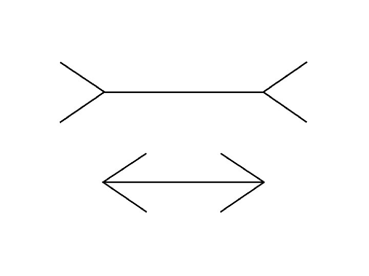
How can our visual perception of data be misled? • Our visual sense takes context into account
How can our visual perception of data be misled? • See Michael Bach’s Optical Illusions & Visual Phenomena for more
What are the limits to distinct perception? • Preattentive symbols become less distinct as the variety of distractors increases – It is easy to spot a single hawk in a sky full of pigeons… – but if the sky contains a greater variety of birds, the hawk will be more difficult to see Source: Ware, C. (2013). Information visualization: perception for design (3 rd ed)
Source: Stephen Few (2012) Show Me the Numbers
Source: Stephen Few (2012) Show Me the Numbers
Source: Stephen Few (2012) Show Me the Numbers
How can we describe colour? • Humans have three distinct colour receptors – Cone cells • Human colour perception is described in three dimensions, e. g. , – Red, green, blue (TV screens) – Red, yellow, blue (primary colours) – Cyan, magenta, yellow (colour printing) Source: Ware, C. (2013). Information visualization: perception for design (3 rd ed)
Source: Ware, C. (2013). Information visualization: perception for design (3 rd ed)
HSL representation Image from Stephen Few (2012) Show Me the Numbers. Used with permission.
HSL representation • Hue • Intensity – Saturation – Lightness/Luminosity Image from Stephen Few (2012) Show Me the Numbers. Used with permission.
Source: Stephen Few (2012) Show Me the Numbers
How do we perceive multiple objects? • Gestalt principles of visual perception • Gestalt – German, = form, shape – A ‘shape’, ‘configuration’, or ‘structure’ which as an object of perception forms a specific whole or unity incapable of expression simply in terms of its parts (e. g. a melody in distinction from the notes that make it up)
Source: Stephen Few (2012) Show Me the Numbers
Source: Stephen Few (2012) Show Me the Numbers
Source: Stephen Few (2012) Show Me the Numbers
Source: Stephen Few (2012) Show Me the Numbers
Source: Stephen Few (2012) Show Me the Numbers
Source: Stephen Few (2012) Show Me the Numbers
Source: Stephen Few (2012) Show Me the Numbers
0% 5% 10% 15% 20% 25% 30% 35% 40% Item 1 Item 2 Item 3 Item 4 Item 5 Item 6 Source: Stephen Few (2012) Show Me the Numbers
Left aligned Right aligned Source: Stephen Few (2012) Show Me the Numbers
Source: Stephen Few (2012) Show Me the Numbers
Source: Stephen Few (2012) Show Me the Numbers
Source: Stephen Few (2012) Show Me the Numbers
Source: Stephen Few (2012) Show Me the Numbers
How do we perceive multiple objects? • Gestalt principles of visual perception – Proximity • Objects that are close together are perceived as a group – Similarity • Objects with similar attributes are perceived as a group – Enclosure • Objects that appear to have a boundary around them are perceived as a group – Closure • Open structures are perceived as closed, complete, regular when there is a way they can be reasonably interpreted as such – Continuity • Objects aligned together or appear to be a continuation of one another are perceived as a group – Connection • Objects that are connected are perceived as a group
What’s the story of this workshop? 1. 2. 3. 4. Why use graphics? How do we make sense of graphics? How can graphics tell the truth (or lie)? How can graphics better reveal the truth of our data? 5. What are some common pitfalls, and how can we avoid them?
3. How can graphics tell the truth (or lie)? • Graphics can lie by representing quantities inconsistently • Tufte: – The representation of numbers, as physically measured on the surface of the graphic itself should be directly proportional to the numerical quantities represented
24 mm ≡ 18 mpg 1 mm ≡ 0. 75 mpg 196 mm ≡ 27. 5 mpg 1 mm ≡ 0. 14 mpg Source: New York Times, used by Edward Tufte (2001) The Visual Display of Quantitative Information.
$14 6 years 1 year Source: New York Times, used by Edward Tufte (2001) The Visual Display of Quantitative Information.
3. How can graphics tell the truth (or lie)? • Graphics can lie by giving a misleading impression of variation
Source: Stephen Few (2012) Show Me the Numbers
3. How can graphics tell the truth (or lie)? • Graphics can lie by misrepresenting the relationship between data points
Source: Stephen Few (2012) Show Me the Numbers
Source: Stephen Few (2012) Show Me the Numbers
Source: Stephen Few (2012) Show Me the Numbers
Source: Stephen Few (2012) Show Me the Numbers
Source: Stephen Few (2012) Show Me the Numbers
Source: Stephen Few (2012) Show Me the Numbers
3. How can graphics tell the truth (or lie)? • Graphics can lie by omitting relevant context • Tufte: – To be truthful and revealing, data graphics must bear on the question at the heart of quantitative thinking: “Compared to what? ” – Graphics must not quote data out of context
Source: Stephen Few (2009) Now you see it
Source: Stephen Few (2009) Now you see it
Source: Stephen Few (2009) Now you see it
3. How can graphics tell the truth (or lie)? • Graphics can lie by omitting relevant context – Please remember that • Axis labels • Scales • Titles – are all relevant context – See also Stephen Few on Avoiding Quantitative Scales That Make Graphs Hard to Read
Quick Exercise – 5 mins • Open up Matlab and run below: x = linspace(0, 2*pi, 6); y = cos(2*x); plot(x, y); • Whats wrong with this? • How would you change it?
What’s the story of this workshop? 1. 2. 3. 4. Why use graphics? How do we make sense of graphics? How can graphics tell the truth (or lie)? How can graphics better reveal the truth of our data? 5. What are some common pitfalls, and how can we avoid them?
4. How can graphics better reveal the truth of our data? • Graphics can better reveal the truth by enabling our vision system to make accurate comparisons
Source: Stephen Few (2012) Show Me the Numbers
Source: Stephen Few (2012) Show Me the Numbers
4. How can graphics better reveal the truth of our data? • Graphics can better reveal the truth by enabling our vision system to make accurate comparisons
Source: Stephen Few (2012) Show Me the Numbers
Source: Stephen Few (2012) Show Me the Numbers
4. How can graphics better reveal the truth of our data? • Graphics can better reveal the truth by enabling our vision system to make accurate comparisons
Source: Stephen Few (2012) Show Me the Numbers
Source: Stephen Few (2012) Show Me the Numbers
Source: Stephen Few (2012) Show Me the Numbers
How can graphics better reveal the truth of our data? • Graphics can better reveal the truth by enabling our vision system to perceive – Patterns and regularities – Outliers and irregularities
Source: Stephen Few (2009) Now you see it
Source: Stephen Few (2009) Now you see it
Source: Stephen Few (2009) Now you see it
4. How can graphics better reveal the truth of our data? • Graphics can better reveal the truth by showing the data – Not the chartjunk – Not the redundant ink – Not the fill patterns • Tufte: – Maximise the data-ink ratio, within reason – Erase non-data-ink, within reason – The larger the share of a graphic’s ink devoted to data, the better
Source: Wickham, H. (2009). Ggplot 2: elegant graphics for data analysis. New York: Springer.
0% Item 1 Item 2 Item 3 Item 4 Item 5 Item 6 5% 10% 15% 20% 25% 30% 35% 40%
0% Item 1 Item 2 Item 3 Item 4 Item 5 Item 6 5% 10% 15% 20% 25% 30% 35% 40%
0% Item 1 Item 2 Item 3 Item 4 Item 5 Item 6 5% 10% 15% 20% 25% 30% 35% 40%
0% Item 1 Item 2 Item 3 Item 4 Item 5 Item 6 5% 10% 15% 20% 25% 30% 35% 40%
0% Item 1 Item 2 Item 3 Item 4 Item 5 Item 6 10% 20% 30% 40%
How can we make this chart worse? 0% Item 1 Item 2 Item 3 Item 4 Item 5 Item 6 5% 10% 15% 20% 25% 30% 35% 40%
…add fill patterns! 0% Item 1 Item 2 Item 3 Item 4 Item 5 Item 6 5% 10% 15% 20% 25% 30% 35% 40%
But wai t! H mak e th ow c is ch ould art wor we se?
Kouchoukos, N. T. , Davila-Roman, V. G. , Spray, T. L. , Murphy, S. F. , & Perrillo, J. B. (1994). Replacement of the aortic root with a pulmonary autograft in children and young adults with aortic-valve disease. The New England Journal of Medicine, 330(1), 1– 6.
What’s the story of this workshop? 1. 2. 3. 4. Why use graphics? How do we make sense of graphics? How can graphics tell the truth (or lie)? How can graphics better reveal the truth of our data? 5. What are some common pitfalls, and how can we avoid them?
5. What are some common pitfalls, and how can we avoid them? • Just because you can plot and decorate a graphic, doesn’t mean you should
Silly graphs that are best forsaken • Stephen Few: – Several graphs that are readily available in software fail miserably at data presentation – The stories that people attempt to tell with these graphs can be told simply and clearly using alternatives
Silly graph
Silly graph
Alternative
Silly graph
Alternative
Silly graph
Alternative
Silly graph
Alternative
Silly graph
Alternative
Silly graph
Alternative
When to use a table? When to use a graph? • How will the information be used? – To look up one or more particular values • Tables make it easy to look up individual values – To examine a set of quantitative values to discern patterns or irregularities • Graphs are used to display relationships among and between sets of quantitative values by giving them shape Source: Stephen Few (2012) Show Me the Numbers
• Tufte: – Tables usually outperform graphics in reporting on small sets of 20 number or less – The special power of graphics comes in the display of large datasets • “usually” is not “always”… Source: Stephen Few (2012) Show Me the Numbers
Source: Stephen Few (2012) Show Me the Numbers
Source: Stephen Few (2012) Show Me the Numbers
Source: Stephen Few (2012) Show Me the Numbers
When to use a table? When to use a graph? • You can get the best of both worlds: – Average monthly temperature – World car production Source: Stephen Few (2012) Show Me the Numbers
What’s the story of this workshop? Why use graphics? How do we make sense of graphics? How can graphics tell the truth (or lie)? How can graphics better reveal the truth of our data? • What are some common pitfalls, and how can we avoid them? • •
What do you need to do to prepare for next week? • Get ready for Assessment 2 b – You will be given some quantitative problems to work on (eg: making sense of conditional probabilities). – You will be given some graphs and their data, and asked to list and briefly explain each of the problems that you detect in the design of these graphs, and come up with an alternative. – By studying the slides and content from this Workshop (including the extra reading, exercise notes, and graphic goodness at the end).
What do you need to do to prepare for this week’s Tute? • How can I analayse and visualise data in Matlab • Either bring your own installed version of Matlab, or access it on the QUT lab PCs.
In your own time: Exercise 1 Source: Stephen Few (2012) Show Me the Numbers
• Wrong type of graph: scatterplots display correlations – too few points for that • Maybe it could be a time series plot of revenue and guests? Title in different for no reason Points too small to distinguish Axes too prominent No reason for yaxis labels to be so prominent No currency information Grid lines unnecessary; too prominent No year information No reason for legend to be so prominent Source: Stephen Few (2012) Show Me the Numbers
• Use three line graphs arranged vertically – Time on horizontal axis • Graph 1: Number of guests • Graph 2: Revenue dollars • Graph 3: Revenue per guest • Align axis titles with labels • Use the same font throughout • Add a date • Add currency indicator • Remove gridlines • Mute the axis lines • Remove legend Source: Stephen Few (2012) Show Me the Numbers
Source: Stephen Few (2012) Show Me the Numbers
• Since so little is changing, Few adds a second set of graphs with non-zero based y-axes Source: Stephen Few (2012) Show Me the Numbers
Source: Stephen Few (2012) Show Me the Numbers
Exercise 2 Source: Stephen Few (2012) Show Me the Numbers
• Graph lines connect nominal variables • 3 -D graphs are impossible to read easily • Data points are occluded • Too many categorical items for a single graph Scale too precise Too many tick marks and labels Vertical text is hard to read Grid lines add no value Quarters unnecessarily bold Source: Stephen Few (2012) Show Me the Numbers
• Place time on the x-axis – so the quarters will be connected by lines, not the products • Use a 2 -D graph • Encode time series information as a separate line for each product • Construct a series of graphs, rather than one for all 12 products – Products group nicely into groups of four • Reduce the number of ticks and labels • Remove the decimals • Remove the grid lines Source: Stephen Few (2012) Show Me the Numbers
Source: Stephen Few (2012) Show Me the Numbers
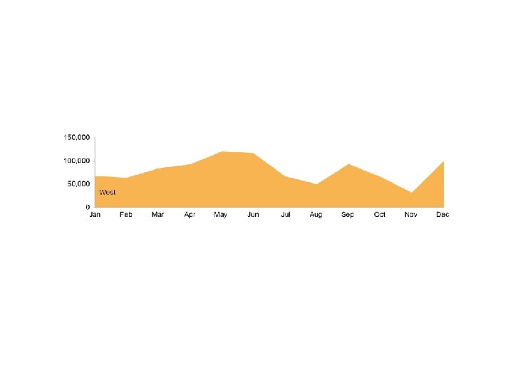
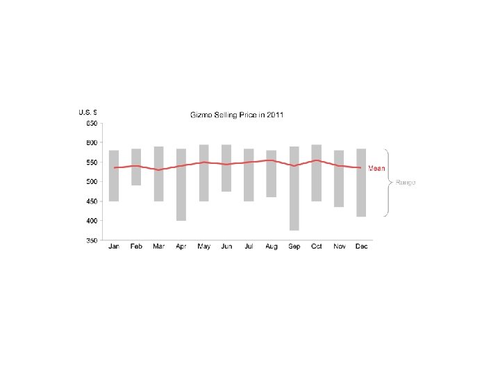
Exercise 3 Source: Stephen Few (2012) Show Me the Numbers
• • • Using separate bars for max, mean, min does not show patterns over time in mean or range Means are most important, but less visually prominent than the max Sequencing mean after max and min is awkward Far too many parts of this graph are visually prominent; the information does not stand out Horizontal ticks are unnecessary Source: Stephen Few (2012) Show Me the Numbers
• Encode the mean values as a line – Max and min range can be encoded as boxes • Highlight the mean • Mute the supporting components • Remove tick marks on the categorical axis
But wait! There’s more graphic goodness • Hans Rosling's 200 Countries, 200 Years, 4 Minutes - The Joy of Stats - BBC Four – Tufte said • “If the statistics are boring, then you've got the wrong numbers” • but maybe you just need Hans Rosling to present them • Rosling's Gap. Minder exploits our perception of shape and motion to great effect.
But wait! There’s more graphic goodness • Flowing Data’s Causes of Death • Han’s Rosling asks “Will saving poor children lead to overpopulation? ” • Quartz on – when it’s OK not to start your y-axis at zero – The most misleading charts of 2015… fixed! • Tatsuki Koyama: Beware of dynamite!