Visualising Variables Validly November 2008 Damien Jolley Monash

Visualising Variables – Validly! November 2008 Damien Jolley Monash Institute of Health Services Research Monash University AHMRC Posters

Download slides from: http: //www. jolley. com. au Weather information, New York Times, September ‘ 08

Download slides from: http: //www. jolley. com. au Obvious fact #1: l Graphs can communicate data: l quickly l accurately l powerfully l efficiently

Download slides from: http: //www. jolley. com. au “Only 50% of American 17 -year-olds can identify information in a graph”* * US National Assessment of Educational Progress, June 1990 Source: Wainer H. Understanding graphs and tables. Educational

Download slides from: http: //www. jolley. com. au Whose fault? Drawn using MS Excel ‘XY-chart’ “Like characterising someone’s ability to read by asking questions about a passage full of spelling and grammatical errors. What are we really testing? ” Source: Wainer H. Understanding graphs and tables. Educational

Download slides from: http: //www. jolley. com. au Obvious fact #2: l Bad graphs can hinder communication

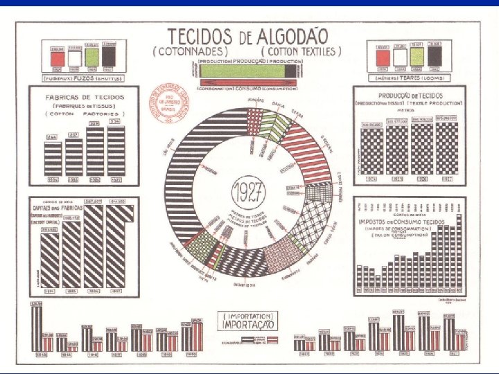
http: //www. odt. org

Download slides from: http: //www. jolley. com. au www. gapminder. org

Download slides from: http: //www. jolley. com. au Less obvious facts #3, #4, #5: l l l What characterises a “good” graph? What are the characteristics of a “bad” graph? What software to use? How to use it?

Download slides from: http: //www. jolley. com. au Howie’s Helpful Hints for bad graph displays l l Ten useful pointers to help you create uninformative, difficult-to-read scientific graphs Adapted from: Wainer H. (1997) Visual Revelations. Mahwah, NJ: Lawrence Erlbaum Associates, Publishers

Download slides from: http: //www. jolley. com. au Steps for better graphs 1. Identify direction of effect l l 2. Identify the levels of measurement l 3. Nominal, ordinal or quantitative are different! Think of visual perception guides l 4. In almost all cases, the cause or predictor variable should be horizontal (X) Effect or outcome variable is best vertical (Y) Columns or dots? Lines or scatterplot? Minimise guides and non-data l Grid lines, tick marks, legends are non-data
 and effect (Y) Figure")
Download slides from: http: //www. jolley. com. au Cause (X) and effect (Y) Figure 16 Standard deviation of batting averages for all full-time players by year for the first 100 years of professional baseball. Note the regular decline. * Time Standard deviation * My emphasis Source: Gould, Stephen Jay. Full House: The Spread of Excellence from Plato to Darwin. Random House, 1997.

Source: Killias M. International correlations between gun ownership and rates of homicide and suicide. Can Med Assoc
 50 USA 10 Belgium")
Rate of homicide with a gun (per million per year) 50 USA 10 Belgium Finland Australia Canada France 5 Switzerland Spain Netherlands Norway West Germany 1 Scotland England & Wales 10 20 30 % of households owning guns Drawn using S-plus 40

Download slides from: http: //www. jolley. com. au Levels of Measurement l l The right display for a variable depends on its level of measurement l s l l l Qualitative s qualitative barplot ordinal column chart quantitative boxplot or histogram l s l For bivariate graphs, l l l X ordinal, Y binary connected percents X & Y both quantitative scatterplot X categorical, Y quant box plots l eg race, political party, religion Diverging eg change (-ve to +ve) Ordinal s l eg gender, death, pregnant Categorical l For univariate graphs, l Binary eg rating scale, skin type, colour Quantitative l Interval s l only differences matter, eg BP, IQ Ratio s absolute zero, ratios matter, eg weight, height, volume

Outcome is COHb%, but drawn on X Ordinal variable, but categories mixed Source: Lewis S, Mason C, Srna J. Carbon monoxide exposure in blast furnace workers. Aust J Public Health.

Download slides from: http: //www. jolley. com. au Outcome variable An alternative display. . . Predictor variable Drawn using MS Excel ‘bubble Area of circles proportional to n

Download slides from: http: //www. jolley. com. au Principles of visual perception l WS Cleveland l much work in psychophysics of human visual understanding Tells us: l l l hierarchy of visual quantitative perception patterns and shade can cause vibration graphs can shrink with almost no loss of information Source: Cleveland WS. The Elements of Graphing Data. Monterey: Wadsworth, 1985.

Download slides from: http: //www. jolley. com. au Ubiquitous column charts Source: Jamrozik K, Spencer. CA, et al. Does the Mediterranean paradox extend to abdominal aortic aneurism? Int J Epidemiol 2001;

Download slides from: http: //www. jolley. com. au A dotchart version… Drawn using S-plus “Trellis”

Moiré vibration is easy with a computer !!!

Download slides from: http: //www. jolley. com. au Moiré vibration l Vibration is maximised with lines of equal separation l This is common in scientific column charts cited in Tufte E. The Visual Display of Quantitative

Download slides from: http: //www. jolley. com. au Minimise non-data ink Greeks in Greece Anglo-Celts in Australia Japanese in Japan Swedes in Sweden Greeks in Australia 0. 10 0. 25 0. 50 0. 75 1. 00 Relative mortality rate (all causes) l Non-data ink includes tick marks, grid lines, background, legend l Explanation of error bars, P-values can be included in caption or in text Note the exception for X-Y orientation: because predictor is qualitative

Download slides from: http: //www. jolley. com. au Software for scientific graphics l Dedicated programs – thousands! l l l Delta. Graph (SPSS) Prism Vi. Sta l Graphics in statistical packages l Stata s l S-Plus, R s l l Business graphics l l MS Excel many other spreadsheet programs easy, expensive Systat s l powerful, difficult SPSS interactive graphics s l simple, powerful good reputation SAS GRAPH language s expensive, powerful Advice: Avoid “default” choice in all programs (almost always wrong). Avoid programs with “Chart Type” menus – wrong approach.

Download slides from: http: //www. jolley. com. au Graph formats l Object-oriented l l lines, shapes, etc can be identified within graph each object has attributes (eg size, colour, font) editable using selection and “grouping” Common formats: l l l Postscript (ps, eps) Windows metafile (wmf, emf) Bit-mapped l l l image exists as a collection of pixels each pixel is light or dark, coloured can edit only pixels not objects often “compressed” to save disk space, bandwidth Common formats l l l graphics interchange (gif) Windows bitmap (bmp) JPEG interchange (jpg) Advice: Use WMF format where possible. Paste WMF into Power. Point, “ungroup”, then edit objects for publication quality.

Download slides from: http: //www. jolley. com. au References, further reading Cleveland WS. Wilkinson L. Visualizing Data The Grammar of Graphics Summit NJ: Hobart Press, 1993 New York: Springer Verlag, 1999 Tufte ER. Wainer H. The Visual Display of Quantitative Information Visual Revelations. Graphical Tales of Fate and Deception from Napoleon Bonaparte to Ross Perot Cheshire, CT: Graphics Press 2001 www. edwardtufte. c om Mahwah, NJ: Lawrence Erlbaum Associates, Publishers. 1997

Download slides from: http: //www. jolley. com. au Summary l Howie’s Helpful Hints for bad graphs: l l Steps for better graphs: l l l Don’t show the data Show the data inaccurately Obfuscate the data Identify direction of cause & effect Exploit levels of measurement Accommodate visual perception principles Minimise non-data ink Don’t use Excel unless you have to l And if you have to, don’t use the default chart!
- Slides: 28