UNIT ONE Introduction to Cartography Cartography is the


 scale – Ø It is the expression of map distance in")


 Ø")

: Ø The area of a figure on the earth")
 can")
 Ø UTM is a cylindrical map projection established in")
 system: Ø The Projection is the")


 define seven controls on the map design process; 1")


 then")


- Slides: 65
UNIT ONE Introduction to Cartography Ø Cartography is the art and science of making maps. Ø INTERNATIONAL Cartographic Association (ICA) defines Cartography as; ü "the discipline dealing with the conception, Production, dissemination and study of maps". ü It goes on to describe a map as ''a symbolized image of geographic reality, representing selected features or characteristics, resulting from the creative effort of its author's execution of choices" q Goals of Cartography ; ü To Communicate geographical information graphically. q The look of a map depends on; ü The needs of the audience and ü The point that you aim to convey.
Map Ø A graphic depiction of all or part of a geographic realm in which the real-world features have been replaced by symbols in their correct spatial location at a reduced scale. Ø A symbolized image of geographic reality, representing selected features or characteristics resulting from the creative efforts of cartographers and designed for use when spatial relationships are of special relevance. Ø Map is a mathematically determined representation of the Earth’s surface systematically plotted to scale upon a plane surface. Ø A graphic representation drawn to scale using colors, symbols, and labels. Ø An abstraction. Ø Medium for displaying geographic information. Ø A primary language of geography.
Maps tells to us: Ø Location of the required place and its name. Ø Give information about the surrounding features. Ø The distance b/n two d/t features. Ø Indicates the direction of the required features. Ø The relationship b/n d/t features.
A well-designed map should include: q Clarity: ü Suppose, to produce an effective Geomorphological map (E. g. an effect of glaciation on a landscape), the map-maker need to deeply understand about that geomorphologic action q Order: ü Sequenced as Title, overall pattern, map legend, peripheral data. q Balance: ü refers to the overall layout of the map elements (title, legend, scale, north arrow or inset maps and border). q Visual Contrast: ü The clarity of the map derives in part from clear visual contrast between symbols used to represent different features – It gives the eye a focal point and makes the map more interesting/attract mapreader’s attention Ø A map that contains only lines of the same color and weight is unlikely to attract the map reader's attention.
q. Unity and Harmony: ü The map shouldn’t be too complex, but even if it represents complex spatial patterns, the map-reader must understand it at a glance – use related/consistent symbols, colors and patterns. q. Visual Hierarchy: ü According to the purpose of the map, unnecessary information should be eliminated entirely – Information that is relevant to the purpose of the map should be symbolized in a way that makes more important information visually more prominent.
Basic characteristics of all maps: Ø all maps are concerned with two primary elements. ü locations and attributes. Ø all maps are reductions of reality (scale). Ø all maps are transformations of space. ü map projections and coordinate systems. Ø all maps are abstractions of reality. (generalization and its components) Ø all maps use signs and symbolism. (Cartographic symbolization).
Types of Maps q Based on function there are three broad categories of maps 1, Reference maps Ø generally show several types of spatial data without specific emphasis on one type over another. Ø Reference maps can vary in their complexity and size, but generally include just the various geographic features that give a picture of the area being mapped, e. g. political boundaries, cities, and topographic features.
2 THEMATIC MAP Ø The map which has a specific theme or focus. Ø Thematic maps can vary in topic, complexity, purpose and kind of representation. Ø They generally show characteristics, or attributes, of features that vary spatially. Ø The attribute can vary in a qualitative or nominal way, e. g. categories of land cover; or the attribute can vary in a quantitative way, e. g. amount of precipitation. Ø Thematic maps can represent data with points, lines, areas or volumes.
3 SPACIAL PURPOSE MAPS Ø It lie somewhat between reference maps and thematic maps as they are often reference-like in their use but are made for specific types of users or pertain to a specific type of data. Ø Navigational maps, like those in road atlases , are considered special-purpose maps, as are maps for certain industries or occupations, like soil maps, and municipal utility maps.
q. Based on scale, there are three types of maps. They are: ü Small scale maps ü Medium scale maps ü Large scale maps
q Larger_ scale maps are: ü Less area ü More detail ü Less generalization ü Less classification q. Smaller_ scale maps are: ü More area ü Less detail ü More generalization ü More classification
q. Map Symbolization Ø Symbolization is the processing of assigning symbols to represent features. . Ø Many factors must be considered when selecting symbols for a map, such as; ü The scale Of the map, ü The nature of the phenomenon being mapped, ü The available data, and the display method of the finished product.
q The following sections explore the symbolization process in greater depth. Ø There is no consensus on the quantitative limits of the terms small, medium, and large scale. Nevertheless, in the junior high school textbooks, maps with scales of 1: 50, 000 or greater are large scale maps. Ø The term large refers to the relative sizes at which objects are represented on the map. Accordingly, when little reduction is involved and features such as roads are large, the map is termed a large scale map. Ø They show greater details of reality as shown in the topographical map of Ethiopia.
Ø Maps with scales ranging from 1: 50, 000 to 1: 250, 000 are medium scale maps. Ø The term medium refers to the relative sizes at which objects are represented on the map. Accordingly, when medium reduction is involved and features such as roads are medium in size, the map is termed a medium scale map
Ø Maps with scales greater than 1: 250, 000 are small scale maps. Accordingly, when large reduction is involved and features such as roads are small, the map is termed a smallscale map. Ø Thus, reality is represented in a highly generalized or simplified manner on smallscale maps whereas it is represented in detail on large-scale maps.
Maps Based on Subject Matter Ø It is also useful to group maps on the basis of the subject matter they portray. But there is no limit to the number of classes of maps that can be created by grouping them according to their dominant subject matter. Thus, there are; ü ü ü geological maps, climatic maps, population maps, economic maps, statistical maps, cadastral maps, plans. etc
ways of representing scale on maps q There are three customary ways of expressing scale on a map. § They are representative fraction, graphic and verbal scale. 1. Representative fraction (RF) - is a ratio expressing the relationship of the number of units on the map to the number of the same units on the real earth. It can be shown either as 1: 50 000 or 1/50 000. Ø In this scale, it means that one unit length on the map represents 50 000 units of length on the earth’s surface Ø The unit of distance in both the numerator and denominator of the fraction must be the same. Ø For example, you can read the scale mentioned above as one millimetre on the map represents 50 000 millimetres on the earth’s surface. It is also possible to read it as one centimeter on the map represents 50 000 centimeters on the earth’s surface.
2 Verbal (Statement) scale – Ø It is the expression of map distance in relation to the same earth distance in words. For example, one centi-meter to one kilometer or one centimeter represents one kilo-meter is an example of a verbal scale.
3. Graphic or Bar Scale Ø is a line or a bar subdivided to show map distance, and the same distance on the earth’s surface. Ø The distance between any two divisions can be measured with a ruler, and you can read the map distance. Ø This distance on the map has the ground distance as labeled on the line or bar. Ø This form of scale is very useful when the map is to be reduced during reproduction because it changes in correct proportion to the amount of reduction.
Purpose of map Ø The look of a map depends largely on its intended use and intended audience. Examples, store geographic information ü aid navigation or mobility ü aid analysis, such as measuring or computing ü Summarize large amounts of statistical data forecasting or detecting trends ü Visualize what was otherwise invisible
Elements of map Ø The title identifies the map area and the type of map. Ø Cartographers may list the title simply or artistically. Ø Another important feature on a map is the legend or map key. Ø Information needed to read a map is found in the map legend
Ø Most maps use symbols or colors to represent different geographic features. The map legend helps determine what the symbols and colors mean. Ø Almost all maps have scales. Ø Scales compare a distance measured on the map to the actual distance on the surface of the earth. Ø Scales appear on maps in several forms, but most cartographers draw a line scale as a point of reference Ø Some cartographers place an arrow that points to the North Pole on the map. This is a “north arrow. ”
UNIT TWO MAP PROJECTION AND COORDINATE SYSTEM Ø Coordinate: is a set of numbers that designate location in a given reference system, such as, x, y in a plane coordinate system or x, y, z in a three dimensional coordinate system. Ø Coordinate pairs represent location on the earth's surface relative to other locations.
Ø A Coordinate System is a reference system used to measure horizontal and vertical distances on a plan metric (flat surface) map. Ø A coordinate system is used to define a location on the Earth. Ø It is created in association with a map projection, datum, and reference ellipsoid and describes locations in terms of distances or angles from a fixed reference point.
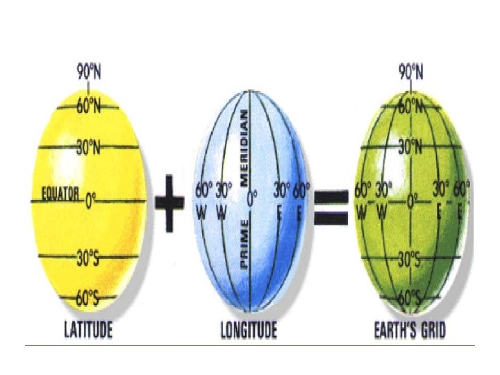
There are 2 types of coordinate systems: q Geographic Coordinate Systems /unprojected/ spherical ü A reference system using latitude and longitude to define the location of points on the surface of the earth. q. Projected Coordinate Systems ü A Projected coordinate system (PCS) is a twodimensional planar surface. ü However, the Earth's surface is threedimensional. Transforming three-dimensional space onto a two-dimensional surface is called projection.
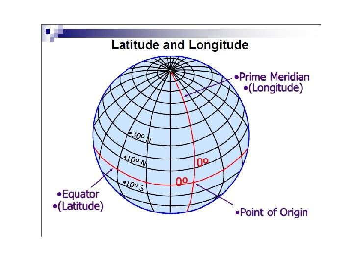
Latitude and Longitude Ø Coordinates are expressed in degrees, minutes and seconds. Ø Position coordinates are based on an angular distance from a known reference point. Ø LATITUDE measures the position of a given point in terms of it’s angular distance from the equator. Ø That is, latitude is an indicator of how far north or south of the equator a given point is situated. Ø All points north of the equator are designated as north latitude (northern hemisphere), all points south of the equator are designated as south latitude (southern hemisphere). Ø Angle from equator: latitude Ø Angle east of Greenwich: longitude
Ø The equator is 0º latitude, and the north and south poles are at 90º angles from the equator. q. Longitude Ø Longitude lines (also called "meridians") run north-south and meet at the poles. Ø It measures distance east and west of the Prime Meridian, from 0 degrees at the Prime.
q Geographic Coordinate System Ø Geographic Coordinate System is a three dimensional spherical surface to define locations on the earth. Ø The spherical grid system uses simple geometry and sets two sets of imaginary lines (Parallels and Meridians) around the earth. Ø With this system we can then describe the locations of any of the objects we wish to describe. Ø The position of any point is defined by the intersection of both imaginary lines. Ø PARALLELS circle the globe from east to west (Latitude) Ø MERIDIANS are drawn from pole to pole (Longitude)
A: PARALLELS B: MERIDIANS
q. Projected Coordinate System Ø A projected coordinate system is a flat, twodimensional representation of the Earth. Ø Reference systems, called rectangular coordinates or plane coordinates, allow us to locate objects correctly on flat maps (Twodimensional maps projected from reference globe). Ø It is based on a sphere or spheroid geographic coordinate system, but it uses linear units of measure for coordinates, so that calculations of distance and area are easily done in terms of the same units.
Ø The latitude and longitude coordinates are converted to x and y coordinates on the flat projection. Ø The x coordinate is, usually, the eastward direction of a point and the y coordinate is, usually, the northward direction of a point. Ø The centerline that runs east and west is referred to as the x-axis and the centerline that runs north and south is referred to as the y-axis.
Map projections Ø When we transform three-dimensional surface to create a flat map sheet. This mathematical transformation is commonly referred to as a map projection. or Ø A map projection is the systematic transformation of locations on the earth (latitude/longitude) to planar coordinates.
Fig Map Projection - the transformation of a curved earth to a flat map (3 D to 2 D)
Classification of Map projections Ø Representing the earth’s surface in two dimensions causes distortion in the; ü shape, ü area, ü distance, or direction of the data. Ø Generally, there are three levels of recognition for map projections: class, aspect and property. q. Based on Class: ü The cylindrical projection ü The planar (Azimuthal) projection ü The conical projection
1. Planar or polar projection Ø Surface of the globe is projected onto a plane tangent at only one point. Ø Project map data onto a flat surface touching the globe. Ø This type of projection is made upon a plane tangent to the reference surface (the globe). Ø Used frequently at N or S pole Ø Usually one hemisphere shown (centered on N or S pole) Ø For example: Lambert Azimuthal Equal Area
2. Conic projection Ø Resulted from projecting a spherical surface onto a cone. Ø Normally shows just one semihemisphere in middle latitudes. Ø Very popular for maps of East-West oriented land masses • Example: Lambert Conformal Conic
3. Cylindrical projection Ø It usually places the earth inside a cylinder with the equator tangent to the inside of the cylinder. Ø low distortion at equator, higher distortion approaching poles. Ø a good choice for use in equatorial and tropical regions, Ø e. g. , Ecuador, Kenya, Ethiopia, Malaysia Ø For example: Mercator projection
q. Properties (Map Projection types based on characteristics of the resultant projected maps) Ø Co formality-angle preserved Ø Equivalence (Equal Area)-areas preserved Ø Equidistance-Equal distance in one direction
1 Conformal projections Ø The angle between any two lines on the earth must be the same between their projected counterparts on the map; in particular, each parallel must cross every meridian at right angles. Ø It is most often used type of projection for world map, example in Mercator type of projection in which distance and size greatly distorted at Polar Regions but shape and direction are accurate. Ø It is valuable for sea travel and ship navigators.
2. Equivalent projections (Equal _area): Ø The area of a figure on the earth remains the same on the plane independent of the shape or size of the figure. Ø To keep the area property, it the scale at a point is increased in one direction, and then it is reduced in another direction. 3. Equidistant projections Ø Distance from a single location to all other locations is preserved. The meridian and certain parallel circles are truly projected. Ø In this type of projection the scale of the map will be kept unity. Ø A combination of conformality and equivalency with some degree of equidistance can be made.
q. Aspect: Based on the orientation of the axis : ( Cylindrical projection) can be classified: ü The normal aspect ü The transverse aspect ü The oblique aspect
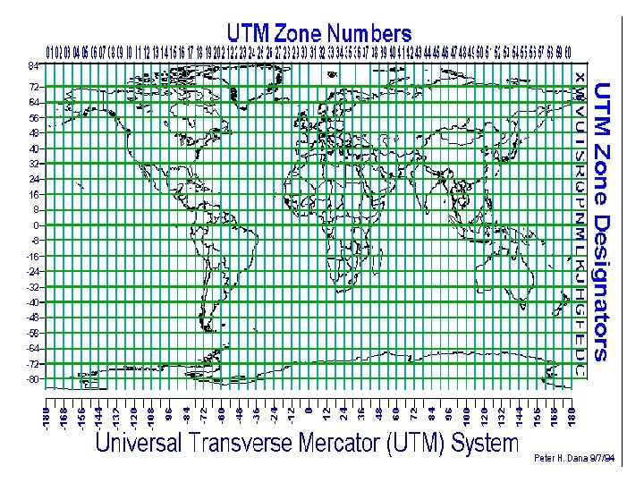
Universal Transverse Mercator projection (UTM) Ø UTM is a cylindrical map projection established in 1936 by international Union of Geodesy and Geophysics, adopted by US Army in 1947, and the purpose was to get a transversal Mercator map of the whole Earth. Ø mapping agencies, including NATO and now it is commonly used in topographic and thematic mapping for referencing satellite imagery. Ø The earth is divided in 60 zones in longitude, between the latitudes 84º N and 80º S, each 6 in longitude since the distortion at the poles is too great with this projection. Ø The numbering of zones starts from the 180 th meridian from Greenwich and going eastwards. Ø The middle meridian in each zone is the central meridian in the projection. The international reference Ellipsoid 1924 is commonly used with the most important exception of North America where Clarke’s 1866 ellipsoid is used, and in Africa Clark’s 1880 ellipsoid is used Ethiopia lies in the zones 35 -38.
q In short, the universal Transverse Mercator (UTM) system: Ø The Projection is the Gauss-Kruger’ version of the Transverse Mercator equidistant cylindrical projection. Ø Intended for mapping areas 840 N -800 s Ø Unit of measure is meter Ø The world is divided into 60 zones 60 of longitude in width Ø Zone 1 s starts at 1800 W and each zone has its own coordinate system Ø The easting of the origin of each zone is assigned a value of 5000, 000 m. Ø The northing for each southern hemisphere the equator is assigned a northing value of 1, 000 m. Ø The UTM might use one of the following spheroid International Clarke 1880 (Africa), Ø Clarke 1866 (N. America) Everest or Bessel (Asia)
q. Selection of a suitable map projection Ø The selection of map projection for GIS will be influenced by the following: ü How the results of analysis are best presented in the form of a map. ü In order to make any quantitative measurements (area, length, etc) the degree of accuracy must be examined. q. General rules for selecting a projection ü Tropical country –cylindrical projection ü Temperate country—Conical projection ü Polar regions— azimuthal projection
Unit 3 Topographic mapping Ø In modern mapping, a topographic map is a type of map characterized by large-scale detail and quantitative representation of relief, usually now using contour lines, but historically using a variety of methods. Ø Traditional definitions require a topographic map to show both natural and man-made features. Ø Topographic maps are detailed, accurate graphic representations of features that appear on the Earth's surface. These features include:
ü cultural: roads, buildings, urban development, railways, airports, names of places and geographic features, administrative boundaries, state and international borders, reserves ü hydrography: lakes, rivers, streams, swamps, coastal flats ü relief: mountains, valleys, slopes, depressions ü vegetation: wooded and cleared areas, vineyards and orchards • A map legend (or key) lists the features shown on that map, and their corresponding symbols
q Map scales / generalization § Cartographic generalization may appear in the following ways: (1). The selection of objects (the restriction of the contents of the map to objects that are essential), (2) The carefully considered simplification of contours (the planned outlining of objects, both linear and those that occupy an area, in which the peculiarities of the outlines typical of such objects are maintained and sometimes even emphasized. (3) The generalization of quantitative characteristics by reducing the number of divisions within which quantitative differences for specific features shown on the map are indicated (for example, in the case of a population scale for built-up areas, combining two divisions on the scale, such as “less than 500 inhabitants” and “from 500 to 2, 000 inhabitants” into one division, “less than 2, 000 inhabitants”), (4) The generalization of qualitative characteristics by simplifying the classifications for the features being shown (not subdividing forests according to type when showing vegetation on topographical maps), and (5) The replacement of individual features by general designations (indicating a population center by blocks and a geometrical sign instead of marking individual buildings).
q Topographic Map Colors Ø Topographic maps use standardized cartographic conventions to represent features. Therefore, the following Colors will still represent the same feature groups on topographic maps: Ø Black: Man-made or cultural features, such as roads, buildings, names, boundaries, and transmission lines. Ø Blue: Water or hydrographic features, such as lakes, rivers, canals, and swamps. Ø Brown: Contour lines, which show relief, but also terrain variation, deserts, historical sites Ø Green / White: Landscape cover. Ø Red: Important roads. Military sites, place names, buildings, borders, airports Ø Yellow - built-up or urban areas. Ø Road maps and other general use maps are often a jumble of color. They use map colors in a variety of ways. . . Ø As you can see, different maps can use colors in a variety of ways. It is important to look at the map key or map legend for the map you are using to become familiar with the color scheme.
Map design Ø Map design is a creative process during which the cartographer, or map-maker, tries to convey the message of the map’s objective. Ø Primary goals in map design are to share information, highlight patterns and processes, and illustrate results. Ø A secondary objective is to create a pleasing and interesting picture.
Basic Issues in Map Design 1. Considering the purpose of and audience for the map : ü One of a cartographer’s first steps is to identify the purpose and audience of the map. q The purpose and audience determine; ü ü ü How data are displayed, What map elements are included, and The general layout and format of the entire map. 2. Choosing a map type: ü Once cartographers know what they want to show on a map, they must decide which map type (reference or thematic) will be most effective in communicating the map’s purpose to its readers. ü The type of data, audience, and geographic area represented are some of the factors that affect this decision. 3. Selecting a title that represents what is shown ü Choosing a title for a map is an important part of the cartographic process. ü The title of the map should tell map readers, in a few words, what is important about the map.
4. Selecting and placing text ü Text must be placed so that it is readable and easily located but also must not interfere with the map’s data or design. ü Different font types, styles, sizes, and colors can be used to establish clear association between text and map features. 5. Designing an overall layout for easy understanding As in any form of graphic art, cartographers have to consider the layout of all map elements to create a final product that is informative, accurate, and aesthetically pleasing. ü Visual balance is always an important consideration for design. ü
q. Robinson et al (1995) define seven controls on the map design process; 1 Purpose. The purpose for which a map is being made will determine what is to be mapped and how the information is to be portrayed. 2 Reality. The phenomena being mapped will usually impose some constraints on map design. 3 Available data. The specific characteristics of data (e. g. , raster or vector). 4 Map scale. It will control how many data can appear in a map frame, the size of symbols. 5 Audience. Different audiences want different types of information on a map and expect to see information presented in different ways. 6 Conditions of use. The environment in which a map is to be used will impose significant constraints. 7 Technical limits. The display medium, be it digital or hardcopy, will impact the design process in several ways.
q Contour Maps Ø Contour line is the imaginary line connecting places of the same elevation as viewed from above. Ø Contour interval is the difference between successive lines. Vertical interval always remains constant. Contour lines are shown only on maps. Ø Contour lines are never overlap, branch or cross each other but they may run together. In large scale map contours seem cross but they are indicating cliff. They are continuous lines and any point on the same contour has the same value. Ø They are drawn by brown or black color on the map. They can indicate different types of the slopes on the map. q Depending on the spacing of the contours we may have five types of the slope: Ø Gentle slope_ widely spaced Contour lines. Ø Even slope_ space between contour lines remain constant Ø Concave slope_ Contour lines are closer together at the top and widely spaced at the lower. Ø Convex slope_ the upper Contour lines widely spaced and lower closely spaced. Ø Stepped slope/terraced_ spaced at certain levels like terracing. Ø Contour lines are a familiar way of representing surfaces on maps. A contour is a line through all contiguous points with equal height values.
Unit 4 Thematic mapping Ø A thematic map is a map that emphasizes a particular theme or special topic such as the average distribution of rainfall in an area. Ø They are different from general reference maps because they do not just show all natural features. Although cartographers can use datasets in many different ways to create thematic maps, there are different thematic mapping techniques that are used most often.
4. 1. Choropleth mapping Ø Choropleth Maps use color shading to represent different quantities or values. Ø Darker colors usually represent greater quantities or values, while lighter colors usually represent smaller quantities or values. Ø This is a map that portrays quantitative data as a color and can show density, percent, average value or quantity of an event within a geographic area. .
q. Example datasets appropriate for choropleth maps: ü world map of income tax rates by country ü map showing number of births per 100, 000 in 2009, reported by U. S. county ü Map showing the percentage change in skin cancer from 1990 to 2010 by Australian state. ü world map of percentage of population under 18 years old, reported by country ü map showing the percentage increase in home value from 1980 to 1990 by Canadian province
4. 2. Isarithm mapping Ø Are maps that represent data sets that have a "continuous distribution" and "smooth change in value. " Ø It represents continuous data by a range of continuous color/value or related classes of color. Ø These maps can also display three-dimensional values like elevation on topographic maps. Ø Generally data for isarithm maps is gathered via measurable points (e. g. - weather stations) or is collected by area (e. g. - tons of corn per acre by county). Ø Isarithmic maps also follow the basic rule that there is a high and low side in relation to the isocline.
q For example in elevation if the isoline is 500 feet (152 m) then one side must be higher than 500 feet and one side must be lower. Ø Isarithmic mapping, Includes contour maps Any map showing lines joining points of equal value Can shade or use colors for areas between lines Can use many terrain‐based methods, such as shading Based on assumption of continuity ü ü ü
4. 3. Proportional point symbol mapping Ø Proportional symbol maps scale the size of simple symbols (usually a circle or square) proportionally to the data value found at that location. Ø They are a simple concept to grasp: § The larger the symbol, the "more" of something exists at a location. Ø Reasons Why We Like Them? Ø Proportional symbol maps are very flexible because you can use either numerical data (e. g. , income, age) or ordered categorical data (e. g. , low, medium, and high risk of bankruptcy). Ø They're also flexible because they can be used for data attached to geographic points (e. g. , a precise location) or data attached to geographic areas (e. g. , countries).
Ø One advantage of proportional symbol maps over dot density maps is it is generally easier for map readers to extract numbers from the map since estimating the size of a symbol is less tedious than counting many little dots. Ø An advantage of proportional symbol maps over choropleth maps is that the size of the enumeration unit doesn't matter: If a country with a small geographic area, such as the Netherlands, has a large data value attached to it, it will have a large symbol over it. Ø By comparison, on a choropleth map, smaller places are easily overlooked on a busy map-even if they have large data values-while large countries such as Canada dominate the map no matter what color they are. Ø It can be argued, thus, that proportional symbol maps "let thematic data speak for itself, " since the size of the symbols relates directly to thematic data and not just the footprint of the enumeration unit Example datasets appropriate for proportional symbol maps:
• liters of coffee consumed per capita in 2010 by country • location and magnitude of earthquakes in California 1900 -2010 • estimated likelihood of a major earthquake for cities in California (low, medium, and high risk) • population totals of the 50 largest cities in China
4. 4. Dot density mapping Ø Also called dot maps place individual points on a map to correspond with occurrences of a particular feature or data. Ø Clusters of dots show where the features or data are concentrated. Ø Dot density maps, or dot maps, portray the geographic distribution of discrete phenomena using an arrangement of identical point symbols, most commonly dots. Ø The dot density technique dates to at least the 19 th century and is today accepted as one of the primary techniques for representing geographic patterns. Ø Dot density maps are particularly useful for understanding global distribution of the mapped phenomenon and comparing relative densities of different regions on the map. Ø Dot density maps are also easy to understand, requiring little cognitive effort by the map reader when compared to isoline maps. Ø However, retrieval of specific information from dot density maps is difficult, as map users find manual counting of dots tedious and tend to underestimate dot totals as density increase.