Principles of Art So what are they The

- Slides: 62

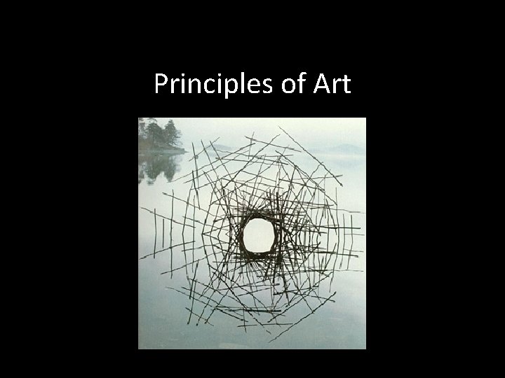
Principles of Art

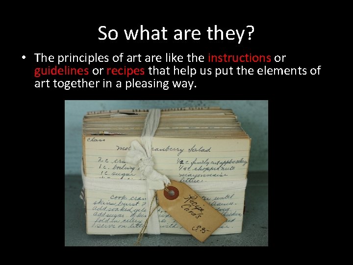
So what are they? • The principles of art are like the instructions or guidelines or recipes that help us put the elements of art together in a pleasing way.

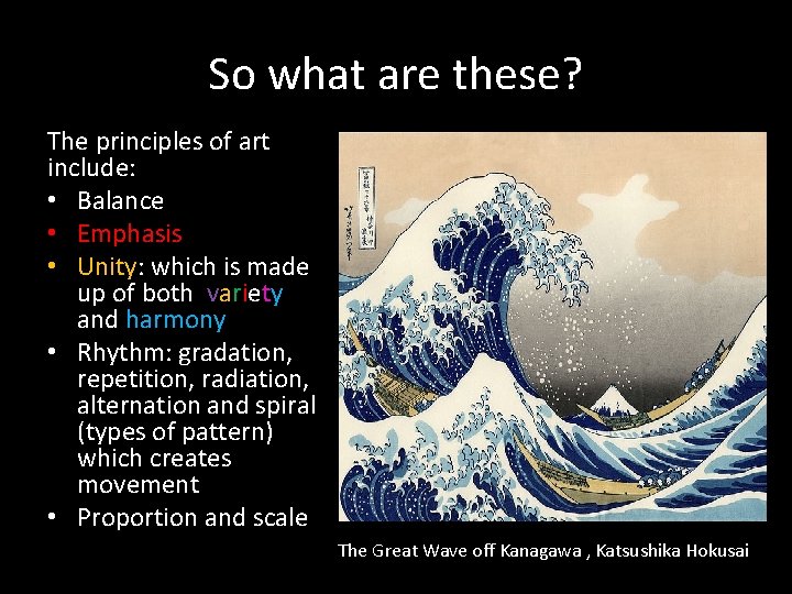
So what are these? The principles of art include: • Balance • Emphasis • Unity: which is made up of both variety and harmony • Rhythm: gradation, repetition, radiation, alternation and spiral (types of pattern) which creates movement • Proportion and scale The Great Wave off Kanagawa , Katsushika Hokusai

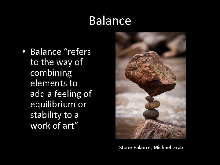
Balance • Balance “refers to the way of combining elements to add a feeling of equilibrium or stability to a work of art” Stone Balance, Michael Grab

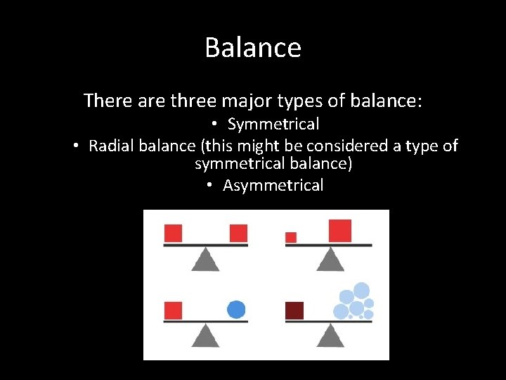
Balance There are three major types of balance: • Symmetrical • Radial balance (this might be considered a type of symmetrical balance) • Asymmetrical

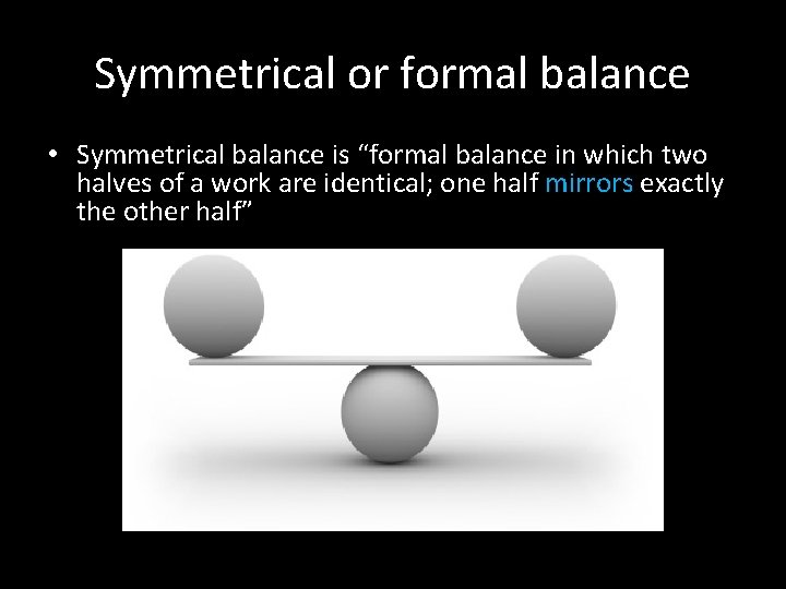
Symmetrical or formal balance • Symmetrical balance is “formal balance in which two halves of a work are identical; one half mirrors exactly the other half”

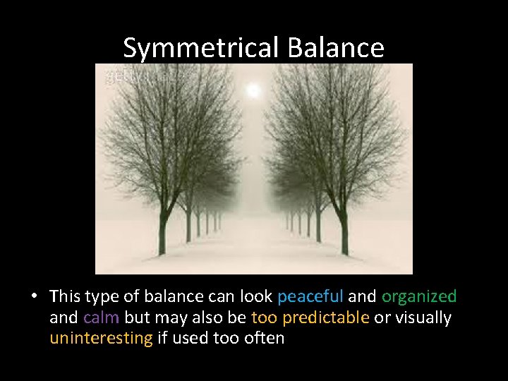
Symmetrical Balance • This type of balance can look peaceful and organized and calm but may also be too predictable or visually uninteresting if used too often

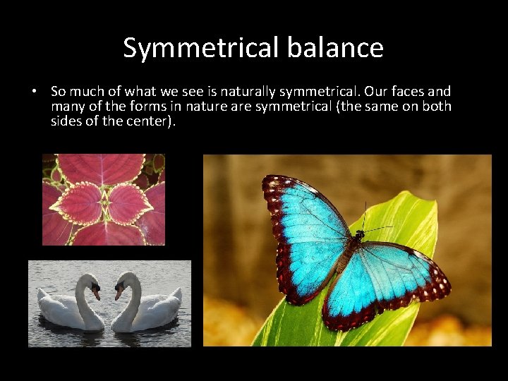
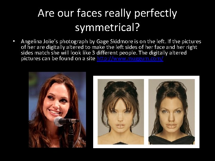
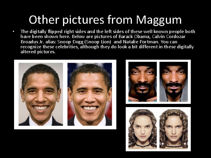
Symmetrical balance • So much of what we see is naturally symmetrical. Our faces and many of the forms in nature are symmetrical (the same on both sides of the center).

Are our faces really perfectly symmetrical? • Angelina Jolie’s photograph by Gage Skidmore is on the left. If the pictures of her are digitally altered to make the left sides of her face and her right sides match she will look like 3 different people. The digitally altered pictures can be found on a site http: //www. muggum. com/

Other pictures from Maggum • The digitally flipped right sides and the left sides of these well known people both have been shown here. Below are pictures of Barack Obama, Calvin Cordozar Broadus Jr. alias: Snoop Dogg (Snoop Lion) and Natalie Portman. You can recognize these celebrities, although they do look a bit different in these digitally altered pictures.

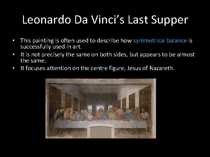
Leonardo Da Vinci’s Last Supper • This painting is often used to describe how symmetrical balance is successfully used in art. • It is not precisely the same on both sides, but appears to be almost the same. • It focuses attention on the centre figure, Jesus of Nazareth.

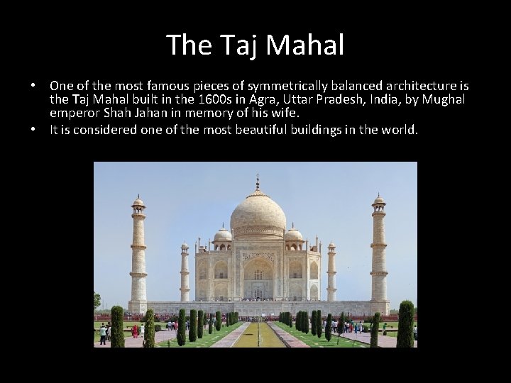
The Taj Mahal • One of the most famous pieces of symmetrically balanced architecture is the Taj Mahal built in the 1600 s in Agra, Uttar Pradesh, India, by Mughal emperor Shah Jahan in memory of his wife. • It is considered one of the most beautiful buildings in the world.

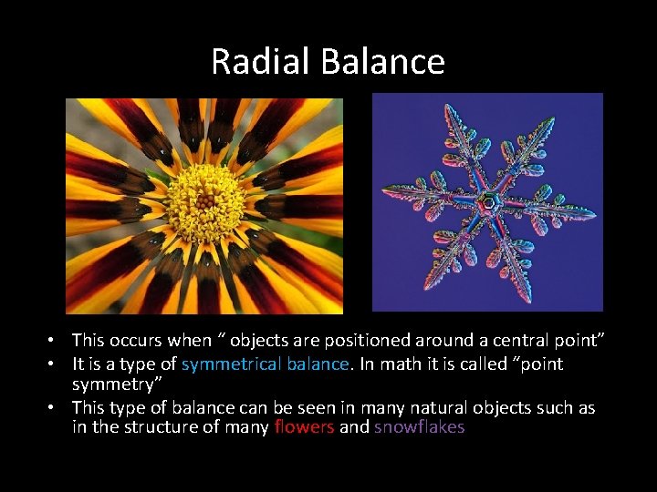
Radial Balance • This occurs when “ objects are positioned around a central point” • It is a type of symmetrical balance. In math it is called “point symmetry” • This type of balance can be seen in many natural objects such as in the structure of many flowers and snowflakes

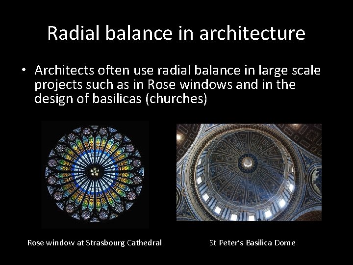
Radial balance in architecture • Architects often use radial balance in large scale projects such as in Rose windows and in the design of basilicas (churches) Rose window at Strasbourg Cathedral St Peter’s Basilica Dome

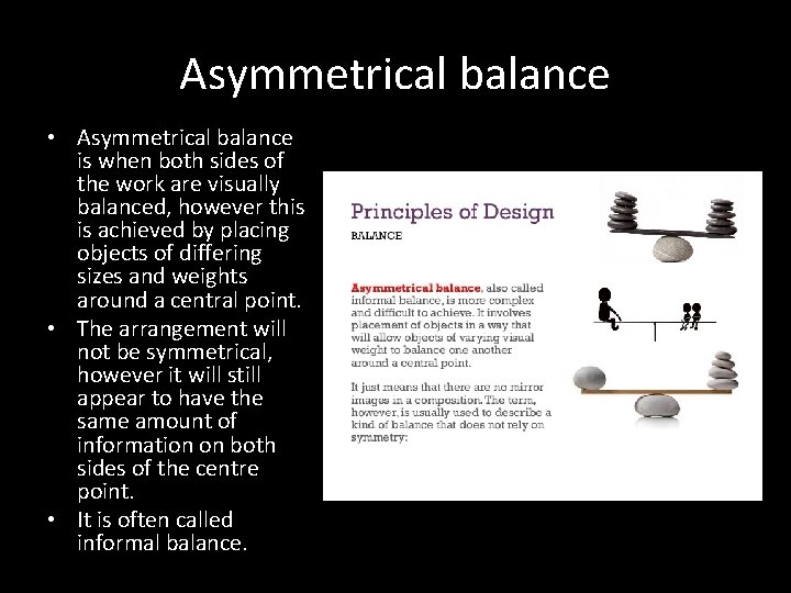
Asymmetrical balance • Asymmetrical balance is when both sides of the work are visually balanced, however this is achieved by placing objects of differing sizes and weights around a central point. • The arrangement will not be symmetrical, however it will still appear to have the same amount of information on both sides of the centre point. • It is often called informal balance.

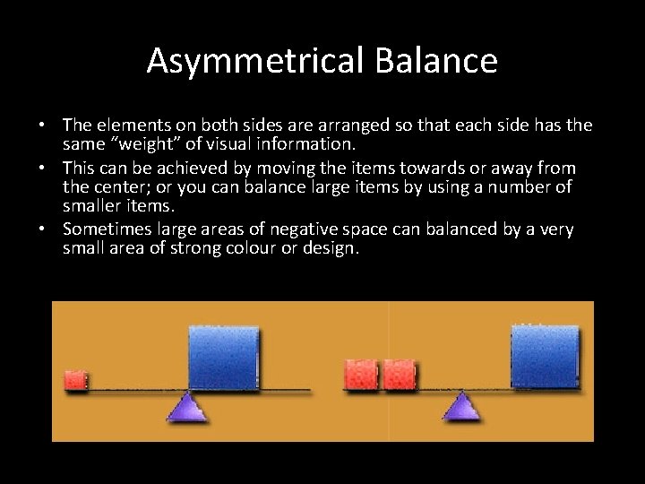
Asymmetrical Balance • The elements on both sides are arranged so that each side has the same “weight” of visual information. • This can be achieved by moving the items towards or away from the center; or you can balance large items by using a number of smaller items. • Sometimes large areas of negative space can balanced by a very small area of strong colour or design.

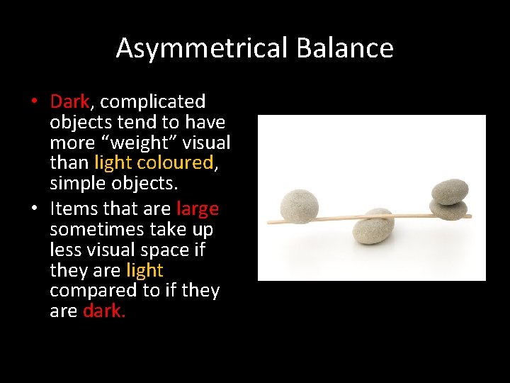
Asymmetrical Balance • Dark, complicated objects tend to have more “weight” visual than light coloured, simple objects. • Items that are large sometimes take up less visual space if they are light compared to if they are dark.

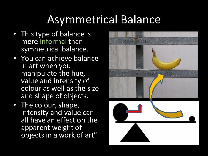
Asymmetrical Balance • This type of balance is more informal than symmetrical balance. • You can achieve balance in art when you manipulate the hue, value and intensity of colour as well as the size and shape of objects. • The colour, shape, intensity and value can all have an effect on the apparent weight of objects in a work of art”

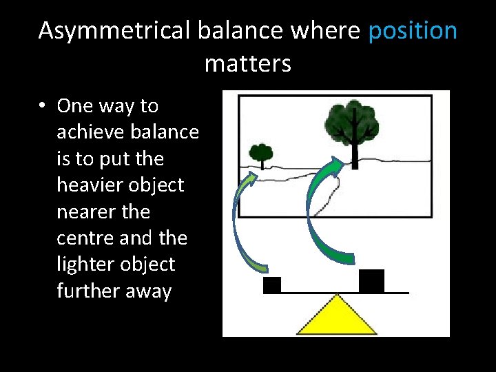
Asymmetrical balance where position matters • One way to achieve balance is to put the heavier object nearer the centre and the lighter object further away

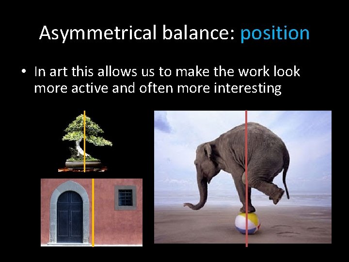
Asymmetrical balance: position • In art this allows us to make the work look more active and often more interesting

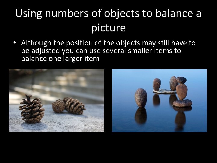
Using numbers of objects to balance a picture • Although the position of the objects may still have to be adjusted you can use several smaller items to balance one larger item

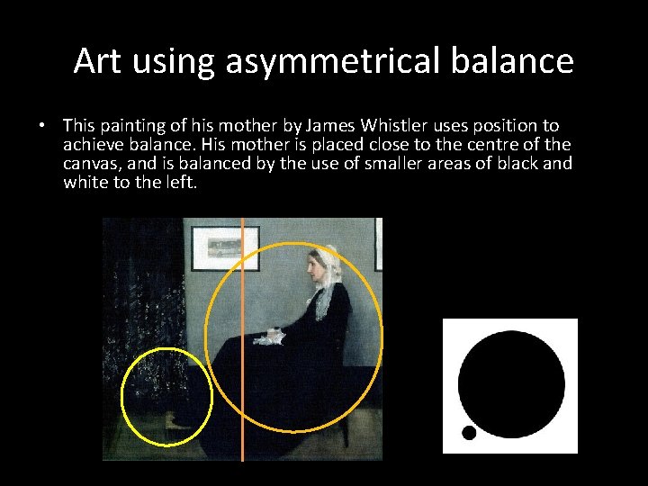
Art using asymmetrical balance • This painting of his mother by James Whistler uses position to achieve balance. His mother is placed close to the centre of the canvas, and is balanced by the use of smaller areas of black and white to the left.

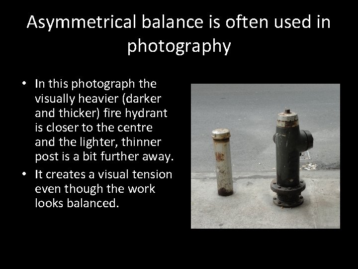
Asymmetrical balance is often used in photography • In this photograph the visually heavier (darker and thicker) fire hydrant is closer to the centre and the lighter, thinner post is a bit further away. • It creates a visual tension even though the work looks balanced.

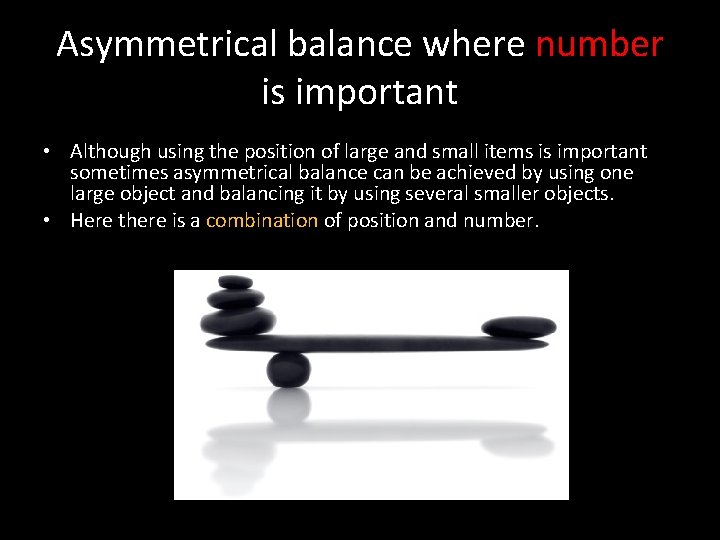
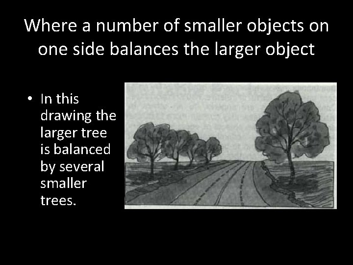
Asymmetrical balance where number is important • Although using the position of large and small items is important sometimes asymmetrical balance can be achieved by using one large object and balancing it by using several smaller objects. • Here there is a combination of position and number.

Where a number of smaller objects on one side balances the larger object • In this drawing the larger tree is balanced by several smaller trees.

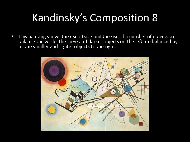
Kandinsky’s Composition 8 • This painting shows the use of size and the use of a number of objects to balance the work. The large and darker objects on the left are balanced by all the smaller and lighter objects to the right

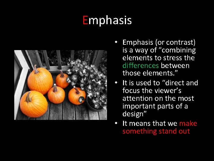
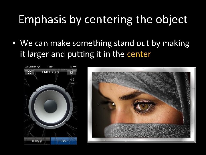
Emphasis • Emphasis (or contrast) is a way of “combining elements to stress the differences between those elements. ” • It is used to “direct and focus the viewer’s attention on the most important parts of a design” • It means that we make something stand out

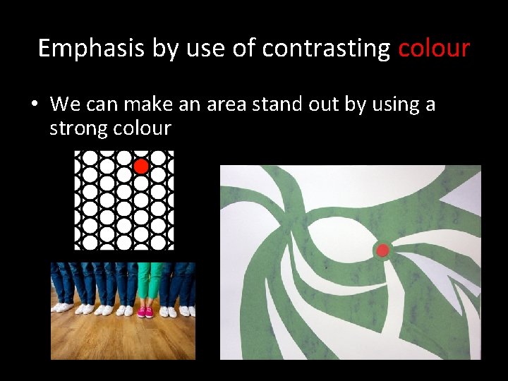
Emphasis by use of contrasting colour • We can make an area stand out by using a strong colour

Emphasis by centering the object • We can make something stand out by making it larger and putting it in the center

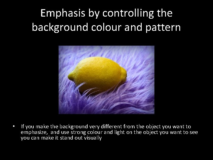
Emphasis by controlling the background colour and pattern • If you make the background very different from the object you want to emphasize, and use strong colour and light on the object you want to see you can make it stand out visually

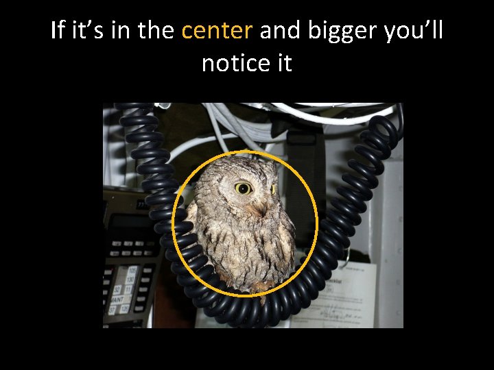
If it’s in the center and bigger you’ll notice it

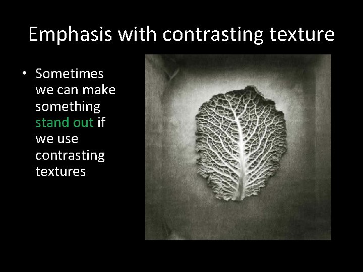
Emphasis with contrasting texture • Sometimes we can make something stand out if we use contrasting textures

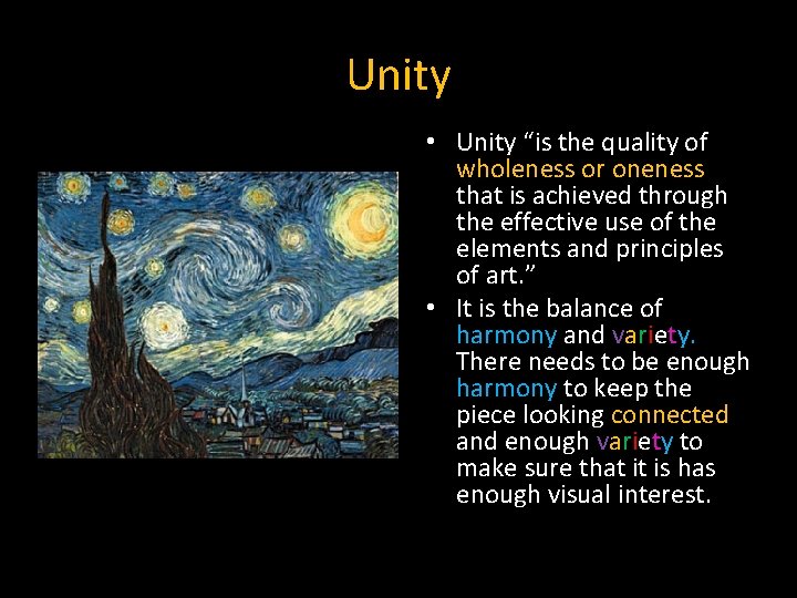
Unity • Unity “is the quality of wholeness or oneness that is achieved through the effective use of the elements and principles of art. ” • It is the balance of harmony and variety. There needs to be enough harmony to keep the piece looking connected and enough variety to make sure that it is has enough visual interest.

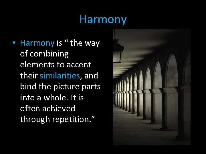
Harmony • Harmony is “ the way of combining elements to accent their similarities, and bind the picture parts into a whole. It is often achieved through repetition. ”

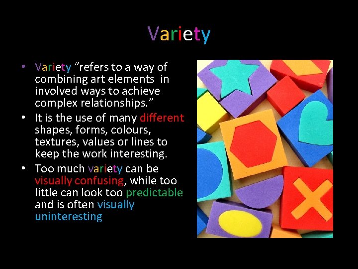
Variety • Variety “refers to a way of combining art elements in involved ways to achieve complex relationships. ” • It is the use of many different shapes, forms, colours, textures, values or lines to keep the work interesting. • Too much variety can be visually confusing, while too little can look too predictable and is often visually uninteresting

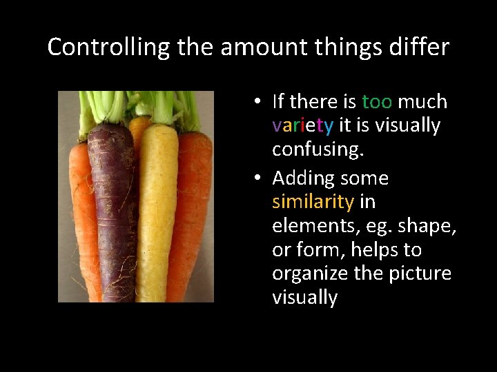
Controlling the amount things differ • If there is too much variety it is visually confusing. • Adding some similarity in elements, eg. shape, or form, helps to organize the picture visually

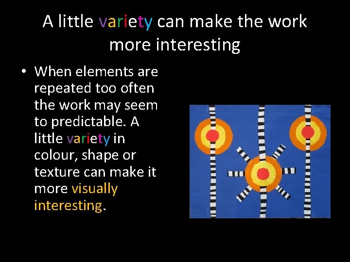
A little variety can make the work more interesting • When elements are repeated too often the work may seem to predictable. A little variety in colour, shape or texture can make it more visually interesting.

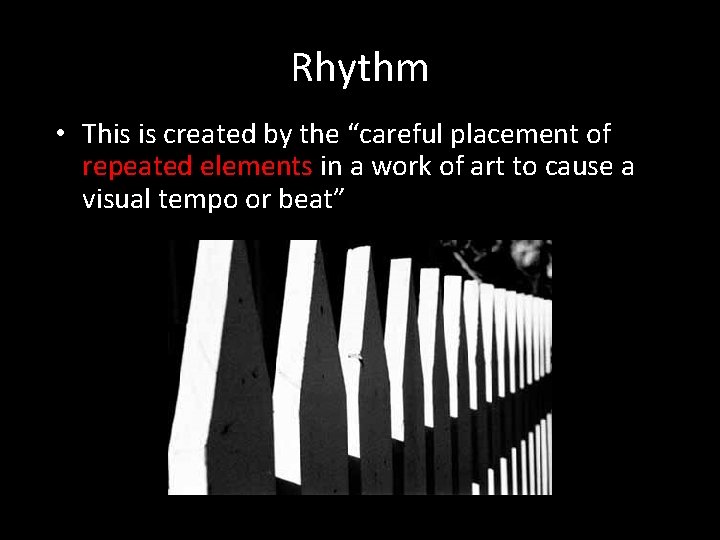
Rhythm • This is created by the “careful placement of repeated elements in a work of art to cause a visual tempo or beat”

Creating Rhythm We can create rhythm and movement in a work of art by using the following ways of organizing elements: • Graduation • Repetition • Alternation • Radiation • Spiral

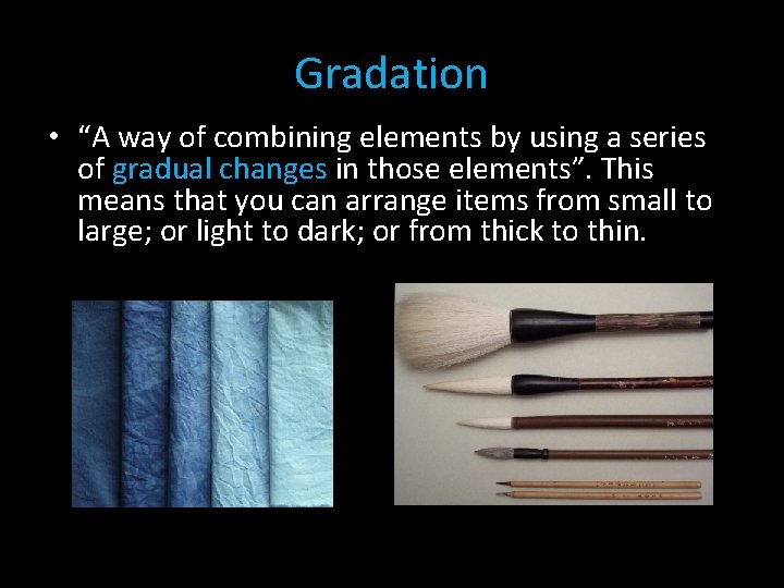
Gradation • “A way of combining elements by using a series of gradual changes in those elements”. This means that you can arrange items from small to large; or light to dark; or from thick to thin.

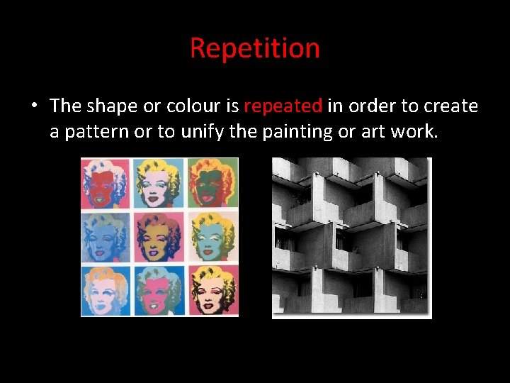
Repetition • The shape or colour is repeated in order to create a pattern or to unify the painting or art work.

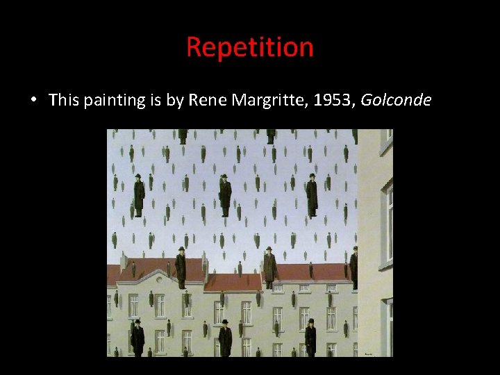
Repetition • This painting is by Rene Margritte, 1953, Golconde

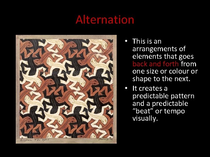
Alternation • This is an arrangements of elements that goes back and forth from one size or colour or shape to the next. • It creates a predictable pattern and a predictable “beat” or tempo visually.

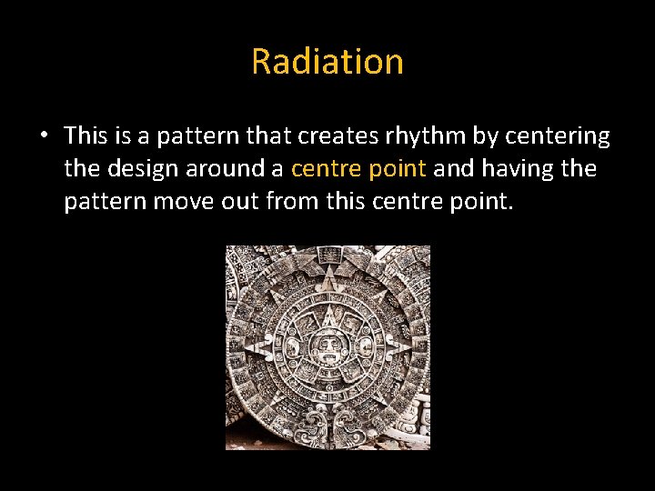
Radiation • This is a pattern that creates rhythm by centering the design around a centre point and having the pattern move out from this centre point.

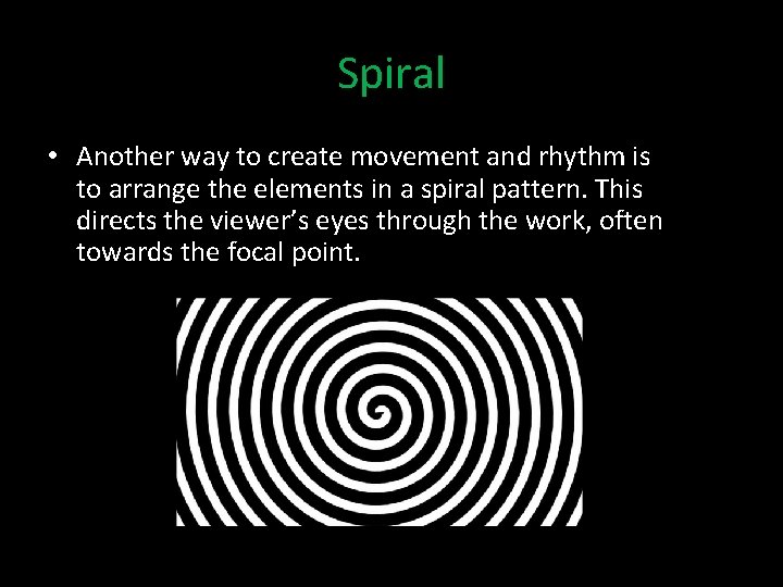
Spiral • Another way to create movement and rhythm is to arrange the elements in a spiral pattern. This directs the viewer’s eyes through the work, often towards the focal point.

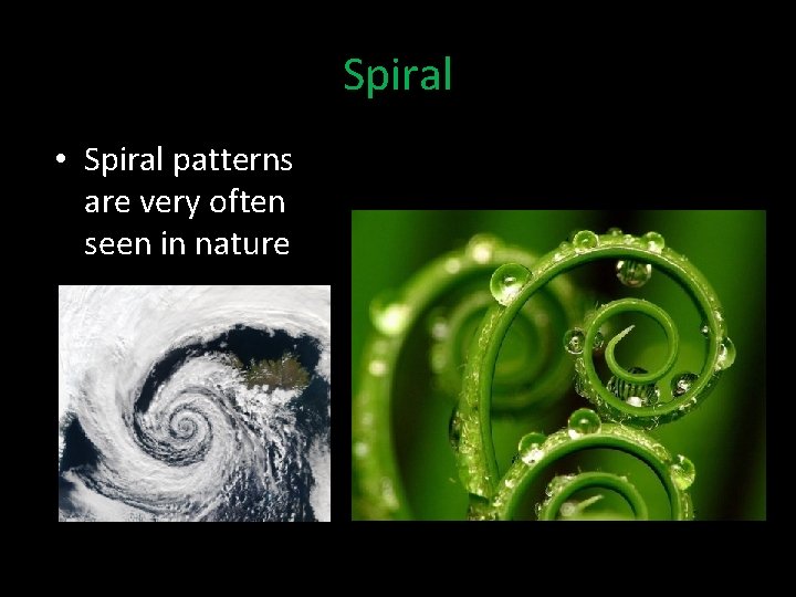
Spiral • Spiral patterns are very often seen in nature

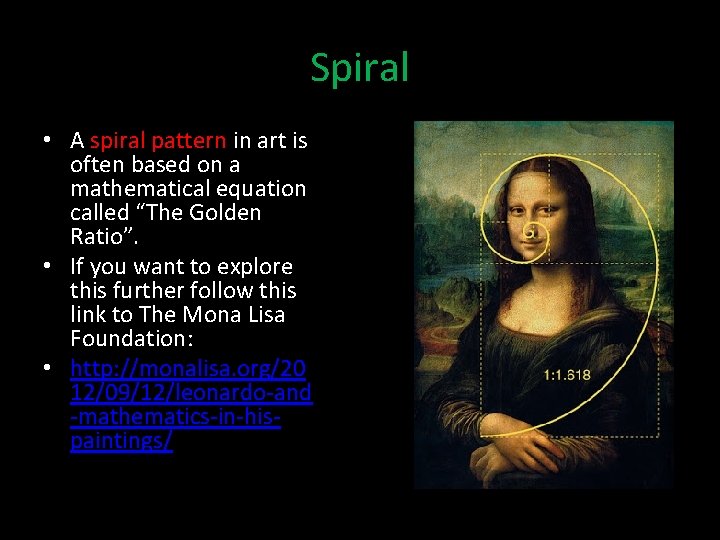
Spiral • A spiral pattern in art is often based on a mathematical equation called “The Golden Ratio”. • If you want to explore this further follow this link to The Mona Lisa Foundation: • http: //monalisa. org/20 12/09/12/leonardo-and -mathematics-in-hispaintings/

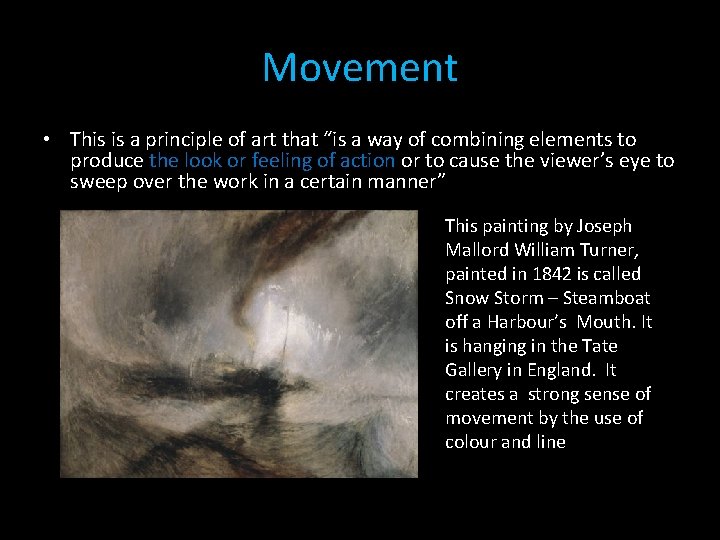
Movement • This is a principle of art that “is a way of combining elements to produce the look or feeling of action or to cause the viewer’s eye to sweep over the work in a certain manner” This painting by Joseph Mallord William Turner, painted in 1842 is called Snow Storm – Steamboat off a Harbour’s Mouth. It is hanging in the Tate Gallery in England. It creates a strong sense of movement by the use of colour and line

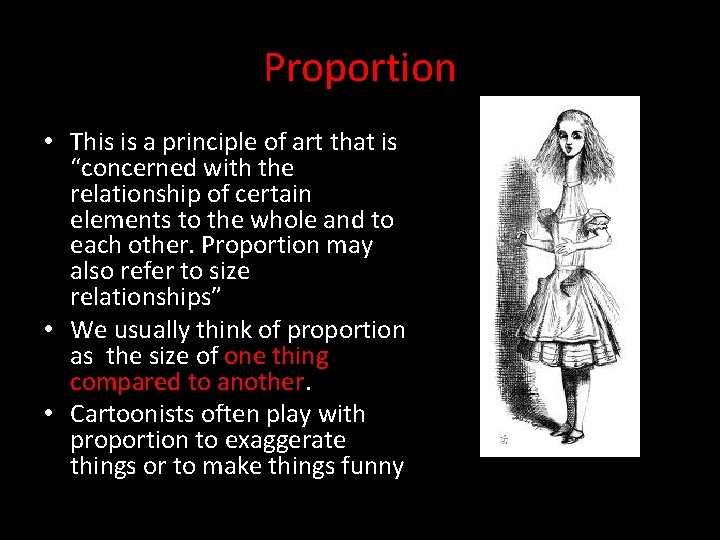
Proportion • This is a principle of art that is “concerned with the relationship of certain elements to the whole and to each other. Proportion may also refer to size relationships” • We usually think of proportion as the size of one thing compared to another. • Cartoonists often play with proportion to exaggerate things or to make things funny

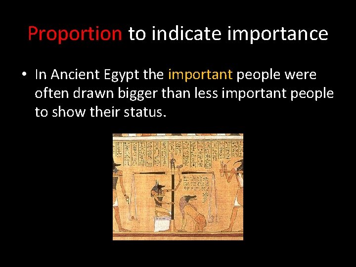
Proportion to indicate importance • In Ancient Egypt the important people were often drawn bigger than less important people to show their status.

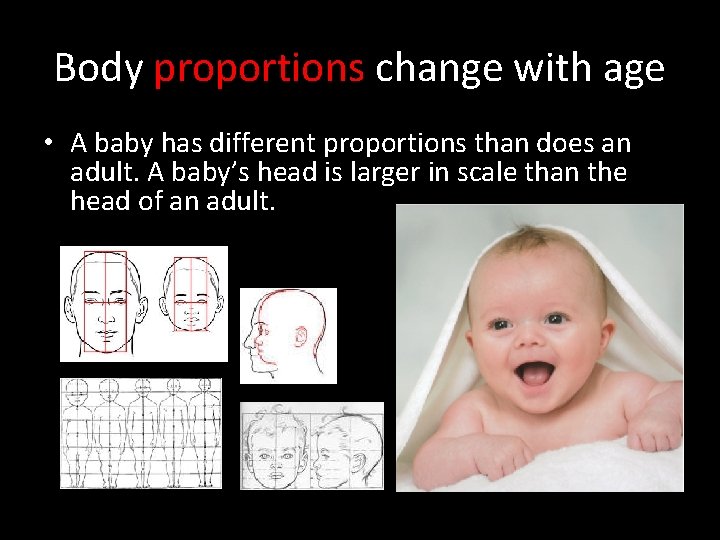
Body proportions change with age • A baby has different proportions than does an adult. A baby’s head is larger in scale than the head of an adult.

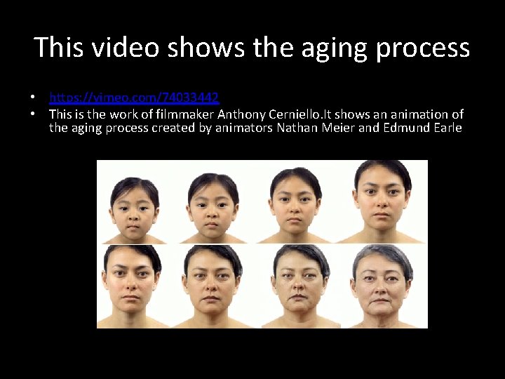
This video shows the aging process • https: //vimeo. com/74033442 • This is the work of filmmaker Anthony Cerniello. It shows an animation of the aging process created by animators Nathan Meier and Edmund Earle

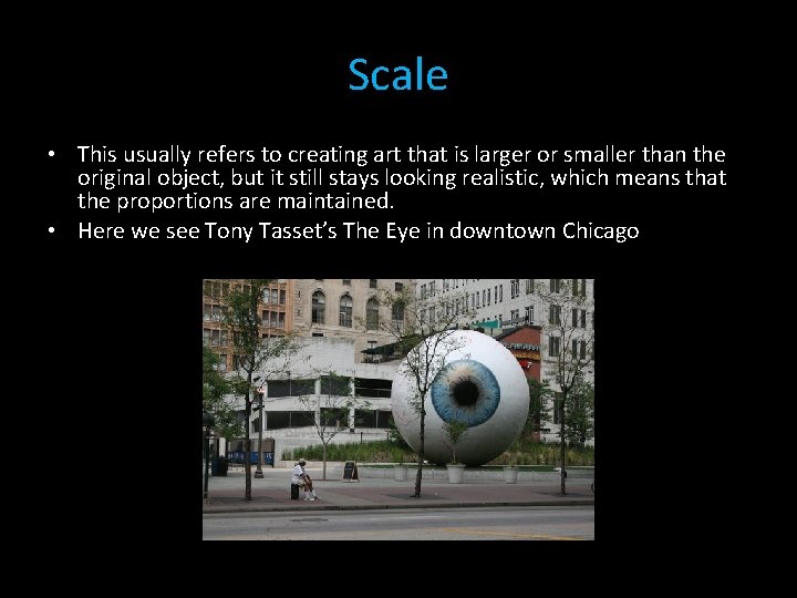
Scale • This usually refers to creating art that is larger or smaller than the original object, but it still stays looking realistic, which means that the proportions are maintained. • Here we see Tony Tasset’s The Eye in downtown Chicago

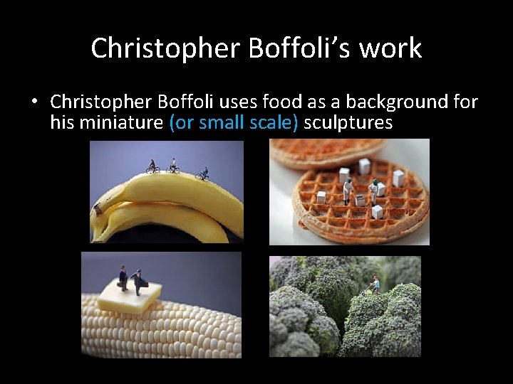
Christopher Boffoli’s work • Christopher Boffoli uses food as a background for his miniature (or small scale) sculptures

References • • • Definitions from Art in Focus, editor: Gene A Mittler, Glencoe Mc. Graw-Hill Taj mahal: http: //www. canindia. com/2013/07/taj-mahal-to-be-adopted-underclean-india-campaign/ Asymmetrical balance, weight: http: //facweb. cs. depaul. edu/sgrais/balance. htm Photo of trees: http: //www. chicowebdesign. com/blog/2011/09/26/the-use-ofbalance-in-a-web-design/ Leonardo da Vinci Last Supper and Kandinsky’s Composition 8: http: //www. vanseodesign. com/web-design-balance/ Asymmetrical and Symmetrical balance shown with stones on a balance arm: http: //www. gatlineducation. com/demo/Res. Interior. Design/html/L 11 CH 02 P 02. html Both types of balance with blocks: http: //www. studiocodex. com/composition 01. html Radial balance flower: http: //hannahfirstblogspot. ca/2012/09/balance-in-artand-design. html Swans symmetry: http: //t-chrys-symmetricalbalance. blogspot. ca/2011/02/symmetrical-balance. html Digitally altered faces: http: //www. muggum. com/

References (cont’d) • Butterfly: http: //www. ephotobay. com/share/butterflies-13. html • Red plant leaves: http: //blsciblogs. baruch. cuny. edu/symmetries/ • Snowflake: http: //www. scientificamerican. com/slideshow. cfm? id=no-twoalike-snowflake-photography • Crab picture: http: //onemoregeneration. org/2011/08/23/trivia-questionfor-aug-23 -2011/ • Asymmetrical tree picture: http: //teresabernardart. com/design-principlebalance/#axzz 2 ey. Nyko. Ay • Door and window: http: //transit-notes. blogspot. ca/2010/04/smallofferings-of-light. html • Bonsai tree: http: //artofbonsai. org/feature_articles/designprinciples. php • Whistler’s Mother: http: //en. wikipedia. org/wiki/Whistler's_Mother • Asymmetrical balance graphics of circles balance: http: //www. highlandtechnology. org/files/assignment_sheets/graphic_des ign/The_BALANCE_Sheets. htm

References (cont’d) • • • Pinecones: http: //takakik. wordpress. com/2012/09/12/design-elements/ Elephant: http: //shihabs 996 blogspot. ca/2011/02/principles-of-designasymmetrical. html Balance beams: http: //art. nmu. edu/cognates/concepts/175_kinesthetic. html Fire hydrant and post: http: //clebolo. wordpress. com/2011/09/15/asymmetricalbalance/ Asymmetrically balanced tree drawing: http: //visualizingit. org/2012/09/10/6 thgrade-calligram-of-arts-core/ Banana balance: http: //fundamentalsofdesign. weebly. com/balance. html Rose window: http: //en. wikipedia. org/wiki/Rose_window St Peter’s Basilica: http: //commons. wikimedia. org/wiki/File: Saint_Peter's_Basilica_Dome_Interior. JP G Balance number using stones: http: //onlinemedia. rmcad. edu/ID 1510/html/Presentation%202. 1. 9%20 Principle_B alance. html Repetition in architecture: http: //permaculturenews. org/2012/01/04/whymonotonous-repetition-is-unsatisfying/

References cont’d • Stones in water: http: //proceedings. esri. com/library/userconf/devsummit 12/papers/strate gic_user_experience_with_flex. pdf • Emphasis red dot: http: //artspilesenglish. blogspot. ca/2012_06_10_archive. html • A student collage work on emphasis green with red dot: http: //studentwork. isabelmar. com/12/emphasis. html • Pumpkins: http: //5 spring 2011. blogspot. ca/2011/02/abi-g-coloremphasis. html • Speaker: http: //reviews. cnet. com/2300 -6466_7 -10002672 -12. html • Emphasis leaf bud: http: //randalsmith. wordpress. com/2012/03/27/composition/ • Emphasis on eyes: http: //funnypagenet. com/emphasis-on-the-eyes/ • Emphasis texture leaf: http: //earth-wizard. livejournal. com/52732. html

References (cont’d) • • • Running shoes emphasis: http: //tgj 3 m-blkh. wikispaces. com/Jamie+Ngo+new Owl: http: //en. wikipedia. org/wiki/File: Screech_Owl_named_Fod_found_on_USS_Harry _S. _Truman_(CVN_75). jpg Lemon http: //www. flickr. com/photos/53330650@N 06/galleries/72157626108005489/ Recipe card: http: //brynmooth. com/introducing-the-clara-project/bundle-ofvintage-recipe-cards/ The Great wave off Kanagawa: http: //en. wikipedia. org/wiki/File: The_Great_Wave_off_Kanagawa. jpg Stone balance http: //www. gravityglue. com/tag/master-of-balance/ Andy Goldsworthy twig sculpture: http: //www. writedesignonline. com/resources/design/rules/balance. html Starry Night: http: //nhsdesigns. com/graphic/principles/unity. php Interior arches: http: //www. explainers. com/Articles/Handling-Repetition-in-Work. Instructions. htm Andy Warhol Marilyn Monroe: http: //artobserved. com/artists/andy-warhol/

References (cont’d) • Carrots: http: //beyondgymwalls. com/tag/cooking-with-variety/ • Shapes and colours : http: //www. rgbstock. com/bigphoto/ng. Et 1 Nw/shapes+and+colours 2 • Quilt block: http: //quilterbeth. blogspot. ca/2010_04_01_archive. html • Fence posts: http: //adaptablearts. com/index. php? itemid=34 • Gradation in colour dyeing: http: //jabotquilt. blogspot. ca/2010/05/gradation-dyeing. html • Chinese Brushes: http: //www. art-virtue. com/principles/p 1 -brush. htm • Mayan Calendar: http: //www. slotshelters. com/explore-radialpattern-making • Rene Margritte, Golconde: and MC Escher, Lizards 1942: http: //flyeschool. com/content/repetition-rhythm-and-pattern • Turner’s Snow Storm: http: //www. tate. org. uk/contextcomment/articles/sublime-roller-coaster-ride-through-art-history

References (cont’d) • Egyptian drawings from The Book of The Dead: http: //en. wikipedia. org/wiki/Book_of_the_Dead • Body proportions change with age: http: //en. wikipedia. org/wiki/Body_proportions • Facial proportions: http: //www. craftsy. com/blog/2013/08/childs-facemastering-proportions/ • Baby picture: http: //www. dennybaptist. org. uk/index. php/churchministries/childrens-ministry/ • Christopher Boffoli’s miniature sculpture: http: //www. mymodernmet. com/profiles/blogs/tiny-peoples-wonderfulworld • The Eye by Tony Tasset: http: //urbanmilwaukee. com/2010/08/19/chicago -and-milwaukee-large-public-art-and-placemaking/ • Alice in Wonderland: http: //www. naturalmath. com/study/view-19. html

References (cont’d) • Spiral pattern: https: //www. youtube. com/watch? v=nes-n. Ubj. Olc • Fern: http: //postris. com/popular-pin/83039/1/repins/30/0/ • Spiral storm pattern: https: //originalbeauty. wordpress. com/2009/06/27/spirals-in-nature/ • Spiral pattern and The Mona Lisa: http: //in 2 visualdesign. blogspot. ca/2011/04/week-7 -golden-ratio. html • Danielle by Anthony Cerniello: http: //www. tuskagency. com/blog/2013/9/12/danielle--the-ageingprocess/ • Still pictures of Danielle aging: http: //www. feeldesain. com/danielle-50 years-in-5 -minutes. html • Asymmetrical balance: https: //www. slideshare. net/shaktinanda/principles -of-design-56175885