why does this suck 1 some of the
![sensemaking tasks [Card et al] • Information foraging – Collect information of interest • sensemaking tasks [Card et al] • Information foraging – Collect information of interest •](https://slidetodoc.com/presentation_image_h2/44fdb94a7739dfbee5f9df009dfa4879/image-20.jpg)
![interactive tasks [Shneiderman] • Overview – Get an overview of the collection • Zoom interactive tasks [Shneiderman] • Overview – Get an overview of the collection • Zoom](https://slidetodoc.com/presentation_image_h2/44fdb94a7739dfbee5f9df009dfa4879/image-21.jpg)


- Slides: 60

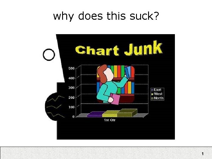
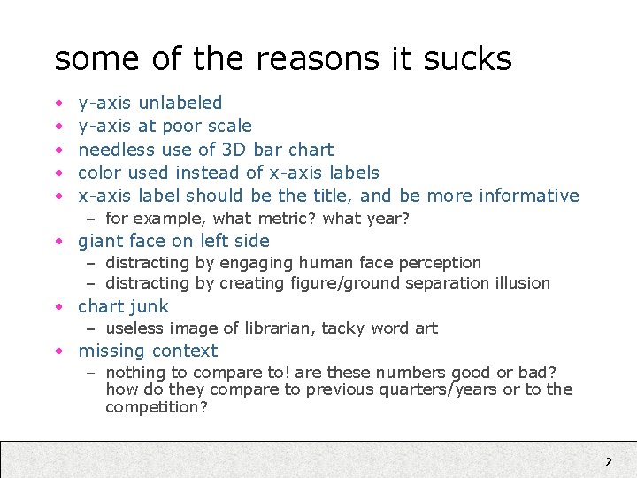
why does this suck? 1

some of the reasons it sucks • • • y-axis unlabeled y-axis at poor scale needless use of 3 D bar chart color used instead of x-axis labels x-axis label should be the title, and be more informative – for example, what metric? what year? • giant face on left side – distracting by engaging human face perception – distracting by creating figure/ground separation illusion • chart junk – useless image of librarian, tacky word art • missing context – nothing to compare to! are these numbers good or bad? how do they compare to previous quarters/years or to the competition? 2

Information Visualization Ryan Aipperspach (slides from Jeffrey Heer) April 19, 2006 3

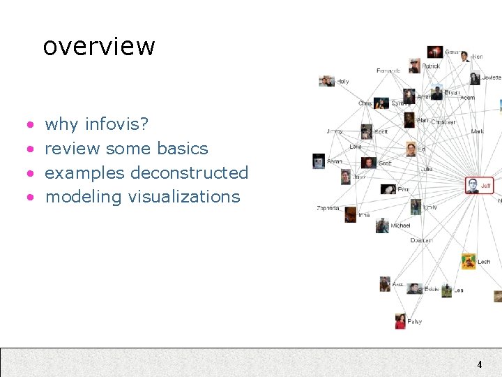
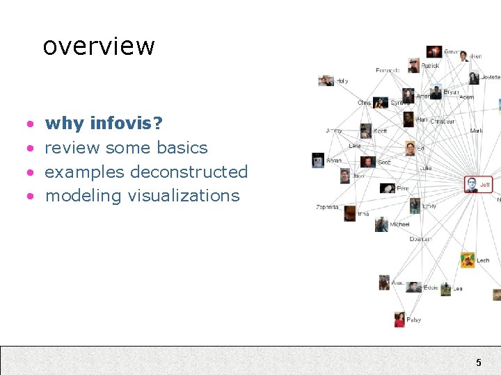
overview • • why infovis? review some basics examples deconstructed modeling visualizations 4

overview • • why infovis? review some basics examples deconstructed modeling visualizations 5

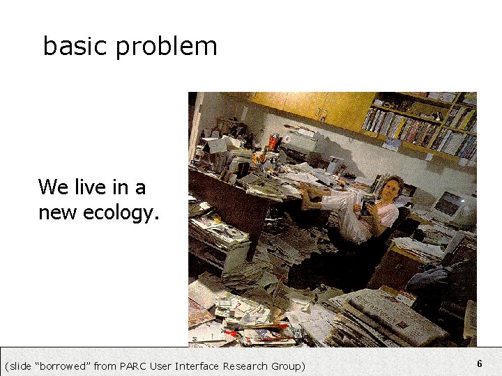
basic problem We live in a new ecology. (slide “borrowed” from PARC User Interface Research Group) 6

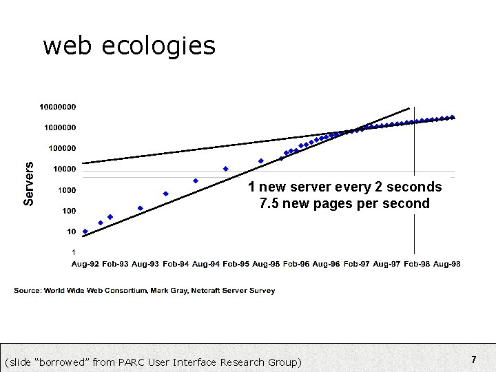
web ecologies 1 new server every 2 seconds 7. 5 new pages per second (slide “borrowed” from PARC User Interface Research Group) 7

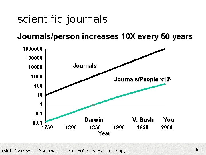
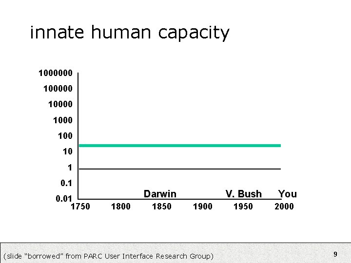
scientific journals Journals/person increases 10 X every 50 years 1000000 10000 Journals 1000 Journals/People x 106 100 10 1 0. 01 1750 Darwin 1800 1850 V. Bush 1900 1950 You 2000 Year (slide “borrowed” from PARC User Interface Research Group) 8

innate human capacity 1000000 10000 100 10 1 0. 01 1750 Darwin 1800 1850 V. Bush 1900 (slide “borrowed” from PARC User Interface Research Group) 1950 You 2000 9

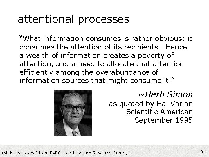
attentional processes “What information consumes is rather obvious: it consumes the attention of its recipients. Hence a wealth of information creates a poverty of attention, and a need to allocate that attention efficiently among the overabundance of information sources that might consume it. ” ~Herb Simon as quoted by Hal Varian Scientific American September 1995 (slide “borrowed” from PARC User Interface Research Group) 10

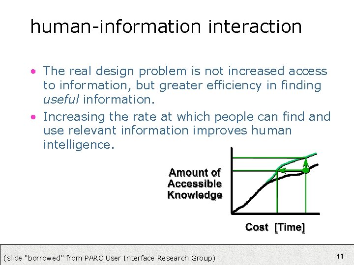
human-information interaction • The real design problem is not increased access to information, but greater efficiency in finding useful information. • Increasing the rate at which people can find and use relevant information improves human intelligence. (slide “borrowed” from PARC User Interface Research Group) 11

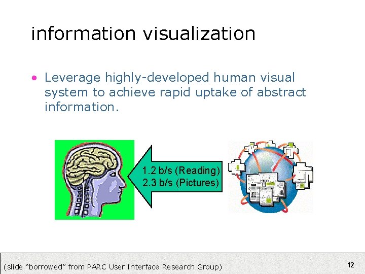
information visualization • Leverage highly-developed human visual system to achieve rapid uptake of abstract information. 1. 2 b/s (Reading) 2. 3 b/s (Pictures) (slide “borrowed” from PARC User Interface Research Group) 12

augmented cognition • Using external artifacts to amplify human mental abilities. – Classic examples: pen and paper, slide rules – A primary goal of Information visualization • In the case of Info. Vis, how? – – – Increased resources Reduced search Enhanced pattern recognition Perceptual inference Perceptual monitoring Manipulable medium 13

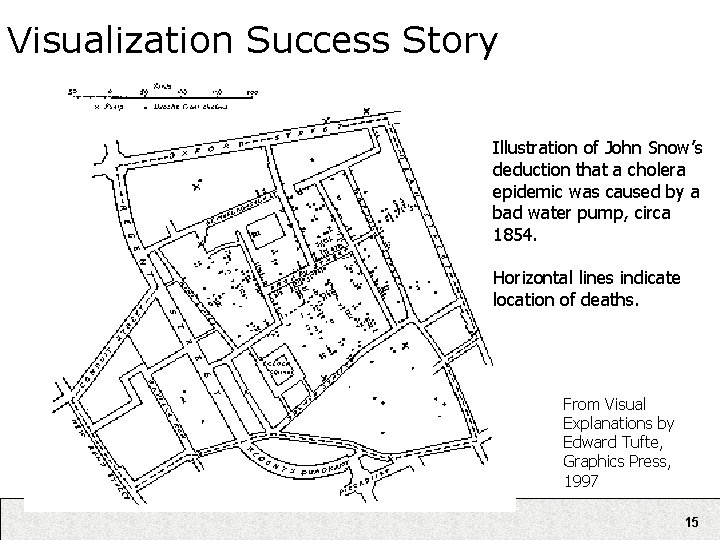
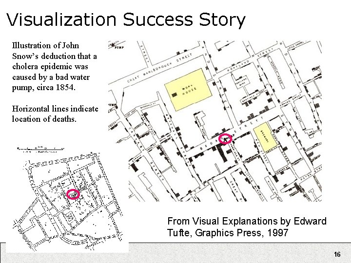
Visualization Success Story Mystery: what is causing a cholera epidemic in London in 1854? 14

Visualization Success Story Illustration of John Snow’s deduction that a cholera epidemic was caused by a bad water pump, circa 1854. Horizontal lines indicate location of deaths. From Visual Explanations by Edward Tufte, Graphics Press, 1997 15

Visualization Success Story Illustration of John Snow’s deduction that a cholera epidemic was caused by a bad water pump, circa 1854. Horizontal lines indicate location of deaths. From Visual Explanations by Edward Tufte, Graphics Press, 1997 16

overview • • why infovis? review some basics examples deconstructed modeling visualizations 17

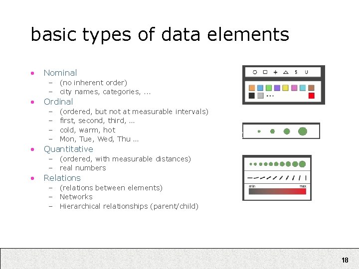
basic types of data elements • Nominal – (no inherent order) – city names, categories, . . . • Ordinal – – • (ordered, but not at measurable intervals) first, second, third, … cold, warm, hot Mon, Tue, Wed, Thu … Quantitative – (ordered, with measurable distances) – real numbers • Relations – (relations between elements) – Networks – Hierarchical relationships (parent/child) 18

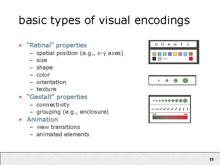
basic types of visual encodings • “Retinal” properties – – – spatial position (e. g. , x-y axes) size shape color orientation texture • “Gestalt” properties – connectivity – grouping (e. g. , enclosure) • Animation – view transitions – animated elements 19
![sensemaking tasks Card et al Information foraging Collect information of interest sensemaking tasks [Card et al] • Information foraging – Collect information of interest •](https://slidetodoc.com/presentation_image_h2/44fdb94a7739dfbee5f9df009dfa4879/image-20.jpg)
sensemaking tasks [Card et al] • Information foraging – Collect information of interest • Search for schema – Identify relevant dimensions of data • Instantiate schema (with data!) – Schema == knowledge representation – Organize / codify information • Analysis (problem solving) – Analyze and filter data, answer questions – Refine schema as needed • Record / communicate – Make a decision, take action, or communicate results 20
![interactive tasks Shneiderman Overview Get an overview of the collection Zoom interactive tasks [Shneiderman] • Overview – Get an overview of the collection • Zoom](https://slidetodoc.com/presentation_image_h2/44fdb94a7739dfbee5f9df009dfa4879/image-21.jpg)
interactive tasks [Shneiderman] • Overview – Get an overview of the collection • Zoom – Zoom in on items of interest • Filter – Remove uninteresting items • Details on demand – Select items and get details • Relate – View relationships between items • History – Keep a history of actions for undo, replay, refinement • Extract – Make subcollections 21

overview • • why infovis? review some basics examples deconstructed modeling visualizations 22

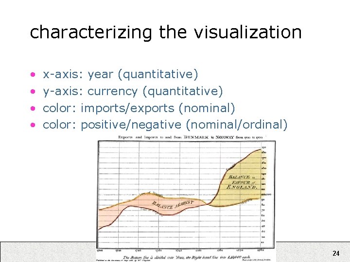
data graphics (Playfair, ca. 1780) 23

characterizing the visualization • • x-axis: year (quantitative) y-axis: currency (quantitative) color: imports/exports (nominal) color: positive/negative (nominal/ordinal) 24

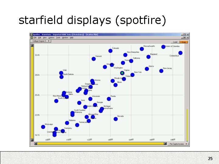
starfield displays (spotfire) 25

starfield displays (spotfire) 26

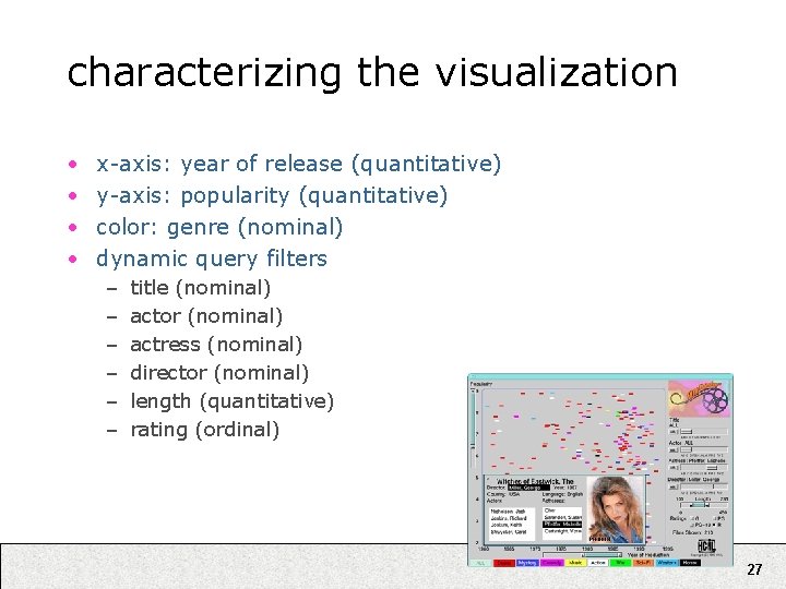
characterizing the visualization • • x-axis: year of release (quantitative) y-axis: popularity (quantitative) color: genre (nominal) dynamic query filters – – – title (nominal) actor (nominal) actress (nominal) director (nominal) length (quantitative) rating (ordinal) 27

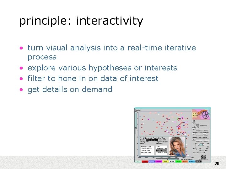
principle: interactivity • turn visual analysis into a real-time iterative process • explore various hypotheses or interests • filter to hone in on data of interest • get details on demand 28

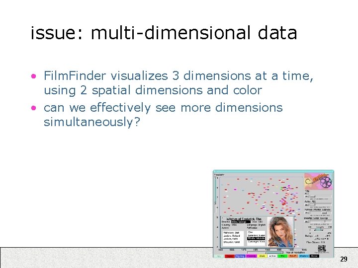
issue: multi-dimensional data • Film. Finder visualizes 3 dimensions at a time, using 2 spatial dimensions and color • can we effectively see more dimensions simultaneously? 29

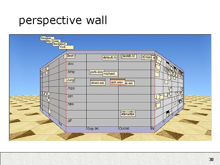
perspective wall 30

perspective wall • Video online at: http: //www. sims. berkeley. edu/courses/is 247/f 05/movies/ Perspective. Wall. mov 31

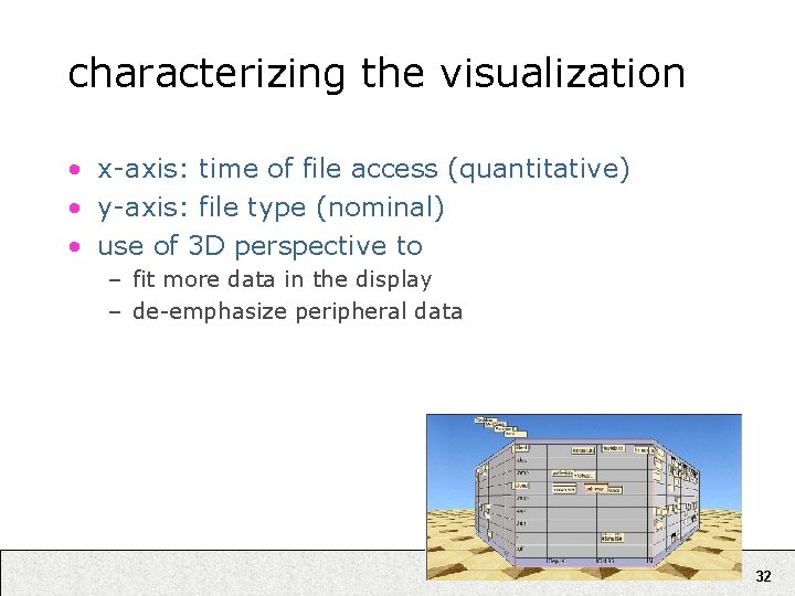
characterizing the visualization • x-axis: time of file access (quantitative) • y-axis: file type (nominal) • use of 3 D perspective to – fit more data in the display – de-emphasize peripheral data 32

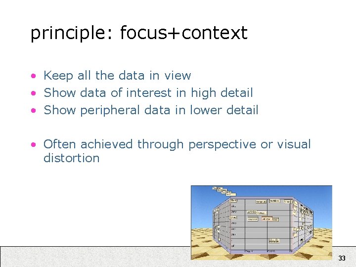
principle: focus+context • Keep all the data in view • Show data of interest in high detail • Show peripheral data in lower detail • Often achieved through perspective or visual distortion 33

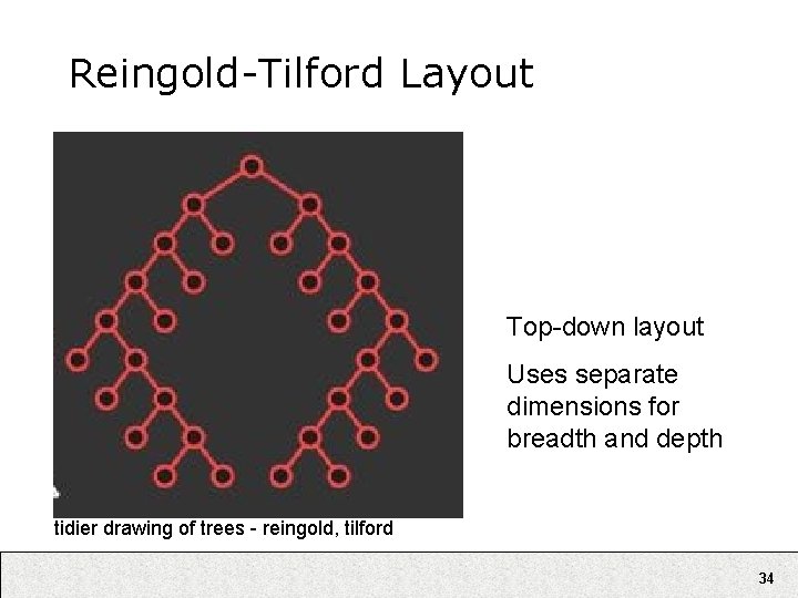
Reingold-Tilford Layout Top-down layout Uses separate dimensions for breadth and depth tidier drawing of trees - reingold, tilford 34

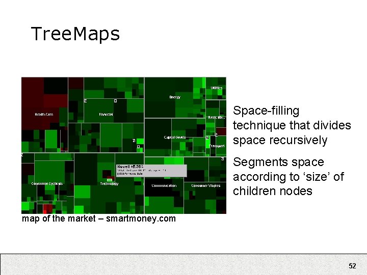
Tree. Maps Space-filling technique that divides space recursively Segments space according to ‘size’ of children nodes map of the market – smartmoney. com 35

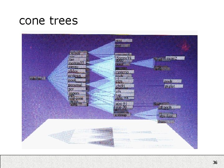
cone trees 36

cone trees • Video online at: http: //www. sims. berkeley. edu/courses/is 247/f 05/movies/ Cone. Tree. mov 37

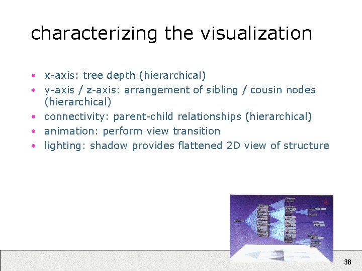
characterizing the visualization • x-axis: tree depth (hierarchical) • y-axis / z-axis: arrangement of sibling / cousin nodes (hierarchical) • connectivity: parent-child relationships (hierarchical) • animation: perform view transition • lighting: shadow provides flattened 2 D view of structure 38

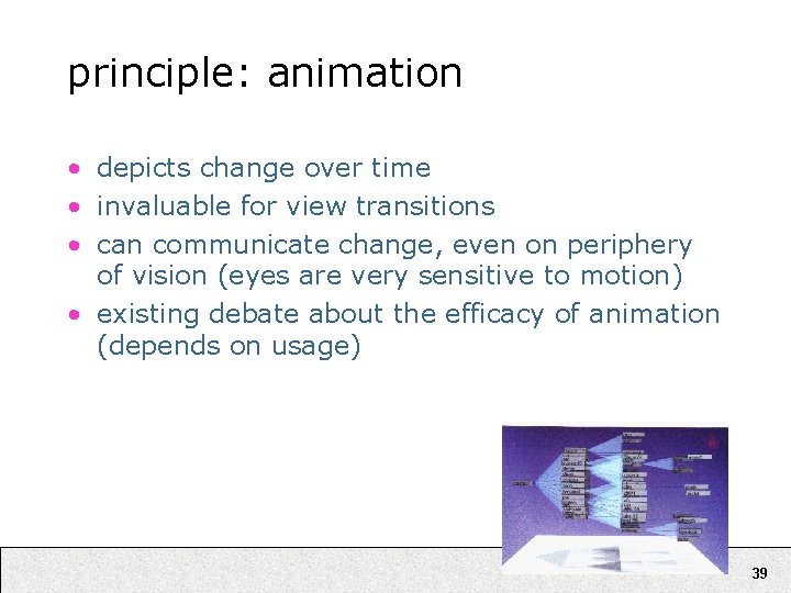
principle: animation • depicts change over time • invaluable for view transitions • can communicate change, even on periphery of vision (eyes are very sensitive to motion) • existing debate about the efficacy of animation (depends on usage) 39

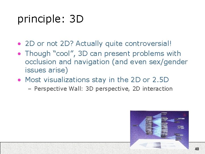
principle: 3 D • 2 D or not 2 D? Actually quite controversial! • Though “cool”, 3 D can present problems with occlusion and navigation (and even sex/gender issues arise) • Most visualizations stay in the 2 D or 2. 5 D – Perspective Wall: 3 D perspective, 2 D interaction 40

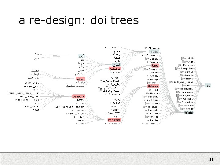
a re-design: doi trees 41

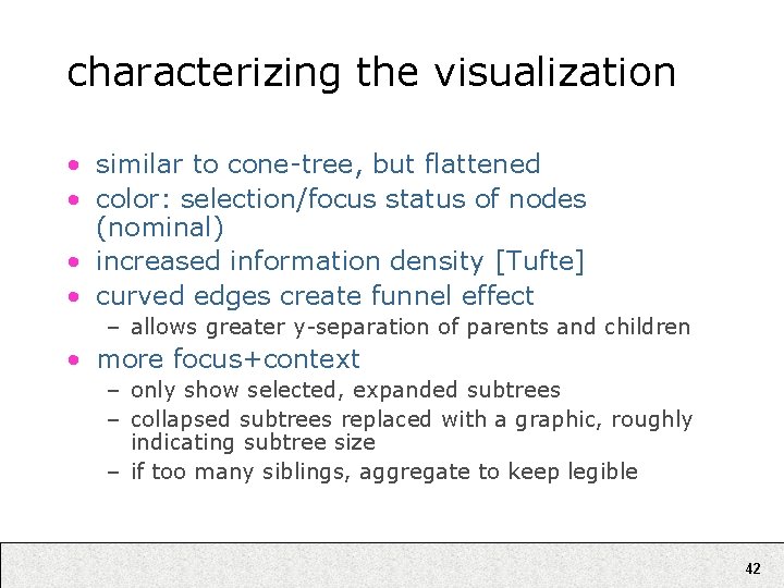
characterizing the visualization • similar to cone-tree, but flattened • color: selection/focus status of nodes (nominal) • increased information density [Tufte] • curved edges create funnel effect – allows greater y-separation of parents and children • more focus+context – only show selected, expanded subtrees – collapsed subtrees replaced with a graphic, roughly indicating subtree size – if too many siblings, aggregate to keep legible 42

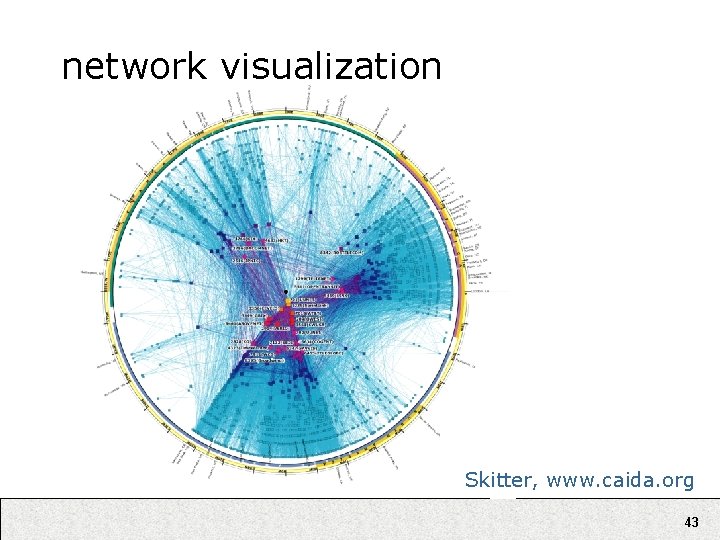
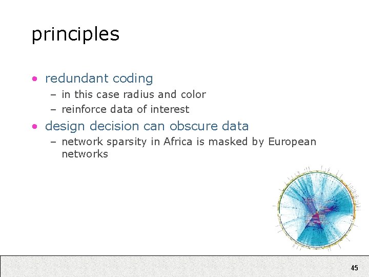
network visualization Skitter, www. caida. org 43

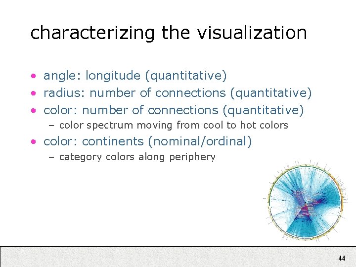
characterizing the visualization • angle: longitude (quantitative) • radius: number of connections (quantitative) • color: number of connections (quantitative) – color spectrum moving from cool to hot colors • color: continents (nominal/ordinal) – category colors along periphery 44

principles • redundant coding – in this case radius and color – reinforce data of interest • design decision can obscure data – network sparsity in Africa is masked by European networks 45

more video examples • Video online at: http: //www. sims. berkeley. edu/courses/is 247/f 05/movies/ prefuse. avi • Shows selected applications built using the prefuse visualization toolkit for writing 2 D visualizations in Java. – http: //prefuse. sourceforge. net 46

overview • • why infovis? review some basics examples deconstructed modeling visualizations 47

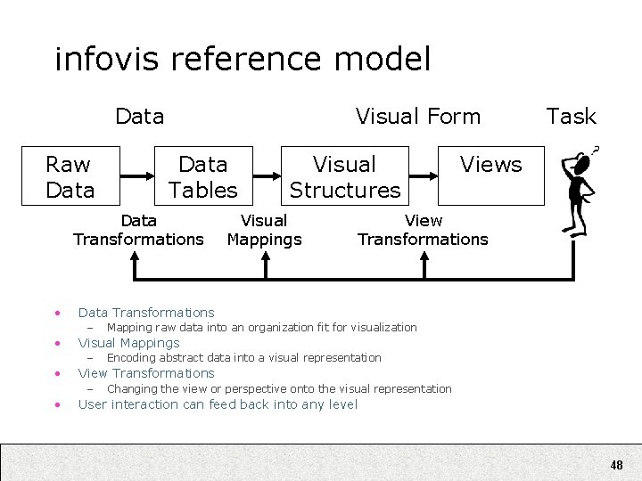
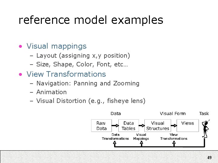
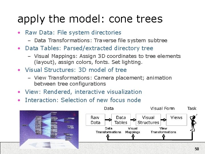
infovis reference model Data Raw Data Visual Form Data Tables Data Transformations • Mapping raw data into an organization fit for visualization Encoding abstract data into a visual representation View Transformations – • View Transformations Visual Mappings – • Visual Mappings Views Data Transformations – • Visual Structures Task Changing the view or perspective onto the visual representation User interaction can feed back into any level 48

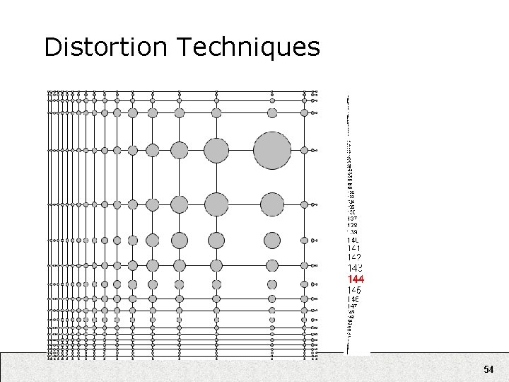
reference model examples • Visual mappings – Layout (assigning x, y position) – Size, Shape, Color, Font, etc… • View Transformations – Navigation: Panning and Zooming – Animation – Visual Distortion (e. g. , fisheye lens) 49

apply the model: cone trees • Raw Data: File system directories – Data Transformations: Traverse file system subtree • Data Tables: Parsed/extracted directory tree – Visual Mappings: Assign 3 D coordinates to tree elements (layout), assign colors, fonts. Set lighting. • Visual Structures: 3 D model of tree – View Transformations: Camera placement; animation between tree configurations • View: Rendered, interactive visualization • Interaction: Selection of new focus node 50

other examples 51

Tree. Maps Space-filling technique that divides space recursively Segments space according to ‘size’ of children nodes map of the market – smartmoney. com 52

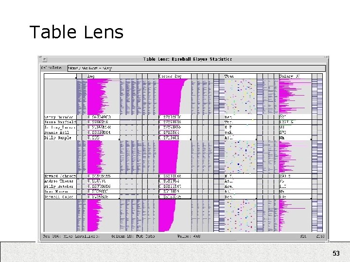
Table Lens 53

Distortion Techniques 54

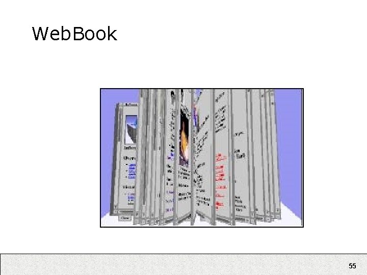
Web. Book 55

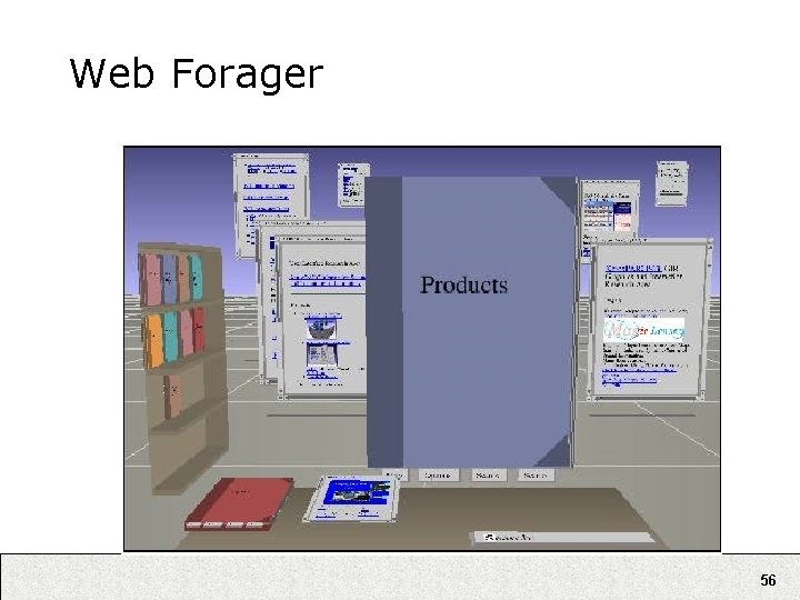
Web Forager 56

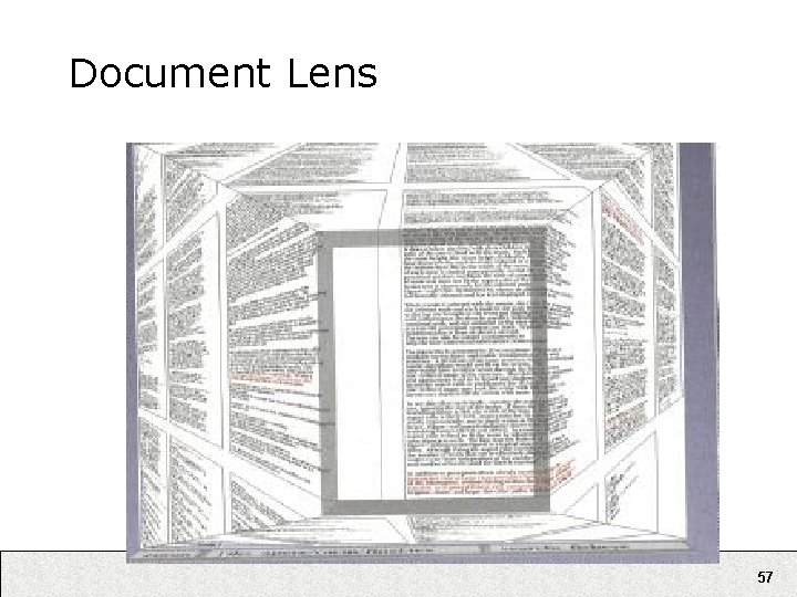
Document Lens 57

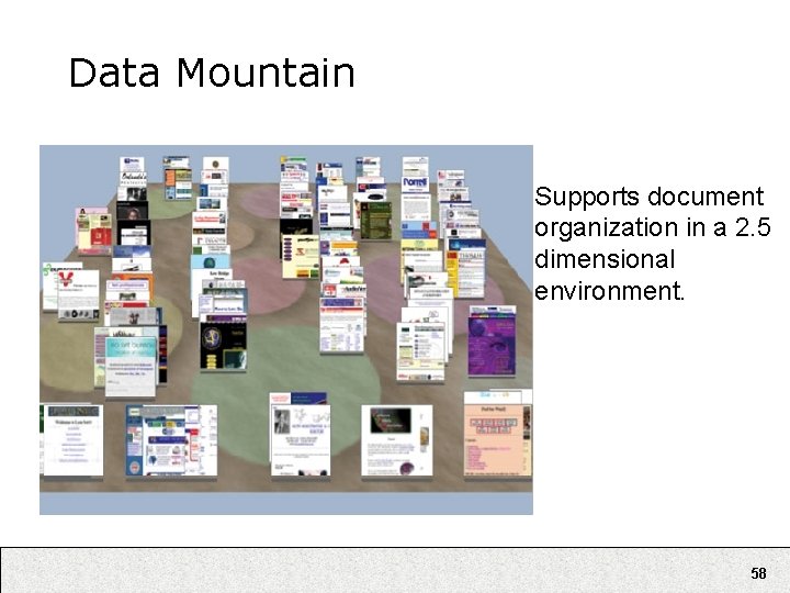
Data Mountain Supports document organization in a 2. 5 dimensional environment. 58

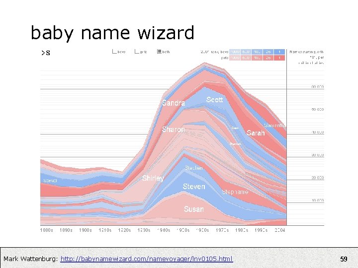
baby name wizard Mark Wattenburg: http: //babynamewizard. com/namevoyager/lnv 0105. html 59

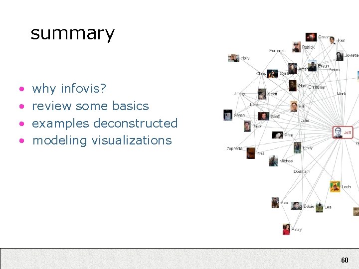
summary • • why infovis? review some basics examples deconstructed modeling visualizations 60