1 Introduction The purpose of this paper is


) sa <-sin(a) b <- sort(runif(25, 0, 3)) sb <-sin(b)")


 http: //en. wikipedia. org/wiki/File: Gaussian. Scatter. PCA. png")


: Three key ideas of topology that make extracting of patterns")

: Three key ideas of topology that make extracting of patterns")
: Three key ideas of topology that make extracting of patterns")


 Data Set Example: Point cloud")
 = ? ? 4 3 Minkowski distance Chebyshev")
 = ? ? 4 3 5 Minkowski distance")

, (10,")


( )")
( )")


")


 whose distance is less than a given threshold")

")


")


 Patient-patient network for topology patterns on 11,")
 Patient-patient network for topology patterns on 11,")


- Slides: 82
1. Introduction The purpose of this paper is to introduce a new method for the qualitative analysis, simplification and visualization of high dimensional data sets, as well as the qualitative analysis of functions on these data sets.
Some quantitative analysis is also possible
3. 2. 2. 2 Insight by Ranked Variables Going back to the Titanic example, the result of the KS-statistic show, that the variable “Sex” is the most strongly related to passengers death. We could generally assume that men conceded the places in lifeboats to women. Furthermore, it is feasible to deduct the subtle reasons of the death of each group. The passengers in group A died because of two reasons: they were man and the cabin class type was low. The passengers in the group B died because they were man. Finally, the passengers in the group C died because they were staying at third class even though most of them were women.
http: //www. physics. csbsju. edu/stats/KS-test. html The KS-test uses the maximum vertical deviation between the two curves as the statistic D. In this case the maximum deviation occurs near x=1 and has D=. 45. (The fraction of the treatment group that is less then one is 0. 2 (4 out of the 20 values); the fraction of the control group that is less than one is 0. 65 (13 out of the 20 values). Thus the maximum difference in cumulative fraction is D=. 45. )
a <- sort(runif(30, 0, 3)) sa <-sin(a) b <- sort(runif(25, 0, 3)) sb <-sin(b) c <- sort(runif(30, 0, 3)) sc <- c^2 plot(sa, main = "data", col="blue", pch = 17, cex. main = 1. 5, cex. lab = 1. 7, cex. axis = 2) points(sb, col="red", pch = 19) points(sc, pch = 10, cex=2) plot(sc, main = "data", pch = 10, cex=2, cex. main = 1. 5, cex. lab = 1. 7, cex. axis = 2) points(sb, col="red", pch = 19) points(sa, col="blue", pch = 17)
“small D” and “large p” means sa and sb may some from same distribution. But D isn’t that small and p < 0. 05 Large D and small p means data come from different distributions Ex sa and sb consist of points taken from sin curve, while sc consists of points taken from x 2 curve.
Sample size matters “small D” and “large p” means sa and sb may some from same distribution. But D isn’t that small and p < 0. 05 Large D and small p means data come from different distributions Ex sa and sb consist of points taken from sin curve, while sc consists of points taken from x 2 curve.
sa and sb consist of points taken from sin curve Sample size matters
sa and sb consist of points taken from sin curve Sample size matters But can compare samples with different sizes Sample size matters
Topological Methods for the Analysis of High Dimensional Data Sets and 3 D Object Recognition Singh, Gurjeet; Memoli, Facundo; Carlsson, Gunnar http: //diglib. eg. org/handle/10. 2312/SPBG 07. 091 -100
TDA mapper can also be used for classification and/or comparing different data sets via a “good” distance between graphs. http: //diglib. eg. org/handle/10. 2312/SPBG 07. 091 -100
The idea is to provide another tool for a generalized notion of coordinatization for high dimensional data sets. Coordinatization can of course refer to a choice of real valued coordinate functions on a data set, http: //diglib. eg. org/handle/10. 2312/SPBG 07. 091 -100
U Dimensionality Reduction: Given dataset D RN Want: embedding f: D Rn where n << N which “preserves” the structure of the data. Many reduction methods: f 1: D R, f 2: D R, … fn: D R (f 1, f 2, … fn): D Rn Many are linear, M: RN Rn, Mx = y But there also non-linear dimensionality reduction algorithms.
Example: Principle component analysis (PCA) http: //en. wikipedia. org/wiki/File: Gaussian. Scatter. PCA. png
https: //en. wikipedia. org/wiki/Nonlinear_dimensionality_reduction
Goal f: D S 1 which “preserves” the structure of the data. circle courtesy of knotplot. com
circle courtesy of knotplot. com
The idea is to provide another tool for a generalized notion of coordinatization for high dimensional data sets. Coordinatization can of course refer to a choice of real valued coordinate functions on a data set, but other notions of geometric representation (e. g. , the Reeb graph [Ree 46]) are often useful and reflect interesting information more directly. http: //diglib. eg. org/handle/10. 2312/SPBG 07. 091 -100
The idea is to provide another tool for a generalized notion of coordinatization for high dimensional data sets. Coordinatization can of course refer to a choice of real valued coordinate functions on a data set, The graph/simplicial complex created by Mapper can be thought of as a partial coordinization of the data set. BUT keep in mind that the output is an abstract graph/simplicial complex
Topological Data Analysis (TDA): Three key ideas of topology that make extracting of patterns via shape possible. 1. ) coordinate free. • No dependence on the coordinate system chosen. • Can compare data derived from different platforms • vital when one is studying data collected with different technologies, or from different labs when the methodologies cannot be standardized. http: //www. nature. com/srep/2013/130207/srep 01236/full/srep 01236. html
Two filter functions, L-Infinity centrality and survival or relapse were used to generate the networks. The top half of panels A and B are the networks of patients who didn't survive, the bottom half are the patients who survived. Panels C and D are similar to panels A and B except that one of the filters is relapse instead of survival. Panels A and C are colored by the average expression of the ESR 1 gene. Panels B and D are colored by the average expression of the genes in the KEGG chemokine pathway. Metric: Correlation; Lens: L-Infinity Centrality (Resolution 70, Gain 3. 0 x, Equalized) and Event Death (Resolution 30, Gain 3. 0 x). Color bar: red: high values, blue: low values. http: //www. nature. com/srep/2013/130207/srep 01236/full/srep 01236. html
Topological Data Analysis (TDA): Three key ideas of topology that make extracting of patterns via shape possible. 2. ) invariant under “small” deformations. • less sensitive to noise Figure from http: //comptop. stanford. edu/u/preprints/mapper. PBG. pdf http: //www. nature. com/srep/2013/130207/srep 01236/full/srep 01236. html Topological Methods for the Analysis of High Dimensional Data Sets and 3 D Object Recognition, Singh, Mémoli, Carlsson
Topological Data Analysis (TDA): Three key ideas of topology that make extracting of patterns via shape possible. 3. ) compressed representations of shapes. • Input: dataset with thousands of points • Output: network with 13 vertices and 12 edges. http: //www. nature. com/srep/2013/130207/srep 01236/full/srep 01236. html
Three key ideas of topology that make extracting of patterns via shape possible. TDA mapper benefits 1. ) coordinate free. • No dependence on the coordinate system chosen. • Can compare data derived from different platforms 2. ) invariant under “small” deformations. • less sensitive to noise 3. ) compressed representations of shapes. • Input: dataset with thousands of points • Output: network with 13 vertices and 12 edges. http: //www. nature. com/srep/2013/130207/srep 01236/full/srep 01236. html
Note: we made many, many choices It helps to know what you are doing when you make choices, so collaborating with others is highly recommended.
We chose how to model the data set A) Data Set Example: Point cloud data representing a hand. http: //www. nature. com/srep/2013/130207/srep 01236/full/srep 01236. html
q Euclidean 5 p d(p, q) = ? ? 4 3 Minkowski distance Chebyshev distance
q Euclidean 5 p d(p, q) = ? ? 4 3 5 Minkowski distance (k = 1) 7 Chebyshev distance 4
In Rn If n small, Euclidean distance often makes sense If n is large, consider Chebyshev distance or performing PCA first to project data into Rd, for small d and then using Euclidean distance Chebyshev distance:
Why use PCA in data analysis? Consider the points (0, 0, …, 0), (10, 0, …, 0) 0 1 Add noise to first point (0, 0, …, 0) (0, 1, …, 1) In R 100, d((0, 1, …, 1), (1, 0, …, 0)) = 10 > 9. Add small noise to first point (0, 0, …, 0) (0, 0. 1, …, 0. 1) In R 39, 900, d((0, 0. 1, …, 0. 1), (1, 0, …, 0)) = 20 > 9. 10
But you may want to focus on Euclidean distance AFTER normalizing: From databasics 3900. r: > # one way to normalize data > scaledata 2 <- scale(data 2) # scales data so that mean = 0, sd = 1 > col. Means(scaledata 2) # faster version of apply(scaled. dat, 2, mean) # shows that mean of each column is 0 Sepal. Length Sepal. Width Petal. Length Petal. Width -4. 480675 e-16 2. 035409 e-16 -2. 844947 e-17 -3. 714621 e-17 > apply(scaledata 2, 2, sd) # shows that standard deviation # of each column is 1 Sepal. Length Sepal. Width Petal. Length Petal. Width 1 1 ---------------------------------------------P<- select(tbl_df(scaledata 2), Petal. Length) # Choose filter m 1 <- mapper 1 D( # Apply mapper distance_matrix = dist(data. frame(scaledata 2)), filter_values = P, # save data to current working num_intervals = 10, # directory as a text file percent_overlap = 50, write. table(scaledata 2, "data. txt", sep=" ", num_bins_when_clustering = 10) row. names = FALSE, col. names = FALSE)
Chose filter function Function f : Data Set R Ex 1: x-coordinate f : (x, y, z) x http: //www. nature. com/srep/2013/130207/srep 01236/full/srep 01236. html
Chose filter function Function f : Data Set R Ex 1: x-coordinate f : (x, y, z) x Ex 2: y-coordinate g : (x, y, z) y http: //www. nature. com/srep/2013/130207/srep 01236/full/srep 01236. html
Filter Function The method begins with a data set X and a real valued function f : X →R, to produce a graph. This function can be a function which reflects geometric properties of the data set, such as the result of a density estimator, or In the first case, one is attempting to obtain information about the qualitative properties of the data set itself, Are there Flares? Topology? http: //diglib. eg. org/handle/10. 2312/SPBG 07. 091 -100 Blobs? # of components?
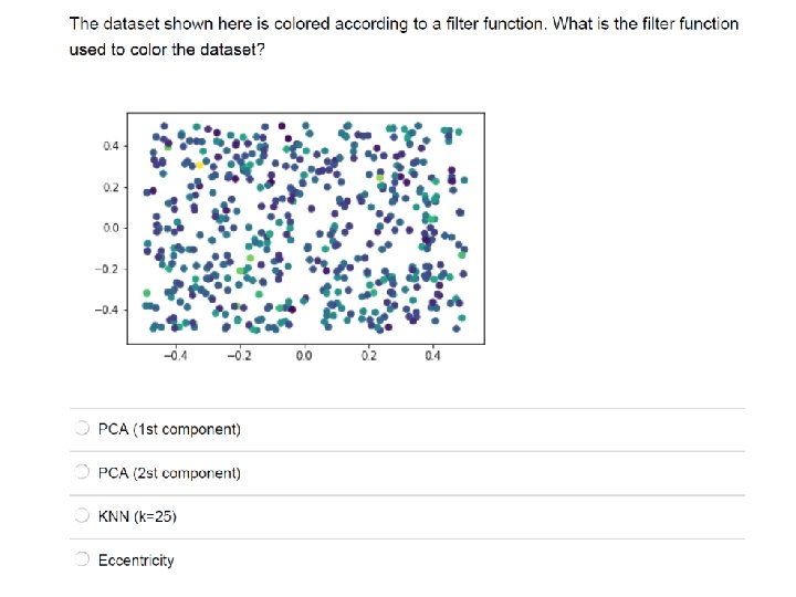
Filter function: eccentricity
5. 3. Mapper on 3 D Shape Database The top row shows the rendering of one model from each of the 7 classes. The bottom row shows the same model colored by the E 1 function (setting p = 1 in equation 4– 1) computed on the mesh. diglib. eg. org/handle/10. 2312/SPBG 07. 091 -100
Filter function: PCA
knn distance with k = 5 3 intervals, 50% overlap [ ( )( ) ]
knn distance with k = 5 3 intervals, 50% overlap [ ( )( ) What parameters can we change to improve output? ? ]
knn distance with k = 5, 3 intervals, 50% overlap 20% overlap
Distance Matrix Eigenvector, Mean Centered Distance Matrix Order of eigenvector: 0 5 intervals, 50% Overlap
Different types of data sets
Different types of data sets Some data sets contain background noise
Use multiple filter functions But for 2 filter functions with n intervals for each = n 2 bins And for k filter functions with n intervals for each = nk bins http: //www. nature. com/srep/2013/130207/srep 01236/full/srep 01236. html
Chose bins For 1 D filter: Put data into overlapping bins. Example: f-1(ai, bi) If equal length intervals: Choose length. Choose % overlap. http: //www. nature. com/srep/2013/130207/srep 01236/full/srep 01236. html
We propose a method which can be used to reduce high dimensional data sets into simplicial complexes with far fewer points which can capture topological and geometric information at a specified resolution. http: //diglib. eg. org/handle/10. 2312/SPBG 07. 091 -100
We propose a method which can be used to reduce high dimensional data sets into simplicial complexes with far fewer points which can capture topological and geometric information at a specified resolution. Resolution means ? ? Which choice refers to resolution? http: //diglib. eg. org/handle/10. 2312/SPBG 07. 091 -100
This construction produces a “multiresolution" or “multiscale“ image of the data set. One can actually construct a family of simplicial complexes (graphs in the case of a one-dimensional parameter space), which are viewed as images at varying levels of coarseness, and maps between them moving from a complex at one resolution to one of coarser resolution. http: //diglib. eg. org/handle/10. 2312/SPBG 07. 091 -100
knn distance with k = 5, 50% overlap 3 intervals 5 intervals 100 intervals
knn distance with k = 50, 50% overlap 3 intervals 10 intervals 5 intervals 100 intervals
This construction produces a “multiresolution" or “multiscale“ image of the data set. One can actually construct a family of simplicial complexes (graphs in the case of a one-dimensional parameter space), which are viewed as images at varying levels of coarseness, and maps between them moving from a complex at one resolution to one of coarser resolution. http: //diglib. eg. org/handle/10. 2312/SPBG 07. 091 -100
This fact allows one to assess the extent to which features are “real" as opposed to “artifacts", since features which persist over a range of values of the coarseness would be viewed as being less likely to be artifacts. http: //diglib. eg. org/handle/10. 2312/SPBG 07. 091 -100
Note: Many, many choices were made “It is useful to think of it as a camera, with lens adjustments and other settings. A different filter function may generate a network with a different shape, thus allowing one to explore the data from a different mathematical perspective. ” False positives vs. robustness http: //www. nature. com/srep/2013/130207/srep 01236/full/srep 01236. html
We do not attempt to obtain a fully accurate representation of a data set, but rather a low dimensional image which is easy to understand, and which can point to areas of interest. Note that it is implicit in the method that one fixes a parameter space, and its dimension will be an upper bound on the dimension of the simplicial complex one studies. As such, it is in a certain way analogous to the idea of a Postnikov tower or the coskeletal filtration in algebraic topology [Hat 02]. http: //diglib. eg. org/handle/10. 2312/SPBG 07. 091 -100
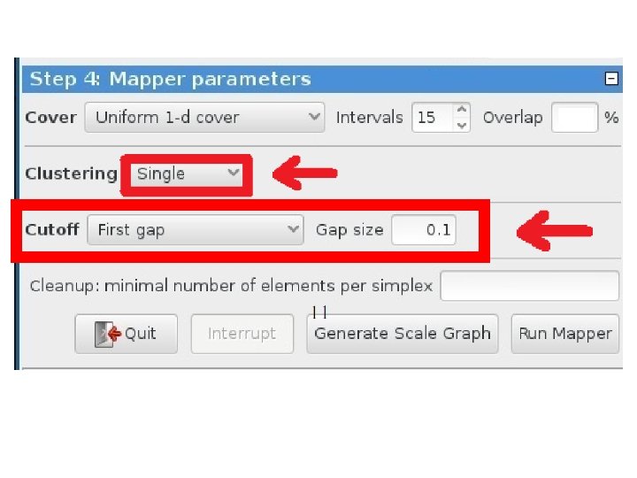
Chose how to cluster. Normally need a definition of distance between data points Cluster each bin & create network. Vertex = a cluster of a bin. Edge = nonempty intersection between clusters http: //www. nature. com/srep/2013/130207/srep 01236/full/srep 01236. html
http: //scikit-learn. org/stable/auto_examples/cluster/plot_cluster_comparison. html
Increasing threshold Connect vertices whose distance is less than a given threshold single linkage hierarchical clustering
Increasing threshold Connect vertices (or clusters) whose distance is less than a given threshold
Different type of hierarchical clustering What is the distance between 2 clusters? http: //en. wikipedia. org/wiki/File: Hiera rchical_clustering_simple_diagram. svg http: //www. multid. se/genex/hs 515. htm
http: //statweb. stanford. edu/~tibs/Elem. Stat. Learn/ The Elements of Statistical Learning (2 nd edition) Hastie, Tibshirani and Friedman
For hierarchical clustering, choose • Single linkage IF … • Complete or average linkage IF …
For hierarchical clustering, choose • Single linkage IF you are interested in shape • Complete or average linkage IF you are interested in closeness.
http: //statweb. stanford. edu/~tibs/Elem. Stat. Learn/ The Elements of Statistical Learning (2 nd edition) Hastie, Tibshirani and Friedman
http: //statweb. stanford. edu/~tibs/Elem. Stat. Learn/ Where do you cut the dendrogram? ? ? The Elements of Statistical Learning (2 nd edition) Hastie, Tibshirani and Friedman
Higher up = fewer clusters Lower down = more clusters http: //statweb. stanford. edu/~tibs/Elem. Stat. Learn/ Where do you cut the dendrogram? ? ? The Elements of Statistical Learning (2 nd edition) Hastie, Tibshirani and Friedman
Note: Many, many choices were made It helps to know what you are doing when you make choices, so collaborating with others is highly recommended.
Note: Many, many choices were made “It is useful to think of it as a camera, with lens adjustments and other settings. A different filter function may generate a network with a different shape, thus allowing one to explore the data from a different mathematical perspective. ” http: //www. nature. com/srep/2013/130207/srep 01236/full/srep 01236. html
Note: we made many, many choices “It is useful to think of it as a camera, with lens adjustments and other settings. A different filter function may generate a network with a different shape, thus allowing one to explore the data from a different mathematical perspective. ” False positives? ? ? http: //www. nature. com/srep/2013/130207/srep 01236/full/srep 01236. html
False Positives will occur https: //xkcd. com/882/
Note: Many, many choices were made “It is useful to think of it as a camera, with lens adjustments and other settings. A different filter function may generate a network with a different shape, thus allowing one to explore the data from a different mathematical perspective. ” False positives vs. robustness http: //www. nature. com/srep/2013/130207/srep 01236/full/srep 01236. html
Tools to analyze TDA mapper output
3. 2. 2. 2 Insight by Ranked Variables Going back to the Titanic example, the result of the KS-statistic show, that the variable “Sex” is the most strongly related to passengers death. We could generally assume that men conceded the places in lifeboats to women. Furthermore, it is feasible to deduct the subtle reasons of the death of each group. The passengers in group A died because of two reasons: they were man and the cabin class type was low. The passengers in the group B died because they were man. Finally, the passengers in the group C died because they were staying at third class even though most of them were women. KS statistic
“Color ranges over red to blue and it has different meanings, depending on the type of attributes. For the continuous values, color represents an average of value. A red node contains data samples that have higher average values. In contrast, a blue node contains lower average values. In contrast, for the categorical values, color represents a value concentration. ” Analyze your data
Coloring 3. 2. 2. 2 Insight by Ranked Variables Going back to the Titanic example, the result of the KS-statistic show, that the variable “Sex” is the most strongly related to passengers death. We could generally assume that men conceded the places in lifeboats to women. Furthermore, it is feasible to deduct the subtle reasons of the death of each group. The passengers in group A died because of two reasons: they were man and the cabin class type was low. The passengers in the group B died because they were man. Finally, the passengers in the group C died because they were staying at third class even though most of them were women.
Two filter functions, L-Infinity centrality and survival or relapse were used to generate the networks. The top half of panels A and B are the networks of patients who didn't survive, the bottom half are the patients who survived. Panels C and D are similar to panels A and B except that one of the filters is relapse instead of survival. Panels A and C are colored by the average expression of the ESR 1 gene. Panels B and D are colored by the average expression of the genes in the KEGG chemokine pathway. Metric: Correlation; Lens: L-Infinity Centrality (Resolution 70, Gain 3. 0 x, Equalized) and Event Death (Resolution 30, Gain 3. 0 x). Color bar: red: high values, blue: low values. http: //www. nature. com/srep/2013/130207/srep 01236/full/srep 01236. html
Fig. 1. Patient and genotype networks. (A) Patient-patient network for topology patterns on 11, 210 Biobank patients. Each node represents a single or a group of patients with the significant similarity based on their clinical features. Edge connected with nodes indicates the nodes have shared patients. Red color represents the enrichment for patients with T 2 D diagnosis, and blue color represents the nonenrichment for patients with T 2 D diagnosis. (B) Patient-patient network for topology patterns on 2551 T 2 D patients. Each node represents a single or a group of patients with the significant similarity based on their clinical features. Edge connected with nodes indicates the nodes have shared patients. Red color represents the enrichment for patients with females, and blue color represents the enrichment for males. Li Li et al. , Sci Transl Med 2015; 7: 311 ra 174 From: http: //stm. sciencemag. org/content/7/311 ra 174. full Published by AAAS
Fig. 1. Patient and genotype networks. (A) Patient-patient network for topology patterns on 11, 210 Biobank patients. Each node represents a single or a group of Apply TDA mapper to a similarity subset based of patients with the significant on their features. Edge connected your dataclinical by selecting nodes indicates the nodes have • with Column value shared patients. Red color represents the • Grouping ofpatients nodeswith T 2 D diagnosis, enrichment for and blue color represents=the (nodes = vertices clusters) nonenrichment for patients with T 2 D • diagnosis. Etc. (B) Patient-patient network for topology patterns on 2551 T 2 D patients. Each node represents a single or a group of patients with the significant similarity based on their clinical features. Edge connected with nodes indicates the nodes have shared patients. Red color represents the enrichment for patients with females, and blue color represents the enrichment for males. Li Li et al. , Sci Transl Med 2015; 7: 311 ra 174 From: http: //stm. sciencemag. org/content/7/311 ra 174. full Published by AAAS