Chapter 7 Scatterplots Association and Correlation Copyright 2009

![TI – Before we start n n n n Select [2 nd][CATALOG] Tab to TI – Before we start n n n n Select [2 nd][CATALOG] Tab to](https://slidetodoc.com/presentation_image_h2/7216f7a2c100dd000e82f950e0edf614/image-64.jpg)


- Slides: 103


Chapter 7 Scatterplots, Association, and Correlation Copyright © 2009 Pearson Education, Inc.

NOTE on slides / What we can and cannot do n The following notice accompanies these slides, which have been downloaded from the publisher’s Web site: “This work is protected by United States copyright laws and is provided solely for the use of instructors in teaching their courses and assessing student learning. Dissemination or sale of any part of this work (including on the World Wide Web) will destroy the integrity of the work and is not permitted. The work and materials from this site should never be made available to students except by instructors using the accompanying text in their classes. All recipients of this work are expected to abide by these restrictions and to honor the intended pedagogical purposes and the needs of other instructors who rely on these materials. ” n n We can use these slides because we are using the text for this course. Please help us stay legal. Do not distribute these slides any further. The original slides are done in orange / brown and black. My additions are in red and blue. Topics in green are optional. Copyright © 2009 Pearson Education, Inc. Slide 1 - 3

Main topics in this chapter n n n Scatterplots Three things to look for n Direction n Form n Strength Correlation and its properties n Calculation n Interpretation Copyright © 2009 Pearson Education, Inc. Slide 1 - 4

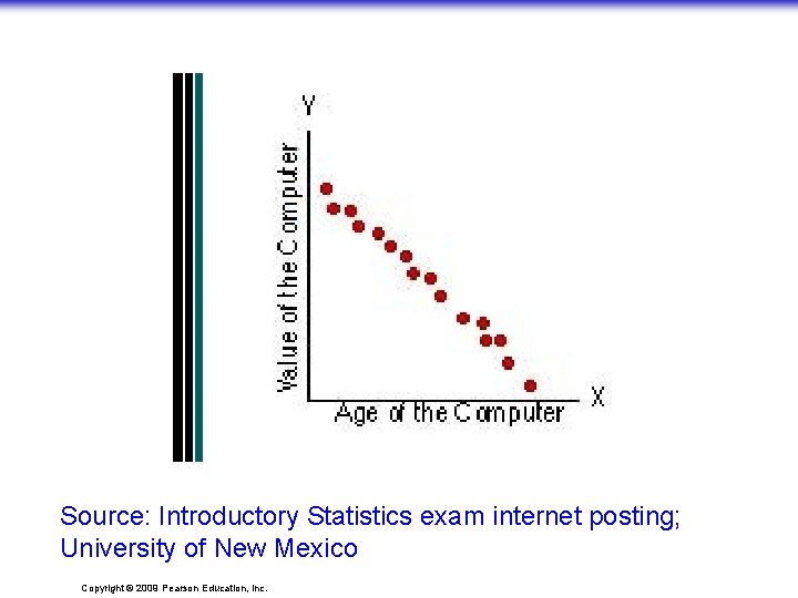
Source: Introductory Statistics exam internet posting; University of New Mexico Copyright © 2009 Pearson Education, Inc.

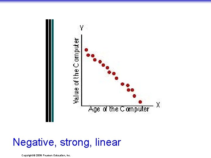
Negative, strong, linear Copyright © 2009 Pearson Education, Inc.

Copyright © 2009 Pearson Education, Inc.

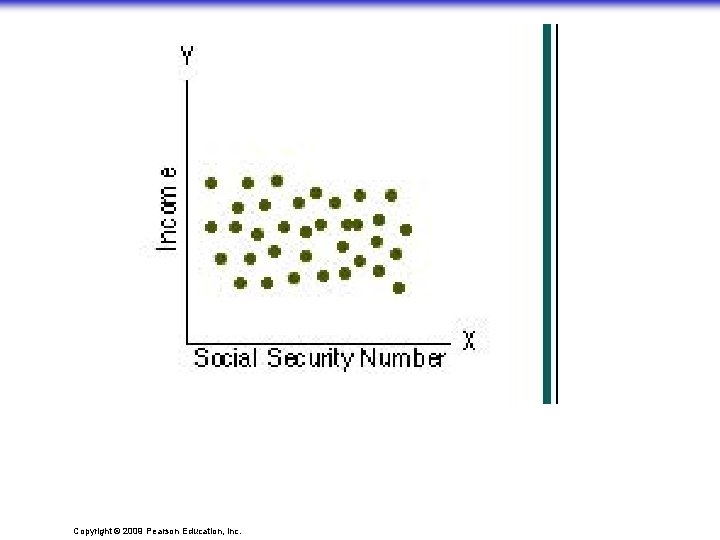
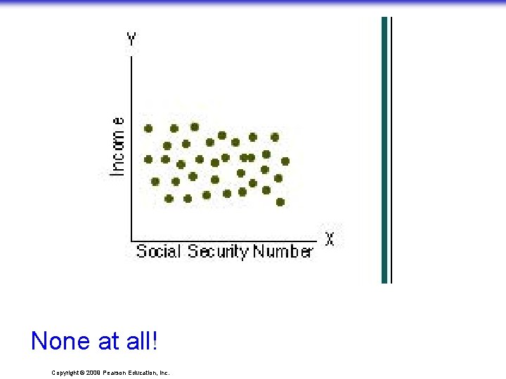
None at all! Copyright © 2009 Pearson Education, Inc.

Copyright © 2009 Pearson Education, Inc.

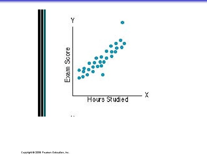
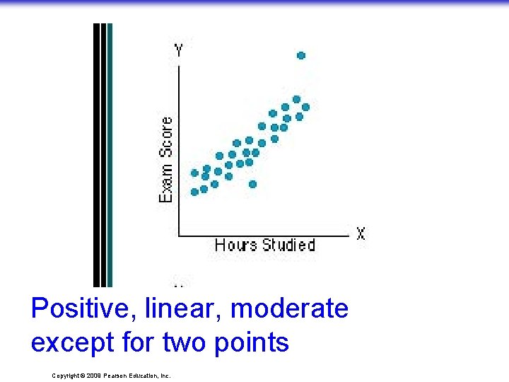
Positive, linear, moderate except for two points Copyright © 2009 Pearson Education, Inc.

Copyright © 2009 Pearson Education, Inc.

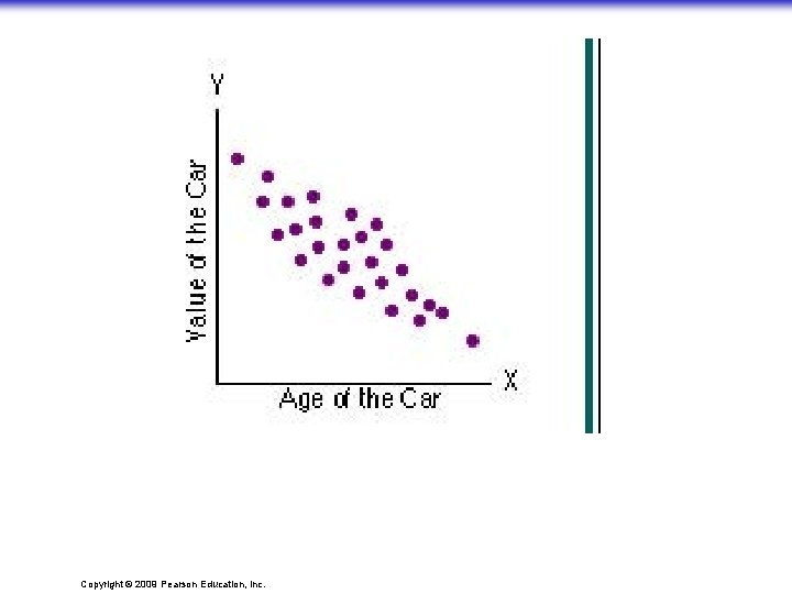
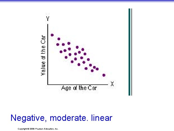
Negative, moderate. linear Copyright © 2009 Pearson Education, Inc.

Copyright © 2009 Pearson Education, Inc.

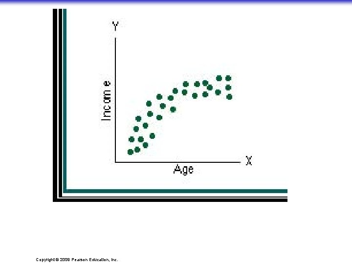
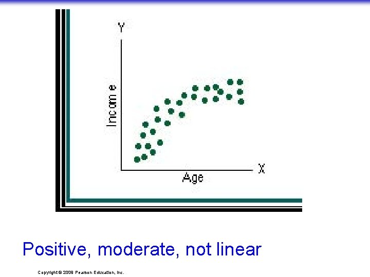
Positive, moderate, not linear Copyright © 2009 Pearson Education, Inc.

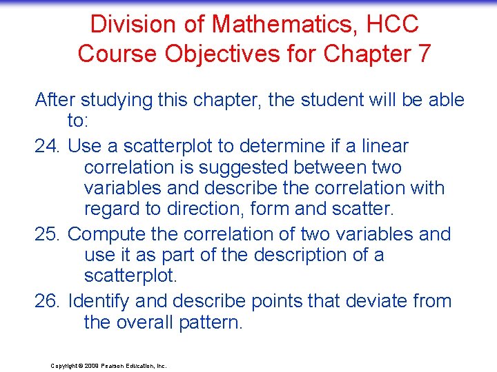
Division of Mathematics, HCC Course Objectives for Chapter 7 After studying this chapter, the student will be able to: 24. Use a scatterplot to determine if a linear correlation is suggested between two variables and describe the correlation with regard to direction, form and scatter. 25. Compute the correlation of two variables and use it as part of the description of a scatterplot. 26. Identify and describe points that deviate from the overall pattern. Copyright © 2009 Pearson Education, Inc.

A change n n Up until now, we have been describing variables one at a time. We now turn toward describing the relationship between two quantitative variables. Statisticians call this bivariate data analysis. The main purpose of data analysis with two variables is to investigate whethere is an association and to describe that association (Source: Agresti & Franklin) Copyright © 2009 Pearson Education, Inc. Slide 1 - 16

Correlation n n Let’s see what we already know about correlation (or association). Note the origin of the word: “co – relation” Let’s look at Exercise 6, page 186 of the text. Then let’s look at Exercise 4, page 173 of Jessica Utts’ book, “Seeing through Statistics. ” These are the first four examples on the next slide. Copyright © 2009 Pearson Education, Inc. Slide 1 - 17

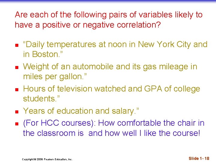
Are each of the following pairs of variables likely to have a positive or negative correlation? n n n “Daily temperatures at noon in New York City and in Boston. ” Weight of an automobile and its gas mileage in miles per gallon. ” Hours of television watched and GPA of college students. ” Years of education and salary. ” (For HCC courses): How comfortable the chair in the classroom is and how well I like the course! Copyright © 2009 Pearson Education, Inc. Slide 1 - 18

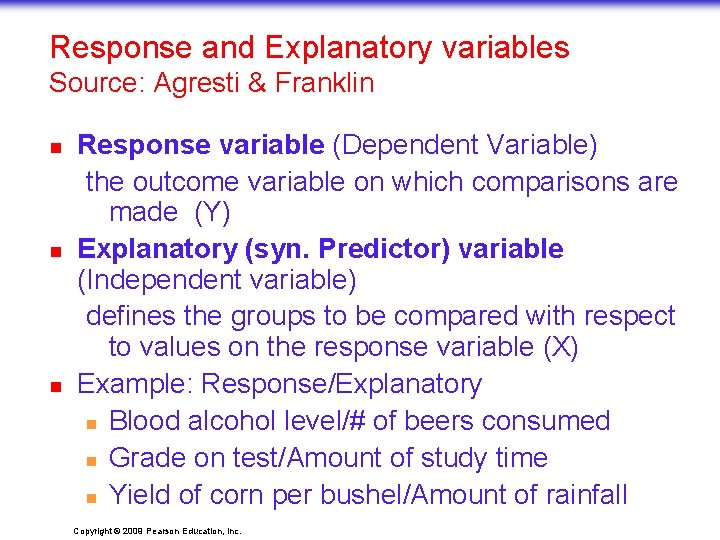
Response and Explanatory variables Source: Agresti & Franklin n Response variable (Dependent Variable) the outcome variable on which comparisons are made (Y) Explanatory (syn. Predictor) variable (Independent variable) defines the groups to be compared with respect to values on the response variable (X) Example: Response/Explanatory n Blood alcohol level/# of beers consumed n Grade on test/Amount of study time n Yield of corn per bushel/Amount of rainfall Copyright © 2009 Pearson Education, Inc.

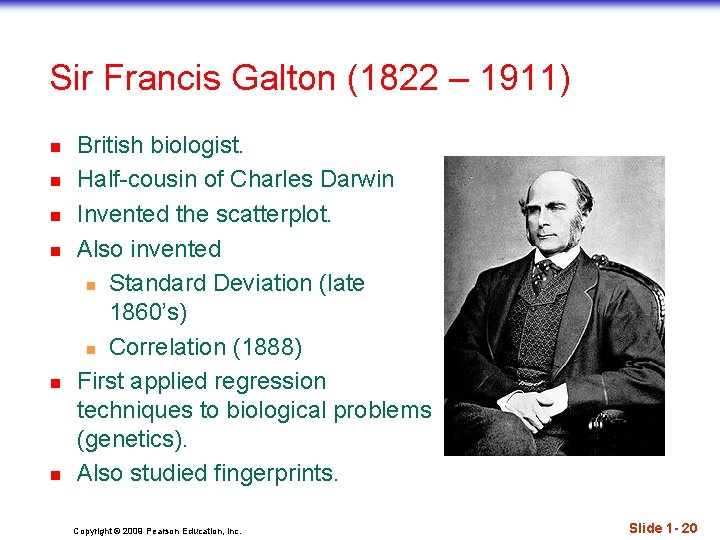
Sir Francis Galton (1822 – 1911) n n n British biologist. Half-cousin of Charles Darwin Invented the scatterplot. Also invented n Standard Deviation (late 1860’s) n Correlation (1888) First applied regression techniques to biological problems (genetics). Also studied fingerprints. Copyright © 2009 Pearson Education, Inc. Slide 1 - 20

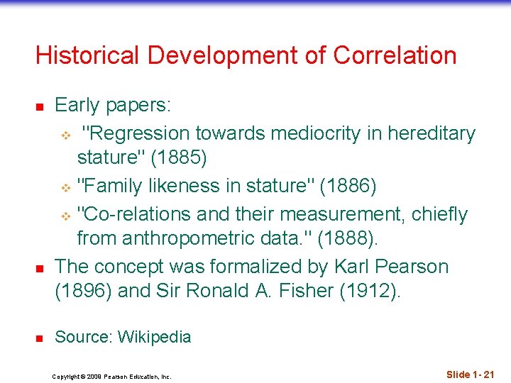
Historical Development of Correlation n Early papers: v "Regression towards mediocrity in hereditary stature" (1885) v "Family likeness in stature" (1886) v "Co-relations and their measurement, chiefly from anthropometric data. " (1888). The concept was formalized by Karl Pearson (1896) and Sir Ronald A. Fisher (1912). Source: Wikipedia Copyright © 2009 Pearson Education, Inc. Slide 1 - 21

Looking at Scatterplots n n Scatterplots may be the most common and most effective display for data. n In a scatterplot, you can see patterns, trends, relationships, and even the occasional extraordinary value sitting apart from the others. Scatterplots are the best way to start observing the relationship and the ideal way to picture associations between two quantitative variables. Copyright © 2009 Pearson Education, Inc. Slide 1 - 22

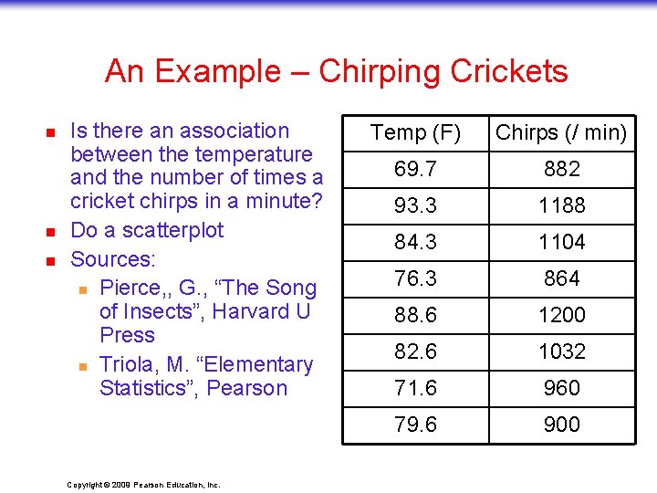
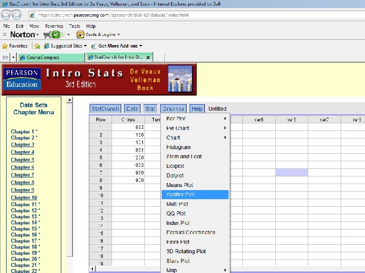
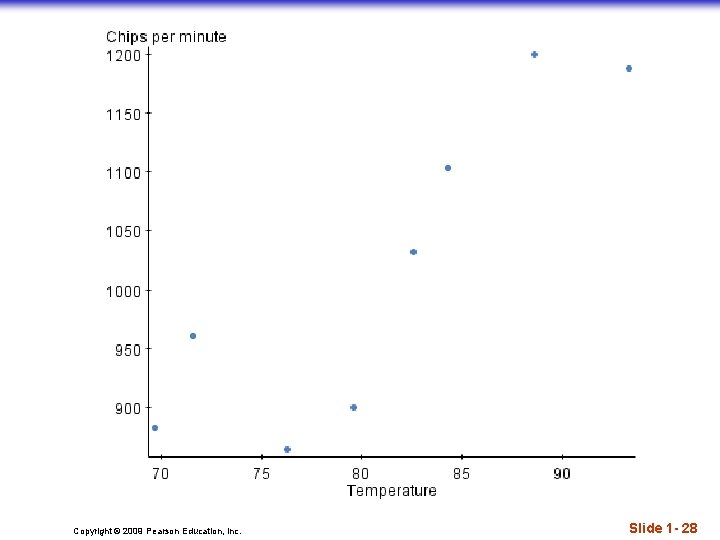
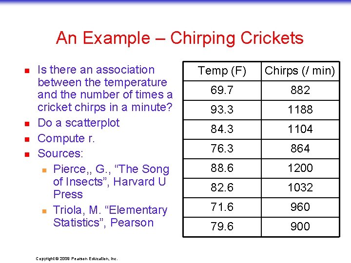
An Example – Chirping Crickets n n n Is there an association between the temperature and the number of times a cricket chirps in a minute? Do a scatterplot Sources: n Pierce, , G. , “The Song of Insects”, Harvard U Press n Triola, M. “Elementary Statistics”, Pearson Copyright © 2009 Pearson Education, Inc. Temp (F) Chirps (/ min) 69. 7 882 93. 3 1188 84. 3 1104 76. 3 864 88. 6 1200 82. 6 1032 71. 6 960 79. 6 900

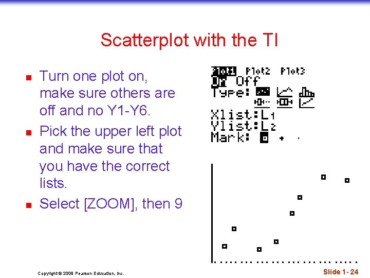
Scatterplot with the TI n n n Turn one plot on, make sure others are off and no Y 1 -Y 6. Pick the upper left plot and make sure that you have the correct lists. Select [ZOOM], then 9 Copyright © 2009 Pearson Education, Inc. Slide 1 - 24

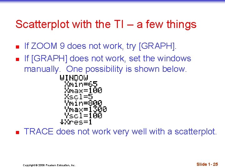
Scatterplot with the TI – a few things n If ZOOM 9 does not work, try [GRAPH]. If [GRAPH] does not work, set the windows manually. One possibility is shown below. n TRACE does not work very well with a scatterplot. n Copyright © 2009 Pearson Education, Inc. Slide 1 - 25

Copyright © 2009 Pearson Education, Inc. Slide 1 - 26

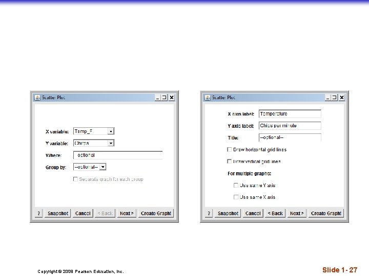
Copyright © 2009 Pearson Education, Inc. Slide 1 - 27

Copyright © 2009 Pearson Education, Inc. Slide 1 - 28

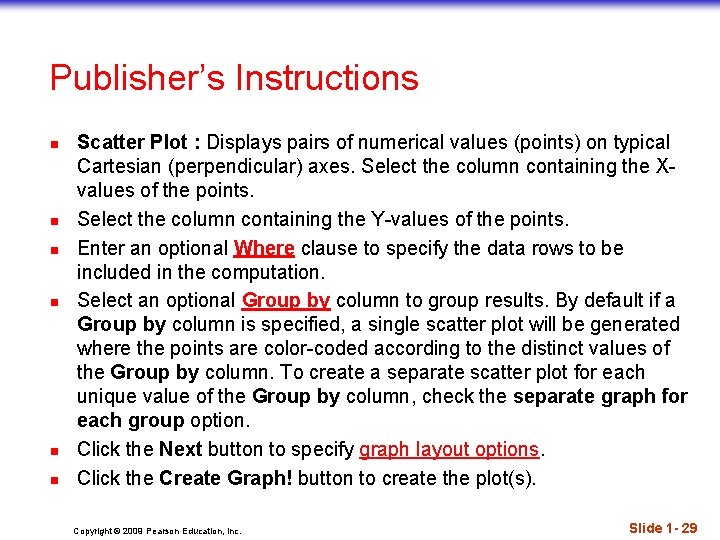
Publisher’s Instructions n n n Scatter Plot : Displays pairs of numerical values (points) on typical Cartesian (perpendicular) axes. Select the column containing the Xvalues of the points. Select the column containing the Y-values of the points. Enter an optional Where clause to specify the data rows to be included in the computation. Select an optional Group by column to group results. By default if a Group by column is specified, a single scatter plot will be generated where the points are color-coded according to the distinct values of the Group by column. To create a separate scatter plot for each unique value of the Group by column, check the separate graph for each group option. Click the Next button to specify graph layout options. Click the Create Graph! button to create the plot(s). Copyright © 2009 Pearson Education, Inc. Slide 1 - 29

Looking at Scatterplots (cont. ) n n When looking at scatterplots, we will look for direction, form, strength, and unusual features. Direction: n A pattern that runs from the upper left to the lower right is said to have a negative direction. n A trend running the other way has a positive direction. Copyright © 2009 Pearson Education, Inc. Slide 1 - 30

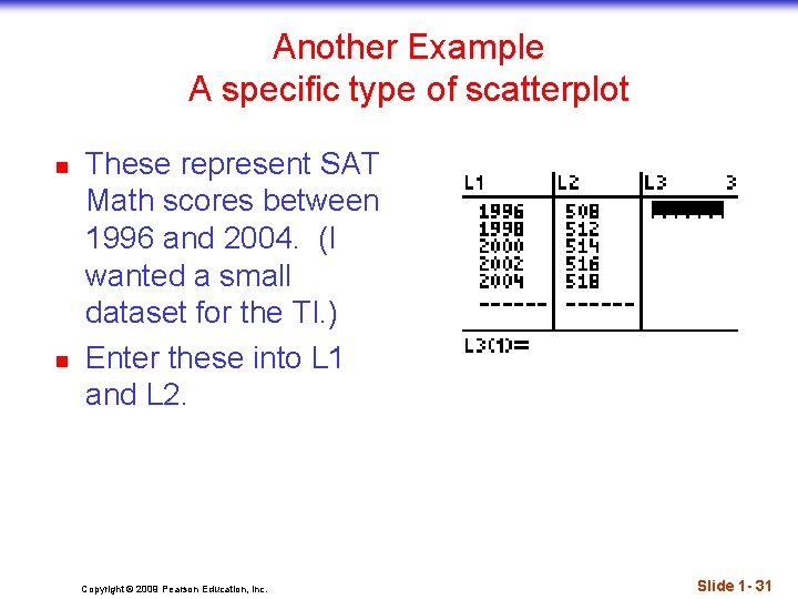
Another Example A specific type of scatterplot n n These represent SAT Math scores between 1996 and 2004. (I wanted a small dataset for the TI. ) Enter these into L 1 and L 2. Copyright © 2009 Pearson Education, Inc. Slide 1 - 31

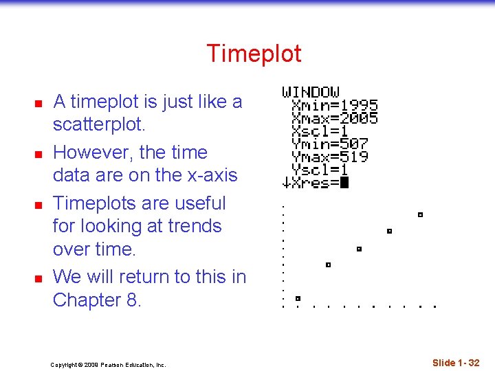
Timeplot n n A timeplot is just like a scatterplot. However, the time data are on the x-axis Timeplots are useful for looking at trends over time. We will return to this in Chapter 8. Copyright © 2009 Pearson Education, Inc. Slide 1 - 32

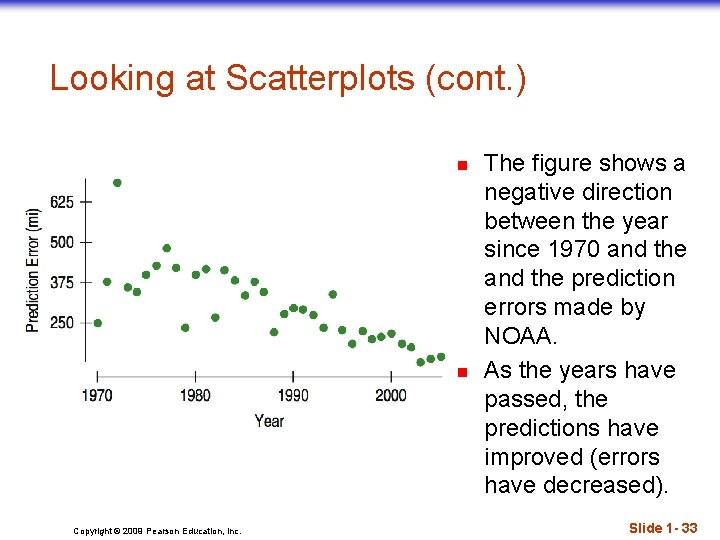
Looking at Scatterplots (cont. ) n n Copyright © 2009 Pearson Education, Inc. The figure shows a negative direction between the year since 1970 and the prediction errors made by NOAA. As the years have passed, the predictions have improved (errors have decreased). Slide 1 - 33

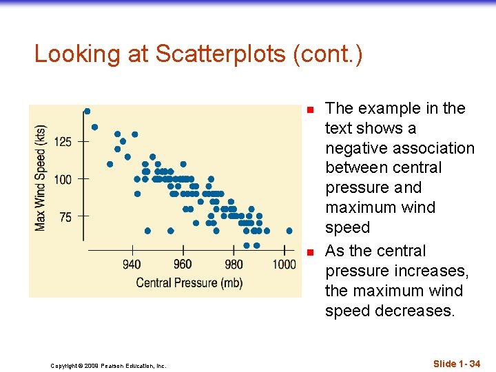
Looking at Scatterplots (cont. ) n n Copyright © 2009 Pearson Education, Inc. The example in the text shows a negative association between central pressure and maximum wind speed As the central pressure increases, the maximum wind speed decreases. Slide 1 - 34

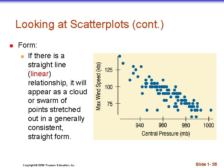
Looking at Scatterplots (cont. ) n Form: n If there is a straight line (linear) relationship, it will appear as a cloud or swarm of points stretched out in a generally consistent, straight form. Copyright © 2009 Pearson Education, Inc. Slide 1 - 35

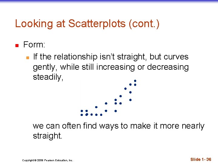
Looking at Scatterplots (cont. ) n Form: n If the relationship isn’t straight, but curves gently, while still increasing or decreasing steadily, we can often find ways to make it more nearly straight. Copyright © 2009 Pearson Education, Inc. Slide 1 - 36

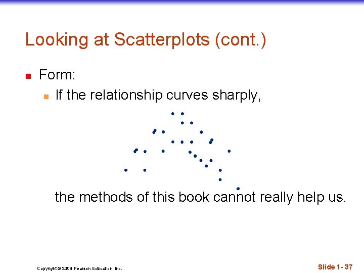
Looking at Scatterplots (cont. ) n Form: n If the relationship curves sharply, the methods of this book cannot really help us. Copyright © 2009 Pearson Education, Inc. Slide 1 - 37

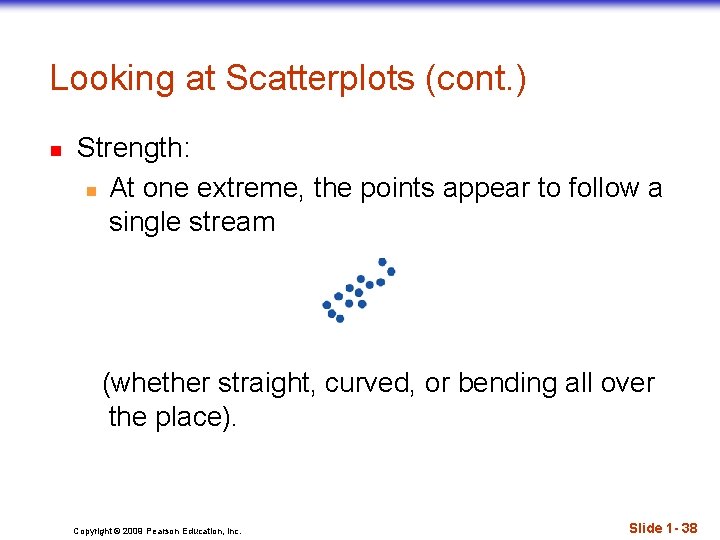
Looking at Scatterplots (cont. ) n Strength: n At one extreme, the points appear to follow a single stream (whether straight, curved, or bending all over the place). Copyright © 2009 Pearson Education, Inc. Slide 1 - 38

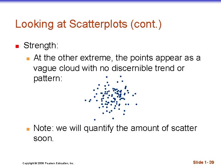
Looking at Scatterplots (cont. ) n Strength: n At the other extreme, the points appear as a vague cloud with no discernible trend or pattern: n Note: we will quantify the amount of scatter soon. Copyright © 2009 Pearson Education, Inc. Slide 1 - 39

Looking at Scatterplots (cont. ) n Unusual features: n Look for the unexpected. n Often the most interesting thing to see in a scatterplot is the thing you never thought to look for. n One example of such a surprise is an outlier standing away from the overall pattern of the scatterplot. n Clusters or subgroups should also raise questions. Copyright © 2009 Pearson Education, Inc. Slide 1 - 40

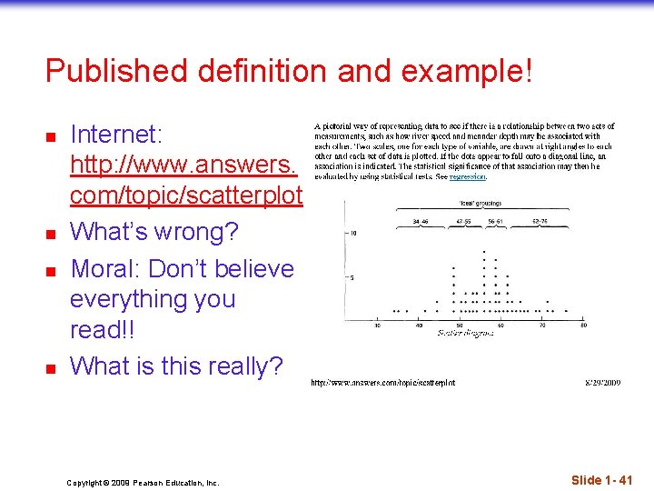
Published definition and example! n n Internet: http: //www. answers. com/topic/scatterplot What’s wrong? Moral: Don’t believe everything you read!! What is this really? Copyright © 2009 Pearson Education, Inc. Slide 1 - 41

Roles for Variables n n n It is important to determine which of the two quantitative variables goes on the x-axis and which on the y-axis. This determination is made based on the roles played by the variables. When the roles are clear, the explanatory or predictor variable goes on the x-axis, and the response variable goes on the y-axis. Copyright © 2009 Pearson Education, Inc. Slide 1 - 42

Roles for Variables (cont. ) n n The roles that we choose for variables are more about how we think about them rather than about the variables themselves. Just placing a variable on the x-axis doesn’t necessarily mean that it explains or predicts anything. And the variable on the y-axis may not respond to it in any way. Copyright © 2009 Pearson Education, Inc. Slide 1 - 43

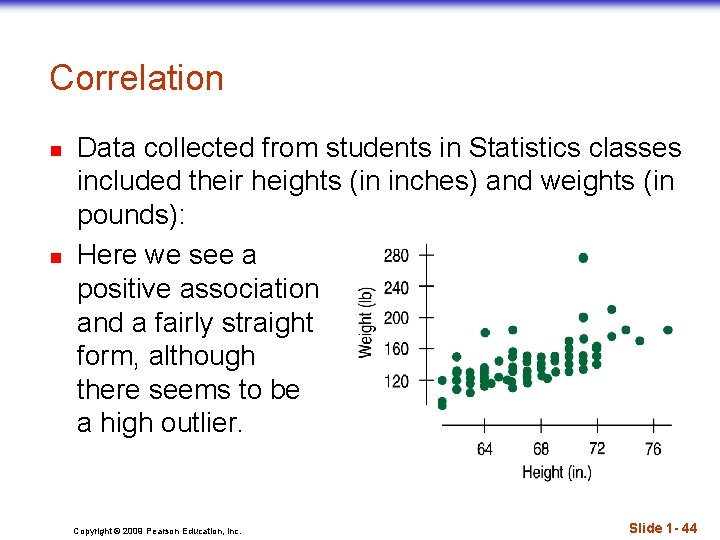
Correlation n n Data collected from students in Statistics classes included their heights (in inches) and weights (in pounds): Here we see a positive association and a fairly straight form, although there seems to be a high outlier. Copyright © 2009 Pearson Education, Inc. Slide 1 - 44

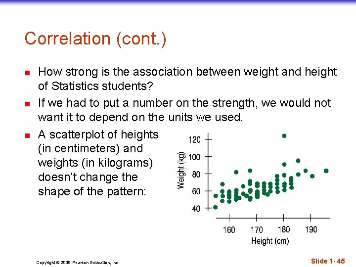
Correlation (cont. ) n n n How strong is the association between weight and height of Statistics students? If we had to put a number on the strength, we would not want it to depend on the units we used. A scatterplot of heights (in centimeters) and weights (in kilograms) doesn’t change the shape of the pattern: Copyright © 2009 Pearson Education, Inc. Slide 1 - 45

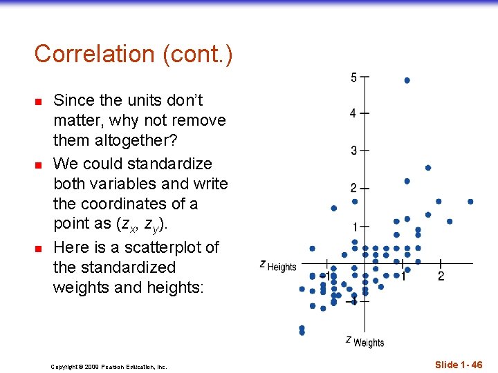
Correlation (cont. ) n n n Since the units don’t matter, why not remove them altogether? We could standardize both variables and write the coordinates of a point as (zx, zy). Here is a scatterplot of the standardized weights and heights: Copyright © 2009 Pearson Education, Inc. Slide 1 - 46

Correlation (cont. ) n n n Note that the underlying linear pattern seems steeper in the standardized plot than in the original scatterplot. That’s because we made the scales of the axes the same. Equal scaling gives a neutral way of drawing the scatterplot and a fairer impression of the strength of the association. Copyright © 2009 Pearson Education, Inc. Slide 1 - 47

Correlation (cont. ) n n n Sir Francis Galton also invented scatterplots. I was unable to find which concept was formalized first, correlation or scatter plots. However, it is natural that the same person would have discovered both! Both were first used to study inheritance of intelligence in humans. and later applied to the study of fingerprints. Copyright © 2009 Pearson Education, Inc. Slide 1 - 48

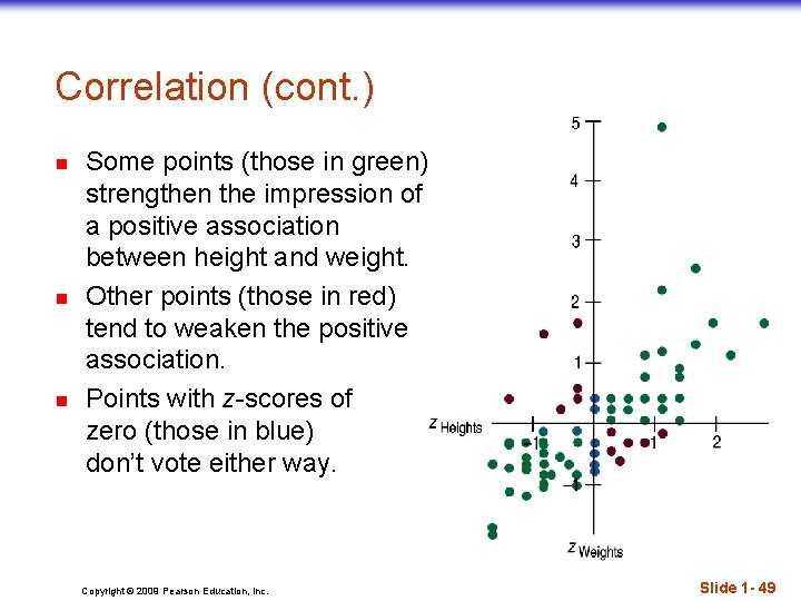
Correlation (cont. ) n n n Some points (those in green) strengthen the impression of a positive association between height and weight. Other points (those in red) tend to weaken the positive association. Points with z-scores of zero (those in blue) don’t vote either way. Copyright © 2009 Pearson Education, Inc. Slide 1 - 49

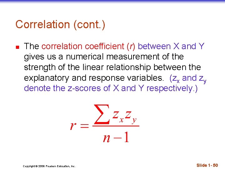
Correlation (cont. ) n The correlation coefficient (r) between X and Y gives us a numerical measurement of the strength of the linear relationship between the explanatory and response variables. (zx and zy denote the z-scores of X and Y respectively. ) Copyright © 2009 Pearson Education, Inc. Slide 1 - 50

Correlation (cont. ) n n For the students’ heights and weights, the correlation is 0. 644. What does this mean in terms of strength? We’ll address this shortly. Copyright © 2009 Pearson Education, Inc. Slide 1 - 51

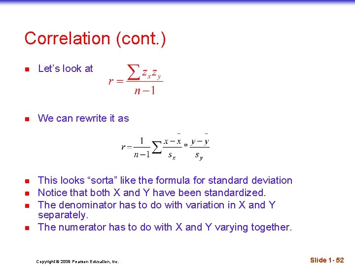
Correlation (cont. ) n Let’s look at n We can rewrite it as n n This looks “sorta” like the formula for standard deviation Notice that both X and Y have been standardized. The denominator has to do with variation in X and Y separately. The numerator has to do with X and Y varying together. Copyright © 2009 Pearson Education, Inc. Slide 1 - 52

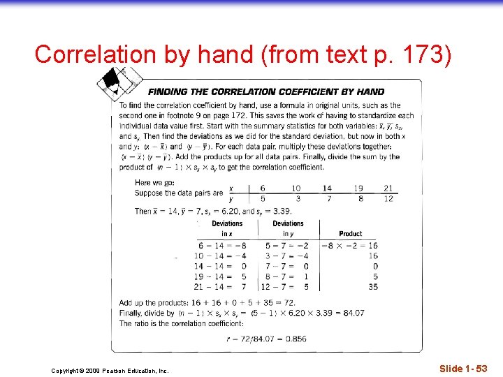
Correlation by hand (from text p. 173) Copyright © 2009 Pearson Education, Inc. Slide 1 - 53

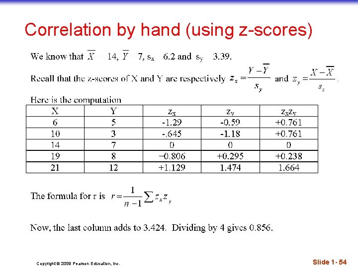
Correlation by hand (using z-scores) Copyright © 2009 Pearson Education, Inc. Slide 1 - 54

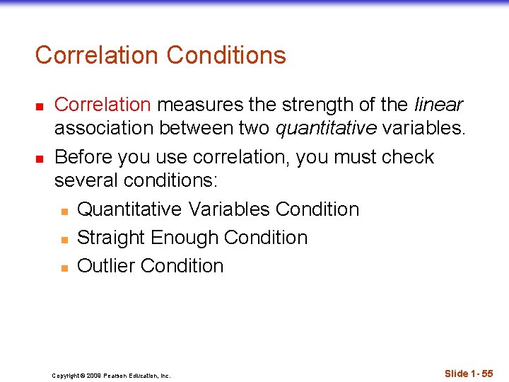
Correlation Conditions n n Correlation measures the strength of the linear association between two quantitative variables. Before you use correlation, you must check several conditions: n Quantitative Variables Condition n Straight Enough Condition n Outlier Condition Copyright © 2009 Pearson Education, Inc. Slide 1 - 55

Returning to the opening exercise n n n What is the correlation between the comfort level of the chair in the classroom and how well I like a course? Let’s grab the TI and figure it out! Can’t – what do we enter? Copyright © 2009 Pearson Education, Inc. Slide 1 - 56

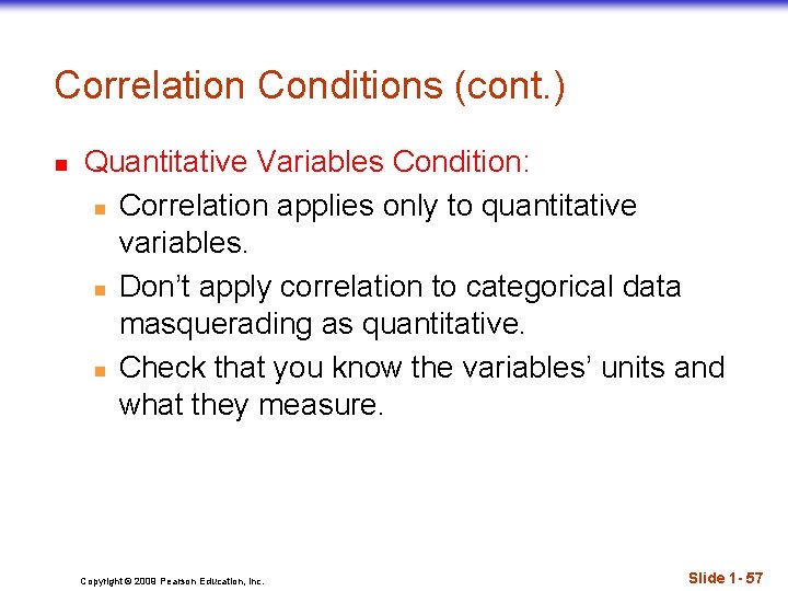
Correlation Conditions (cont. ) n Quantitative Variables Condition: n Correlation applies only to quantitative variables. n Don’t apply correlation to categorical data masquerading as quantitative. n Check that you know the variables’ units and what they measure. Copyright © 2009 Pearson Education, Inc. Slide 1 - 57

Correlation Conditions (cont. ) n Straight Enough Condition: n You can calculate a correlation coefficient for any pair of variables. n But correlation measures the strength only of the linear association, and will be misleading if the relationship is not linear. Copyright © 2009 Pearson Education, Inc. Slide 1 - 58

Correlation Conditions (cont. ) n Outlier Condition: n Outliers can distort the correlation dramatically. n An outlier can make an otherwise small correlation look big, or hide a large correlation. n It can even give an otherwise positive association a negative correlation coefficient (and vice versa). n When you see an outlier, it’s often a good idea to report the correlations with and without that point. Copyright © 2009 Pearson Education, Inc. Slide 1 - 59

Correlation Properties n n The sign of a correlation coefficient gives the direction of the association. Correlation is always between -1 and +1. n Correlation can be exactly equal to -1 or +1, but these values are unusual in real data because they mean that all the data points fall exactly on a single straight line. n A correlation near zero corresponds to a weak linear association. Copyright © 2009 Pearson Education, Inc. Slide 1 - 60

Correlation Properties (cont. ) n n n Correlation treats x and y symmetrically: n The correlation of x with y is the same as the correlation of y with x. Correlation has no units. Correlation is not affected by changes in the center or scale of either variable. n Correlation depends only on the z-scores, and they are unaffected by changes in center or scale. Copyright © 2009 Pearson Education, Inc. Slide 1 - 61

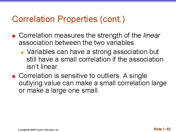
Correlation Properties (cont. ) n n Correlation measures the strength of the linear association between the two variables. n Variables can have a strong association but still have a small correlation if the association isn’t linear. Correlation is sensitive to outliers. A single outlying value can make a small correlation large or make a large one small. Copyright © 2009 Pearson Education, Inc. Slide 1 - 62

An Example – Chirping Crickets n n Is there an association between the temperature and the number of times a cricket chirps in a minute? Do a scatterplot Compute r. Sources: n Pierce, , G. , “The Song of Insects”, Harvard U Press n Triola, M. “Elementary Statistics”, Pearson Copyright © 2009 Pearson Education, Inc. Temp (F) Chirps (/ min) 69. 7 882 93. 3 1188 84. 3 1104 76. 3 864 88. 6 1200 82. 6 1032 71. 6 960 79. 6 900
![TI Before we start n n n n Select 2 ndCATALOG Tab to TI – Before we start n n n n Select [2 nd][CATALOG] Tab to](https://slidetodoc.com/presentation_image_h2/7216f7a2c100dd000e82f950e0edf614/image-64.jpg)
TI – Before we start n n n n Select [2 nd][CATALOG] Tab to “Diagnostic. On” Or [ALPHA]D twice, then tab to “Diagnostic. On” Select. The TI will return “Done”. With 2. 55, you can also use “statdiagnostics” Copyright © 2009 Pearson Education, Inc. Slide 1 - 64

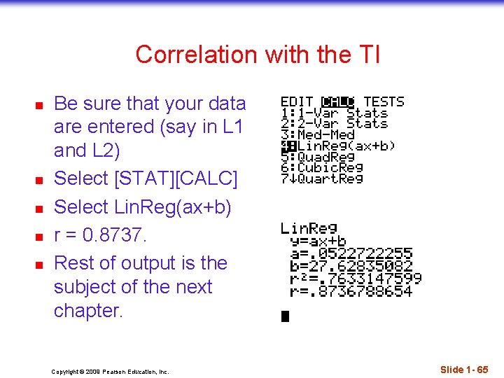
Correlation with the TI n n n Be sure that your data are entered (say in L 1 and L 2) Select [STAT][CALC] Select Lin. Reg(ax+b) r = 0. 8737. Rest of output is the subject of the next chapter. Copyright © 2009 Pearson Education, Inc. Slide 1 - 65

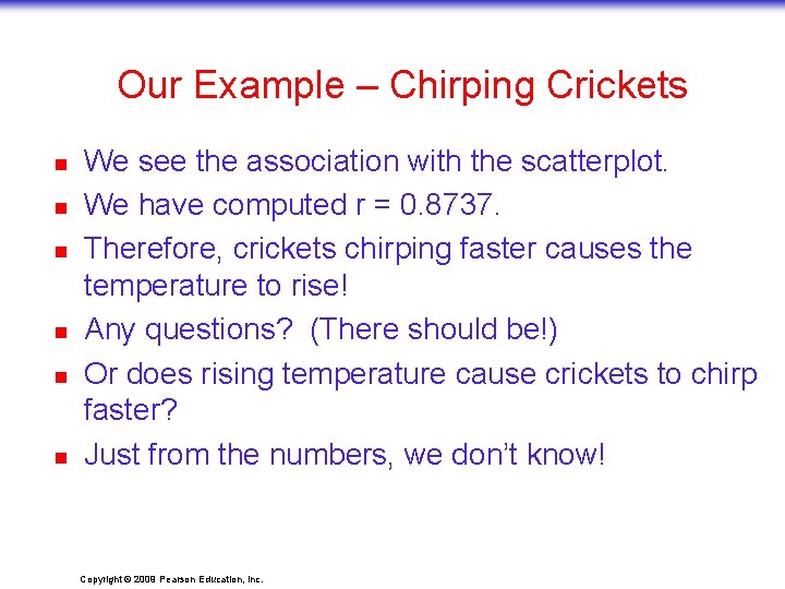
Our Example – Chirping Crickets n n n We see the association with the scatterplot. We have computed r = 0. 8737. Therefore, crickets chirping faster causes the temperature to rise! Any questions? (There should be!) Or does rising temperature cause crickets to chirp faster? Just from the numbers, we don’t know! Copyright © 2009 Pearson Education, Inc.

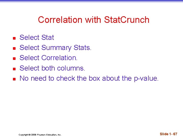
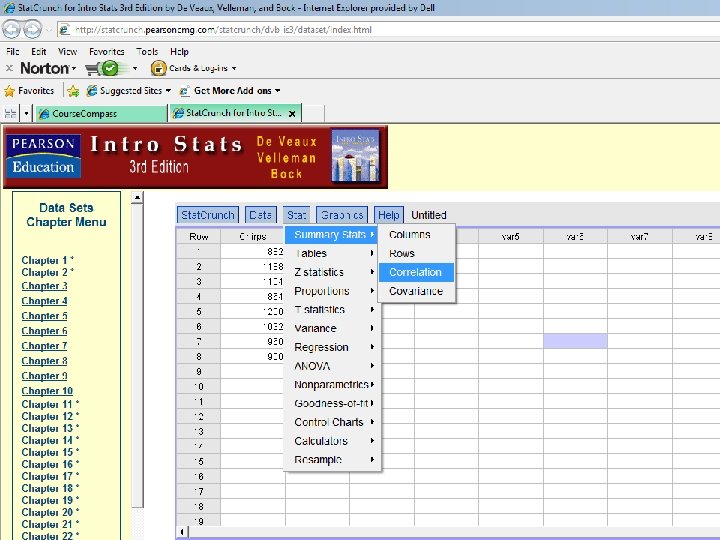
Correlation with Stat. Crunch n n n Select Stat Select Summary Stats. Select Correlation. Select both columns. No need to check the box about the p-value. Copyright © 2009 Pearson Education, Inc. Slide 1 - 67

Copyright © 2009 Pearson Education, Inc. Slide 1 - 68

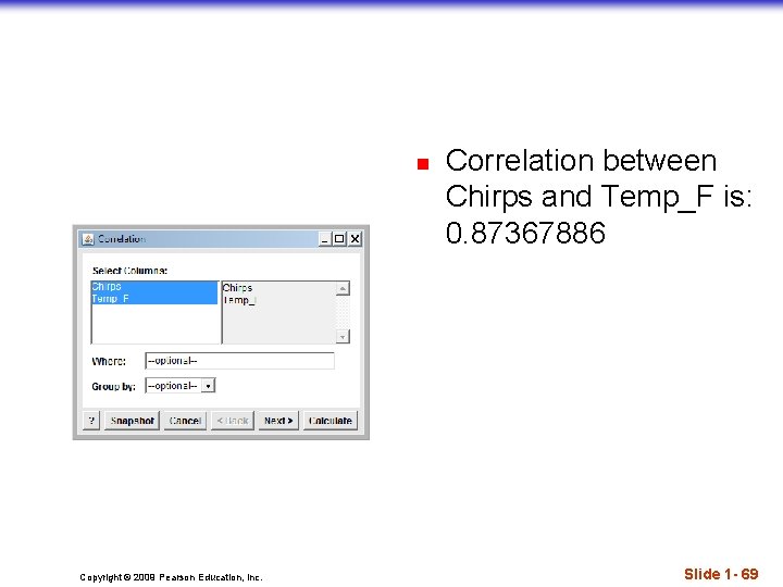
n Copyright © 2009 Pearson Education, Inc. Correlation between Chirps and Temp_F is: 0. 87367886 Slide 1 - 69

Publisher’s Instructions n n Correlation : Computes the Pearson correlation between two columns or the lower half of the correlation matrix if three or more columns are selected. Select the columns to be used in the computation. Enter an optional Where clause to specify the data rows to be included in the computation. Select an optional Group By column to group results. A separate result (matrix) will be computed for each distinct value of the Group By column. Click the Calculate button to view the results. Copyright © 2009 Pearson Education, Inc. Slide 1 - 70

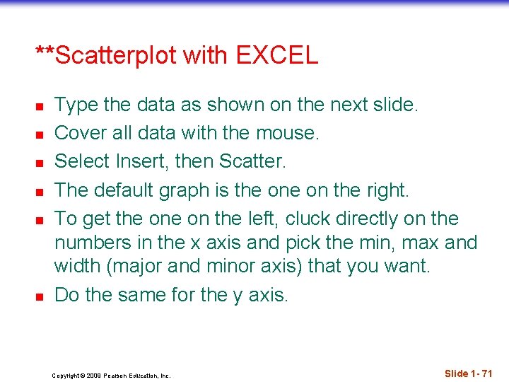
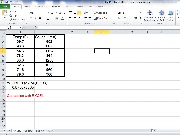
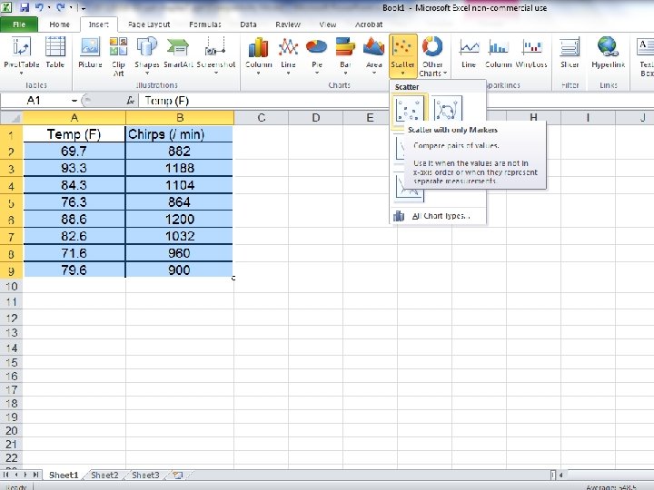
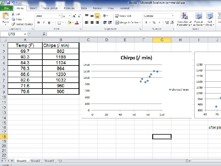
**Scatterplot with EXCEL n n n Type the data as shown on the next slide. Cover all data with the mouse. Select Insert, then Scatter. The default graph is the on the right. To get the on the left, cluck directly on the numbers in the x axis and pick the min, max and width (major and minor axis) that you want. Do the same for the y axis. Copyright © 2009 Pearson Education, Inc. Slide 1 - 71

Copyright © 2009 Pearson Education, Inc. Slide 1 - 72

Copyright © 2009 Pearson Education, Inc. Slide 1 - 73

Copyright © 2009 Pearson Education, Inc. Slide 1 - 74

Exam hint – reading the whole question n n You may be given two sets of data in which you are asked to draw a scatterplot and / or give the correlation between them. This may be followed by other questions – such as regression (Chapter 8). The correlation comes as part of that output (we will see this in the next chapter. ) The scatterplot can be requested then as well (with Stat. Crunch) Wait and do it all at once. Copyright © 2009 Pearson Education, Inc.

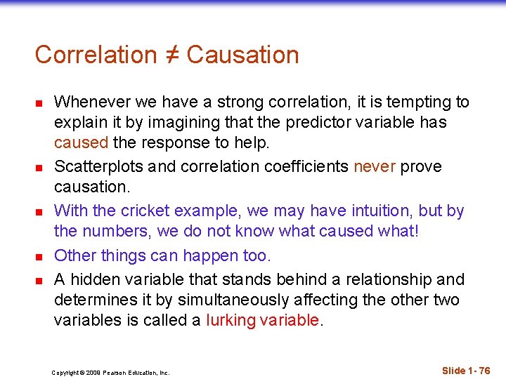
Correlation ≠ Causation n n Whenever we have a strong correlation, it is tempting to explain it by imagining that the predictor variable has caused the response to help. Scatterplots and correlation coefficients never prove causation. With the cricket example, we may have intuition, but by the numbers, we do not know what caused what! Other things can happen too. A hidden variable that stands behind a relationship and determines it by simultaneously affecting the other two variables is called a lurking variable. Copyright © 2009 Pearson Education, Inc. Slide 1 - 76

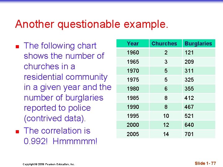
Another questionable example. n n The following chart shows the number of churches in a residential community in a given year and the number of burglaries reported to police (contrived data). The correlation is 0. 992! Hmmmmm! Copyright © 2009 Pearson Education, Inc. Year Churches Burglaries 1960 2 121 1965 3 209 1970 5 311 1975 5 325 1980 6 355 1985 8 412 1990 8 467 1995 10 521 2000 12 640 2005 14 701 Slide 1 - 77

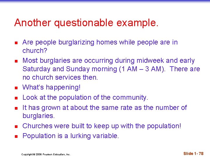
Another questionable example. n n n n Are people burglarizing homes while people are in church? Most burglaries are occurring during midweek and early Saturday and Sunday morning (1 AM – 3 AM). There are no church services then. What’s happening! Look at the population of the community. It has grown at about the same rate as the number of burglaries. Churches were built to keep up with the population! Population is a lurking variable. Copyright © 2009 Pearson Education, Inc. Slide 1 - 78

Lurking Variables & Confounding (Source: Agresti & Franklin) n A lurking variable is a variable, usually unobserved, that influences the association between the variables of primary interest n n n Ice cream sales and drowning – lurking variable =temperature Reading level and shoe size – lurking variable=age Childhood obesity rate and GDP-lurking variable=time When two explanatory variables are both associated with a response variable but are also associated with each other, there is said to be confounding Lurking variables are not measured in the study but have the potential for confounding Copyright © 2009 Pearson Education, Inc.

Goofy Correlations n n The next five slides are taken from “Bundled Babies: Dangerous Ice Cream” by Kathleen H. Offenholley, “Mathematics Teacher”, Vol. 106, No. 6, February 2013, pp. 418 – 422 Does correlation imply causation or is there something else going on? Copyright © 2009 Pearson Education, Inc. Slide 1 - 80

Goofy Correlation #1 Fire Damage and Fire Trucks n n “The amount of damage at the scene of a fire has a positive correlation with the number of fire trucks at the scene. ” More people will call 911 when the fire is more extensive. When 911 dispatchers get more calls, more alarms are sent out. Fire trucks will respond to each alarm. Copyright © 2009 Pearson Education, Inc. Slide 1 - 81

Goofy Correlation #2 Bundled-Up Babies and Outdoor Temperature n n n “The age at which a baby first learns to crawl has a negative correlation with the outdoor temperature. ” If the temperature goes down, babies have to be bundled in layers of winter clothing to go out. This inhibits their ability to crawl. Copyright © 2009 Pearson Education, Inc. Slide 1 - 82

Goofy Correlation #3 Dangerous Ice Cream and Drownings n n n “The number of ice cream servings consumed has a positive correlation with the number of drownings. ” As the outdoor temperature goes up, more ice cream is eaten. As the outdoor temperature goes up, there are more drownings. Copyright © 2009 Pearson Education, Inc. Slide 1 - 83

Goofy Correlation #4 Car cost and Gas mileage n n “In 2005, there was a negative correlation between car cost and gas mileage. ” Typically, cars with larger engines tend to cost more. Cars with larger engines also get lower gas mileage. With the recent advent of hybrid vehicles, this correlation may no longer hold. Copyright © 2009 Pearson Education, Inc. Slide 1 - 84

Goofy Correlation #5 Foot size and reading ability n n n “Foot size and reading ability have a positive correlation. ” Older children have bigger feet. Older children also have better reading ability. Copyright © 2009 Pearson Education, Inc. Slide 1 - 85

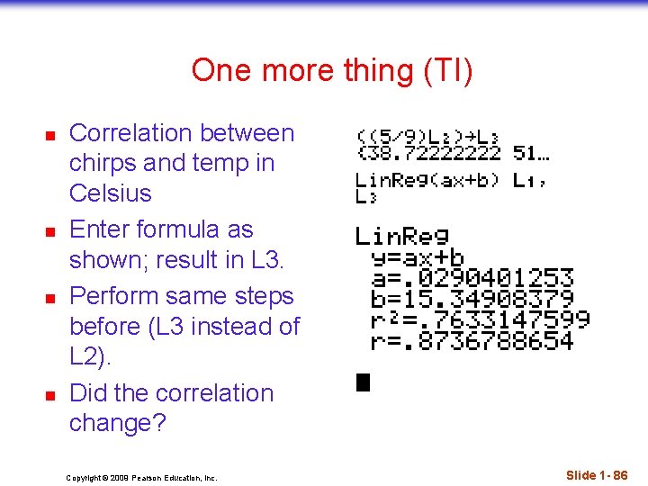
One more thing (TI) n n Correlation between chirps and temp in Celsius Enter formula as shown; result in L 3. Perform same steps before (L 3 instead of L 2). Did the correlation change? Copyright © 2009 Pearson Education, Inc. Slide 1 - 86

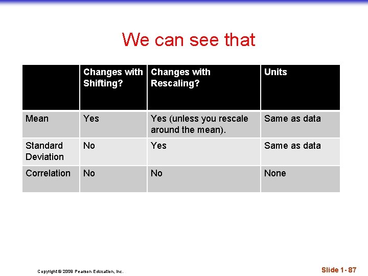
We can see that Changes with Shifting? Rescaling? Units Mean Yes (unless you rescale around the mean). Same as data Standard Deviation No Yes Same as data Correlation No No None Copyright © 2009 Pearson Education, Inc. Slide 1 - 87

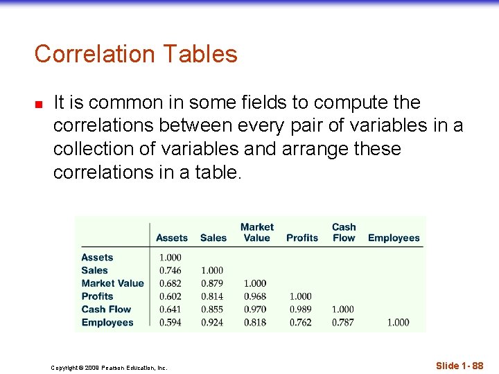
Correlation Tables n It is common in some fields to compute the correlations between every pair of variables in a collection of variables and arrange these correlations in a table. Copyright © 2009 Pearson Education, Inc. Slide 1 - 88

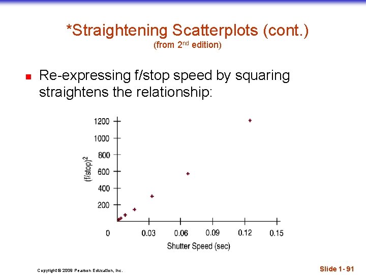
Straightening Scatterplots n n n Correlation is a measure of the strength for straight relationships only. Therefore, straight line relationships are the ones that we can measure with correlation. When a scatterplot shows a bent form that consistently increases or decreases, we can often straighten the form of the plot by re-expressing one or both variables. We can often find transformations that straighten the scatterplot’s form. Later in the text, we discuss simple ways to find a good re-expression. Copyright © 2009 Pearson Education, Inc. Slide 1 - 89

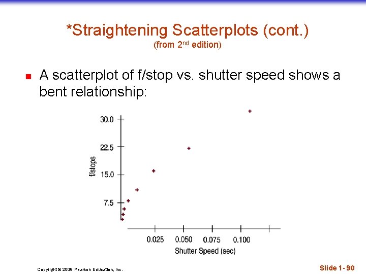
*Straightening Scatterplots (cont. ) (from 2 nd edition) n A scatterplot of f/stop vs. shutter speed shows a bent relationship: Copyright © 2009 Pearson Education, Inc. Slide 1 - 90

*Straightening Scatterplots (cont. ) (from 2 nd edition) n Re-expressing f/stop speed by squaring straightens the relationship: Copyright © 2009 Pearson Education, Inc. Slide 1 - 91

What Can Go Wrong? n Don’t say “correlation” when you mean “association. ” n More often than not, people say correlation when they mean association. n The word “correlation” should be reserved for measuring the strength and direction of the linear relationship between two quantitative variables. Copyright © 2009 Pearson Education, Inc. Slide 1 - 92

What Can Go Wrong? n Don’t confuse “correlation” with “causation. ” n Scatterplots and correlations never demonstrate causation. n These statistical tools can only demonstrate an association between variables. Copyright © 2009 Pearson Education, Inc. Slide 1 - 93

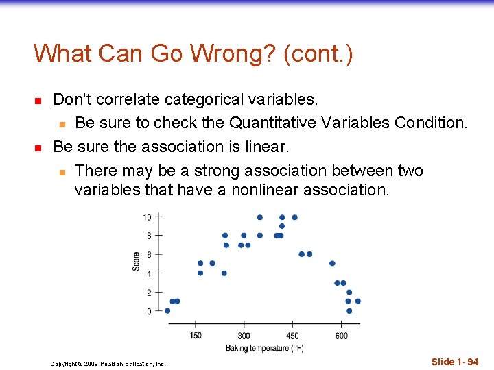
What Can Go Wrong? (cont. ) n n Don’t correlate categorical variables. n Be sure to check the Quantitative Variables Condition. Be sure the association is linear. n There may be a strong association between two variables that have a nonlinear association. Copyright © 2009 Pearson Education, Inc. Slide 1 - 94

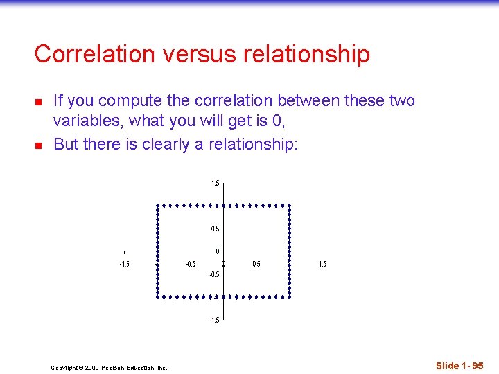
Correlation versus relationship n n If you compute the correlation between these two variables, what you will get is 0, But there is clearly a relationship: Copyright © 2009 Pearson Education, Inc. Slide 1 - 95

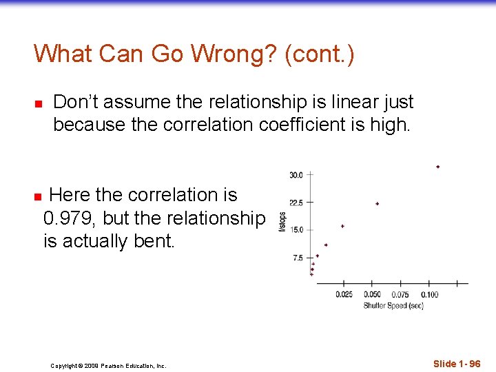
What Can Go Wrong? (cont. ) n n Don’t assume the relationship is linear just because the correlation coefficient is high. Here the correlation is 0. 979, but the relationship is actually bent. Copyright © 2009 Pearson Education, Inc. Slide 1 - 96

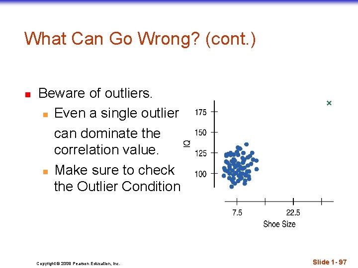
What Can Go Wrong? (cont. ) n Beware of outliers. n Even a single outlier can dominate the correlation value. n Make sure to check the Outlier Condition. Copyright © 2009 Pearson Education, Inc. Slide 1 - 97

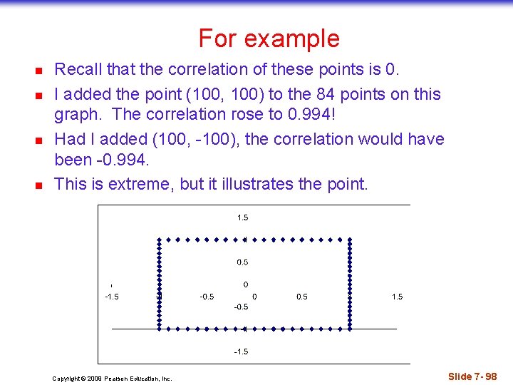
For example n n Recall that the correlation of these points is 0. I added the point (100, 100) to the 84 points on this graph. The correlation rose to 0. 994! Had I added (100, -100), the correlation would have been -0. 994. This is extreme, but it illustrates the point. Copyright © 2009 Pearson Education, Inc. Slide 7 - 98

What Can Go Wrong? (cont. ) n Watch out for lurking variables. n A hidden variable that stands behind a relationship and determines it by simultaneously affecting the other two variables is called a lurking variable. n Example: Experiment on activity of mice. n Example: Churches and burglaries. n Example: Number of firefighters and cost of fire. n Example: pp. 325 off – Impact of musical instrument playing on school GPA. Copyright © 2009 Pearson Education, Inc. Slide 1 - 99

What have we learned? n n We examine scatterplots for direction, form, strength, and unusual features. Although not every relationship is linear, when the scatterplot is straight enough, the correlation coefficient is a useful numerical summary. n The sign of the correlation tells us the direction of the association. n The magnitude of the correlation tells us the strength of a linear association. n Correlation has no units, so shifting or scaling the data, standardizing, or swapping the variables has no effect on the numerical value. Copyright © 2009 Pearson Education, Inc. Slide 1 - 100

What have we learned? (cont. ) n n Doing Statistics right means that we have to Think about whether our choice of methods is appropriate. n Before finding or talking about a correlation, check the Straight Enough Condition. n Watch out for outliers! Don’t assume that a high correlation or strong association is evidence of a cause-and-effect relationship—beware of lurking variables! Copyright © 2009 Pearson Education, Inc. Slide 1 - 101

Main topics in this chapter n n n Scatterplots Three things to look for n Direction n Form n Strength Correlation and its properties n Calculation n Interpretation Copyright © 2009 Pearson Education, Inc. Slide 1 - 102

Division of Mathematics, HCC Course Objectives for Chapter 7 After studying this chapter, the student will be able to: 24. Use a scatterplot to determine if a linear correlation is suggested between two variables and describe the correlation with regard to direction, form and scatter. 25. Compute the correlation of two variables and use it as part of the description of a scatterplot. 26. Identify and describe points that deviate from the overall pattern. Copyright © 2009 Pearson Education, Inc.