SCATTER PLOT AND CORRELATION TO CONSTRUCT A SCATTER


- Slides: 19

SCATTER PLOT AND CORRELATION TO CONSTRUCT A SCATTER PLOT: PREPARE A GRAPH WITH INDEPENDENT VARIABLE LIES ALONG THE HORIZONTAL AXIS AND DEPENDENT VARIABLE LIES ON THE VERTICAL AXIS. EXAMPLE: ADVERTIZING EXPENDITURE IS THE INDEPENDENT VARIABLE, WHILE, REVENUE IS THE DEPENDANT VARIABLE AND THEY COULD HAVE A RELATIONSHIP.

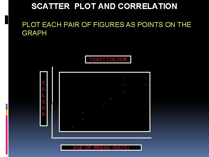
SCATTER PLOT AND CORRELATION PLOT EACH PAIR OF FIGURES AS POINTS ON THE GRAPH TOAST COLOUR C O L O U R - - - AGE OF BREAD (DAYS) -

SCATTER DIAGRAM A PLOT IS A LINE GRAPH WITH NO LINE – I. E. THE POINT INTERSECTIONS BETWEEN THE TWO DATA SETS ARE PLOTTED THERE IS NO NEED TO DRAW A PHYSICAL LINE. “Y” AXIS IS USED FOR THE CHARACTERISTIC WHOSE BEHAVIOUR WE WOULD LIKE TO PREDICT OR TO DEFINE THE AREA OF RELATIONSHIP BETWEEN TWO VARIABLES

SCATTER PLOT AND CORRELATION IMPORTANT : THERE ARE CHANCES TO BE APPEAR A RELATIONSHIP ON THE PLOT WHEN IN REALITY THERE IS NONE. MOST LIKELY BOTH VARIABLES ACTUALLY RELATE INDEPENDENTLY TO A THIRD VARIABLE.

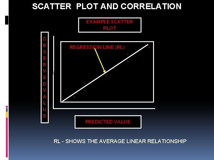
SCATTER PLOT AND CORRELATION SCATTER PLOTS ARE THE REPRESENTATIONS OF TWO OR MORE VARIABLES PLOTTED AGAINST EACH OTHER. THE FIGURE BELOW SHOWS A PLOT OF TWO VARIABLES, IN THIS EXAMPLE, PREDICTED VALUES VERSES OBSERVED VALUES. AS SHOWN, AS THE PREDICTED VALUE INCREASES, SO DOES THE ACTUAL MEASURED VALUE. THE VARIABLES ARE TO BE POSITIVELY CORRELATED, THAT IS, IF ONE INCREASES SO DOES THE OTHER.

SCATTER PLOT AND CORRELATION THE LINE PLOTTED IS A REGRESSION LINE WHICH SHOWS THE AVERAGE LINEAR RELATIONSHIP BETWEEN THE VARIABLES. IF THE LINE SLOPPED NEGATIVELY, THE VARIABLE WOULD BE NEGATIVELY CORRELATED, THAT IS, WHEN ONE INCREASES, THE OTHER DECREASES, AND VICE VERSE WHEN NO REGRESSION LINE CAN BE PLOTTED AND THE SCATTER PLOT APPEARS TO SIMPLY BE A BAIL OF DIFFUSE POINTS, THEN THE RELATIONSHIP BETWEEN VARIABLES ARE SAID TO UNCORRELATED.

SCATTER PLOT AND CORRELATION EXAMPLE SCATTER PLOT O B S E R V E D V A L U E REGRESSION LINE (RL) - - - PREDICTED VALUE RL - SHOWS THE AVERAGE LINEAR RELATIONSHIP

SCATTER PLOT AND CORRELATION THE USE OF THE TOOL FOR QUALITY ASSESSMENT IS THE DETERMINATION BY MEASURING VARIABLES IN A PROCESS TO SEE IF ANY TWO OR MORE VARIABLES ARE CORRELATED OR UNCORRELATED ---- TO FIND RELATIONSHIP OF THE VARIABLES AND FIND ROOT CAUSES OF THE PROBLEM. TOOL SIMPLY CAN CONTRIBUTE AN ADDITIONAL SMALL AMOUNT OF INFORMATION TO A QUALITY ASSESSMENT.

SCATTER PLOT AND CORRELATION STEP 1 COLLECT 50 – 100 PAIRED SAMPLES OF DATA STEP 2 DRAW HORIZONTAL AND VERTICAL AXIS OF THE DIAGRAM CAUSE HORIZONTAL AXIS EFFECT VERTICAL AXIS STEP 3 PLOT THE DATA

SCATTER PLOT AND CORRELATION Thank You

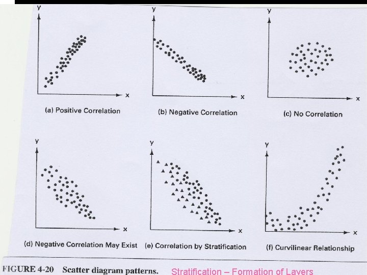
SCATTER PLOT AND CORRELATION Example of Scatter Diagram Patterns

SCATTER PLOT AND CORRELATION Stratification – Formation of Layers

SUMMARY OF THE LECTURE Purpose: The purpose of Scatter Diagram (SD), plot or graph is to provide a graphical of the numerical relationship between two or more variables. Some Important information's regarding how to interpret Scatter Diagram, for example: (1) Assess relationship in terms of correlation by looking for increasing and decreasing pattern of the graph. (2) Look at the positive and negative correlation is seen when large values of one variable correspond to large values of an other variable. (3) Large values of variables correspond to small values of another variables

SUMMARY OF THE LECTURE Some Important information's regarding how to interpret Scatter Diagram, for example: (4) No correlation implies a scattered arrangement of points without any noticeable shape or direction or trend or pattern. (5) Scatter Diagram provides a graphical picture of quantitative relationship. (6) Patterns that are not of a linear nature are considered for manufacturing process setting, adjusting and process improvement. (7) Linear nature variables are not picked-up, not considered for manufacturing process adjustment or process improvement

SUMMARY OF THE LECTURE Some Important information's regarding how to interpret Scatter Diagram, for example: (8) Scatter Diagram is one of the seven (7) fundamental quality improvement tools described by Ishikawa, they are simple in nature to develop, provide the data have been collected properly for manufacturing process improvement. (9) These tools support data exploration before modeling or simulation the manufacturing process variables into the experiment. (10) Scatter Diagrams are supported by computer aided statistical packages as well as spread sheets.

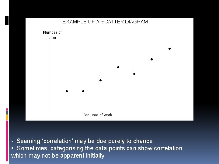
SCATTER PLOT AND CORRELATION Example of Scatter Diagram

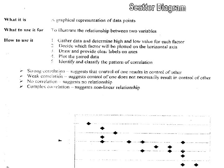
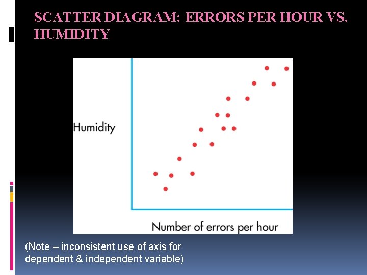
SCATTER DIAGRAM: ERRORS PER HOUR VS. HUMIDITY (Note – inconsistent use of axis for dependent & independent variable)

• Seeming ‘correlation’ may be due purely to chance • Sometimes, categorising the data points can show correlation which may not be apparent initially

Thank You