a brief introduction to Data Visualization Jeffrey Heer

a brief introduction to Data Visualization Jeffrey Heer Stanford University Joe Hellerstein UC Berkeley

The Instructors Jeffrey Heer Asst Professor, Stanford Computer Science Joe Hellerstein Professor, UC Berkeley

Set A X 10 8 13 9 11 14 6 4 12 7 5 Y 8. 04 6. 95 7. 58 8. 81 8. 33 9. 96 7. 24 4. 26 10. 84 4. 82 5. 68 Set B X 10 8 13 9 11 14 6 4 12 7 5 Y 9. 14 8. 74 8. 77 9. 26 8. 1 6. 13 3. 1 9. 11 7. 26 4. 74 Set C X Summary Statistics Linear Regression u. X = 9. 0 σX = 3. 317 Y 2 = 3 + 0. 5 X u. Y = 7. 5 σY = 2. 03 R 2 = 0. 67 10 8 13 9 11 14 6 4 12 7 5 Y 7. 46 6. 77 12. 74 7. 11 7. 81 8. 84 6. 08 5. 39 8. 15 6. 42 5. 73 Set D X 8 8 8 8 19 8 8 8 Y 6. 58 5. 76 7. 71 8. 84 8. 47 7. 04 5. 25 12. 5 5. 56 7. 91 6. 89 [Anscombe 73]

Set B Set A Y 14 14 12 12 10 10 8 8 6 6 4 4 2 2 0 0 0 2 4 6 8 10 12 14 16 0 4 6 8 10 12 14 16 Set D Set C Y 2 14 14 12 12 10 10 8 8 6 6 4 4 2 2 0 0 0 2 4 6 8 X 10 12 14 16 0 5 10 15 X 20
 Illiteracy in France, Pierre Charles Dupin")
1826(? ) Illiteracy in France, Pierre Charles Dupin

cabspotting. org
")
Wikipedia History Flow (IBM)

Attention “What information consumes is rather obvious: it consumes the attention of its recipients. Hence a wealth of information creates a poverty of attention, and a need to allocate that attention efficiently among the overabundance of information sources that might consume it. ” ~Herb Simon as quoted by Hal Varian Scientific American September 1995

Tutorial Topics 1 What makes visualizations effective? 2 Deconstruct and evaluate visualizations 3 Supporting interactivity and scale 4 Engaging web users in social data analysis

How do we design effective visualizations?

Goals of visualization research 1 Understand how visualizations convey information What do people perceive/comprehend? How do visualizations correspond with mental models? 2 Develop principles and techniques for creating effective visualizations and supporting analysis Amplify perception and cognition Strengthen tie between visualization and mental models

Visualization Reference Model Data Raw Data Visual Form Data Tables Data Transformations Visual Structures Visual Encodings Task Views View Transformation s
 Fruits: Apples, oranges, … O -")
Nominal, Ordinal and Quantitative N - Nominal (labels) Fruits: Apples, oranges, … O - Ordinal (rank-ordered) Quality of meat: Grade A, AAA Q - Interval (location of zero arbitrary) Dates: Jan, 19, 2006; Location: (LAT 33. 98, LONG -118. 45) Like a geometric point. Cannot compare directly Only differences (i. e. intervals) may be compared Q - Ratio (zero fixed) Physical measurement: Length, Mass, Temp, … Counts and amounts Like a geometric vector, origin is meaningful S. S. Stevens, On theory of scales of

Example: U. S. Census Data People: # of people in group Year: 1850 – 2000 (every decade) Age: 0 – 90+ Sex: Male, Female Marital Status: Single, Married, Divorced, …

Example: U. S. Census People Year Age Sex Marital Status 2348 data points

All Marital Status Ye ar 2000 1990 1980 1970 40 -59 20 -39 Sum along Marital Status Widowed Divorced Married 0 -19 Single Age 60+ Sum along Age Marital Status All Ages All Years Sum along Year

All Marital Status ar 2000 1990 1980 1970 Ye Roll-Up Drill-Down 40 -59 20 -39 Sum along Marital Status Widowed Divorced Married 0 -19 Single Age 60+ Sum along Age Marital Status All Ages All Years Sum along Year

Visualization Reference Model Data Raw Data Visual Form Data Tables Data Transformations Visual Structures Visual Encodings Task Views View Transformation s


Visual language is a sign system Images perceived as a set of signs Sender encodes information in signs Receiver decodes information from signs Sémiologie Graphique, 1967 Jacques Bertin

Bertin’s Semiology of Graphics C B A 1. A, B, C are distinguishable 2. B is between A and C. 3. BC is twice as long as AB. Encode quantitative variables "Resemblance, order and proportion are three signifieds in graphics. ” - Bertin
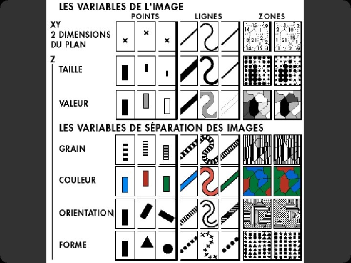
 Size Value Texture Color Orientation Shape")
Visual encoding variables Position (x 2) Size Value Texture Color Orientation Shape

Visual encoding variables Position Length Area Volume Value Texture Color Orientation Shape Transparency Blur / Focus …

Playfair 1786
 y-axis: currency (Q) color: imports/exports (N, O)")
Playfair 1786 x-axis: year (Q) y-axis: currency (Q) color: imports/exports (N, O)

Wattenberg 1998 http: //www. smartmoney. com/marketmap/
 rectangle position: market sector (N), market cap")
Wattenberg 1998 rectangle size: market cap (Q) rectangle position: market sector (N), market cap (Q) color hue: loss vs. gain (N, O) color value: magnitude of loss or gain (Q)

Minard 1869: Napoleon’s march

Single axis composition + =
 + x-axis: longitude (Q) / time (O) = temp")
Mark composition y-axis: temperature (Q) + x-axis: longitude (Q) / time (O) = temp over space/time (Q x Q)
 + + = x-axis: latitude (Q) width: army size")
Mark composition y-axis: longitude (Q) + + = x-axis: latitude (Q) width: army size (Q) army position (Q x Q) and army size (Q)
 latitude (Q) army size (Q) temperature (Q) latitude (Q) / time (O)")
longitude (Q) latitude (Q) army size (Q) temperature (Q) latitude (Q) / time (O)

Minard 1869: Napoleon’s march Depicts at least 5 quantitative variables. Any

Graphical Perception
 Color Hue Orientation (Angle)")
Which best encodes quantities? Position Length Area Volume Value (Brightness) Color Hue Orientation (Angle) Shape

Detecting Brightness Which is brighter?
 (144, 144) Which is brighter?")
Detecting Brightness (128, 128) (144, 144) Which is brighter?


Detecting Brightness Which is brighter?
 (128, 128) Which is brighter?")
Detecting Brightness (134, 134) (128, 128) Which is brighter?
 Ratios more important than magnitude Most continuous variation")
Just Noticeable Difference JND (Weber’s Law) Ratios more important than magnitude Most continuous variation in stimuli perceived in discrete steps

Steps in font size Sizes standardized in 16 th century 6 7 8 a 9 a 10 a 11 a 12 a 14 a 16 a 18 a 21 a 24 a 36 a a a 48 a 60 a 72 a
")
Information in color and value Value is perceived as ordered Encode ordinal variables (O) Encode continuous variables (Q) [not as well] Hue is normally perceived as unordered Encode nominal variables (N) using color

Compare area of circles

Steven’s Power Law p < 1 : underestimate p > 1 : overestimate [graph from Wilkinson 99, based on Stevens 61]

Graduated sphere map
![Apparent magnitude scaling [Cartography: Thematic Map Design, Figure 8. 6, p. 170, Dent, 96]](http://slidetodoc.com/presentation_image_h/17a016af87881bfc5880a8dbc0573df3/image-48.jpg "Apparent magnitude scaling [Cartography: Thematic Map Design, Figure 8. 6, p. 170, Dent, 96]")
Apparent magnitude scaling [Cartography: Thematic Map Design, Figure 8. 6, p. 170, Dent, 96] S = 0. 98 A 0. 87 [from Flannery 71]
![How many 3’s 1281768756138976546984506985604982826762 98098584582245098564589450980943585 9091030209905959595772564675050678904567 8845789809821677654876364908560912949686 [based on slide from Stasko]](http://slidetodoc.com/presentation_image_h/17a016af87881bfc5880a8dbc0573df3/image-49.jpg "How many 3’s 1281768756138976546984506985604982826762 98098584582245098564589450980943585 9091030209905959595772564675050678904567 8845789809821677654876364908560912949686 [based on slide from Stasko]")
How many 3’s 1281768756138976546984506985604982826762 98098584582245098564589450980943585 9091030209905959595772564675050678904567 8845789809821677654876364908560912949686 [based on slide from Stasko]
![How many 3’s 1281768756138976546984506985604982826762 98098584582245098564589450980943585 9091030209905959595772564675050678904567 8845789809821677654876364908560912949686 [based on slide from Stasko]](http://slidetodoc.com/presentation_image_h/17a016af87881bfc5880a8dbc0573df3/image-50.jpg "How many 3’s 1281768756138976546984506985604982826762 98098584582245098564589450980943585 9091030209905959595772564675050678904567 8845789809821677654876364908560912949686 [based on slide from Stasko]")
How many 3’s 1281768756138976546984506985604982826762 98098584582245098564589450980943585 9091030209905959595772564675050678904567 8845789809821677654876364908560912949686 [based on slide from Stasko]

Visual pop-out: Color http: //www. csc. ncsu. edu/faculty/healey/PP/index. html

Visual pop-out: Shape http: //www. csc. ncsu. edu/faculty/healey/PP/index. html

Feature Conjunctions http: //www. csc. ncsu. edu/faculty/healey/PP/index. html
![Pre-Attentive features [Information Visualization. Figure 5. 5 Ware 04]](http://slidetodoc.com/presentation_image_h/17a016af87881bfc5880a8dbc0573df3/image-54.jpg "Pre-Attentive features [Information Visualization. Figure 5. 5 Ware 04]")
Pre-Attentive features [Information Visualization. Figure 5. 5 Ware 04]
![Small Multiples [Figure 2. 11, p. 38, Mac. Eachren 95]](http://slidetodoc.com/presentation_image_h/17a016af87881bfc5880a8dbc0573df3/image-55.jpg "Small Multiples [Figure 2. 11, p. 38, Mac. Eachren 95]")
Small Multiples [Figure 2. 11, p. 38, Mac. Eachren 95]
 Color Hue Orientation (Angle)")
Which best encodes quantities? Position Length Area Volume Value (Brightness) Color Hue Orientation (Angle) Shape

Cleveland & Mc. Gill, Graphical Perception 1984
![[Cleveland Mc. Gill 84]](http://slidetodoc.com/presentation_image_h/17a016af87881bfc5880a8dbc0573df3/image-58.jpg "[Cleveland Mc. Gill 84]")
[Cleveland Mc. Gill 84]
![[Cleveland Mc. Gill 84]](http://slidetodoc.com/presentation_image_h/17a016af87881bfc5880a8dbc0573df3/image-59.jpg "[Cleveland Mc. Gill 84]")
[Cleveland Mc. Gill 84]
 scale Position (non-aligned) scale Length Slope Angle Area Volume Least")
Most accurate Position (common) scale Position (non-aligned) scale Length Slope Angle Area Volume Least accurate Color hue-saturation-density

Combinatorics of Encodings Challenge: Pick the best encoding from the exponential number of possibilities (n+1)8 Principle of Consistency: The properties of the image (visual variables) should match the properties of the data. Principle of Importance Ordering: Encode the most important information in the most effective way.
 Expressiveness A set of facts is expressible in a visual language")
Design Criteria (Mackinlay) Expressiveness A set of facts is expressible in a visual language if the sentences (i. e. the visualizations) in the language express all the facts in the set of data, and only the facts in the data.
 relation cannot be expressed in a")
Cannot express the facts A one-to-many (1 N) relation cannot be expressed in a single horizontal dot plot because multiple tuples are mapped to the same position

Expresses facts not in the data A length is interpreted as a quantitative value; Length of bar says something untrue about N data [Mackinlay, APT, 1986]
 Expressiveness A set of facts is expressible in a visual language")
Design Criteria (Mackinlay) Expressiveness A set of facts is expressible in a visual language if the sentences (i. e. the visualizations) in the language express all the facts in the set of data, and only the facts in the data. Effectiveness A visualization is more effective than another visualization if the information conveyed by one visualization is more readily perceived than the information in the other visualization.

Mackinlay’s Ranking Conjectured effectiveness of the encoding

Visualization Reference Model Data Raw Data Visual Form Data Tables Data Transformations Visual Structures Visual Encodings Task Views View Transformation s
![Time. Searcher [Hochheiser & Shneiderman 02] Based on Wattenberg’s [2001] idea for sketch-based queries](http://slidetodoc.com/presentation_image_h/17a016af87881bfc5880a8dbc0573df3/image-68.jpg "Time. Searcher [Hochheiser & Shneiderman 02] Based on Wattenberg’s [2001] idea for sketch-based queries")
Time. Searcher [Hochheiser & Shneiderman 02] Based on Wattenberg’s [2001] idea for sketch-based queries of time-series data.

Interaction Techniques Dynamic Queries Filter a visualization through direct, reversable actions that avoid complex syntax.
 distribution")
Baseball Statistics how long in majors avg assists vs avg putouts (fielding ability) distribution of positions played [from Wills 95] select high salaries avg career HRs vs avg career hits (batting ability)

Interaction Techniques Dynamic Queries Filter a visualization through direct, reversable actions that avoid complex syntax. Brushing and Linking Highlight relationships between related items across multiple visualization views.

Database Visualization

Polaris Research at Stanford by Stolte, Tang, and Hanrahan.

Tableau Encodings Data Display Data Model

Tableau Demo The dataset: Federal Elections Commission Receipts Every Congressional Candidate from 1996 to 2002 4 Election Cycles 9216 Candidacies

Hypotheses? What might we learn from this data? ? ?

Hypotheses? What might we learn from this data? Correlation between receipts and winners? Do receipts increase over time? Which states spend the most? Which party spends the most? Margin of victory vs. amount spent? Amount spent between competitors?

Tableau Demo

Polaris/Tableau Approach Insight: can simultaneously specify both database queries and visualization (c. f. , Leland Wilkinson’s Grammar of Graphics) Choose data, then visualization, not vice versa Use smart defaults for visual encodings More recently: automate visualization design

Specifying Table Configurations Operands are the database fields Each operand interpreted as a set {…} Quantitative and Ordinal fields treated differently Three operators: concatenation (+) cross product (x) nest (/)

Table Algebra: Operands Ordinal fields: interpret domain as a set that partitions table into rows and columns. Quarter = {(Qtr 1), (Qtr 2), (Qtr 3), (Qtr 4)} Quantitative fields: treat domain as single element set and encode spatially as axes: Profit = {(Profit[-410, 650])} �
 Operator Ordered union of set interpretations Quarter + Product Type = {(Qtr")
Concatenation (+) Operator Ordered union of set interpretations Quarter + Product Type = {(Qtr 1), (Qtr 2), (Qtr 3), (Qtr 4)} + {(Coffee), (Espresso)} = {(Qtr 1), (Qtr 2), (Qtr 3), (Qtr 4), (Coffee), (Espresso)} Profit + Sales = {(Profit[-310, 620]), (Sales[0, 1000])}
 Operator Cross-product of set interpretations Quarter x Product Type = {(Qtr 1,")
Cross (x) Operator Cross-product of set interpretations Quarter x Product Type = {(Qtr 1, Coffee), (Qtr 1, Tea), (Qtr 2, Coffee), (Qtr 2, Tea), (Qtr 3, Coffee), (Qtr 3, Tea), (Qtr 4, Coffee), (Qtr 4, Tea)} Product Type x Profit =
 Operator Cross-product filtered by existing records Quarter x Month creates twelve entries")
Nest (/) Operator Cross-product filtered by existing records Quarter x Month creates twelve entries for each quarter. i. e. , (Qtr 1, December) Quarter / Month creates three entries per quarter based on tuples in database (not semantics)

Ordinal - Ordinal

Quantitative - Quantitative

Ordinal - Quantitative

Querying the Database

Next: Interaction and Scale: Visual Analysis of Big Data

Questions?


Parallel Coordinates
![Parallel Coordinates [Inselberg]](http://slidetodoc.com/presentation_image_h/17a016af87881bfc5880a8dbc0573df3/image-93.jpg "Parallel Coordinates [Inselberg]")
Parallel Coordinates [Inselberg]

The Multidimensional Detective The Dataset: Production data for 473 batches of a VLSI chip 16 process parameters: X 1: The yield: % of produced chips that are useful X 2: The quality of the produced chips (speed) X 3 … X 12: 10 types of defects (zero defects shown at top) X 13 … X 16: 4 physical parameters The Objective: Raise the yield (X 1) and maintain high quality (X 2) A. Inselberg, Multidimensional Detective, Proceedings of IEEE Symposium on Information Visualization (Info. Vis '97), 1997

Parallel Coordinates

Inselberg’s Principles 1. Do not let the picture scare you 2. Understand your objectives – Use them to obtain visual cues 3. Carefully scrutinize the picture 4. Test your assumptions, especially the “I am really sure of’s” 5. You can’t be unlucky all the time!
 Filtered below for high")
Each line represents a tuple (e. g. , VLSI batch) Filtered below for high values of X 1 and X 2
 Most of these have low yields")
Look for batches with nearly zero defects (9/10) Most of these have low yields defects OK.
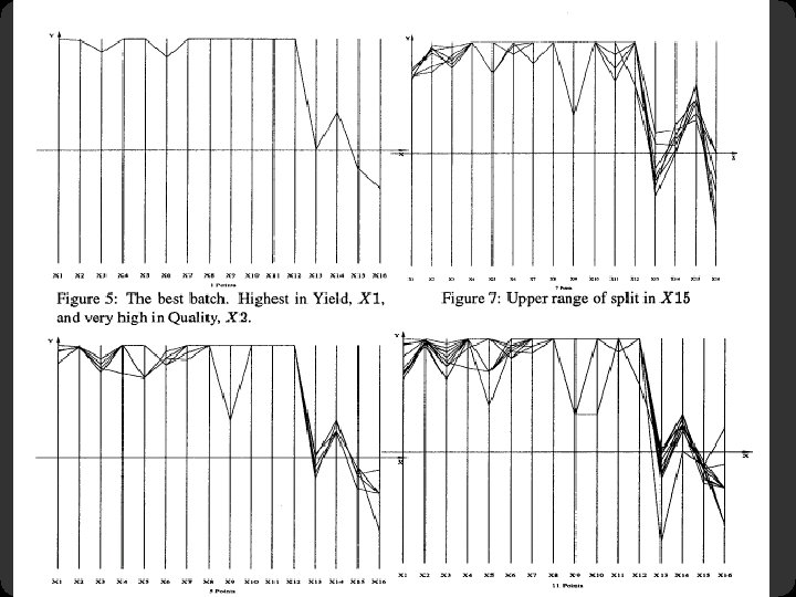

Notice that X 6 behaves differently. Allow 2 defects, including X 6 best batches

Parallel Coordinates Free implementation: Parvis by Ledermen http: //home. subnet. at/flo/mv/parvis/

GGobi: Projections of n. D data http: //www. ggobi. org/
")
Dimensionality Reduction (Sometimes Considered Harmful)

Centered Projection
 Map entries from relational DB to pixels on the")
Vis. DB (Keim & Kriegel) Map entries from relational DB to pixels on the screen Include “approximate” answers, with placement and color-coding based on relevance Data points laid out in: Rectangular spiral Or, with axes representing positive/negative values for two selected dimensions Or, group dimensions together (easier to interpret than very large number of dimensions)

from http: //infovis. cs. vt. edu/cs 5984/students/Vis. DB. ppt

Vis. DB - Relevance calculation based on “distance” of each variable from query specification Distance calculation depends on data type Numeric: mathematical String: character/substring matching, lexical, phonetic? , syntactic? Nominal: predefined distance matrix Possibly other “domain-specific” distance metrics

Vis. DB – Screen Resolution Stated screen resolution seems reasonable by today’s standards: 19 inch display, 1024 x 1280 pixels = 1. 3 million data points However, controls take up a lot of space! Adapted

from http: //www 1. ics. uci. edu/~kobsa/courses/ICS 280/notes/presentations/Keim-Vis. DB. ppt

Limitations and Issues Complexity Abstract data These visualizations are oriented toward abstract data For “naturally” two or three-dimensional data (things that vary over time or space, e. g. , geographic data) visualizations which exploit those properties may exist and be more effective Adapted

Spotfire

Spotfire Research at UMD, College Park: “Starfield Displays” and “Dynamic Queries” by Ahlberg and Shneiderman

Spotfire Data Display Dynamic Queries Details on Demand


Visual Analysis Software

Time-Series Data

Multivariate Data

Name. Voyager http: //www. babynamewizard. com/voyager
 Temporal 2 D (maps) 3 D (shapes) n.")
Taxonomy 1 D (sets and sequences) Temporal 2 D (maps) 3 D (shapes) n. D (relational) Trees (hierarchies) Networks (graphs) Are there others? The eyes have it: A task by data type taxonomy for information visualization [Shneiderman 96]

All Marital Status Ye ar 2000 1990 1980 1970 40 -59 20 -39 Sum along Marital Status Widowed Divorced Married 0 -19 Single Age 60+ Sum along Age Marital Status All Ages All Years Sum along Year

All Marital Status ar 2000 1990 1980 1970 Ye Roll-Up Drill-Down 40 -59 20 -39 Sum along Marital Status Widowed Divorced Married 0 -19 Single Age 60+ Sum along Age Marital Status All Ages All Years Sum along Year

Why do we create visualizations?

Why do we create visualizations?
 Make decisions See data")
Why do we create visualizations? Answer questions (or discover them) Make decisions See data in context Expand memory Support graphical calculation Find patterns Present argument or tell a story Inspire

Three functions of visualizations Record: store information Photographs, blueprints, …
![Answer question Gallop, Bay Horse “Daisy” [Muybridge 1884 -86]](http://slidetodoc.com/presentation_image_h/17a016af87881bfc5880a8dbc0573df3/image-126.jpg "Answer question Gallop, Bay Horse “Daisy” [Muybridge 1884 -86]")
Answer question Gallop, Bay Horse “Daisy” [Muybridge 1884 -86]

Three functions of visualizations Record: store information Photographs, blueprints, … Analyze: support reasoning about information Process and calculate Reason about data Develop models and hypotheses

In 1854 John Snow plotted the position of each cholera case on a map. [from Tufte 83]

Cholera outbreak Used map to hypothesize that pump on Broad St. was the cause. [from Tufte 83]

Three functions of visualizations Record: store information Photographs, blueprints, … Analyze: support reasoning about information Process and calculate Reason about data Feedback and interaction Communicate: convey information to others Share and persuade Collaborate and revise Emphasize important aspects of data

“to affect thro’ the Eyes what we fail to convey to the public through their word-proof ears” 1856 “Coxcomb” of Crimean War Deaths, Florence Nightingale
 Interaction and")
Agenda Section I A Brief Introduction to Data Visualization Section II (a) Interaction and Scale: Visual Analysis of Big Data (b) Social Data Analysis & Collaborative Visualization

Drawing: Phases of the moon Galileo’s drawings of the phases of the moon from 1616 http: //galileo. rice. edu/sci/observations/moon. html

The most powerful brain?
![Tell a story: Most powerful brain? The Dragons of Eden [Carl Sagan]](http://slidetodoc.com/presentation_image_h/17a016af87881bfc5880a8dbc0573df3/image-135.jpg "Tell a story: Most powerful brain? The Dragons of Eden [Carl Sagan]")
Tell a story: Most powerful brain? The Dragons of Eden [Carl Sagan]
![Tell a story: Most powerful brain? The Elements of Graphing Data [Cleveland]](http://slidetodoc.com/presentation_image_h/17a016af87881bfc5880a8dbc0573df3/image-136.jpg "Tell a story: Most powerful brain? The Elements of Graphing Data [Cleveland]")
Tell a story: Most powerful brain? The Elements of Graphing Data [Cleveland]
- Slides: 136