Interactive Tools for Data Transformation Visualization Jeffrey Heer

 will we produce in 2010?")


. on(NEWLINE). max_splits(NO_MAX) split('split'). on(COMMA). max_splits(NO_MAX) column. Name(). row(0)")


![Today's first task is not to invent wholly new [graphical] techniques, though these are](https://slidetodoc.com/presentation_image_h2/156836d0a00e1550f3c5410a4df8c7af/image-16.jpg "Today's first task is not to invent wholly new [graphical] techniques, though these are")


; var vis = new pv. Panel();")


![[CHI 07]](https://slidetodoc.com/presentation_image_h2/156836d0a00e1550f3c5410a4df8c7af/image-28.jpg "[CHI 07]")


- Slides: 53
Interactive Tools for Data Transformation & Visualization Jeffrey Heer University Stanford
How much data (bytes) will we produce in 2010?
2010: 1, 200 exabytes 10 x increase over 5 years Gantz et al, 2008, 2010
Records of Human Activity – The “Buzz” of the Crowd?
The ability to take data—to be able to understand it, to process it, to extract value from it, to visualize it, to communicate it—that’s going to be a hugely important skill in the next decades, … because now we really do have essentially free and ubiquitous data. So the complimentary scarce factor is the ability to understand that data and extract value from it. Hal Varian, Google’s Chief Economist The Mc. Kinsey Quarterly, Jan 2009
Acquisition Cleaning Integration Visualizati on Analysis Presentatio n Disseminati on
Acquisition Cleaning Integration Visualizati on Analysis Presentatio n Disseminati on
Data. Wrangler with Sean Kandel , Andreas Paepcke & Joe Hellerstein
From UI to running code… split('data'). on(NEWLINE). max_splits(NO_MAX) split('split'). on(COMMA). max_splits(NO_MAX) column. Name(). row(0) delete(is. Empty()) extract('Year'). on(/. */). after(/in /) fill('extract'). method(COPY). direction(DOWN) delete('Year starts with "Reported crime in"') column. Name('extract'). to('State')
Data Wrangler Declarative data transformation language Tuple mapping – split, merge, extract, delete Lookups and joins – e. g. , FIPS code to US state Reshaping – e. g. , cross-tabulation Sorting, aggregation, etc. Informed by prior work in databases, namely Potter’s Wheel & Schema. SQL
Data Wrangler Declarative data transformation language + Mixed-initiative interface for data transforms Select data elements of interest Suggest applicable transforms Enable rapid preview and refinement
Comparative Evaluation Compared Wrangler performance to Excel with 3 data cleaning tasks on small data sets. Median completion time for Wrangler at least twice as fact in all tasks. Skilled Excel users benefit disproportionately!
Acquisition Cleaning Integration Visualizati on Analysis Presentatio n Disseminati on
Acquisition Cleaning Integration Visualizati on Analysis Presentatio n Disseminati on
How do people create visualizations? Chart Typology Pick from a stock of templates Easy-to-use but limited expressiveness Prohibits novel designs, new data types Component Model Architectures Compose common high-level operations Permits more combinatorial possibilities Novel views require new
Today's first task is not to invent wholly new [graphical] techniques, though these are needed. Rather we need most vitally to recognize and reorganize the essential of old techniques, to make easy their assembly in new ways, and to modify their external appearances to fit the new opportunities. J. W. Tukey, The Future of Data Analysis, 1962.
Protovis: A Declarative Language for Visualization A graphic is a composition of data-representative marks. with Mike Bostock & Vadim Ogievetsky
Area Bar Dot Image Line Label Rule Wedge
Protovis Create customized visualizations using a declarative specification language. var vis = new pv. Panel(); vis. add(pv. Bar). data([1, 1. 2, 1. 7, 1. 5, . 7]). bottom(10). width(20). height(function(d) d * 70). left(function() this. index * 25 + 20); vis. render(); Protovis (http: //protovis. org) – Declarative Visualization Specification
var army = pv. nest(napoleon. army, "dir", "group“); var vis = new pv. Panel(); var lines = vis. add(pv. Panel). data(army); lines. add(pv. Line). data(function() army[this. idx]). left(lon). top(lat). size(function(d) d. size/8000). stroke. Style(function() color[army[pane. Index][0]. dir]); vis. add(pv. Label). data(napoleon. cities). left(lon). top(lat). text(function(d) d. city). font("italic 10 px Georgia"). text. Align("center"). text. Baseline("middle"); vis. add(pv. Rule). data([0, -10, -20, -30]). top(function(d) 300 - 2*d 0. 5). left(200). right(150). line. Width(1). stroke. Style("#ccc"). anchor("right"). add(pv. Label). font("italic 10 px Georgia"). text(function(d) d+"°"). text. Baseline("center"); vis. add(pv. Line). data(napoleon. temp). left(lon). top(tmp). stroke. Style("#0"). add(pv. Label). top(function(d) 5 + tmp(d)). text(function(d) d. temp+"° "+d. date. substr(0, 6)). text. Baseline("top"). font("italic 10 px Georgia");
Bach’s Prelude #1 in C Major Jieun Oh |
Flickr. Season | Ken-Ichi Ueda
Dymaxion Maps | Vadim Ogievetsky
Exploiting Declarative Specification Protovis has led to faster designs, less code Job Voyager: 5 x less code, 10 x less dev time Over 20, 000 downloads and widely in use Multiple implementations: Java. Script & Java Behind-the-scenes optimization & parallelization 20 x scalability over prior systems (in Java)
Acquisition Cleaning Integration Visualizati on Analysis Presentatio n Disseminati on
Acquisition Cleaning Integration Visualizati on Analysis Presentatio n Disseminati on
sense. us A Web Application for Collaborative Visualization of Demographic Data with Fernanda Viégas and Martin Wattenberg
[CHI 07]
Voyagers and Voyeurs Complementary faces of analysis Voyager – focus on visualized data Active engagement with the data Serendipitous comment discovery Voyeur – focus on comment listings Investigate others’ explorations Find people and topics of interest Catalyze new explorations
Many-
Content Analysis of Comments Sense. us Observation Question Hypothesis Data Integrity Linking Socializing System Design Testing Tips To-Do Affirmation 0 20 40 60 Percentage Service 80 0 Many-Eyes 20 40 60 Percentage 80 Feature prevalence from content analysis (min Cohen’s =. 74) High co-occurrence of Observation, Question, and Hypothesis
Content Analysis of Comments Sense. us Observation Question Hypothesis Data Integrity Linking Socializing System Design Testing Tips To-Do Affirmation 0 20 40 60 Percentage Service 80 0 Many-Eyes 20 40 60 Percentage 16% of sense. us comments and 10% of Many. Eyes comments reference data integrity issues. 80
Acquisition Cleaning Integration Visualizati on Analysis Presentatio n Disseminati on
Acquisition Cleaning Integration Visualizati on Analysis Presentatio n Disseminati on
Students & Collaborators Mike Bostock Jason Chuang Sean Kandel Diana Mac. Lean Vadim Ogievetsky Joe Hellerstein, Andreas Paepcke Fernanda Viégas, Martin Wattenberg
Interactive Tools for Data Transformation & Visualization Jeffrey Heer http: //vis. stanford. edu
Node-link
Matrix
Matrix
Set A X 10 8 13 9 11 14 6 4 12 7 5 Y 8. 04 6. 95 7. 58 8. 81 8. 33 9. 96 7. 24 4. 26 10. 84 4. 82 5. 68 Summary Statistics u. X = 9. 0σX = 3. 317 u. Y = 7. 5σY = 2. 03 Set B X 10 8 13 9 11 14 6 4 12 7 5 Y 9. 14 8. 74 8. 77 9. 26 8. 1 6. 13 3. 1 9. 11 7. 26 4. 74 Set C X 10 8 13 9 11 14 6 4 12 7 5 Linear Regression Y 2 = 3 + 0. 5 X R 2 = 0. 67 Y 7. 46 6. 77 12. 74 7. 11 7. 81 8. 84 6. 08 5. 39 8. 15 6. 42 5. 73 Set D X 8 8 8 8 19 8 8 8 Y 6. 58 5. 76 7. 71 8. 84 8. 47 7. 04 5. 25 12. 5 5. 56 7. 91 6. 89 [Anscombe 73]
Set B Set A Y 14 14 12 12 10 10 8 8 6 6 4 4 2 2 0 0 0 2 4 6 8 10 12 14 16 0 4 6 8 10 12 14 16 Set D Set C Y 2 14 14 12 12 10 10 8 8 6 6 4 4 2 2 0 0 0 2 4 6 8 X 10 12 14 16 0 5 10 15 X 20
Bullet Charts | Clint Ivy
Climate Graph | Robert Kosara
Social Data Analysis & sense. us
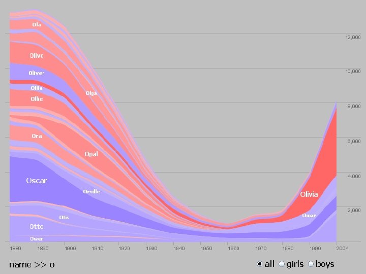
Name. Voyager The Baby Name Voyager
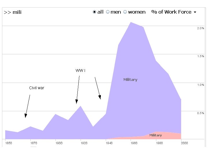
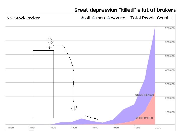
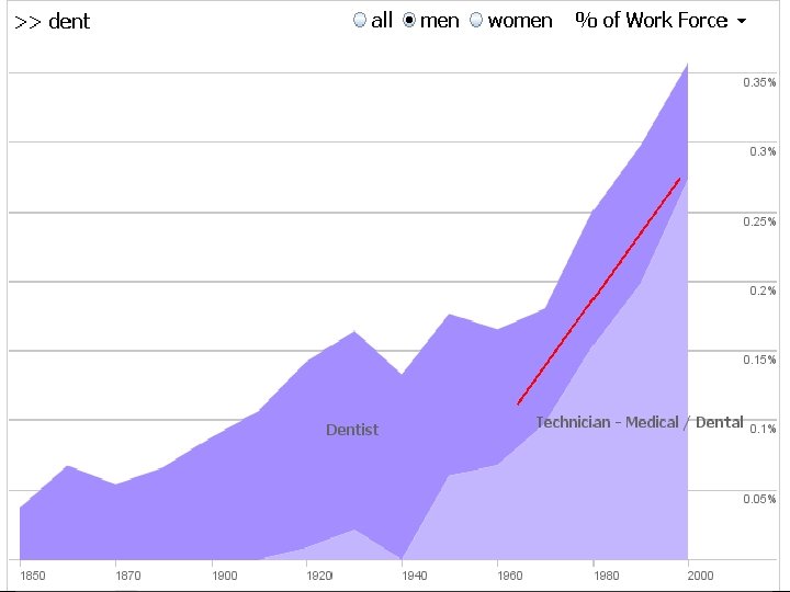
The great postmaster scourge of 1910? Or just a bug in the data?
Transform History Suggested Transforms Data Quality Meter Interactive Data Table
Comparative Evaluation Compared Wrangler performance to Excel with 3 data cleaning tasks on small data sets. Median completion time for Wrangler at least twice as fact in all tasks. Skilled Excel users benefit disproportionately!