DATA VISUALIZATION USING PYPLOT DATA VISUALIZATION Data visualization


![WITH LABELS import matplotlib. pyplot as p Yr=[2000, 2002, 2004, 2006] rate=[21. 0, 20.](https://slidetodoc.com/presentation_image_h/cfefd58d0c489a78df1ecba10a93b51f/image-6.jpg "WITH LABELS import matplotlib. pyplot as p Yr=[2000, 2002, 2004, 2006] rate=[21. 0, 20.")
![WITH LABELS import matplotlib. pyplot as p Yr=[2000, 2002, 2004, 2006] rate=[21. 0, 20.](https://slidetodoc.com/presentation_image_h/cfefd58d0c489a78df1ecba10a93b51f/image-7.jpg "WITH LABELS import matplotlib. pyplot as p Yr=[2000, 2002, 2004, 2006] rate=[21. 0, 20.")

![BAR GRAPH import matplotlib. pyplot as p week=[ ‘First’, ’Second’, ’Third’, ’Fourth’, ’Fifth’] nofbed=[600,](https://slidetodoc.com/presentation_image_h/cfefd58d0c489a78df1ecba10a93b51f/image-9.jpg "BAR GRAPH import matplotlib. pyplot as p week=[ ‘First’, ’Second’, ’Third’, ’Fourth’, ’Fifth’] nofbed=[600,")


![import matplotlib. pyplot as p x=[6, 7, 8, 9, 10, 11, 12] y 1=[130,](https://slidetodoc.com/presentation_image_h/cfefd58d0c489a78df1ecba10a93b51f/image-12.jpg "import matplotlib. pyplot as p x=[6, 7, 8, 9, 10, 11, 12] y 1=[130,")


 s = [1, 2, 3,")
 s")
 in numpy Numpy arrange() also called np. arrange() is a tool for creating")
 in Python Parameters: start : number, optional Start of interval. The interval")

![Example >>> np. arange(3) [0, 1, 2] >>> np. arange(3. 0) [ 0. ,](https://slidetodoc.com/presentation_image_h/cfefd58d0c489a78df1ecba10a93b51f/image-24.jpg "Example >>> np. arange(3) [0, 1, 2] >>> np. arange(3. 0) [ 0. ,")
 npdata. shape=(5, 8) print(npdata) OUTPUT : RESTART:")


- Slides: 27
DATA VISUALIZATION USING PYPLOT
DATA VISUALIZATION Data visualization basically refers to the graphical or visual representation of information and data using visual elements like charts, graphs, maps etc. Data visualization is the discipline of trying to understand data by placing it in a visual context so that patterns, trends and correlations that might not otherwise be detected can be exposed.
PYLOT OF MATPLOTLIB LIBRARY Py. Plot is a collection of methods within matplotlib library which allow user to construct 2 D plots easily and interactively. LINE BAR PIE
LINE CHART Is a type fo chart which displays information as a series of data points called ‘markers’ connected by straight line segment
The table shows passenger car fuel rates in miles per gallon for several years. Make a LINE GRAPH of the data. During which 2 -year period did the fuel rate decrease? YEAR: 2000 2002 2004 2006 RATE: 21. 0 20. 7 21. 2 21. 6 import matplotlib. pyplot as p Yr=[2000, 2002, 2004, 2006] rate=[21. 0, 20. 7, 21. 2, 21. 6] p. plot(Yr, rate) p. show()
WITH LABELS import matplotlib. pyplot as p Yr=[2000, 2002, 2004, 2006] rate=[21. 0, 20. 7, 21. 2, 21. 6] p. plot(Yr, rate, color='red') # To draw line in red colour p. xlabel('Year') # To Put Label At X Axis p. ylabel('Rate') # To put Label At Y Axis p. title('Fuel Rates in every Two Year') # To Write Title of the Line Chart p. show()
WITH LABELS import matplotlib. pyplot as p Yr=[2000, 2002, 2004, 2006] rate=[21. 0, 20. 7, 21. 2, 21. 6] p. plot(Yr, rate, color='red') # To draw line in red colour p. xlabel('Year') # To Put Label At X Axis p. ylabel('Rate') # To put Label At Y Axis p. title('Fuel Rates in every Two Year') # To Write Title of the Line Chart p. show()
BAR GRAPH A bar graph / bar chart/ bar diagram is a visual tool that uses bars(Vertical or Horizontal) to represent/compare categorical data. The number of bed-sheets manufactured by a factory during five consecutive weeks is given below. Week First Number of Bed-sheets 600 Second 850 Third 700 Draw the bar graph representing the above data. Fourth Fifth 300 900
BAR GRAPH import matplotlib. pyplot as p week=[ ‘First’, ’Second’, ’Third’, ’Fourth’, ’Fifth’] nofbed=[600, 850, 700, 300, 900] p. bar(week, nofbed, color='red‘, width=. 50) p. xlabel(‘Week') p. ylabel(‘No of Beds') p. title(‘Production by Factory’) p. show()
WITH GRID AND HORIZONTAL BAR
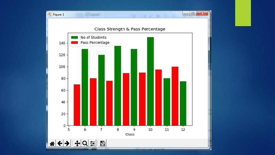
The number of students and Pass percentage in 7 different classes is given below. Represent this data on the bar graph. Class 6 th 7 th 8 th 9 th 10 th 11 th 12 th Number of Students 130 120 135 130 150 80 75 Pass Percentage 70 80 76 89 90 95 100
import matplotlib. pyplot as p x=[6, 7, 8, 9, 10, 11, 12] y 1=[130, 120, 135, 130, 150, 80, 75] x 1=[5. 5, 6. 5, 7. 5, 8. 5, 9. 5, 10. 5, 11. 5] y 2 =[70, 80, 76, 89, 90, 95, 100] p. title("Class Strength & Pass Percentage") p. bar(x, y 1, color='green', width=0. 4, label='No of Students') p. bar(x 1, y 2, color='r', width=0. 4, label='Pass Percentage') p. xlabel('Class') #p. legend() p. show()
PIE CHART A pie chart is a circular chart divided into sectors which is proportional to the whole quantity it represents. A pie chart displays data, information, and statistics in an easy-to-read 'pie-slice' format. Different sizes of slice indicates how much of one data element exists.
. The number of students and Pass percentage in 7 different classes is given below. Represent this data on the Pie Chart Class 9 th 10 th 11 th 12 th Number of Students 130 150 80 75 import matplotlib. pyplot as p cls =[9, 10, 11, 12] stud=[130, 150, 80, 75] p. title("Class Strength") p. pie(stud, labels=cls, colors=['gold', 'red', 'pink', 'lightcoral']) p. show()
Note : If we also want to show much percent each slice is representing then we have to specify value for autopct='%. 2 f%%' parameter wit pie() function as bel ow : import matplotlib. pyplot as p cls =[9, 10, 11, 12] stud=[130, 150, 80, 75] p. title("Class Strength") p. pie(stud, labels=cls, colors=['gold', 'red', 'pink', 'lightcoral'], autopct='%. 2 f%%' ) p. show()
PIE CHART import matplotlib. pyplot as plt # Data to plot labels = 'Python', 'C++', 'Ruby', 'Java' sizes = [215, 130, 245, 210] colors = ['gold', 'yellowgreen', 'lightcoral', 'lightskyblue'] explode = (0. 1, 0, 0, 0. 0) # explode 1 st slice # Plot plt. pie(sizes, explode=explode, labels=labels, colors=colors, autopct='%1. 1 f%%', shadow=True, startangle=140) plt. axis('equal') plt. show()
The startangle parameter rotates the pie chart by the specified number of degrees. The rotation is counter clock wise and performed on X Axis of the pie chart. Shadow effect can be provided using the shadow parameter of the pie() function. Passing True will make a shadow appear below the rim of the pie chart.
SUB PLOTS t = arange(0. 0, 20. 0, 1) s = [1, 2, 3, 4, 5, 6, 7, 8, 9, 10, 11, 12, 13, 14, 15, 16, 17, 18, 19, 20] subplot(2, 1, 1) xticks([]), yticks([]) title('subplot(2, 1, 1)') plot(t, s) subplot(2, 1, 2) xticks([]), yticks([]) title('subplot(2, 1, 2)') plot(t, s, 'r-') show()
SUB PLOTS from pylab import * t = arange(0. 0, 20. 0, 1) s = [1, 2, 3, 4, 5, 6, 7, 8, 9, 10, 11, 12, 13, 14, 15, 16, 17, 18, 19, 20] subplot(1, 2, 1) xticks([]), yticks([]) title('subplot(1, 2, 1)') plot(t, s) subplot(1, 2, 2) xticks([]), yticks([]) title('subplot(1, 2, 2)') plot(t, s, 'r-') show()
arange() in numpy Numpy arrange() also called np. arrange() is a tool for creating numeric sequences in Python Syntax: arange([start, ] stop[, step, ][, dtype]) :
numpy. arange() in Python Parameters: start : number, optional Start of interval. The interval includes this value. The default start value is 0. stop : number End of interval. The interval does not include this value, except in some cases where step is not an integer and floating point round-off affects the length of out. step : number, optional Spacing between values. For any output out, this is the distance between two adjacent values, out[i+1] - out[i]. The default step size is 1. If step is specified as a position argument, start must also be given. dtype : dtype The type of the output array. If dtype is not given, infer the data type from the other input arguments.
Returns: arange : ndarray Array of evenly spaced values. For floating point arguments, the length of the result is ceil((stop - start)/step). Because of floating point overflow, this rule may result in the last element of out being greater than stop.
Example >>> np. arange(3) [0, 1, 2] >>> np. arange(3. 0) [ 0. , 1. , 2. ] >>> np. arange(3, 7) [3, 4, 5, 6] >>> np. arange(3, 7, 2) [3, 5]
import numpy as np npdata= np. arange(40) npdata. shape=(5, 8) print(npdata) OUTPUT : RESTART: C: /Users/user/App. Data/Local/Programs/Python 3732/arangefun. py [[ 0 1 2 3 4 5 6 7] [ 8 9 10 11 12 13 14 15] [16 17 18 19 20 21 22 23] [24 25 26 27 28 29 30 31] [32 33 34 35 36 37 38 39]]
SINE WAVE USING LINE CHART import matplotlib. pyplot as pt import numpy as np xvals=np. arange(-2, 1, 0. 01) yvals=np. sin(xvals) pt. plot(xvals, yvals) pt. show()
Program to plot quadratic equation using dashed line chart 1 - 0. 5 * x ** 2 import matplotlib. pyplot as pt import numpy as np xvals =np. arange(-2, 1, 0. 01) yvals=1 - 0. 5 * xvals**2 pt. plot(xvals, yvals) pt. title("Quadratic Equation") pt. xlabel("Input") pt. ylabel("Function Values") pt. show()