SIMS 247 Information Visualization and Presentation jeffrey heer
- Slides: 28

SIMS 247: Information Visualization and Presentation jeffrey heer Visualization and the Arts Nov 28, 2005 1

today • overview – art, science, engineering, design – aesthetics • case studies – ambient infovis – artifacts of the presence era • online examples • “playful visualization” 2

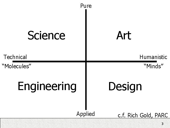
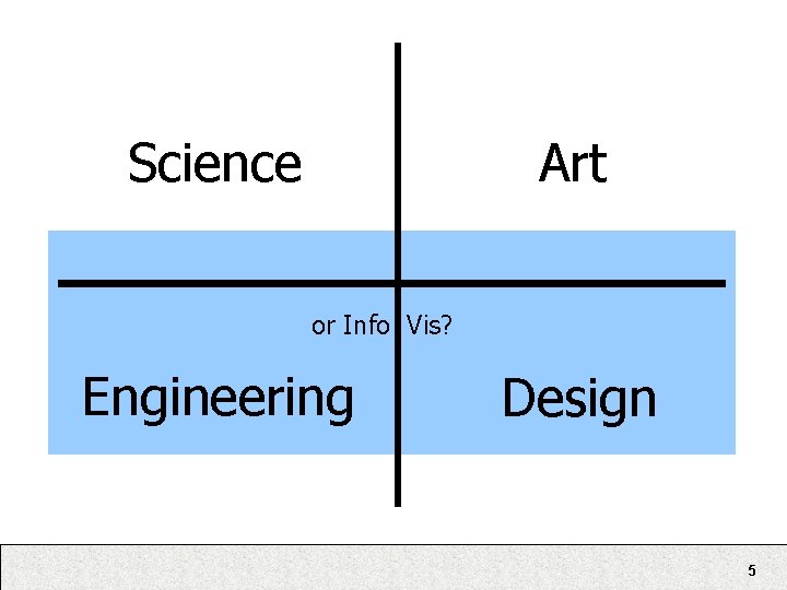
Pure Science Art Technical Humanistic “Molecules” “Minds” Engineering Design Applied c. f. Rich Gold, PARC 3

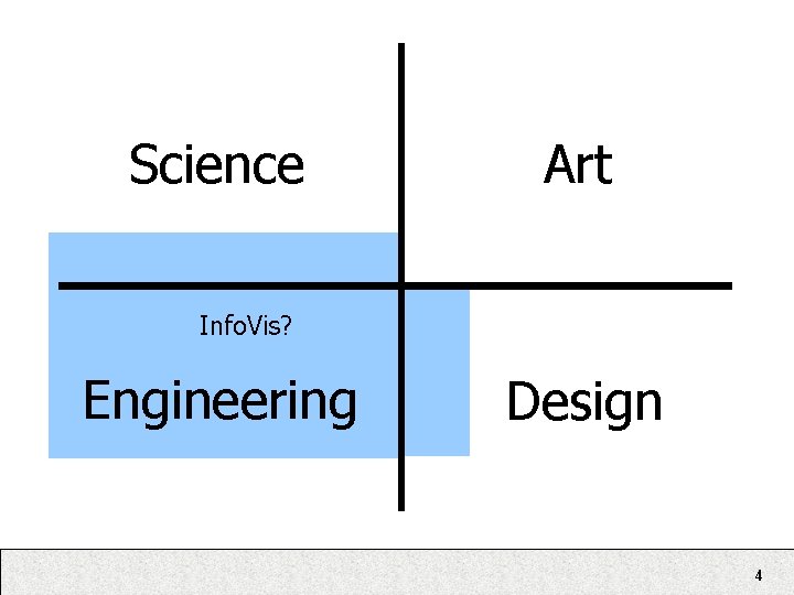
Science Art Info. Vis? Engineering Design 4

Science Art or Info Vis? Engineering Design 5

“Top 10 Unsolved Information Visualization Problems” • Problem 7: Aesthetics. The purpose of information visualization is the insights into data that it provides, not just pretty pictures. But what makes a picture pretty? What can we learn from making a pretty picture and enhancing the representation of insights? It’s important, therefore, to understand how insights and aesthetics interact, and these two goals could sustain insightful and visually appealing information visualization. – Chaomei Chen 6

Aesthetics == Pretty Pictures? • Reactions? • My own (somewhat half-baked) thoughts… – Affective engagement. • Increased interest and prolonged use due to positive emotional experience. – Inspiration. • Inspire new thoughts or approaches through creative presentation. – Denotation vs. Connotation. • Not just what is portrayed, but how it is portrayed can meaningfully communicate. 7

Aesthetics • Aesthetic - tending to stimulate or enliven the senses. • Or, in contrast, • Anaesthetic - tending to dull the senses or cause sleepiness. 8

Motivation for aesthetic visualization • End-user adoption of information visualization – Moving beyond scenarios of dedicated analysts – (or alternatively, more inspiring and domainembedded solutions for said analysts) • Visualization off-of-the-desktop – The role of visualization in “ubiquitous computing” – Determining the relative importance of design constraints beyond “cognitive bandwidth” • Exploration of new media and visualization techniques for artistic expression 9

Case Studies • Examples to reflect on • Not being upheld as either good or bad • Given lack of tested evaluation approaches, this remains largely subjective • Still, put on your critical hat as we step through these… – What works? What doesn’t? – What do we walk away with that can improve design? 10

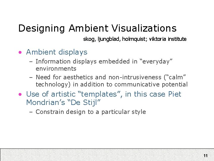
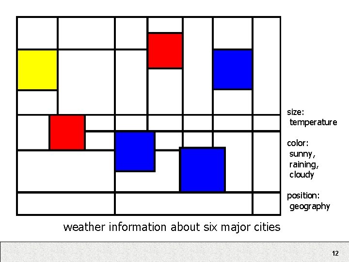
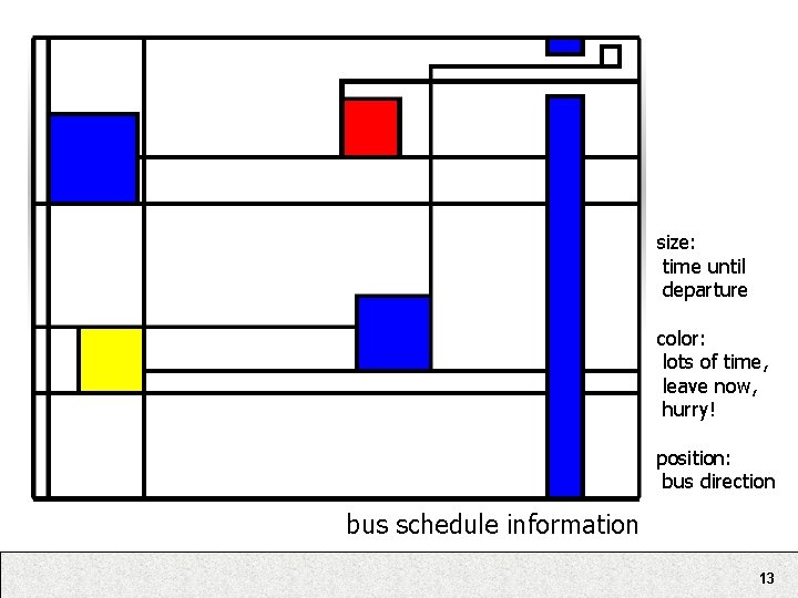
Designing Ambient Visualizations skog, ljungblad, holmquist; viktoria institute • Ambient displays – Information displays embedded in “everyday” environments – Need for aesthetics and non-intrusiveness (“calm” technology) in addition to communicative potential • Use of artistic “templates”, in this case Piet Mondrian’s “De Stijl” – Constrain design to a particular style 11

size: temperature color: sunny, raining, cloudy position: geography weather information about six major cities 12

size: time until departure color: lots of time, leave now, hurry! position: bus direction bus schedule information 13

User Testing Results • Three Questions 1. Do you know that data is being visualized? 2. What data is being visualized? 3. Can you read the visualization? • Results – 1/6 answered “No” to Q 1 – Other 5/6 answered “Yes” to Q 1 and Q 2 – Of those 2 answered “No” to Q 3 14

Lessons Learned (paraphrased) • 1: Optimize the relevance of information to the people at the site of installation. • 2: Rate of information change should be frequent enough to be relevant, but changes need to be carefully designed • 3: Artistic templates need not hinder, and may aid, readability and comprehension. • 4: Let features of the underlying information affect the visual encoding (i. e. , exploit domain specific features) • Your thoughts? 15

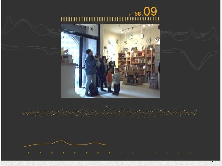
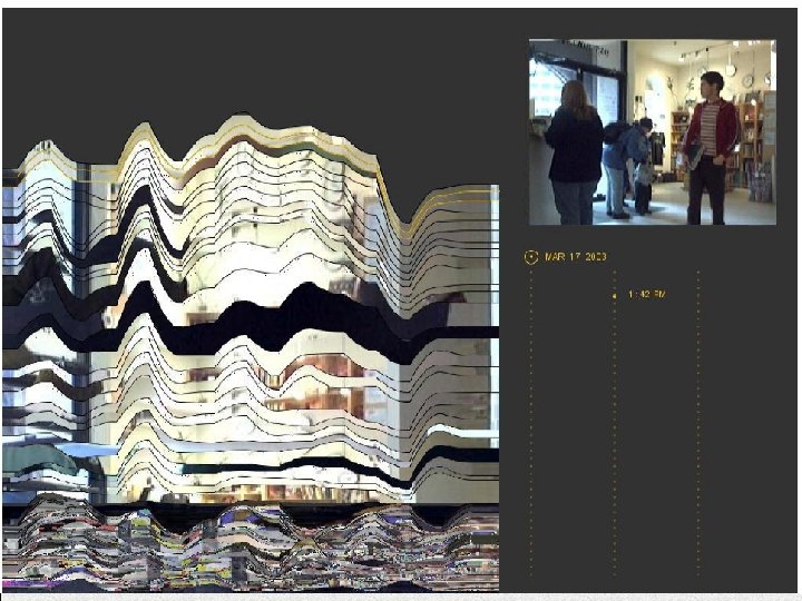
Artifacts of the Presence Area viegas et al; mit media lab • “Using Information Visualization to Create an Evocative Souvenir” • Goal: to design a commemorative, historical record of the passage of time inside a museum. – – Aesthetically compelling presentation Highlight long-term temporal patterns Apply the metaphor of geological layering Use of visualization technology not to analyze large data collections, but to serve as a catalyst for memory. 16

17

18

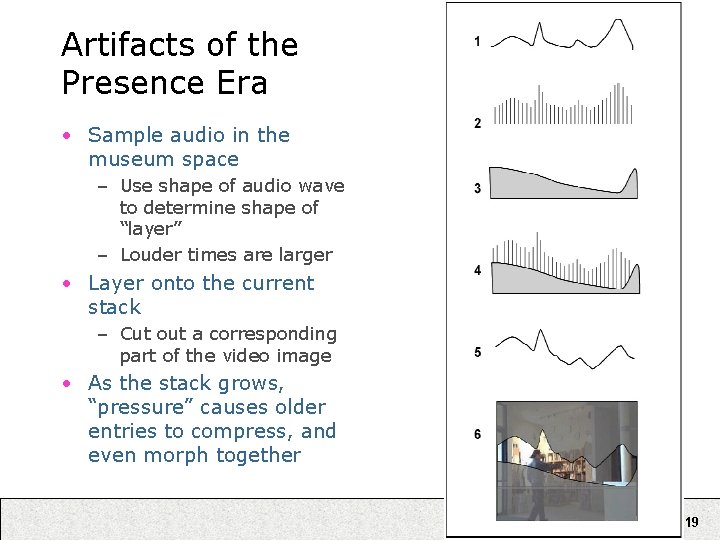
Artifacts of the Presence Era • Sample audio in the museum space – Use shape of audio wave to determine shape of “layer” – Louder times are larger • Layer onto the current stack – Cut out a corresponding part of the video image • As the stack grows, “pressure” causes older entries to compress, and even morph together 19

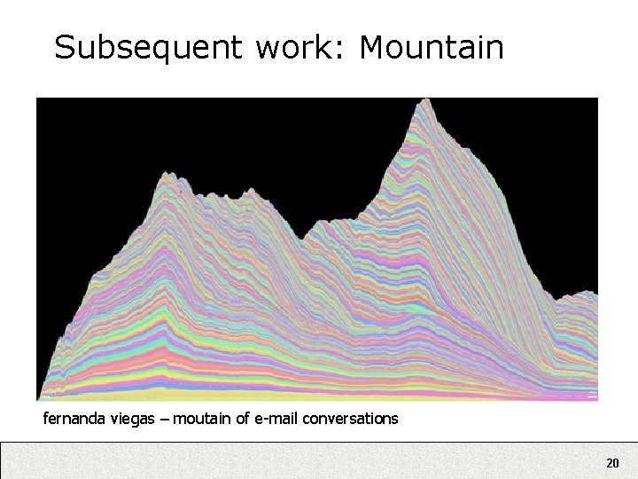
Subsequent work: Mountain fernanda viegas – moutain of e-mail conversations 20

Online Examples • Word. Count / Query. Count (Jonathan Harris) – http: //www. wordcount. org/ • The Secret Lives of Numbers (Golan Levin) – http: //www. turbulence. org/Works/nums/ • Genomic Cartography (Ben Fry) – http: //acg. media. mit. edu/people/fry/genocarto. html • Processing Exhibition – http: //processing. org/exhibition/ • Whitney Artport – http: //artport. whitney. org/ 21

Related Idea – “Playful Visualization” • Data exploration re-cast as a “playful” rather than “analytic” behavior. – (while, in fact, it should hopefully be both) • Visualizations become “public” places facilitating social interaction and play, which in turn hopefully stimulates both personal and group exploration to unearth insight. – Generating personal insight into a data set – Harnessing “social data analysis” to effectively “open source” data mining. 22

Vizster findings • Exploration was framed as social play. – Hunting for friends and acquaintances. – Groups spent more time in front of the visualization than individuals. – People who couldn’t find their own profile spent the least time of all. • Visualization usage elicited social narratives. – Users engaged in stories, conversation, and social bonding in response to visualization. – Visualization as ethnographic tools. 23

Name. Voyager Findings • “Unexpected” interest in the data – “…by the way, I don’t like babies or children. ” • Analysis as social activity – Pattern-finding challenges carried out on blogs – “dialogue, one-upmanship, and repartee” • Applied Bartle’s characterization of online multiplayer game players – Achievers, Socializers, Explorers, Killers 24

How to design for playfulness? • What lessons can we take away to attempt purposeful design of such visualizations? 25

Preliminary Hypotheses • Personal connection to the data – Personal relevance or interest in the data – Personal points of entry into data sets • Facilitate communication and sharing – Pointers/links into the data • Easy to reach particular states – Make people’s activity visible – Annotation, or “planting your flag” on discovered data • “Subversion” of intended purpose – Finding the boundary cases – The “Explorers” and “Killers” roles 26

Looking towards the future • Different opinions / perspectives • Formalizing design – Developing design guidelines and evaluation criteria, extending into aesthetic criteria. • Separatist approaches – Let artists/designers develop “templates” that engineers can then apply without focusing about aesthetics, maintaining domain specialization – Improved tools can encapsulate the engineering legwork into abstractions designers can work with. • Integrated approaches – The necessary marriage of design and engineering practices? 27

“Top 10 Unsolved Information Visualization Problems” • Problem 7: Aesthetics. … It’s important, therefore, to understand how insights and aesthetics interact … – Chaomei Chen • Any thoughts on what this entails, and how it might be achieved? – How to evaluate aesthetic response? – How to characterize aesthetic interaction on the process of insight? 28