SIMS 247 Information Visualization and Presentation Marti Hearst
- Slides: 30

SIMS 247: Information Visualization and Presentation Marti Hearst Feb 4, 2004 1

Today • • Perceptual Illusions Tufte’s Design Guidelines How to Mislead with Visualizations Infoviz Frameworks – Shneiderman’s Taxonomy – The Polaris System 2

Visual/Perceptual Illusions • People don’t perceive length, area, angle, brightness they way they “should”. • Some illusions have been reclassified as systematic perceptual errors – e. g. , brightness contrasts (grey square on white background vs. on black background) – partly due to increase in our understanding of the relevant parts of the visual system • Nevertheless, the visual system does some really unexpected things.

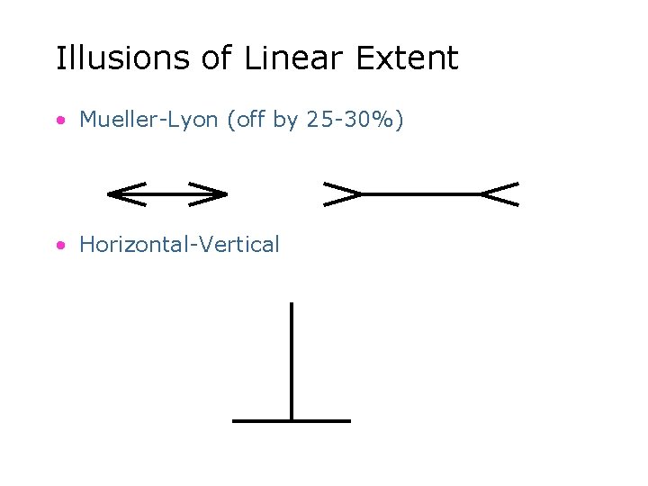
Illusions of Linear Extent • Mueller-Lyon (off by 25 -30%) • Horizontal-Vertical

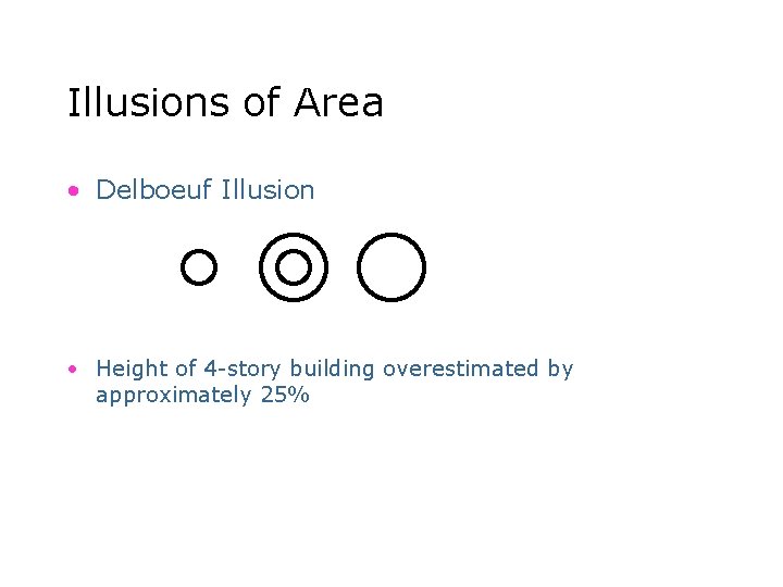
Illusions of Area • Delboeuf Illusion • Height of 4 -story building overestimated by approximately 25%

Movement Illusion Moving Train Illusion – More than 300 people/year killed by trains in US – Many caused by misperceptions! • Large objects in motion appear to be moving more slowly than they really are. • Field-tested in the cab of a moving train – First looks like train is barely moving – Then takes over entire field of view (looming) http: //sfgate. com/cgibin/article. cgi? file=/chronicle/archive/2003/12/04/MNGIF 3 EQKE 1. DTL 6

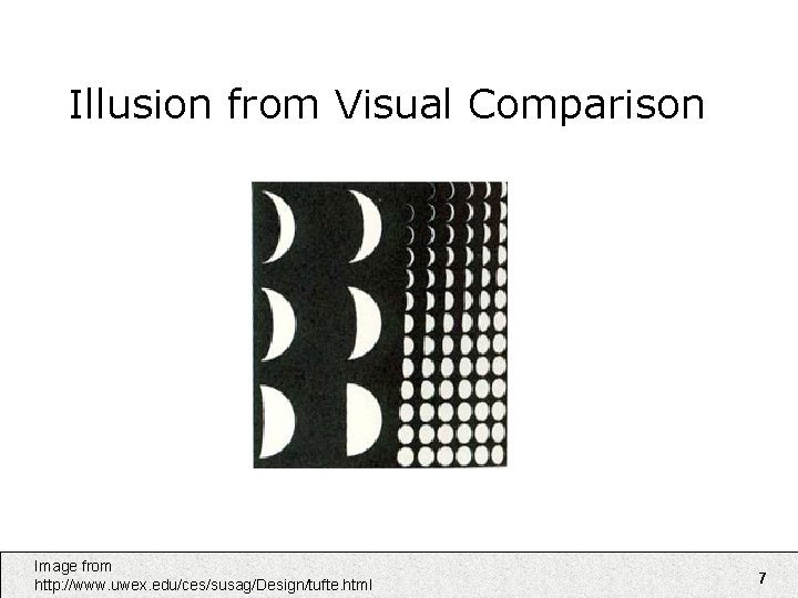
Illusion from Visual Comparison Image from http: //www. uwex. edu/ces/susag/Design/tufte. html 7

Tufte • Principles of Graphical Excellence – Graphical excellence is • the well-designed presentation of interesting data – a matter of substance, of statistics, and of design • consists of complex ideas communicated with clarity, precision and efficiency • is that which gives to the viewer the greatest number of ideas in the shortest time with the least ink in the smallest space • requires telling the truth about the data. 8

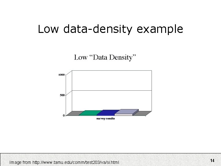
Tufte Principles • Use High Data Density – Number of items/area of graphic – This is controversial • White space thought to contribute to good visual design • Tufte’s book itself has lots of white space 9

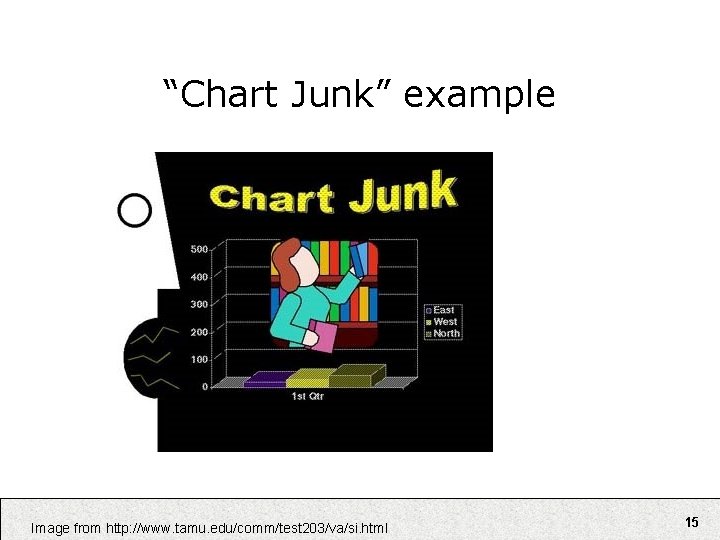
Some Other Tufte Principles • Use multifunctioning graphical elements • Use small multiples • Show mechanism, process, dynamics, and causality • Avoid “chart junk” 10

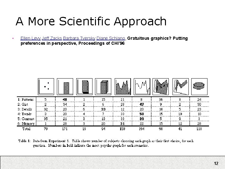
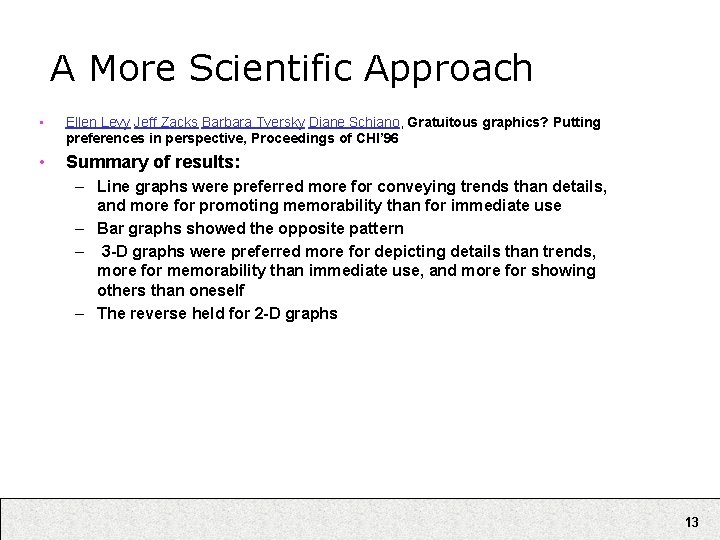
A More Scientific Approach • Ellen Levy Jeff Zacks Barbara Tversky Diane Schiano, Gratuitous graphics? Putting preferences in perspective, Proceedings of CHI’ 96 • Question: In what contexts do people find 3 -D graphs of 2 -D data both attractive and useful? • Method: Questionnaire examined 161 undergrad students' preferences for graphical display formats under several use scenarios – E. g. : • imagine yourself as a research scientist working at a high-tech firm. You have been given the chance to present the findings from you work to the Board of Directors of the company. Your research assistant has been assigned the job of preparing the slides that you will need. Given each of the scenarios listed below, decide which graphs (give your first and second choice) you think would be the best given the circumstances. " 11

A More Scientific Approach • Ellen Levy Jeff Zacks Barbara Tversky Diane Schiano, Gratuitous graphics? Putting preferences in perspective, Proceedings of CHI’ 96 12

A More Scientific Approach • Ellen Levy Jeff Zacks Barbara Tversky Diane Schiano, Gratuitous graphics? Putting preferences in perspective, Proceedings of CHI’ 96 • Summary of results: – Line graphs were preferred more for conveying trends than details, and more for promoting memorability than for immediate use – Bar graphs showed the opposite pattern – 3 -D graphs were preferred more for depicting details than trends, more for memorability than immediate use, and more for showing others than oneself – The reverse held for 2 -D graphs 13

Low data-density example Image from http: //www. tamu. edu/comm/test 203/va/si. html 14

“Chart Junk” example Image from http: //www. tamu. edu/comm/test 203/va/si. html 15

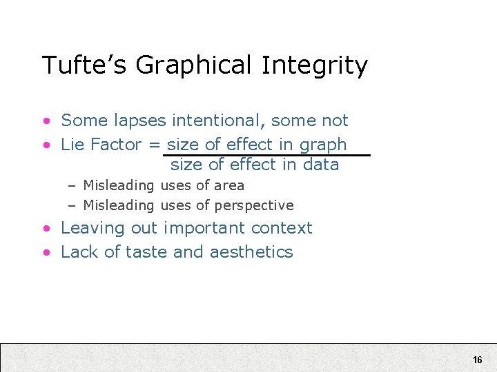
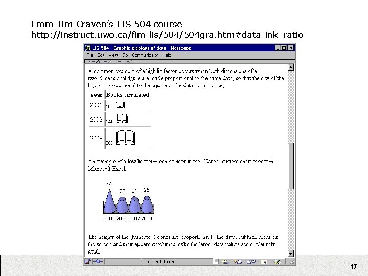
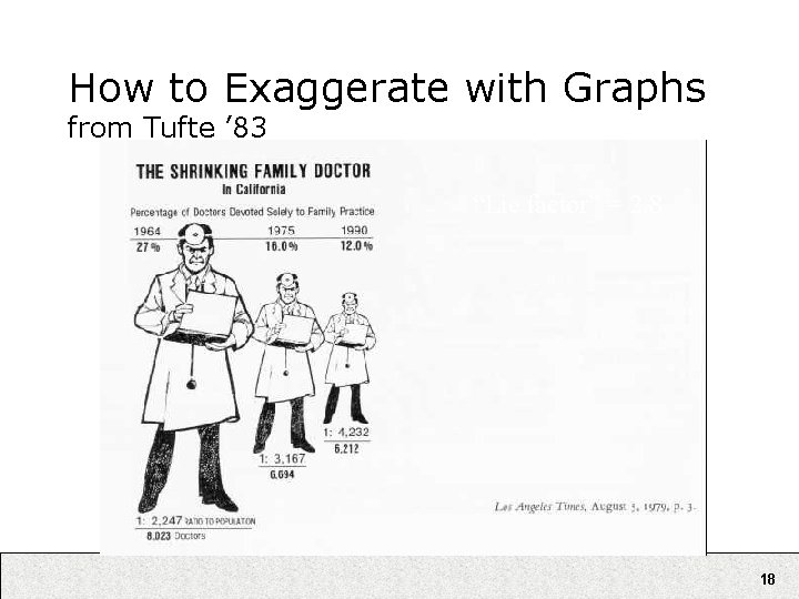
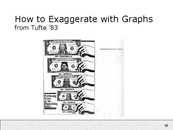
Tufte’s Graphical Integrity • Some lapses intentional, some not • Lie Factor = size of effect in graph size of effect in data – Misleading uses of area – Misleading uses of perspective • Leaving out important context • Lack of taste and aesthetics 16

From Tim Craven’s LIS 504 course http: //instruct. uwo. ca/fim-lis/504 gra. htm#data-ink_ratio 17

How to Exaggerate with Graphs from Tufte ’ 83 “Lie factor” = 2. 8 18

How to Exaggerate with Graphs from Tufte ’ 83 Error: Shrinking along both dimensions 19

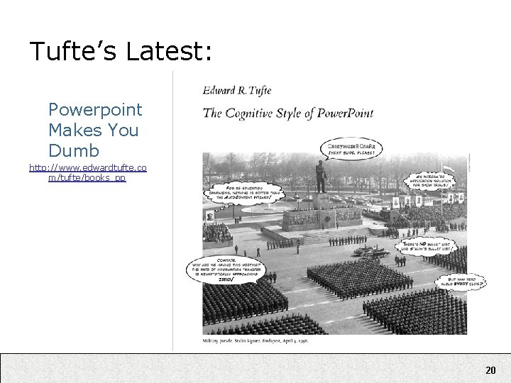
Tufte’s Latest: Powerpoint Makes You Dumb http: //www. edwardtufte. co m/tufte/books_pp 20

Tufte’s Powerpoint Arguments http: //www. wired. com/wired/archive/11. 09/ppt 2. html • “… may help speakers outline their talks, but convenience for the speaker can be punishing to both content and audience. ” • “The standard Power. Point presentation elevates format over content, betraying an attitude of commercialism that turns everything into a sales pitch. ” • “At a minimum, a presentation format should do no harm. Yet the Power. Point style routinely disrupts, dominates, and trivializes content. ” 21

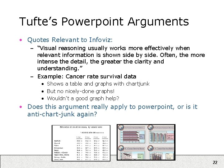
Tufte’s Powerpoint Arguments • Quotes Relevant to Infoviz: – “Visual reasoning usually works more effectively when relevant information is shown side by side. Often, the more intense the detail, the greater the clarity and understanding. ” – Example: Cancer rate survival data • Shows a table and graphs with chartjunk • But no nicely-done graphs! • Wouldn’t a good graph help? • Does this argument really apply to powerpoint, or is it anti-chart-junk again? 22

Howard Wainer How to Display Data Badly (Video) http: //www. dartmouth. edu/~chance/Chance. Lecture/Audio. Video. html 23

Shneiderman’s Taxonomy • Data vs. Tasks • Data types: – – – – Multi-dimensional: databases, … 1 D: timelines, … 2 D: maps, … 3 D: volumes, … Hierarchies/Trees: directories, … Networks/Graphs: web, … Document collections: digital libraries, … 24

Shneiderman’s Mantra • Overview first, then zoom & filter, then details on demand • Overview first, then zoom & filter, then details on demand 25

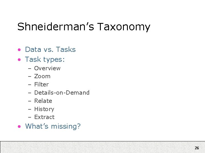
Shneiderman’s Taxonomy • Data vs. Tasks • Task types: – – – – Overview Zoom Filter Details-on-Demand Relate History Extract • What’s missing? 26

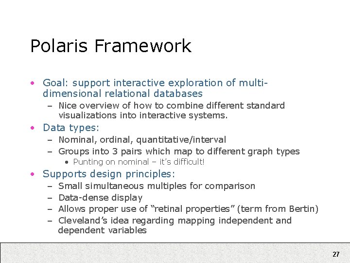
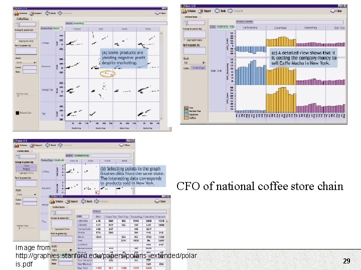
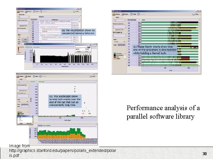
Polaris Framework • Goal: support interactive exploration of multidimensional relational databases – Nice overview of how to combine different standard visualizations into interactive systems. • Data types: – Nominal, ordinal, quantitative/interval – Groups into 3 pairs which map to different graph types • Punting on nominal – it’s difficult! • Supports design principles: – – Small simultaneous multiples for comparison Data-dense display Allows proper use of “retinal properties” (term from Bertin) Cleveland’s idea regarding mapping independent and dependent variables 27

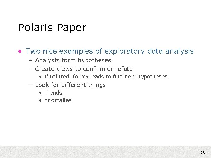
Polaris Paper • Two nice examples of exploratory data analysis – Analysts form hypotheses – Create views to confirm or refute • If refuted, follow leads to find new hypotheses – Look for different things • Trends • Anomalies 28

CFO of national coffee store chain Image from http: //graphics. stanford. edu/papers/polaris_extended/polar is. pdf 29

Performance analysis of a parallel software library Image from http: //graphics. stanford. edu/papers/polaris_extended/polar is. pdf 30