SIMS 247 Information Visualization and Presentation Prof Marti











- Slides: 47

SIMS 247 Information Visualization and Presentation Prof. Marti Hearst September 7, 2000

Today • Cognitive considerations in HCI – Action Cycle / Gulf of Execution – Affordances – Mental Models • UI Design Guidelines

Cognitive Considerations • • • Action Cycle and Gulf of Execution Affordances Mental Models

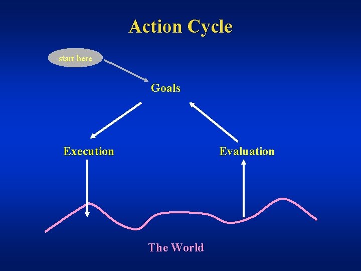
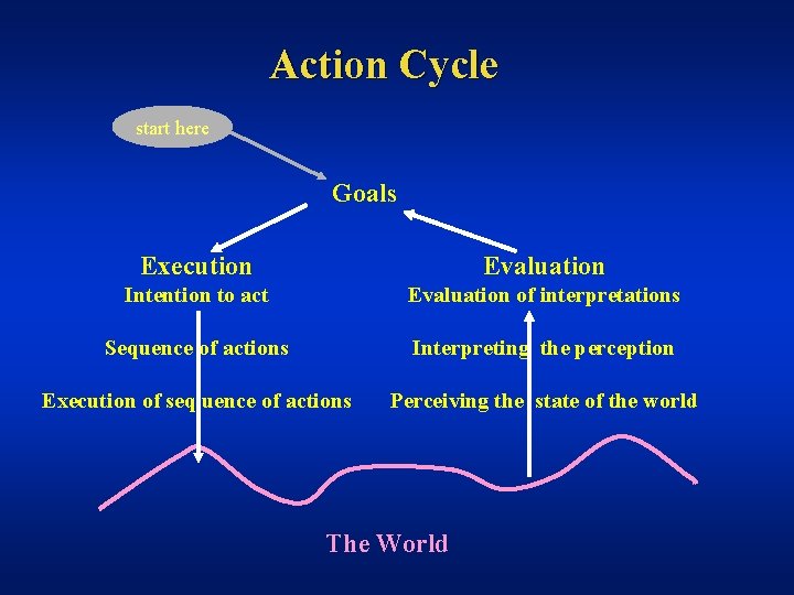
Norman’s Action Cycle • Human action has two aspects – execution and evaluation • Execution: doing something • Evaluation: comparison of what happened to what was desired

Action Cycle start here Goals Execution Evaluation The World

Action Cycle start here Goals Execution Evaluation Intention to act Evaluation of interpretations Sequence of actions Interpreting the perception Execution of seq uence of actions Perceiving the state of the world The World

Gulf of Evaluation • The amount of effort a person must exert to interpret – the physical state of the system – how well the expectations and intentions have been met • We want a small gulf!

Affordances • The perceived and actual fundamental properties of the object that determine how it could possibly be used. • Perceived can differ from actual – Chair: real affordance • Sitting device • Door jamming device – Chair: false affordance • Can be moved: not if bolted down – Rock: • Sitting device • Hammering device Based on slide by Saul Greenberg

Visual Affordances • Complex things may need explaining • Simple things should not – Which way does the door open? • If something simple needs instructions, the design has failed – Things that seem simple to the designer often are not obvious – Video: The Strauss Mouse (Marilyn Mantei, Chi 90)

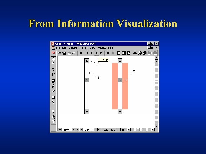
Affordances in Computer Screen-Based Interfaces • Most of the screen affordance is of no value – Example: • What happens when you touch a screen? – Example: • Does a graphical object on the screen afford clicking? • Yes, but – the real question is does the user perceive this affordance; does the user recognize that clicking on the icon is a meaningful, useful action? – Example from IV book: • Affordances of different parts of scrollbars Based on slide by Saul Greenberg

From Information Visualization

Visible Constraints • Limitations of actions are perceivable from the object’s appearance – key in lock – plug in electric outlet – door handle -- push or pull? • How does this transfer to computer interfaces? Based on slide by Saul Greenberg

Transfer Effects • People transfer their expectations from familiar objects to similar new ones – positive transfer: previous experience applies to new situation – negative transfer: previous experience conflicts with new situation Based on slide by Saul Greenberg

Cultural Associations • Groups of people learn idioms red = danger, green = go • But these differ in different places – Light switches • America: down is off • Britain: down is on – Faucets • America: counter-clockwise is on • Britain: counter-clockwise is off Based on slide by Saul Greenberg

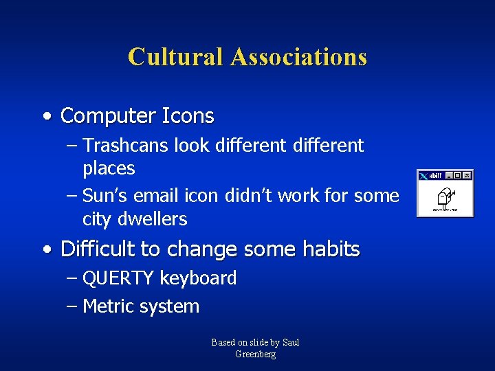
Cultural Associations • Computer Icons – Trashcans look different places – Sun’s email icon didn’t work for some city dwellers • Difficult to change some habits – QUERTY keyboard – Metric system Based on slide by Saul Greenberg

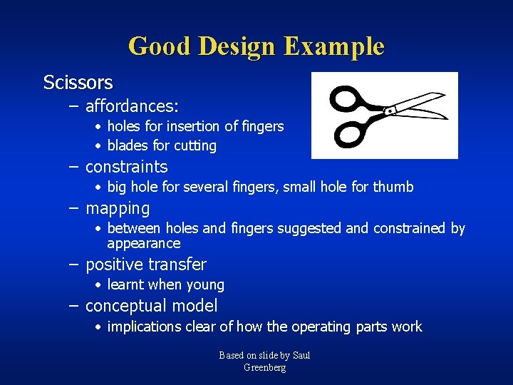
Good Design Example Scissors – affordances: • holes for insertion of fingers • blades for cutting – constraints • big hole for several fingers, small hole for thumb – mapping • between holes and fingers suggested and constrained by appearance – positive transfer • learnt when young – conceptual model • implications clear of how the operating parts work Based on slide by Saul Greenberg

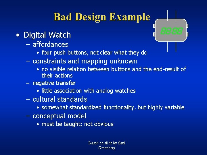
Bad Design Example • Digital Watch – affordances • four push buttons, not clear what they do – constraints and mapping unknown • no visible relation between buttons and the end-result of their actions – negative transfer • little association with analog watches – cultural standards • somewhat standardized functionality, but highly variable – conceptual model • must be taught; not obvious Based on slide by Saul Greenberg

Mental Models • People have mental models of how things work: – how does your car start? – how does an ATM machine work? – how does your computer boot? • Allows people to make predictions about how things will work Based on slide by Saul Greenberg

Mental Models • Mental models are built from – – – – affordances constraints mappings positive transfer cultural associations/standards instructions interactions • Mental models are often wrong! Based on slide by Saul Greenberg

Strategy for Design • Provide a good conceptual model – allows users to predict consequences of actions – communicated through the image of the system • Make things visible – relations between user’s intentions, required actions, and results should be • sensible • consistent • meaningful (non-arbitrary) – make use of visible affordances, mappings, and constraints – remind person of what can be done and how to do it Based on slide by Saul Greenberg

Design Goals and Guidelines

Attributes of Good UIs • Minimal training required – easy to learn • High transfer of training – easy to remember • Predictable • Few errors • Easy to recover from errors • “Invisible” Adapted from slide by James Landay ?

Attributes of Good UIs (cont. ) • Allow people perform real tasks well – efficient • Flexible • Seem “intelligent” – “do the right thing” • People like it “It is easy to make things hard. It is hard to make things easy. ” -- A. Chapanis, ‘ 82 Adapted from slide by James Landay

Usability Slogans (from Nielsen’s Usability Engineering) • Your best guess is not good enough • The user is always right • The user is not always right • Users are not designers • Designers are not users • Less is more • Details matter Adapted from slide by James Landay

Design Guidelines • Set of design rules to follow • Apply at multiple levels of design • Are neither complete nor orthogonal • Have psychological underpinnings (ideally) Adapted from slide by James Landay

Usability Design Goals • Ease of learning – faster the second time and so on. . . • Recall – remember how from one session to the next • Productivity – perform tasks quickly and efficiently • Minimal error rates – if they occur, good feedback so user can recover • High user satisfaction – confident of success Slide by James Landay

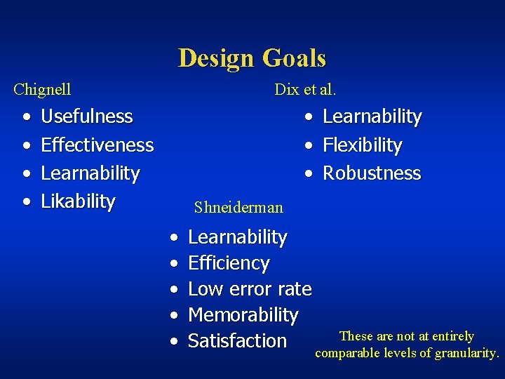
Design Goals Chignell • • Dix et al. • • • Usefulness Effectiveness Learnability Likability Learnability Flexibility Robustness Shneiderman • • • Learnability Efficiency Low error rate Memorability These are not at entirely Satisfaction comparable levels of granularity.

Guideline Mania • Lots of things to worry about • Which are most critical depend on the application • Some are easier to evaluate than others

Provide Feedback • Feedback: give each action an immediate and obvious effect • Examples – Show characters as user types – Reverse-video highlighting when selecting • Importance of visibility for feedback – less burden on memory – help user monitor current state Adapted from slide by James Landay

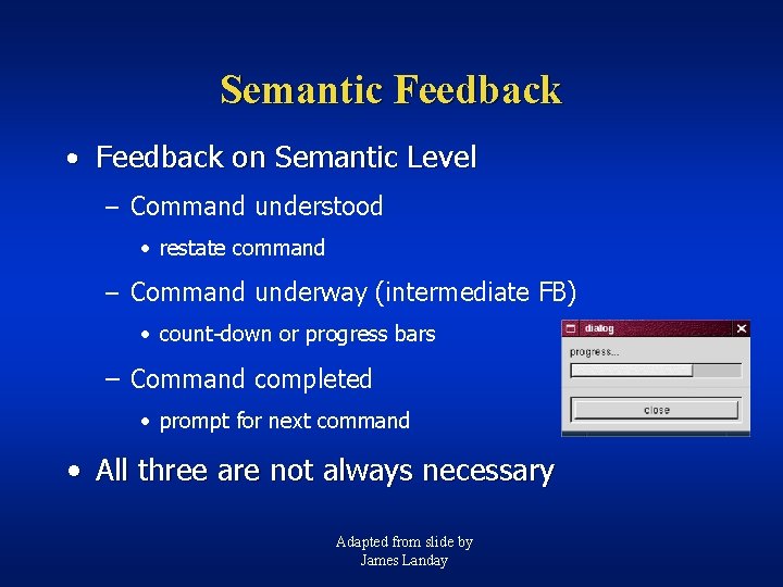
Semantic Feedback • Feedback on Semantic Level – Command understood • restate command – Command underway (intermediate FB) • count-down or progress bars – Command completed • prompt for next command • All three are not always necessary Adapted from slide by James Landay

Audio Feedback • On physical artifacts – – – click when bolt is secured rattle of unsecured car door sound of a well-working zipper vacuum cleaner increase in pitch as the bag fills examples on computer systems? • What are the potential problems? – annoying • media lab videotape discussed “peripheral” or “ambient” interfaces (CHI 98) Time permitting. – non-private

Errors • Need to design for human capabilities and traits – Human speech is riddled with “errors” • Reduce Gulfs of Execution and Evaluation!

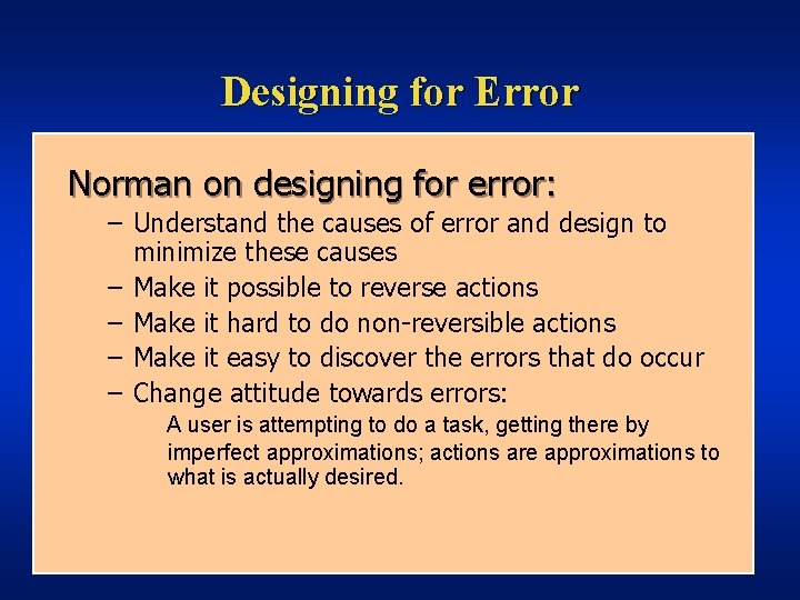
Designing for Error Norman on designing for error: – Understand the causes of error and design to minimize these causes – Make it possible to reverse actions – Make it hard to do non-reversible actions – Make it easy to discover the errors that do occur – Change attitude towards errors: A user is attempting to do a task, getting there by imperfect approximations; actions are approximations to what is actually desired.

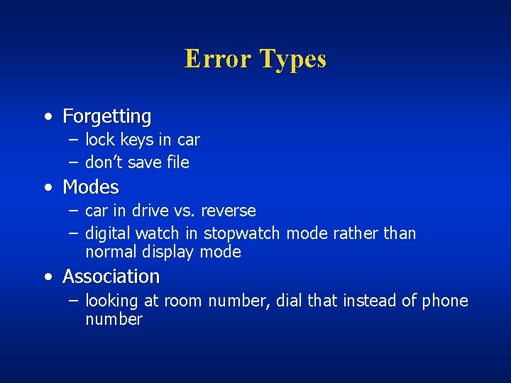
Error Types • Forgetting – lock keys in car – don’t save file • Modes – car in drive vs. reverse – digital watch in stopwatch mode rather than normal display mode • Association – looking at room number, dial that instead of phone number

Reducing Errors • Design constraints into the interface – Can’t activate toaster unless it is plugged in – Can’t exit program without saving files – Grey out inappropriate commands • Flexibility vs. Robustness tradeoff • Allow overrides? • Reminding devices – place keys on papers, book by door

Error Correction • Semantic – abort operation underway – undo previous command(s) • Lexical – typing mistakes (automatic in MS Word) Adapted from slide by James Landay

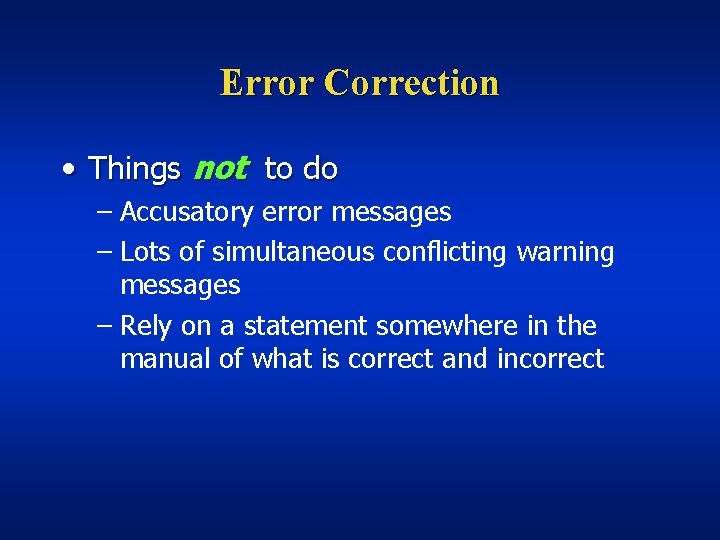
Error Correction • Things not to do – Accusatory error messages – Lots of simultaneous conflicting warning messages – Rely on a statement somewhere in the manual of what is correct and incorrect

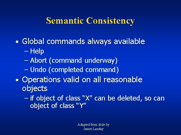
Semantic Consistency • Global commands always available – Help – Abort (command underway) – Undo (completed command) • Operations valid on all reasonable objects – if object of class “X” can be deleted, so can object of class “Y” Adapted from slide by James Landay

Lexical Consistency • Coding consistent with common usage – red = bad, green = good (*) – left = less, right = more • Consistent abbreviation rules – equal length or first set of unambiguous chars. • Mnemonic names rather than codes • Devices used same way in all phases – character delete key is always the same Adapted from slide by James Landay

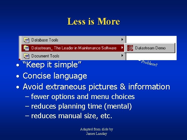
Less is More Problem ? • “Keep it simple” • Concise language • Avoid extraneous pictures & information – fewer options and menu choices – reduces planning time (mental) – reduces manual size, etc. Adapted from slide by James Landay

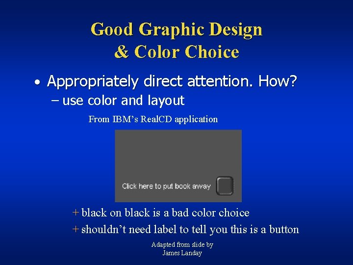
Good Graphic Design & Color Choice • Appropriately direct attention. How? – use color and layout From IBM’s Real. CD application + black on black is a bad color choice + shouldn’t need label to tell you this is a button Adapted from slide by James Landay

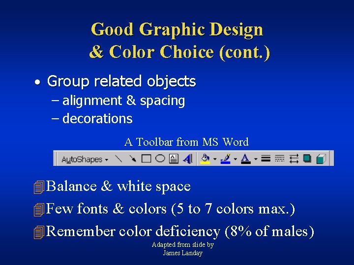
Good Graphic Design & Color Choice (cont. ) • Group related objects – alignment & spacing – decorations A Toolbar from MS Word 4 Balance & white space 4 Few fonts & colors (5 to 7 colors max. ) 4 Remember color deficiency (8% of males) Adapted from slide by James Landay

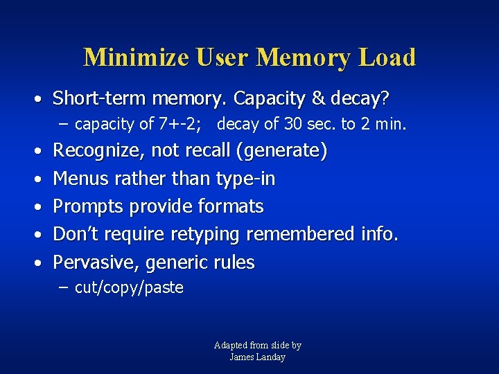
Minimize User Memory Load • Short-term memory. Capacity & decay? – capacity of 7+-2; decay of 30 sec. to 2 min. • Recognize, not recall (generate) • Menus rather than type-in • Prompts provide formats • Don’t require retyping remembered info. • Pervasive, generic rules – cut/copy/paste Adapted from slide by James Landay

Why are Guidelines Insufficient? • Too specific and/or too general • Standards do not address all issues Adapted from slide by James Landay

Summary • UIs are hard to design • Guidelines can give us general principles to follow • Guidelines fail in that they can be hard to apply – too specific or too general – especially true for style guides Adapted from slide by James Landay

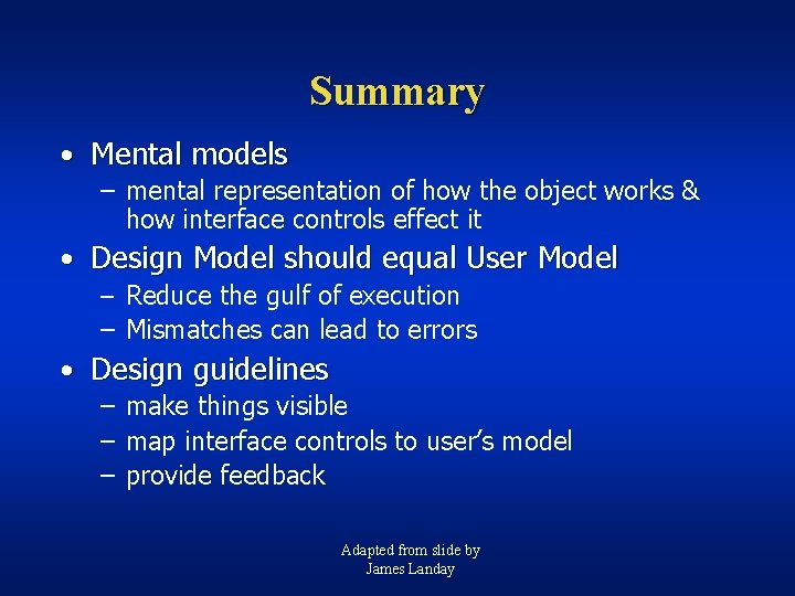
Summary • Mental models – mental representation of how the object works & how interface controls effect it • Design Model should equal User Model – Reduce the gulf of execution – Mismatches can lead to errors • Design guidelines – make things visible – map interface controls to user’s model – provide feedback Adapted from slide by James Landay

Thinking Point For Next Time: What are good guidelines for Infoviz?