Lecture 1 Introduction to Data Visualization 732 A
![Data preprocessing • Normalization – Converting column to range [0, 1]. Useful in for Data preprocessing • Normalization – Converting column to range [0, 1]. Useful in for](https://slidetodoc.com/presentation_image_h2/40b355918319e7b0545a133221ce62ac/image-21.jpg)
- Slides: 35

Lecture 1 Introduction to Data Visualization 732 A 98 Visualization

About the course Course structure • 7 lectures (presentations), pre-recoded • 7 practical sessions, campus. See timetable! Groups A and B at different time • 6 labs, work in groups 2 persons, campus • 3 obligatory seminars, Zoom • Star-marked assignments in 3 occasions – to be solved individually, optional. Examination • Submission of lab reports • Presentation of lab reports and opposition • Computer-based written exam • 2 out of 3 star-marked assignments passed+ earned at least 14 points at the exam =get 2 points more 732 A 98 Visualization

About the course Information & Lab reporting • LISAM is used • Good lab practices Supervision time is limited (2 h) Lab is normally put to LISAM a day before the lab supervision session Start doing lab before the supervision session Possible strategy: one individual in the group works with assignment 1, one with assignment 2 during the supervision time, then help each other later – To see who is your group member, check LISAM, Course Documents – – • Deadlines • Seminars are obligatory – speakers and opponents selected randomly 732 A 98 Visualization

About the course Course literature: • “Interactive Data Visualization” by M. O. Ward et al. , Second Edition. • “Interactive web-based data visualization with R, plotly, and shiny “ by C. Sievert https: //plotly-r. com/ • Papers, software documentation & manuals 732 A 98 Visualization

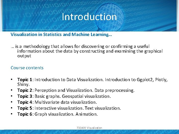
Introduction Visualization in Statistics and Machine Learning… … is a methodology that allows for discovering or confirming a useful information about the data by constructing and examining the graphical output Course contents • Topic 1: Introduction to Data Visualization. Introduction to Ggplot 2, Plotly, Shiny. • Topic 2: Perception and Visualization. Data preprocessing. • Topic 3: Basic graphs. Geospatial visualization. • Topic 4: Multivariate data visualization. • Topic 5: Interactive visualization. Text visualization. • Topic 6: Graph visualization. Animation. 732 A 98 Visualization

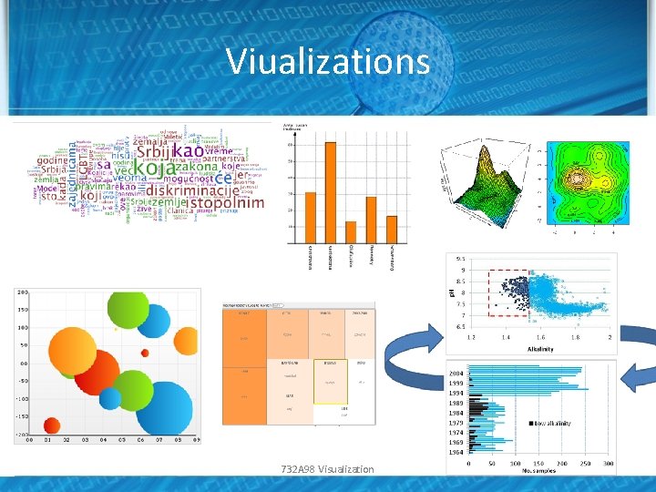
Viualizations 732 A 98 Visualization

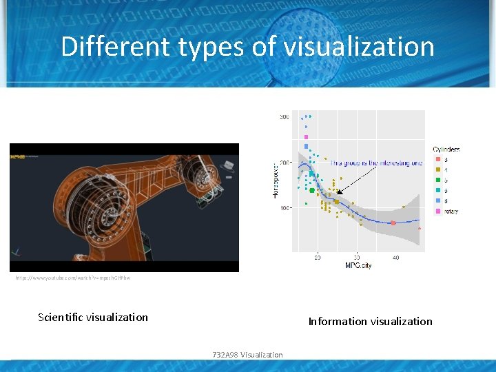
Different types of visualization • In this course, we focus on visualization=information visualization – Data Visualization Analysis • Related concepts – Computer graphics: Data are not necessary present, analysis is not normally assumed • Example: Computer games – Scientific visualization: similar to information visualization, often engineering data, statistical/machine learning analysis is normally not assumed • Example: Industrial robots 732 A 98 Visualization

Different types of visualization https: //www. youtube. com/watch? v=mpech. GIf. Pbw Scientific visualization Information visualization 732 A 98 Visualization

Challenges in information visualization • • Which graphs can be used for analysis of my data? How to create these graphs? How should these graphs be analysed? How to make these graphs looking good enough for publication or presentation? 732 A 98 Visualization

Why is visualization important? • Human sight = primary resource for information understanding • Visualization is often the quickest way for data understanding • The way of data visualization may affect decision making dramatically 732 A 98 Visualization

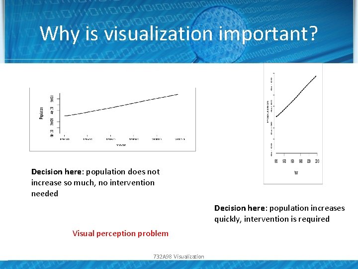
Why is visualization important? Decision here: population does not increase so much, no intervention needed Decision here: population increases quickly, intervention is required Visual perception problem 732 A 98 Visualization

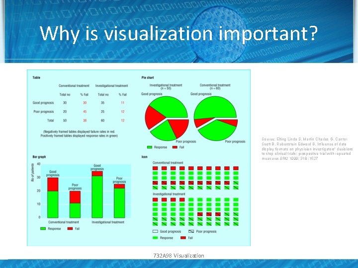
Why is visualization important? Source: Elting Linda S, Martin Charles G, Cantor Scott B, Rubenstein Edward B. Influence of data display formats on physician investigators' decisions to stop clinical trials: prospective trial with repeated measures BMJ 1999; 318 : 1527 732 A 98 Visualization

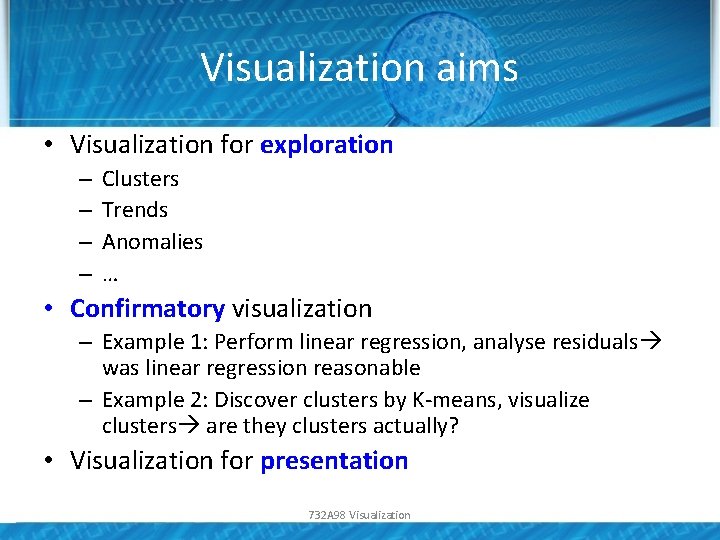
Visualization aims • Visualization for exploration – – Clusters Trends Anomalies … • Confirmatory visualization – Example 1: Perform linear regression, analyse residuals was linear regression reasonable – Example 2: Discover clusters by K-means, visualize clusters are they clusters actually? • Visualization for presentation 732 A 98 Visualization

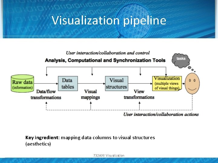
Visualization pipeline Key ingredient: mapping data columns to visual structures (aesthetics) 732 A 98 Visualization

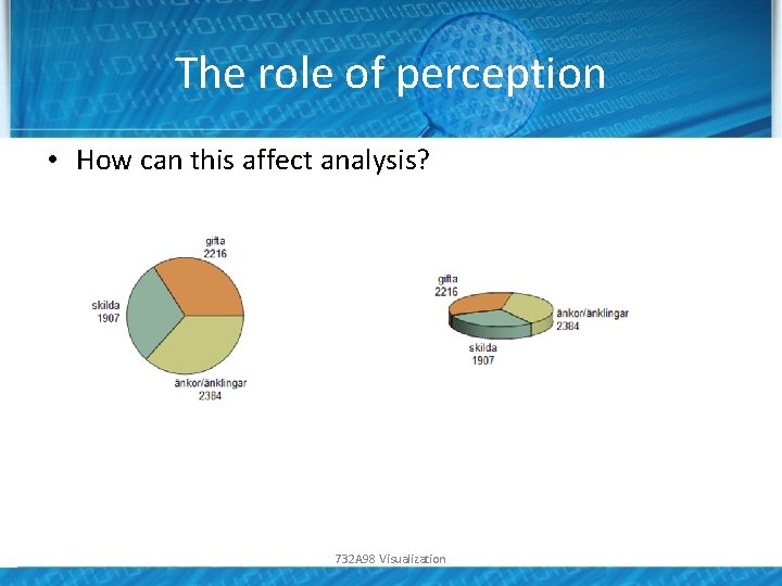
The role of perception • Human visual system has limitations • These limitations may lead to wrong/incomplete analysis of graphs • Understanding how we see better displays • Misleading graphics needs to be avoided 732 A 98 Visualization

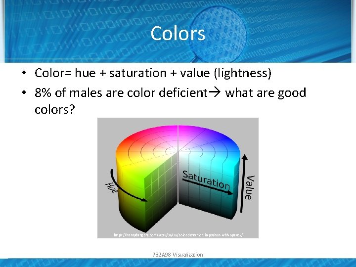
Colors • Color= hue + saturation + value (lightness) • 8% of males are color deficient what are good colors? https: //henrydangprg. com/2016/06/26/color-detection-in-python-with-opencv/ 732 A 98 Visualization

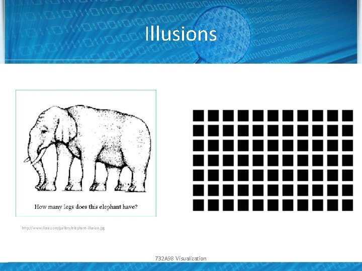
Illusions http: //www. ilusa. com/gallery/elephant-illusion. jpg 732 A 98 Visualization

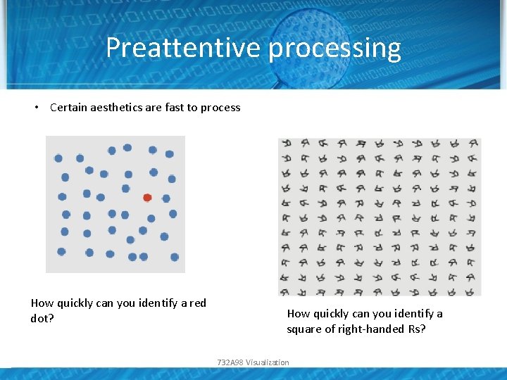
Preattentive processing • Certain aesthetics are fast to process How quickly can you identify a red dot? How quickly can you identify a square of right-handed Rs? 732 A 98 Visualization

The role of perception • How can this affect analysis? 732 A 98 Visualization

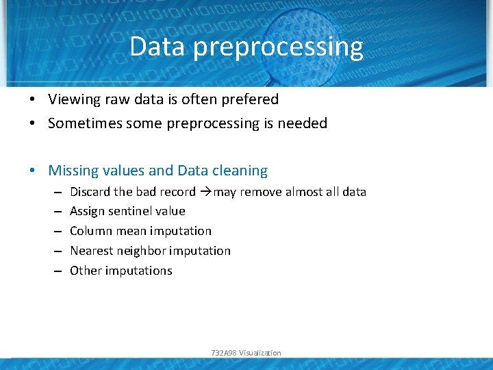
Data preprocessing • Viewing raw data is often prefered • Sometimes some preprocessing is needed • Missing values and Data cleaning – – – Discard the bad record may remove almost all data Assign sentinel value Column mean imputation Nearest neighbor imputation Other imputations 732 A 98 Visualization
![Data preprocessing Normalization Converting column to range 0 1 Useful in for Data preprocessing • Normalization – Converting column to range [0, 1]. Useful in for](https://slidetodoc.com/presentation_image_h2/40b355918319e7b0545a133221ce62ac/image-21.jpg)
Data preprocessing • Normalization – Converting column to range [0, 1]. Useful in for ex. color mapping – Centering and scaling 0/1 – Nonlinear transformations: log, sqrt • Segmentation – Split data according to some column 732 A 98 Visualization

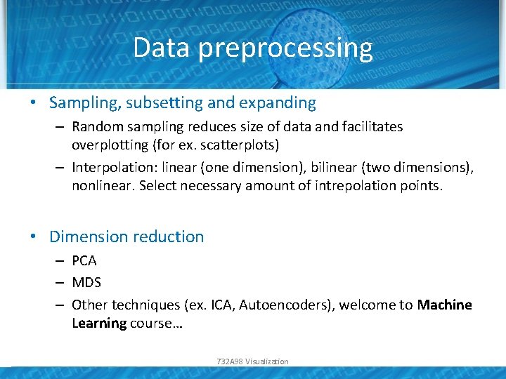
Data preprocessing • Sampling, subsetting and expanding – Random sampling reduces size of data and facilitates overplotting (for ex. scatterplots) – Interpolation: linear (one dimension), bilinear (two dimensions), nonlinear. Select necessary amount of intrepolation points. • Dimension reduction – PCA – MDS – Other techniques (ex. ICA, Autoencoders), welcome to Machine Learning course… 732 A 98 Visualization

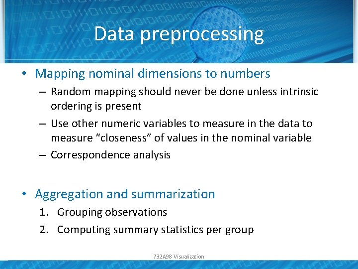
Data preprocessing • Mapping nominal dimensions to numbers – Random mapping should never be done unless intrinsic ordering is present – Use other numeric variables to measure in the data to measure “closeness” of values in the nominal variable – Correspondence analysis • Aggregation and summarization 1. Grouping observations 2. Computing summary statistics per group 732 A 98 Visualization

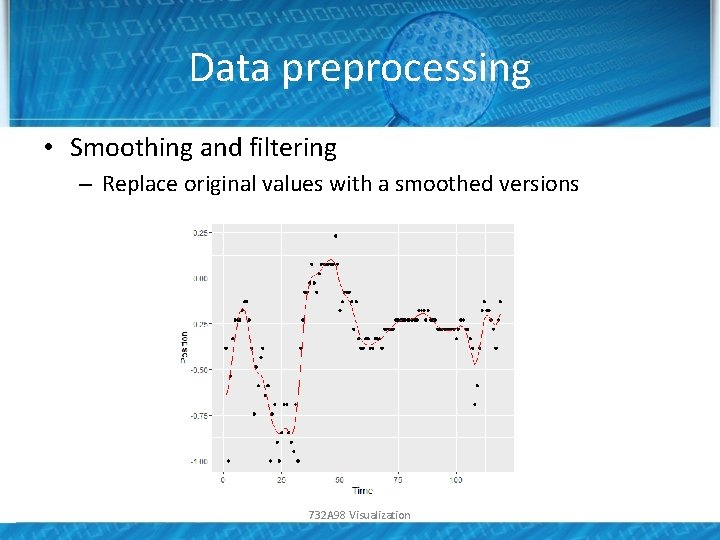
Data preprocessing • Smoothing and filtering – Replace original values with a smoothed versions 732 A 98 Visualization

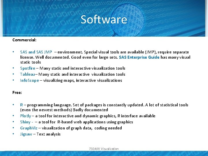
Software Commercial: • • SAS and SAS JMP – environment. Special visual tools are available (JMP), require separate license. Well documented. Good even for large sets. SAS Enterprise Guide has many visual static tools Spotfire – Many static and interactive visualization tools Tableau– Many static and interactive visualization tools Info. Scope – visualizing maps, interactive visualizations Free: • • • R – programming language. Set of packages is constantly updated. A lot of statistical tools (even the newest methods) Badly documented Plotly – a tool for interactive and dynamic graphics, R interface available Shiny - – a tool for R-based web applications using graphics Graph. Viz – visualization of graph data, coding needed Jigsaw – Text analysis 732 A 98 Visualization

Software Tools for the web (used by web designers): • • Action. Script Java. Script Prefuse VTK … much more references given in the course book 732 A 98 Visualization

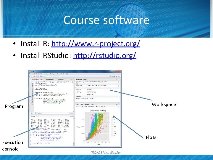
Course software • Install R: http: //www. r-project. org/ • Install RStudio: http: //rstudio. org/ Workspace Program Execution console Plots 732 A 98 Visualization

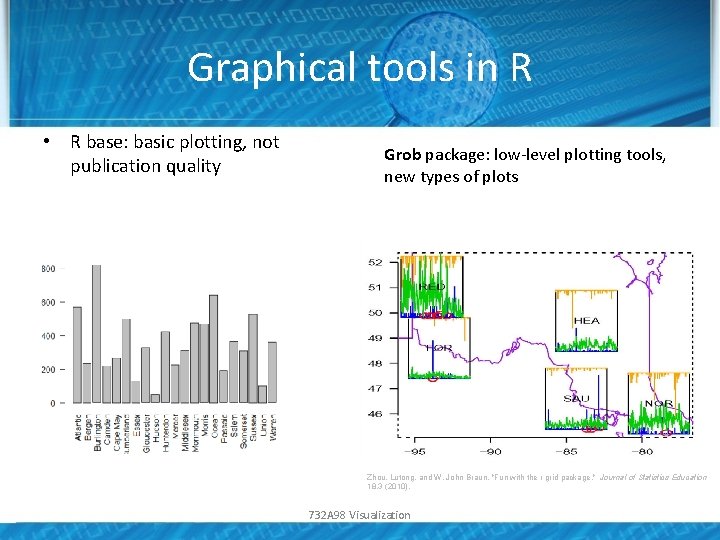
Graphical tools in R • R base: basic plotting, not publication quality Grob package: low-level plotting tools, new types of plots Zhou, Lutong, and W. John Braun. "Fun with the r grid package. " Journal of Statistics Education 18. 3 (2010). 732 A 98 Visualization

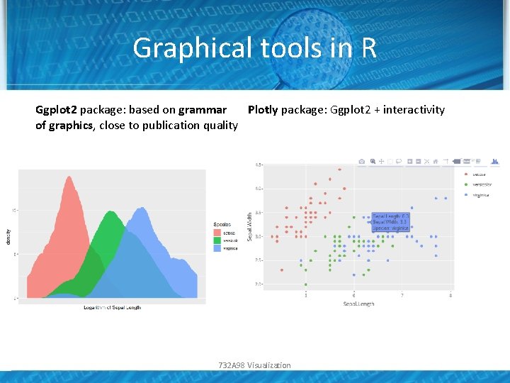
Graphical tools in R Ggplot 2 package: based on grammar Plotly package: Ggplot 2 + interactivity of graphics, close to publication quality 732 A 98 Visualization

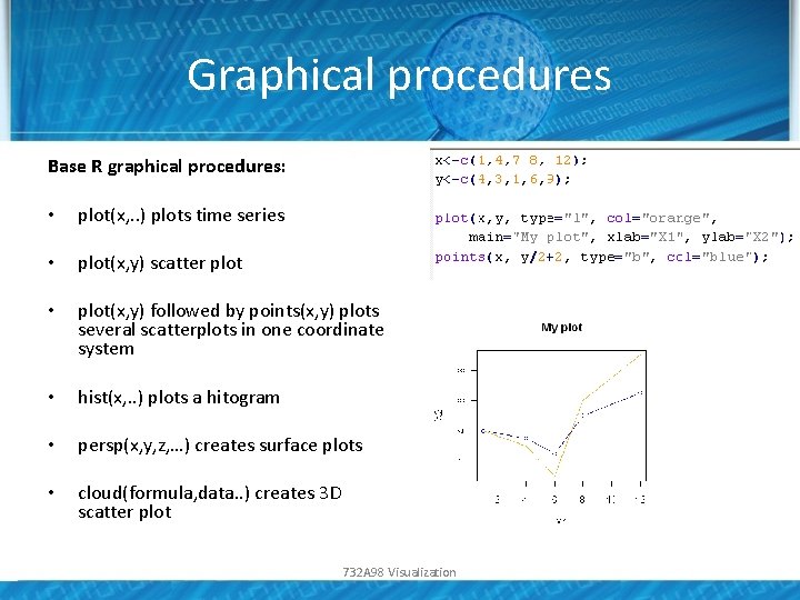
Graphical procedures Base R graphical procedures: • plot(x, . . ) plots time series • plot(x, y) scatter plot • plot(x, y) followed by points(x, y) plots several scatterplots in one coordinate system • hist(x, . . ) plots a hitogram • persp(x, y, z, …) creates surface plots • cloud(formula, data. . ) creates 3 D scatter plot 732 A 98 Visualization

Publication quality graphics • Visualization for exploration – Default settings • Visualization for presentation for publication – Higher quality graphics is required • Improve the graph quality in the software (often requires quite a bit of programming) • Use postprocessing tools, such as Inkscape or Adobe Illustrator 732 A 98 Visualization

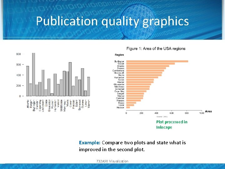
Publication quality graphics Plot processed in Inkscape Example: Compare two plots and state what is improved in the second plot. 732 A 98 Visualization

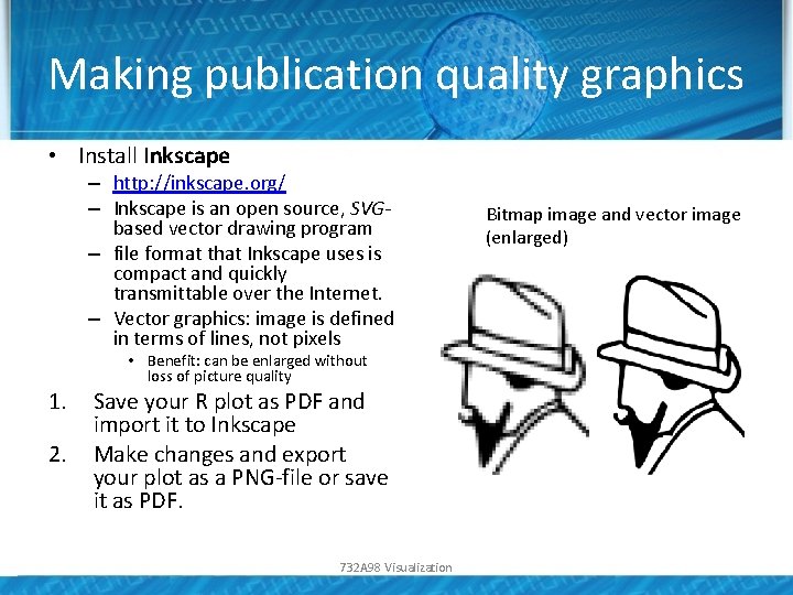
Making publication quality graphics • Install Inkscape – http: //inkscape. org/ – Inkscape is an open source, SVGbased vector drawing program – file format that Inkscape uses is compact and quickly transmittable over the Internet. – Vector graphics: image is defined in terms of lines, not pixels 1. 2. • Benefit: can be enlarged without loss of picture quality Save your R plot as PDF and import it to Inkscape Make changes and export your plot as a PNG-file or save it as PDF. 732 A 98 Visualization Bitmap image and vector image (enlarged)

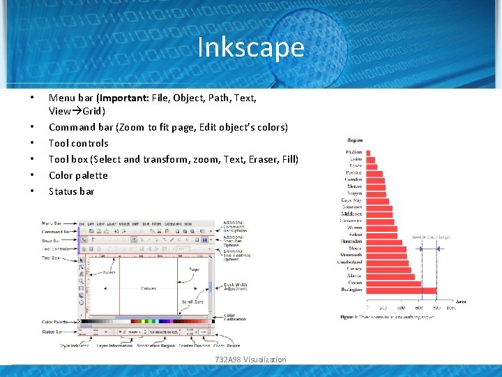
Inkscape • • • Menu bar (Important: File, Object, Path, Text, View Grid) Command bar (Zoom to fit page, Edit object’s colors) Tool controls Tool box (Select and transform, zoom, Text, Eraser, Fill) Color palette Status bar 732 A 98 Visualization

Home reading • Course book, chapters 1. 1, 1. 3 -1. 8 and 2 • Manual to Ink. Scape: http: //tavmjong. free. fr/INKSCAPE/MANUAL/html/in dex. php 732 A 98 Visualization