14 Descriptive Statistics 14 1 Graphical Descriptions of




- Slides: 122

14 Descriptive Statistics 14. 1 Graphical Descriptions of Data 14. 2 Variables 14. 3 Numerical Summaries 14. 4 Measures of Spread Copyright © 2010 Pearson Education, Inc. Excursions in Modern Mathematics, 7 e: 14. 1 - 1

Data Set A data set is a collection of data values. Statisticians often refer to the individual data values in a data set as data points. For the sake of simplicity, we will work with data sets in which each data point consists of a single number, but in more complicated settings, a single data point can consist of many numbers. Copyright © 2010 Pearson Education, Inc. Excursions in Modern Mathematics, 7 e: 14. 1 - 2

Data Set As usual, we will use the letter N to represent the size of the data set. In reallife applications, data sets can range in size from reasonably small (a dozen or so data points) to very large (hundreds of millions of data points), and the larger the data set is, the more we need a good way to describe and summarize it. Copyright © 2010 Pearson Education, Inc. Excursions in Modern Mathematics, 7 e: 14. 1 - 3

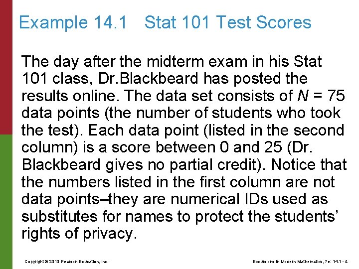
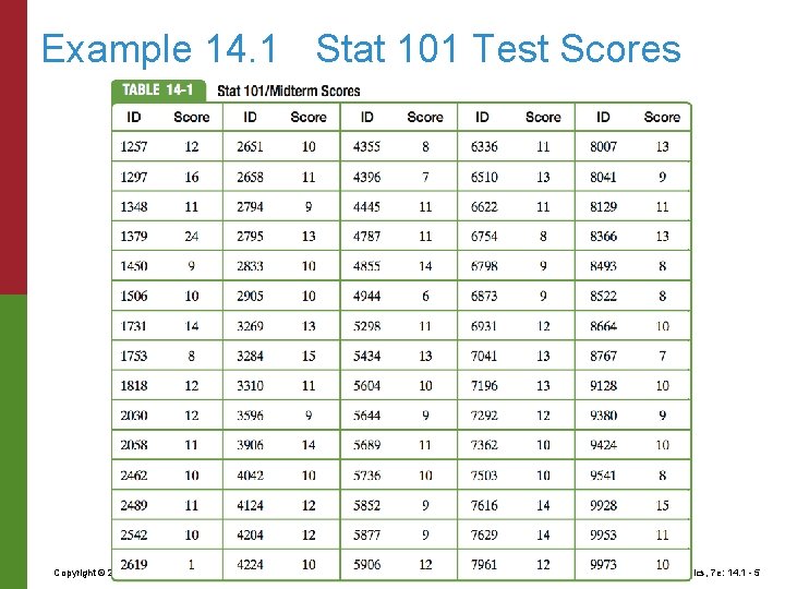
Example 14. 1 Stat 101 Test Scores The day after the midterm exam in his Stat 101 class, Dr. Blackbeard has posted the results online. The data set consists of N = 75 data points (the number of students who took the test). Each data point (listed in the second column) is a score between 0 and 25 (Dr. Blackbeard gives no partial credit). Notice that the numbers listed in the first column are not data points–they are numerical IDs used as substitutes for names to protect the students’ rights of privacy. Copyright © 2010 Pearson Education, Inc. Excursions in Modern Mathematics, 7 e: 14. 1 - 4

Example 14. 1 Stat 101 Test Scores Copyright © 2010 Pearson Education, Inc. Excursions in Modern Mathematics, 7 e: 14. 1 - 5

Example 14. 1 Stat 101 Test Scores Like students everywhere, the students in the Stat 101 class have one question foremost on their mind when they look at the results: How did I do? Each student can answer this question directly from the table. It’s the next question that is statistically much more interesting. How did the class as a whole do? To answer this last question, we will have to find a way to package the results into a compact, organized, and intelligible whole. Copyright © 2010 Pearson Education, Inc. Excursions in Modern Mathematics, 7 e: 14. 1 - 6

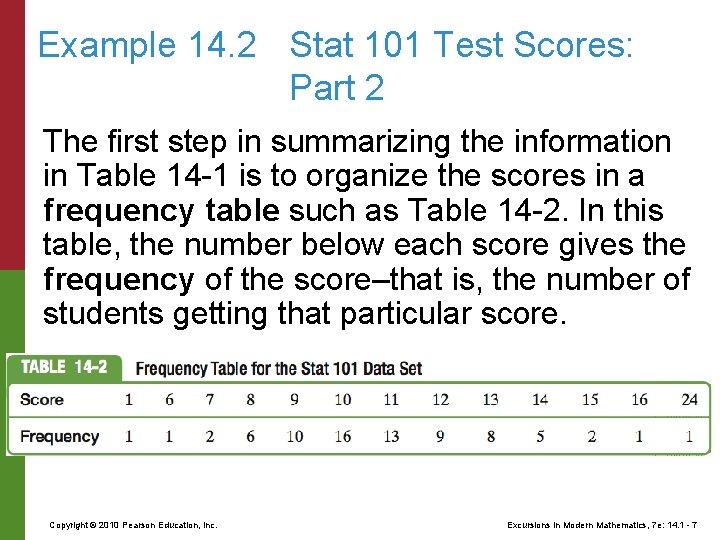
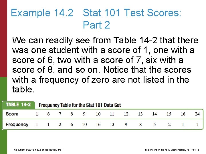
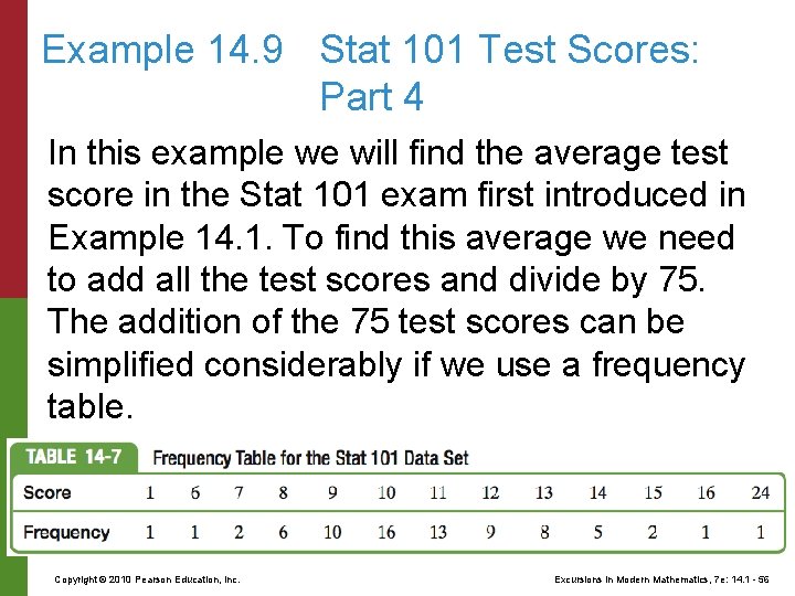
Example 14. 2 Stat 101 Test Scores: Part 2 The first step in summarizing the information in Table 14 -1 is to organize the scores in a frequency table such as Table 14 -2. In this table, the number below each score gives the frequency of the score–that is, the number of students getting that particular score. Copyright © 2010 Pearson Education, Inc. Excursions in Modern Mathematics, 7 e: 14. 1 - 7

Example 14. 2 Stat 101 Test Scores: Part 2 We can readily see from Table 14 -2 that there was one student with a score of 1, one with a score of 6, two with a score of 7, six with a score of 8, and so on. Notice that the scores with a frequency of zero are not listed in the table. Copyright © 2010 Pearson Education, Inc. Excursions in Modern Mathematics, 7 e: 14. 1 - 8

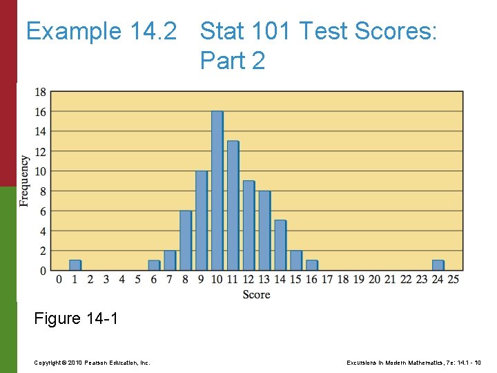
Example 14. 2 Stat 101 Test Scores: Part 2 We can do even better. Figure 14 -1 (next slide) shows the same information in a much more visual way called a bar graph, with the test scores listed in increasing order on a horizontal axis and the frequency of each test score displayed by the height of the column above that test score. Notice that in the bar graph, even the test scores with a frequency of zero show up–there simply is no column above these scores. Copyright © 2010 Pearson Education, Inc. Excursions in Modern Mathematics, 7 e: 14. 1 - 9

Example 14. 2 Stat 101 Test Scores: Part 2 Figure 14 -1 Copyright © 2010 Pearson Education, Inc. Excursions in Modern Mathematics, 7 e: 14. 1 - 10

Example 14. 2 Stat 101 Test Scores: Part 2 Bar graphs are easy to read, and they are a nice way to present a good general picture of the data. With a bar graph, for example, it is easy to detect outliers–extreme data points that do not fit into the overall pattern of the data. In this example there are two obvious outliers–the score of 24 (head and shoulders above the rest of the class) and the score of 1 (lagging way behind the pack). Copyright © 2010 Pearson Education, Inc. Excursions in Modern Mathematics, 7 e: 14. 1 - 11

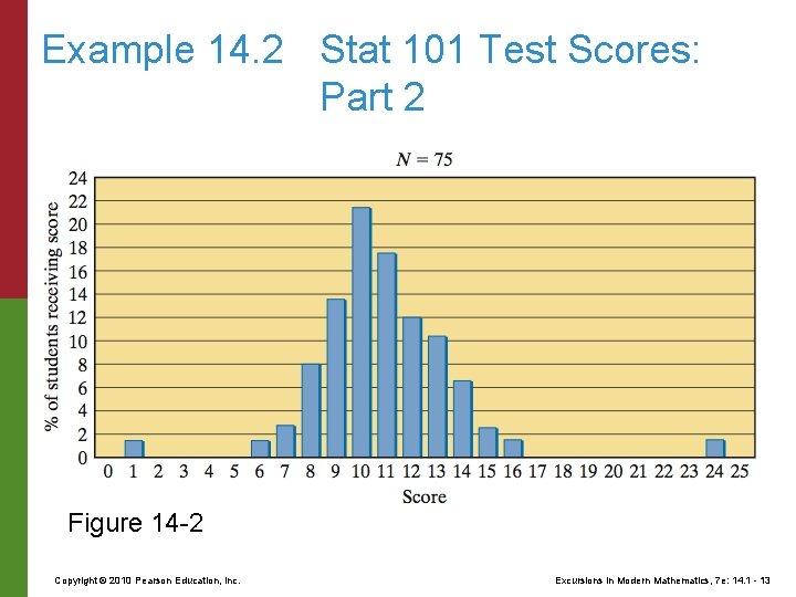
Example 14. 2 Stat 101 Test Scores: Part 2 Sometimes it is more convenient to express the bar graph in terms of relative frequencies –that is, the frequencies given in terms of percentages of the total population. Figure 14 -2 shows a relative frequency bar graph for the Stat 101 data set. Notice that we indicated on the graph that we are dealing with percentages rather than total counts and that the size of the data set is N = 75. Copyright © 2010 Pearson Education, Inc. Excursions in Modern Mathematics, 7 e: 14. 1 - 12

Example 14. 2 Stat 101 Test Scores: Part 2 Figure 14 -2 Copyright © 2010 Pearson Education, Inc. Excursions in Modern Mathematics, 7 e: 14. 1 - 13

Example 14. 2 Stat 101 Test Scores: Part 2 This allows anyone who wishes to do so to compute the actual frequencies. For example, Fig. 14 -2 indicates that 12% of the 75 students scored a 12 on the exam, so the actual frequency is given by 75 0. 12 = 9 students. The change from actual frequencies to percentages (or vice versa) does not change the shape of the graph–it is basically a change of scale. Copyright © 2010 Pearson Education, Inc. Excursions in Modern Mathematics, 7 e: 14. 1 - 14

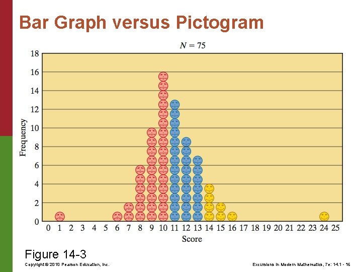
Bar Graph versus Pictogram Frequency charts that use icons or pictures instead of bars to show the frequencies are commonly referred to as pictograms. The point of a pictogram is that a graph is often used not only to inform but also to impress and persuade, and, in such cases, a wellchosen icon or picture can be a more effective tool than just a bar. Here’s a pictogram displaying the same data as in figure 14 -2. Copyright © 2010 Pearson Education, Inc. Excursions in Modern Mathematics, 7 e: 14. 1 - 15

Bar Graph versus Pictogram Figure 14 -3 Copyright © 2010 Pearson Education, Inc. Excursions in Modern Mathematics, 7 e: 14. 1 - 16

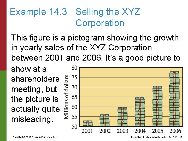
Example 14. 3 Selling the XYZ Corporation This figure is a pictogram showing the growth in yearly sales of the XYZ Corporation between 2001 and 2006. It’s a good picture to show at a shareholders meeting, but the picture is actually quite misleading. Copyright © 2010 Pearson Education, Inc. Excursions in Modern Mathematics, 7 e: 14. 1 - 17

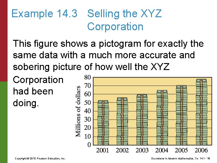
Example 14. 3 Selling the XYZ Corporation This figure shows a pictogram for exactly the same data with a much more accurate and sobering picture of how well the XYZ Corporation had been doing. Copyright © 2010 Pearson Education, Inc. Excursions in Modern Mathematics, 7 e: 14. 1 - 18

Example 14. 3 Selling the XYZ Corporation The difference between the two pictograms can be attributed to a couple of standard tricks of the trade: (1) stretching the scale of the vertical axis and (2) “cheating” on the choice of starting value on the vertical axis. As an educated consumer, you should always be on the lookout for these tricks. In graphical descriptions of data, a fine line separates objectivity from propaganda. Copyright © 2010 Pearson Education, Inc. Excursions in Modern Mathematics, 7 e: 14. 1 - 19

14 Descriptive Statistics 14. 1 Graphical Descriptions of Data 14. 2 Variables 14. 3 Numerical Summaries 14. 4 Measures of Spread Copyright © 2010 Pearson Education, Inc. Excursions in Modern Mathematics, 7 e: 14. 1 - 20

Variable Before we continue with our discussion of graphs, we need to discuss briefly the concept of a variable. In statistical usage, a variable is any characteristic that varies with the members of a population. The students in Dr. Blackbeard’s Stat 101 course (the population) did not all perform equally on the exam. Thus, the test score is a variable, which in this particular case is a whole number between 0 and 25. In some instances, such as when the instructor gives Copyright © 2010 Pearson Education, Inc. Excursions in Modern Mathematics, 7 e: 14. 1 - 21

Variable partial credit, a test score may take on a fractional value, such as 18. 5 or 18. 25. Even in these cases, however, the possible increments for the values of the variable are given by some minimum amount–a quarterpoint, a half-point, whatever. In contrast to this situation, consider a different variable: the amount of time each student studied for the exam. In this case the variable can take on values that differ by any amount: an hour, a minute, a second, a tenth of a second, and so on. Copyright © 2010 Pearson Education, Inc. Excursions in Modern Mathematics, 7 e: 14. 1 - 22

Numerical Variable A variable that represents a measurable quantity is called a numerical (or quantitative) variable. When the difference between the values of a numerical variable can be arbitrarily small, we call the variable continuous (person’s height, weight, foot size, time it takes to run one mile); when possible values of the numerical variable change by minimum increments, the variable is called discrete (person’s IQ, SAT score, shoe size, score of a basketball game). Copyright © 2010 Pearson Education, Inc. Excursions in Modern Mathematics, 7 e: 14. 1 - 23

Categorical Variables can also describe characteristics that cannot be measured numerically: nationality, gender, hair color, and so on. Variables of this type are called categorical (or qualitative) variables. Copyright © 2010 Pearson Education, Inc. Excursions in Modern Mathematics, 7 e: 14. 1 - 24

Categorical Variable In some ways, categorical variables must be treated differently from numerical variables– they cannot, for example, be added, multiplied, or averaged. In other ways, categorical variables can be treated much like discrete numerical variables, particularly when it comes to graphical descriptions, such as bar graphs and pictograms. Copyright © 2010 Pearson Education, Inc. Excursions in Modern Mathematics, 7 e: 14. 1 - 25

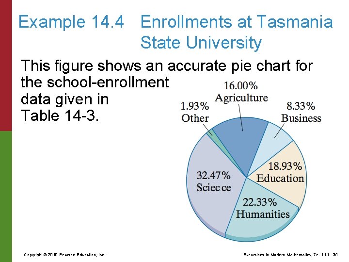
Example 14. 4 Enrollments at Tasmania State University Table 14 -3 shows undergraduate enrollments in each of the five schools at Tasmania State University. A sixth category (“other”) includes undeclared students, interdisciplinary majors, and so on. Copyright © 2010 Pearson Education, Inc. Excursions in Modern Mathematics, 7 e: 14. 1 - 26

Example 14. 4 Enrollments at Tasmania State University Vertical and horizontal bar graphs displaying the data for table 14 -3. Copyright © 2010 Pearson Education, Inc. Excursions in Modern Mathematics, 7 e: 14. 1 - 27

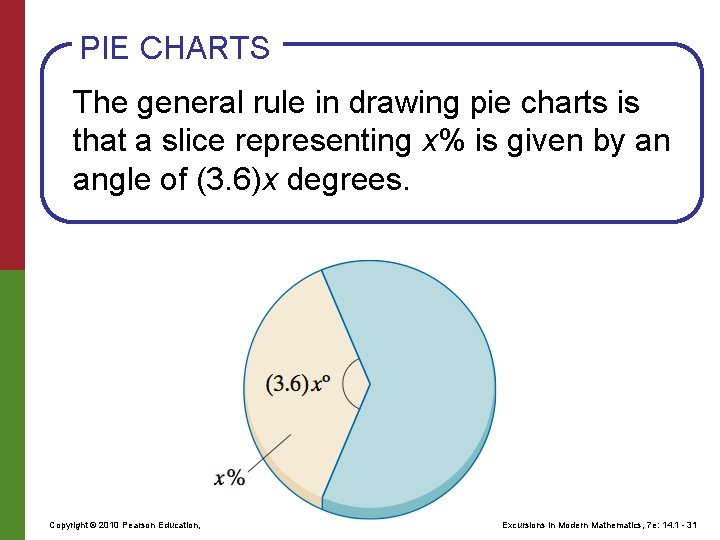
Example 14. 4 Enrollments at Tasmania State University When the number of categories is small, as is the case here, another common way to describe the relative frequencies of the categories is by using a pie chart. In a pie chart the “pie” represents the entire population (100%), and the “slices” represent the categories (or classes), with the size (angle) of each slice being proportional to the relative frequency of the corresponding category. Copyright © 2010 Pearson Education, Inc. Excursions in Modern Mathematics, 7 e: 14. 1 - 28

Example 14. 4 Enrollments at Tasmania State University Some relative frequencies, such as 50% and 25%, are very easy to sketch, but how do we accurately draw the slice corresponding to a more complicated frequency, say, 32. 47%? Here, a little elementary geometry comes in handy. Since 100% equals 360º, 1% corresponds to an angle of 360º/100 = 3. 6º. It follows that the frequency 32. 47% is given by 32. 47 3. 6º = 117º (rounded to the nearest degree, which is generally good enough for most practical purposes). Copyright © 2010 Pearson Education, Inc. Excursions in Modern Mathematics, 7 e: 14. 1 - 29

Example 14. 4 Enrollments at Tasmania State University This figure shows an accurate pie chart for the school-enrollment data given in Table 14 -3. Copyright © 2010 Pearson Education, Inc. Excursions in Modern Mathematics, 7 e: 14. 1 - 30

PIE CHARTS The general rule in drawing pie charts is that a slice representing x% is given by an angle of (3. 6)x degrees. Copyright © 2010 Pearson Education, Inc. Excursions in Modern Mathematics, 7 e: 14. 1 - 31

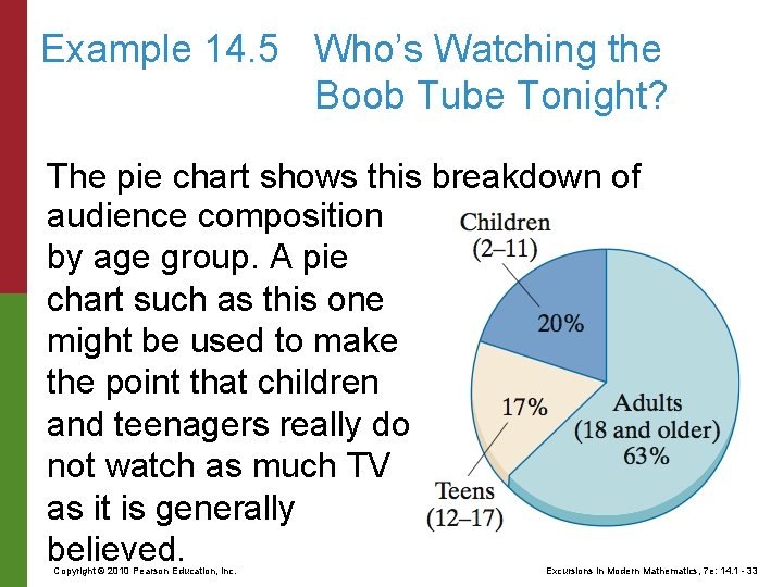
Example 14. 5 Who’s Watching the Boob Tube Tonight? According to Nielsen Media Research data, the percentages of the TV audience watching TV during prime time (8 P. M. to 11 P. M. ), broken up by age group, are as follows: adults (18 years and older), 63%; teenagers (12– 17 years), 17%; children (2– 11 years), 20%. Copyright © 2010 Pearson Education, Inc. Excursions in Modern Mathematics, 7 e: 14. 1 - 32

Example 14. 5 Who’s Watching the Boob Tube Tonight? The pie chart shows this breakdown of audience composition by age group. A pie chart such as this one might be used to make the point that children and teenagers really do not watch as much TV as it is generally believed. Copyright © 2010 Pearson Education, Inc. Excursions in Modern Mathematics, 7 e: 14. 1 - 33

Example 14. 5 Who’s Watching the Boob Tube Tonight? The problem with this conclusion is that children make up only 15% of the population at large and teens only 8%. In relative terms, a higher percentage of teenagers (taken out of the total teenage population) watch primetime TV than any other group, with children second adults last. Using absolute percentages can be quite misleading. When comparing characteristics of a population that is broken up into categories, it is essential to take into account the relative sizes of the various categories. Copyright © 2010 Pearson Education, Inc. Excursions in Modern Mathematics, 7 e: 14. 1 - 34

How Many Categories When it comes to deciding how best to display graphically the frequencies of a population, a critical issue is the number of categories into which the data can fall. When the number of categories is too big (say, in the dozens), a bar graph or pictogram can become muddled and ineffective. This happens more often than not with numerical data–numerical variables can take on infinitely many values, and even when they don’t, the number of values can be too large for any reasonable graph. Copyright © 2010 Pearson Education, Inc. Excursions in Modern Mathematics, 7 e: 14. 1 - 35

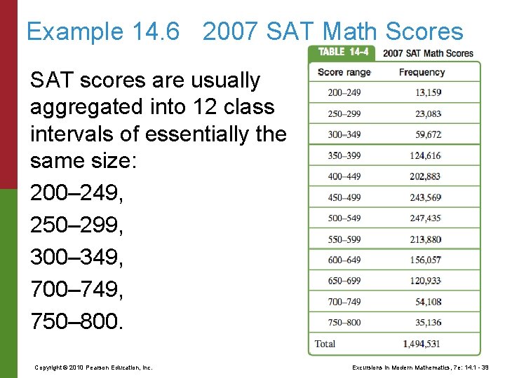
Example 14. 6 2007 SAT Math Scores The college dreams and aspirations of millions of high school seniors often ride on their SAT scores. The SAT consists of three sections: a math section, a writing section, and a critical reading section, with the scores for each section ranging from a minimum of 200 to a maximum of 800 and going up in increments of 10 points. In 2007, there were 1, 494, 531 college-bound seniors who took the SAT. How do we describe the math section results for this group of students? Copyright © 2010 Pearson Education, Inc. Excursions in Modern Mathematics, 7 e: 14. 1 - 36

Example 14. 6 2007 SAT Math Scores We could set up a frequency table (or a bar graph) with the number of students scoring each of the possible scores– 200, 210, 220, 790, 800. The problem is that there are 61 different possible scores between 200 and 800, and this number is too large for an effective bar graph. Copyright © 2010 Pearson Education, Inc. Excursions in Modern Mathematics, 7 e: 14. 1 - 37

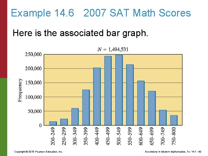
Example 14. 6 2007 SAT Math Scores In situations such as this one it is customary to present a more compact picture of the data by grouping together, or aggregating, sets of scores into categories called class intervals. The decision as to how the class intervals are defined and how many there are will depend on how much or how little detail is desired, but as a general rule of thumb, the number of class intervals should be somewhere between 5 and 20. Copyright © 2010 Pearson Education, Inc. Excursions in Modern Mathematics, 7 e: 14. 1 - 38

Example 14. 6 2007 SAT Math Scores SAT scores are usually aggregated into 12 class intervals of essentially the same size: 200– 249, 250– 299, 300– 349, 700– 749, 750– 800. Copyright © 2010 Pearson Education, Inc. Excursions in Modern Mathematics, 7 e: 14. 1 - 39

Example 14. 6 2007 SAT Math Scores Here is the associated bar graph. Copyright © 2010 Pearson Education, Inc. Excursions in Modern Mathematics, 7 e: 14. 1 - 40

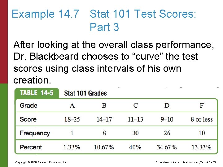
Example 14. 7 Stat 101 Test Scores: Part 3 The process of converting test scores (a numerical variable) into grades (a categorical variable) requires setting up class intervals for the various letter grades. Typically, the professor has the latitude to decide how to do this. One standard approach is to use an absolute grading scale, usually with class intervals of (almost) equal length for all grades except F. (e. g. , A = 90 -100%, B = 8089%, C = 70 -79%, D = 60 -69%, F = 0 -59%). Copyright © 2010 Pearson Education, Inc. Excursions in Modern Mathematics, 7 e: 14. 1 - 41

Example 14. 7 Stat 101 Test Scores: Part 3 Another frequently used approach is to use a relative grading scale. Here the professor fits the class intervals for the grades to the performance of the class in the test, often using class intervals of varying lengths. Some people call this “grading on the curve, ” although this terminology is somewhat misused. To illustrate relative grading in action, let’s revisit the Stat 101 midterm scores discussed in Example 14. 1. Copyright © 2010 Pearson Education, Inc. Excursions in Modern Mathematics, 7 e: 14. 1 - 42

Example 14. 7 Stat 101 Test Scores: Part 3 After looking at the overall class performance, Dr. Blackbeard chooses to “curve” the test scores using class intervals of his own creation. Copyright © 2010 Pearson Education, Inc. Excursions in Modern Mathematics, 7 e: 14. 1 - 43

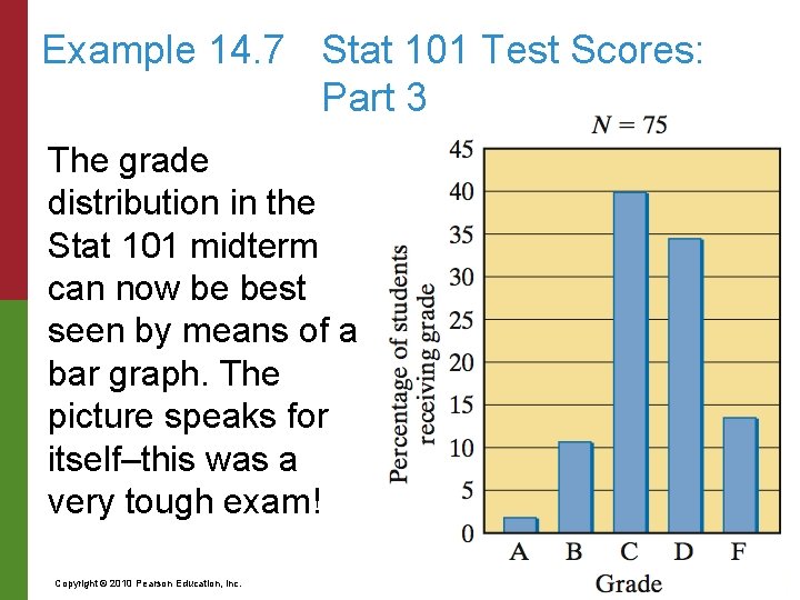
Example 14. 7 Stat 101 Test Scores: Part 3 The grade distribution in the Stat 101 midterm can now be best seen by means of a bar graph. The picture speaks for itself–this was a very tough exam! Copyright © 2010 Pearson Education, Inc. Excursions in Modern Mathematics, 7 e: 14. 1 - 44

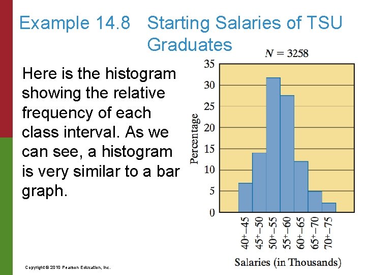
Capture-Recapture Method When a numerical variable is continuous, its possible values can vary by infinitesimally small increments. As a consequence, there are no gaps between the class intervals, and our old way of doing things (using separated columns or stacks) will no longer work. In this case we use a variation of a bar graph called a histogram. Copyright © 2010 Pearson Education, Inc. Excursions in Modern Mathematics, 7 e: 14. 1 - 45

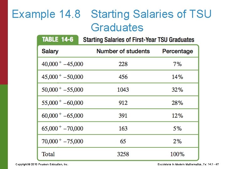
Example 14. 8 Starting Salaries of TSU Graduates Suppose we want to use a graph to display the distribution of starting salaries for last year’s graduating class at Tasmania State University. The starting salaries of the N = 3258 graduates range from a low of $40, 350 to a high of $74, 800. Based on this range and the amount of detail we want to show, we must decide on the length of the class intervals. A reasonable choice would be to use class intervals defined in increments of $5000. Copyright © 2010 Pearson Education, Inc. Excursions in Modern Mathematics, 7 e: 14. 1 - 46

Example 14. 8 Starting Salaries of TSU Graduates Copyright © 2010 Pearson Education, Inc. Excursions in Modern Mathematics, 7 e: 14. 1 - 47

Example 14. 8 Starting Salaries of TSU Graduates Here is the histogram showing the relative frequency of each class interval. As we can see, a histogram is very similar to a bar graph. Copyright © 2010 Pearson Education, Inc. Excursions in Modern Mathematics, 7 e: 14. 1 - 48

Example 14. 8 Starting Salaries of TSU Graduates Several important distinctions must be made, however. To begin with, because a histogram is used for continuous variables, there can be no gaps between the class intervals, and it follows, therefore, that the columns of a histogram must touch each other. Among other things, this forces us to make an arbitrary decision as to what happens to a value that falls exactly on the boundary between two class intervals. Copyright © 2010 Pearson Education, Inc. Excursions in Modern Mathematics, 7 e: 14. 1 - 49

Example 14. 8 Starting Salaries of TSU Graduates Should it always belong to the class interval to the left or to the one to the right? This is called the endpoint convention. The superscript “plus” marks in Table 14 -6 indicate how we chose to deal with the endpoint convention in Fig. 14 -11. A starting salary of exactly $50, 000, for example, would be listed under the 45, 000+– 50, 000 class interval rather than the 50, 000+– 55, 000 class interval. Copyright © 2010 Pearson Education, Inc. Excursions in Modern Mathematics, 7 e: 14. 1 - 50

Use Class Intervals of Equal Length When creating histograms, we should try, as much as possible, to define class intervals of equal length. When the class intervals are of unequal length, the rules for creating a histogram are considerably more complicated, since it is no longer appropriate to use the heights of the columns to indicate the frequencies of the class intervals. Copyright © 2010 Pearson Education, Inc. Excursions in Modern Mathematics, 7 e: 14. 1 - 51

14 Descriptive Statistics 14. 1 Graphical Descriptions of Data 14. 2 Variables 14. 3 Numerical Summaries 14. 4 Measures of Spread Copyright © 2010 Pearson Education, Inc. Excursions in Modern Mathematics, 7 e: 14. 1 - 52

Numerical Summaries of a Data Set Measures of Location Measures of location such as the mean (or average), the median, and the quartiles, are numbers that provide information about the values of the data. Copyright © 2010 Pearson Education, Inc. Excursions in Modern Mathematics, 7 e: 14. 1 - 53

Average or Mean The best known of all numerical summaries of data is the average, also called the mean. There is no universal agreement as to which of these names is a better choice–in some settings mean is a better choice than average, in other settings it’s the other way around. In this chapter we will use whichever seems the better choice at the moment. Copyright © 2010 Pearson Education, Inc. Excursions in Modern Mathematics, 7 e: 14. 1 - 54

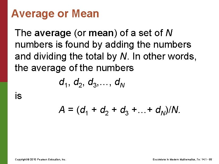
Average or Mean The average (or mean) of a set of N numbers is found by adding the numbers and dividing the total by N. In other words, the average of the numbers d 1, d 2, d 3, …, d. N is A = (d 1 + d 2 + d 3 +…+ d. N)/N. Copyright © 2010 Pearson Education, Inc. Excursions in Modern Mathematics, 7 e: 14. 1 - 55

Example 14. 9 Stat 101 Test Scores: Part 4 In this example we will find the average test score in the Stat 101 exam first introduced in Example 14. 1. To find this average we need to add all the test scores and divide by 75. The addition of the 75 test scores can be simplified considerably if we use a frequency table. Copyright © 2010 Pearson Education, Inc. Excursions in Modern Mathematics, 7 e: 14. 1 - 56

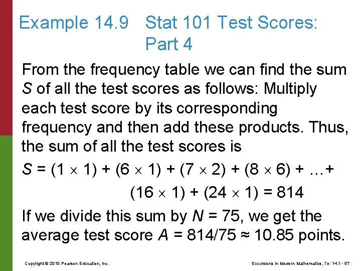
Example 14. 9 Stat 101 Test Scores: Part 4 From the frequency table we can find the sum S of all the test scores as follows: Multiply each test score by its corresponding frequency and then add these products. Thus, the sum of all the test scores is S = (1 1) + (6 1) + (7 2) + (8 6) + …+ (16 1) + (24 1) = 814 If we divide this sum by N = 75, we get the average test score A = 814/75 ≈ 10. 85 points. Copyright © 2010 Pearson Education, Inc. Excursions in Modern Mathematics, 7 e: 14. 1 - 57

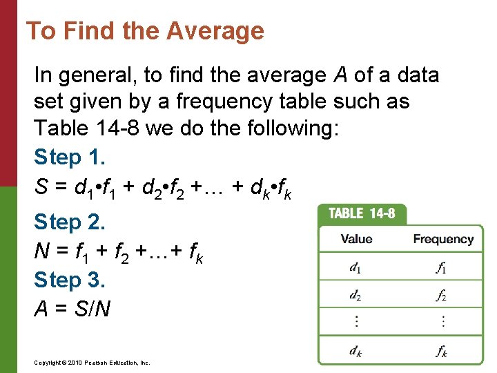
To Find the Average In general, to find the average A of a data set given by a frequency table such as Table 14 -8 we do the following: Step 1. S = d 1 • f 1 + d 2 • f 2 +… + dk • fk Step 2. N = f 1 + f 2 +…+ fk Step 3. A = S/N Copyright © 2010 Pearson Education, Inc. Excursions in Modern Mathematics, 7 e: 14. 1 - 58

Example 14. 10 Starting Salaries of Philosophy Majors Imagine that you just read in the paper the following remarkable tidbit: The average starting salary of philosophy majors who recently graduated from Tasmania State University is $76, 400 a year! This is quite an impressive number, but before we all rush out to change majors, let’s point out that one of the graduating philosophy majors happens to be basketball star “Hoops” Tallman, who is doing his thing in the NBA for a starting salary of $3. 5 million a year. Copyright © 2010 Pearson Education, Inc. Excursions in Modern Mathematics, 7 e: 14. 1 - 59

Example 14. 10 Starting Salaries of Philosophy Majors If we were to take this one outlier out of the population of 75 philosophy majors, we would have a more realistic picture of what philosophy majors are making. Here is how we can do it. ■ The total of all 75 salaries is 75 times the average salary: 75 $76, 400 = $5, 730, 000 Copyright © 2010 Pearson Education, Inc. Excursions in Modern Mathematics, 7 e: 14. 1 - 60

Example 14. 10 Starting Salaries of Philosophy Majors ■ The total of the other 74 salaries (excluding Hoops’s cool 3. 5 mill) is $5, 730, 000 – $3, 500, 000 = $2, 230, 000 ■ The average of the remaining 74 salaries is $2, 230, 000/74 ≈ $30, 135 Copyright © 2010 Pearson Education, Inc. Excursions in Modern Mathematics, 7 e: 14. 1 - 61

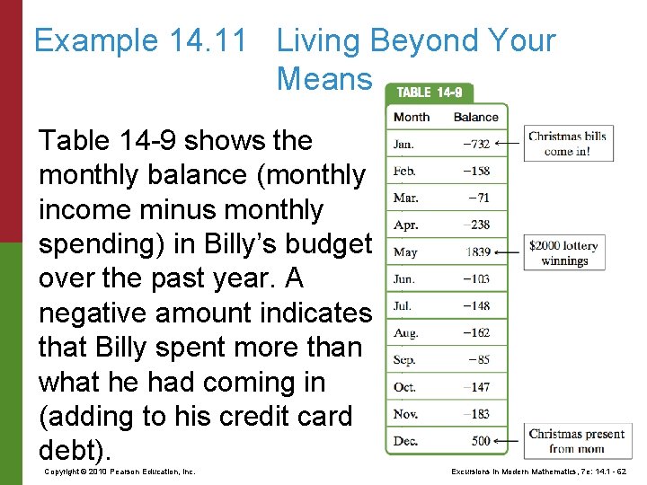
Example 14. 11 Living Beyond Your Means Table 14 -9 shows the monthly balance (monthly income minus monthly spending) in Billy’s budget over the past year. A negative amount indicates that Billy spent more than what he had coming in (adding to his credit card debt). Copyright © 2010 Pearson Education, Inc. Excursions in Modern Mathematics, 7 e: 14. 1 - 62

Example 14. 11 Living Beyond Your Means In spite of his consistent overspending, Billy’s average monthly balance for the year is $26 (check it out!). This average hides the true picture of what is going on. Billy is living well beyond his means but was bailed out by a lucky break and a generous mom. Copyright © 2010 Pearson Education, Inc. Excursions in Modern Mathematics, 7 e: 14. 1 - 63

Percentiles While a single numerical summary–such as the average–can be useful, it is rarely sufficient to give a meaningful description of a data set. A better picture of the data set can be presented by using a well-organized cadre of numerical summaries. The most common way to do this is by means of percentiles. The pth percentile of a data set is a value such that p percent of the numbers fall at or below this value and the rest fall at or above it. It essentially splits a data set into two parts: the lower p% of the data values and the upper of the data values. Copyright © 2010 Pearson Education, Inc. Excursions in Modern Mathematics, 7 e: 14. 1 - 64

Percentiles There are several different ways to compute percentiles that will satisfy the definition, and different statistics books describe different methods. We will illustrate one such method. The first step is to sort the numbers from smallest to largest. Let’s denote the sorted data values by d 1, d 2, d 3, … , d. N , where d 1 represents the smallest number in the data set, d 2 the second smallest number, and so on; d 3. 5 represents the average of the data values d 3 and d 4, d 7. 5 represents the average of the data values d 7 and d 8. Copyright © 2010 Pearson Education, Inc. Excursions in Modern Mathematics, 7 e: 14. 1 - 65

Percentiles The next, and most important, step is to identify which d represents the pth percentile of the data set. To do this, we compute the pth percent of N, which we will call the locator and denote by the letter L. [In other words, ] If L happens to be a whole number, then the pth percentile will be d. L. 5 (the average of d. L and d. L+1). If L is not a whole number, then the pth percentile will be d. L+ where L+ represents the value of L rounded up. Copyright © 2010 Pearson Education, Inc. Excursions in Modern Mathematics, 7 e: 14. 1 - 66

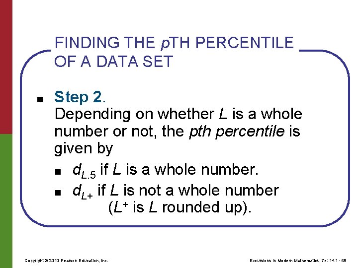
FINDING THE p. TH PERCENTILE OF A DATA SET ■ ■ Step 0. Sort the data set from smallest to largest. Let d 1, d 2, d 3, … , d. N represent the sorted data. Step 1. Find the locator L = (p/100) • N. Copyright © 2010 Pearson Education, Inc. Excursions in Modern Mathematics, 7 e: 14. 1 - 67

FINDING THE p. TH PERCENTILE OF A DATA SET ■ Step 2. Depending on whether L is a whole number or not, the pth percentile is given by ■ d. L. 5 if L is a whole number. ■ d. L+ if L is not a whole number (L+ is L rounded up). Copyright © 2010 Pearson Education, Inc. Excursions in Modern Mathematics, 7 e: 14. 1 - 68

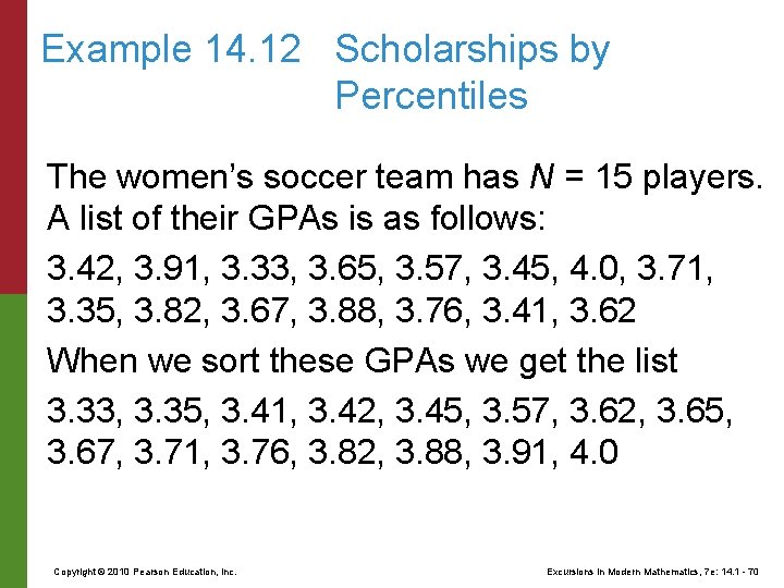
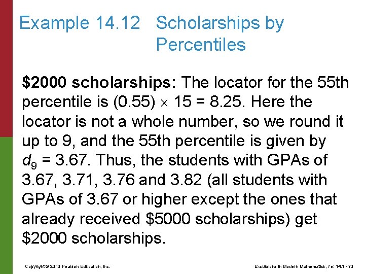
Example 14. 12 Scholarships by Percentiles To reward good academic performance from its athletes, Tasmania State University has a program in which athletes with GPAs in the top 20 th percentile of their team’s GPAs get a $5000 scholarship and athletes with GPAs in the top forty-fifth percentile of their team’s GPAs who did not get the $5000 scholarship get a $2000 scholarship. Copyright © 2010 Pearson Education, Inc. Excursions in Modern Mathematics, 7 e: 14. 1 - 69

Example 14. 12 Scholarships by Percentiles The women’s soccer team has N = 15 players. A list of their GPAs is as follows: 3. 42, 3. 91, 3. 33, 3. 65, 3. 57, 3. 45, 4. 0, 3. 71, 3. 35, 3. 82, 3. 67, 3. 88, 3. 76, 3. 41, 3. 62 When we sort these GPAs we get the list 3. 33, 3. 35, 3. 41, 3. 42, 3. 45, 3. 57, 3. 62, 3. 65, 3. 67, 3. 71, 3. 76, 3. 82, 3. 88, 3. 91, 4. 0 Copyright © 2010 Pearson Education, Inc. Excursions in Modern Mathematics, 7 e: 14. 1 - 70

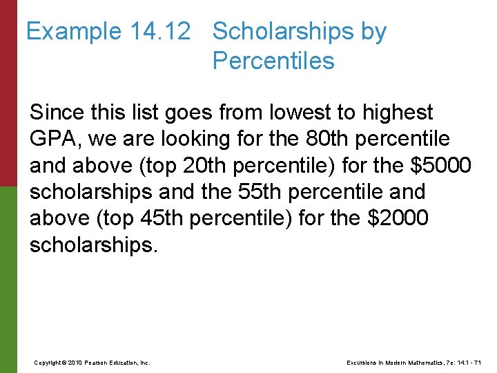
Example 14. 12 Scholarships by Percentiles Since this list goes from lowest to highest GPA, we are looking for the 80 th percentile and above (top 20 th percentile) for the $5000 scholarships and the 55 th percentile and above (top 45 th percentile) for the $2000 scholarships. Copyright © 2010 Pearson Education, Inc. Excursions in Modern Mathematics, 7 e: 14. 1 - 71

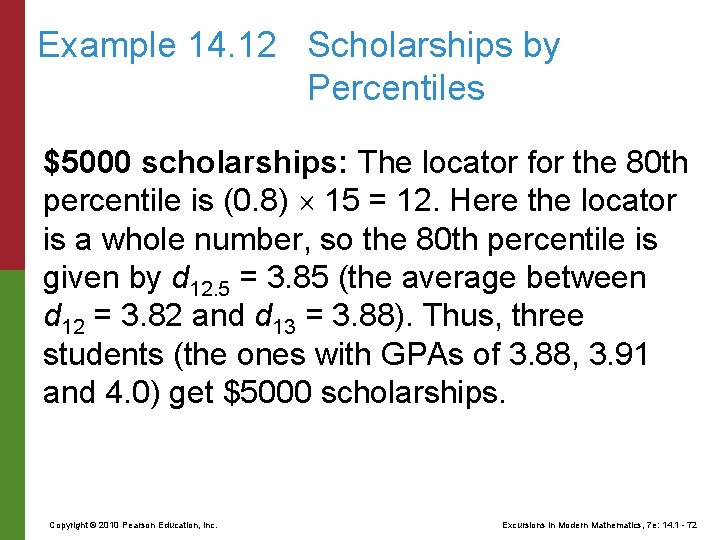
Example 14. 12 Scholarships by Percentiles $5000 scholarships: The locator for the 80 th percentile is (0. 8) 15 = 12. Here the locator is a whole number, so the 80 th percentile is given by d 12. 5 = 3. 85 (the average between d 12 = 3. 82 and d 13 = 3. 88). Thus, three students (the ones with GPAs of 3. 88, 3. 91 and 4. 0) get $5000 scholarships. Copyright © 2010 Pearson Education, Inc. Excursions in Modern Mathematics, 7 e: 14. 1 - 72

Example 14. 12 Scholarships by Percentiles $2000 scholarships: The locator for the 55 th percentile is (0. 55) 15 = 8. 25. Here the locator is not a whole number, so we round it up to 9, and the 55 th percentile is given by d 9 = 3. 67. Thus, the students with GPAs of 3. 67, 3. 71, 3. 76 and 3. 82 (all students with GPAs of 3. 67 or higher except the ones that already received $5000 scholarships) get $2000 scholarships. Copyright © 2010 Pearson Education, Inc. Excursions in Modern Mathematics, 7 e: 14. 1 - 73

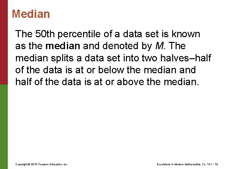
Median The 50 th percentile of a data set is known as the median and denoted by M. The median splits a data set into two halves–half of the data is at or below the median and half of the data is at or above the median. Copyright © 2010 Pearson Education, Inc. Excursions in Modern Mathematics, 7 e: 14. 1 - 74

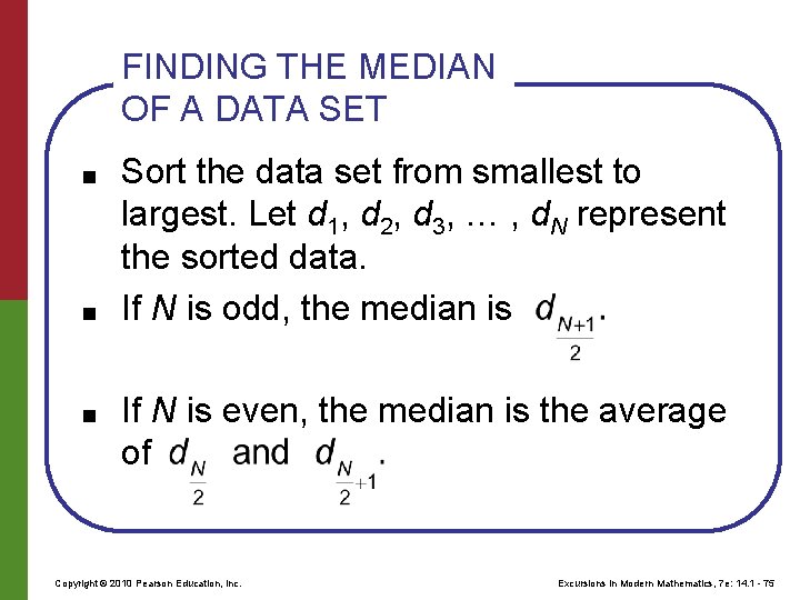
FINDING THE MEDIAN OF A DATA SET ■ ■ ■ Sort the data set from smallest to largest. Let d 1, d 2, d 3, … , d. N represent the sorted data. If N is odd, the median is If N is even, the median is the average of Copyright © 2010 Pearson Education, Inc. Excursions in Modern Mathematics, 7 e: 14. 1 - 75

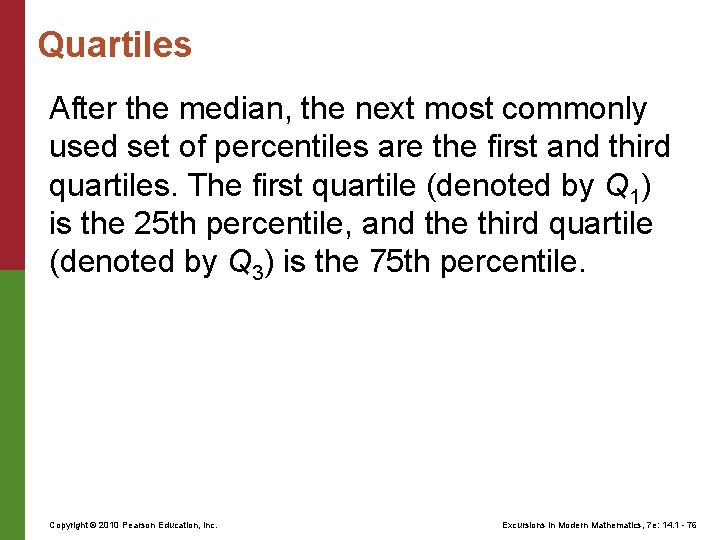
Quartiles After the median, the next most commonly used set of percentiles are the first and third quartiles. The first quartile (denoted by Q 1) is the 25 th percentile, and the third quartile (denoted by Q 3) is the 75 th percentile. Copyright © 2010 Pearson Education, Inc. Excursions in Modern Mathematics, 7 e: 14. 1 - 76

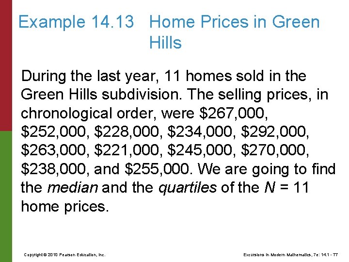
Example 14. 13 Home Prices in Green Hills During the last year, 11 homes sold in the Green Hills subdivision. The selling prices, in chronological order, were $267, 000, $252, 000, $228, 000, $234, 000, $292, 000, $263, 000, $221, 000, $245, 000, $270, 000, $238, 000, and $255, 000. We are going to find the median and the quartiles of the N = 11 home prices. Copyright © 2010 Pearson Education, Inc. Excursions in Modern Mathematics, 7 e: 14. 1 - 77

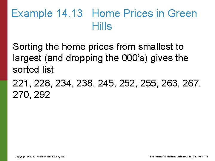
Example 14. 13 Home Prices in Green Hills Sorting the home prices from smallest to largest (and dropping the 000’s) gives the sorted list 221, 228, 234, 238, 245, 252, 255, 263, 267, 270, 292 Copyright © 2010 Pearson Education, Inc. Excursions in Modern Mathematics, 7 e: 14. 1 - 78

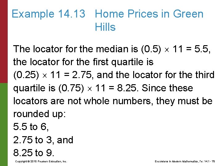
Example 14. 13 Home Prices in Green Hills The locator for the median is (0. 5) 11 = 5. 5, the locator for the first quartile is (0. 25) 11 = 2. 75, and the locator for the third quartile is (0. 75) 11 = 8. 25. Since these locators are not whole numbers, they must be rounded up: 5. 5 to 6, 2. 75 to 3, and 8. 25 to 9. Copyright © 2010 Pearson Education, Inc. Excursions in Modern Mathematics, 7 e: 14. 1 - 79

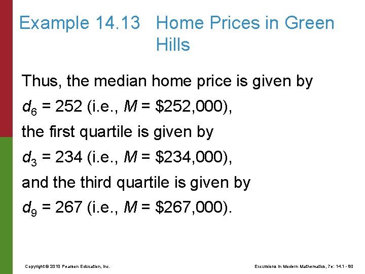
Example 14. 13 Home Prices in Green Hills Thus, the median home price is given by d 6 = 252 (i. e. , M = $252, 000), the first quartile is given by d 3 = 234 (i. e. , M = $234, 000), and the third quartile is given by d 9 = 267 (i. e. , M = $267, 000). Copyright © 2010 Pearson Education, Inc. Excursions in Modern Mathematics, 7 e: 14. 1 - 80

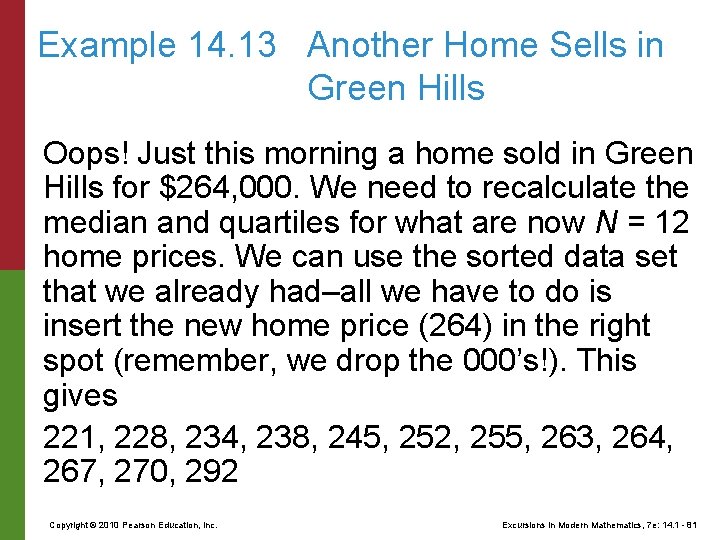
Example 14. 13 Another Home Sells in Green Hills Oops! Just this morning a home sold in Green Hills for $264, 000. We need to recalculate the median and quartiles for what are now N = 12 home prices. We can use the sorted data set that we already had–all we have to do is insert the new home price (264) in the right spot (remember, we drop the 000’s!). This gives 221, 228, 234, 238, 245, 252, 255, 263, 264, 267, 270, 292 Copyright © 2010 Pearson Education, Inc. Excursions in Modern Mathematics, 7 e: 14. 1 - 81

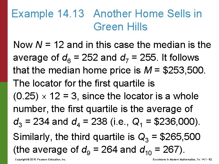
Example 14. 13 Another Home Sells in Green Hills Now N = 12 and in this case the median is the average of d 6 = 252 and d 7 = 255. It follows that the median home price is M = $253, 500. The locator for the first quartile is (0. 25) 12 = 3, since the locator is a whole number, the first quartile is the average of d 3 = 234 and d 4 = 238 (i. e. , Q 1 = $236, 000). Similarly, the third quartile is Q 3 = $265, 500 (the average of d 9 = 264 and d 10 = 267). Copyright © 2010 Pearson Education, Inc. Excursions in Modern Mathematics, 7 e: 14. 1 - 82

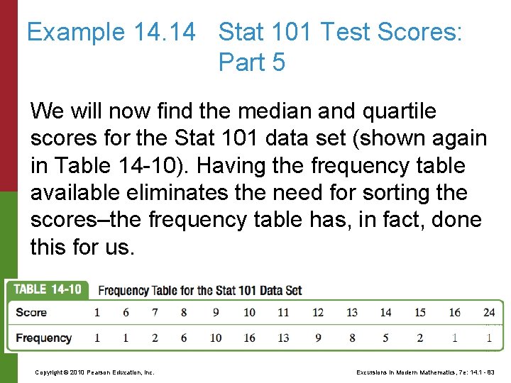
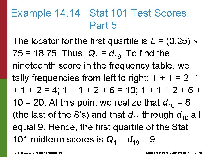
Example 14. 14 Stat 101 Test Scores: Part 5 We will now find the median and quartile scores for the Stat 101 data set (shown again in Table 14 -10). Having the frequency table available eliminates the need for sorting the scores–the frequency table has, in fact, done this for us. Copyright © 2010 Pearson Education, Inc. Excursions in Modern Mathematics, 7 e: 14. 1 - 83

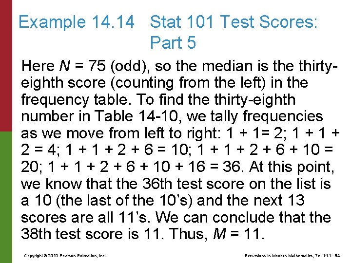
Example 14. 14 Stat 101 Test Scores: Part 5 Here N = 75 (odd), so the median is the thirtyeighth score (counting from the left) in the frequency table. To find the thirty-eighth number in Table 14 -10, we tally frequencies as we move from left to right: 1 + 1= 2; 1 + 2 = 4; 1 + 2 + 6 = 10; 1 + 2 + 6 + 10 = 20; 1 + 2 + 6 + 10 + 16 = 36. At this point, we know that the 36 th test score on the list is a 10 (the last of the 10’s) and the next 13 scores are all 11’s. We can conclude that the 38 th test score is 11. Thus, M = 11. Copyright © 2010 Pearson Education, Inc. Excursions in Modern Mathematics, 7 e: 14. 1 - 84

Example 14. 14 Stat 101 Test Scores: Part 5 The locator for the first quartile is L = (0. 25) 75 = 18. 75. Thus, Q 1 = d 19. To find the nineteenth score in the frequency table, we tally frequencies from left to right: 1 + 1 = 2; 1 + 2 = 4; 1 + 2 + 6 = 10; 1 + 2 + 6 + 10 = 20. At this point we realize that d 10 = 8 (the last of the 8’s) and that d 11 through d 10 all equal 9. Hence, the first quartile of the Stat 101 midterm scores is Q 1 = d 19 = 9. Copyright © 2010 Pearson Education, Inc. Excursions in Modern Mathematics, 7 e: 14. 1 - 85

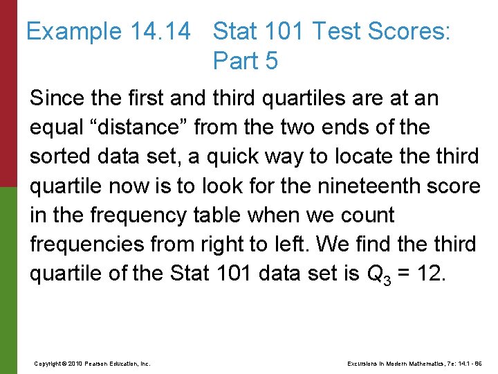
Example 14. 14 Stat 101 Test Scores: Part 5 Since the first and third quartiles are at an equal “distance” from the two ends of the sorted data set, a quick way to locate third quartile now is to look for the nineteenth score in the frequency table when we count frequencies from right to left. We find the third quartile of the Stat 101 data set is Q 3 = 12. Copyright © 2010 Pearson Education, Inc. Excursions in Modern Mathematics, 7 e: 14. 1 - 86

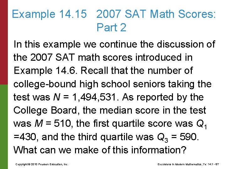
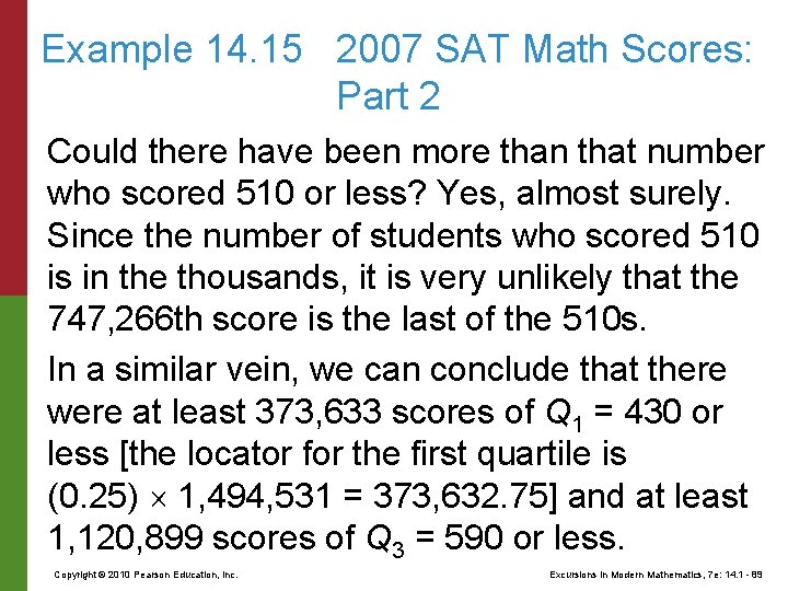
Example 14. 15 2007 SAT Math Scores: Part 2 In this example we continue the discussion of the 2007 SAT math scores introduced in Example 14. 6. Recall that the number of college-bound high school seniors taking the test was N = 1, 494, 531. As reported by the College Board, the median score in the test was M = 510, the first quartile score was Q 1 =430, and the third quartile was Q 3 = 590. What can we make of this information? Copyright © 2010 Pearson Education, Inc. Excursions in Modern Mathematics, 7 e: 14. 1 - 87

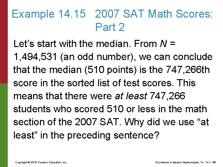
Example 14. 15 2007 SAT Math Scores: Part 2 Let’s start with the median. From N = 1, 494, 531 (an odd number), we can conclude that the median (510 points) is the 747, 266 th score in the sorted list of test scores. This means that there were at least 747, 266 students who scored 510 or less in the math section of the 2007 SAT. Why did we use “at least” in the preceding sentence? Copyright © 2010 Pearson Education, Inc. Excursions in Modern Mathematics, 7 e: 14. 1 - 88

Example 14. 15 2007 SAT Math Scores: Part 2 Could there have been more than that number who scored 510 or less? Yes, almost surely. Since the number of students who scored 510 is in the thousands, it is very unlikely that the 747, 266 th score is the last of the 510 s. In a similar vein, we can conclude that there were at least 373, 633 scores of Q 1 = 430 or less [the locator for the first quartile is (0. 25) 1, 494, 531 = 373, 632. 75] and at least 1, 120, 899 scores of Q 3 = 590 or less. Copyright © 2010 Pearson Education, Inc. Excursions in Modern Mathematics, 7 e: 14. 1 - 89

A Note of Warning Medians, quartiles, and general percentiles are often computed using statistical calculators or statistical software packages, which is all well and fine since the whole process can be a bit tedious. The problem is that there is no universally agreed upon procedure for computing percentiles, so different types of calculators and different statistical packages may give different answers from each other and from those given in this book for quartiles and other percentiles (everyone agrees on the median). Copyright © 2010 Pearson Education, Inc. Excursions in Modern Mathematics, 7 e: 14. 1 - 90

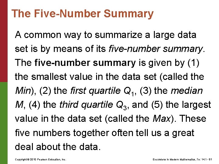
The Five-Number Summary A common way to summarize a large data set is by means of its five-number summary. The five-number summary is given by (1) the smallest value in the data set (called the Min), (2) the first quartile Q 1, (3) the median M, (4) the third quartile Q 3, and (5) the largest value in the data set (called the Max). These five numbers together often tell us a great deal about the data. Copyright © 2010 Pearson Education, Inc. Excursions in Modern Mathematics, 7 e: 14. 1 - 91

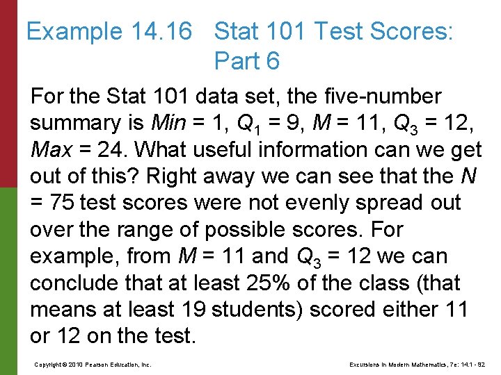
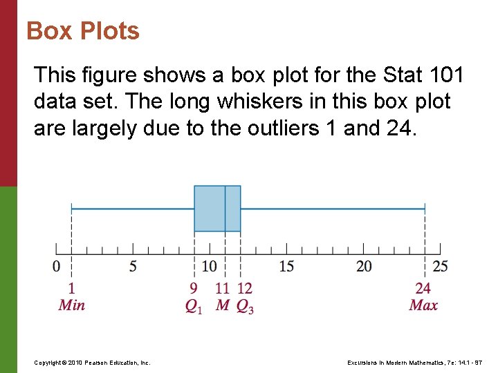
Example 14. 16 Stat 101 Test Scores: Part 6 For the Stat 101 data set, the five-number summary is Min = 1, Q 1 = 9, M = 11, Q 3 = 12, Max = 24. What useful information can we get out of this? Right away we can see that the N = 75 test scores were not evenly spread out over the range of possible scores. For example, from M = 11 and Q 3 = 12 we can conclude that at least 25% of the class (that means at least 19 students) scored either 11 or 12 on the test. Copyright © 2010 Pearson Education, Inc. Excursions in Modern Mathematics, 7 e: 14. 1 - 92

Example 14. 16 Stat 101 Test Scores: Part 6 At the same time, from Q 3 = 12 and Max = 24 we can conclude that less than one-fourth of the class (i. e. , at most 18 students) had scores in the 13– 24 point range. Using similar arguments, we can conclude that at least 19 students had scores between Q 1 = 9 and M = 11 points and no more than 18 students scored in the 1– 8 point range. Copyright © 2010 Pearson Education, Inc. Excursions in Modern Mathematics, 7 e: 14. 1 - 93

Example 14. 16 Stat 101 Test Scores: Part 6 The “big picture” we get from the five-number summary of the Stat 101 test scores is that there was a lot of bunching up in a narrow band of scores (at least half of the students in the class scored in the range 9– 12 points), and the rest of the class was all over the place. In general, this type of “bumpy” distribution of test scores is indicative of a test with an uneven level of difficulty–a bunch of easy questions and a bunch of really hard questions with little in between. Copyright © 2010 Pearson Education, Inc. Excursions in Modern Mathematics, 7 e: 14. 1 - 94

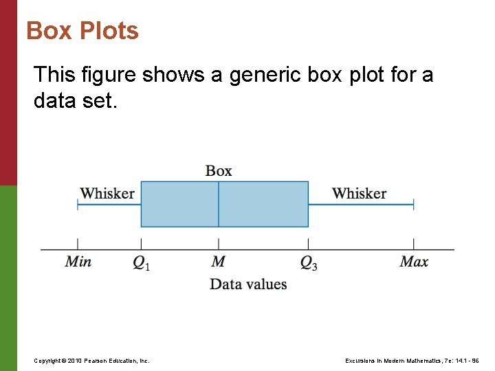
Box Plots Invented in 1977 by statistician John Tukey, a box plot (also known as a box-andwhisker plot) is a picture of the five-number summary of a data set. The box plot consists of a rectangular box that sits above a scale and extends from the first quartile Q 1 to the third quartile Q 3 on that scale. A vertical line crosses the box, indicating the position of the median M. On both sides of the box are “whiskers” extending to the smallest value, Min, and largest value, Max, of the data. Copyright © 2010 Pearson Education, Inc. Excursions in Modern Mathematics, 7 e: 14. 1 - 95

Box Plots This figure shows a generic box plot for a data set. Copyright © 2010 Pearson Education, Inc. Excursions in Modern Mathematics, 7 e: 14. 1 - 96

Box Plots This figure shows a box plot for the Stat 101 data set. The long whiskers in this box plot are largely due to the outliers 1 and 24. Copyright © 2010 Pearson Education, Inc. Excursions in Modern Mathematics, 7 e: 14. 1 - 97

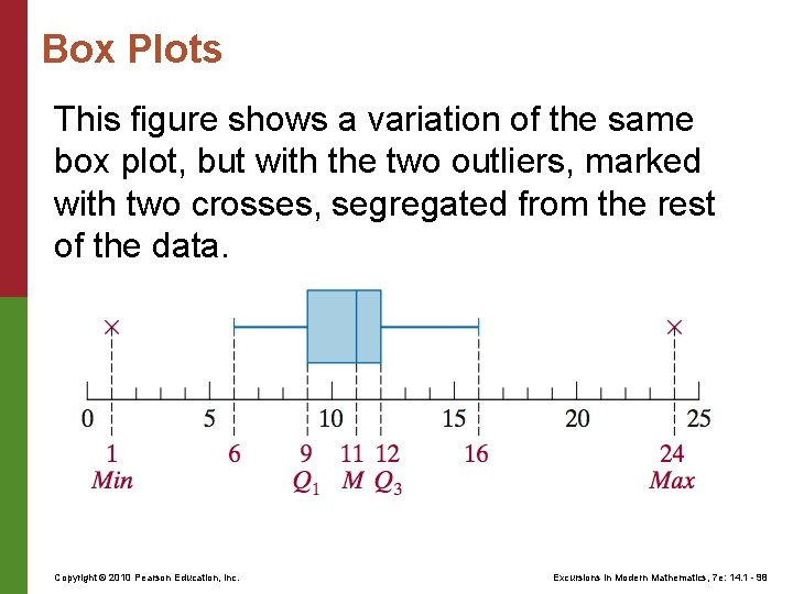
Box Plots This figure shows a variation of the same box plot, but with the two outliers, marked with two crosses, segregated from the rest of the data. Copyright © 2010 Pearson Education, Inc. Excursions in Modern Mathematics, 7 e: 14. 1 - 98

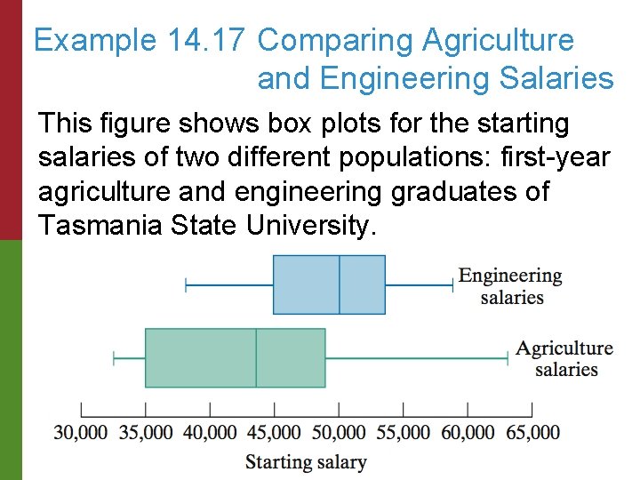
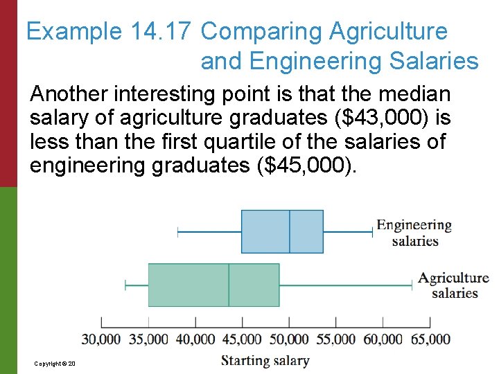
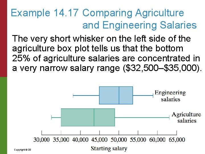
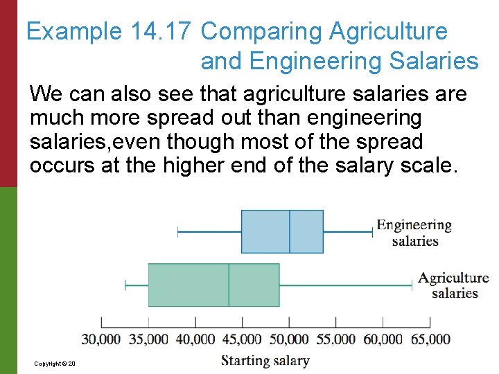
Example 14. 17 Comparing Agriculture and Engineering Salaries This figure shows box plots for the starting salaries of two different populations: first-year agriculture and engineering graduates of Tasmania State University. Copyright © 2010 Pearson Education, Inc. Excursions in Modern Mathematics, 7 e: 14. 1 - 99

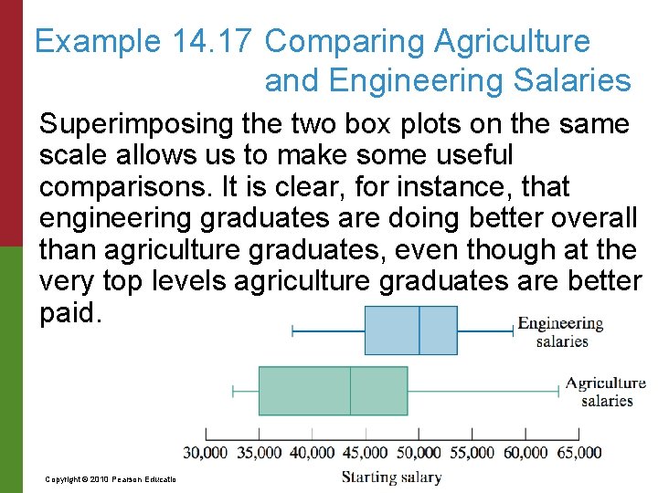
Example 14. 17 Comparing Agriculture and Engineering Salaries Superimposing the two box plots on the same scale allows us to make some useful comparisons. It is clear, for instance, that engineering graduates are doing better overall than agriculture graduates, even though at the very top levels agriculture graduates are better paid. Copyright © 2010 Pearson Education, Inc. Excursions in Modern Mathematics, 7 e: 14. 1 - 100

Example 14. 17 Comparing Agriculture and Engineering Salaries Another interesting point is that the median salary of agriculture graduates ($43, 000) is less than the first quartile of the salaries of engineering graduates ($45, 000). Copyright © 2010 Pearson Education, Inc. Excursions in Modern Mathematics, 7 e: 14. 1 - 101

Example 14. 17 Comparing Agriculture and Engineering Salaries The very short whisker on the left side of the agriculture box plot tells us that the bottom 25% of agriculture salaries are concentrated in a very narrow salary range ($32, 500–$35, 000). Copyright © 2010 Pearson Education, Inc. Excursions in Modern Mathematics, 7 e: 14. 1 - 102

Example 14. 17 Comparing Agriculture and Engineering Salaries We can also see that agriculture salaries are much more spread out than engineering salaries, even though most of the spread occurs at the higher end of the salary scale. Copyright © 2010 Pearson Education, Inc. Excursions in Modern Mathematics, 7 e: 14. 1 - 103

14 Descriptive Statistics 14. 1 Graphical Descriptions of Data 14. 2 Variables 14. 3 Numerical Summaries 14. 4 Measures of Spread Copyright © 2010 Pearson Education, Inc. Excursions in Modern Mathematics, 7 e: 14. 1 - 104

The Range An obvious approach to describing the spread of a data set is to take the difference between the highest and lowest values of the data. This difference is called the range of the data set and usually denoted by R. Thus, R = Max – Min. The range of a data set is a useful piece of information when there are no outliers in the data. In the presence of outliers the range tells a distorted story. Copyright © 2010 Pearson Education, Inc. Excursions in Modern Mathematics, 7 e: 14. 1 - 105

The Range For example, the range of the test scores in the Stat 101 exam is 24 – 1 = 23 points, an indication of a big spread within the scores (i. e. , a very heterogeneous group of students). True enough, but if we discount the two outliers, the remaining 73 test scores would have a much smaller range of 16 – 6 = 10 points. Copyright © 2010 Pearson Education, Inc. Excursions in Modern Mathematics, 7 e: 14. 1 - 106

The Interquartile Range To eliminate the possible distortion caused by outliers, a common practice when measuring the spread of a data set is to use the interquartile range, denoted by the acronym IQR. The interquartile range is the difference between the third quartile and the first quartile (IQR = Q 3 – Q 1), and it tells us how spread out the middle 50% of the data values are. For many types of real-world data, the interquartile range is a useful measure of spread. Copyright © 2010 Pearson Education, Inc. Excursions in Modern Mathematics, 7 e: 14. 1 - 107

Example 14. 18 2007 SAT Math Scores: Part 3 The five-number summary for the 2007 SAT math scores was Min = 200 (yes, there were a few jokers who missed every question!), Q 1 = 430, M = 590, Max = 800 (there are still a few geniuses around!). It follows that the 2007 SAT math scores had a range of 600 points (800 – 200 = 600) and an interquartile range of 160 points (IQR = 590 – 430 = 160). Copyright © 2010 Pearson Education, Inc. Excursions in Modern Mathematics, 7 e: 14. 1 - 108

Standard Deviation The most important and most commonly used measure of spread for a data set is the standard deviation. The key concept for understanding the standard deviation is the concept of deviation from the mean. If A is the average of the data set and x is an arbitrary data value, the difference x – A is x’s deviation from the mean. The deviations from the mean tell us how “far” the data values are from the average value of the data. The idea is to use this information to figure out how spread out the data is. Copyright © 2010 Pearson Education, Inc. Excursions in Modern Mathematics, 7 e: 14. 1 - 109

Standard Deviation The deviations from the mean are themselves a data set, which we would like to summarize. One way would be to average them, but if we do that, the negative deviations and the positive deviations will always cancel each other out so that we end up with an average of 0. This, of course, makes the average useless in this case. The cancellation of positive and negative deviations can be avoided by squaring each of the deviations. Copyright © 2010 Pearson Education, Inc. Excursions in Modern Mathematics, 7 e: 14. 1 - 110

Standard Deviation The squared deviations are never negative, and if we average them out, we get an important measure of spread called the variance, denoted by V. Finally, we take the square root of the variance and get the standard deviation, denoted by the Greek letter (and sometimes by the acronym SD). The following is an outline of the definition of the standard deviation of a data set. Copyright © 2010 Pearson Education, Inc. Excursions in Modern Mathematics, 7 e: 14. 1 - 111

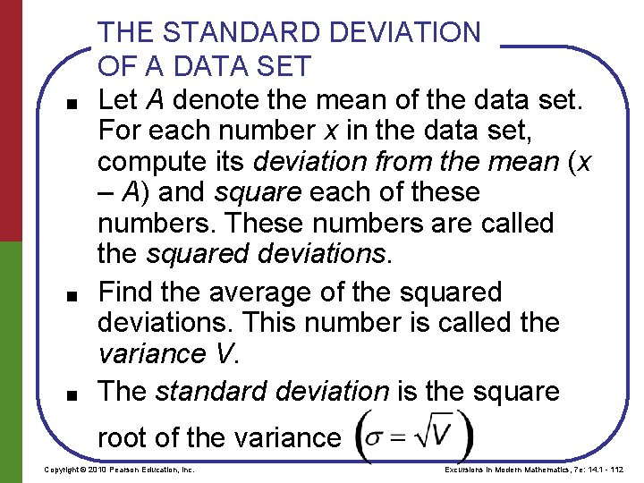
■ ■ ■ THE STANDARD DEVIATION OF A DATA SET Let A denote the mean of the data set. For each number x in the data set, compute its deviation from the mean (x – A) and square each of these numbers. These numbers are called the squared deviations. Find the average of the squared deviations. This number is called the variance V. The standard deviation is the square root of the variance Copyright © 2010 Pearson Education, Inc. Excursions in Modern Mathematics, 7 e: 14. 1 - 112

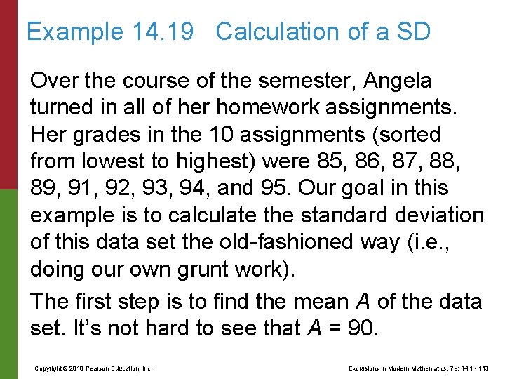
Example 14. 19 Calculation of a SD Over the course of the semester, Angela turned in all of her homework assignments. Her grades in the 10 assignments (sorted from lowest to highest) were 85, 86, 87, 88, 89, 91, 92, 93, 94, and 95. Our goal in this example is to calculate the standard deviation of this data set the old-fashioned way (i. e. , doing our own grunt work). The first step is to find the mean A of the data set. It’s not hard to see that A = 90. Copyright © 2010 Pearson Education, Inc. Excursions in Modern Mathematics, 7 e: 14. 1 - 113

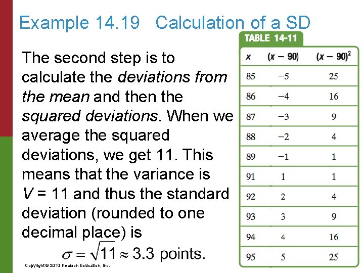
Example 14. 19 Calculation of a SD The second step is to calculate the deviations from the mean and then the squared deviations. When we average the squared deviations, we get 11. This means that the variance is V = 11 and thus the standard deviation (rounded to one decimal place) is Copyright © 2010 Pearson Education, Inc. Excursions in Modern Mathematics, 7 e: 14. 1 - 114

Interpreting the Standard Deviation It is clear from just a casual look at Angela’s homework scores that she was pretty consistent in her homework, never straying too much above or below her average score of 90 points. The standard deviation is, in effect, a way to measure this degree of consistency (or lack thereof). A small standard deviation tells us that the data are consistent and the spread of the data is small, as is the case with Angela’s homework scores. Copyright © 2010 Pearson Education, Inc. Excursions in Modern Mathematics, 7 e: 14. 1 - 115

Interpreting the Standard Deviation The ultimate in consistency within a data set is when all the data values are the same (like Angela’s friend Chloe, who got a 20 in every homework assignment). When this happens the standard deviation is 0. Copyright © 2010 Pearson Education, Inc. Excursions in Modern Mathematics, 7 e: 14. 1 - 116

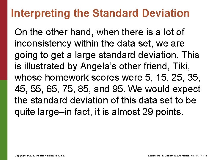
Interpreting the Standard Deviation On the other hand, when there is a lot of inconsistency within the data set, we are going to get a large standard deviation. This is illustrated by Angela’s other friend, Tiki, whose homework scores were 5, 15, 25, 35, 45, 55, 65, 75, 85, and 95. We would expect the standard deviation of this data set to be quite large–in fact, it is almost 29 points. Copyright © 2010 Pearson Education, Inc. Excursions in Modern Mathematics, 7 e: 14. 1 - 117

Summary of the Standard Deviation The standard deviation is arguably the most important and frequently used measure of data spread. Yet it is not a particularly intuitive concept. Here a few basic guidelines that recap our preceding discussion: Copyright © 2010 Pearson Education, Inc. Excursions in Modern Mathematics, 7 e: 14. 1 - 118

Summary of the Standard Deviation ■ The standard deviation of a data set is measured in the same units as the original data. For example, if the data are points on a test, then the standard deviation is also given in points. Conversely, if the standard deviation is given in dollars, then we can conclude that the original data must have been money–some prices, salaries, or something like that. For sure, the data couldn’t have been test scores on an exam. Copyright © 2010 Pearson Education, Inc. Excursions in Modern Mathematics, 7 e: 14. 1 - 119

Summary of the Standard Deviation ■ It is pointless to compare standard deviations of data sets that are given in different units. Even for data sets that are given in the same units–say, for example, test scores–the underlying scale should be the same. We should not try to compare standard deviations for SAT scores measured on a scale of 200– 800 points with standard deviations of a set of homework assignments measured on a scale of 0– 100 points. Copyright © 2010 Pearson Education, Inc. Excursions in Modern Mathematics, 7 e: 14. 1 - 120

Summary of the Standard Deviation ■ For data sets that are based on the same underlying scale, a comparison of standard deviations can tell us something about the spread of the data. If the standard deviation is small, we can conclude that the data points are all bunched together– there is very little spread. As the standard deviation increases, we can conclude that the data points are beginning to spread out. Copyright © 2010 Pearson Education, Inc. Excursions in Modern Mathematics, 7 e: 14. 1 - 121

Summary of the Standard Deviation The more spread out they are, the larger the standard deviation becomes. A standard deviation of 0, means that all data values are the same. As a measure of spread, the standard deviation is particularly useful for analyzing real-life data. Copyright © 2010 Pearson Education, Inc. Excursions in Modern Mathematics, 7 e: 14. 1 - 122