ANALYSING YOUR PAT DATA Which reports do I
- Slides: 31

ANALYSING YOUR PAT DATA Which report(s) do I use?

Reports There are several reports that can be generated from student engagement with the Progressive Achievement Tests (PAT). Each of these reports can be analysed for different purposes. This Power. Point displays screen shots to take you through how to access the different reports available. Included in the final slides are web links to useful tutorials available from ACER to support the use of PAT.

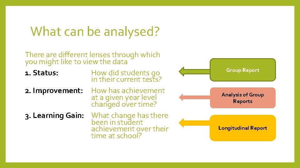
What can be analysed? There are different lenses through which you might like to view the data 1. Status: How did students go in their current tests? 2. Improvement: How has achievement at a given year level changed over time? 3. Learning Gain: What change has there been in student achievement over their time at school? Group Report Analysis of Group Reports Longitudinal Report

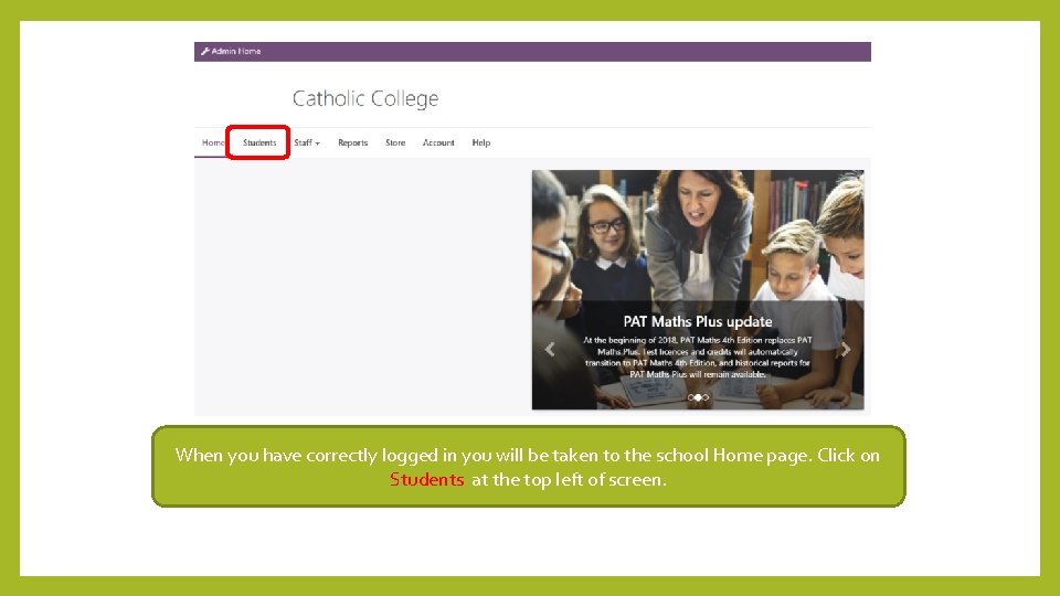
When you have correctly logged in you will be taken to the school Home page. Click on Students at the top left of screen.

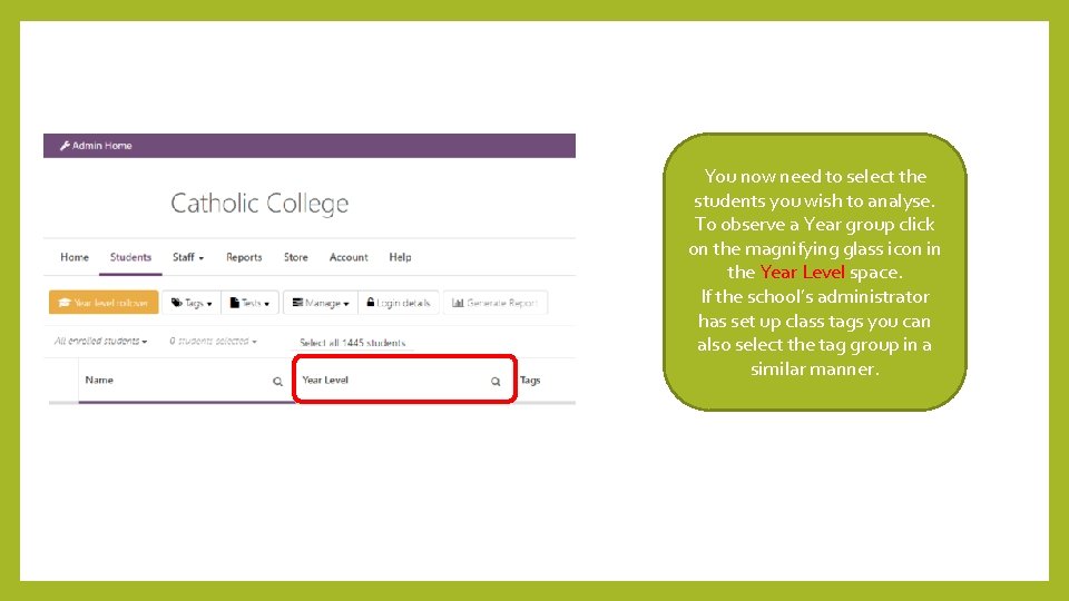
You now need to select the students you wish to analyse. To observe a Year group click on the magnifying glass icon in the Year Level space. If the school’s administrator has set up class tags you can also select the tag group in a similar manner.

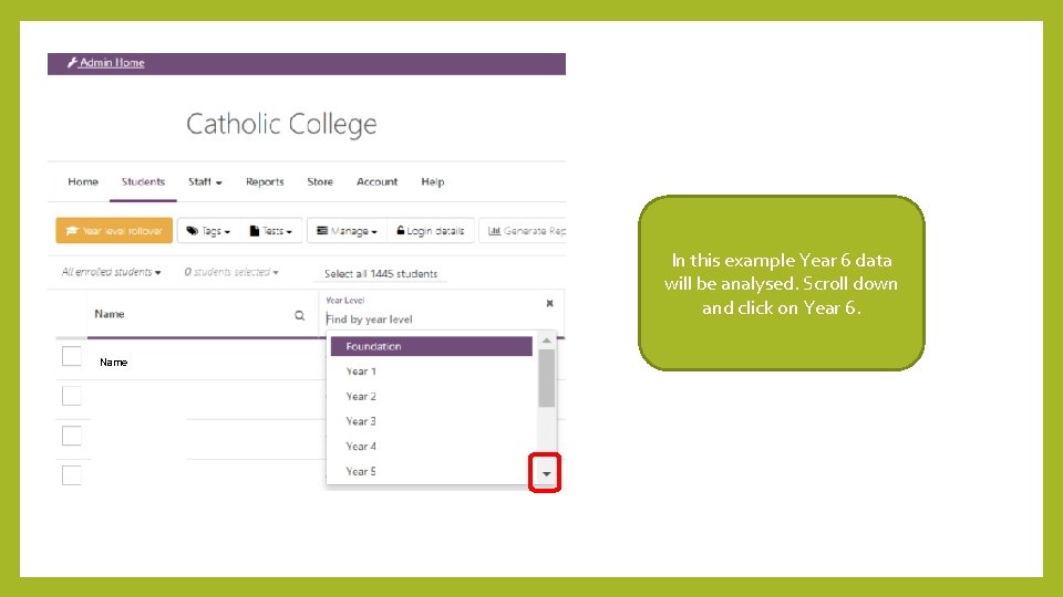
In this example Year 6 data will be analysed. Scroll down and click on Year 6. Name

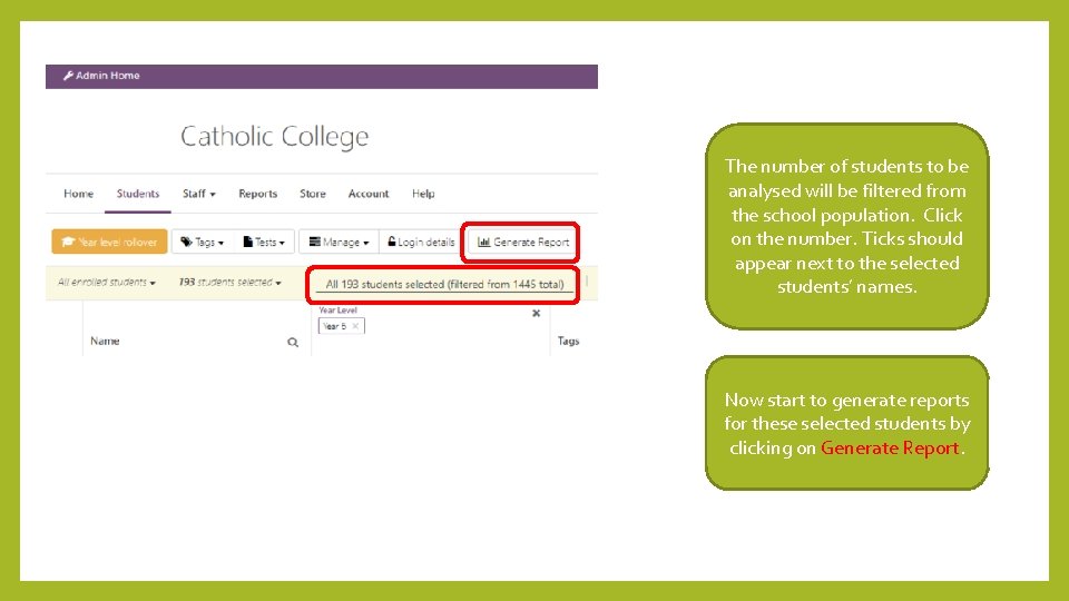
The number of students to be analysed will be filtered from the school population. Click on the number. Ticks should appear next to the selected students’ names. Now start to generate reports for these selected students by clicking on Generate Report.

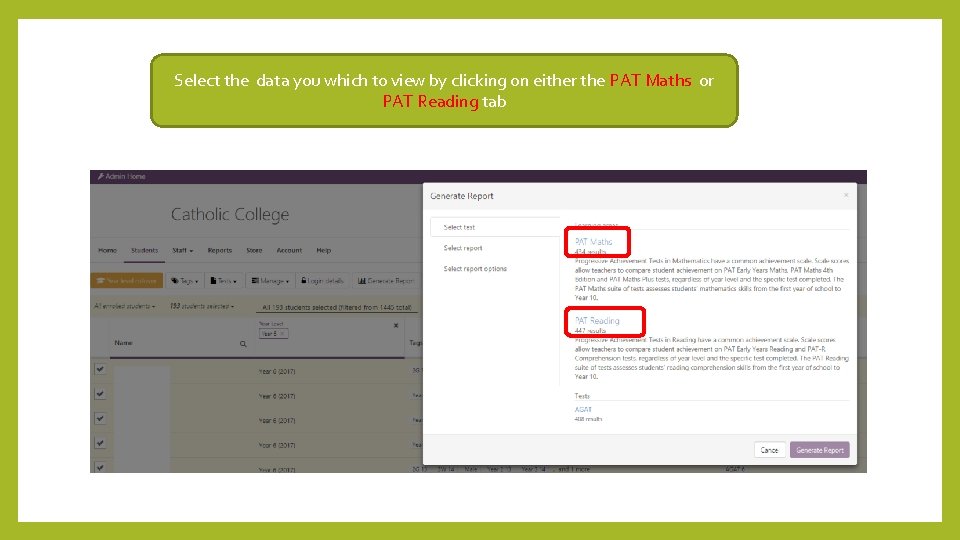
Select the data you which to view by clicking on either the PAT Maths or PAT Reading tab

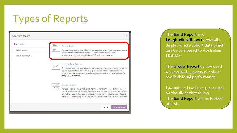
Types of Reports The Band Report and Longitudinal Report generally display whole cohort data which can be compared to Australian NORMS. The Group Report can be used to view both aspects of cohort and individual performance. Examples of each are presented on the slides that follow. The Band Report will be looked at first.

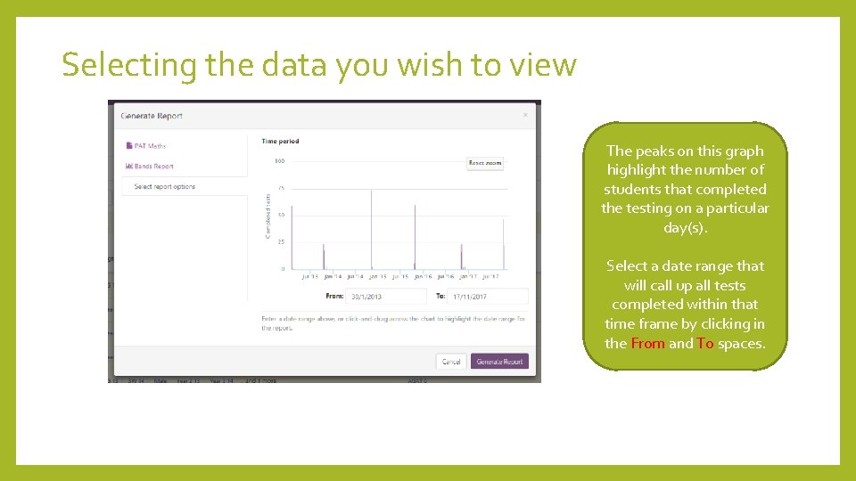
Selecting the data you wish to view The peaks on this graph highlight the number of students that completed the testing on a particular day(s). Select a date range that will call up all tests completed within that time frame by clicking in the From and To spaces.

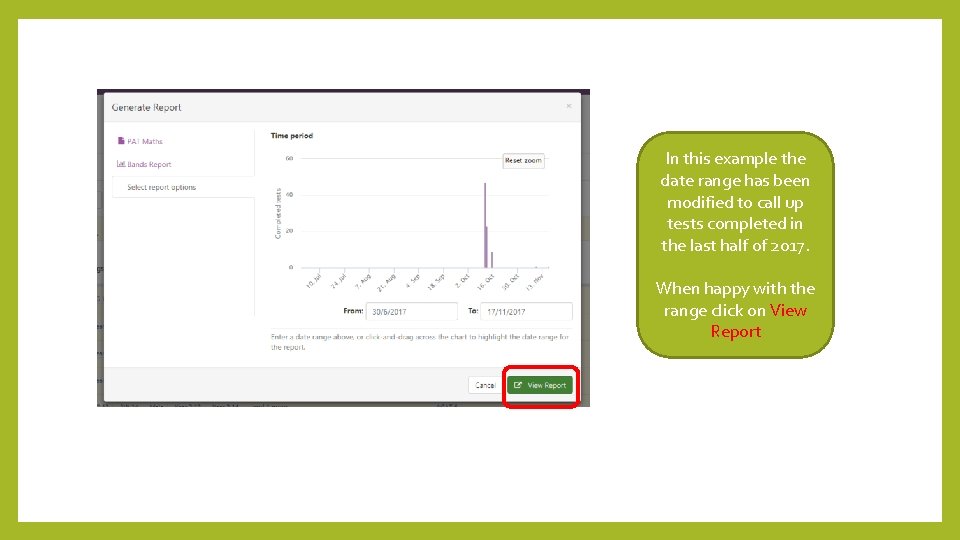
In this example the date range has been modified to call up tests completed in the last half of 2017. When happy with the range click on View Report

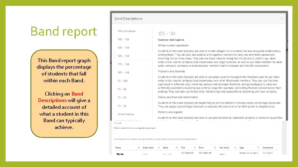
Band report This Band report graph displays the percentage of students that fall within each Band. Clicking on Band Descriptions will give a detailed account of what a student in this Band can typically achieve. Name

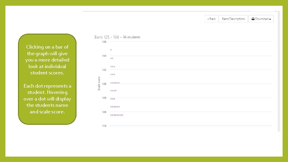
Clicking on a bar of the graph will give you a more detailed look at individual student scores. Each dot represents a student. Hovering over a dot will display the students name and scale score.

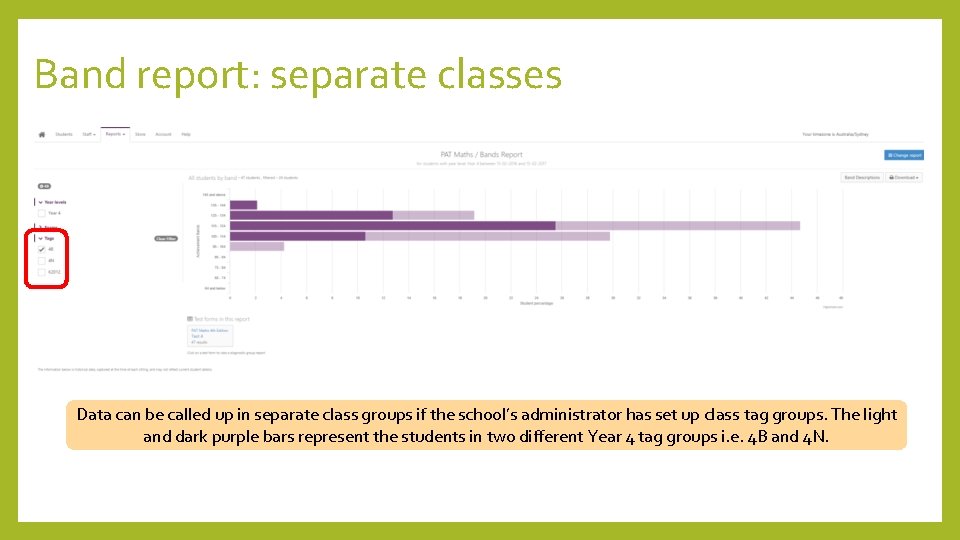
Band report: separate classes Data can be called up in separate class groups if the school’s administrator has set up class tag groups. The light and dark purple bars represent the students in two different Year 4 tag groups i. e. 4 B and 4 N.

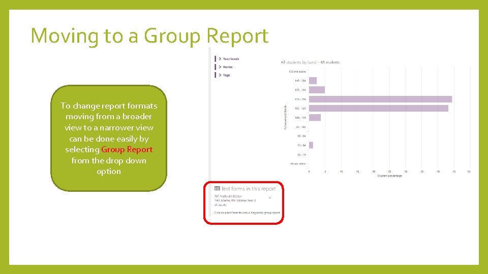
Moving to a Group Report To change report formats moving from a broader view to a narrower view can be done easily by selecting Group Report from the drop down option

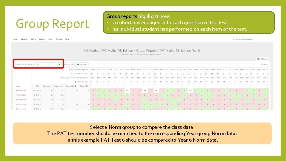
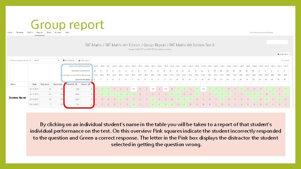
Group Report Group reports highlight how: • a cohort has engaged with each question of the test. • an individual student has performed on each item of the test. Select a Norm group to compare the class data. The PAT test number should be matched to the corresponding Year group Norm data. In this example PAT Test 6 should be compared to Year 6 Norm data.

Group report Student Name Selecting groupstudent’s for comparison will complete columns on theof table By clicking on aan. Norm individual name in the table youadditional will be taken to a report that student’s The data can be sorted onthis theand different criteria listed bystudent. clicking the titles. adding Percentile Stanine data for each individual performance on the test. On overview Pink squares indicate the on student incorrectly responded to the question and Green a correct response. The letter in the Pink box displays the distractor the student selected in getting the question wrong.

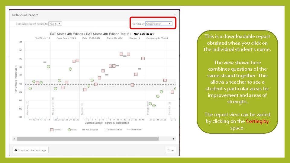
Name of student This is a downloadable report obtained when you click on the individual student’s name. The view shown here combines questions of the same strand together. This allows a teacher to see a student’s particular areas for improvement and areas of strength. The report view can be varied by clicking on the Sorting by space.

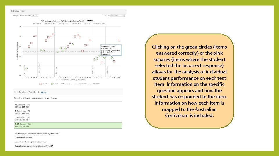
Name Clicking on the green circles (items answered correctly) or the pink squares (items where the student selected the incorrect response) allows for the analysis of individual student performance on each test item. Information on the specific question appears and how the student has responded to the item. Information on how each item is mapped to the Australian Curriculum is included.

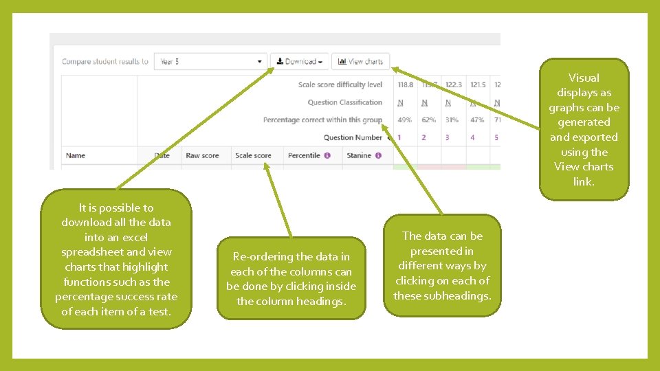
Visual displays as graphs can be generated and exported using the View charts link. It is possible to download all the data into an excel spreadsheet and view charts that highlight functions such as the percentage success rate of each item of a test. Re-ordering the data in each of the columns can be done by clicking inside the column headings. The data can be presented in different ways by clicking on each of these subheadings.

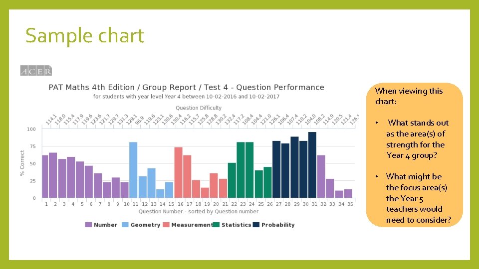
Sample chart When viewing this chart: • What stands out as the area(s) of strength for the Year 4 group? • What might be the focus area(s) the Year 5 teachers would need to consider?

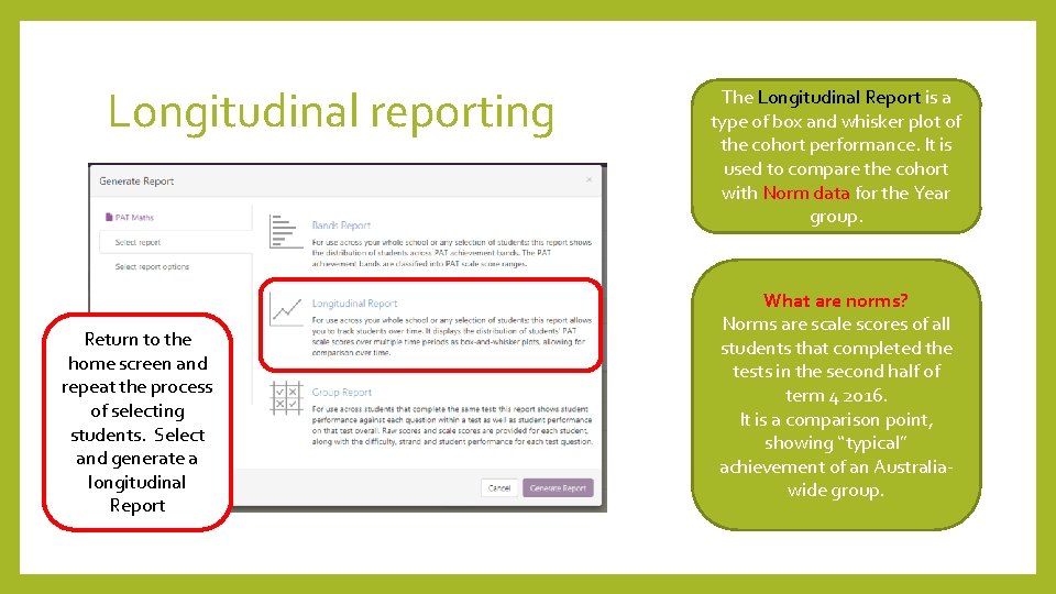
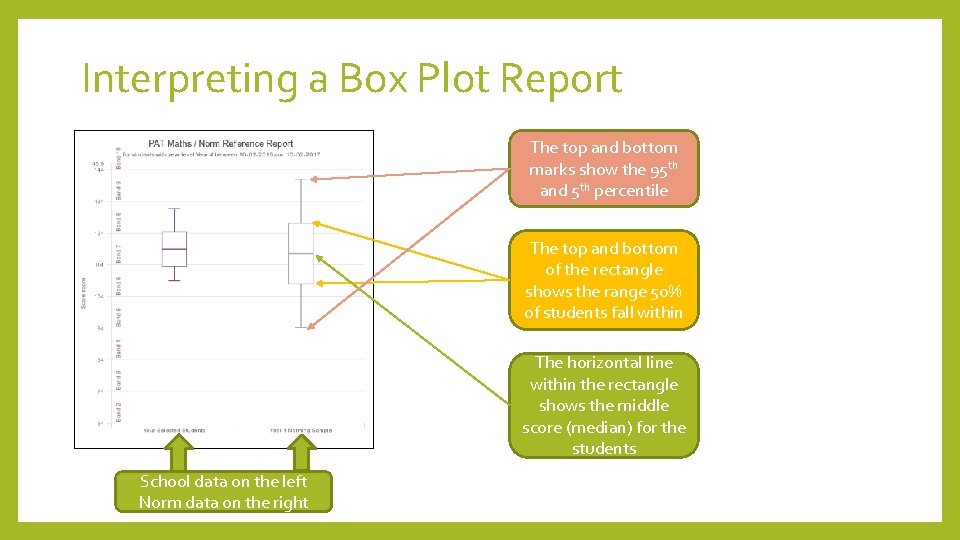
Longitudinal reporting Return to the home screen and repeat the process of selecting students. Select and generate a longitudinal Report The Longitudinal Report is a type of box and whisker plot of the cohort performance. It is used to compare the cohort with Norm data for the Year group. What are norms? Norms are scale scores of all students that completed the tests in the second half of term 4 2016. It is a comparison point, showing “typical” achievement of an Australiawide group.

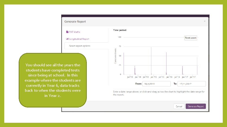
You should see all the years the students have completed tests since being at school. In this example where the students are currently in Year 6, data tracks back to when the students were in Year 2.

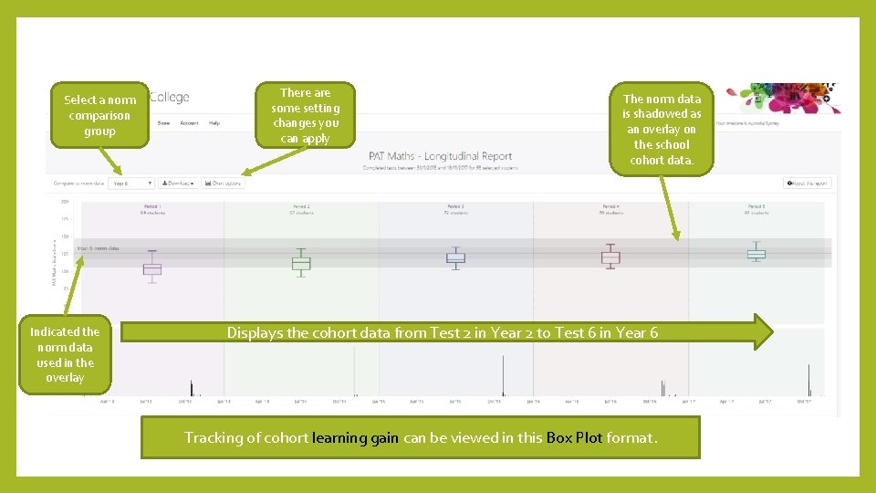
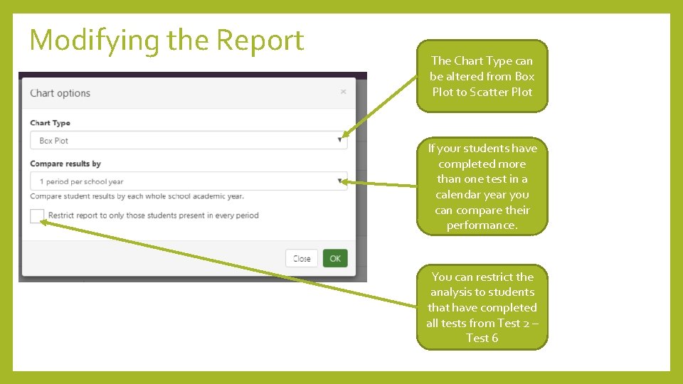
Select a norm comparison group Indicated the norm data used in the overlay There are some setting changes you can apply The norm data is shadowed as an overlay on the school cohort data. Displays the cohort data from Test 2 in Year 2 to Test 6 in Year 6 Tracking of cohort learning gain can be viewed in this Box Plot format.

Interpreting a Box Plot Report The top and bottom marks show the 95 th and 5 th percentile The top and bottom of the rectangle shows the range 50% of students fall within The horizontal line within the rectangle shows the middle score (median) for the students School data on the left Norm data on the right

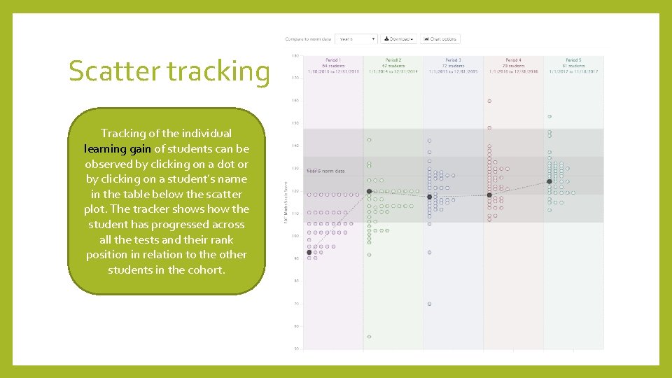
Modifying the Report The Chart Type can be altered from Box Plot to Scatter Plot If your students have completed more than one test in a calendar year you can compare their performance. You can restrict the analysis to students that have completed all tests from Test 2 – Test 6

Scatter tracking Tracking of the individual learning gain of students can be observed by clicking on a dot or by clicking on a student’s name in the table below the scatter plot. The tracker shows how the student has progressed across all the tests and their rank position in relation to the other students in the cohort.

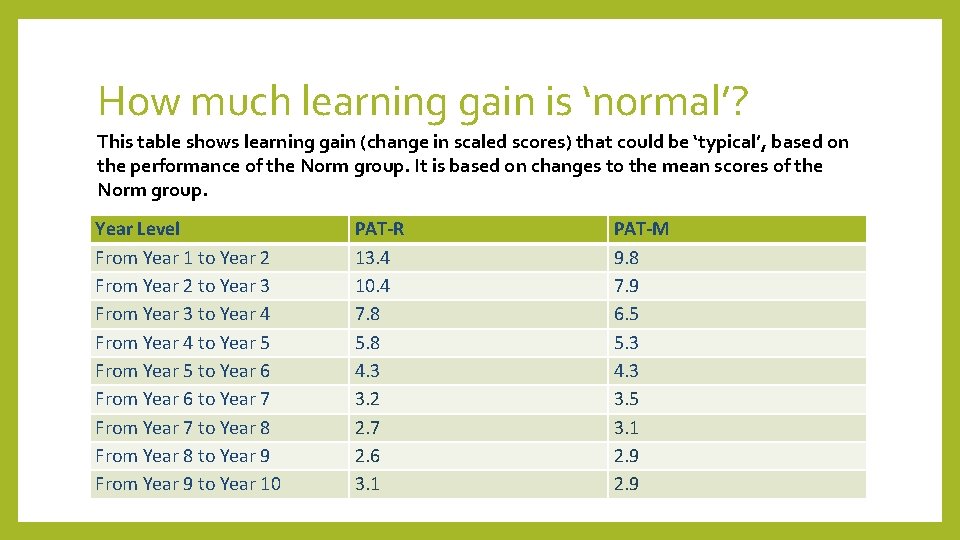
How much learning gain is ‘normal’? This table shows learning gain (change in scaled scores) that could be ‘typical’, based on the performance of the Norm group. It is based on changes to the mean scores of the Norm group. Year Level From Year 1 to Year 2 From Year 2 to Year 3 From Year 3 to Year 4 From Year 4 to Year 5 From Year 5 to Year 6 From Year 6 to Year 7 From Year 7 to Year 8 From Year 8 to Year 9 From Year 9 to Year 10 PAT-R 13. 4 10. 4 7. 8 5. 8 4. 3 3. 2 2. 7 2. 6 3. 1 PAT-M 9. 8 7. 9 6. 5 5. 3 4. 3 3. 5 3. 1 2. 9

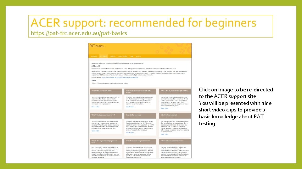
ACER support: recommended for beginners https: //pat-trc. acer. edu. au/pat-basics Click on image to be re-directed to the ACER support site. You will be presented with nine short video clips to provide a basic knowledge about PAT testing

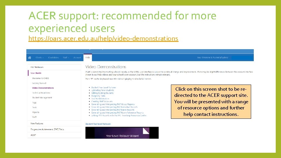
ACER support: recommended for more experienced users https: //oars. acer. edu. au/help/video-demonstrations Click on this screen shot to be redirected to the ACER support site. You will be presented with a range of resource options and further help contact instructions.

How might your school share & use data? • To identify areas for further development for a particular cohort • To track learning gain of both cohorts and individual students • To find out about the achievement of students in a class at the start of the year • To identify areas of strength and weakness of individual students • To relate the image of a student using PAT data to the image gained from other data sets such as NAPLAN and MAI • Reflect on the influence of teacher practice on student achievement and learning gain • In what other ways do you use PAT data? How else could you use the data?