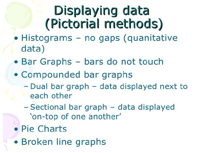
A histogram is a graphical representation of the


- Slides: 58
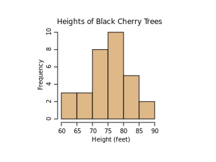
A histogram is a graphical representation of the distribution of data. It is an estimate of the probability distribution of a continuous variable and was first introduced by Karl Pearson.
Histograms are a great way to show results of continuous data, such as: • weight • how much time • etc. But if your data is in categories (such as Country or Favorite Movie), then you should use a Bar Chart.
Description A bar graph is a chart that uses either horizontal or vertical bars to show comparisons among categories. One axis of the chart shows the specific categories being compared, and the other axis represents a discrete value. Some bar graphs present bars clustered in groups of more than one (grouped bar graphs), and others show the bars divided into subparts to show cumulate effect (stacked bar graphs).
SIMPLE BARCHART A bar chart or bar graph is a chart with rectangular bars with lengths proportional to the values that they represent. The bars can be plotted vertically or horizontally. A vertical bar chart is sometimes called a column bar chart.
Advantages 1. It can be drawn quickly 2. The ratios of the bars are readily seems. 3. Can also be used to show values of non categories such as months, different brands etc. Disadvantage 1. One simple information can be shown
MULTIPLE BAR CHARTS It shoes 2 or more characteristics corresponding to the values of a common variable in the form of grouped bars, whose lengths are proportional to the values of the characteristics and each of which is shaded differently to aid identification.
Advantages 1. This type of chart is useful when dealing with two or three categories 2. Comparing categories with in days, a year and the years. 3. By comparing the heights of the bars we are able to see not only the trend, but the difference between the two items (or more) for each of the specific periods of time. Disadvantage 1. It is even more different to group readily the relation between two or three test of figures.
It is preferable when comparing two sets of related data and is an extension of the simple bar graph.
MULTIPLE BAR CHARTS
COMPONENT/COMPOUND BAR CHART It is in which each bar is divided into two or more sections, proportional in size to the components parts of a total being displayed by each bar. They are used to represent the cumulative of the various components of data and the percentages. They are also known as sub divided bars.
2. Subdivided Bar Chart
1. Sectional percentage bar chart
Advantages It is generally used to compare the different sections Disadvantages It doesn’t show clearly the actual amount
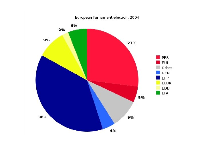
PIE CHART It is a graphic device consisting of a circle divided into sectors or pie-shaped devices whose areas are proportional to the various parts into which the whole quantity is devised Angle = (Component part /whole quantity) x 360 For example If total number of students from UK were 10 out of 50 we will first divide 10 by 50 then will multiply it by 360 according to the formula mentioned above. In the same way we will calculate each and every thing and using these figures we will draw pie chart shown below.
Group EUL PES EFA EDD ELDR EPP UEN Other Total Seats 39 200 42 15 67 276 27 66 732 Percent (%) Central angle (°) 5. 3 19. 2 27. 3 98. 4 5. 7 20. 7 2. 0 7. 4 9. 2 33. 0 37. 7 135. 7 3. 7 13. 3 9. 0 32. 5 99. 9* 360. 2*
ADVANTAGES • It is useful when projections ﺍﻟﺘﻘﺪﻳﺮﺍﺕ are more important than the numerical values. • It provides a strong visual impact. DISADVANTAGE • It can not be drawn quickly as bar chart.
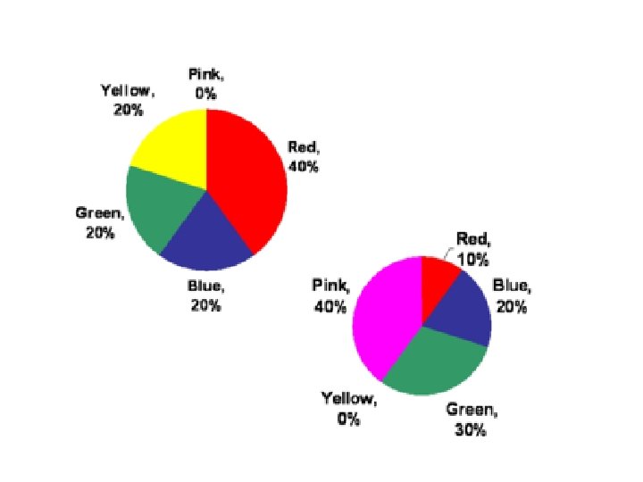
COMPARATIVE PIE CHART The set of data can be compared by using two different pie charts. The area of the circles is proportional to the total quantities they represent. The comparative pie charts are very difficult to read and compare if the ratio of the pie chart is not given. The r 1 and r 2 be, the radius of the circles which represent the total TI and T 2 respectively. Then T 1/ T 2 = (r 1/ r 2)2 This formula is applied when two pie chart similar to each other are given then we will apply formula given T 1/T 2=(r 1/r 2)2. Information is always given in the question or labeled on the pie chart.
Frequency Histogram A Frequency Histogram is a special histogram that uses vertical columns to show frequencies (how many times each score occurs):
Broken Line Graph A broken line graph is a graph that represents information through points or dots, which are then joined together by lines. They are the most common graphs, and are used to represent information that changes over a period of time, i. e. the sale of products over a period of a number of years, or months, or days, etc. types of broken line graphs include the double broken line graph, and triple broken line graph.
Line graph: A line graph is typically used to represent serial data (data that can be collected without gaps such as change in temperature over a time period). Typically, observations are made over regular intervals. Then, these discrete points are plotted and adjacent points are connected with line segments to indicate the serial nature of the data and allow for interpolation ﺍﻟﺰﻳﺎﺩﺓ.
Double line graph:
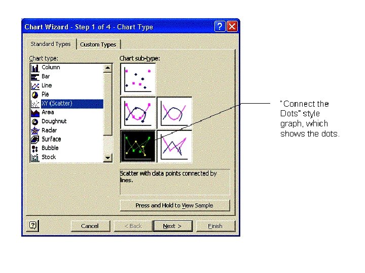
How to Make a Broken-Line Graph in MS Excel When we collect experimental data, we are not using the most accurate of equipment. For this reason, we construct scatter-plots and draw lines of best fit when we are graphing data. When graphing counted data, or when we are graphing data which has been provided with the assurance that it is very accurate, we will “connect the dots” and make a broken-line graph instead. • Enter the data in Excel. Make sure the independent variable is in the first column • Drag a box with the mouse to highlight the data, and then click the chart icon on the toolbar. • Select XY (Scatter), and click on the bottom right chart-type, to show the data points connected by straight lines.
Click “Next” to bring up the Chart Options window of the Chart Wizard. Enter the title and appropriate axis-labels.
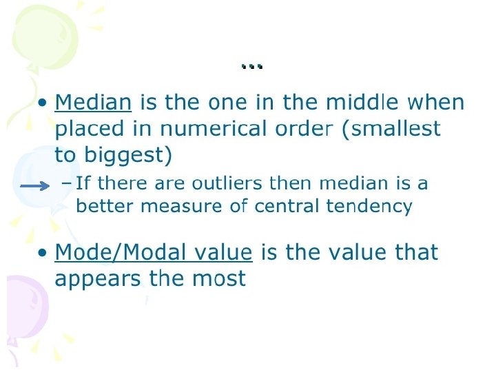
line plot Another form of graph, the line plot, makes it easy to see the mean, median, mode, and range of a set of data. The line plot uses a number line and Xs to represent each number. This line plot shows these scores from the game: 18, 14, 22, 33, 7, 7, 30, 34, 30, 15. • The data has two modes 7 and 30. The line plot lets you see these easily, because the numbers are represented by Xs. • The range is 34 − 7 or 27. • The median, the middle value is the sixth X, or 18. • To find the mean, add the scores and divide by the number of scores (220 ÷ 11 = 20).
18, 14, 22, 33, 7, 7, 30, 34, 30, 15. 7, 7, 10, 14, 15, 18, 22, 30, 33, 34 scores from the game
With so many types of graphs available, students must learn how to choose appropriate types. Ø Bar graphs are often a good choice to show comparisons among data. Ø Histograms show data that is organized in equal intervals. Ø Line graphs and double line graphs are well suited to showing change over time. Ø Circle graphs are well suited for showing parts of a whole.
Chart Title 300 250 200 Axis Title 150 100 50 0 200 Series 1 150 1 2 3 4 5 6 7 8 Series 2 Series 3 100 Series 2 Series 1 50 Axis Title 0 1 65 2 3 4 5 6 7 8 65 64 64 63 63 62 Series 1 61 60 61 59 60 58 0 10 20 30 40 50 60 7 9 11 13 15 17
250 200 150 Series 1 Series 2 100 Series 3 50 0 1 2 3 4 5 2500 2000 1500 Series 1 Series 2 1000 Series 3 500 0 1 2 3 4 5
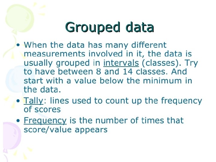
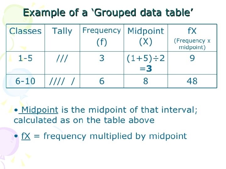
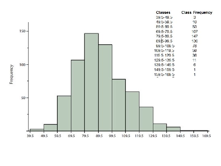
Grouped Frequency Distribution of a Test Scores Classes 39. 5 -49. 5 -59. 5 -69. 5 -79. 5 -89. 5 -99. 5 -109. 5 -119. 5 -129. 5 -139. 5 -149. 5 -159. 5 -169. 5 Lower Limit Class Frequency 3 10 53 107 147 130 78 59 36 11 6 1 1 Upper Limit The first step is to create a frequency table. Unfortunately, a simple frequency table would be too big, containing over 100 rows. To simplify the table, we group scores together as shown
To create this table, the range of scores was broken into intervals, called class intervals. The first interval is from 39. 5 to 49. 5, the second from 49. 5 to 59. 5, etc. Next, the number of scores falling into each interval was counted to obtain the class frequencies. There are 3 scores in the first interval, 10 in the second, etc. In a histogram, the class frequencies are represented by bars. The height of each bar corresponds to its class frequency. A histogram of these data is shown in next Figure.
Frequency Polygon A graph made by joining the middle-top points of the columns of a frequency histogram