Descriptive and inferential statistics Descriptive statistics ways of

- Slides: 10

Descriptive and inferential statistics Descriptive statistics = ways of summarising data Inferential statistics = tests that allow judgements (inferences) about whole populations based on the sample used in a study; they allow you to see whether the research hypothesis or null hypothesis is retained

Levels of measurement • Nominal data – data that is in categories; if it is in one category, it cannot be in another. The categories have verbal descriptions. • Ordinal data – the data is in some kind of rank (order), for instance the order that horses finish in a race • Interval data – when the data is measured on a scale and there are equal intervals between the units on the scale, like someone’s height or the number of items remembered in a memory test.

Identify whether the data in each statement is nominal, ordinal or interval. 1. A psychologist counts the number of males and females who are shopping on a Saturday morning in Churchill Square. 2. A researcher measures how quickly participants can run 50 metres. 3. A researcher measures the temperature at which people feel most aggressive. 4. The social readjustment rating scale counts up the life change units assigned to the items that have happened to the participants in the previous two years. 5. A psychologist counts the number of items out of 20 that students can remember from a memory test. 6. A researcher asks five year olds what their favourite flavours of ice cream are. 7. A researcher asks participants the age they were when they first fell in love. 8. Milgram measured the level of electric shock that participants would give to the confederate. 9. A psychologist measures the attachment style of children: secure or insecure. 10. A researcher asks participants to put ten photographs of faces in order from most to least attractive.

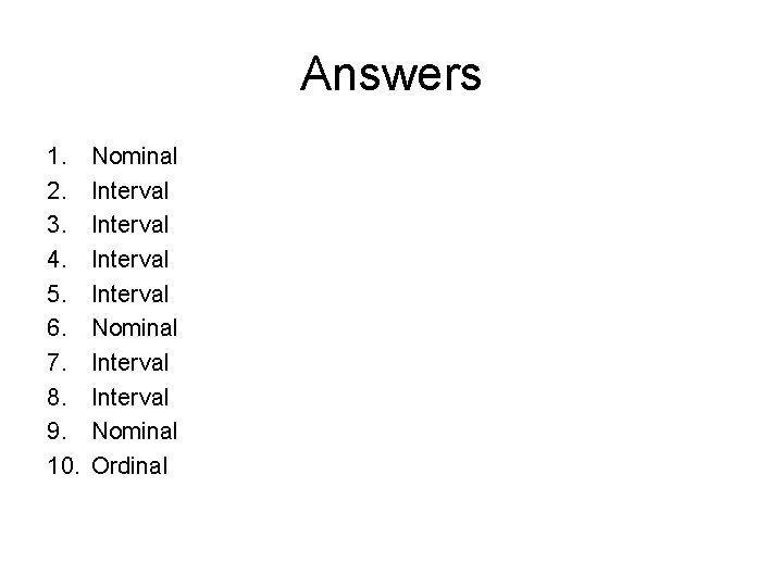
Answers 1. 2. 3. 4. 5. 6. 7. 8. 9. 10. Nominal Interval Nominal Interval Nominal Ordinal

Which type of graph to draw • A bar chart is appropriate for nominal and ordinal data • A histogram is appropriate for interval data • A frequency polygon is appropriate for interval data

How to draw graphs • All graphs should have a title such as bar chart to show … • All axes must be labelled • Pick sensible scales for drawing your graph so they fit on the graph paper • Remember that bar charts must have gaps between the columns. • For histograms the bars touch • A frequency polygon is like a histogram but only the central point of where each column would be is plotted, and these dots are joined

How to draw graphs • Sometimes it is easier to use histograms if the data is in whole units (so is discrete) e. g. number of items remembered from a memory test and frequency polygons if the data is continuous (the result can be at any point on a scale) such as 13 years 5 months 5 days 6 hours and 25 seconds for how old they were when they first fell in love • It is possible to plot different sets of data on a graph. There are sometimes known as clustered graphs. For instance, for the attachment style of children it would be possible to plot the attachment styles of children who do and do not attend nursery on one bar chart. The two columns for each category should touch – so the two columns for secure attachment must touch each other. A key is essential if you are plotting your data in this way.

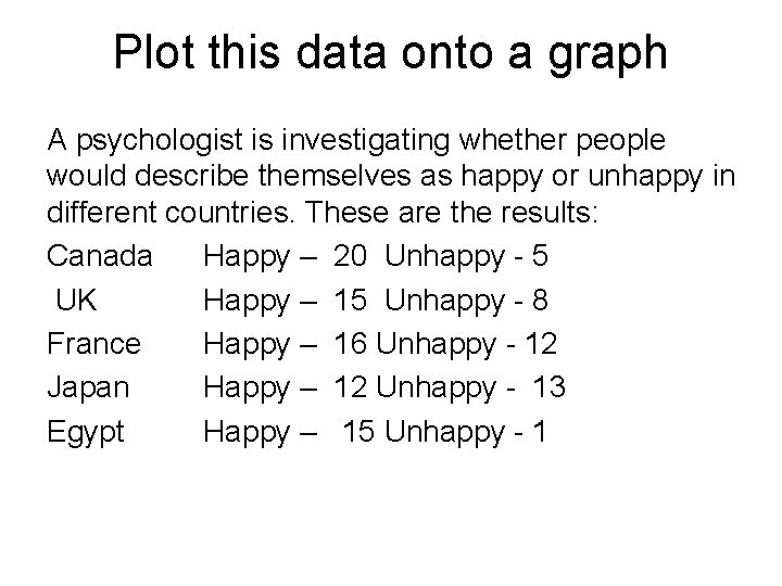
Plot this data onto a graph A psychologist is investigating whether people would describe themselves as happy or unhappy in different countries. These are the results: Canada Happy – 20 Unhappy - 5 UK Happy – 15 Unhappy - 8 France Happy – 16 Unhappy - 12 Japan Happy – 12 Unhappy - 13 Egypt Happy – 15 Unhappy - 1

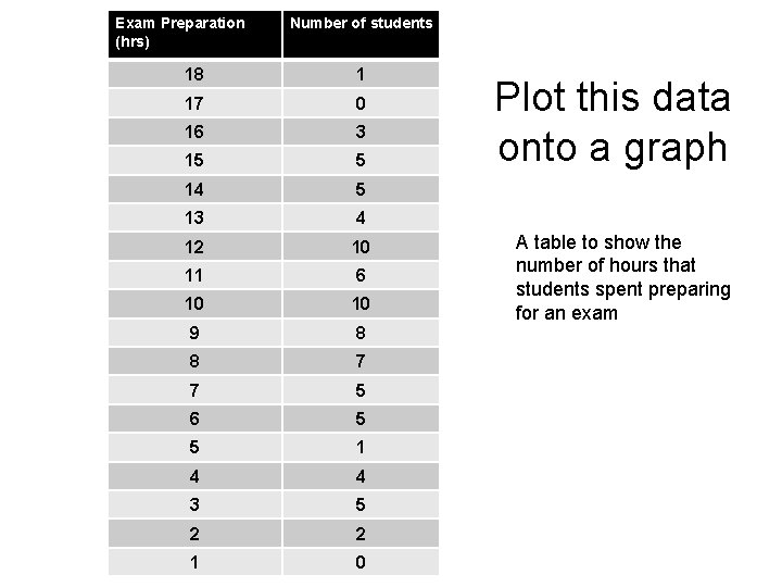
Exam Preparation (hrs) Number of students 18 1 17 0 16 3 15 5 14 5 13 4 12 10 11 6 10 10 9 8 8 7 7 5 6 5 5 1 4 4 3 5 2 2 1 0 Plot this data onto a graph A table to show the number of hours that students spent preparing for an exam

Did you…. • Group the hours of exam prep into class intervals (e. g. 1 -3 hours, 4 -6, 7 -9 etc)? • Keep the bars touching? • Include a title? • Label the axes clearly?