NAMRATHA KALASANNAVAR Applets are small Java applications that


 ➢ start( ) ➢")

 ➢ The init( ) method is the first method to be called. ➢")
 ➢ The stop( ) method is called when a web browser leaves the")
, which is")
. ➢To")


, and show. Document() to display an")


 Because")

 2) Swing component are lightweight component. Swing Support pluggable look and feel.")


- Slides: 72
NAMRATHA KALASANNAVAR
� � Applets are small Java applications that can be accessed on an Internet server, transported over Internet, and can be automatically installed and run as apart of a web document. Any applet in Java is a class that extends the java. applet. Applet class. �Two Types of Applets : It is important to state at the outset that there are two varieties of applets. � The � � first are those based directly on the Applet class. These applets use the Abstract Window Toolkit (AWT) to provide the graphic user interface (or use no GUI at all). This style of applet has been available since Java was first created. � The second type of applets are those based on the Swing class Japplet. � Swing applets use the Swing classes to provide the GUI. Swing offers a richer and often easier-to-use user interface than does the AWT. Thus, Swing -based applets are now the most popular.
� � � � JApplet is the subclass of Applet and Applet class is present in java. Applet Package. Hence all the methods which are present in Applet Class will be inherited by Japplet class. All applets are subclasses (either directly or indirectly) of Applets are not stand-alone programs. Instead, they run within either a web browser or an applet viewer. The illustrations shown in this chapter were created with the standard applet viewer, called applet viewer, provided by the JDK. Execution of an applet does not begin at main( ). Actually, few applets even have main( ) methods. Instead, execution of an applet is started and controlled with an entirely different mechanism, which will be explained shortly. Output to your applet’s window is not performed by System. out. println( ). Rather, in non-Swing applets, output is handled with various AWT methods, such as draw. String( ), which outputs a string to a specified X, Y location. Input is also handled differently than in a console application.
� � � To use an applet, it is specified in an HTML file. One way to do this is by using the APPLET tag. The applet will be executed by a Java-enabled web browser when it encounters the APPLET tag within the HTMLfile. To view and test an applet more conveniently, simply include a comment at the head of your Java source code file that contains the APPLET tag. This way, your code is documented with the necessary HTML statements needed by your applet, and you can test the compiled applet by starting the applet viewer with your Java source code file specified as the target. /* <applet code="My. Applet" width=200 height=60> </applet> */ This comment contains an APPLET tag that will run an applet called My. Applet in a window that is 200 pixels wide and 60 pixels high. Because the inclusion of an APPLET command makes testing applets easier, all of the applets shown in this book will contain the appropriate APPLET tag embedded in a comment.
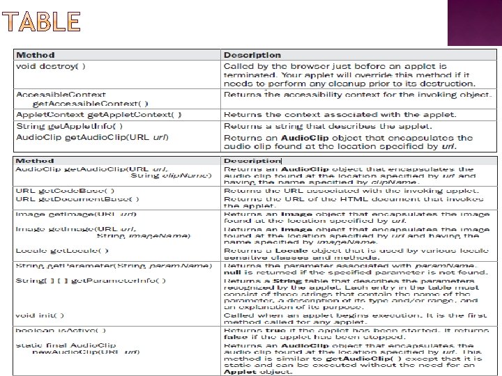
� � � The Applet class defines the methods shown in Table below. Applet provides all necessary support for applet execution, such as starting and stopping. It also provides methods that load and display images, and methods that load and play audio clips. Applet extends the AWT class Panel. In turn, Panel extends Container, which extends Component. These classes provide support for Java’s window-based, graphical interface. Thus, Applet provides all of the necessary support for window-based activities.
� � � An applet is a window-based program. As such, its architecture is different from the console-based programs. First, applets are event driven. Although we won’t examine event handling until the following chapter, it is important to understand in a general way how the eventdriven architecture impacts the design of an applet. An applet resembles a set of interrupt service routines. Here is how the process works. � � � An applet waits until an event occurs. The run-time system notifies the applet about an event by calling an event handler that has been provided by the applet. Once this happens, the applet must take appropriate action and then quickly return. This is a crucial point. For the most part, your applet should not enter a “mode” of operation in which it maintains control for an extended period. Instead, it must perform specific actions in response to events and then return control to the run-time system. In those situations in which your applet needs to perform a repetitive task on its own (for example, displaying a scrolling message across its window), you must start an additional thread of execution.
� � � � Second, the user initiates interaction with an applet—not the other way around. As you know, in a nonwindowed program, when the program needs input, it will prompt the user and then call some input method, such as read. Line( ). This is not the way it works in an applet. Instead, the user interacts with the applet as he or she wants, when he or she wants. These interactions are sent to the applet as events to which the applet must respond. For example, when the user clicks the mouse inside the applet’s window, a mouseclicked event is generated. If the user presses a key while the applet’s window has input focus, a keypress event is generated. When the user interacts with one of these controls, an event is generated. While the architecture of an applet is not as easy to understand as that of a consolebased program, Java makes it as simple as possible.
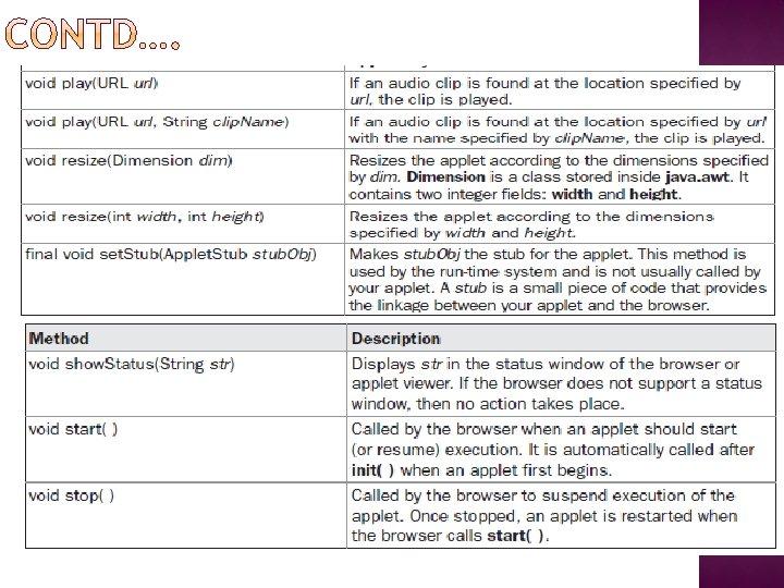
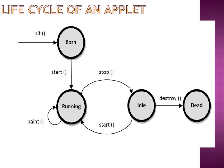
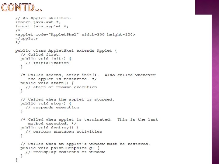
An Applet Skeleton Consists of 4 methods: ➢ init( ) ➢ start( ) ➢ stop( ) ➢ destroy( ) These are defined in Applet. � Applets do not need to override those methods they do not use. � AWT-based applets will also override the paint( ) method, which is defined by the AWT Component class. This method is called when the applet’s output must be redisplayed.
� � It is important to understand the order in which the various methods shown in the skeleton are called. When an applet begins, the following methods are called, in this sequence: 1. init( ) 2. start( ) 3. paint( ) When an applet is terminated, the following sequence of method calls takes place: 1. stop( ) 2. destroy( ) When minimized: 1. stop() When Maximized: 1. start() 2. paint()
init() ➢ The init( ) method is the first method to be called. ➢ This is where you should initialize variables. ➢ This method is called only once during the run time of your applet. start() ➢ The start( ) method is called after init( ). ➢ It is also called to restart an applet after it has been stopped. ➢ start( ) is called each time an applet’s HTML document is displayed onscreen. ➢ So, if a user leaves a web page and comes back, the applet resumes execution a start( ). paint() ➢ The paint( ) method is called each time your applet’s output must be redrawn. ➢ For example, the window in which the applet is running may be overwritten by another window and then uncovered. ➢ Or the applet window may be minimized and then restored. paint( ) is also called when the applet begins execution. ➢ Whatever the cause, whenever the applet must redraw its output, paint( ) is called. ➢ The paint( ) method has one parameter of type Graphics.
stop() ➢ The stop( ) method is called when a web browser leaves the HTML document containing the applet. ➢ For example : when it goes to another page. ➢ You should use stop( ) to suspend threads that don’t need to run when the applet is not visible. ➢ You can restart them when start( ) is called if the user returns to the page. destroy() ➢ The destroy( ) method is called when the environment determines that your applet needs to be removed completely from memory. ➢ At this point, you should free up any resources the applet may be using. ➢ The stop( ) method is always called before destroy( ).
➢ To output a string to an applet, use draw. String( ), which is a member of the Graphics class. ➢ Typically, it is called from within paint(). ➢ It has the following general form: void draw. String(String message, int x, int y) ➢ Here, message is the string to be output beginning at x, y. ➢ In a Java window, the upper-left corner is location 0, 0. ➢ The draw. String( ) method will not recognize newline characters. ➢ If you want to start a line of text on another line, you must do so manually, specifying the precise X, Y location where you want the line to begin.
➢To set the background color of an applet’s window, use set. Background( ). ➢To set the foreground color, use set. Foreground( ). ➢These methods are defined by Component, and they have the following general forms: void set. Background(Color new. Color) void set. Foreground(Color new. Color) ➢ Here, new. Color specifies the new color. ➢ The class Color defines the constants shown here that can be used to specify colors:
The following example sets the background color to green and the text color to red: set. Background(Color. green); set. Foreground(Color. red); ➢A good place to set the foreground and background colors is in the init( ) method. ➢You can obtain the current settings for the background and foreground colors by calling get. Background( ) and get. Foreground( ), respectively. ➢They are also defined by Component and are shown here: Color get. Background( ) Color get. Foreground( ) EXAMPLE
➢ As a general rule, an applet writes to its window only when its update( ) or paint( ) method is called by the AWT. This raises an interesting question: How can the applet itself cause its window to be updated when its information changes? � For example, if an applet is displaying a moving banner, what mechanism does the applet use to update the window each time this banner scrolls? � Remember, one of the fundamental architectural constraints imposed on an applet is that it must quickly return control to the run-time system. It cannot create a loop inside paint( ) that repeatedly scrolls the banner, for example � The AWT will then execute a call to paint( ), which can display the stored information. � This would prevent control from passing back to the AWT. Given this constraint, it may seem that output to your applet’s window will be difficult at best. � Fortunately, this is not the case. Whenever your applet needs to update the information displayed in its window, it simply calls repaint( ). The repaint( ) method is defined by the AWT. repaint() calls paint(). ➢ Thus, for another part of your applet to output to its window, simply store the output and then call repaint( ).
➢ For example, if part of your applet needs to output a string, it can store this string in String variable and then call repaint( ). Inside paint( ), you will output the string using draw. String( ). The repaint( ) method has four forms. 1. void repaint( ) ➢ This version causes the entire window to be repainted. ➢ The following version specifies a region that will be repainted: 2. void repaint(int left, int top, int width, int height) ➢ Here, the coordinates of the upper-left corner of the region are specified by left and top, and the width and height of the region are passed in width and height. ➢ These dimensions are specified in pixels. ➢ You save time by specifying a region to repaint. ➢ If you need to update only a small portion of the window, it is more efficient to repaint only that region. ➢The other 2 forms are as follows: void repaint(long max. Delay) void repaint(long max. Delay, int x, int y, int width, int height) Here, max. Delay specifies the maximum number of milliseconds that can elapse before update( ) is called.
➢ In addition to displaying information in its window, an applet can also output a message to the status window of the browser or applet viewer on which it is running. ➢ To do so, call show. Status( ) with the string that you want displayed. ➢ The status window is a good place to give the user feedback about what is occurring in the applet, suggest options, or possibly report some types of errors. ➢ The status window also makes an excellent debugging aid, because it gives you an easy way to output information about your applet. ➢ Ex: Status. Window. java
An applet viewer will execute each APPLET tag that it finds in a separate window, while web browsers will allow many applets on a single page. � ➢ So far, we have been using only a simplified form of the APPLET tag. Now it is time to take a closer look at it. � ➢ The syntax for a fuller form of the APPLET tag is shown here. Bracketed items are optional. �➢
� The syntax for a fuller form of the APPLET tag is shown here. Bracketed items are optional. < APPLET [CODEBASE = codebase. URL] CODE = applet. File [ALT = alternate. Text] [NAME = applet. Instance. Name] WIDTH = pixels HEIGHT = pixels [ALIGN = alignment] [VSPACE = pixels] [HSPACE = pixels] > [< PARAM NAME = Attribute. Name VALUE = Attribute. Value>] [< PARAM NAME = Attribute. Name 2 VALUE = Attribute. Value>]. . . [HTML Displayed in the absence of Java] </APPLET>
� CODEBASE: � CODE: � ALT : � NAME : � WIDTH and HEIGHT are required attributes that give the size (in pixels) of the applet CODEBASE is an optional attribute that specifies the base URL of the applet code, which is the directory that will be searched for the applet’s executable class file. CODE is a required attribute that gives the name of the file containing your applet’s compiled. class file. The ALT tag is an optional attribute used to specify a short text message that should be displayed if the browser recognizes the APPLET tag but can’t currently run Java applets. NAME is an optional attribute used to specify a name for the applet instance. Applets must be named in order for other applets on the same page to find them by name and communicate with them. display area. � ALIGN : ALIGN is an optional attribute that specifies the alignment of the applet. The possible values are LEFT, RIGHT, TOP, BOTTOM, MIDDLE, BASELINE, TEXTTOP, ABSMIDDLE, and ABSBOTTOM � VSPACE and HSPACE : These attributes are optional. VSPACE specifies the space, in pixels, above and below the applet. HSPACE specifies the space, in pixels, on each side of the applet. They’re treated the same as the IMG tag’s VSPACE and HSPACE attributes.
The APPLET tag in HTML allows you to pass parameters to your applet. � ➢ To retrieve a parameter, use the get. Parameter( ) method. � ➢ It returns the value of the specified parameter in the form of a String object. � ➢ Thus, for numeric and boolean values, you will need to convert their string representations into their internal formats. �➢
Java will allow the applet to load data from the directory holding the HTML file that started the applet (the document base) and the directory from which the applet’s class file was loaded (the code base). ➢ These directories are returned as URL objects by get. Document. Base( ) and get. Code. Base( ). ➢ They can be concatenated with a string that names the file you want to load. ➢ Import java. net. *; ➢ Ex: Bases. java DCBases. html
To allow your applet to transfer control to another URL, you must use the show. Document( ) method defined by the Applet. Context interface. ➢ Applet. Context is an interface that lets you get information from the applet’s execution environment. ➢ Within an applet, once you have obtained the applet’s context, you can bring another document into view by calling show. Document( ). ➢ Ex: The following applet demonstrates Applet. Context and show. Document( ). Upon execution, it obtains the current applet context and uses that context to transfer control to a file called Test. html.
/* Using an applet context, get. Code. Base(), and show. Document() to display an HTML file. � */ � import java. awt. *; � import java. applet. *; � import java. net. *; � /* � <applet code="ACDemo" width=300 height=50> � </applet> � */ � public class ACDemo extends Applet{ � public void start() { � Applet. Context ac = get. Applet. Context(); � URL url = get. Code. Base(); // get url of this applet � try { � ac. show. Document(new URL(url+"Test. html")); � } catch(Malformed. URLException e) { � show. Status("URL not found"); � } � }
� In earlier days of Java AWT classes were used to create Graphical User Interface(GUI’s). � Now no longer AWT Classes are used to develop GUI. � Today, most programmers use Swing for this purpose because “Swing is a set of classes that provides more powerful and flexible GUI components than does the AWT” � Earlier to swing, Java programmer uses AWT classes to develop GUI’s but AWT classes contains limited graphical interface. � This is one of reason that programmer wants to develop different component, that has more flexible and rich in graphical interface. � Because of the limited graphical interface AWT translate its various visual components into their corresponding, platform-specific equivalents, or peers. That means look and feel of the component is decided by platform, not by JAVA. � Because the AWT components use native code resources, they are referred to as heavyweight.
� The usage of native resources of platform led to following problems 1) Because of variations between operating systems, a component might look, or even act, differently on different platforms which also threaten the philosophy of java “write once, run anywhere”. 2) Second, the look and feel of each component was fixed and could not be (easily) changed. The use of heavyweight components caused some frustrating restrictions. 3) This Restriction and limitation of AWT classes create serious issues for programmer so SWINGS came into picture. Introduced in 1997, Swing was included as part of the Java Foundation Classes (JFC). Java Swing component is completely incorporated in JDK 1. 2.
� There is one important point to be remembered that Although SWING eliminates number of limitations of AWT classes, but SWING doesn't replace it. � Swing is built on the foundation of the AWT.
1) 2) Swing component are lightweight component. Swing Support pluggable look and feel.
� � In general, a visual component is a composite of three distinct aspects: • The way that the component looks when rendered on the screen • The way that the component reacts to the user • The state information associated with the component the model corresponds to the state information associated with the component. For example, in the case of a check box, the model contains a field that indicates if the box is checked or unchecked. The view determines how the component is displayed on the screen, including any aspects of the view that are affected by the current state of the model. The controller determines how the component reacts to the user. For example, when the user clicks a check box, the controller reacts by changing the model to reflect the user’s choice (checked or unchecked). However MVC architecture is Conceptually good and sound. But there is high level of separation between view and controller which is not beneficial for SWINGS.
� � � Hence swing uses a modified version of MVC that combines the view and the controller into a single logical entity. For this reason, Swing’s approach is called either the Model-Delegate architecture or the Separable Model architecture. Swing’s pluggable look and feel is made possible by its Model-Delegate architecture. Because the view (look) and controller (feel) are separate from the model, the look and feel can be changed without affecting how the component is used within a program. Conversely, it is possible to customize the model without affecting the way that the component appears on the screen or responds to user input. To support the Model-Delegate architecture, most Swing components contain two objects. 1) model 2) UI Delegate
� A Swing GUI consists of two key items: components and containers.
� Component is an independent visual control, such as a push button or slider. � A container holds a group of components � Thus, a container is a special type of component that is designed to hold other components. � Furthermore, in order for a component to be displayed, it must be held within a container. Thus, all Swing GUIs will have at least one container. � Container can also hold another container.
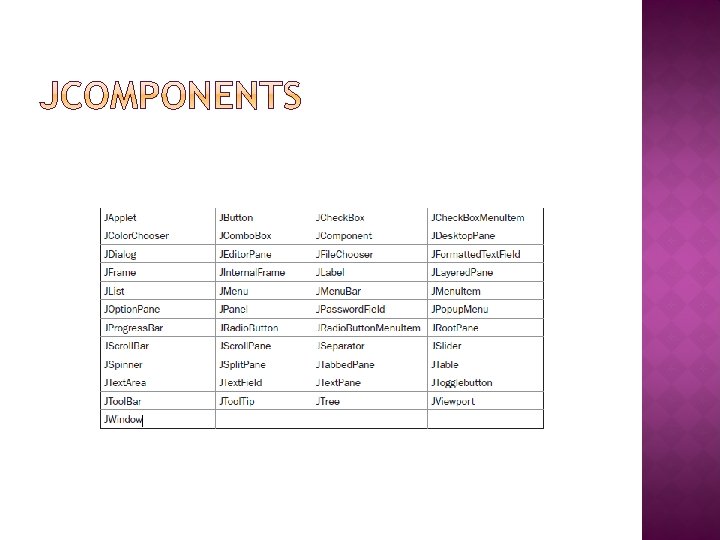
� In general, Swing components are derived from the JComponent class. � JComponent provides the functionality that is common to all components. For example, JComponent supports for the pluggable look and feel. � JComponent inherits the AWT classes Container and Component. � All Swing components are present in the package Javax. swing
� Swing defines two types of containers. � The first are top-level containers: JFrame, JApplet, JWindow, and JDialog. � The second type of containers supported by Swing are lightweight containers. � top-level containers are heavyweight containers. � Top-level containers do not inherit JComponent. � Lightweight containers do inherit JComponent. � An example of a lightweight container is JPanel, which is a general-purpose container.
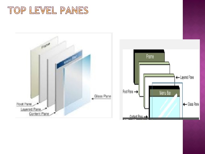
� � � � � Each top-level container defines a set of panes. At the top of the hierarchy is an instance of JRoot. Pane is a lightweight container whose purpose is to manage the other panes. The panes that comprise the root pane are called the glass pane, the content pane, and the layered pane. The glass pane is the top-level pane. It sits above and completely covers all other panes. The glass pane enables you to manage mouse events that affect the entire container (rather than an individual control) or to paint over any other component. The layered pane is an instance of JLayered. Pane. The layered pane allows components to be given a depth value. This value determines which component overlays another.
� These are the packages used by Swing that are defined by Java SE 6. � The main package is javax. swing.
� � � Swing programs differ from both the console-based programs and the AWTbased programs. In the following program we are using two swing component: JFrame and JLabel. JFrame is the top-level container that is commonly used for Swing applications. JLabel is the Swing component that creates a label, which is a component that displays information. A simple Swing application.
� When swing component do respond to user input and the events are generated by those interactions. � An event need to handle by using event handlers. � The event handling mechanism used by Swing is the same as that used by the AWT. � In many cases, Swing uses the same events as does the AWT, and these events are packaged in java. awt. event. � Events specific to Swing are stored in javax. swing. event. � Consider the example
� Swing-based applets are similar to AWT-based applets. � but with an important difference: A Swing applet extends JApplet rather than Applet. � JApplet is derived from Applet. � Thus, JApplet includes all of the functionality found in Applet and adds support for Swing.
� � � � Although the Swing component set is quite powerful, you are not limited to using it because Swing also lets you write directly into the display area of a frame, panel, or one of Swing’s other components, such as JLabel. To write output directly to the surface of a component, you will use one or more drawing methods defined by the AWT, such as draw. Line( ) or draw. Rect( ). The AWT class Component defines a method called paint( ) that is used to draw output directly to the surface of a component. In most of the time paint( ) method is not directly called by your program. Rather, paint( ) is called by the run-time system. Because JComponent inherits Component, all Swing’s lightweight components inherit the paint( ) method. Swing uses a bit more sophisticated approach to painting that involves three distinct methods: paint. Component( ), paint. Border( ), and paint. Children( ). The paint. Component( ) method is shown here: protected void paint. Component(Graphics g) The parameter g is the graphics context to which output is written.
� � � When drawing to the surface of a component, you must be careful to restrict your output to the area that is inside the border. Although Swing automatically clips any output that will exceed the boundaries of a component. To obtain the border width, call get. Insets( ), shown here: Insets get. Insets( ) This method is defined by Container and overridden by JComponent. The inset values can be obtained by using these fields: int top; int bottom; int left; int right; These values are then used to compute the drawing area given the width and the height of the component. You can obtain the width and height of the component by calling get. Width( ) and get. Height( ) on the component.
� � � Here in this topic we are going to discuss about Swing components that provide rich functionality and allow a high level of customization. Ex: buttons, check boxes, trees, and tables These components are all lightweight, which means that they are all derived from JComponent. One other point: The Swing components are demonstrated in applets because the code for an applet is more compact than it is for a desktop application.
� � � JLabel is Swing’s easiest-to-use component. It creates a label. JLabel can be used to display text and/or an icon. It is a passive component in that it does not respond to user input. The Following are three forms of Jlabel (Constructor). JLabel(Icon icon) JLabel(String str, Icon icon, int align) Here, str and icon are the text and icon used for the label. � The align argument specifies the horizontal alignment of the text and/or icon within the dimensions of the label. It must be one of the following values: LEFT, RIGHT, CENTER, LEADING, or TRAILING. � One of the easiest way to obtain an icon is to use the Image. Icon class. � Image. Icon implements Icon and encapsulates an image. General Form is Image. Icon(String filename)
� � � Filename is the name of the image if it is present in same folder, otherwise you should add URL. The icon and text associated with the label can be obtained by the following methods: void set. Icon(Icon icon): To set the icon associated with label. void set. Text(String str): To set the text associated with label. Icon get. Icon( ) : To obtain already set icon associated with label. String get. Text( ): To obtain already set text associated with label. Consider the example
� JText. Field is the simplest Swing text component. It is also probably its most widely used text component. � JText. Field allows you to edit one line of text. � Three of JText. Field’s constructors are shown here: � JText. Field(int cols) JText. Field(String str, int cols) Jtext. Field(String str) Here, str is the string to be initially presented, and cols is the number of columns in the text field. If the number of columns is not specified, the text field is sized to fit the specified string. JText. Field generates events in response to user interaction. For example, an Action. Event is fired when the user presses ENTER. To obtain the current text use get. Text( ). � PROGRAMMING EXAMPLE. � �
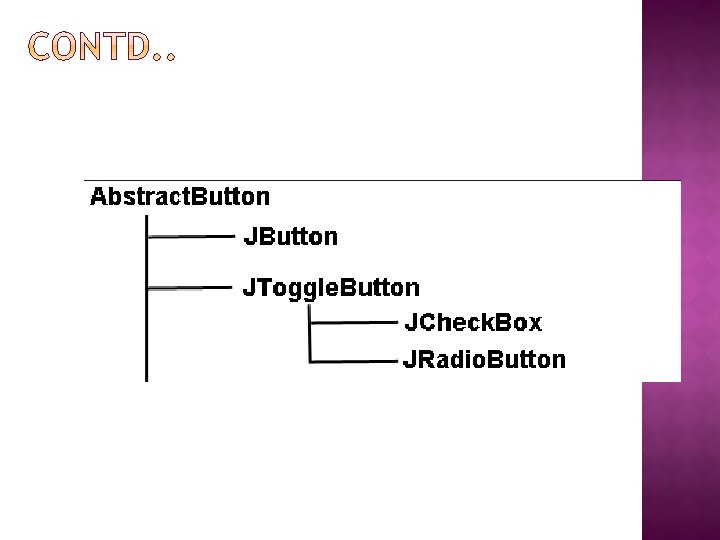
� � � � Swing defines four types of buttons: JButton, JToggle. Button, JCheck. Box, and JRadio. Button. All are subclasses of the Abstract. Button class, which extends JComponent. Abstract. Button contains many methods that allow you to control the behavior of buttons. For example, you can define different icons that are displayed for the button when it is disabled, pressed, or selected. void set. Disabled. Icon(Icon di) void set. Pressed. Icon(Icon pi) void set. Selected. Icon(Icon si) void set. Rollover. Icon(Icon ri) Here, di, pi, si, and ri are the icons to be used for the indicated purpose. The text associated with a button can be read and written via the following methods: String get. Text( ): Read void set. Text(String str): Written
� � � The JButton class provides the functionality of a push button. JButton allows an icon, a string, or both to be associated with the push button. Three of its constructors are shown here: JButton(Icon icon) JButton(String str, Icon icon) Here, str and icon are the string and icon used for the button. � When the button is pressed, an Action. Event is generated. Using the Action. Event object passed to the action. Performed( ) method of the registered Action. Listener, you can obtain the action command string associated with the button. � In the preceding chapter, you saw an example of a text-based button. The following demonstrates an icon-based button. It displays four push buttons and a label. Each button displays an icon that represents the flag of a country. � get. Action. Command( ): This method is used to display the result of action taken when an event is generated.
A useful variation on the push button is called a toggle button. � A toggle button looks just like a push button, but it acts differently because it has two states: pushed and released. � When you press toggle button first time, it stays pressed(pushed). When you press the button second time, it will be released(pops up). � Toggle buttons are objects of the JToggle. Button class. JToggle. Button implements Abstract. Button. � JToggle. Button defines several constructors. The one used by the example in this section is shown here: JToggle. Button(String str) � This creates a toggle button that contains the text passed in str. � Like JButton, JToggle. Button generates an action event each time it is pressed. � however, JToggle. Button also generates an item event. � To handle item events, you must implement the Item. Listener interface. � Easiest way to determine the state of the button is by using this method: is. Selected( ); It returns the Boolean value : true or false �
� The JCheck. Box class provides the functionality of a check box. which provides support for two-state buttons. � JCheck. Box defines several constructors. The one used here is JCheck. Box(String str); It creates a check box that has the text specified by str as a label. When the user selects or deselects a check box, an Item. Event is generated. Item. Event passed to the item. State. Changed( ) method defined by Item. Listener. � The easiest way to determine the selected state of a check box is to call is. Selected( ) method. � In addition to supporting the normal check box operation, JCheck. Box lets you specify the icons that indicate when a check box is selected, cleared, and rolled -over. �
� � Radio buttons are a group of mutually exclusive buttons, in which only one button can be selected at any one time. They are supported by the JRadio. Button class, which extends JToggle. Button. JRadio. Button provides several constructors. JRadio. Button(String str) � � � Here, str is the label for the button. Only one of the buttons in the group can be selected at any time. For example, if a user presses a radio button that is in a group, any previously selected button in that group is automatically deselected. A JRadio. Button generates action events, item events, and change events each time the button selection changes. Most often, it is the action event that is handled, which means that you will normally implement the Action. Listener interface. Inside this method, you can use a number of different ways to determine which button was selected. get. Action. Command( ): This method is used to display the result of action taken when an event is generated.
� � � � JTabbed. Pane encapsulates a tabbed pane. It manages a set of components by linking them with tabs. Selecting a tab causes the component associated with that tab to come to the forefront. JTabbed. Pane defines three constructors. We will use its default constructor, which creates an empty control with the tabs positioned across the top of the pane. Tabs are added by calling add. Tab( ). Here is one of its forms: void add. Tab(String name, Component comp) Here, name is the name for the tab, and comp is the component that should be added to the tab. Often, the component added to a tab is a JPanel that contains a group of related components. The general procedure to use a tabbed pane is outlined here: 1. Create an instance of JTabbed. Pane. 2. Add each tab by calling add. Tab( ). 3. Add the tabbed pane to the content pane.
� � � � JScroll. Pane is a lightweight container that automatically handles the scrolling of another component. If the object being scrolled is larger than the viewable area, horizontal and/or vertical scroll bars are automatically provided, and the component can be scrolled through the pane. Because JScroll. Pane automates scrolling, it usually eliminates the need to manage individual scroll bars. The viewable area of a scroll pane is called the viewport. It is a window in which the component being scrolled is displayed. Thus, the viewport displays the visible portion of the component being scrolled. The scroll bars scroll the component through the viewport. In its default behavior, a JScroll. Pane will dynamically add or remove a scroll bar as needed. For example, if the component is taller than the viewport, a vertical scroll bar is added. If the component will completely fit within the viewport, the scroll bars are removed.
� JScroll. Pane defines several constructors. The one used in this chapter is shown here: JScroll. Pane(Component comp) The component to be scrolled is specified by comp. Here are the steps to follow to use a scroll pane: 1. Create the component to be scrolled. 2. Create an instance of JScroll. Pane, passing to it the object to scroll. 3. Add the scroll pane to the content pane. Consider the example of JScroll. Pane, where first panel is created by using Jpanel. � 400 buttons are added to It, arranged into 20 columns.
� � In Swing, the basic list class is called JList. It supports the selection of one or more items from a list. JList provides several constructors. The one used here is JList(Object[ ] items) This creates a JList that contains the items in the array specified by items. JList is based on two models. The first is List. Model ------- The second model is the List. Selection. Model interface. This defines how to access list of data � This determine what list item is selected Although a JList will work properly by itself, most of the time you will wrap a Jlist inside a JScroll. Pane.
A JList generates a List. Selection. Event when the user makes or changes a selection. � This event is also generated when the user deselects an item. � It is handled by implementing List. Selection. Listener. � This listener specifies only one method, called value. Changed( ), which is shown here: void value. Changed(List. Selection. Event le) Here, le is a reference to the object that generated the event. � Both List. Selection. Event and List. Selection. Listener are packaged in javax. swing. event. � By default, a JList allows the user to select multiple ranges of items within the list, but you can change this behavior by calling set. Selection. Mode( ). � This method is defined by JList. It is shown here: void set. Selection. Mode(int mode) � Here, mode specifies the selection mode. It must be one of these values defined by List. Selection. Model: 1) SINGLE_SELECTION 2) SINGLE_INTERVAL_SELECTION 3) MULTIPLE_INTERVAL_SELECTION �
The default, multiple-interval selection, lets the user select multiple ranges of items within a list. � With single selection, the user can select only a single item. � With single-interval selection, the user can select one range of items � You can obtain the index of the first item selected using the method get. Selected. Index( ). int get. Selected. Index( ); � Indexing begins at zero. So, if the first item is selected, this method will return 0. If no item is selected, – 1 is returned. � Instead of obtaining the index of a selection, you can obtain the value associated with the selection by calling get. Selected. Value( ): Object get. Selected. Value( ) It returns a reference to the first selected value. If no value has been selected, it returns null. �
� � Swing provides a combo box (a combination of a text field and a drop-down list) through the JCombo. Box class. A combo box normally displays one entry, but it will also display a drop-down list that allows a user to select a different entry. � The JCombo. Box constructor used by the example is shown here: � JCombo. Box(Object[ ] items) Here, items is an array that initializes the combo box. JCombo. Box uses the Combo. Box. Model. Mutable combo boxes (those whose entries can be changed) use the Mutable. Combo. Box. Model. Items can be dynamically added to the list of choices via the add. Item( ) method � void add. Item(Object obj) Here, obj is the object to be added to the combo box. JCombo. Box generates an action event when the user selects an item from the list. � JCombo. Box also generates an item event when the state of selection changes, which occurs when an item is selected or deselected. � Here two events will occur, one for selected item, another for deselected item.
� One way to obtain the item selected in the list is to call get. Selected. Item( ) on the combo box. Object get. Selected. Item( )
� � � A tree is a component that presents a hierarchical view of data. The user has the ability to expand or collapse individual subtrees in this display. Trees are implemented in Swing by the JTree class. A sampling of its constructors is shown here: JTree(Object obj[ ]) JTree(Vector<? > v) JTree(Tree. Node tn) In the first form, the tree is constructed from the elements in the array obj. The second form constructs the tree from the elements of vector v. In the third form, the tree whose root node is specified by tn specifies the tree. Although JTree is packaged in javax. swing JTree relies on two models: Tree. Model and Tree. Selection. Model. 3 Events are generated by JTreecomponent 1) Tree. Expansion. Event 2) Tree. Selection. Event 3) Tree. Model. Event.
Tree. Expansion. Event events occur when a node is expanded or collapsed. � A Tree. Selection. Event is generated when the user selects or deselects a node within the tree. � ATree. Model. Event is fired when the data or structure of the tree changes. � The listeners for these events are Tree. Expansion. Listener, Tree. Selection. Listener, and Tree. Model. Listener, respectively. � The tree event classes and listener interfaces are packaged in javax. swing. event. � In the example shown, we are using Tree. Selection. Event and the listener for this event is Tree. Selection. Listener. � It defines only one method, called value. Changed( ), which receives the Tree. Selection. Event object. � You can obtain the path to the selected object by calling get. Path( ) Tree. Path get. Path( ): This returns a Tree. Path object that describes the path to the changed node. The Mutable. Tree. Node interface extends Tree. Node �
It declares methods that can insert and remove child nodes or change the parent node. � One of its constructors is shown here: Default. Mutable. Tree. Node(Object obj) � Here, obj is the object to be enclosed in this tree node. The new tree node doesn’t have a parent or children. � To add the child nodes to tree we have add( ) method. void add(Mutable. Tree. Node child) Here, child is a mutable tree node that is to be added as a child to the current node. � JTree does not provide any scrolling capabilities of its own. So, a JTree is typically placed within a JScroll. Pane. Here are the steps to follow to use a tree: � 1. Create an instance of JTree. � 2. Create a JScroll. Pane and specify the tree as the object to be scrolled. � 3. Add the tree to the scroll pane. � 4. Add the scroll pane to the content pane. �
� � � � � JTable is a component that displays rows and columns of data. You can drag the cursor on column boundaries to resize columns. Depending on its configuration, it is also possible to select a row, column, or cell within the table, and to change the data within a cell. JTable is a sophisticated component that offers many more options and features than can be discussed here. JTable is easy to use—especially if you simply want to use the table to present data in a tabular format. Like JTree, JTable has many classes and interfaces associated with it. These are packaged in javax. swing. table. JTable is conceptually simple. It is a component that consists of one or more columns of information. At the top of each column is a heading. In addition to describing the data in a column, the heading also provides the mechanism by which the user can change the size of a column or change the location of a column within the table.
JTable does not provide any scrolling capabilities of its own. Instead, you will normally wrap a Jtable inside a JScroll. Pane. � JTable supplies several constructors. The one used here is JTable(Object data[ ][ ], Object col. Heads[ ]) � Here, data is a two-dimensional array of the information to be presented, and col. Heads is a one-dimensional array with the column headings. � JTable relies on three models. 1) Table. Model: This model defines those things related to displaying data in a two-dimensional format. 2) Table. Column. Model: specifies the characteristics of a column. 3) List. Selection. Model: This model determines how items are selected. � A JTable can generate several different events. The two most fundamental to a table’s operation are List. Selection. Event and Table. Model. Event. � By default, JTable allows you to select one or more complete rows, but you can change this behavior to allow one or more columns, or one or more individual cells to be selected. �
Here are the steps required to set up a simple JTable that can be used to display data: 1. Create an instance of JTable. 2. Create a JScroll. Pane object, specifying the table as the object to scroll. 3. Add the table to the scroll pane. 4. Add the scroll pane to the content pane. �