Looking at Data Relationships Scatterplots IPS Chapter 2

- Slides: 102

Looking at Data - Relationships Scatterplots IPS Chapter 2. 1 © 2009 W. H. Freeman and Company

Objectives (IPS Chapter 2. 1) Scatterplots p Explanatory and response variables p Interpreting scatterplots p Outliers p Categorical variables in scatterplots p Scatterplot smoothers

Examining Relationships Most statistical studies involve more than one variable. Questions: p What individuals does the data describe? p What variables are present and how are they measured? p Are all of the variables quantitative? p Do some of the variables explain or even cause changes in other variables?

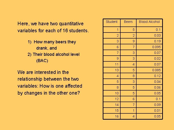
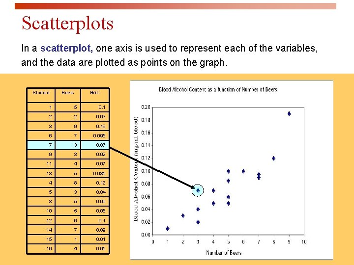
Here, we have two quantitative variables for each of 16 students. 1) How many beers they drank, and 2) Their blood alcohol level (BAC) We are interested in the relationship between the two variables: How is one affected by changes in the other one? Student Beers Blood Alcohol 1 5 0. 1 2 2 0. 03 3 9 0. 19 6 7 0. 095 7 3 0. 07 9 3 0. 02 11 4 0. 07 13 5 0. 085 4 8 0. 12 5 3 0. 04 8 5 0. 06 10 5 0. 05 12 6 0. 1 14 7 0. 09 15 1 0. 01 16 4 0. 05

Looking at relationships q Start with a graph q Look for an overall pattern and deviations from the pattern q Use numerical descriptions of the data and overall pattern (if appropriate)

Scatterplots In a scatterplot, one axis is used to represent each of the variables, and the data are plotted as points on the graph. Student Beers BAC 1 5 0. 1 2 2 0. 03 3 9 0. 19 6 7 0. 095 7 3 0. 07 9 3 0. 02 11 4 0. 07 13 5 0. 085 4 8 0. 12 5 3 0. 04 8 5 0. 06 10 5 0. 05 12 6 0. 1 14 7 0. 09 15 1 0. 01 16 4 0. 05

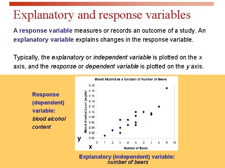
Explanatory and response variables A response variable measures or records an outcome of a study. An explanatory variable explains changes in the response variable. Typically, the explanatory or independent variable is plotted on the x axis, and the response or dependent variable is plotted on the y axis. Response (dependent) variable: blood alcohol content y x Explanatory (independent) variable: number of beers

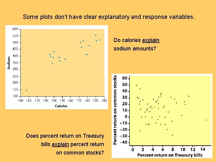
Some plots don’t have clear explanatory and response variables. Do calories explain sodium amounts? Does percent return on Treasury bills explain percent return on common stocks?

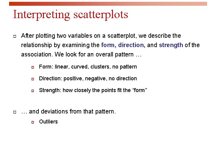
Interpreting scatterplots p After plotting two variables on a scatterplot, we describe the relationship by examining the form, direction, and strength of the association. We look for an overall pattern … p p Form: linear, curved, clusters, no pattern p Direction: positive, negative, no direction p Strength: how closely the points fit the “form” … and deviations from that pattern. p Outliers

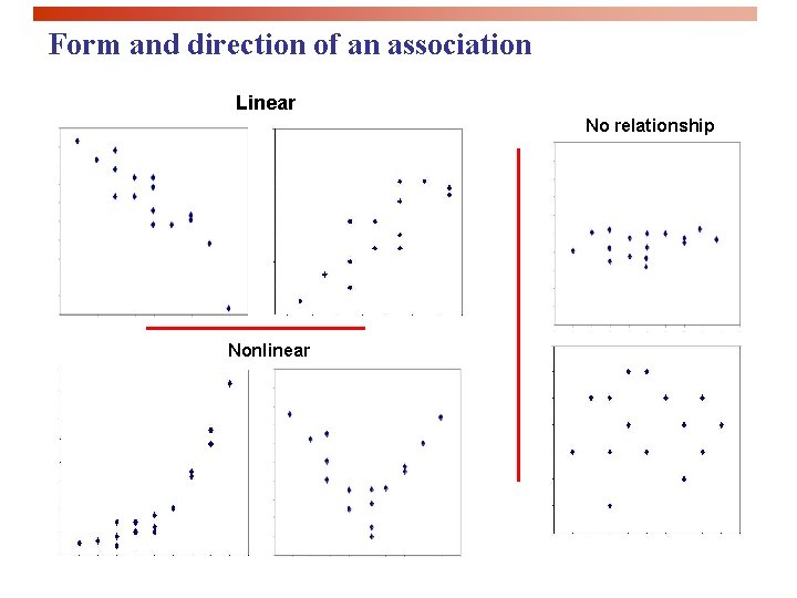
Form and direction of an association Linear No relationship Nonlinear

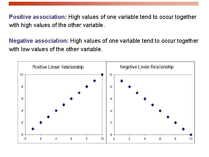
Positive association: High values of one variable tend to occur together with high values of the other variable. Negative association: High values of one variable tend to occur together with low values of the other variable.

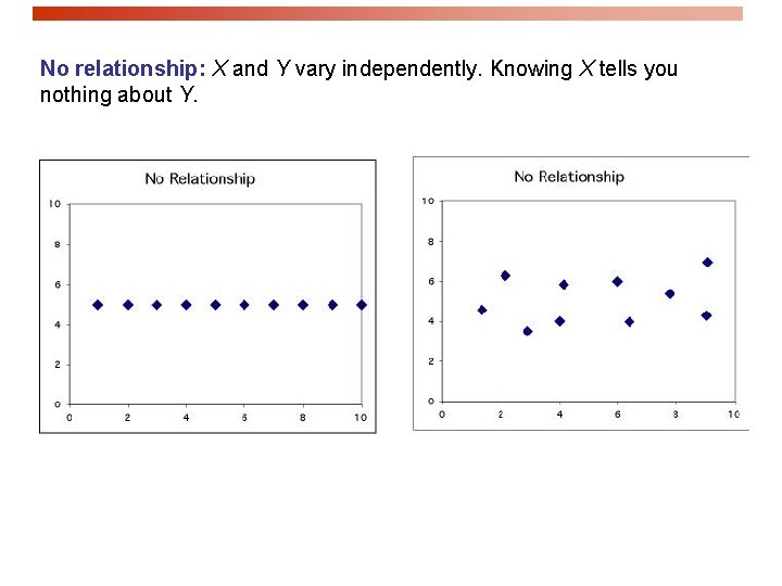
No relationship: X and Y vary independently. Knowing X tells you nothing about Y.

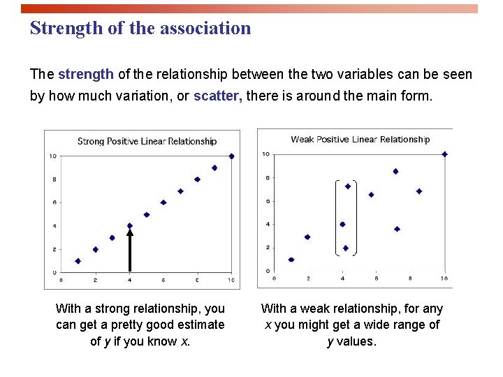
Strength of the association The strength of the relationship between the two variables can be seen by how much variation, or scatter, there is around the main form. With a strong relationship, you can get a pretty good estimate of y if you know x. With a weak relationship, for any x you might get a wide range of y values.

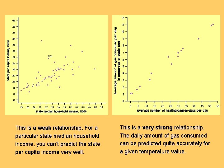
This is a weak relationship. For a particular state median household income, you can’t predict the state per capita income very well. This is a very strong relationship. The daily amount of gas consumed can be predicted quite accurately for a given temperature value.

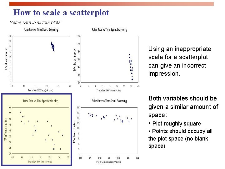
How to scale a scatterplot Same data in all four plots Using an inappropriate scale for a scatterplot can give an incorrect impression. Both variables should be given a similar amount of space: • Plot roughly square • Points should occupy all the plot space (no blank space)

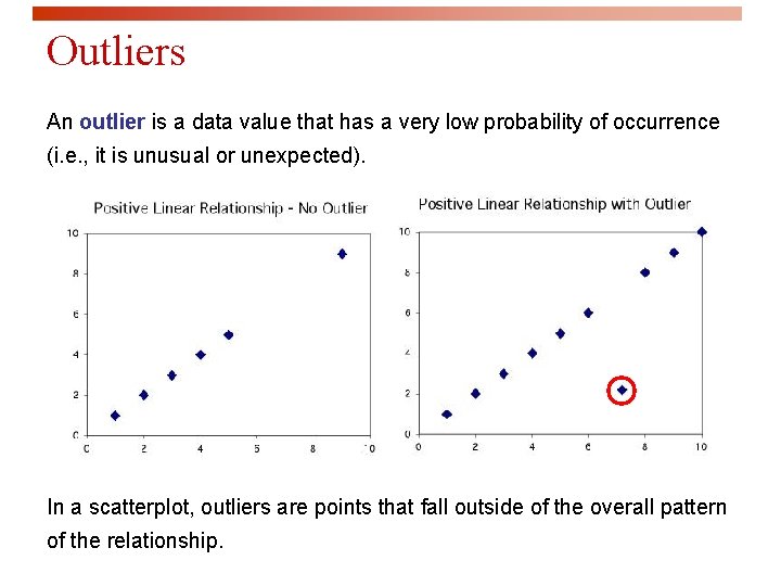
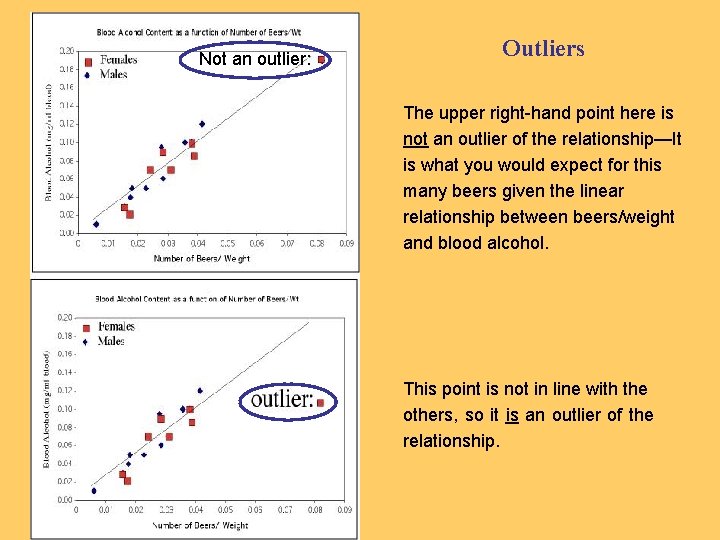
Outliers An outlier is a data value that has a very low probability of occurrence (i. e. , it is unusual or unexpected). In a scatterplot, outliers are points that fall outside of the overall pattern of the relationship.

Not an outlier: Outliers The upper right-hand point here is not an outlier of the relationship—It is what you would expect for this many beers given the linear relationship between beers/weight and blood alcohol. This point is not in line with the others, so it is an outlier of the relationship.

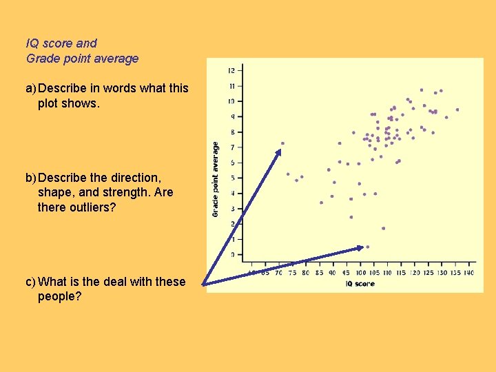
IQ score and Grade point average a) Describe in words what this plot shows. b) Describe the direction, shape, and strength. Are there outliers? c) What is the deal with these people?

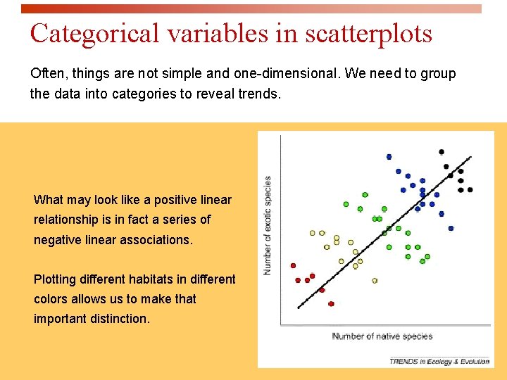
Categorical variables in scatterplots Often, things are not simple and one-dimensional. We need to group the data into categories to reveal trends. What may look like a positive linear relationship is in fact a series of negative linear associations. Plotting different habitats in different colors allows us to make that important distinction.

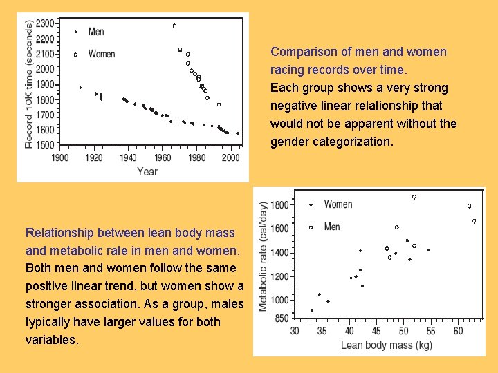
Comparison of men and women racing records over time. Each group shows a very strong negative linear relationship that would not be apparent without the gender categorization. Relationship between lean body mass and metabolic rate in men and women. Both men and women follow the same positive linear trend, but women show a stronger association. As a group, males typically have larger values for both variables.

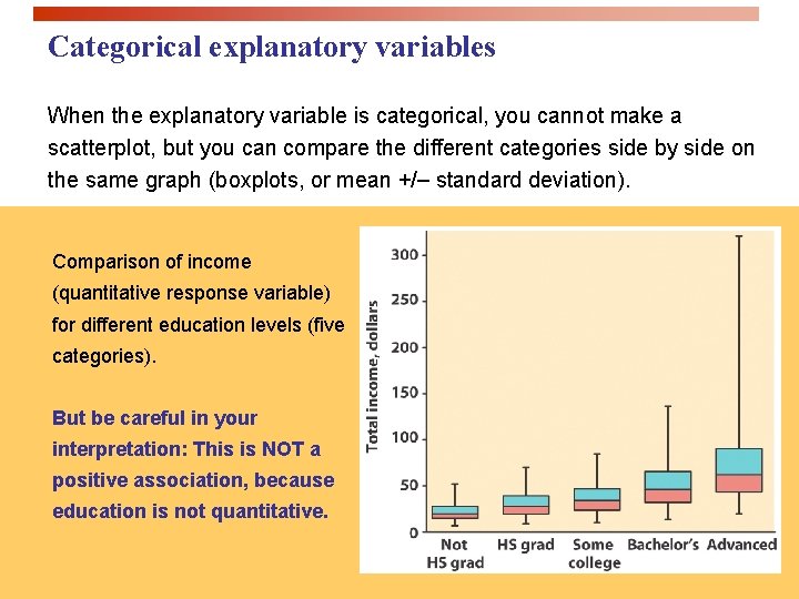
Categorical explanatory variables When the explanatory variable is categorical, you cannot make a scatterplot, but you can compare the different categories side by side on the same graph (boxplots, or mean +/ standard deviation). Comparison of income (quantitative response variable) for different education levels (five categories). But be careful in your interpretation: This is NOT a positive association, because education is not quantitative.

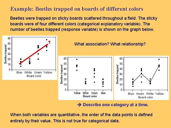
Example: Beetles trapped on boards of different colors Beetles were trapped on sticky boards scattered throughout a field. The sticky boards were of four different colors (categorical explanatory variable). The number of beetles trapped (response variable) is shown on the graph below. ? What association? What relationship? Blue White Green Yellow Board color Blue Green White Yellow Board color Describe one category at a time. When both variables are quantitative, the order of the data points is defined entirely by their value. This is not true for categorical data.

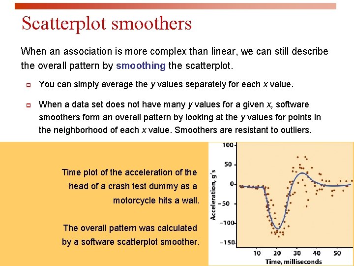
Scatterplot smoothers When an association is more complex than linear, we can still describe the overall pattern by smoothing the scatterplot. p p You can simply average the y values separately for each x value. When a data set does not have many y values for a given x, software smoothers form an overall pattern by looking at the y values for points in the neighborhood of each x value. Smoothers are resistant to outliers. Time plot of the acceleration of the head of a crash test dummy as a motorcycle hits a wall. The overall pattern was calculated by a software scatterplot smoother.

Looking at Data - Relationships - Correlation IPS Chapter 2. 2 © 2009 W. H. Freeman and Company

Objectives (IPS Chapter 2. 2) Correlation p The correlation coefficient “r” p r does not distinguish between x and y p r has no units of measurement p r ranges from -1 to +1 p Influential points

The correlation coefficient "r" q The correlation coefficient is a measure of the direction and strength of a linear relationship. q It is calculated using the mean and the standard deviation of both the x and y variables. q Correlation can only be used to describe quantitative variables. Categorical variables don’t have means and standard deviations.

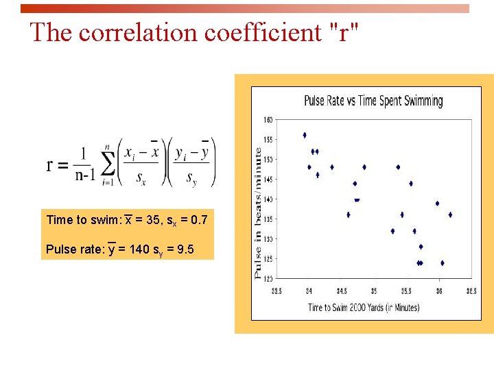
The correlation coefficient "r" Time to swim: x = 35, sx = 0. 7 Pulse rate: y = 140 sy = 9. 5

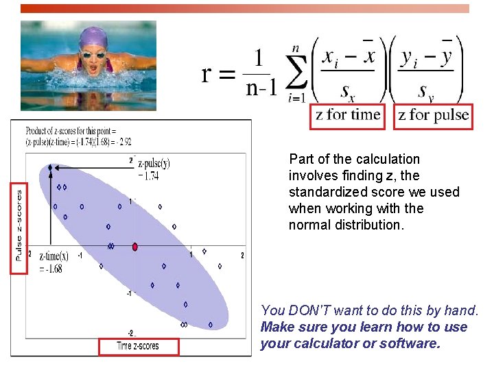
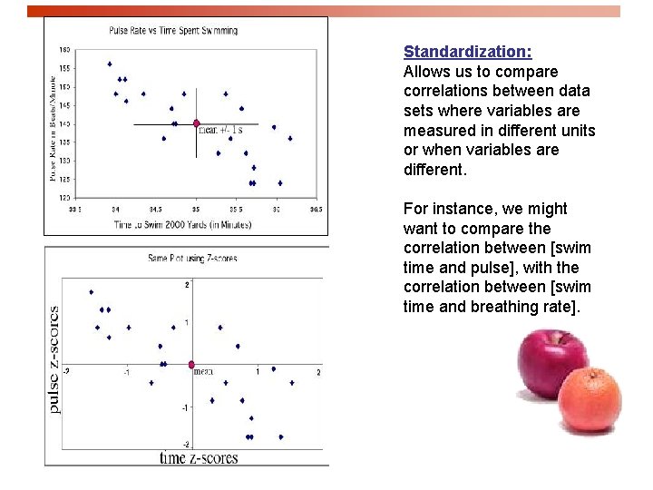
Part of the calculation involves finding z, the standardized score we used when working with the normal distribution. You DON'T want to do this by hand. Make sure you learn how to use your calculator or software.

Standardization: Allows us to compare correlations between data sets where variables are measured in different units or when variables are different. For instance, we might want to compare the correlation between [swim time and pulse], with the correlation between [swim time and breathing rate].

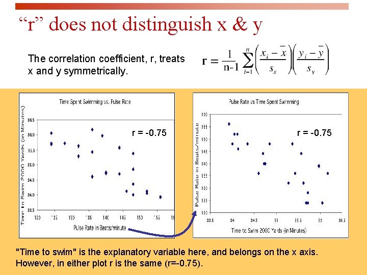
“r” does not distinguish x & y The correlation coefficient, r, treats x and y symmetrically. r = -0. 75 "Time to swim" is the explanatory variable here, and belongs on the x axis. However, in either plot r is the same (r=-0. 75).

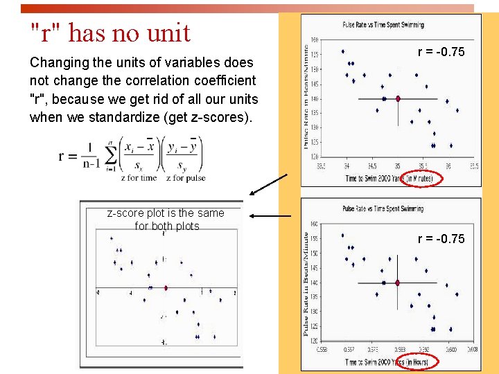
"r" has no unit Changing the units of variables does not change the correlation coefficient "r", because we get rid of all our units when we standardize (get z-scores). z-score plot is the same for both plots r = -0. 75

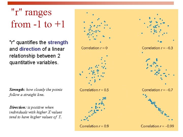
"r" ranges from -1 to +1 "r" quantifies the strength and direction of a linear relationship between 2 quantitative variables. Strength: how closely the points follow a straight line. Direction: is positive when individuals with higher X values tend to have higher values of Y.

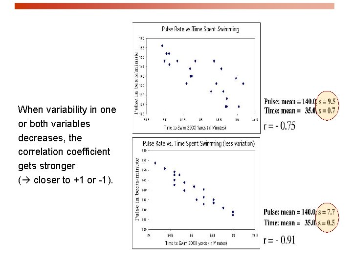
When variability in one or both variables decreases, the correlation coefficient gets stronger ( closer to +1 or -1).

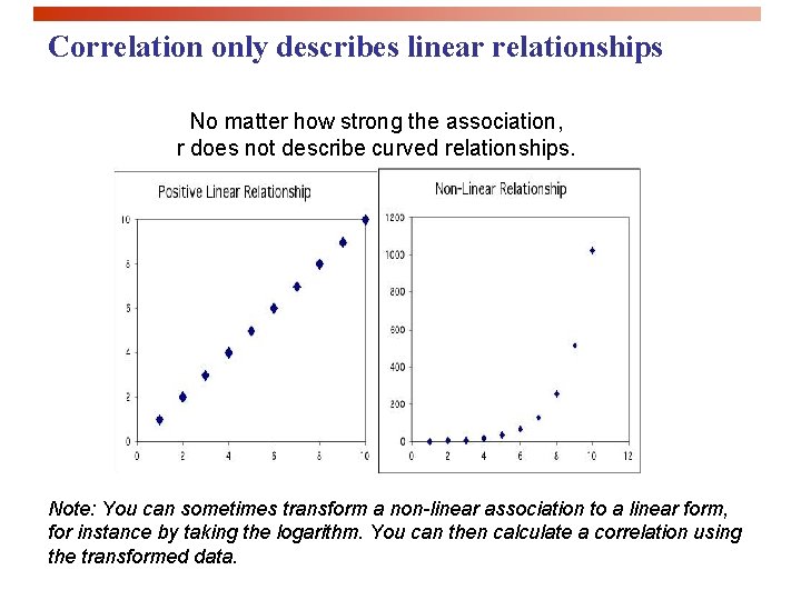
Correlation only describes linear relationships No matter how strong the association, r does not describe curved relationships. Note: You can sometimes transform a non-linear association to a linear form, for instance by taking the logarithm. You can then calculate a correlation using the transformed data.

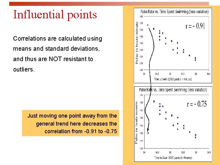
Influential points Correlations are calculated using means and standard deviations, and thus are NOT resistant to outliers. Just moving one point away from the general trend here decreases the correlation from -0. 91 to -0. 75

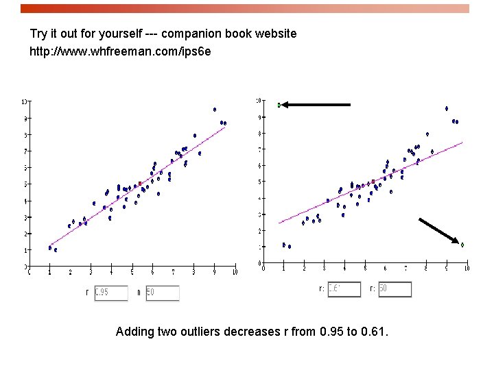
Try it out for yourself --- companion book website http: //www. whfreeman. com/ips 6 e Adding two outliers decreases r from 0. 95 to 0. 61.

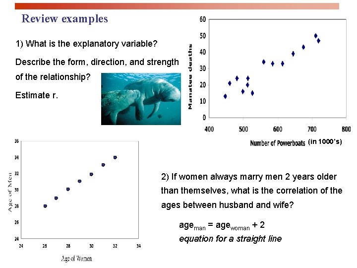
Review examples 1) What is the explanatory variable? Describe the form, direction, and strength of the relationship? Estimate r. (in 1000’s) 2) If women always marry men 2 years older than themselves, what is the correlation of the ages between husband wife? ageman = agewoman + 2 equation for a straight line

Thought quiz on correlation 1. Why is there no distinction between explanatory and response variables in correlation? 2. Why do both variables have to be quantitative? 3. How does changing the units of measurement affect correlation? 4. What is the effect of outliers on correlations? 5. Why doesn’t a tight fit to a horizontal line imply a strong correlation?

Looking at Data - Relationships Least-Squares Regression IPS Chapter 2. 3 © 2009 W. H. Freeman and Company

Objectives (IPS Chapter 2. 3) Least-squares regression p Regression lines p Prediction and Extrapolation p Correlation and r 2 p Transforming relationships

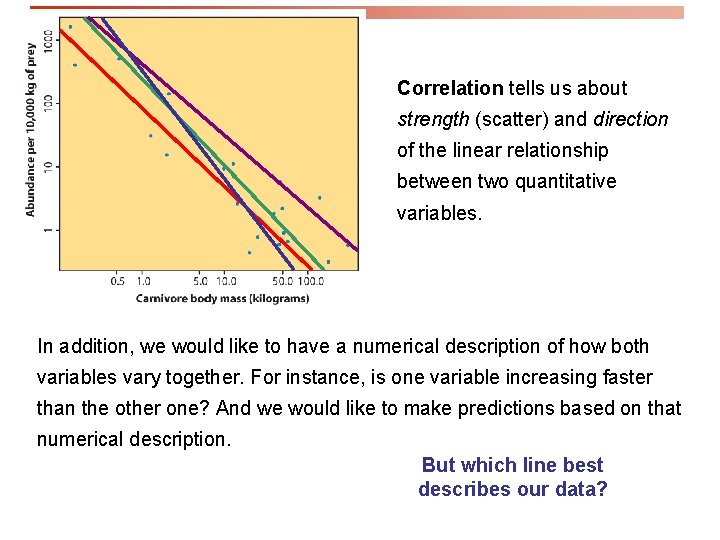
Correlation tells us about strength (scatter) and direction of the linear relationship between two quantitative variables. In addition, we would like to have a numerical description of how both variables vary together. For instance, is one variable increasing faster than the other one? And we would like to make predictions based on that numerical description. But which line best describes our data?

The regression line p A regression line is a straight line that describes how a response variable y changes as an explanatory variable x changes. p We often use a regression line to predict the value of y for a given value of x. p In regression, the distinction between explanatory and response variables is important.

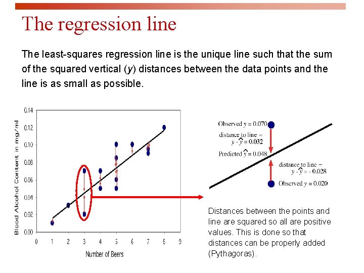
The regression line The least-squares regression line is the unique line such that the sum of the squared vertical (y) distances between the data points and the line is as small as possible. Distances between the points and line are squared so all are positive values. This is done so that distances can be properly added (Pythagoras).

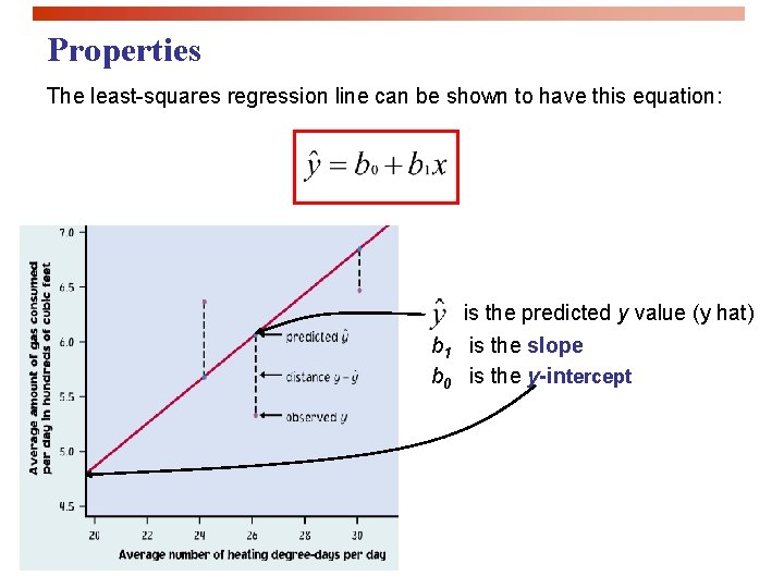
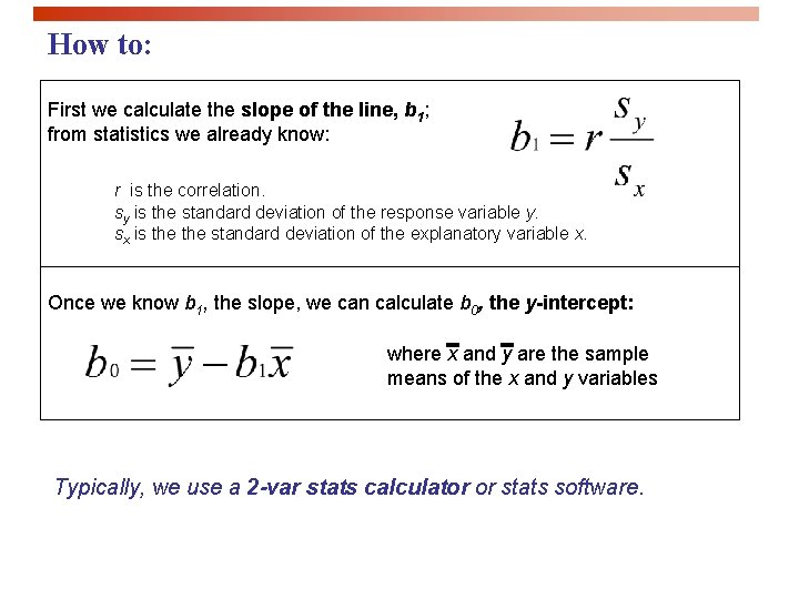
Properties The least-squares regression line can be shown to have this equation: is the predicted y value (y hat) b 1 is the slope b 0 is the y-intercept

How to: First we calculate the slope of the line, b 1; from statistics we already know: r is the correlation. sy is the standard deviation of the response variable y. sx is the standard deviation of the explanatory variable x. Once we know b 1, the slope, we can calculate b 0, the y-intercept: where x and y are the sample means of the x and y variables Typically, we use a 2 -var stats calculator or stats software.

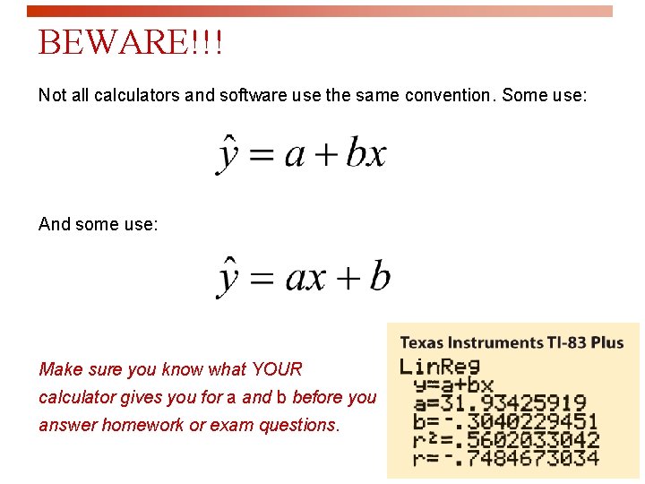
BEWARE!!! Not all calculators and software use the same convention. Some use: And some use: Make sure you know what YOUR calculator gives you for a and b before you answer homework or exam questions.

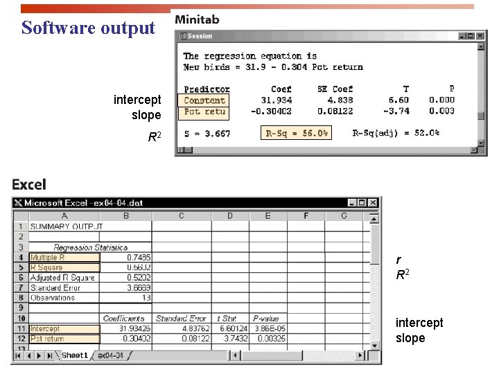
Software output intercept slope R 2 r R 2 intercept slope

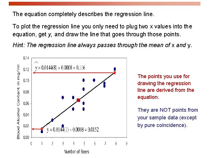
The equation completely describes the regression line. To plot the regression line you only need to plug two x values into the equation, get y, and draw the line that goes through those points. Hint: The regression line always passes through the mean of x and y. The points you use for drawing the regression line are derived from the equation. They are NOT points from your sample data (except by pure coincidence).

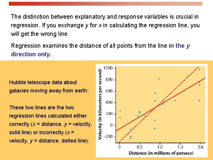
The distinction between explanatory and response variables is crucial in regression. If you exchange y for x in calculating the regression line, you will get the wrong line. Regression examines the distance of all points from the line in the y direction only. Hubble telescope data about galaxies moving away from earth: These two lines are the two regression lines calculated either correctly (x = distance, y = velocity, solid line) or incorrectly (x = velocity, y = distance, dotted line).

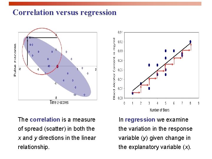
Correlation versus regression The correlation is a measure In regression we examine of spread (scatter) in both the variation in the response x and y directions in the linear variable (y) given change in relationship. the explanatory variable (x).

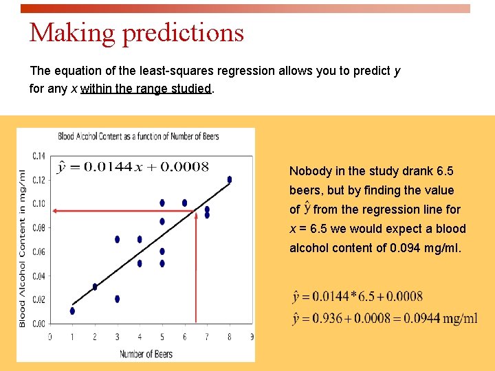
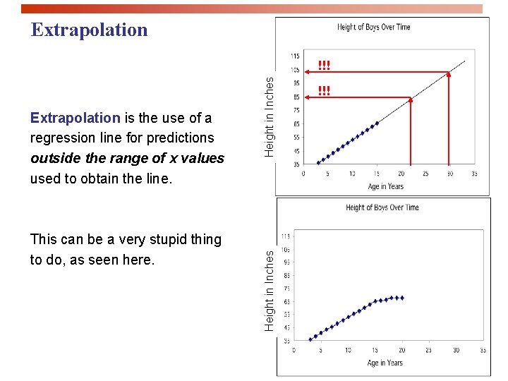
Making predictions The equation of the least-squares regression allows you to predict y for any x within the range studied. Nobody in the study drank 6. 5 beers, but by finding the value of from the regression line for x = 6. 5 we would expect a blood alcohol content of 0. 094 mg/ml.

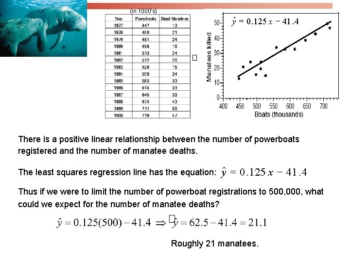
(in 1000’s) yˆ = 0. 125 x - 41. 4 � There is a positive linear relationship between the number of powerboats registered and the number of manatee deaths. The least squares regression line has the equation: yˆ = 0. 125 x - 41. 4 Thus if we were to limit the number of powerboat registrations to 500, 000, what could we expect for the number of manatee deaths? � Roughly 21 manatees.

Extrapolation This can be a very stupid thing to do, as seen here. Height in Inches Extrapolation is the use of a regression line for predictions outside the range of x values used to obtain the line. Height in Inches !!!

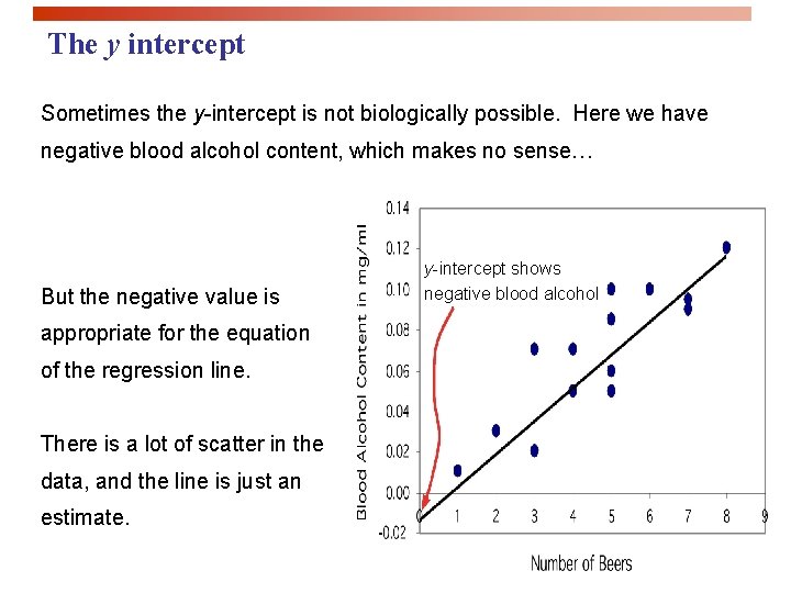
The y intercept Sometimes the y-intercept is not biologically possible. Here we have negative blood alcohol content, which makes no sense… But the negative value is appropriate for the equation of the regression line. There is a lot of scatter in the data, and the line is just an estimate. y-intercept shows negative blood alcohol

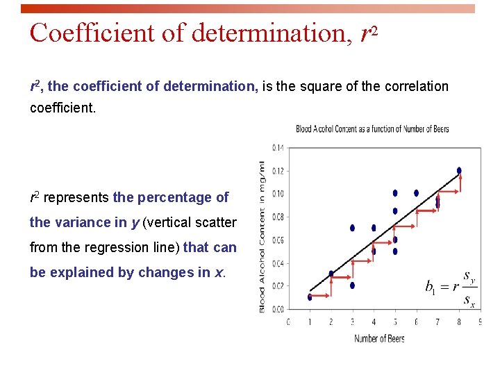
Coefficient of determination, r 2, the coefficient of determination, is the square of the correlation coefficient. r 2 represents the percentage of the variance in y (vertical scatter from the regression line) that can be explained by changes in x.

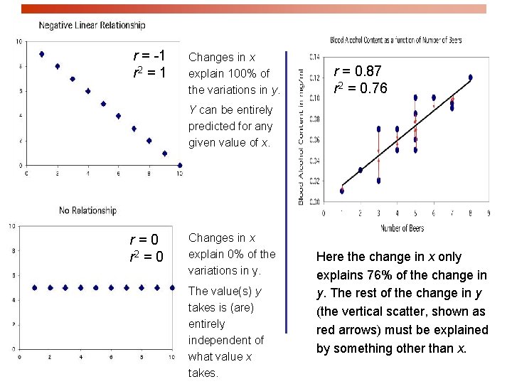
r = -1 r 2 = 1 Changes in x explain 100% of the variations in y. r = 0. 87 r 2 = 0. 76 Y can be entirely predicted for any given value of x. r=0 r 2 = 0 Changes in x explain 0% of the variations in y. The value(s) y takes is (are) entirely independent of what value x takes. Here the change in x only explains 76% of the change in y. The rest of the change in y (the vertical scatter, shown as red arrows) must be explained by something other than x.

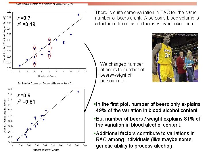
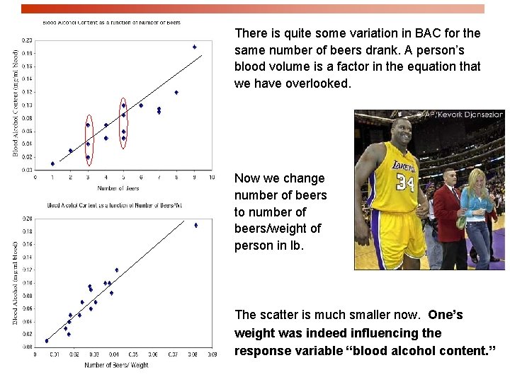
r =0. 7 r 2 =0. 49 There is quite some variation in BAC for the same number of beers drank. A person’s blood volume is a factor in the equation that was overlooked here. We changed number of beers to number of beers/weight of person in lb. r =0. 9 r 2 =0. 81 §In the first plot, number of beers only explains 49% of the variation in blood alcohol content. §But number of beers / weight explains 81% of the variation in blood alcohol content. §Additional factors contribute to variations in BAC among individuals (like maybe some genetic ability to process alcohol).

Grade performance If class attendance explains 16% of the variation in grades, what is the correlation between percent of classes attended and grade? 1. We need to make an assumption: attendance and grades are positively correlated. So r will be positive too. 2. r 2 = 0. 16, so r = +√ 0. 16 = + 0. 4 A weak correlation.

Transforming relationships A scatterplot might show a clear relationship between two quantitative variables, but issues of influential points or nonlinearity prevent us from using correlation and regression tools. Transforming the data – changing the scale in which one or both of the variables are expressed – can make the shape of the relationship linear in some cases. Example: Patterns of growth are often exponential, at least in their initial phase. Changing the response variable y into log(y) or ln(y) will transform the pattern from an upward-curved exponential to a straight line.

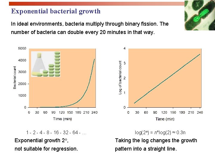
Exponential bacterial growth In ideal environments, bacteria multiply through binary fission. The number of bacteria can double every 20 minutes in that way. 1 - 2 - 4 - 8 - 16 - 32 - 64 - … log(2 n) = n*log(2) ≈ 0. 3 n Exponential growth 2 n, Taking the log changes the growth not suitable for regression. pattern into a straight line.

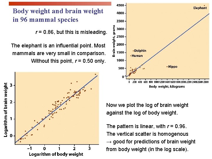
Body weight and brain weight in 96 mammal species r = 0. 86, but this is misleading. The elephant is an influential point. Most mammals are very small in comparison. Without this point, r = 0. 50 only. Now we plot the log of brain weight against the log of body weight. The pattern is linear, with r = 0. 96. The vertical scatter is homogenous → good for predictions of brain weight from body weight (in the log scale).

Looking at Data - Relationships Cautions about Correlation and Regression IPS Chapter 2. 4 © 2009 W. H. Freeman and Company

Objectives (IPS Chapter 2. 4) Cautions about correlation and regression p Residuals p Outliers and influential points p Lurking variables p Correlation/regression using averages p The restricted range problem

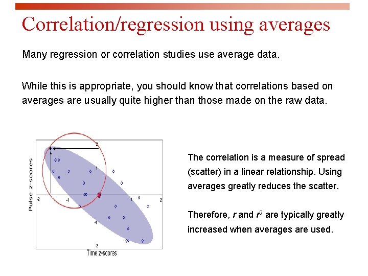
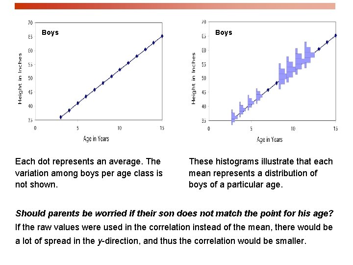
Correlation/regression using averages Many regression or correlation studies use average data. While this is appropriate, you should know that correlations based on averages are usually quite higher than those made on the raw data. The correlation is a measure of spread (scatter) in a linear relationship. Using averages greatly reduces the scatter. Therefore, r and r 2 are typically greatly increased when averages are used.

Boys Each dot represents an average. The variation among boys per age class is not shown. Boys These histograms illustrate that each mean represents a distribution of boys of a particular age. Should parents be worried if their son does not match the point for his age? If the raw values were used in the correlation instead of the mean, there would be a lot of spread in the y-direction, and thus the correlation would be smaller.

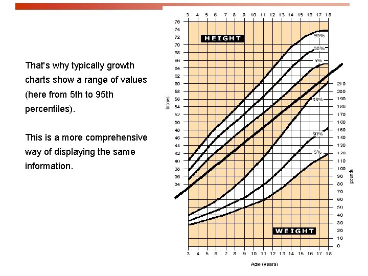
That's why typically growth charts show a range of values (here from 5 th to 95 th percentiles). This is a more comprehensive way of displaying the same information.

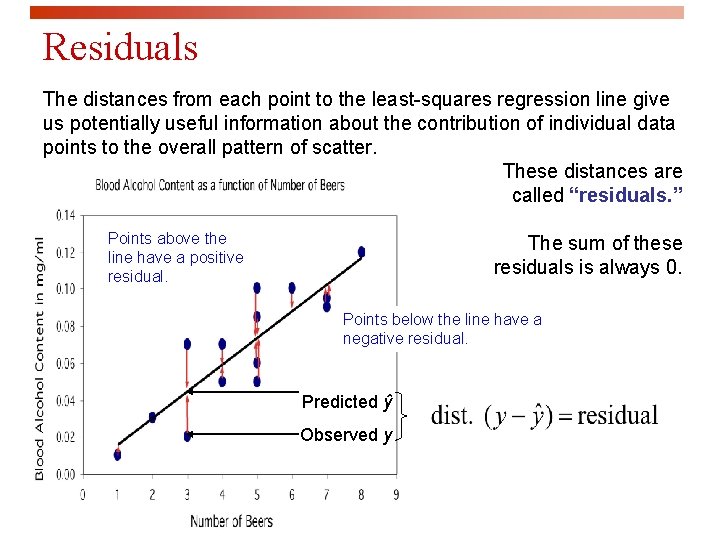
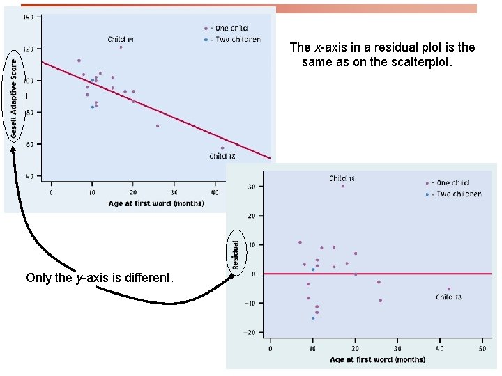
Residuals The distances from each point to the least-squares regression line give us potentially useful information about the contribution of individual data points to the overall pattern of scatter. These distances are called “residuals. ” Points above the line have a positive residual. The sum of these residuals is always 0. Points below the line have a negative residual. Predicted ŷ Observed y

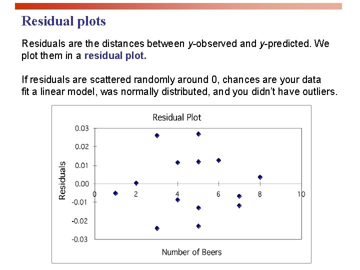
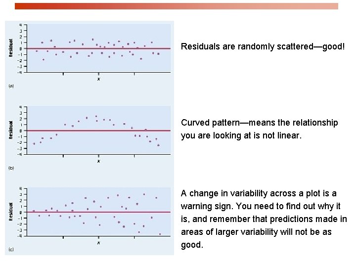
Residual plots Residuals are the distances between y-observed and y-predicted. We plot them in a residual plot. If residuals are scattered randomly around 0, chances are your data fit a linear model, was normally distributed, and you didn’t have outliers.

The x-axis in a residual plot is the same as on the scatterplot. Only the y-axis is different.

Residuals are randomly scattered—good! Curved pattern—means the relationship you are looking at is not linear. A change in variability across a plot is a warning sign. You need to find out why it is, and remember that predictions made in areas of larger variability will not be as good.

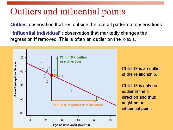
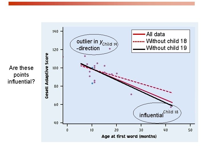
Outliers and influential points Outlier: observation that lies outside the overall pattern of observations. “Influential individual”: observation that markedly changes the regression if removed. This is often an outlier on the x-axis. Child 19 = outlier in y direction Child 19 is an outlier of the relationship. Child 18 = outlier in x direction Child 18 is only an outlier in the x direction and thus might be an influential point.

outlier in y -direction All data Without child 18 Without child 19 Are these points influential? influential

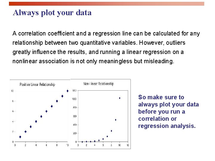
Always plot your data A correlation coefficient and a regression line can be calculated for any relationship between two quantitative variables. However, outliers greatly influence the results, and running a linear regression on a nonlinear association is not only meaningless but misleading. So make sure to always plot your data before you run a correlation or regression analysis.

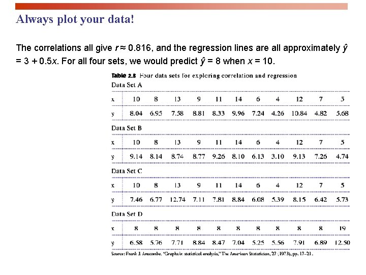
Always plot your data! The correlations all give r ≈ 0. 816, and the regression lines are all approximately ŷ = 3 + 0. 5 x. For all four sets, we would predict ŷ = 8 when x = 10.

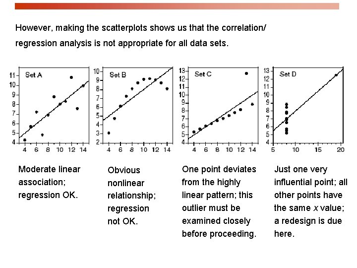
However, making the scatterplots shows us that the correlation/ regression analysis is not appropriate for all data sets. Moderate linear association; regression OK. Obvious nonlinear relationship; regression not OK. One point deviates from the highly linear pattern; this outlier must be examined closely before proceeding. Just one very influential point; all other points have the same x value; a redesign is due here.

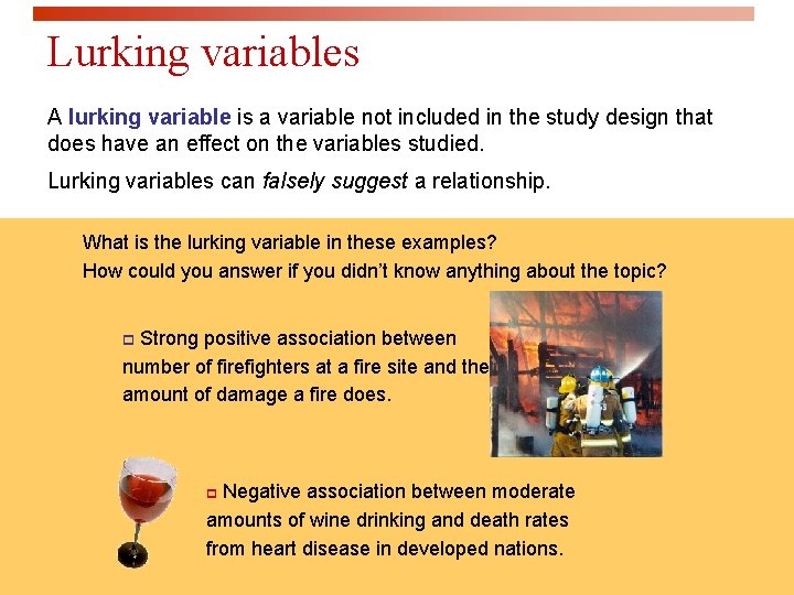
Lurking variables A lurking variable is a variable not included in the study design that does have an effect on the variables studied. Lurking variables can falsely suggest a relationship. What is the lurking variable in these examples? How could you answer if you didn’t know anything about the topic? Strong positive association between number of firefighters at a fire site and the amount of damage a fire does. p Negative association between moderate amounts of wine drinking and death rates from heart disease in developed nations. p

There is quite some variation in BAC for the same number of beers drank. A person’s blood volume is a factor in the equation that we have overlooked. Now we change number of beers to number of beers/weight of person in lb. The scatter is much smaller now. One’s weight was indeed influencing the response variable “blood alcohol content. ”

Vocabulary: lurking vs. confounding p A lurking variable is a variable that is not among the explanatory or response variables in a study and yet may influence the interpretation of relationships among those variables. p Two variables are confounded when their effects on a response variable cannot be distinguished from each other. The confounded variables may be either explanatory variables or lurking variables. p Association is not causation. Even if an association is very strong, this is not by itself good evidence that a change in x will cause a change in y.

p Association is not causation. p Even if an association is very strong, this is not by itself good evidence that a change in x will cause a change in y

Caution before rushing into a correlation or a regression analysis § Do not use a regression on inappropriate data. ü Pattern in the residuals ü Presence of large outliers ü Clumped data falsely appearing linear Use residual plots for help. § Beware of lurking variables. § Avoid extrapolating (going beyond interpolation). § Recognize when the correlation/regression is performed on averages. § A relationship, however strong it is, does not itself imply causation.

Looking at Data - Relationships Data analysis for two-way tables IPS Chapter 2. 5 © 2009 W. H. Freeman and Company

Objectives (IPS Chapter 2. 5) Data analysis for two-way tables p Two-way tables p Joint distributions p Marginal distributions p Relationships between categorical variables p Conditional distributions p Simpson’s paradox

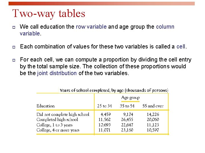
Two-way tables An experiment has a two-way, or block, design if two categorical factors are studied with several levels of each factor. Two-way tables organize data about two categorical variables obtained from a two-way, or block, design. (There are now two ways to group the data). Group by age Record education Second factor: education First factor: age

Two-way tables p We call education the row variable and age group the column variable. p Each combination of values for these two variables is called a cell. p For each cell, we can compute a proportion by dividing the cell entry by the total sample size. The collection of these proportions would be the joint distribution of the two variables.

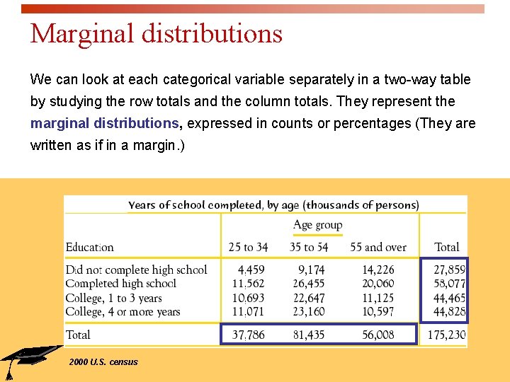
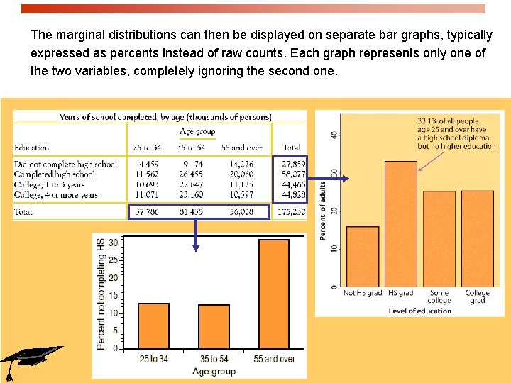
Marginal distributions We can look at each categorical variable separately in a two-way table by studying the row totals and the column totals. They represent the marginal distributions, expressed in counts or percentages (They are written as if in a margin. ) 2000 U. S. census

The marginal distributions can then be displayed on separate bar graphs, typically expressed as percents instead of raw counts. Each graph represents only one of the two variables, completely ignoring the second one.

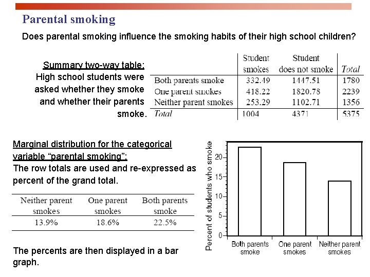
Parental smoking Does parental smoking influence the smoking habits of their high school children? Summary two-way table: High school students were asked whether they smoke and whether their parents smoke. Marginal distribution for the categorical variable “parental smoking”: The row totals are used and re-expressed as percent of the grand total. The percents are then displayed in a bar graph.

Relationships between categorical variables The marginal distributions summarize each categorical variable independently. But the two-way table actually describes the relationship between both categorical variables. The cells of a two-way table represent the intersection of a given level of one categorical factor and a given level of the other categorical factor.

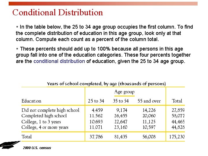
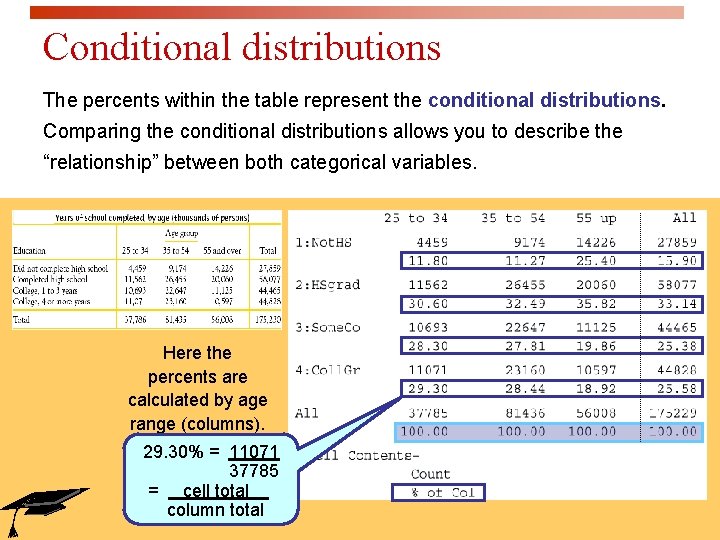
Conditional Distribution § In the table below, the 25 to 34 age group occupies the first column. To find the complete distribution of education in this age group, look only at that column. Compute each count as a percent of the column total. § These percents should add up to 100% because all persons in this age group fall into one of the education categories. These four percents together are the conditional distribution of education, given the 25 to 34 age group. 2000 U. S. census

Conditional distributions The percents within the table represent the conditional distributions. Comparing the conditional distributions allows you to describe the “relationship” between both categorical variables. Here the percents are calculated by age range (columns). 29. 30% = 11071 37785 = cell total. column total

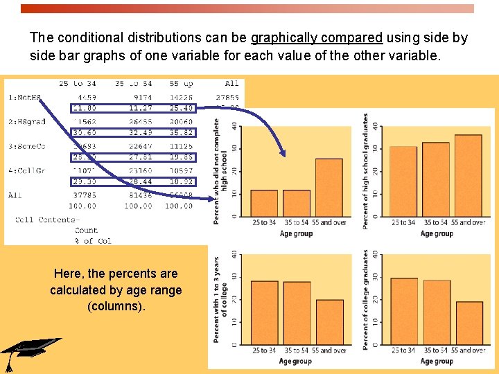
The conditional distributions can be graphically compared using side by side bar graphs of one variable for each value of the other variable. Here, the percents are calculated by age range (columns).

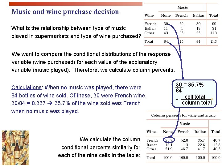
Music and wine purchase decision What is the relationship between type of music played in supermarkets and type of wine purchased? We want to compare the conditional distributions of the response variable (wine purchased) for each value of the explanatory variable (music played). Therefore, we calculate column percents. Calculations: When no music was played, there were 84 bottles of wine sold. Of these, 30 were French wine. 30/84 = 0. 357 35. 7% of the wine sold was French when no music was played. We calculate the column conditional percents similarly for each of the nine cells in the table: 30 = 35. 7% 84 = cell total. column total

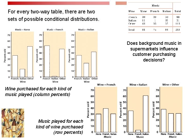
For every two-way table, there are two sets of possible conditional distributions. Does background music in supermarkets influence customer purchasing decisions? Wine purchased for each kind of music played (column percents) Music played for each kind of wine purchased (row percents)

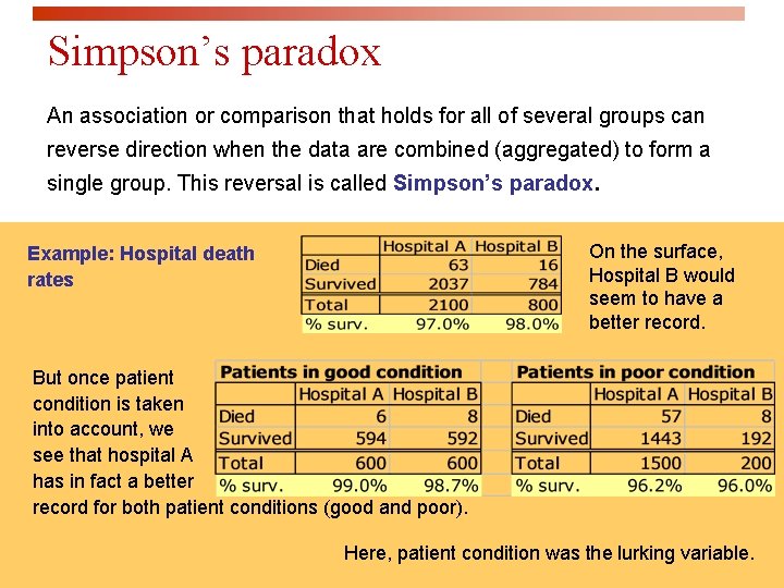
Simpson’s paradox An association or comparison that holds for all of several groups can reverse direction when the data are combined (aggregated) to form a single group. This reversal is called Simpson’s paradox. On the surface, Hospital B would seem to have a better record. Example: Hospital death rates But once patient condition is taken into account, we see that hospital A has in fact a better record for both patient conditions (good and poor). Here, patient condition was the lurking variable.

Looking at Data - Relationships The Question of Causation IPS Chapter 2. 6 © 2009 W. H. Freeman and Company

Objectives (IPS Chapter 2. 6) The question of causation p Common response p Confounding p Establishing causation

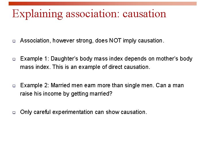
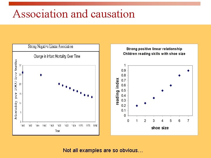
Explaining association: causation q Association, however strong, does NOT imply causation. q Example 1: Daughter’s body mass index depends on mother’s body mass index. This is an example of direct causation. q Example 2: Married men earn more than single men. Can a man raise his income by getting married? q Only careful experimentation can show causation.

Association and causation Not all examples are so obvious…

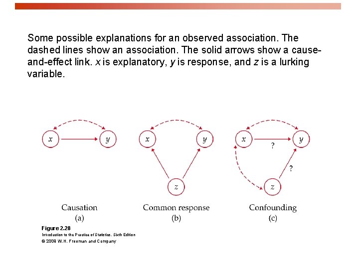
Explaining association: common response p Students who have high SAT scores in high school have high GPAs in their first year of college. p This positive correlation can be explained as a common response to students’ ability and knowledge. p The observed association between two variables x and y could be explained by a third lurking variable z. p Both x and y change in response to changes in z. This creates an association even though there is no direct causal link.

Explaining association: confounding p Two variables are confounded when their effects on a response variable cannot be distinguished from each other. The confounded variables may be either explanatory variables or lurking variables. p Example: Studies have found that religious people live longer than nonreligious people. p Religious people also take better care of themselves and are less likely to smoke or be overweight.

Some possible explanations for an observed association. The dashed lines show an association. The solid arrows show a causeand-effect link. x is explanatory, y is response, and z is a lurking variable. Figure 2. 28 Introduction to the Practice of Statistics, Sixth Edition © 2009 W. H. Freeman and Company

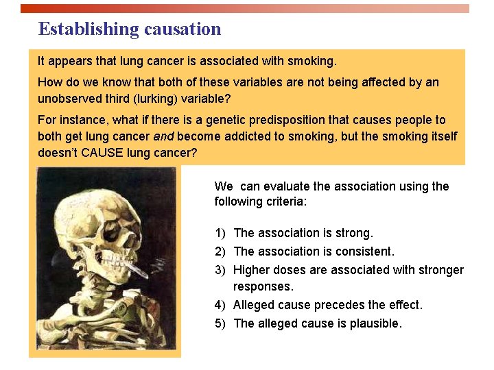
Establishing causation It appears that lung cancer is associated with smoking. How do we know that both of these variables are not being affected by an unobserved third (lurking) variable? For instance, what if there is a genetic predisposition that causes people to both get lung cancer and become addicted to smoking, but the smoking itself doesn’t CAUSE lung cancer? We can evaluate the association using the following criteria: 1) The association is strong. 2) The association is consistent. 3) Higher doses are associated with stronger responses. 4) Alleged cause precedes the effect. 5) The alleged cause is plausible.