Chapter 4 Describing Relationships Section 4 1 Scatterplots

Chapter 4 Describing Relationships

Section 4. 1 Scatterplots and Correlation

Scatterplot Most common way to display relationship between 2 quantitative variables One variable on the vertical axis One variable on the horizontal axis Individual is the point fixed by value of both variables

Shows how the interval between eruptions is related to the duration of the previous eruption. "Duration" helps to explain "interval" Figure 4. 2 Scatterplot of the interval between eruptions of Old Faithful against the duration of the previous eruption.

Response variable measures an outcome or result of a study Explanatory variable we think it explains or causes changes in the response variable "Duration" is the explanatory variable "Interval" is the response variable

The explanatory variable always is plotted on the horizontal axis!

Interpreting scatterplots. . . Look for the overall pattern and deviations Describe the overall pattern by the direction, form, and strength of the relationship Identify outliers

Direction Positive association The two variables increase together or decrease together "Positive slope" Negative association As one variable increases, the other decreases. "Negative slope"

Form Is the data clustered? linear? scattered? Strength Determined by how closely the points follow a form
 form strength? Month Temp (x) Gas consumed (y) Oct")
What is the association (+/-) form strength? Month Temp (x) Gas consumed (y) Oct Nov Dec Jan Feb Mar Apr Ma y 49. 4 38. 2 27. 2 28. 6 29. 5 46. 4 49. 7 57. 1 520 610 870 850 880 490 450 250

Correlation Describes the direction and strength of a straight-line relationship between two quantitative variables. Positive r = positive association Negative r = negative association Always between -1 and +1 Correlation of 0 is weak, -1 and +1 is strong
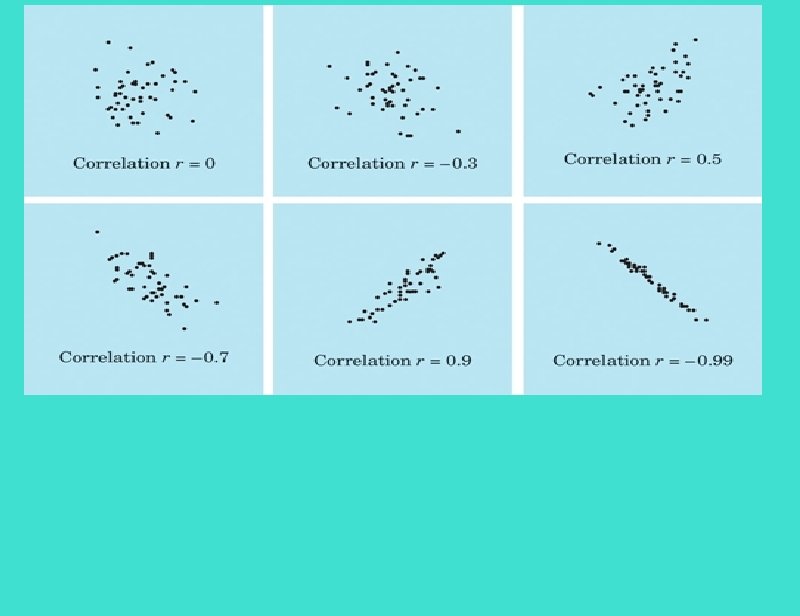

Correlation Does not change when units of measurement change Ignores the distinction between explanatory and response variables (can interchange x and y) Measures the strength of only straight-line association between 2 variables Is strongly affected by a few outliers
 r=0. 9 (b) r=0 (c) r=0.")
Match each correlation value with its scatterplot (a) r=0. 9 (b) r=0 (c) r=0. 7 (d) r=-0. 3 (e) r=-0. 9 r=-0. 7 r=-0. 9 r=-0. 3 r= 0. 7 r= 0. 9
, like many
statisticians, worked on war problems
during WWII. Wald")
Abraham Wald (1902 -1950), like many statisticians, worked on war problems during WWII. Wald invented some statistical methods that were military secrets until th ended. Here is one of his simpler ideas. Asked where extr armor should be added to airplanes, Wald studied the location of enemy bullet holes in planes returning from combat. He plotted the location on an outline of the pl As data accumulated, most of the outline was filled up. Where should extra armor be placed?

Place the armor in the few spots with no bullet holes, said Wald. bullets hit the planes that didn't make it back! That's where

- Slides: 18