EMPHASIS Emphasis is the Principle of Design that


. In")


.")
. That is")
. They")


 an item actually is. It is")


 used: • one for")
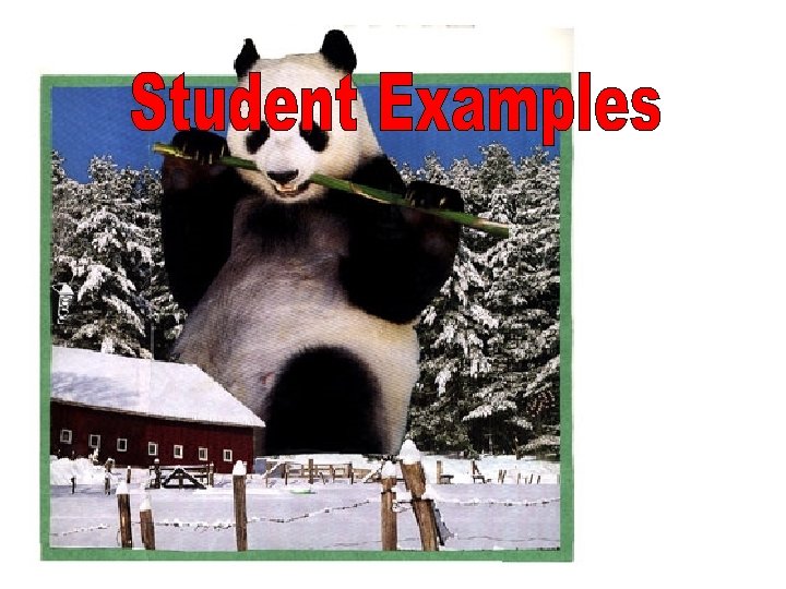


- Slides: 33
EMPHASIS
Emphasis: is the Principle of Design that makes one part of a work dominant over other parts.
It is important for artists and designers to know how to control the attention of someone viewing their artwork. This lesson will investigate how to control attention through emphasis -- how to make objects or difficult to notice.
In this lesson you will: • Learn methods for controlling where a viewer will look in a composition. • Explore how to make an object look completely out of scale. • Make a photomontage where you determine what will be noticed first, second and last (a hidden object).
Dominance describes a situation where something is more important or more noticeable than its surroundings. Information is rarely of uniform interest in art (except in wallpaper). There is usually a focal point, a place where the action begins. You should be able to control what will be noticed first, what is dominant in an image, and where the viewer's attention will go from there.
When there is dominance… there must also be subordination (things lower in ranking). In art this means that some things get more attention and some get less. Figure dominates ground for instance.
CONTRAST: The objective of contrast is to produce maximum visibility. The more contrast there is the more noticeable an item is
Contrast in Value: One of the greatest possible contrasts in art is the difference between black and white.
Contrast in Color: Color contrasts can be strong but usually not as strong as value contrasts. Example: Bright colors are more attractive & attract more attention than dull colors. Different colors that are the same value do not show as much as you would expect
Contrast in Size: When it comes to being noticed B I G G E R is always better, but it is not always desirable to be noticed first.
Contrast in Shape: An unusual shape can call attention to itself but it is not as strong a contrast as size or value or color.
Contrast in Texture:
PLACEMENT Where items are placed in relation to the picture plane and each other can affect emphasis
The most important place in the picture plane, by far, is the center (1). That is where the viewer looks first and so anything that is there is likely to be noticed first. The further from the center, the less noticeable an item becomes.
As items contact the outside edges they become slightly more noticeable (2). That is because they relate to the format, which is always a dominant shape in any composition.
Objects that overlap the edge of format call more attention to themselves (3). They seem to be going out or coming in to the composition. This works well if it is not overdone and the format shape is simple and clear. These objects can seem to be in front of the format.
Once you establish a primary focal point you can use proximity & similarity to control what is to be noticed next. Proximity: An overlapping (2), touching (3) or close (4) object is likely to be seen next (in that order) after a primary object. The more visible (contrasting) the object is, the more likely this is to happen. Where you place objects is important.
Similarity: An object that is the same color, size and/or shape will form a group with the primary object and be seen next. The more alike the two objects are the stronger the link.
Continuance: If the primary object points or looks at an object, that can direct the viewer's attention to the secondary object.
ISOLATION: Isolation is a kind of placement -- where something is put. An item that stands apart from its surroundings will be more noticeable. This is not likely to make an item be noticed first but can make one item stand out.
• Size is how large (or small) an item actually is. It is a measurable quantity. The format you use for a project is a certain size. • Scale is a relative size. It refers to how large (or small) an item seems. There has to be some standards against which to measure scale. You can make a scale model of a car that will fit in your hand. Next to a real car the model is much smaller in scale.
It is possible to make an object appear different in scale without changing its size. The fortune cookie to the left is about life size. The one in the picture below appears to be quite large in scale. They are both the same size.
The fortune cookie appears large because there are buildings in front of it. If It were the same size, but in front of all the buildings, it would look like a normal fortune cookie that was closer to us and the city scene was in the distance behind it.
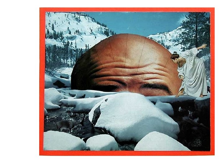
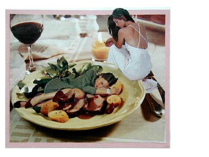
Your PHOTOMONTAGE Assignment: You will make a photomontage that shows an object very out of scale (either very large or very small). Make sure that it will be the first thing a viewer will notice when they look at the image. Also determine, and control, what the viewer should see second. You will hide an object in the image. The hidden object should be visible and a surprise when it is found (it should look out of place in its surroundings).
There must be at least three photographic images (from magazines) used: • one for the out of scale object, • one for the background (can include the second thing to be seen) • and one for the hidden object.
Main Subject: First, look for a main subject. It should be large, clear, colorful and have high contrast. Make your subject look at least 10 times its normal size. Find a background to use with the first image that will make it look out of scale. The background should be large enough to fill up most of the format for the image (it is possible to piece several pictures together for a background).
Thing Seen Second: The thing to be seen second can be a feature of the background or a separate image collaged with the others. Test the effectiveness of your choices by asking at least two other people what they notice first and what they notice second in your image (before gluing anything down). If you have planned carefully they should see what you have arranged for them to see.
Hidden Object: Hiding an object requires you to place that object against a similar looking area in the image. Look for places with texture and find an object to hide that is similar in color and texture. The hidden object must look out of place where it is hidden. Have some fun and see how visible an object you can hide.