Statistics What is Statistics What are statistics used





















- Slides: 65

Statistics What is Statistics? What are statistics used for?

Statistics in Today’s World Weather Reports Stock Markets Compiling Football leagues Compiling music charts Compiling summaries of road traffic deaths Making predictions about the outcome of elections Insurance rates Make – up tests

Learning Outcomes How to find, collect and organise data How to deal with different types of data How to present data in a frequency table How to represent data on a line plot, a bar chart, a stem-and-leaf diagram and a histogram Measures of central tendency: mean median and mode Recognise how sampling variability influences the use of sample information Misuses and understanding the limitations of statistics

Today’s Learning outcome Students will learn about: Types of data How to carry out a statistical investigation

Statistical Investigations Data : - Any unordered list Information : - when the list is ordered in some way

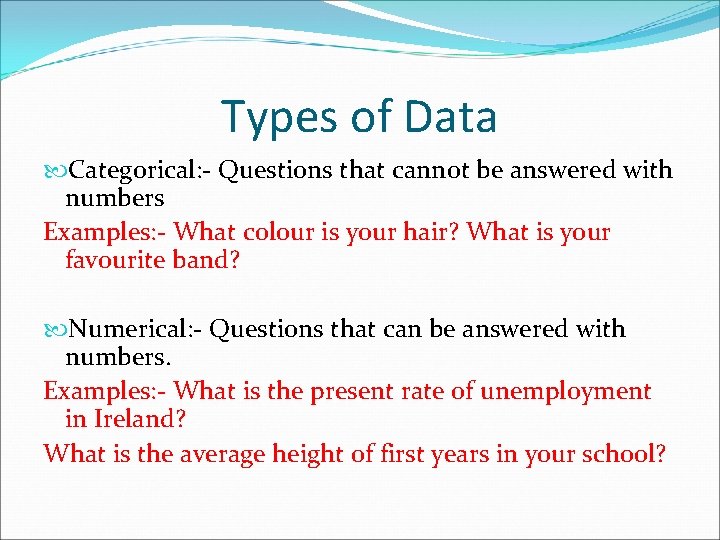
Types of Data Categorical: - Questions that cannot be answered with numbers Examples: - What colour is your hair? What is your favourite band? Numerical: - Questions that can be answered with numbers. Examples: - What is the present rate of unemployment in Ireland? What is the average height of first years in your school?

Primary Data: - Experiments and Surveys Secondary Data: - The Guinness book of records and Census of Population

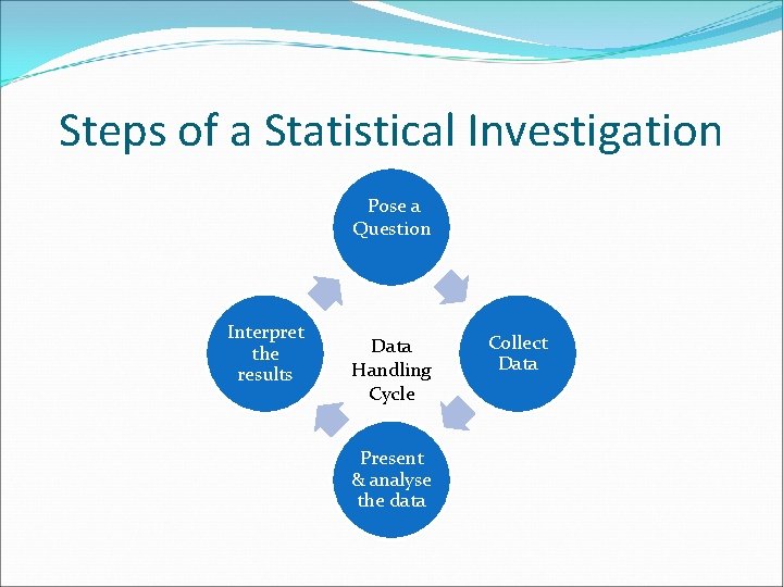
Steps of a Statistical Investigation Pose a Question Interpret the results Data Handling Cycle Present & analyse the data Collect Data

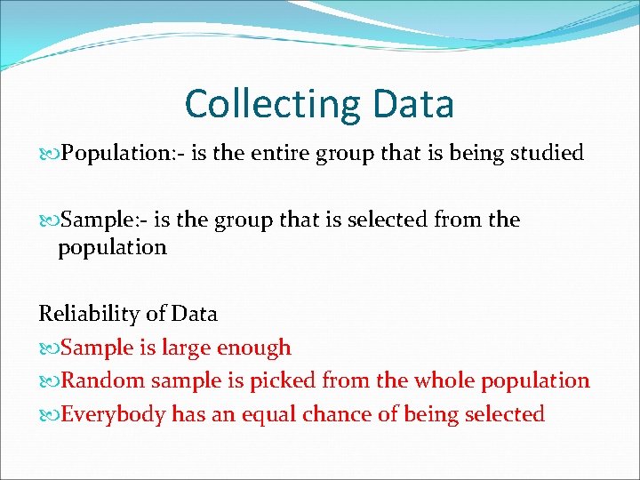
Collecting Data Population: - is the entire group that is being studied Sample: - is the group that is selected from the population Reliability of Data Sample is large enough Random sample is picked from the whole population Everybody has an equal chance of being selected

Surveys How can surveys be carried out? Face to face Telephone Postal Online What are the advantages and disadvantages of each? Group work

Questionnaire Is a set of questions designed to obtain data from a population Questionnaires should be: Clear Useful and relevant to what you are looking to find out Be as brief as possible Begin with simple questions Accommodate all answers Be clear on how answers should be recorded

Designed Experiments Apply some treatment to a group of subjects and observe the effects of the treatments on the subjects. Drug companies carry out these to test new drugs.

Questions Page 231 Q. 2 Q. 4 Q. 6 Q. 7 Q. 13 Q. 18

Frequency Tables Aim: - How to represent data in a frequency table

Frequency Tables Shows how frequently each piece of data occurs

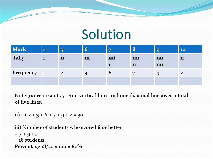
Example: Question A class sits a maths test. Their marks out of 10 are as follows: 7 8 9 7 9 10 8 8 6 9 7 5 9 6 4 8 6 9 7 8 9 7 9 10 9 7 5 9 8 8 i) Sort the data into a frequency table. Include a tally column ii) How many students sat the test? iii) What percentage of the students scored 8 or better?

Solution Mark 4 5 6 7 8 9 10 Tally 1 11 1111 1111 11 Frequency 1 2 3 6 7 9 2 Note: 1111 represents 5. Four vertical lines and one diagonal line gives a total of five lines. ii) 1 + 2 + 3 + 6 + 7 + 9 + 2 = 30 iii) Number of students who scored 8 or better = 7 + 9 +2 = 18 students Percentage 18/30 x 100 = 60%

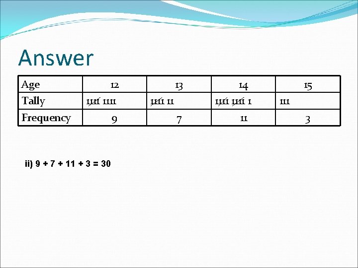
Example 2 Listed below are the ages of students who attended a school disco. 15 12 14 15 14 14 13 13 14 12 13 13 12 12 14 15 14 14 13 12 14 12 12 13 14 i) Sort the data into a frequency table. Include a tally row in your table ii) How many students attended the disco?

Answer Age Tally 12 1111 Frequency ii) 9 + 7 + 11 + 3 = 30 9 13 1111 11 14 1111 1 7 11 15 111 3

Questions Q. 2 Q. 4 Q. 6 Q. 7

Graphing Data Aim: - How to graph sets of data Line plots Bar charts Pie Charts Stem-and-leaf Diagrams Histograms

Line Plots Is a simple and effective way of representing data. A line plot uses symbols – usually - x’s – to represent the frequency of a piece of data

Example 1 Tom, a car salesman, sells second-hand cars that have been manufactured by four different companies. The line plot shows the number of cars he sold during January. i) How many cars did Tom sell in January? ii) What % of the total were Nissan? iii) What type of car sold the best? iv) What was the least popular model?

Solution: i) iii) iv) 4 + 5 + 3 + 2 = 14 cars Opel 3/14 x 100 = 21% Peugeot

Questions P. g. 234 Q. 1 Q. 3 Q. 4

Bar Charts Bars on the chart may be horizontal or vertical. The height and length of the bars is proportional to the numbers in each category. All the bars in a bar chart are the same width

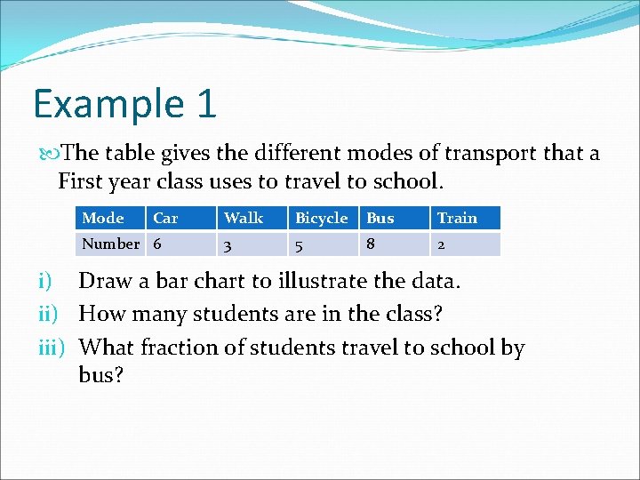
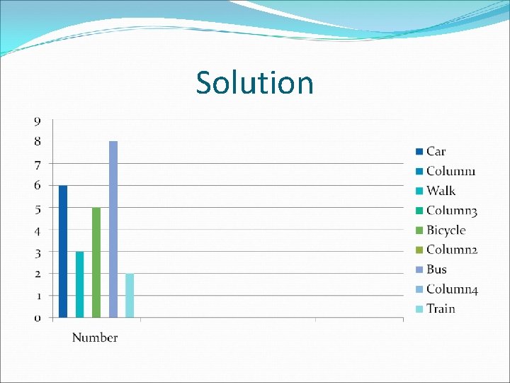
Example 1 The table gives the different modes of transport that a First year class uses to travel to school. Mode Car Number 6 Walk Bicycle Bus Train 3 5 8 2 i) Draw a bar chart to illustrate the data. ii) How many students are in the class? iii) What fraction of students travel to school by bus?

Solution

ii) 6 + 3 + 5 + 8 + 2 = 24 students iii) 8/24 = 1/3

Question P. g. 237 Q. 1

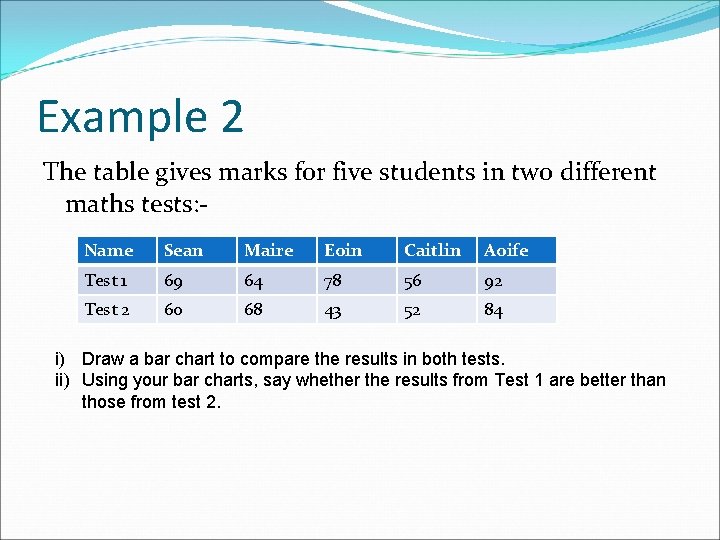
Example 2 The table gives marks for five students in two different maths tests: Name Sean Maire Eoin Caitlin Aoife Test 1 69 64 78 56 92 Test 2 60 68 43 52 84 i) Draw a bar chart to compare the results in both tests. ii) Using your bar charts, say whether the results from Test 1 are better than those from test 2.

Solution i) On board ii) The chart indicates that all students with the exception of Maire scored better in Test 1.

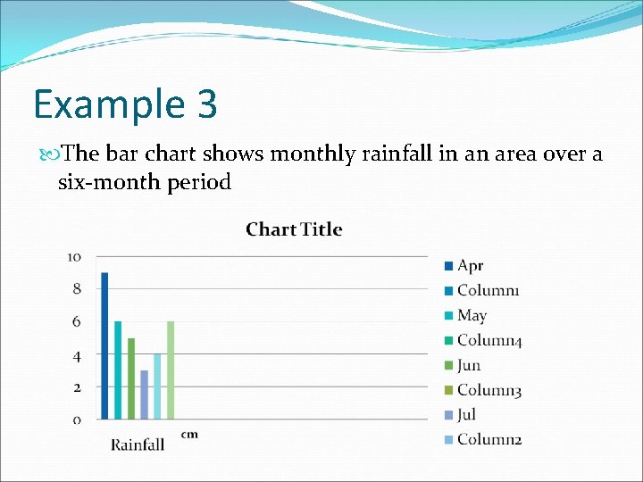
Example 3 The bar chart shows monthly rainfall in an area over a six-month period

Solution i) Which was the wettest month? April ii) Which was the driest month? July

Solution iii) What was the total rainfall for the six – month period? 9+ 6 + 5 + 3 + 4 + 6 = 33 cm iv) What fraction of the rain for the period fell during May? 6/33 = 2/11

Questions: P. g. 237 Q. 2 Q. 4 Q. 9 You need a maths set. Compass and protractor, etc.

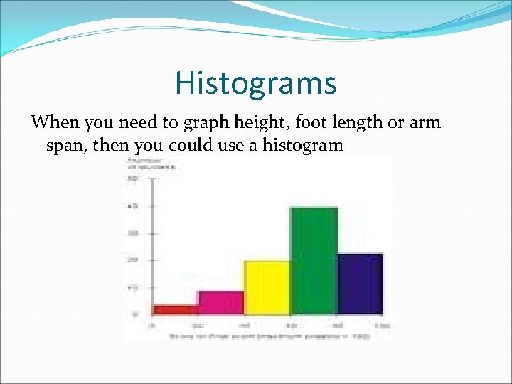
Histograms When you need to graph height, foot length or arm span, then you could use a histogram

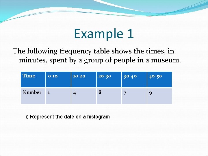
Example 1 The following frequency table shows the times, in minutes, spent by a group of people in a museum. Time 0 -10 10 -20 20 -30 30 -40 40 -50 Number 1 4 8 7 9 i) Represent the date on a histogram

Questions P. g. 245 Q. 1. Q. 2. Q. 3. Everyone needs to collect an article from a newspaper, magazine or internet article that shows data in a bar chart, histogram or pie chart. Please don’t just cut out the chart, information is needed

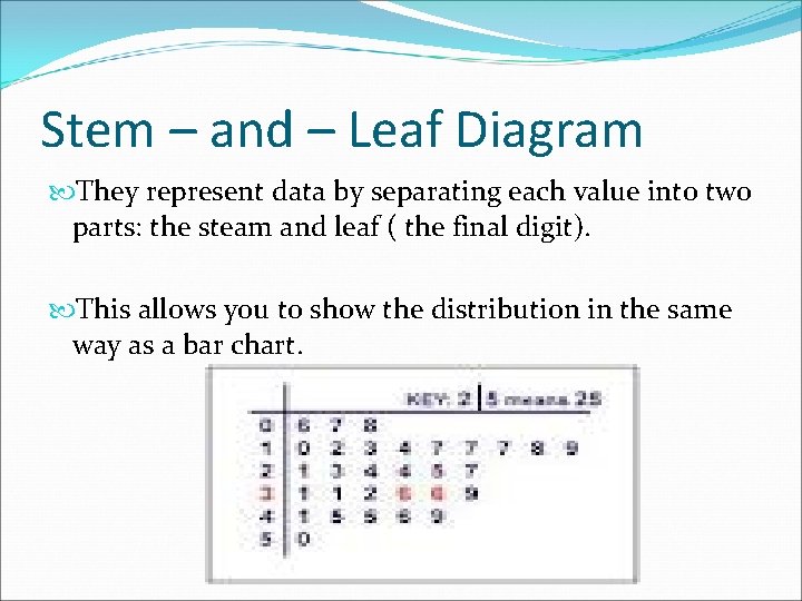
Stem – and – Leaf Diagram They represent data by separating each value into two parts: the steam and leaf ( the final digit). This allows you to show the distribution in the same way as a bar chart.

Example 1 Here are the marks obtained by 30 boys in a maths test: 87, 57, 29, 79, 84, 7, 55, 53, 65, 69, 62, 44, 52, 39, 43, 9, 13, 91, 61, 57, 75, 44, 73, 74, 68, 52, 37, 35, 14. Represent the data in a stem-and-leaf diagram

Solution Step 1: - Decide on the size of numbers in the stem. The marks range from 7 to 91. This range suggests a stem in 10’s. Step 2: - Construct an unordered stem - and – leaf diagram.

Step 3: - Order the leaves from the smallest to the largest Step 4: - Give the diagram a key

Example 1 Stem Leaf 0 1 2 3 4 5 6 7 8 9 7, 9 3, 4 9 5, 7, 9 3, 4, 4 2, 2, 3, 5, 7, 7, 8 1, 2, 5, 8, 9 3, 4, 5, 9 4, 7 1

Questions P. g. 243 Q. 1. Q. 3.

P. g. 243 Q. 1. Stem 3 4 5 6 7 8 9 10 Leaf

Q. 3 Stem Leaf 13 14 15 16 17 18 8, 9

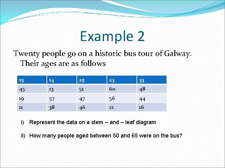
Example 2 Twenty people go on a historic bus tour of Galway. Their ages are as follows 15 14 25 23 33 45 13 51 60 48 19 57 47 56 44 11 38 46 21 16 i) Represent the data on a stem – and – leaf diagram ii) How many people aged between 50 and 65 were on the bus?

Questions P. g. 244 Q. 6. Q. 8.

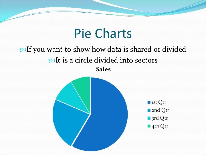
Pie Charts If you want to show data is shared or divided It is a circle divided into sectors

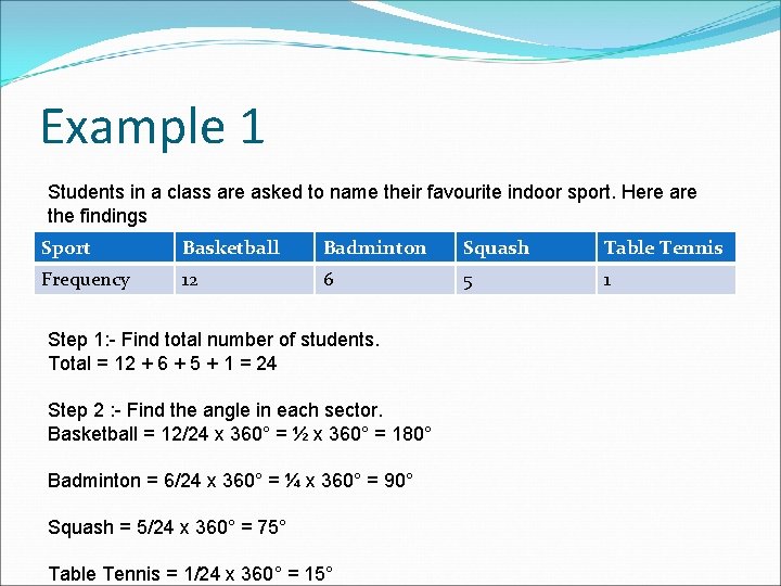
Example 1 Students in a class are asked to name their favourite indoor sport. Here are the findings Sport Basketball Badminton Squash Table Tennis Frequency 12 6 5 1 Step 1: - Find total number of students. Total = 12 + 6 + 5 + 1 = 24 Step 2 : - Find the angle in each sector. Basketball = 12/24 x 360° = ½ x 360° = 180° Badminton = 6/24 x 360° = ¼ x 360° = 90° Squash = 5/24 x 360° = 75° Table Tennis = 1/24 x 360° = 15°

Step 3: - Draw a circle and marks its centre Using your protractor, construct and label the sectors.

Questions P. g. 241 Q. 9 Q. 10

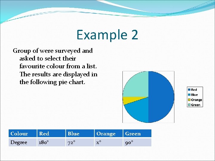
Example 2 Group of were surveyed and asked to select their favourite colour from a list. The results are displayed in the following pie chart. Colour Red Blue Orange Green Degree 180° 72° x° 90°

i) What is the value of x? ii) If eight people chose blue as their favourite colour, how many students were surveyed? iii) Copy and complete the table: Colour Number Red Blue Orange Green

Questions P. g. 249 Q. 1. Q. 2. Q. 7.

Statistic Project Groups of Three Pick a topic, to find out more about your peers / friends(e. g. favourite sport, favourite tv program, etc) Pick at random a class from your year (you need to do this in a fair manner) Make your questionnaire ( look back on what kind of questions to ask) Show Ms. Kehoe the questions Carry out your survey. Record the answers carefully and clearly Pick a method to represent the data (bar chart, pie chart, histogram, etc)

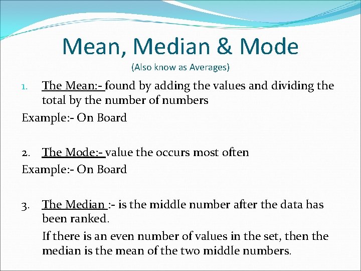
Mean, Median & Mode (Also know as Averages) The Mean: - found by adding the values and dividing the total by the number of numbers Example: - On Board 1. 2. The Mode: - value the occurs most often Example: - On Board 3. The Median : - is the middle number after the data has been ranked. If there is an even number of values in the set, then the median is the mean of the two middle numbers.

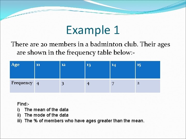
Example 1 There are 20 members in a badminton club. Their ages are shown in the frequency table below: Age 11 Frequency 4 12 13 14 15 3 4 7 2 Find: i) The mean of the data ii) The mode of the data iii) The % of members who have ages greater than the mean.

Questions P. g. 248 Q. 1 Q. 2

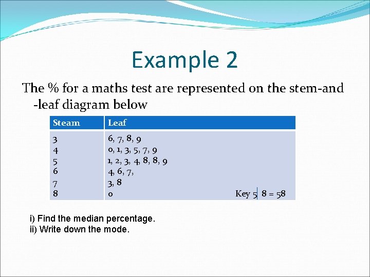
Example 2 The % for a maths test are represented on the stem-and -leaf diagram below Steam Leaf 3 4 5 6 7 8 6, 7, 8, 9 0, 1, 3, 5, 7, 9 1, 2, 3, 4, 8, 8, 9 4, 6, 7, 3, 8 0 i) Find the median percentage. ii) Write down the mode. Key 5 8 = 58

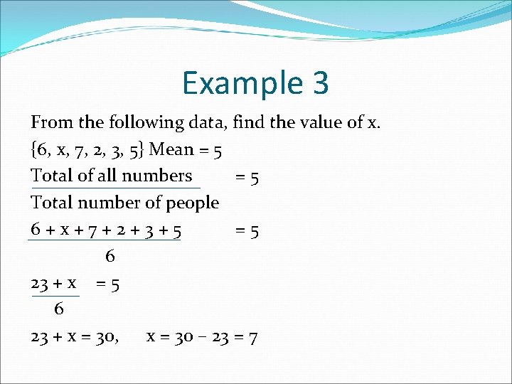
Example 3 From the following data, find the value of x. {6, x, 7, 2, 3, 5} Mean = 5 Total of all numbers =5 Total number of people 6+x+7+2+3+5 =5 6 23 + x = 30, x = 30 – 23 = 7

Questions P. g. 248 Q. 3 Q. 5 Q. 10. ii) – v)

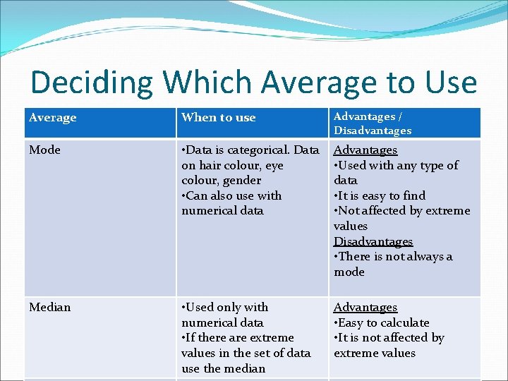
Deciding Which Average to Use Average When to use Advantages / Disadvantages Mode • Data is categorical. Data on hair colour, eye colour, gender • Can also use with numerical data Advantages • Used with any type of data • It is easy to find • Not affected by extreme values Disadvantages • There is not always a mode Median • Used only with numerical data • If there are extreme values in the set of data use the median Advantages • Easy to calculate • It is not affected by extreme values

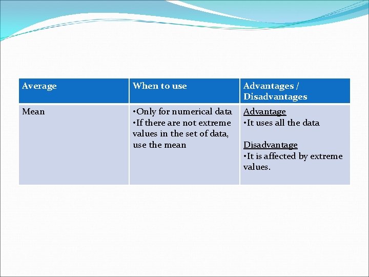
Average When to use Advantages / Disadvantages Mean • Only for numerical data • If there are not extreme values in the set of data, use the mean Advantage • It uses all the data Disadvantage • It is affected by extreme values.