CS 639 Data Management for Data Science Lecture









- Slides: 53

CS 639: Data Management for Data Science Lecture 24: Data Vizualization [based on slides by John Canny] Theodoros Rekatsinas 1

2

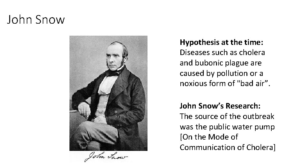
John Snow Hypothesis at the time: Diseases such as cholera and bubonic plague are caused by pollution or a noxious form of "bad air”. John Snow’s Research: The source of the outbreak was the public water pump [On the Mode of Communication of Cholera]

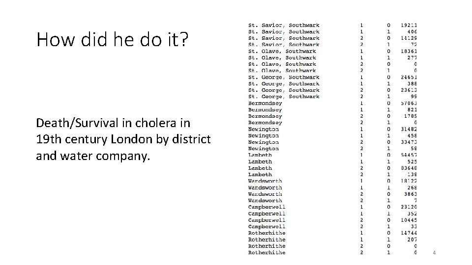
How did he do it? Death/Survival in cholera in 19 th century London by district and water company. 4

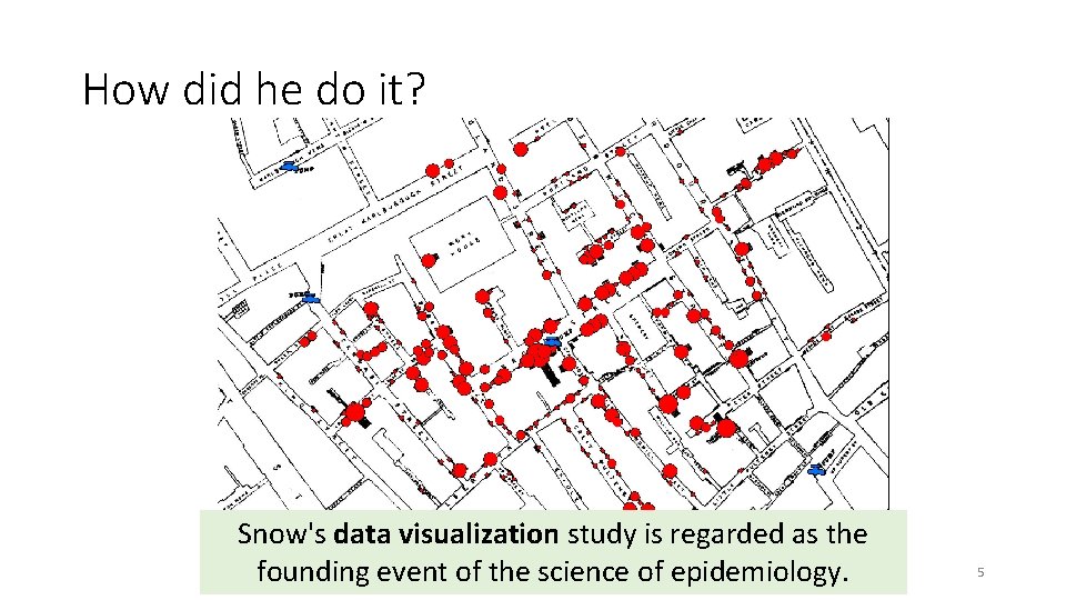
How did he do it? Snow's data visualization study is regarded as the founding event of the science of epidemiology. 5

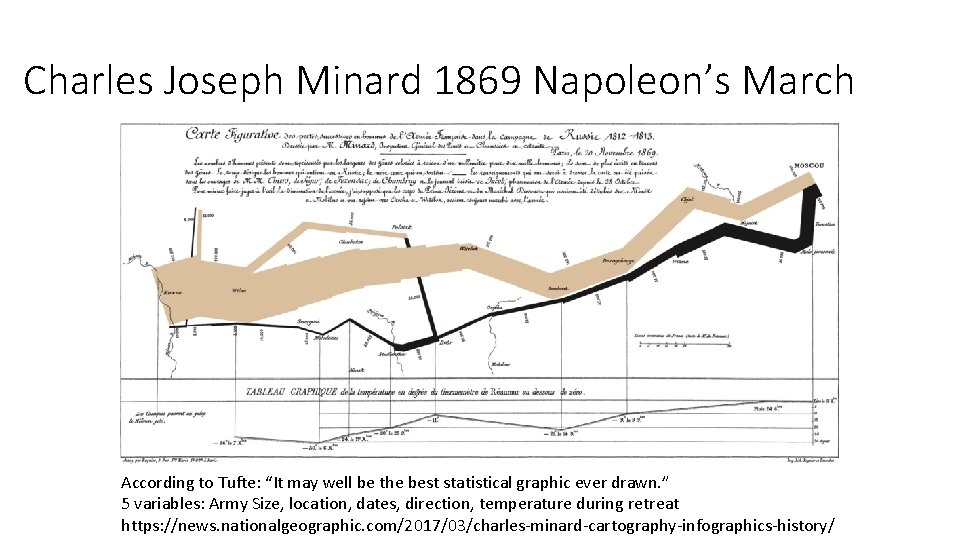
Charles Joseph Minard 1869 Napoleon’s March According to Tufte: “It may well be the best statistical graphic ever drawn. ” 5 variables: Army Size, location, dates, direction, temperature during retreat https: //news. nationalgeographic. com/2017/03/charles-minard-cartography-infographics-history/

Interactivity to Educate • The famous Gapminder Video, Hans Rosling: 200 Countries, 200 Years, 4 Minutes • https: //www. youtube. com/watch? feature=player_embedded&v=jbk. SRLYSojo

Outline Visualization: • Some great examples • Some counter-examples • Principles for Visualization Design • Visualization Toolkits preview

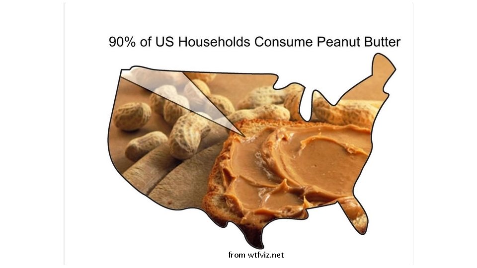
Some Anti-Examples • Courtesy of WTFViz. net

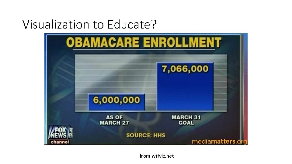
Visualization to Educate? from wtfviz. net

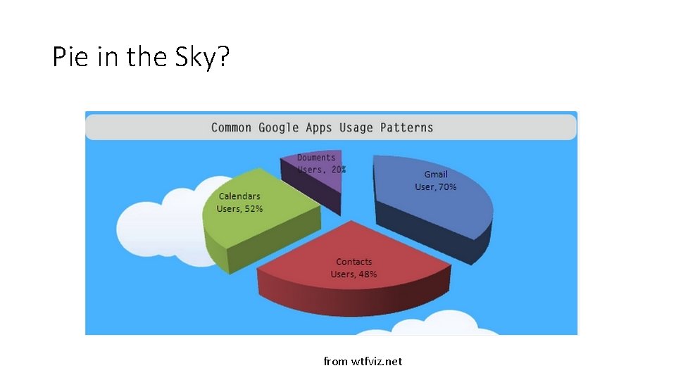
Pie in the Sky? from wtfviz. net

from wtfviz. net

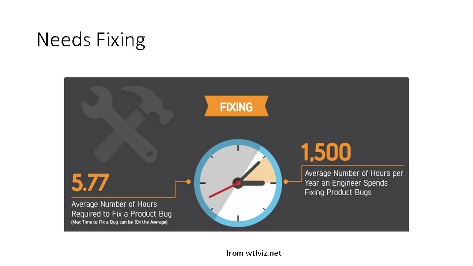
Needs Fixing from wtfviz. net

Outline Visualization: • Some great examples • Some counter-examples • Principles for Visualization Design • Visualization Toolkits preview

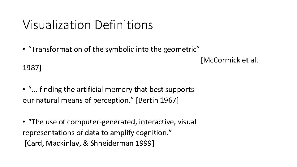
Visualization Definitions • “Transformation of the symbolic into the geometric” [Mc. Cormick et al. 1987] • “. . . finding the artificial memory that best supports our natural means of perception. ” [Bertin 1967] • “The use of computer-generated, interactive, visual representations of data to amplify cognition. ” [Card, Mackinlay, & Shneiderman 1999]

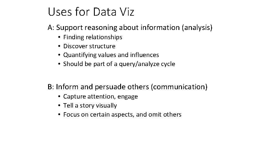
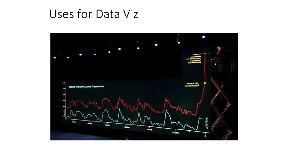
Uses for Data Viz A: Support reasoning about information (analysis) • • Finding relationships Discover structure Quantifying values and influences Should be part of a query/analyze cycle B: Inform and persuade others (communication) • Capture attention, engage • Tell a story visually • Focus on certain aspects, and omit others

Uses for Data Viz

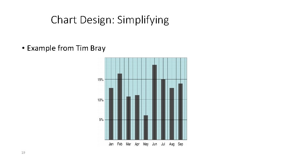
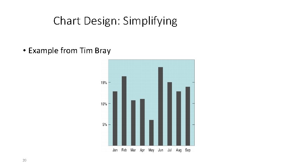
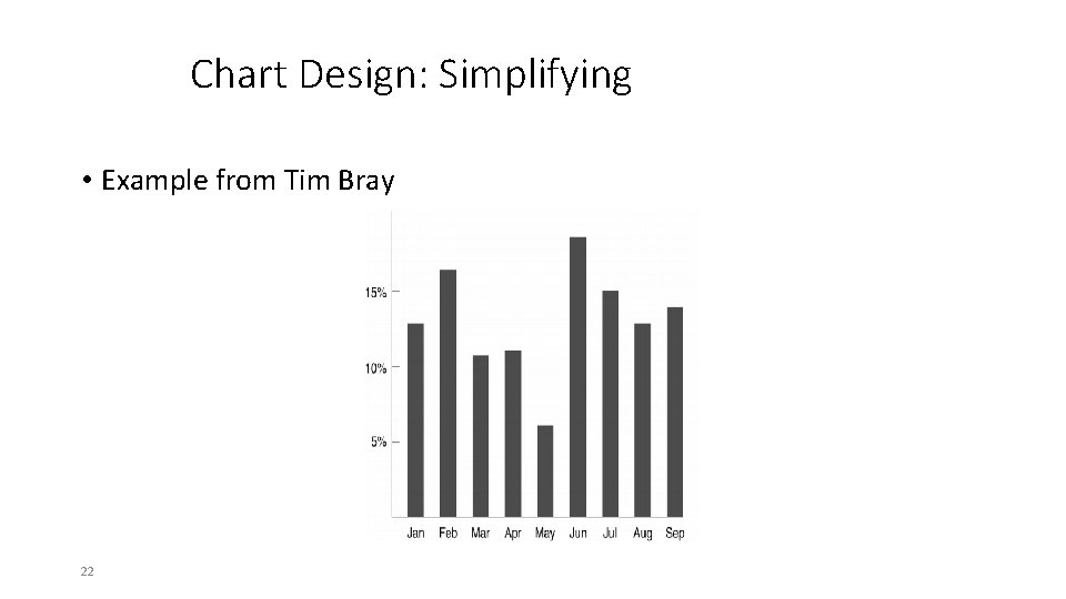
Principle 1 • Simplify ! 18

Chart Design: Simplifying • Example from Tim Bray 19

Chart Design: Simplifying • Example from Tim Bray 20

Chart Design: Simplifying • Example from Tim Bray 21

Chart Design: Simplifying • Example from Tim Bray 22

Chart Design: Simplifying • Example from Tim Bray 23

Chart Design: Simplifying • Example from Tim Bray 24

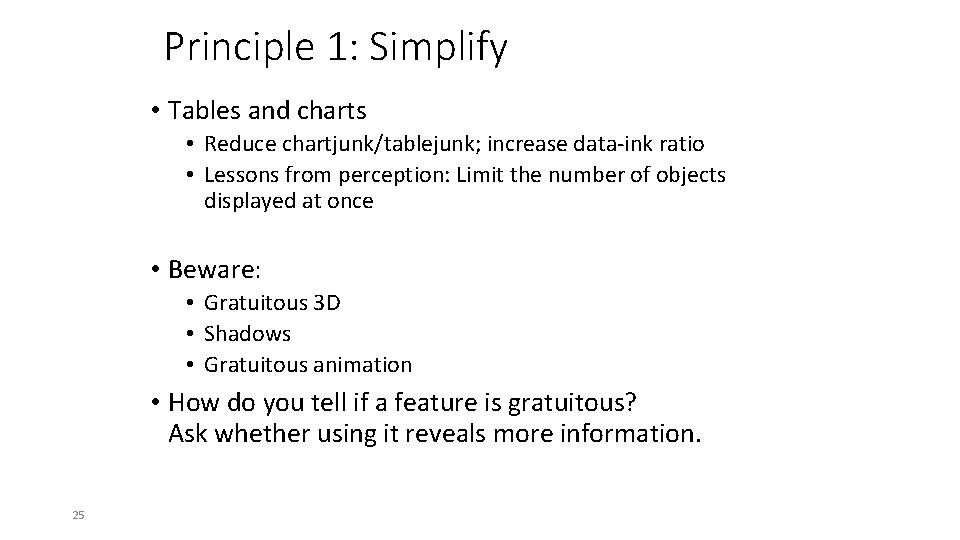
Principle 1: Simplify • Tables and charts • Reduce chartjunk/tablejunk; increase data-ink ratio • Lessons from perception: Limit the number of objects displayed at once • Beware: • Gratuitous 3 D • Shadows • Gratuitous animation • How do you tell if a feature is gratuitous? Ask whether using it reveals more information. 25

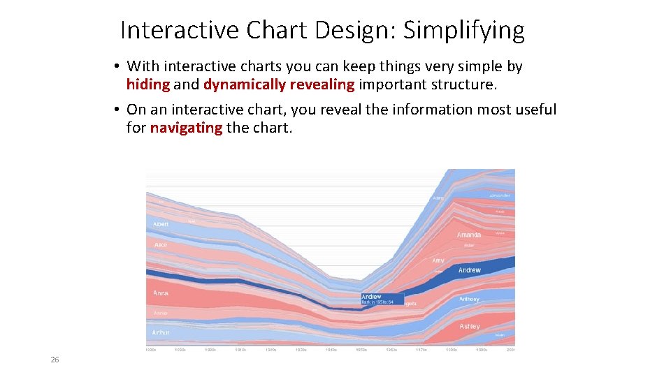
Interactive Chart Design: Simplifying • With interactive charts you can keep things very simple by hiding and dynamically revealing important structure. • On an interactive chart, you reveal the information most useful for navigating the chart. 26

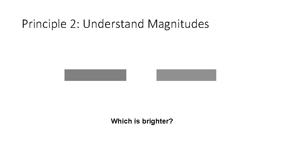
Principle 2: Understand Magnitudes Which is brighter?

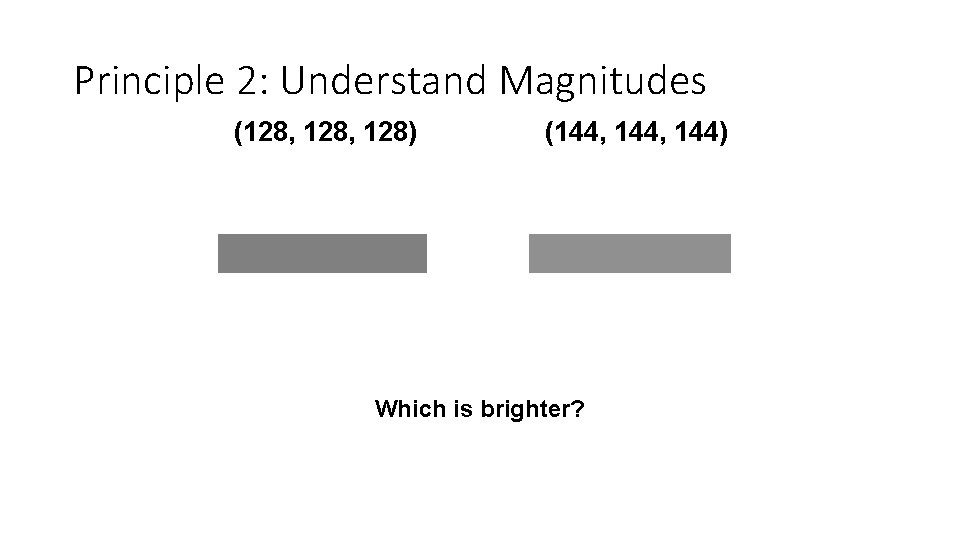
Principle 2: Understand Magnitudes (128, 128) (144, 144) Which is brighter?

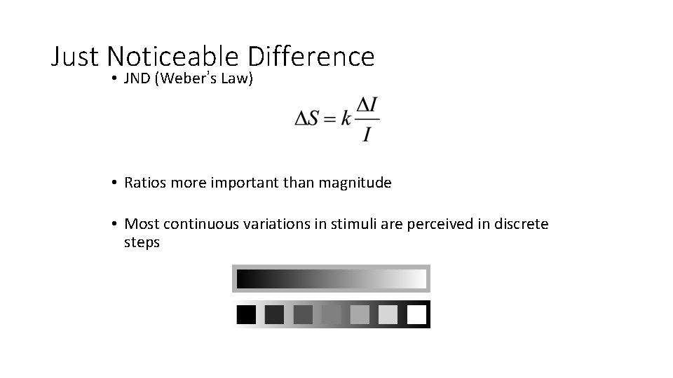
Just Noticeable Difference • JND (Weber’s Law) • Ratios more important than magnitude • Most continuous variations in stimuli are perceived in discrete steps

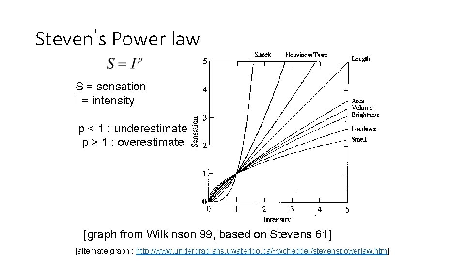
Steven’s Power law S = sensation I = intensity p < 1 : underestimate p > 1 : overestimate [graph from Wilkinson 99, based on Stevens 61] [alternate graph : http: //www. undergrad. ahs. uwaterloo. ca/~wchedder/stevenspowerlaw. htm]

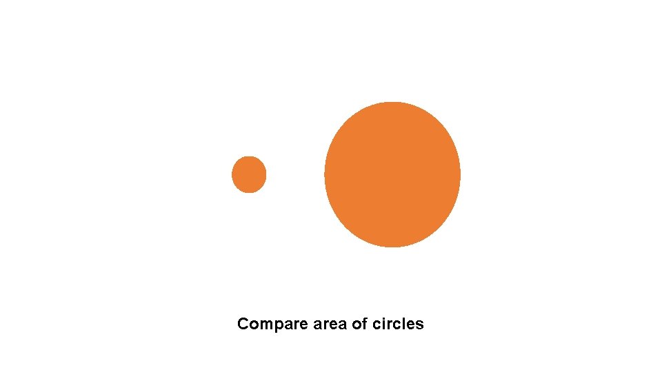
Compare area of circles

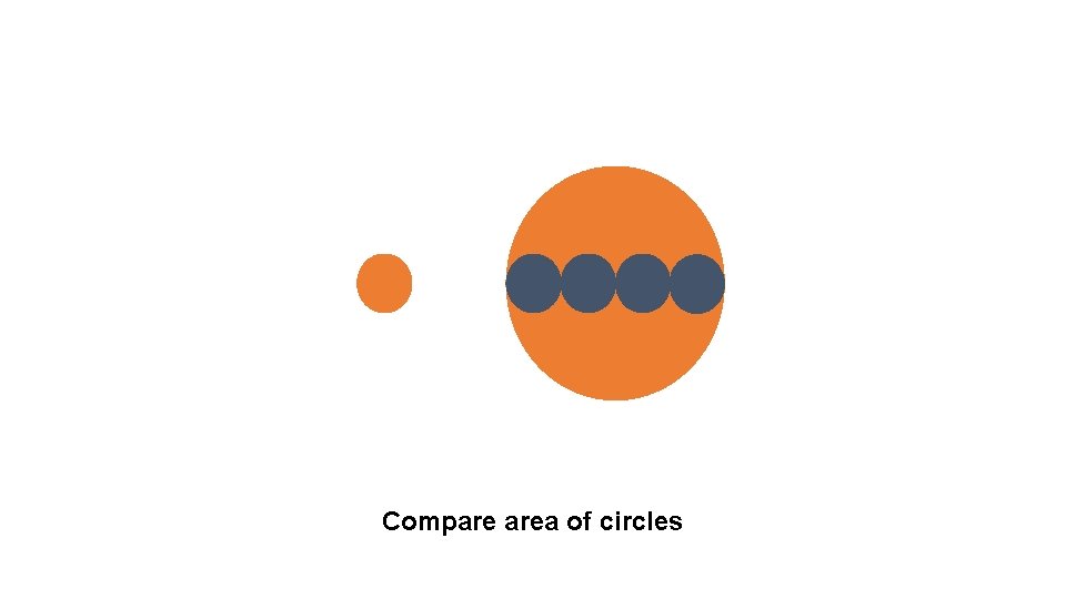
Compare area of circles

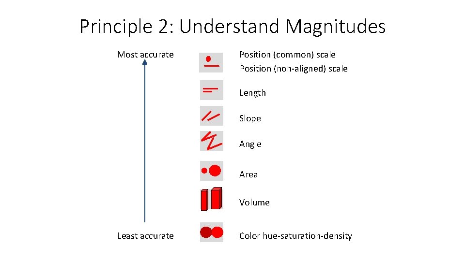
Principle 2: Understand Magnitudes Most accurate Position (common) scale Position (non-aligned) scale Length Slope Angle Area Volume Least accurate Color hue-saturation-density

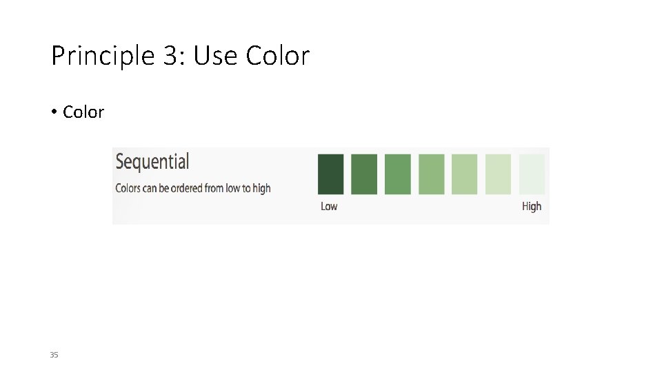
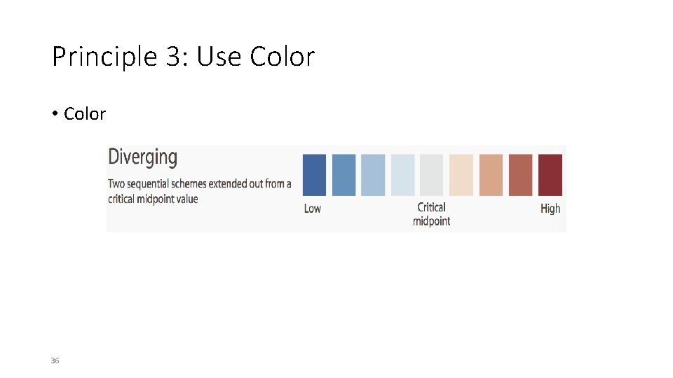
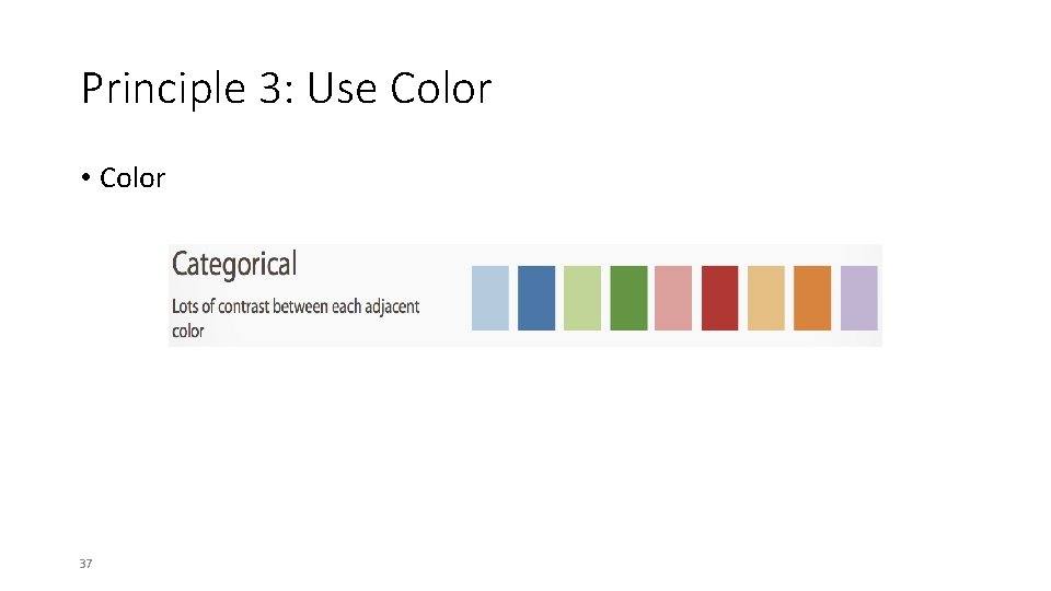
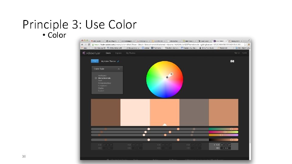
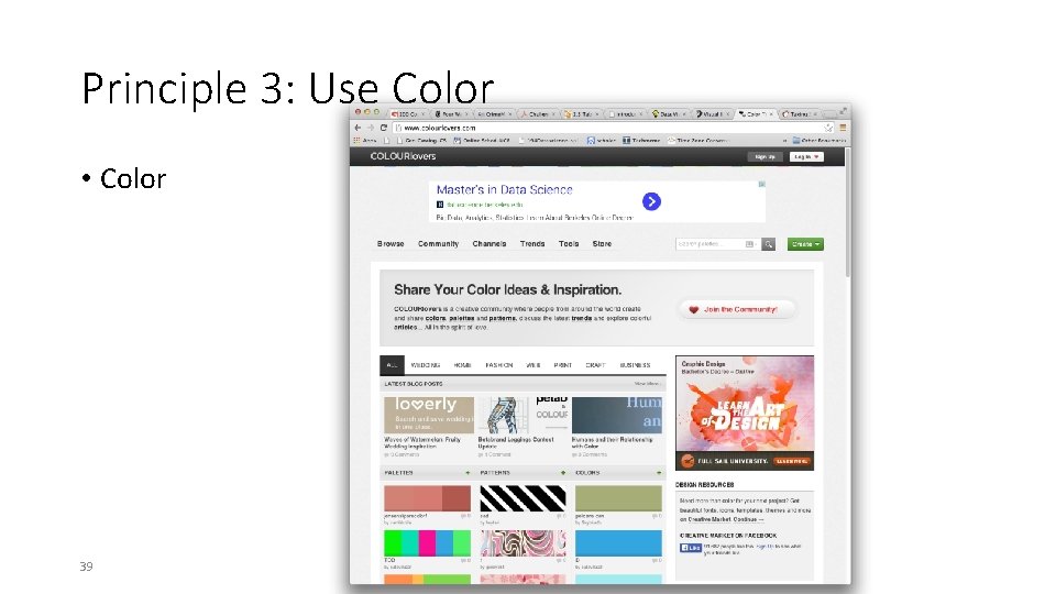
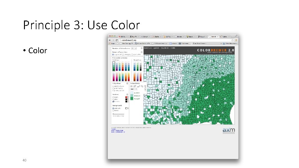
Principle 3: Use Color • Choose colors based on the information you want to convey • Sequential • Diverging • Categorical • Use online resources to discover and record your color schemes • Color Brewer • Kuler • Colour Lovers • Where possible, use your organization’s palette 34

Principle 3: Use Color • Color 35

Principle 3: Use Color • Color 36

Principle 3: Use Color • Color 37

Principle 3: Use Color • Color 38

Principle 3: Use Color • Color 39

Principle 3: Use Color • Color 40

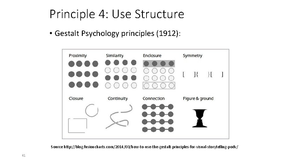
Principle 4: Use Structure • Gestalt Psychology principles (1912): Source http: //blog. fusioncharts. com/2014/03/how-to-use-the-gestalt-principles-for-visual-storytelling-podv/ 41

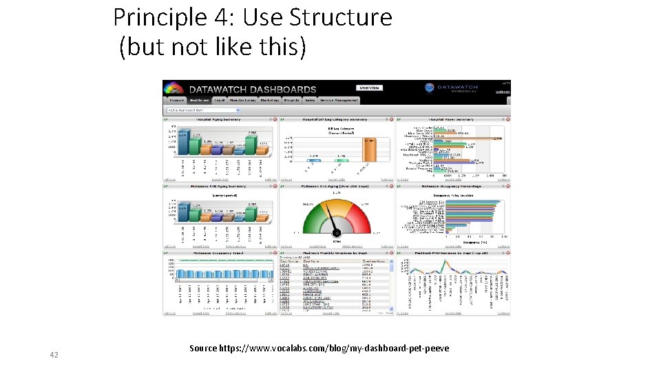
Principle 4: Use Structure (but not like this) 42 Source https: //www. vocalabs. com/blog/my-dashboard-pet-peeve

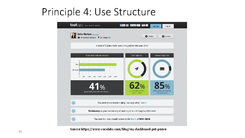
Principle 4: Use Structure 43 Source https: //www. vocalabs. com/blog/my-dashboard-pet-peeve

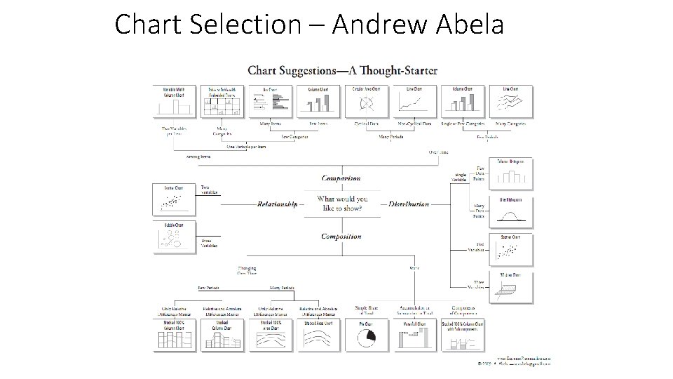
Chart Selection – Andrew Abela

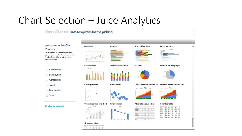
Chart Selection – Juice Analytics

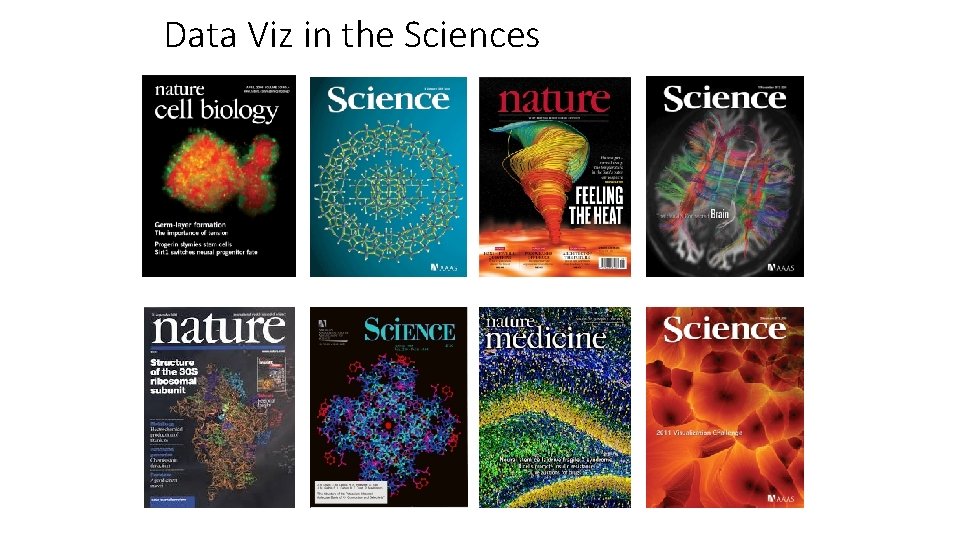
Data Viz in the Sciences

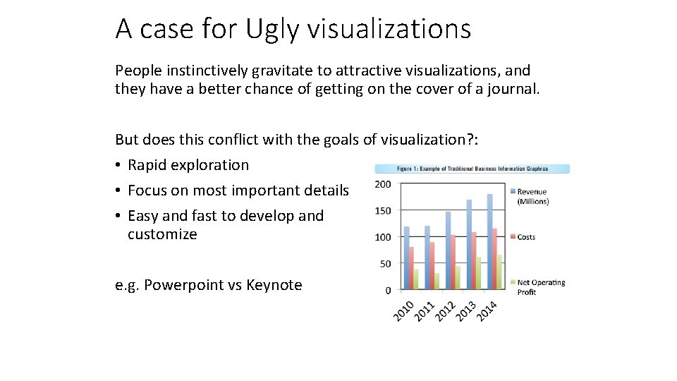
A case for Ugly visualizations People instinctively gravitate to attractive visualizations, and they have a better chance of getting on the cover of a journal. But does this conflict with the goals of visualization? : • Rapid exploration • Focus on most important details • Easy and fast to develop and customize e. g. Powerpoint vs Keynote

Outline Visualization: • Some great examples • Some counter-examples • Principles for Visualization Design • Visualization Toolkits preview

Interactive Toolkits: D 3 Without Doubt, the most widely used interactive visualization framework is D 3, developed around 2011 by Jeff Heer, Mike Bostock and Vadim Ogievetsky. Note from the authors: D 3 is intentionally a low-level system. During the early design of D 3, we even referred to it as a "visualization kernel" rather than a "toolkit" or "framework"

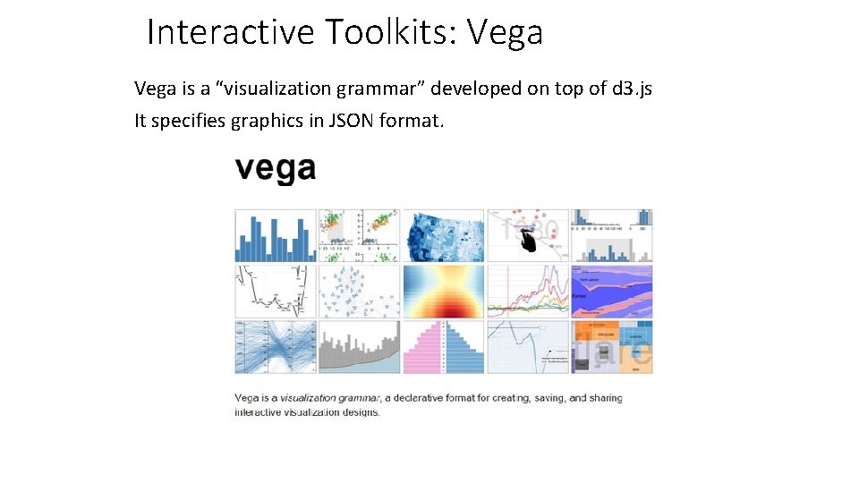
Interactive Toolkits: Vega is a “visualization grammar” developed on top of d 3. js It specifies graphics in JSON format.

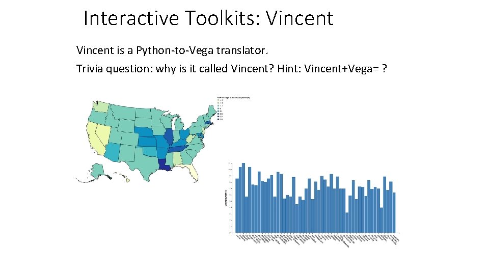
Interactive Toolkits: Vincent is a Python-to-Vega translator. Trivia question: why is it called Vincent? Hint: Vincent+Vega= ?

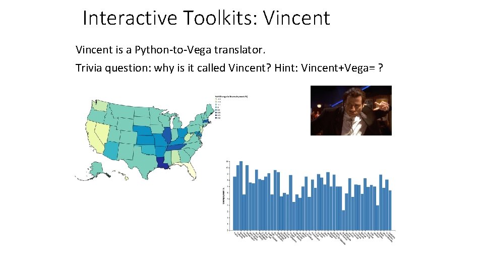
Interactive Toolkits: Vincent is a Python-to-Vega translator. Trivia question: why is it called Vincent? Hint: Vincent+Vega= ?

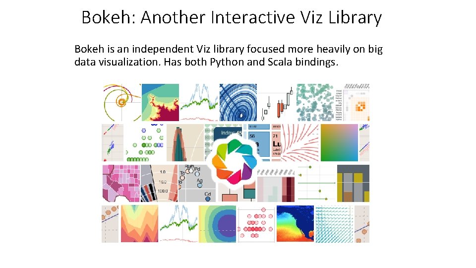
Bokeh: Another Interactive Viz Library Bokeh is an independent Viz library focused more heavily on big data visualization. Has both Python and Scala bindings.