Swings Agenda n n n Introduction Swings Event


 JBuilder (Borland) Eclipse (IBM and others) q")


 as")


 { JFrame jf = new JFrame(\"My")


 Constructs a new Flow. Layout with the specified alignment")


 Creates a button with no set text or icon")

 Creates an initially unselected check box button")
 Creates a check box with text")


 Creates a JCombo. Box")


. add(child); n The")
 Creates a non-modal dialog without a title")
 Creates a modal or non-modal dialog")

 Creates a JOption. Pane")
")


 Constructs a default JTable that")
 Constructs a JTable that")


- Slides: 72
Swings
Agenda n n n Introduction Swings Event Handling Containers Swing Components Layout Managers
Swing overview n Defined in package javax. swing n Original GUI components from AWT in java. awt q Heavyweight components - rely on local platform's windowing system for look and feel n Swing components are lightweight q Not weighed down by GUI capabilities of platform q More portable than heavyweight components n Swing components allow programmer to specify look and feel q Can change depending on platform q Can be same across all platforms
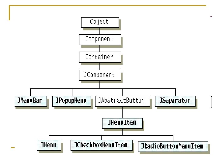
Swing component inheritance hierarchy java. lang. Object java. awt. Component java. awt. Container javax. swing. JComponent • Component defines methods used in its subclasses (for example, paint and repaint) • Container - collection of related components • When using JFrame, add components to content pane (a Container) • JComponent - superclass to most Swing components
Swing vs. AWT n n n Swing is bigger Swing is more flexible and better looking Swing and AWT are incompatible--you can use either, but you can’t mix them Learning the AWT is a good start on learning Swing AWT: Button b = new Button (“OK”); Swing: Jbutton b = new Jbutton(“OK”);
To build a GUI. . . n n n Make somewhere to display things--a Frame, a Window, or an Applet Create controls (buttons, text areas, etc. ) Add your controls to your display area Arrange, or lay out, your controls Attach Listeners actions to your controls
GUI Builders n n n Netbeans (Sun) JBuilder (Borland) Eclipse (IBM and others) q Visual Editor n Help Software Updates Find and Install…
JFC – Java Foundation Classes n Graphical framework for building portable Java-based graphical user interfaces (GUIs). n Features of the Java Foundation Classes q q q Swing GUI Components Pluggable Look-and-Feel Support Accessibility API Java 2 D API Internationalization
Swing Features n n n n n Vast Range of Components Pluggable Look and Feel Data Transfer Drag and Drop Cut, Copy, and Paste Internationalization and Localization Accessibility Integrating with the Desktop System Tray Icon Support
Swing Components JApplet JDialog JFrame JWindow JComponent JCombo. Box JLabel JList JMenu. Bar JPanel JPopup. Menu JScroll. Bar JScroll. Pane JTable JTree JInternal. Frame JOption. Pane JProgress. Bar JRoot. Pane JSeparator JSlider JSplit. Pane JTabbed. Pane JTool. Bar JTool. Tip JViewport JColor. Chooser JText. Component JText. Area JText. Field JPassword. Field JText. Field JEditor. Pane JText. Pane JFile. Chooser JLayered. Pane JDesktop. Pane Abstract. Button Class JToggle. Button -- JCheck. Box and JRadio. Button JMenu. Item -- JMenu, JRadio. Button. Menu. Item and JCheck. Button. Item
Swing Architecture – MVC Architecture n n Swing uses the Model-View-Controller architecture (MVC) as the fundamental design behind each of its components. MVC breaks GUI components into 3 elements Each elements plays an important role in how component behaves Allows for Portability etc.
Basic MVC Model n n The three elements interact as follows: The MVC Communication Model
MVC in Swing uses a simplified model of the MVC design: model-delegate • Combines View and Controller into a single element -- the UI-delegate • Easy to bundle graphics and event handling in Java -- AWT. • Model delegate interaction is now Two way. • Model -- maintains information • UI-delegate -- Draws and reacts to events that propagate through component
Event Delegation Model n n Source and the Listener Event Listeners Event Sources Adapters
Your First Swing Program Import javax. swing. *; public class JFrame. Tester { public static void main(String[] args) { JFrame jf = new JFrame("My JFrame"); jf. get. Content. Pane(). set. Layout(new Flow. Layout()); JButton button = new JButton("My Button"); jf. set. Size(250, 250); jf. set. Location(300, 200); jf. get. Content. Pane(). add(button); jf. set. Default. Close. Operation(JFrame. EXIT_ON_CLOSE); jf. set. Visible(true); } }
Lets Add Action to the Button 10. public class JFrame. Tester implements Action. Listener { public static void main(String[] args) { Swing. Utilities. invoke. Later(new Runnable() { public void run() { JFrame. Tester test = new JFrame. Tester(); test. create. And. Show. Frame(); }); } 11. 1. 2. 3. 4. 5. 6. 7. 8. 9.
1. 2. 3. 4. 5. 6. 7. 8. 9. 10. 11. 12. 13. 14. 15. 16. public void create. And. Show. Frame() { JFrame jf = new JFrame("My JFrame"); jf. get. Content. Pane(). set. Layout(new Flow. Layout()); JButton button = new JButton("My Button"); button. add. Action. Listener(this); jf. set. Size(250, 250); jf. set. Location(300, 200); jf. get. Content. Pane(). add(button); jf. set. Default. Close. Operation(JFrame. EXIT_ON_CLOSE); jf. set. Visible(true); } public void action. Performed(Action. Event e) { ((JButton)e. get. Source()). set. Text("Action Event"); } }
Types of Event Classes / Listeners n n n Action. Event Action. Listener Adjustment. Event Adjustment. Listener Component. Event Component. Listener Container. Event Container. Listener Focus. Event Focus. Listener Item. Event Item. Listener Key. Event Key. Listener Mouse. Event Mouse. Listener Mouse. Wheel. Event Mouse. Wheel. Listener Text. Event Text. Listener Window. Event Window. Focus. Listener, Window. Listener
Adapter. Classes / Listeners n n n n Component. Adapter Component. Listener Container. Adapter Container. Listener Focus. Adapter Focus. Listener Key. Adapter Key. Listener Mouse. Adapter Mouse. Listener Mouse. Motion. Adapter Mouse. Motion. Listener Window. Adapter Window. Listener
Adapter Example public void create. And. Show. Frame() { JFrame jf = new JFrame("My JFrame"); jf. get. Content. Pane(). set. Layout(new Flow. Layout()); JButton button 1 = new JButton("My Button 1"); JButton button 2 = new JButton("My Button 2"); button 2. add. Focus. Listener(new My. Focus. Adapter()); jf. set. Size(250, 250); jf. set. Location(300, 200); jf. get. Content. Pane(). add(button 1); jf. get. Content. Pane(). add(button 2); jf. set. Default. Close. Operation(JFrame. EXIT_ON_CLOSE); jf. set. Visible(true); } class My. Focus. Adapter extends Focus. Adapter{ public void focus. Gained(Focus. Event e){ ((JButton)e. get. Source()). set. Text("Focus Adapter"); } } }
Swing Containers
Top Level Containers n n Swing provides three generally useful top-level container classes: JFrame, JDialog, and JApplet. To appear onscreen, every GUI component must be part of a containment hierarchy. A containment hierarchy is a tree of components that has a top-level container as its root. Each GUI component can be contained only once. If a component is already in a container and you try to add it to another container, the component will be removed from the first container and then added to the second. Each top-level container has a content pane that, generally speaking, contains (directly or indirectly) the visible components in that top-level container's GUI.
Panes n n Root Pane Content Pane Glass Pane Layered Pane
Swing Frame, Panes and Panels
JFrames n n Like all other JFC/Swing top-level containers, a JFrame contains a JRoot. Pane as its only child. The content pane provided by the root pane should, as a rule, contain all the non-menu components displayed by the JFrame. This is different from the AWT Frame case. For example, to add a child to an AWT frame you'd write: q frame. add(child); However using JFrame you need to add the child to the JFrame's content pane instead: q frame. get. Content. Pane(). add(child);
n n The same is true for setting layout managers, removing components, listing children, and so on. All these methods should normally be sent to the content pane instead of the JFrame itself. The content pane will always be non-null. Attempting to set it to null will cause the JFrame to throw an exception. The default content pane will have a Border. Layout manager set on it. Unlike a Frame, a JFrame has some notion of how to respond when the user attempts to close the window. The default behavior is to simply hide the JFrame when the user closes the window. To change the default behavior, you invoke the method set. Default. Close. Operation(int). To make the JFrame behave the same as a Frame instance, use set. Default. Close. Operation(Window. Constants. DO_NOTHIN G_ON_CLOSE).
Internal. Frame n n Internal frames are not windows or top-level containers, however, which makes them different from frames. For example, you must add an internal frame to a container (usually a JDesktop. Pane); an internal frame cannot be the root of a containment hierarchy. Also, internal frames do not generate window events. Instead, the user actions that would cause a frame to fire window events cause an internal frame to fire internal frame events.
JInternal. Frame A lightweight object that provides many of the features of a native frame, including dragging, closing, becoming an icon, resizing, title display, and support for a menu bar. n Generally, you add JInternal. Frames to a JDesktop. Pane. The JInternal. Frame content pane is where you add child components. So, to create a JInternal. Frame that has a number of buttons arranged with the content pane's default Border. Layout object, you might do something like this: n JComponent c = (JComponent) internal. Frame. get. Content. Pane(); c. add(new JButton(), Border. Layout. NORTH); c. add(new JButton(), Border. Layout. CENTER); n
Internal. Frame Ex.
JPanel n n n The JPanel class provides general-purpose containers for lightweight components Like other containers, a panel uses a layout manager to position and size its components. By default, a panel's layout manager is an instance of Flow. Layout, which places the panel's contents in a row. You can easily make a panel use any other layout manager by invoking the set. Layout method or by specifying a layout manager when creating the panel. When you add components to a panel, you use the add method.
JTabbed. Pane n n n component that lets the user switch between a group of components by clicking on a tab with a given title and/or icon Tabs/components are added to a Tabbed. Pane object by using the add. Tab and insert. Tab methods. A tab is represented by an index corresponding to the position it was added in, where the first tab has an index equal to 0 and the last tab has an index equal to the tab count minus 1. The Tabbed. Pane uses a Single. Selection. Model to represent the set of tab indices and the currently selected index. If the tab count is greater than 0, then there will always be a selected index, which by default will be initialized to the first tab. If the tab count is 0, then the selected index will be -1.
Tabbed. Pane Ex
Layout Managers
Flow. Layout n n A flow layout arranges components in a left-to-right flow, much like lines of text in a paragraph. Flow layouts are typically used to arrange buttons in a panel. It will arrange buttons left to right until no more buttons fit on the same line. Each line is centered. Constructor Summary q Flow. Layout() Constructs a new Flow. Layout with a centered alignment and a default 5 -unit horizontal and vertical gap.
q q Flow. Layout(int align) Constructs a new Flow. Layout with the specified alignment and a default 5 -unit horizontal and vertical gap. Flow. Layout(int align, int hgap, int vgap) Creates a new flow layout manager with the indicated alignment and the indicated horizontal and vertical gaps.
Border. Layout n A border layout lays out a container, arranging and resizing its components to fit in five regions: north, south, east, west, and center. Each region may contain no more than one component, and is identified by a corresponding constant: NORTH, SOUTH, EAST, WEST, and CENTER. When adding a component to a container with a border layout, use one of these five constants, for example: n n n Panel p = new Panel(); p. set. Layout(new Border. Layout()); p. add(new Button("Okay"), Border. Layout. SOUTH);
n n As a convenience, Border. Layout interprets the absence of a string specification the same as the constant CENTER: For compatibility with previous releases, Border. Layout also includes the relative positioning constants BEFORE_FIRST_LINE, AFTER_LAST_LINE, BEFORE_LINE_BEGINS and AFTER_LINE_ENDS. These are equivalent to PAGE_START, PAGE_END, LINE_START and LINE_END respectively. For consistency with the relative positioning constants used by other components, the latter constants are preferred.
Grid. Layout n n The Grid. Layout class is a layout manager that lays out a container's components in a rectangular grid. The container is divided into equal-sized rectangles, and one component is placed in each rectangle. When both the number of rows and the number of columns have been set to non-zero values, either by a constructor or by the set. Rows and set. Columns methods, the number of columns specified is ignored. Instead, the number of columns is determined from the specified number or rows and the total number of components in the layout. So, for example, if three rows and two columns have been specified and nine components are added to the layout, they will be displayed as three rows of three columns. Specifying the number of columns affects the layout only when the number of rows is set to zero.
Icon n n Many Swing components, such as labels, buttons, and tabbed panes, can be decorated with an icon — a fixed-sized picture. An icon is an object that adheres to the Icon interface. Swing provides a particularly useful implementation of the Icon interface: Image. Icon, which paints an icon from a GIF, JPEG, or PNG image. Constructor Image. Icon icon = new Image. Icon(image. Name); Image. Icon icon = new Image. Icon(image. Name, description);
JLabels n n In many cases, JLabel is used exactly like Label: as a way to display text. However, since a JLabel can have an image instead of or in addition to the text, it is also frequently used as a way to put an image in a display. Features: Images, Borders, and HTML Content The first is the ability to display images, usually by supplying an Image. Icon eiher to the constructor or via a call to set. Icon. The second new feature is the ability to place borders around the labels.
JButton n Simple uses of JButton are very similar to Button. You create a JButton with a String as a label, and then drop it in a window. Events are normally handled just as with a Button: you attach an Action. Listener via the add. Action. Listener method n The most obvious new feature is the ability to associate images with buttons. Swing introduced a utility class called Image. Icon that lets you very easily specify an image file (jpeg or GIF, including animated GIFs). Many Swing controls allow the inclusion of icons. The simplest way to associate an image with a JButton is to pass the Image. Icon to the constructor, either in place of the text or in addition to it. However, a JButton actually allows seven associated images:
q q q q the main image (use set. Icon to specify it if not supplied in the constructor), the image to use when the button is pressed (set. Pressed. Icon), the image to use when the mouse is over it (set. Rollover. Icon, but you need to call set. Rollover. Enabled(true) first), the image to use when the button is selected and enabled (set. Selected. Icon), the image to use when the button is disabled (set. Disabled. Icon), the image to use when it is selected but disabled (set. Disabled. Selected. Icon), and the image to use when the mouse is over it while it is selected (set. Rollover. Selected. Icon).
JButton Continued. . n n You can also change the alignment of the text or icon in the button (set. Horizontal. Alignment and set. Vertical. Alignment; only valid if button is larger than preferred size), and change where the text is relative to the icon (set. Horizontal. Text. Position, set. Vertical. Text. Position). You can also easily set keyboard mnemonics via set. Mnemonic. This results in the specified character being underlined on the button, and also results in ALTchar activating the button.
n Constructor Summary n JButton() Creates a button with no set text or icon supplied. n JButton(Icon icon) Creates a button with an icon. n JButton(String text) Creates a button with text. n JButton(String text, Icon icon) Creates a button with initial text and an icon.
JCheck. Box n The JCheck. Box class provides support for check box buttons. You can also put check boxes in menus, using the JCheck. Box. Menu. Item class. Because JCheck. Box and JCheck. Box. Menu. Item inherit from Abstract. Button, Swing check boxes have all the usual button characteristics. For example, you can specify images to be used in check boxes. Check boxes are similar to radio buttons but their selection model is different, by convention. Any number of check boxes in a group — none, some, or all — can be selected. A group of radio buttons, on the other hand, can have only one button selected.
JCheck. Box Continued… q q JCheck. Box() Creates an initially unselected check box button with no text, no icon. JCheck. Box(Icon icon) Creates an initially unselected check box with an icon. JCheck. Box(Icon icon, boolean selected) Creates a check box with an icon and specifies whether or not it is initially selected. JCheck. Box(String text) Creates an initially unselected check box with text.
q q q JCheck. Box(String text, boolean selected) Creates a check box with text and specifies whether or not it is initially selected. JCheck. Box(String text, Icon icon) Creates an initially unselected check box with the specified text and icon. JCheck. Box(String text, Icon icon, boolean selected) Creates a check box with text and icon, and specifies whether or not it is initially selected.
JCombo. Box n n n The actions of the combo box are as follows: By default, the selected text is displayed in the text field, which acts as the current selection box. The button to the right of the text field controls the display of the list box, and is used to select a preconfigured list of items. the combo box has the addition of editing capability in the selection text field, the ability to display icons along with, or in place of, the text is also available.
n n n When the use combo boxes? Use combo boxes to conserve GUI Space: Combo boxes are ideal for allowing the user to choose a single item from a long list of options, without consuming a lot of dialog space. If you are running out of room in a dialog, and you need a UI that allows for either selecting from a list of choices or typing in place, use a combo box. Consider deploying the scroll bar when the item list reaches ten items, or if you need to display a hierarchy. The Swing JCombo. Box will automatically add scroll bars after approximately seven items, but you can change this by setting the preferred size of the instance.
JCombo. Box Continued. . n Constructor Summary q JCombo. Box() Creates a JCombo. Box with a default data model. q JCombo. Box(Combo. Box. Model a. Model) Creates a JCombo. Box that takes it's items from an existing Combo. Box. Model. q JCombo. Box(Object[] items) Creates a JCombo. Box that contains the elements in the specified array. q JCombo. Box(Vector items) Creates a JCombo. Box that contains the elements in the specified Vector.
Swing Components – Part 2
JMenu n n n Here are some notable features of the Swing menu system: Icons can augment or replace menu items. Menu items can be radio buttons. Keyboard accelerators can be assigned to menu items; these appear next to the menu item text. Most standard Swing components can be used as menu items.
Menu Ex
JPop. Up. Menu n n An implementation of a popup menu -- a small window that pops up and displays a series of choices. A JPopup. Menu is used for the menu that appears when the user selects an item on the menu bar. It is also used for "pull-right" menu that appears when the selects a menu item that activates it. Finally, a JPopup. Menu can also be used anywhere else you want a menu to appear. For example, when the user right-clicks in a specified area. Constructor Summary n JPopup. Menu() Constructs a JPopup. Menu without an "invoker". n JPopup. Menu(String label) Constructs a JPopup. Menu with the specified title.
JTool. Bar n n n JTool. Bar provides a component that is useful for displaying commonly used Actions or controls. With most look and feels, the user can drag out a tool bar into a separate window (unless the floatable property is set to false). For drag-out to work correctly, it is recommended that you add JTool. Bar instances to one of the four "sides" of a container whose layout manager is a Border. Layout, and do not add children to any of the other four "sides". n JTool. Bar() Creates a new tool bar; orientation defaults to HORIZONTAL. n JTool. Bar(int orientation) Creates a new tool bar with the specified orientation. n JTool. Bar(String name) Creates a new tool bar with the specified name. n JTool. Bar(String name, int orientation) Creates a new tool bar with a specified name and orientation
JDialog n n The main class for creating a dialog window. You can use this class to create a custom dialog, or invoke the many class methods in JOption. Pane to create a variety of standard dialogs The JDialog component contains a JRoot. Pane as its only child. The content. Pane should be the parent of any children of the JDialog. From the older java. awt. Window object you would normally do something like this: n dialog. add(child);
n Using JDialog the proper semantic is: dialog. get. Content. Pane(). add(child); n The same principle holds true for setting layout managers, removing components, listing children, etc. All these methods should normally be sent to the content. Pane instead of to the JDialog. The content. Pane is always non-null. Attempting to set it to null generates an exception. The default content. Pane has a Border. Layout manager set on it.
JDialog Continued… n Constructor Summary n JDialog() Creates a non-modal dialog without a title and without a specified Frame owner. n JDialog(Dialog owner) Creates a non-modal dialog without a title with the specified Dialog as its owner. n JDialog(Dialog owner, boolean modal) Creates a modal or non-modal dialog without a title and with the specified owner dialog. n JDialog(Dialog owner, String title) Creates a non-modal dialog with the specified title and with the specified owner dialog.
n n JDialog(Dialog owner, String title, boolean modal) Creates a modal or non-modal dialog with the specified title and the specified owner frame. JDialog(Frame owner, boolean modal) Creates a modal or non-modal dialog without a title and with the specified owner Frame. JDialog(Frame owner, String title) Creates a non-modal dialog with the specified title and with the specified owner JDialog(Frame owner, String title, boolean modal) Creates a modal or non-modal dialog with the specified title and the specified owner Frame.
JOption. Pane n n JOption. Pane makes it easy to pop up a standard dialog box that prompts users for a value or informs them of something While the JOption. Pane class may appear complex because of the large number of methods, almost all uses of this class are one-line calls to one of the static show. Xxx. Dialog methods All dialogs are modal. Each show. Xxx. Dialog method blocks the current thread until the user's interaction is complete. The two most useful show. Xxx. Dialog methods are show. Message. Dialog and show. Option. Dialog.
JOption. Pane Continued. . n Constructor Summary n JOption. Pane() Creates a JOption. Pane with a test message. n JOption. Pane(Object message) Creates a instance of JOption. Pane to display a message using the plain-message type and the default options delivered by the UI. n JOption. Pane(Object message, int message. Type) Creates an instance of JOption. Pane to display a message with the specified message type and the default options, n JOption. Pane(Object message, int message. Type, int option. Type) Creates an instance of JOption. Pane to display a message with the specified message type and options.
n n n JOption. Pane(Object message, int message. Type, int option. Type, Icon icon) Creates an instance of JOption. Pane to display a message with the specified message type, options, and icon. JOption. Pane(Object message, int message. Type, int option. Type, Icon icon, Object[] options) Creates an instance of JOption. Pane to display a message with the specified message type, icon, and options. JOption. Pane(Object message, int message. Type, int option. Type, Icon icon, Object[] options, Object initial. Value) Creates an instance of JOption. Pane to display a message with the specified message type, icon, and options, with the initially-selected option specified.
JOption. Pane Continued. . n parent. Component q q Defines the Component that is to be the parent of this dialog box. It is used in two ways: the Frame that contains it is used as the Frame parent for the dialog box, and its screen coordinates are used in the placement of the dialog box. In general, the dialog box is placed just below the component. This parameter may be null, in which case a default Frame is used as the parent, and the dialog will be centered on the screen (depending on the L&F). Imp Link for JOption. Pane http: //java. sun. com/docs/books/tutorial/uiswing/components/dialog. html
n message q A descriptive message to be placed in the dialog box. In the most common usage, message is just a String or String constant. However, the type of this parameter is actually Object. Its interpretation depends on its type: q Object[] n An array of objects is interpreted as a series of messages (one per object) arranged in a vertical stack. The interpretation is recursive -- each object in the array is interpreted according to its type. q Component n The Component is displayed in the dialog. q Icon n The Icon is wrapped in a JLabel and displayed in the dialog. q others n The object is converted to a String by calling its to. String method. The result is wrapped in a JLabel and displayed.
Swing Components – Part 3
JTable n n The final Swing Component we consider in this course is the JTable component. In many applications a Table is a natural representation to use: q Displays a grid of data consisting of rows and columns similar to a spreadsheet. q The JTable class is NOT a spreadsheet, but it supports many features that make it superior to a simple spreadsheet component. q The JTable component that provides the power to present large amounts of data in a simple 2 D display, and it supports custom data modeling and display rendering
JTable - Constructors n Constructor Summary n n JTable() Constructs a default JTable that is initialized with a default data model, a default column model, and a default selection model. JTable(int num. Rows, int num. Columns) Constructs a JTable with num. Rows and num. Columns of empty cells using Default. Table. Model. JTable(Object[][] row. Data, Object[] column. Names) Constructs a JTable to display the values in the two dimensional array, row. Data, with column names, column. Names. JTable(Table. Model dm) Constructs a JTable that is initialized with dm as the data model, a default column model, and a default selection model.
n n n JTable(Table. Model dm, Table. Column. Model cm) Constructs a JTable that is initialized with dm as the data model, cm as the column model, and a default selection model. JTable(Table. Model dm, Table. Column. Model cm, List. Selection. Model sm) Constructs a JTable that is initialized with dm as the data model, cm as the column model, and sm as the selection model. JTable(Vector row. Data, Vector column. Names) Constructs a JTable to display the values in the Vector of Vectors, row. Data, with column names, column. Names.
IMP Links http: //java. sun. com/docs/books/tutorial/uiswing/examples/components/index. html# Popup. Menu. Demo http: //java. sun. com/docs/books/tutorial/uiswing/components/menu. html
JThank You!