display inlineblock 8 div CSS div display inlineblock
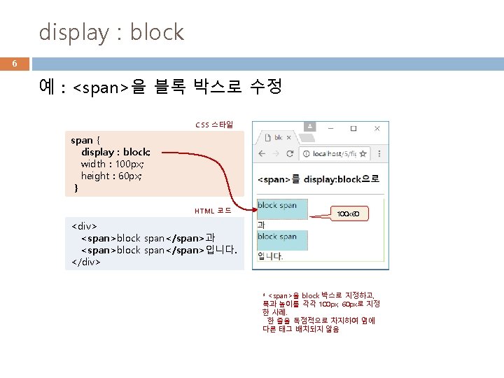

display : inline-block 8 예 : <div>를 인라인 블록 박스로 수정 CSS 스타일 div { display : inline-block; border : 2 px dotted orangered ; background : powderblue; margin : 10 px; width : 60 px; height : 80 px; } margin : 10 px HTML 코드 <div style="background : orange"> <div>inline-block DIV</div> * inline-block 박스는 라인 안에 다른 요소들과 함께 배치. 동시에 width, height, margin 으로 크기 조절 가능

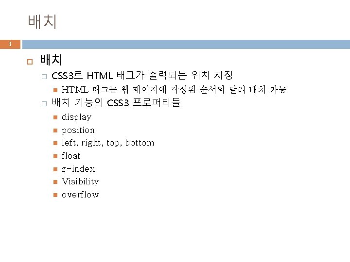
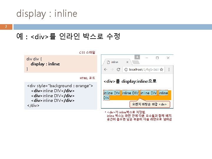
예제 5– 1 display 프로퍼티로 박스 유형 설정 9 <!DOCTYPE html> <html><head><title>display 프로퍼티</title> <style> div { border : 2 px solid yellowgreen; color : blue; background : aliceblue; } span { border : 3 px dotted red; display: none으로 지정되 background : yellow; 어 텍스트가 보이지 않음 } </style></head> <body> <h 3>인라인, 인라인 블록, 블록</h 3> <hr> 나는 <div style="display: none"> div(none)</div>입니다. 나는 <div style="display: inline"> div(inline)</div> 입니다. 나는 <div style="display: inline-block; height: 50 px"> div(inline-block)</div> 입니다. 나는 <div>div<span style="display: block"> span(block)</span> 입니다. </div> </body> </html> height : 50 px
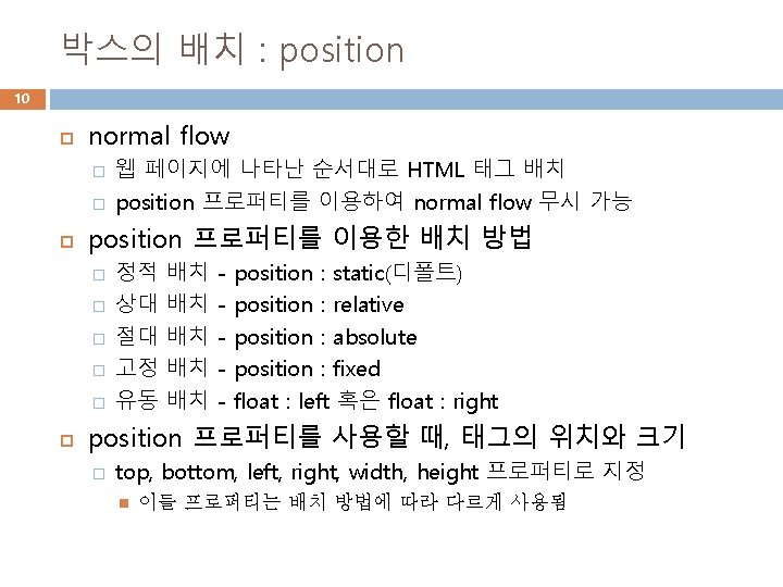

상대 배치, position : relative 11 normal flow의 ‘기본 위치’에서 left, top, bottom, right 프로퍼티의 값만큼 이동한 ‘상대 위치’에 배치 position : relative; right : 20 px; bottom : 20 px; right : 20 px top : 20 px 기본 위치 상대 위치 기본 위치 left : 20 px 상대 위치 position : relative; left : 20 px; top : 20 px; bottom : 20 px

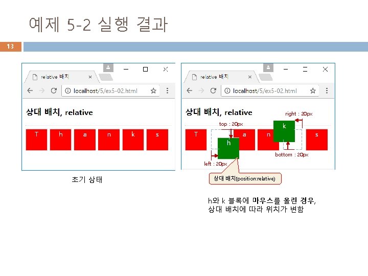
예제 5 -2 position : relative 상대 배치 12 이 예제는 5 개의 <div> 중 h와 k 글자를 가진 2개의 <div>에 마우스를 올리면 20 px씩 상대 배치시키는 사례를 보여준다. <!DOCTYPE html> <head> <title>relative 배치</title> <style> div { display : inline-block; height : 50 px; width : 50 px; border : 1 px solid lightgray; text-align : center; color : white; background : red; h 블록에 마우스를 } 올리면 상대배치함 #down: hover { position : relative; left : 20 px; top : 20 px; background : green; } k 블록에 마우스를 #up: hover { 올리면 상대배치함 position : relative; right : 20 px; bottom : 20 px; background : green; } </style> </head> <body> <h 3>상대 배치, relative</h 3> <hr> <div>T</div> <div id="down">h</div> <div >a</div> <div>n</div> <div id="up">k</div> <div>s</div> </body> </html>

예제 5 -3 position: absolute 절대 배치 14 top: 30 px left: 50 px 브라우저 크기가 변해도 절대 배치된 태그 위치는 변하지 않는다. <!DOCTYPE html> <head> <title>절대 배치</title> <style> div { display : inline-block; position : absolute; /* 절대 배치 */ border : 1 px solid lightgray; } div > p { display : inline-block; /* div의 자식 p */ position : absolute; /* 절대 배치 */ height : 20 px; width : 15 px; background : lightgray; } </style> </head> <body> <h 3>Merry Christmas!</h 3> <hr> <p>예수님이 탄생하셨습니다. </p> <div> <img src="media/christmastree. png" width="200" height="200" alt="크리스마스 트리"> <p style="left: 50 px; top: 30 px">M</p> <p style="left: 100 px; top: 0 px">E</p> <p style="left: 100 px; top: 80 px">R</p> <p style="left: 150 px; top: 110 px">R</p> <p style="left: 30 px; top: 130 px">Y</p> </div> </body> </html>

15 예제 5 -4 position : fixed로 브라우저 하단 오른 쪽에 고정 배치 <!DOCTYPE html> <head><title>고정 배치</title> <style> #fixed { position : fixed; bottom : 10 px; right : 10 px; width : 100 px; padding : 5 px; background : red; color : white; } </style></head> <body> <h 3>Merry Christmas!</h 3> <hr> <img src="media/christmastree. png" width="300" height="300" alt="크리스마스 트리"> <div id="fixed">예수님이 탄생하셨습니다. </div> </body> </html> 브라우저의 하단에 항상 출력 right : 10 px bottom : 10 px

예제 5 -6 z-index로 카드 쌓기 17 <!DOCTYPE html> <html><head><title>z-index 프로퍼티</title> <style> div { position : absolute; } img { position : absolute; } #spade. A { z-index : -3; left : 10 px; top : 20 px; } #spade 2 { z-index : 2; left : 40 px; top : 30 px; } #spade 3 { z-index : 3; left : 80 px; top : 40 px; } #spade 7 { z-index : 7; left : 120 px; top : 50 px; } </style></head> <body> <h 3>z-index 프로퍼티</h 3> <hr> <div> <img id="spade. A" src="media/spade-A. png" width="100" height="140" alt="스페이드A"> <img id="spade 2" src="media/spade-2. png" width="100" height="140" alt="스페이드 2"> <img id="spade 3" src="media/spade-3. png" width="100" height="140" alt="스페이드 3"> <img id="spade 7" src="media/spade-7. png" width="100" height="140" alt="스페이드 7"> </div> </body> </html> z-index: 7 z-index: 3 z-index: 2 z-index: -3

예제 5 -7 visibility로 텍스트 숨기기 18 <!DOCTYPE html> <head><title>visibility 프로퍼티</title> <style> span { visibility : hidden; } </style> </head> <body> <h 3>다음 빈 곳에 숨은 단어? </h 3> <hr> <ul> <li>I (<span>love</span>) you. <li>CSS is Cascading (<span>Style</span>) Sheet. <li>응답하라 (<span>1988</span>). </ul> </body> </html> visibility : hidden; 공간은 차지하지만 텍스트는 보이지 않음

예제 5 -8 overflow 프로퍼티 활용 19 <!DOCTYPE html> <head> <title>overflow 프로퍼티</title> <style> p{ width : 15 em; height : 3 em; border : 1 px solid lightgray; } overflow : hidden { overflow : hidden; }. visible { overflow : visible; }. scroll { overflow : scroll; } </style> </head> overflow : visible <body> <h 3>overflow 프로퍼티</h 3> <hr> <p class="hidden">overflow에 hidden 값을 적용하면 박스를 넘어가는 내용이 잘려 보이지 않습니다. </p> <p class="visible">overflow에 visible 값을 적용하면 콘텐트가 박스를 넘어가서도 출력됩니다</p> <p class="scroll">overflow에 scroll 값을 적용하면 박스에 스크롤바를 붙여 출력합니다. </p> overflow : scroll </body> </html>

리스트 꾸미기에 사용할 HTML 페이지 21 <!DOCTYPE html> <head> <title>리스트 꾸미기</title> </head> <body> <h 3>커피 메뉴</h 3> <hr> <ul> <li>Espresso</li> <li>Cappuccino</li> <li>Cafe Latte</li> </ul> </body> </html> 아이템 마커(marker)

리스트와 아이템에 배경색 입히기 22 background 프로퍼티 이용 CSS 스타일 ul { background : goldenrod; padding : 10 px 50 px; } <ul> 영역 ul li { /* ul의 자손 li */ background : greenyellow; margin-bottom : 5 px; } <li> 영역 paddingtop : 10 px marginbottom : 5 px 마커(아이템바깥에 있음) padding-left : 50 px padding-right : 10 px

마커의 위치, list-style-position 23 CSS 스타일 ul { background : goldenrod; padding : 10 px 50 px; list-style-position : inside; } ul li { background : greenyellow; margin-bottom : 5 px; } 마커가 아이템 영역의 안쪽에 배치됨
 list-style-type : circle (d) list-style-type : upper-roman (b) list-style-type")
마커 종류, list-style-type 24 (a) list-style-type : circle (d) list-style-type : upper-roman (b) list-style-type : square (e) list-style-type : lower-alpha (c) list-style-type : none (f) list-style-type : decimal

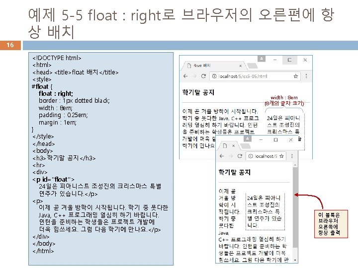
이미지 마커, list-style-image 25 list-style-image � 사용자가 이미지 마커 작성 가능 CSS 스타일 ul { background : goldenrod; padding : 10 px 50 px; list-style-image : url("media/marker. png"); } ul li { background : greenyellow; margin-bottom : 5 px; } 모든 아이템에 동일한 이미지 마크

26 예제 5 -9 CSS 3 스타일을 응용하여 리스트로 메 뉴 만들기 <!DOCTYPE html> <head><title>리스트로 메뉴 만들기</title> <style> #menubar { background : olive; } #menubar ul { /* 여백과 패딩 모두 0 */ margin : 0; padding : 0; width : 567 px; /* 모든 아이템(<li>)을 한 줄에 품을 수 있는 폭 */ } #menubar ul li { display : inline; /* 새 줄로 넘어가지 않게 */ list-style-type : none; /* 마커 삭제 */ padding : 0 px 15 px; /* top=bottom=0, left=right=15 px */ } #menubar ul li a { color : white; text-decoration : none; /* 링크 보이지 않게 */ } #menubar ul li a: hover { color : violet; /* 마우스 올라 갈 때 색 */ } </style></head> <body> <nav id="menubar"> <ul> <li><a href="#">Home</a></li> <li><a href="#">Espresso</a></li> <li><a href="#">Cappuccino</a></li> <li><a href="#">Cafe Latte</a></li> <li><a href="#">F. A. Q</a></li> </ul> </nav> </body> </html> 이 곳에 연결할 페이지 주소를 주면 된다. 메뉴 아이템에 마우스 올리면 글자 색 변경

CSS 3로 표 꾸미기 27 CSS 3로 표 꾸미기를 설명할 기본 HTML 문서 <!DOCTYPE html> <head><title>기본 구조를 가진 표 만들기</title></head> <body> <h 3>1학기 성적</h 3> <hr> <table> <thead> <tr><th>이름/th><th>HTML</th><th>CSS</th></tr> <tr><th>이름</th><th>HTML</th><th>CSS</th></tr> </thead> <tfoot> <tr><th>합</th><th>175</th><th>169</th></tr> </tfoot> <tbody> <tr><td>황기태</td><td>80</td><td>70</td></tr> <tr><td>이재문</td><td>95</td><td>99</td></tr> <tbody> </table> </body> </html>

표 테두리 제어, border 28 � � border : 표 테두리 border-collapse : collapse; /* 중복된 테두리 합치기 */ 테두리 두께 1 픽셀 파란색 실선 table { border : 1 px solid blue; } td, th { border : 1 px dotted green; } 모든 <td>, <th>에 적용 점선 table { border : 1 px solid blue; border-collapse : collapse; } td, th { border : 1 px dotted green; } 표와 셀의 테두리를 합친 결과

셀 크기 제어, width height 29 100 px th { height : 40 px; width : 100 px; } td { height : 20 px; width : 100 px; } 40 px 20 px 40 px <thead>의 자손 <th> thead th { height : 40 px; width : 100 px; } td, th { height : 20 px; width : 100 px; } 40 px 20 px
 td,")
셀 여백 및 정렬 30 padding : 여백 text-align : 정렬(eft, center, right) td, th { height : 20 px; width : 100 px; padding : 10 px; text-align : right; } 10픽셀 패딩 셀 모두 오른쪽 정렬

배경색과 테두리 효과 31 table { /* 이중 테두리 제거 */ border-collapse : collapse; } td, th { /* 모든 셀에 적용 */ text-align : left; padding : 10 px; height : 20 px; width : 100 px; } thead { /* <thead>의 모든 셀 적용 */ background : darkgray; color : yellow; } td, tfoot th { /* 아래쪽 테두리만 회색 */ border-bottom : 1 px solid gray }
의 배경색을 aliceblue 색으로 지정 thead, tfoot { background")
줄무늬 만들기 32 짝수 번째 행(<tr>)의 배경색을 aliceblue 색으로 지정 thead, tfoot { background : darkgray; color : yellow; } tbody tr: nth-child(even) { /* 짝수 <tr>에 적용*/ background : aliceblue; } <tbody>의 자손 <tr>

33 예제 5 -10 마우스가 올라오면 행의 배경색이 변 하는 표 만들기 <!DOCTYPE html> <html><head><title>표 응용 1</title> <style> table { /* 이중 테두리 제거 */ border-collapse : collapse; } td, th { /* 모든 셀에 적용 */ text-align : left; padding : 5 px; height : 15 px; width : 100 px; } thead, tfoot { /* <thead>의 모든 셀에 적용 */ background : darkgray; color : yellow; } tbody tr: nth-child(even) { /* 짝수 <tr>에 적용*/ background : aliceblue; } tbody tr: hover { background : pink; } </style></head> <body> <h 3>2017년 1학기 성적</h 3> <hr> <table> <thead> <tr><th>이름</th><th>HTML</th><th>CSS</th></tr> </thead> <tfoot> <tr><th>합</th><th>310</th><th>249</th></tr> </tfoot> <tbody> <tr><td>황기태</td><td>80</td><td>70</td></tr> <tr><td>이재문</td><td>95</td><td>99</td></tr> <tr><td>이병은</td><td>85</td><td>90</td></tr> <tr><td>김남윤</td><td>50</td><td>40</td></tr> </tbody> </table> </body> </html> 마우스가 올라오 면 배경색이 pink 으로 변함
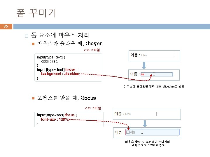
![폼 꾸미기 34 � input[type=text]로 폼 요소의 글자 색 지정 CSS 스타일 input[type=text] {](http://slidetodoc.com/presentation_image/495ed450bf1b02e67cdef60315f8591b/image-34.jpg "폼 꾸미기 34 � input[type=text]로 폼 요소의 글자 색 지정 CSS 스타일 input[type=text] {")
폼 꾸미기 34 � input[type=text]로 폼 요소의 글자 색 지정 CSS 스타일 input[type=text] { color : red; } HTML 코드 입력되는 글자 색 red <label> 이름 : <input type="text" placeholder="Elvis"> </label> � input[type=text]로 폼 요소의 테두리 만들기 CSS 스타일 input[type=text] { border : 2 px solid skyblue; border-radius : 5 px; } HTML 코드 <label> 이름 : <input type="text" placeholder="Elvis"> </label> 2 px 두께의 둥근 모서리 테두리)

예제 5 -11 스타일로 폼 꾸미기 36 <!DOCTYPE html> <label> <html><head><title>폼 스타일 주기</title> <span>Email</span><input type="email" placeholder="elvis@graceland. com"> <style> </label> input[type=text] { /* text 창에만 적용 */ <label> color : red; <span>Comment</span><textarea placeholder="메시지를 남겨주세요"></textarea> } </label> input: hover, textarea: hover { /* 마우스 올라 올 때 */ <label> background : aliceblue; <span></span><input type="submit" value="submit"> } </label> input[type=text]: focus, input[type=email]: focus { /* 포커스 받을 때 */ font-size : 120%; </form> } </body></html> label { display : block; /* 새 라인에서 시작 */ padding : 10 px; } label span { float : left; width : 90 px; text-align : right; padding : 10 px; 포커스를 받으면 글자 크기 } 는 120% 커짐 </style> </head> <body> <h 3>CONTACT US</h 3> <hr> 마우스가 올라가면 <form> 배경색이 aliceblue로 <label> 바뀜 <span>Name</span><input type="text" placeholder="Elvis"> </label>
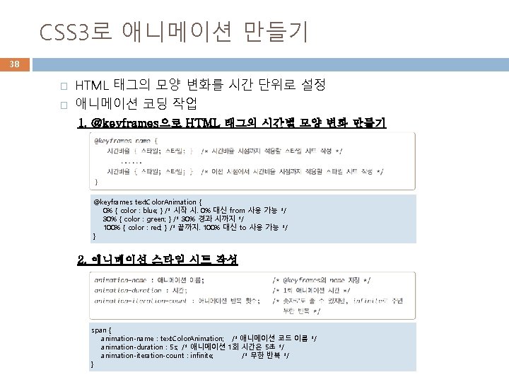

CSS 3 애니메이션 사례 39 5초를 주기로 <span> 태그의 글자색을 파란색, 초록색, 빨간색으로 바꾸는 애니메이션. 무한 반복 CSS 스타일 @keyframes text. Color. Animation { 0% { color : blue; } 30% { color : green; } 100% { color : red; } } span { animation-name : text. Color. Animation; animation-duration : 5 s; animation-iteration-count : infinite; } 0% 과 경 100% HTML 코드 <p><span>span</span>텍스트를 5초에 blue, green, red로 무한 반복합니다. </p> 5초 30% 무한 반복
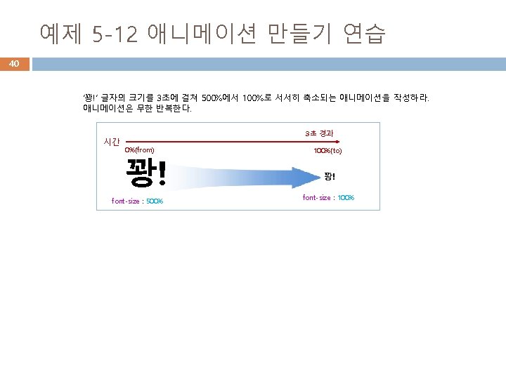

예제 5 -12 애니메이션 만들기 연습 정답 41 from은 0%로 to는 100%로 수정 가능 이 태그에 애니메이션 작동 <!DOCTYPE html> <head><title>애니메이션</title> <style> @keyframes bomb { from { font-size : 500%; } to { font-size : 100%; } } h 3 { animation-name : bomb; animation-duration : 3 s; animation-iteration-count : infinite; } </style></head> <body> <h 3>꽝!</h 3> <hr> <p>꽝! 글자가 3초동안 500%에서 시작하여 100%로 바뀌는 애니메이션입니다. 무한 반복합니다. </p> </body> </html> 500%의 크기로 시작하여 3초 내에 100%로 줄어드는 애니메이션
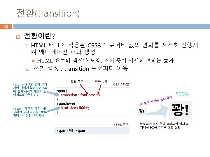

예제 5 -13 font-size에 대한 전환 효과 만들기 43 <!DOCTYPE html> <head><title>전환</title> <style> span { transition : font-size 5 s; } span: hover { font-size : 500%; } </style> <span>에 마우스를 올리면 5초 동안 점진적으로 글자를 500% 확대. </head> <body> <h 3>font-size에 대한 전환</h 3> <hr> <p><span>꽝!</span> 글자에 마우스를 올려보세요. </p> </body> </html>
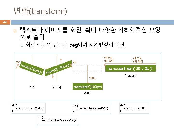
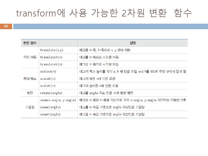

예제 5 -14 다양한 변환 사례 46 <!DOCTYPE html> <head><title>다양한 변환 사례</title> <style> div { display : inline-block; padding : 5 px; color : white; background : olivedrab; } /* 변환 */ div#rotate { transform : rotate(20 deg); } div#skew { transform : skew(0 deg, -20 deg); } div#translate { transform : translate. Y(100 px); } div#scale { transform : scale(3, 1); } 초기화면 /* 마우스 올릴 때 추가 변환 */ div#rotate: hover { transform : rotate(80 deg); } div#skew: hover { transform : skew(0 deg, -60 deg); } div#translate: hover { transform : translate(50 px, 100 px); } div#scale: hover { transform : scale(4, 2); } /* 마우스 누를 때 추가 변환 */ div#scale: active { transform : scale(1, 5); } </style> </head> <body> <h 3>다양한 Transform</h 3> 아래는 회전(rotate), 기울임(skew), 이동(translate), 확대/축소(scale)가 적용된 사례이다. 또한 마우스를 올리면 추가적 변환이 일어난다. <hr> <div id="rotate">rotate 20 deg</div> <div id="skew">skew(0, -20 deg)</div> <div id="translate">translate. Y(100 px)</div> <div id="scale">scale(3, 1)</div> </body> </html> 마우스를 올릴 때
- Slides: 46