Measure Phase Six Sigma Statistics Six Sigma Statistics


- Slides: 61

Measure Phase Six Sigma Statistics

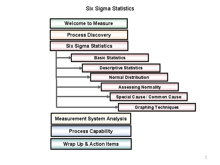
Six Sigma Statistics Welcome to Measure Process Discovery Six Sigma Statistics Basic Statistics Descriptive Statistics Normal Distribution Assessing Normality Special Cause / Common Cause Graphing Techniques Measurement System Analysis Process Capability Wrap Up & Action Items 2

Purpose of Basic Statistics The purpose of Basic Statistics is to: • Provide a numerical summary of the data being analyzed. – Data (n) • Factual information organized for analysis. • Numerical or other information represented in a form suitable for processing by computer • Values from scientific experiments. • Provide the basis for making inferences about the future. • Provide the foundation for assessing process capability. • Provide a common language to be used throughout an organization to describe processes. Relax…. it won’t be that bad! 3

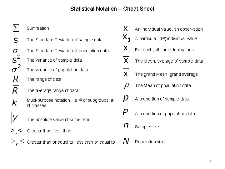
Statistical Notation – Cheat Sheet Summation An individual value, an observation The Standard Deviation of sample data A particular (1 st) individual value The Standard Deviation of population data For each, all, individual values The variance of sample data The Mean, average of sample data The variance of population data The grand Mean, grand average The range of data The Mean of population data The average range of data Multi-purpose notation, i. e. # of subgroups, # of classes A proportion of sample data A proportion of population data The absolute value of some term Greater than, less than Greater than or equal to, less than or equal to Sample size Population size 4

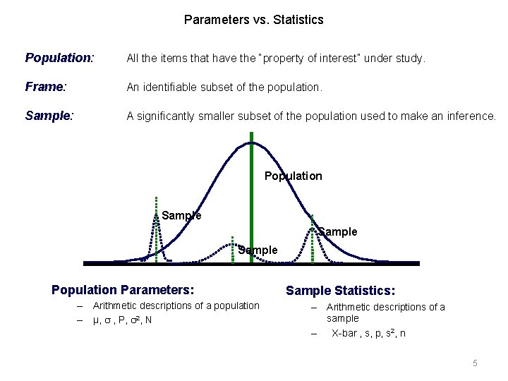
Parameters vs. Statistics Population: All the items that have the “property of interest” under study. Frame: An identifiable subset of the population. Sample: A significantly smaller subset of the population used to make an inference. Population Sample Population Parameters: – Arithmetic descriptions of a population – µ, , P, 2, N Sample Statistics: – Arithmetic descriptions of a sample – X-bar , s, p, s 2, n 5

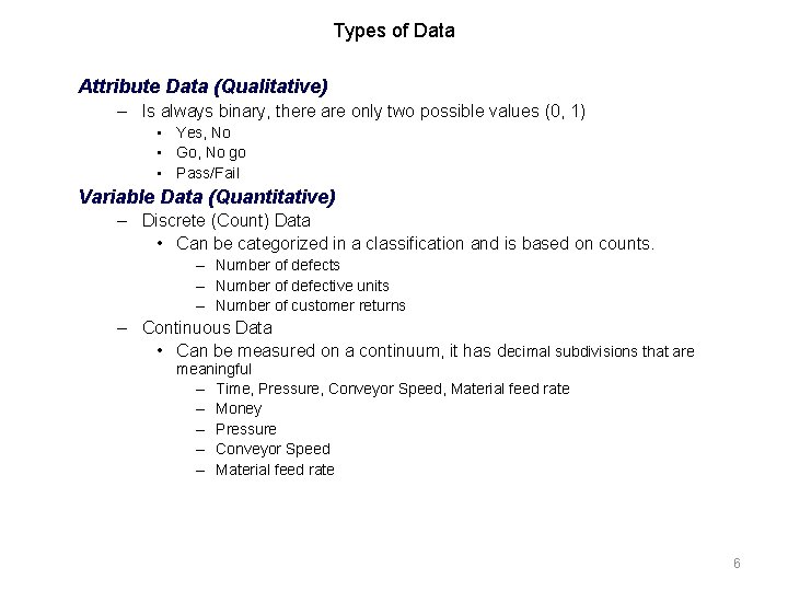
Types of Data Attribute Data (Qualitative) – Is always binary, there are only two possible values (0, 1) • Yes, No • Go, No go • Pass/Fail Variable Data (Quantitative) – Discrete (Count) Data • Can be categorized in a classification and is based on counts. – Number of defects – Number of defective units – Number of customer returns – Continuous Data • Can be measured on a continuum, it has decimal subdivisions that are meaningful – Time, Pressure, Conveyor Speed, Material feed rate – Money – Pressure – Conveyor Speed – Material feed rate 6

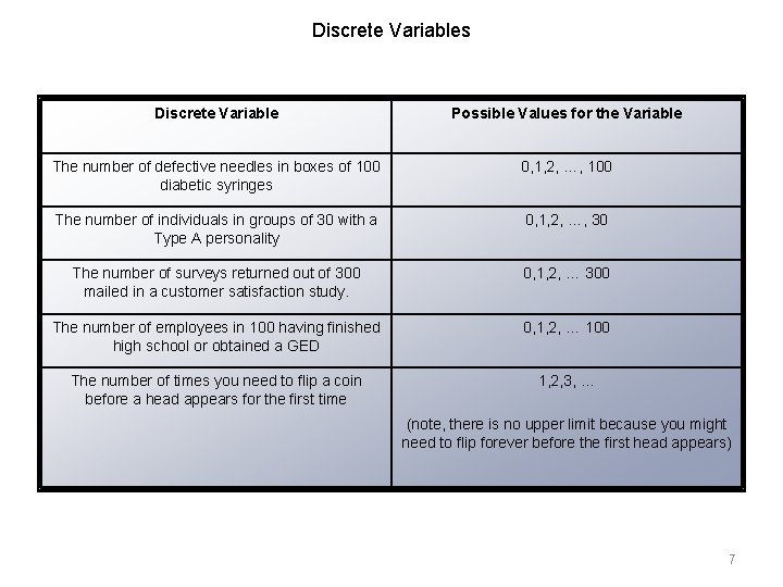
Discrete Variables Discrete Variable Possible Values for the Variable The number of defective needles in boxes of 100 diabetic syringes 0, 1, 2, …, 100 The number of individuals in groups of 30 with a Type A personality 0, 1, 2, …, 30 The number of surveys returned out of 300 mailed in a customer satisfaction study. 0, 1, 2, … 300 The number of employees in 100 having finished high school or obtained a GED 0, 1, 2, … 100 The number of times you need to flip a coin before a head appears for the first time 1, 2, 3, … (note, there is no upper limit because you might need to flip forever before the first head appears) 7

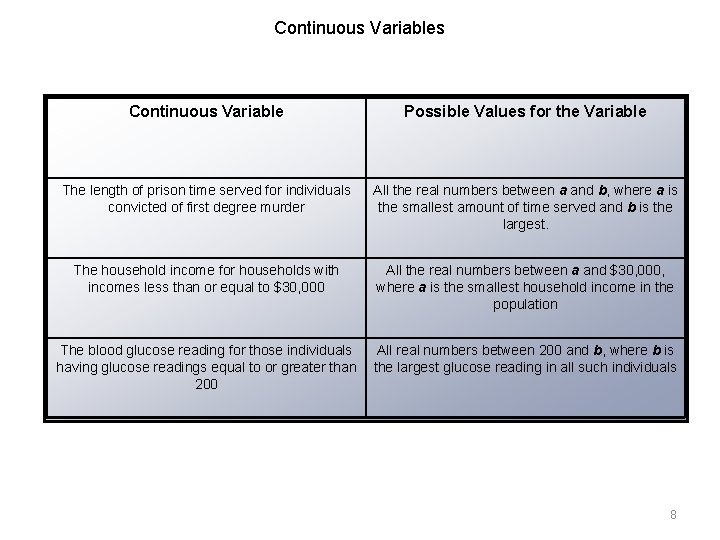
Continuous Variables Continuous Variable Possible Values for the Variable The length of prison time served for individuals convicted of first degree murder All the real numbers between a and b, where a is the smallest amount of time served and b is the largest. The household income for households with incomes less than or equal to $30, 000 All the real numbers between a and $30, 000, where a is the smallest household income in the population The blood glucose reading for those individuals having glucose readings equal to or greater than 200 All real numbers between 200 and b, where b is the largest glucose reading in all such individuals 8

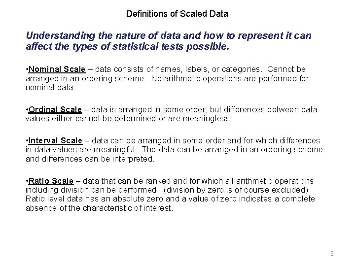
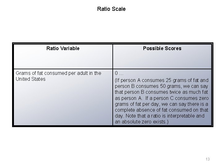
Definitions of Scaled Data Understanding the nature of data and how to represent it can affect the types of statistical tests possible. • Nominal Scale – data consists of names, labels, or categories. Cannot be arranged in an ordering scheme. No arithmetic operations are performed for nominal data. • Ordinal Scale – data is arranged in some order, but differences between data values either cannot be determined or are meaningless. • Interval Scale – data can be arranged in some order and for which differences in data values are meaningful. The data can be arranged in an ordering scheme and differences can be interpreted. • Ratio Scale – data that can be ranked and for which all arithmetic operations including division can be performed. (division by zero is of course excluded) Ratio level data has an absolute zero and a value of zero indicates a complete absence of the characteristic of interest. 9

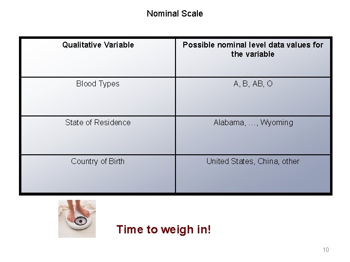
Nominal Scale Qualitative Variable Possible nominal level data values for the variable Blood Types A, B, AB, O State of Residence Alabama, …, Wyoming Country of Birth United States, China, other Time to weigh in! 10

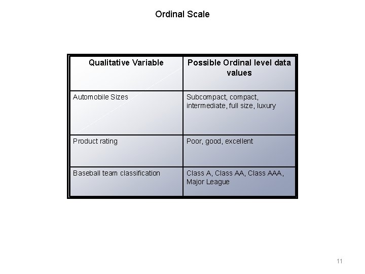
Ordinal Scale Qualitative Variable Possible Ordinal level data values Automobile Sizes Subcompact, intermediate, full size, luxury Product rating Poor, good, excellent Baseball team classification Class A, Class AAA, Major League 11

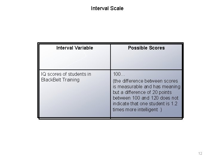
Interval Scale Interval Variable IQ scores of students in Black. Belt Training Possible Scores 100… (the difference between scores is measurable and has meaning but a difference of 20 points between 100 and 120 does not indicate that one student is 1. 2 times more intelligent ) 12

Ratio Scale Ratio Variable Grams of fat consumed per adult in the United States Possible Scores 0… (If person A consumes 25 grams of fat and person B consumes 50 grams, we can say that person B consumes twice as much fat as person A. If a person C consumes zero grams of fat per day, we can say there is a complete absence of fat consumed on that day. Note that a ratio is interpretable and an absolute zero exists. ) 13

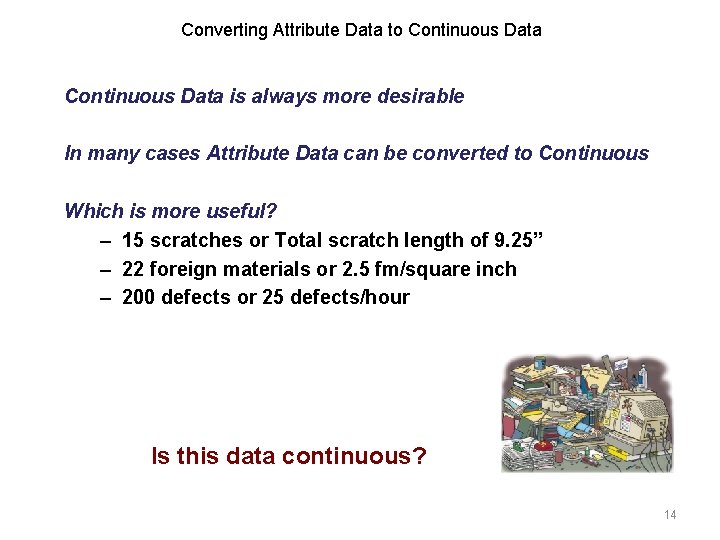
Converting Attribute Data to Continuous Data is always more desirable In many cases Attribute Data can be converted to Continuous Which is more useful? – 15 scratches or Total scratch length of 9. 25” – 22 foreign materials or 2. 5 fm/square inch – 200 defects or 25 defects/hour Is this data continuous? 14

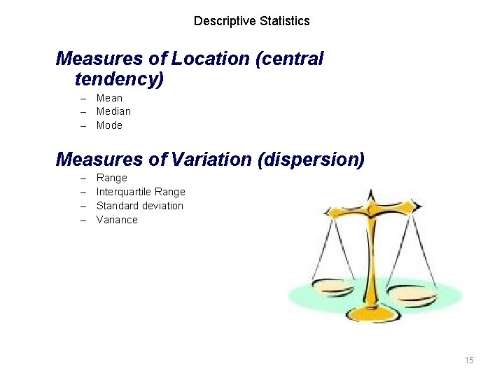
Descriptive Statistics Measures of Location (central tendency) – Mean – Median – Mode Measures of Variation (dispersion) – – Range Interquartile Range Standard deviation Variance 15

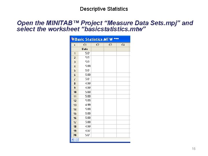
Descriptive Statistics Open the MINITAB™ Project “Measure Data Sets. mpj” and select the worksheet “basicstatistics. mtw” 16

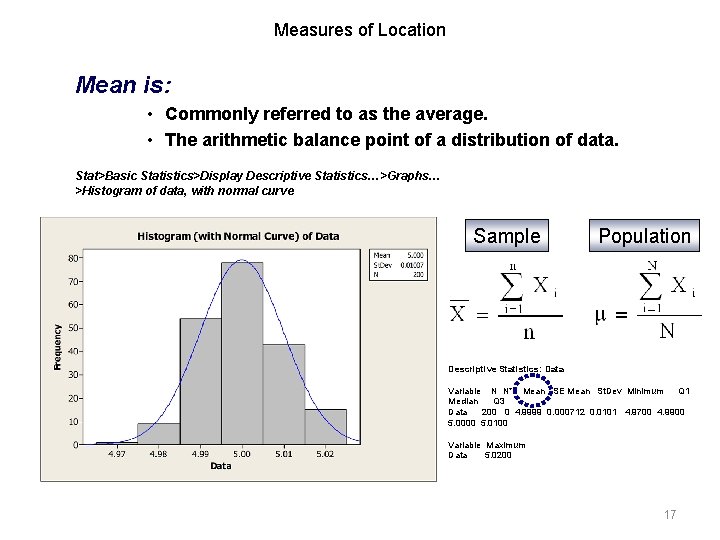
Measures of Location Mean is: • Commonly referred to as the average. • The arithmetic balance point of a distribution of data. Stat>Basic Statistics>Display Descriptive Statistics…>Graphs… >Histogram of data, with normal curve Sample Population Descriptive Statistics: Data Variable N N* Mean SE Mean St. Dev Minimum Q 1 Median Q 3 Data 200 0 4. 9999 0. 000712 0. 0101 4. 9700 4. 9900 5. 0000 5. 0100 Variable Maximum Data 5. 0200 17

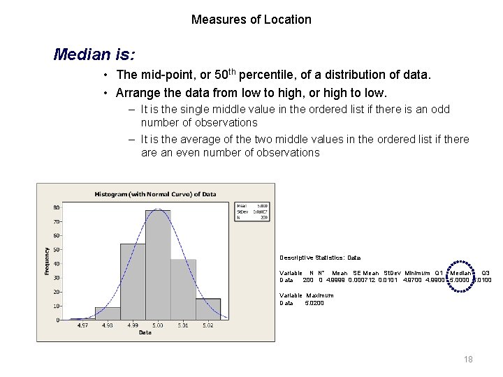
Measures of Location Median is: • The mid-point, or 50 th percentile, of a distribution of data. • Arrange the data from low to high, or high to low. – It is the single middle value in the ordered list if there is an odd number of observations – It is the average of the two middle values in the ordered list if there an even number of observations Descriptive Statistics: Data Variable N N* Mean SE Mean St. Dev Minimum Q 1 Median Q 3 Data 200 0 4. 9999 0. 000712 0. 0101 4. 9700 4. 9900 5. 0000 5. 0100 Variable Maximum Data 5. 0200 18

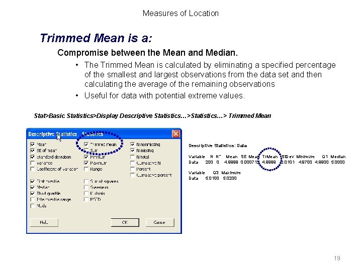
Measures of Location Trimmed Mean is a: Compromise between the Mean and Median. • The Trimmed Mean is calculated by eliminating a specified percentage of the smallest and largest observations from the data set and then calculating the average of the remaining observations • Useful for data with potential extreme values. Stat>Basic Statistics>Display Descriptive Statistics…> Trimmed Mean Descriptive Statistics: Data Variable N N* Mean SE Mean Tr. Mean St. Dev Minimum Q 1 Median Data 200 0 4. 9999 0. 000712 4. 9999 0. 0101 4. 9700 4. 9900 5. 0000 Variable Q 3 Maximum Data 5. 0100 5. 0200 19

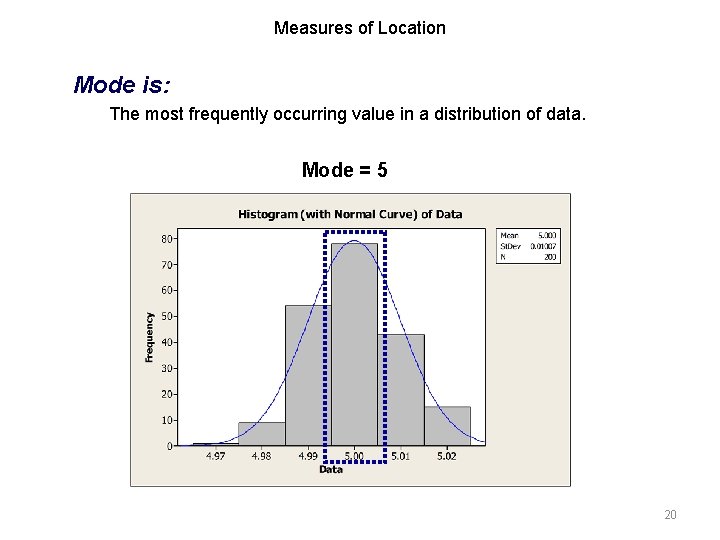
Measures of Location Mode is: The most frequently occurring value in a distribution of data. Mode = 5 20

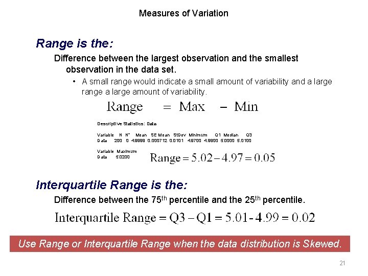
Measures of Variation Range is the: Difference between the largest observation and the smallest observation in the data set. • A small range would indicate a small amount of variability and a large range a large amount of variability. Descriptive Statistics: Data Variable N N* Mean SE Mean St. Dev Minimum Q 1 Median Q 3 Data 200 0 4. 9999 0. 000712 0. 0101 4. 9700 4. 9900 5. 0000 5. 0100 Variable Maximum Data 5. 0200 Interquartile Range is the: Difference between the 75 th percentile and the 25 th percentile. Use Range or Interquartile Range when the data distribution is Skewed. 21

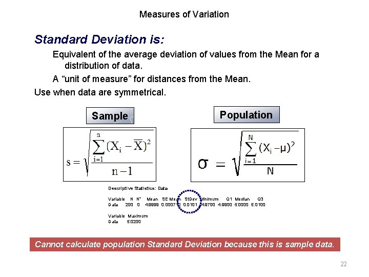
Measures of Variation Standard Deviation is: Equivalent of the average deviation of values from the Mean for a distribution of data. A “unit of measure” for distances from the Mean. Use when data are symmetrical. Sample Population Descriptive Statistics: Data Variable N N* Mean SE Mean St. Dev Minimum Q 1 Median Q 3 Data 200 0 4. 9999 0. 000712 0. 0101 4. 9700 4. 9900 5. 0000 5. 0100 Variable Maximum Data 5. 0200 Cannot calculate population Standard Deviation because this is sample data. 22

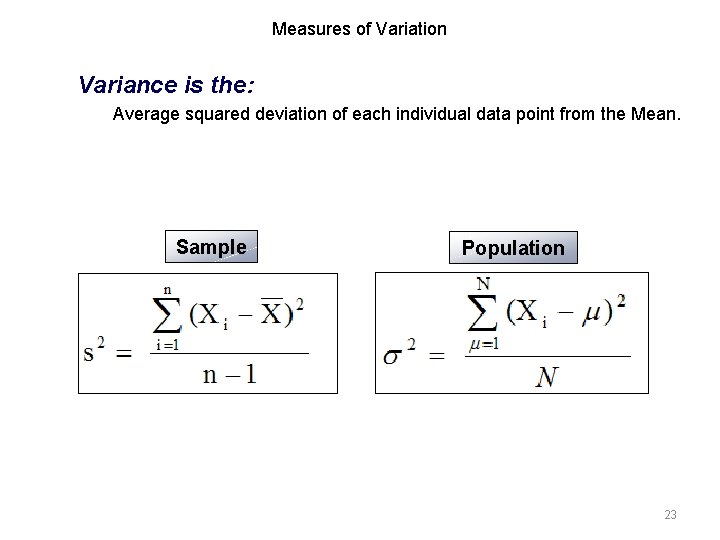
Measures of Variation Variance is the: Average squared deviation of each individual data point from the Mean. Sample Population 23

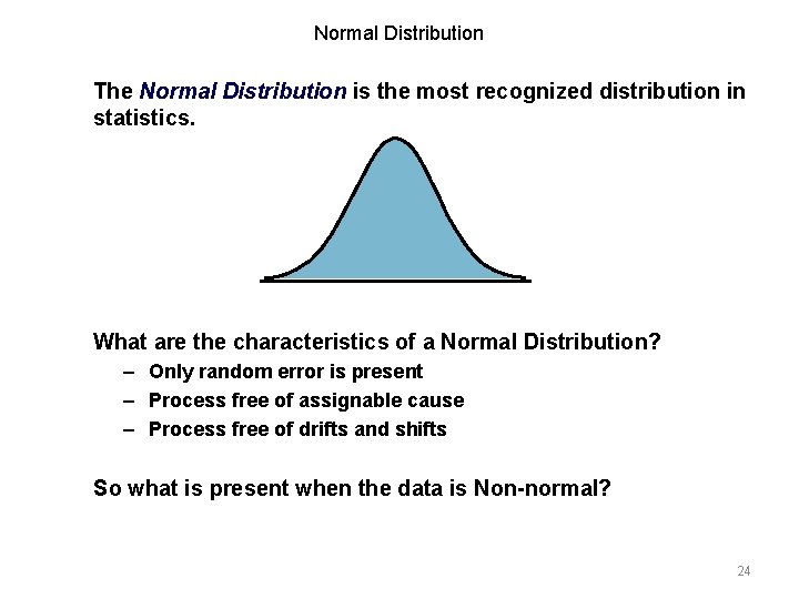
Normal Distribution The Normal Distribution is the most recognized distribution in statistics. What are the characteristics of a Normal Distribution? – Only random error is present – Process free of assignable cause – Process free of drifts and shifts So what is present when the data is Non-normal? 24

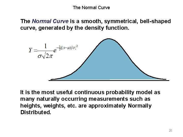
The Normal Curve is a smooth, symmetrical, bell-shaped curve, generated by the density function. It is the most useful continuous probability model as many naturally occurring measurements such as heights, weights, etc. are approximately Normally Distributed. 25

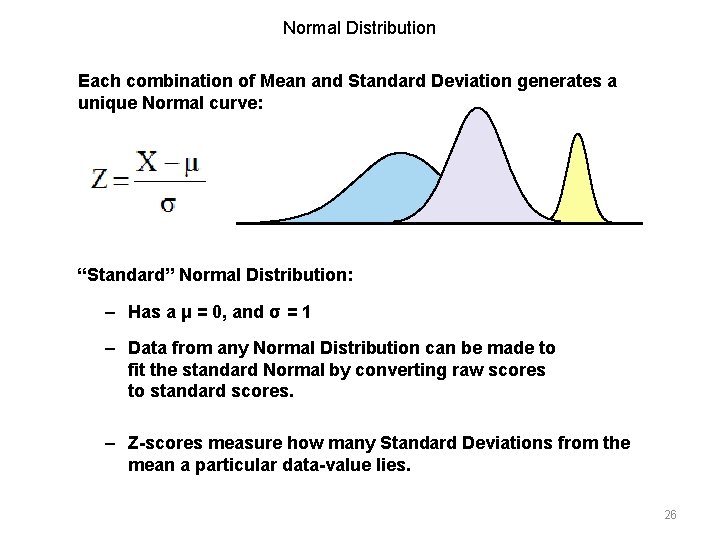
Normal Distribution Each combination of Mean and Standard Deviation generates a unique Normal curve: “Standard” Normal Distribution: – Has a μ = 0, and σ = 1 – Data from any Normal Distribution can be made to fit the standard Normal by converting raw scores to standard scores. – Z-scores measure how many Standard Deviations from the mean a particular data-value lies. 26

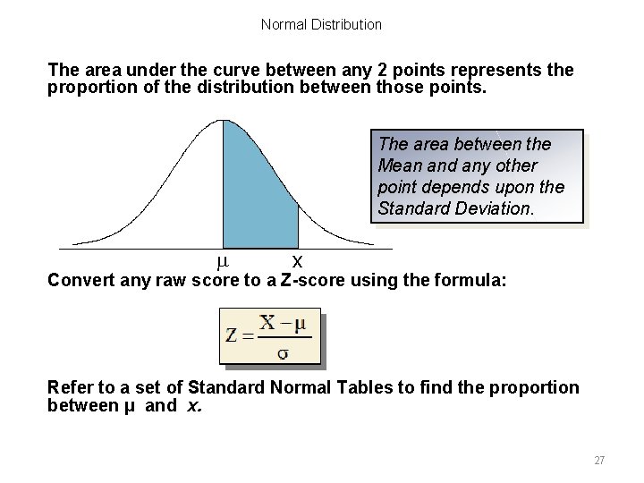
Normal Distribution The area under the curve between any 2 points represents the proportion of the distribution between those points. The area between the Mean and any other point depends upon the Standard Deviation. m x Convert any raw score to a Z-score using the formula: Refer to a set of Standard Normal Tables to find the proportion between μ and x. 27

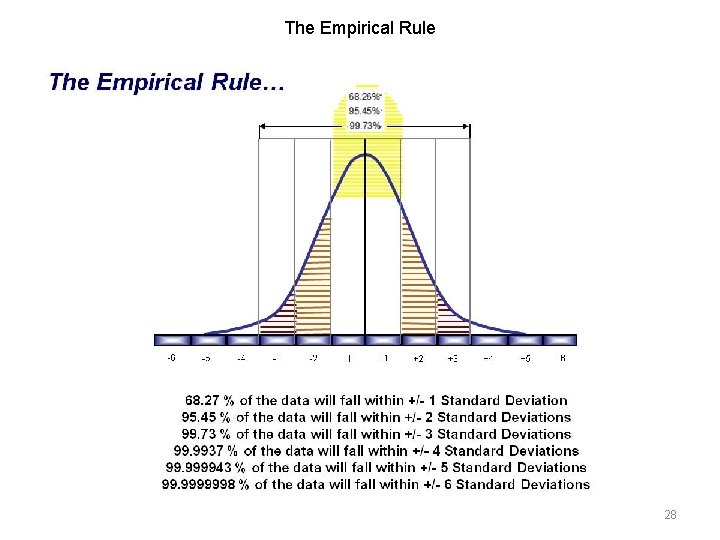
The Empirical Rule… -6 -5 -4 -3 -2 -1 +1 +2 +3 +4 +5 +6 28

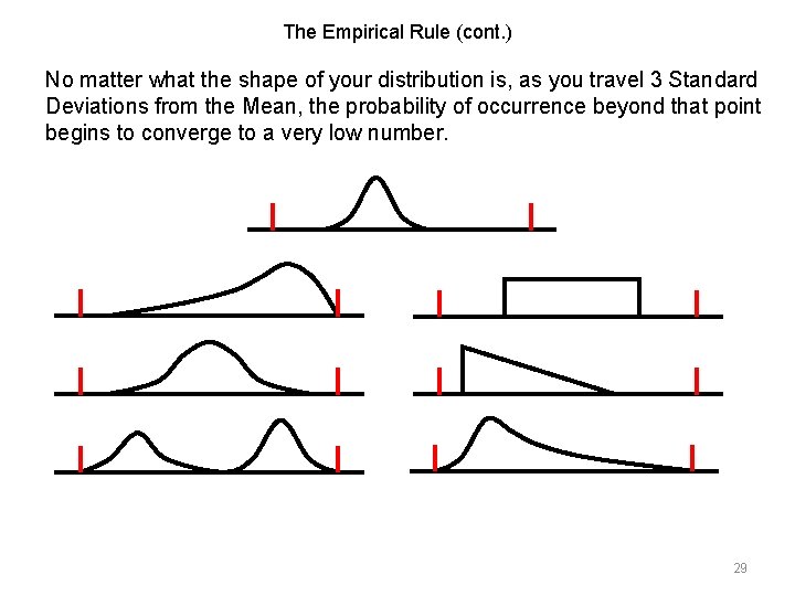
The Empirical Rule (cont. ) No matter what the shape of your distribution is, as you travel 3 Standard Deviations from the Mean, the probability of occurrence beyond that point begins to converge to a very low number. 29

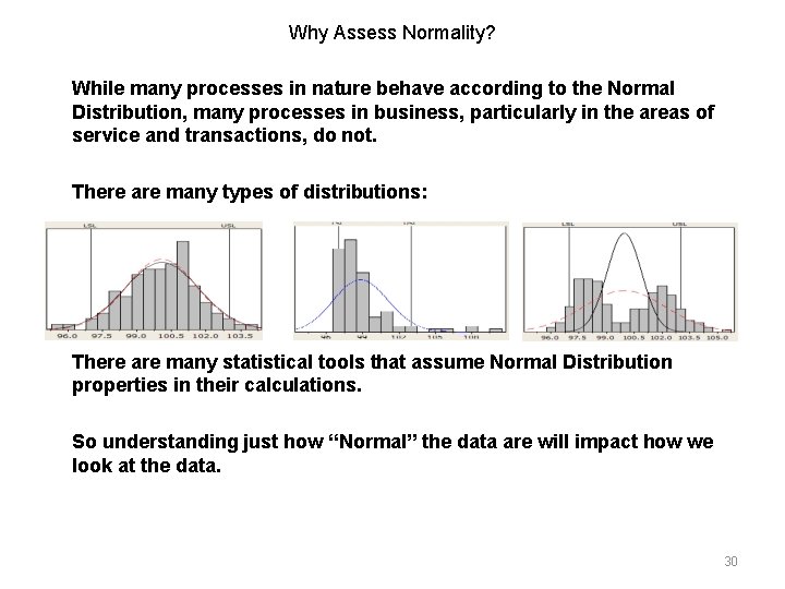
Why Assess Normality? While many processes in nature behave according to the Normal Distribution, many processes in business, particularly in the areas of service and transactions, do not. There are many types of distributions: There are many statistical tools that assume Normal Distribution properties in their calculations. So understanding just how “Normal” the data are will impact how we look at the data. 30

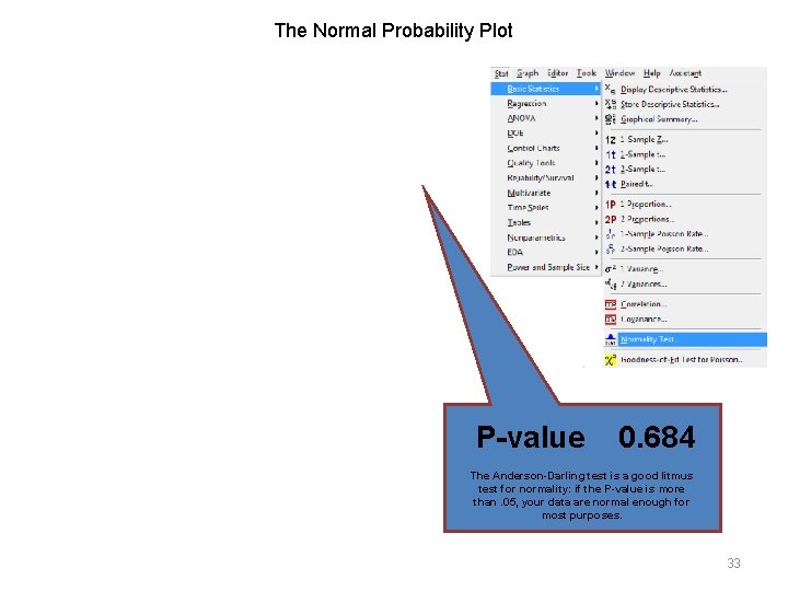
Tools for Assessing Normality The shape of any Normal curve can be calculated based on the Normal Probability density function. Tests for Normality basically compare the shape of the calculated curve to the actual distribution of your data points. For the purposes of this training, we will focus on 2 ways in MINITAB™ to assess Normality: – The Anderson-Darling test – Normal probability test Watch that curve! 31

Goodness-of-Fit The Anderson-Darling test uses an empirical density function. Departure of the actual data from the expected Normal Distribution. The Anderson-Darling Goodness-of-Fit test assesses the magnitude of these departures using an Observed minus Expected formula. 32

The Normal Probability Plot P-value 0. 684 The Anderson-Darling test is a good litmus test for normality: if the P-value is more than. 05, your data are normal enough for most purposes. 33

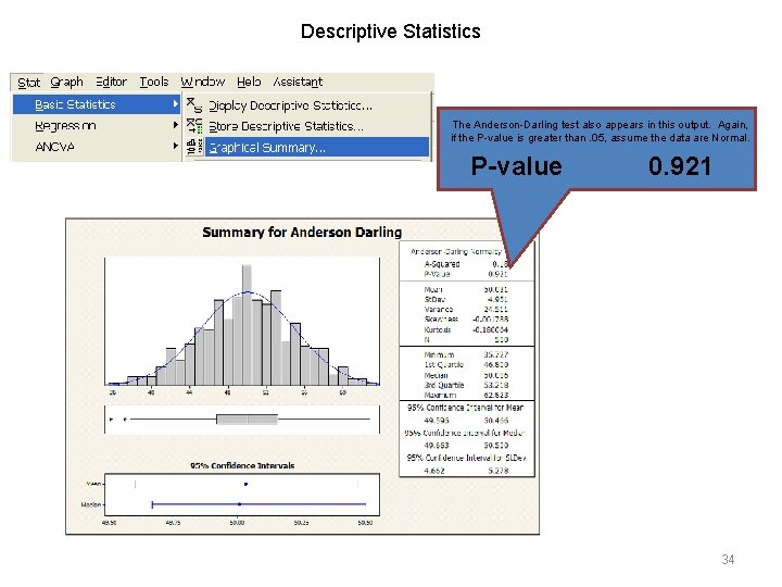
Descriptive Statistics The Anderson-Darling test also appears in this output. Again, if the P-value is greater than. 05, assume the data are Normal. P-value 0. 921 34

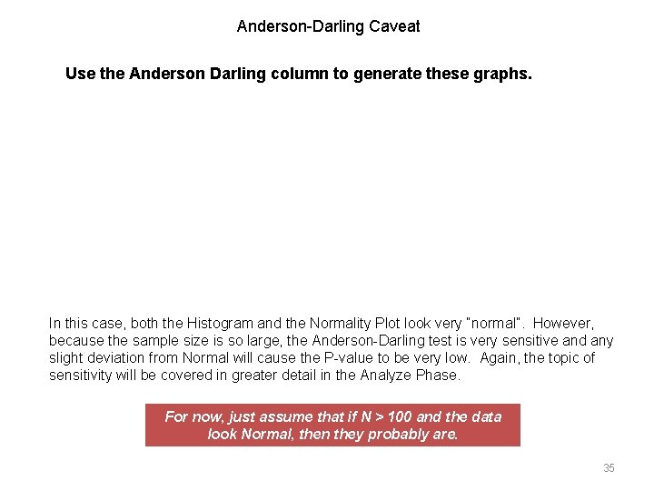
Anderson-Darling Caveat Use the Anderson Darling column to generate these graphs. In this case, both the Histogram and the Normality Plot look very “normal”. However, because the sample size is so large, the Anderson-Darling test is very sensitive and any slight deviation from Normal will cause the P-value to be very low. Again, the topic of sensitivity will be covered in greater detail in the Analyze Phase. For now, just assume that if N > 100 and the data look Normal, then they probably are. 35

If the Data Are Not Normal, Don’t Panic! • Normal Data are not common in the transactional world. • There are lots of meaningful statistical tools you can use to analyze your data (more on that later). • It just means you may have to think about your data in a slightly different way. Don’t touch that button! 36

Normality Exercise objective: To demonstrate how to test for Normality. 1. Generate Normal Probability Plots and the graphical summary using the “Descriptive Statistics. MTW” file. 2. Use only the columns Dist A and Dist D. 3. Answer the following quiz questions based on your analysis of this data set. 37

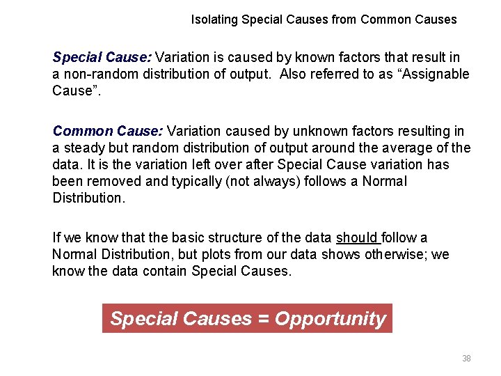
Isolating Special Causes from Common Causes Special Cause: Variation is caused by known factors that result in a non-random distribution of output. Also referred to as “Assignable Cause”. Common Cause: Variation caused by unknown factors resulting in a steady but random distribution of output around the average of the data. It is the variation left over after Special Cause variation has been removed and typically (not always) follows a Normal Distribution. If we know that the basic structure of the data should follow a Normal Distribution, but plots from our data shows otherwise; we know the data contain Special Causes = Opportunity 38

Introduction to Graphing The purpose of Graphing is to: • • Identify potential relationships between variables. Identify risk in meeting the critical needs of the Customer, Business and People. Provide insight into the nature of the X’s which may or may not control Y. Show the results of passive data collection. In this section we will cover… 1. Box Plots 2. Scatter Plots 3. Dot Plots 4. Time Series Plots 5. Histograms 39

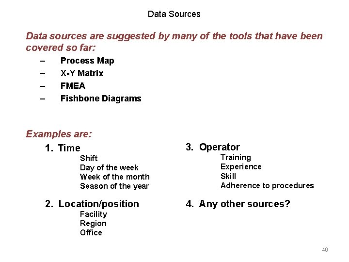
Data Sources Data sources are suggested by many of the tools that have been covered so far: – – Process Map X-Y Matrix FMEA Fishbone Diagrams Examples are: 1. Time Shift Day of the week Week of the month Season of the year 2. Location/position 3. Operator Training Experience Skill Adherence to procedures 4. Any other sources? Facility Region Office 40

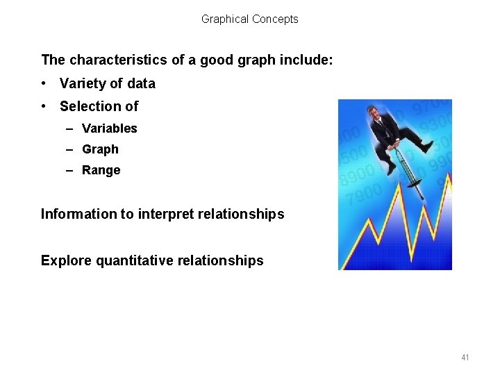
Graphical Concepts The characteristics of a good graph include: • Variety of data • Selection of – Variables – Graph – Range Information to interpret relationships Explore quantitative relationships 41

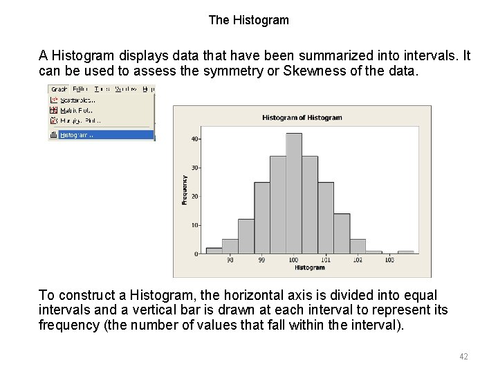
The Histogram A Histogram displays data that have been summarized into intervals. It can be used to assess the symmetry or Skewness of the data. To construct a Histogram, the horizontal axis is divided into equal intervals and a vertical bar is drawn at each interval to represent its frequency (the number of values that fall within the interval). 42

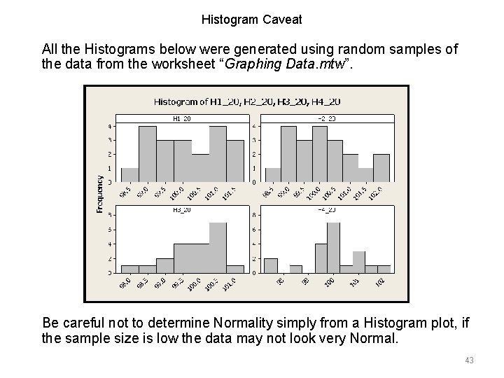
Histogram Caveat All the Histograms below were generated using random samples of the data from the worksheet “Graphing Data. mtw”. Be careful not to determine Normality simply from a Histogram plot, if the sample size is low the data may not look very Normal. 43

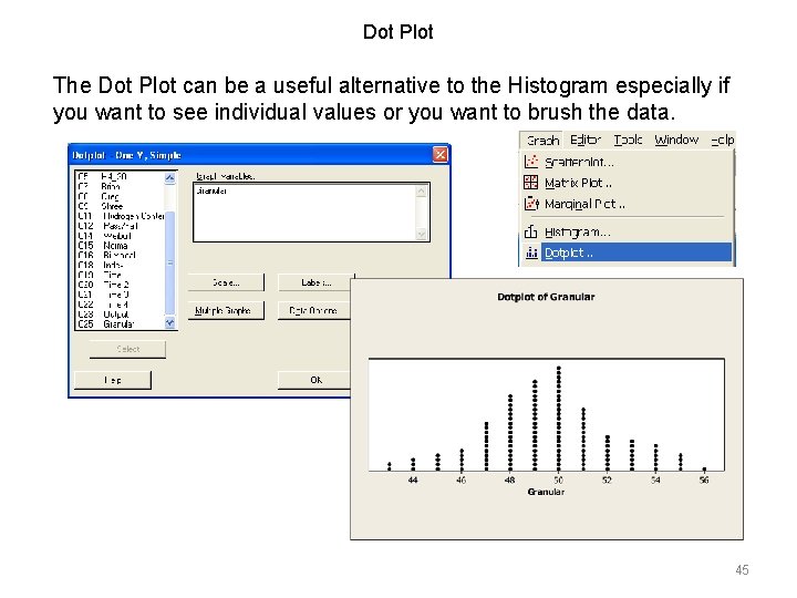
Variation on a Histogram Using the worksheet “Graphing Data. mtw” create a simple Histogram for the data column called granular. 44

Dot Plot The Dot Plot can be a useful alternative to the Histogram especially if you want to see individual values or you want to brush the data. 45

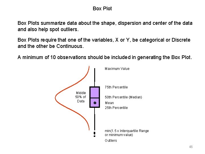
Box Plots summarize data about the shape, dispersion and center of the data and also help spot outliers. Box Plots require that one of the variables, X or Y, be categorical or Discrete and the other be Continuous. A minimum of 10 observations should be included in generating the Box Plot. Maximum Value 75 th Percentile Middle 50% of Data 50 th Percentile (Median) Mean 25 th Percentile min(1. 5 x Interquartile Range or minimum value) Outliers 46

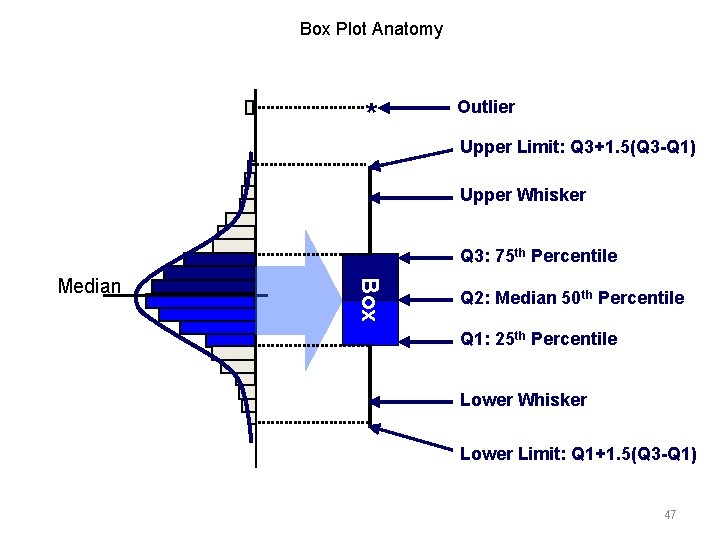
Box Plot Anatomy * Outlier Upper Limit: Q 3+1. 5(Q 3 -Q 1) Upper Whisker Q 3: 75 th Percentile Box Median Q 2: Median 50 th Percentile Q 1: 25 th Percentile Lower Whisker Lower Limit: Q 1+1. 5(Q 3 -Q 1) 47

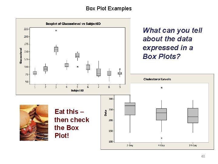
Box Plot Examples What can you tell about the data expressed in a Box Plots? Eat this – then check the Box Plot! 48

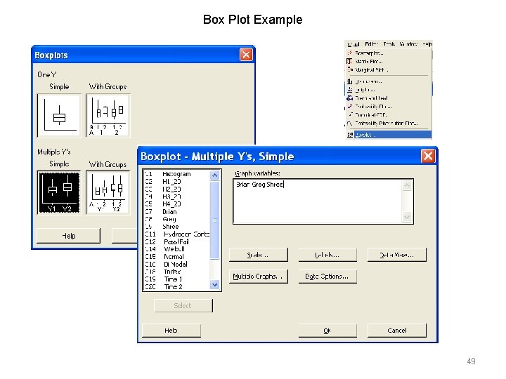
Box Plot Example 49

Box Plot Example 50

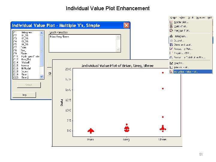
Individual Value Plot Enhancement 51

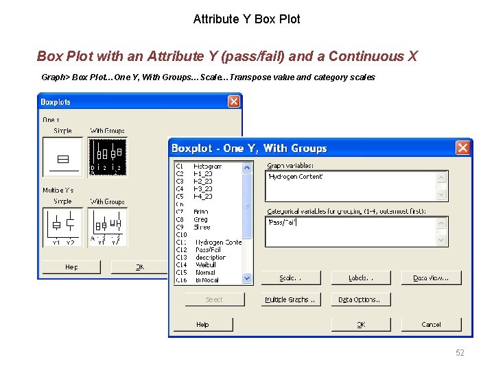
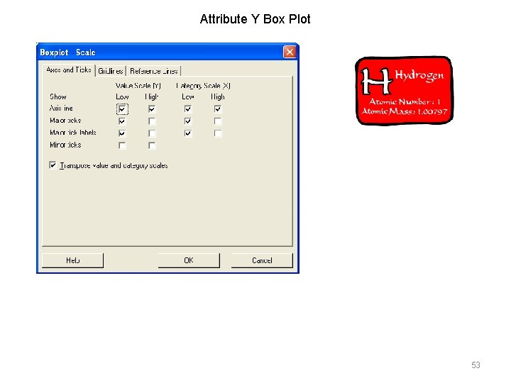
Attribute Y Box Plot with an Attribute Y (pass/fail) and a Continuous X Graph> Box Plot…One Y, With Groups…Scale…Transpose value and category scales 52

Attribute Y Box Plot 53

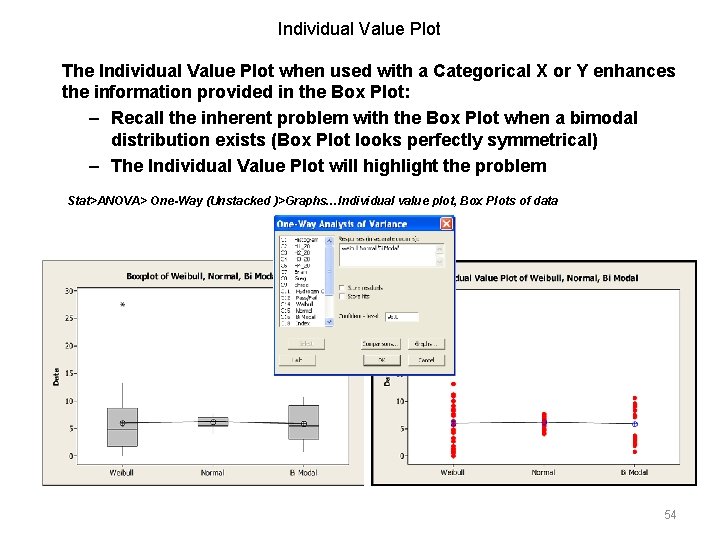
Individual Value Plot The Individual Value Plot when used with a Categorical X or Y enhances the information provided in the Box Plot: – Recall the inherent problem with the Box Plot when a bimodal distribution exists (Box Plot looks perfectly symmetrical) – The Individual Value Plot will highlight the problem Stat>ANOVA> One-Way (Unstacked )>Graphs…Individual value plot, Box Plots of data 54

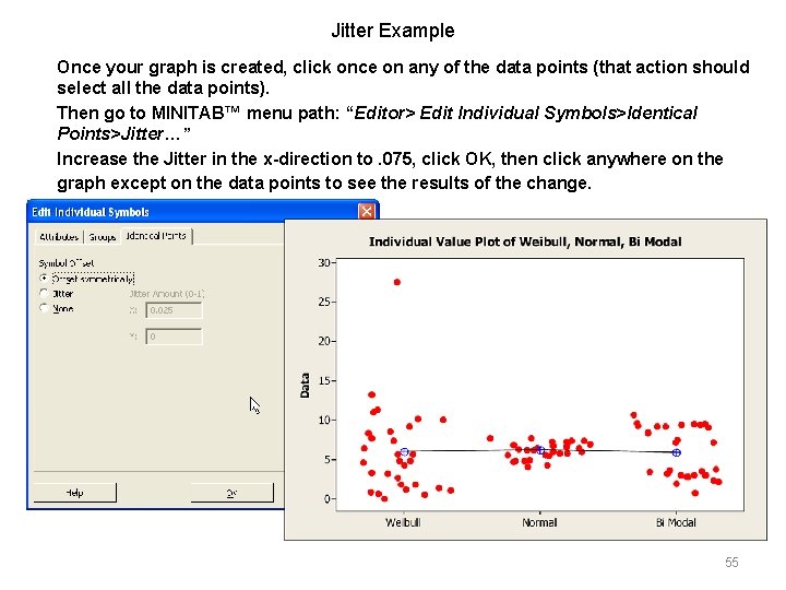
Jitter Example Once your graph is created, click once on any of the data points (that action should select all the data points). Then go to MINITAB™ menu path: “Editor> Edit Individual Symbols>Identical Points>Jitter…” Increase the Jitter in the x-direction to. 075, click OK, then click anywhere on the graph except on the data points to see the results of the change. 55

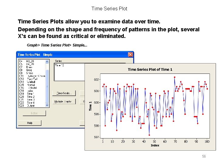
Time Series Plots allow you to examine data over time. Depending on the shape and frequency of patterns in the plot, several X’s can be found as critical or eliminated. Graph> Time Series Plot> Simple. . . 56

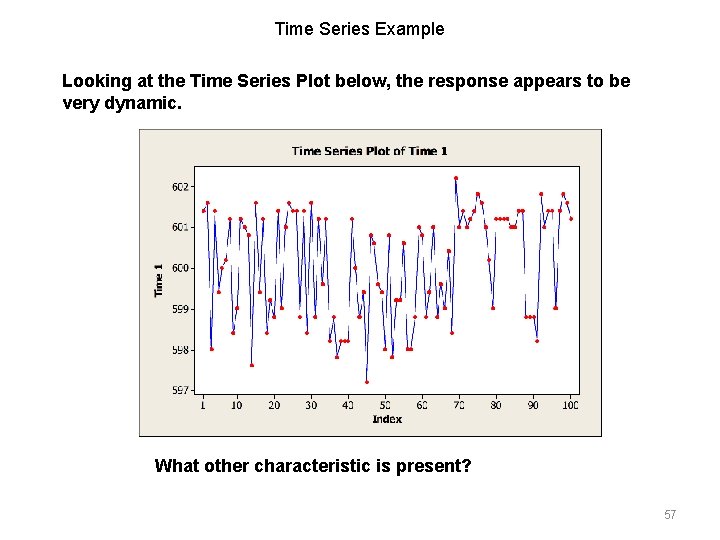
Time Series Example Looking at the Time Series Plot below, the response appears to be very dynamic. What other characteristic is present? 57

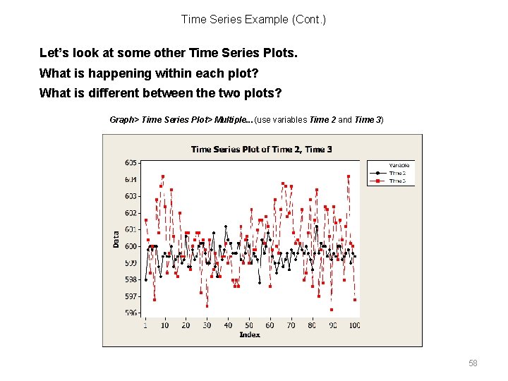
Time Series Example (Cont. ) Let’s look at some other Time Series Plots. What is happening within each plot? What is different between the two plots? Graph> Time Series Plot> Multiple. . . (use variables Time 2 and Time 3) 58

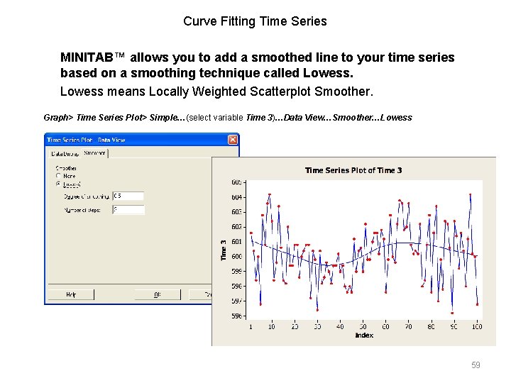
Curve Fitting Time Series MINITAB™ allows you to add a smoothed line to your time series based on a smoothing technique called Lowess means Locally Weighted Scatterplot Smoother. Graph> Time Series Plot> Simple…(select variable Time 3)…Data View…Smoother…Lowess 59

Summary At this point, you should be able to: • Explain the various statistics used to express location and spread of data • Describe characteristics of a Normal Distribution • Explain Special Cause variation • Use data to generate various graphs and make interpretations based on their output 60

The Certified Lean Six Sigma Yellow Belt Assessment The Certified Lean Six Sigma Yellow Belt (CLSSYB) tests are useful for assessing a Yellow Belt’s knowledge of Lean Six Sigma. The CLSSYB can be used in preparation for the ASQ or IASSC Certified Six Sigma Yellow Belt exam or for any number of other certifications, including private company certifications. The Lean Six Sigma Yellow Belt Course Manual Open Source Six Sigma Course Manuals are professionally designed and formatted manuals used by Belt’s during training and for reference guides afterwards. The OSSS manuals complement the OSSS Training Materials and consist of slide content, instructional notes data sets and templates. Get the latest products at… www. Open. Source. Six. Sigma. com