DAY 5 MICROSOFT EXCEL Navya Thum navya thummail


- Slides: 50

DAY 5: MICROSOFT EXCEL Navya Thum navya. thum@mail. wvu. edu February 06, 2013

ATTENDANCE • Go to https: //cs 101. wvu. edu/tools/recordattendance/ to record attendance. • Enter your My. ID username and password. 12/24/2021 2

CHART • A chart is a graphic or visual representation of data • Multiple chart types can enhance information, adding visual appeal and making it easy to analyze data Excel Chapter 5 12/24/2021 3

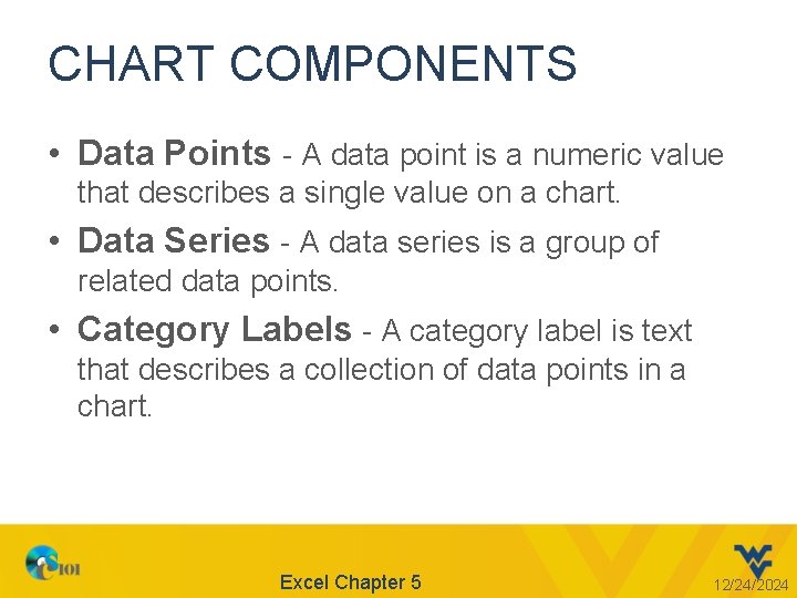
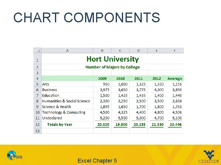
CHART COMPONENTS • Data Points - A data point is a numeric value that describes a single value on a chart. • Data Series - A data series is a group of related data points. • Category Labels - A category label is text that describes a collection of data points in a chart. Excel Chapter 5 12/24/2021 4

CHART COMPONENTS Excel Chapter 5 12/24/2021 5

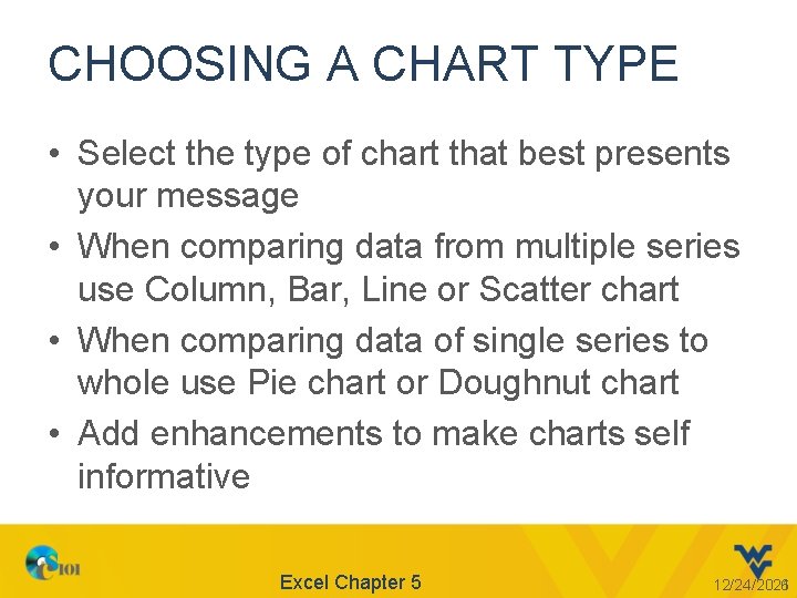
CHOOSING A CHART TYPE • Select the type of chart that best presents your message • When comparing data from multiple series use Column, Bar, Line or Scatter chart • When comparing data of single series to whole use Pie chart or Doughnut chart • Add enhancements to make charts self informative Excel Chapter 5 12/24/2021 6

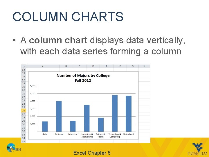
COLUMN CHARTS • A column chart displays data vertically, with each data series forming a column Excel Chapter 5 12/24/2021 7

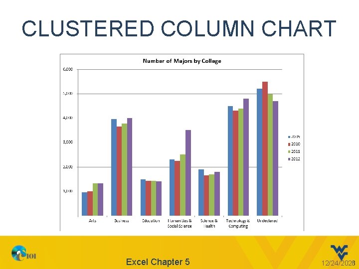
CLUSTERED COLUMN CHART Excel Chapter 5 12/24/2021 8

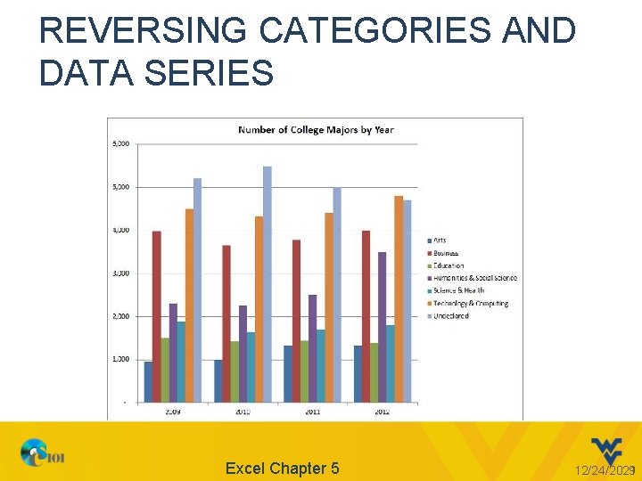
REVERSING CATEGORIES AND DATA SERIES Excel Chapter 5 12/24/2021 9

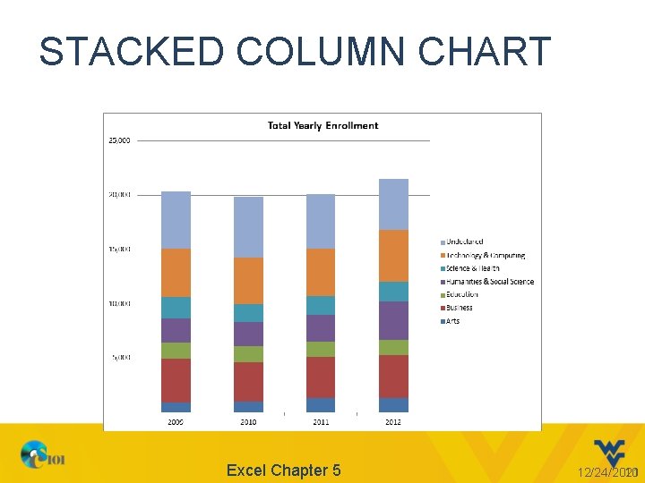
STACKED COLUMN CHART Excel Chapter 5 12/24/2021 10

CLUSTERED VS. STACKED • A multiple data series chart compares two or more sets of data – Clustered column chart • Groups similar data in columns • Makes visual comparison easier – Stacked column chart • Places (stacks) data in one column with each data series in a different color for each category Excel Chapter 5 12/24/2021 11

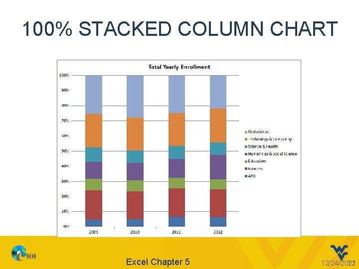
100% STACKED COLUMN CHART Excel Chapter 5 12/24/2021 12

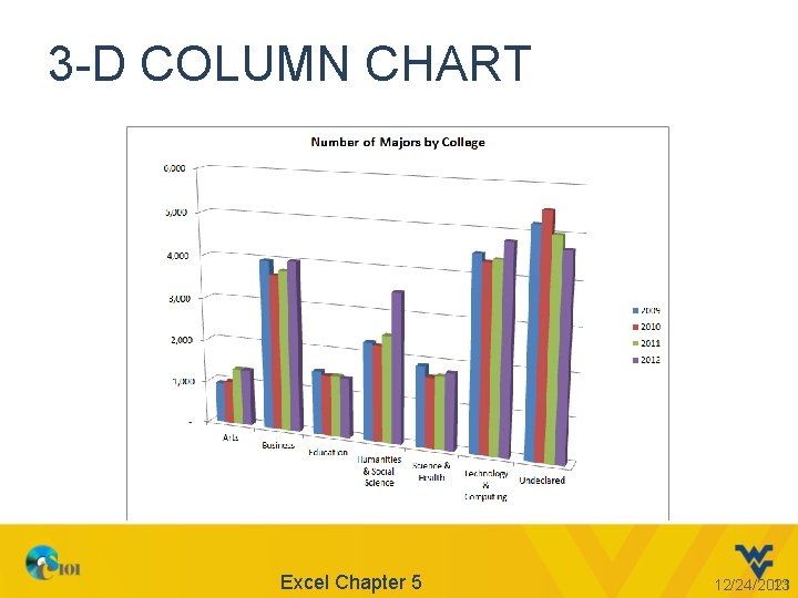
3 -D COLUMN CHART Excel Chapter 5 12/24/2021 13

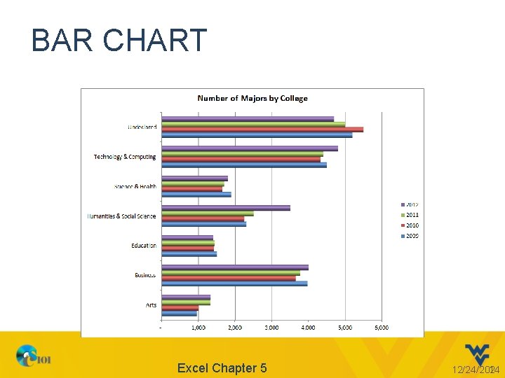
BAR CHART Excel Chapter 5 12/24/2021 14

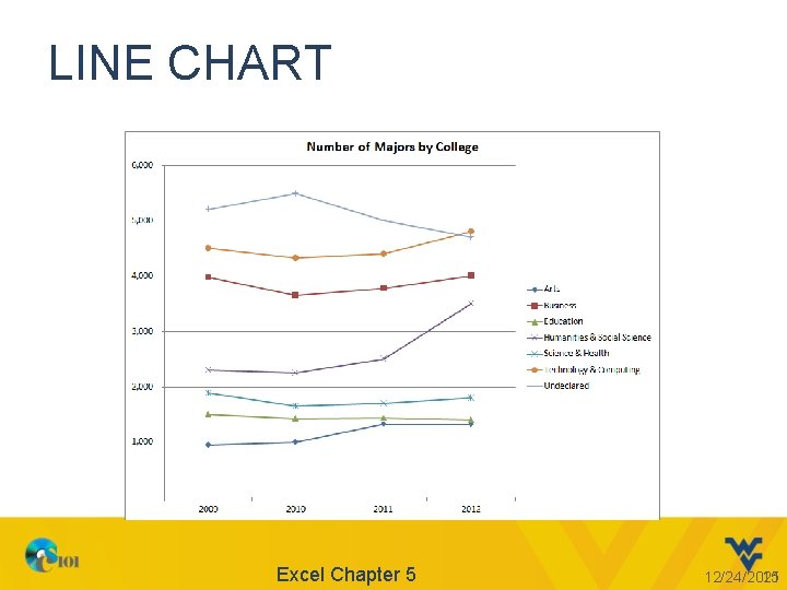
LINE CHART Excel Chapter 5 12/24/2021 15

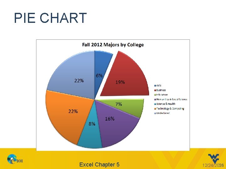
PIE CHART Excel Chapter 5 12/24/2021 16

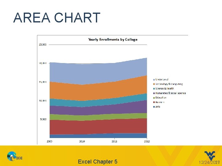
AREA CHART Excel Chapter 5 12/24/2021 17

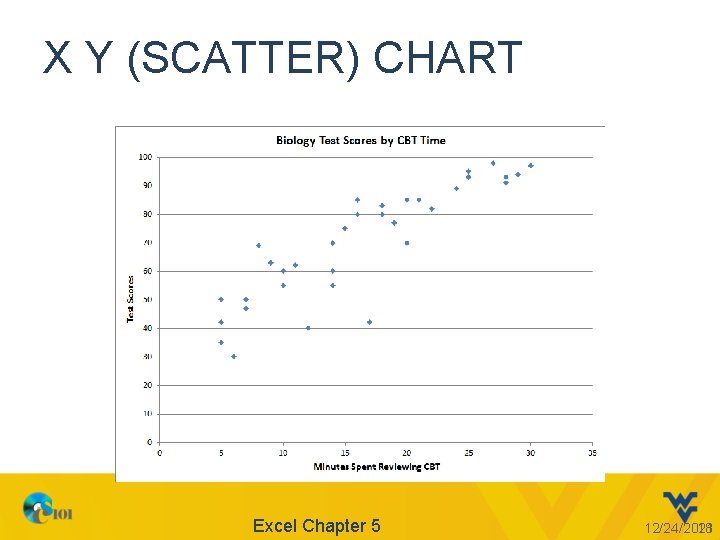
X Y (SCATTER) CHART Excel Chapter 5 12/24/2021 18

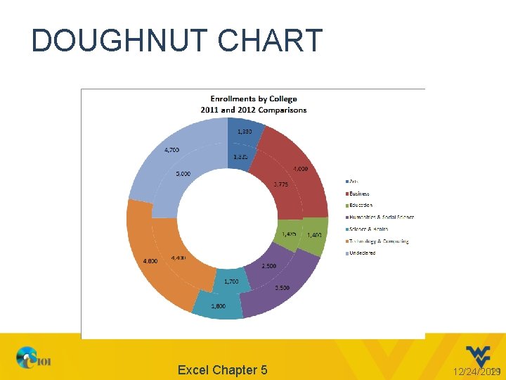
DOUGHNUT CHART Excel Chapter 5 12/24/2021 19

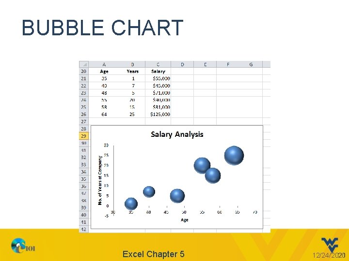
BUBBLE CHART Excel Chapter 5 12/24/2021 20

CREATING A CHART • Select the data. • Go to Insert ribbon -> Charts group -> Select the appropriate chart 21

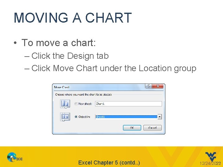
MOVING A CHART • To move a chart: – Click the Design tab – Click Move Chart under the Location group Excel Chapter 5 (contd. . ) 12/24/2021 22

CHANGING THE CHART TYPE • Using the Chart Tools contextual tab: – Click the Design tab – Click Change Chart Type – Select the desired chart type Excel Chapter 5 (contd. . ) 12/24/2021 23

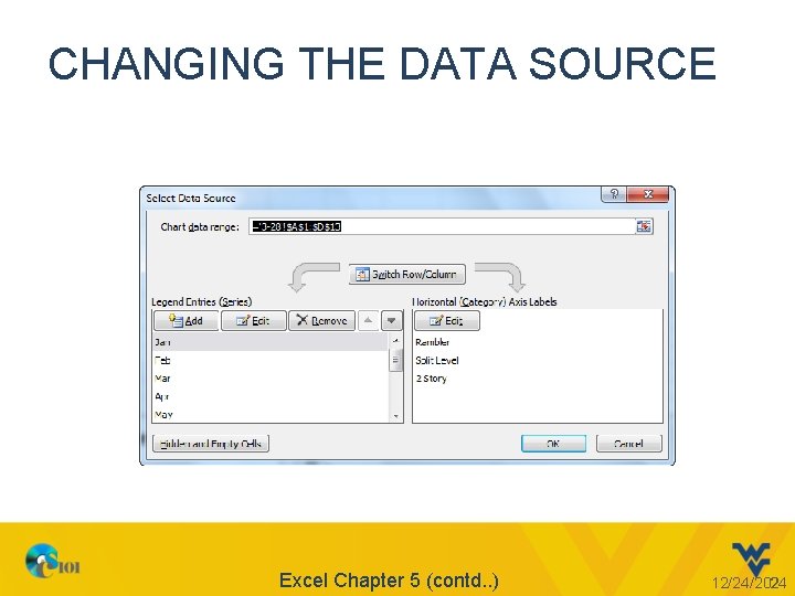
CHANGING THE DATA SOURCE Excel Chapter 5 (contd. . ) 12/24/2021 24

PRINTING A CHART • To print an embedded chart: – Select the chart – Click the File tab – Click Print to display the Backstage view – Use the Print Selected Chart option • To print a chart sheet: – Use the Print Active Sheet option Excel Chapter 5 (contd. . ) 12/24/2021 25

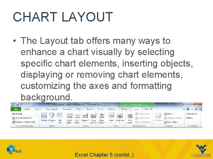
CHART LAYOUT • The Layout tab offers many ways to enhance a chart visually by selecting specific chart elements, inserting objects, displaying or removing chart elements, customizing the axes and formatting background. Excel Chapter 5 (contd. . ) 12/24/2021 26

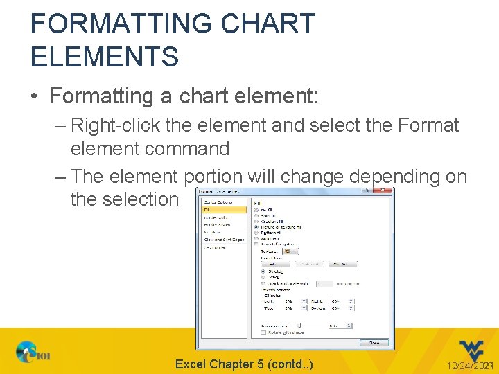
FORMATTING CHART ELEMENTS • Formatting a chart element: – Right-click the element and select the Format element command – The element portion will change depending on the selection Excel Chapter 5 (contd. . ) 12/24/2021 27

CUSTOMIZING CHART LABELS • A chart title is the label that describes the entire chart • An axis title is a label that describes either the category or value axis • A legend is used to distinguish data points in a pie chart or data series in a multiple series chart • A data label is the value or name of a data point Excel Chapter 5 (contd. . ) 12/24/2021 28

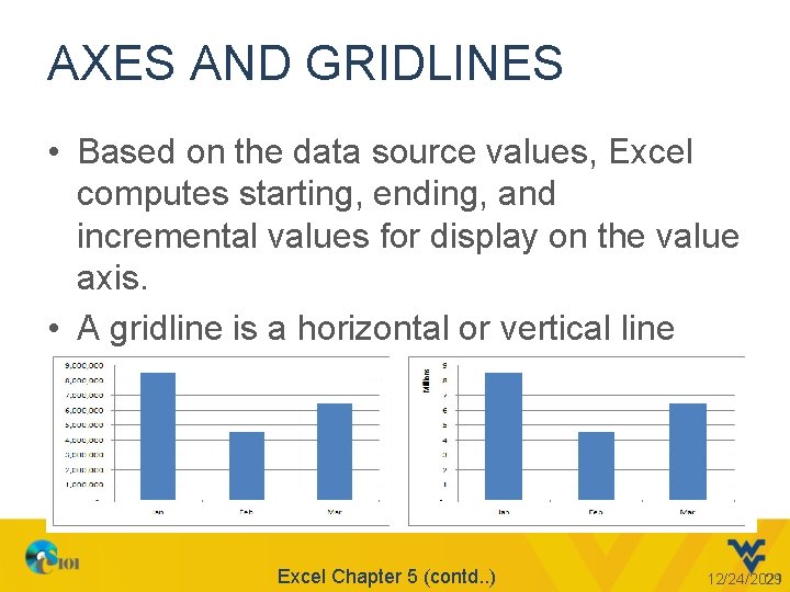
AXES AND GRIDLINES • Based on the data source values, Excel computes starting, ending, and incremental values for display on the value axis. • A gridline is a horizontal or vertical line through the plot area. Excel Chapter 5 (contd. . ) 12/24/2021 29

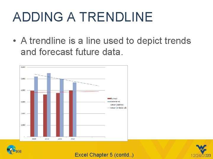
ADDING A TRENDLINE • A trendline is a line used to depict trends and forecast future data. Excel Chapter 5 (contd. . ) 12/24/2021 30

TRENDLINES • Trend Types – Linear – Exponential – Logarithmic – Polynomial – Power etc. , . • Forecast • R-Squared Value Excel Chapter 5 (contd. . ) 12/24/2021 31

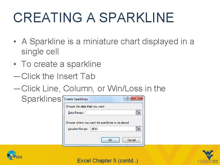
CREATING A SPARKLINE • A Sparkline is a miniature chart displayed in a single cell • To create a sparkline ― Click the Insert Tab ― Click Line, Column, or Win/Loss in the Sparklines group. Excel Chapter 5 (contd. . ) 12/24/2021 32

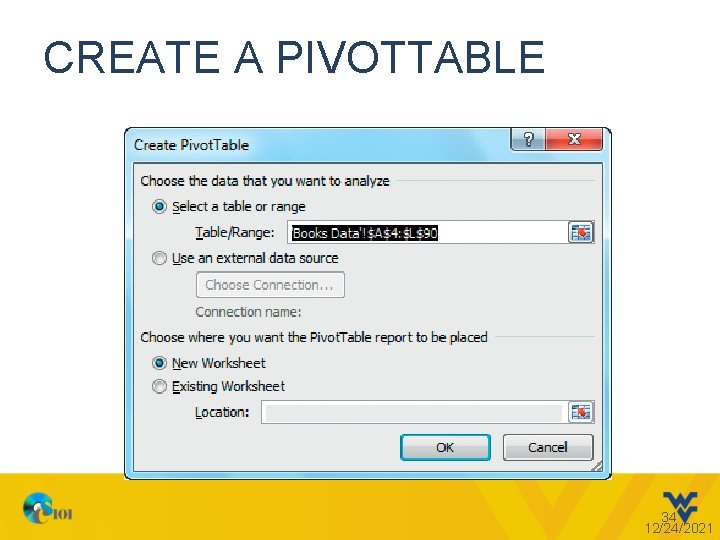
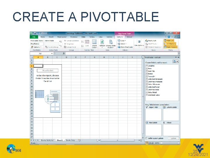
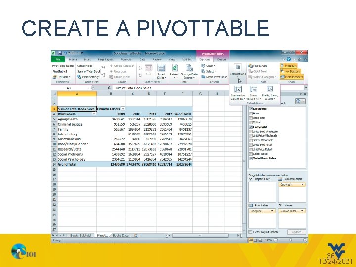
CREATE A PIVOTTABLE • A Pivot. Table allows you to summarize, analyze, and explore large amounts of data • Data can be dynamically arranged to view it from different angles • One column must have duplicate values to create categories for organizing and summarizing data • Another column must have numeric values • Create a Pivot. Table by clicking Pivot. Table in the Tables group on the Insert tab 33 12/24/2021

CREATE A PIVOTTABLE 34 12/24/2021

CREATE A PIVOTTABLE 35 12/24/2021

CREATE A PIVOTTABLE 36 12/24/2021

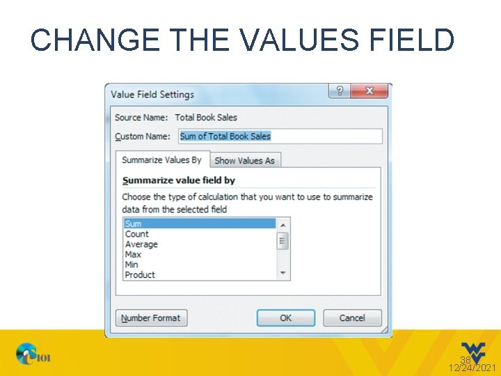
CHANGE THE VALUES FIELD • Select the function used to calculate summary statistics • Default is: – Sum for values – Count for text fields • Specify a custom column heading • Apply number formatting 37 12/24/2021

CHANGE THE VALUES FIELD 38 12/24/2021

MODIFY A PIVOTTABLE • Add, remove, or rearrange fields to get a different perspective of the data • Be careful not to make the data overwhelming with too many details • Excel does not automatically update Pivot. Tables 39 12/24/2021

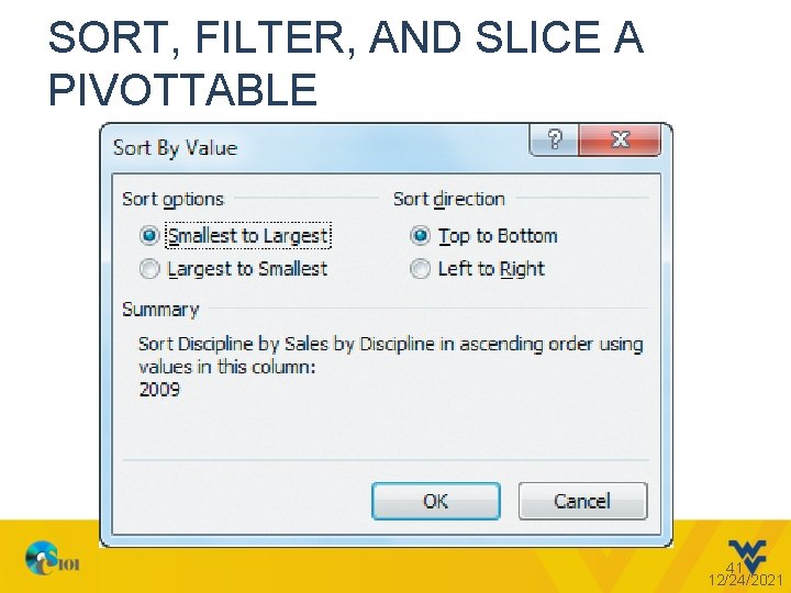
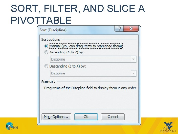
SORT, FILTER, AND SLICE A PIVOTTABLE • Sort data in a Pivot. Table – Default is alphabetical by row label text • To quickly rearrange data, click in a cell in the column you want to sort, and then click Sort Smallest to Largest (Sort A to Z for text) or Sort Largest to Smallest (Sort Z to A for text) in the Sort & Filter group on the Options tab • For specialized sorting, click Sort in the Sort & Filter group on the Options tab – If you click in a row label or column label first, you get a dialog box that has slightly different options than if you click on a value first 40 12/24/2021

SORT, FILTER, AND SLICE A PIVOTTABLE 41 12/24/2021

SORT, FILTER, AND SLICE A PIVOTTABLE 42 12/24/2021

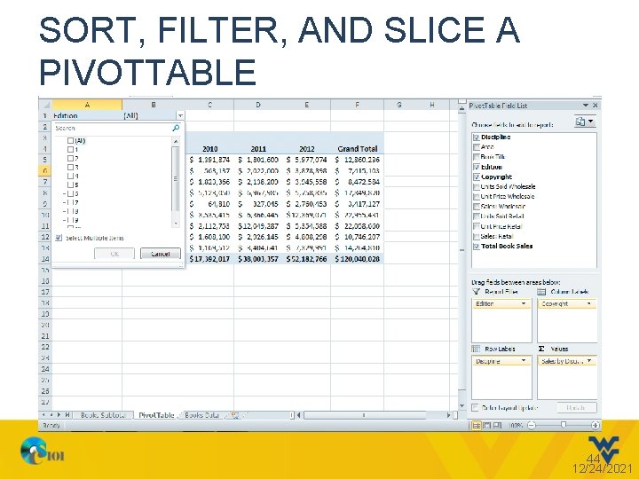
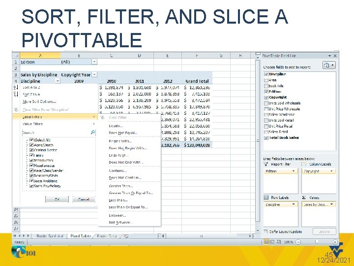
SORT, FILTER, AND SLICE A PIVOTTABLE • Apply filters to show a subset of data in a Pivot. Table • Two types of filters: – A report filter sets the overall conditions for aggregating data – A group filters out data based on a row or column category • Filter by one or multiple items, as well as by entering a search condition 43 12/24/2021

SORT, FILTER, AND SLICE A PIVOTTABLE 44 12/24/2021

SORT, FILTER, AND SLICE A PIVOTTABLE 45 12/24/2021

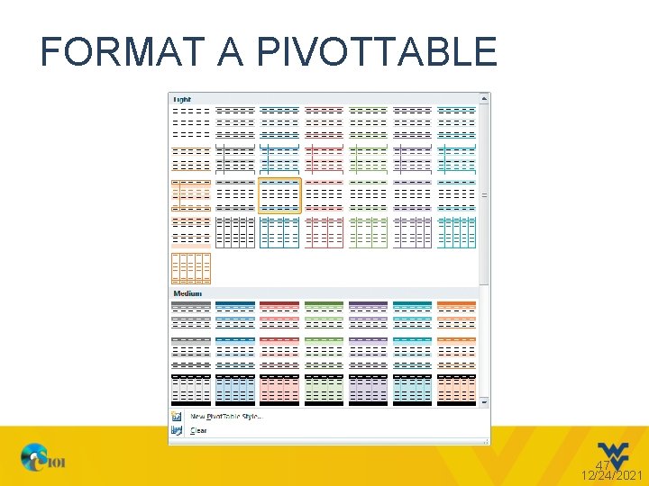
FORMAT A PIVOTTABLE • Basic formatting applied to Pivot. Tables: – Primary row labels formatted in bold – Subtotals are bold • Use Pivot. Table Tools Design tab to apply a Pivot. Table style and control: – Font color – Fill color – Bolding – Border lines 46 12/24/2021

FORMAT A PIVOTTABLE 47 12/24/2021

CREATE A PIVOTCHART • A Pivot. Chart is a graphical representation of data in a Pivot. Table. • You can create a Pivot. Chart from a Pivot. Table or at the same time you create a Pivot. Table. • Creating and customizing Pivot. Charts is similar to the methods used on regular charts. • A Pivot. Chart is interactive, meaning changes made in the associated Pivot. Table are immediately reflected in the Pivot. Chart. 48 12/24/2021

REMINDER • Homework #1 is due on 02/08/13 by 11: 59 P. M • My. ITLab Lesson B due on 02/11/13 by 11: 59 P. M 12/24/2021 49

Questions? 50 12/24/2021