Data Visualization with Pandas Basics Use matplotlib Based

Data Visualization with Pandas

Basics • Use matplotlib • Based on matlab • Allows • • • histograms line plots box-plots scatter plots hex-density plots

Basics • • • Import numpy as np Import pandas as pd Import matplotlib. pyplot as plt

Basic Example • Import an artificial time series >>> ts 1 = pd. read_csv('. . /Data/ts 1. csv') • Show it: >>> ts 1. info() <class 'pandas. core. frame. Data. Frame'> Range. Index: 5000 entries, 0 to 4999 Data columns (total 2 columns): time 5000 non-null int 64 TS 5000 non-null float 64 dtypes: float 64(1), int 64(1) memory usage: 78. 2 KB
 ts 1. tail() •")
Basic Example • Use head and tail ts 1. head() ts 1. tail() • To make it more realistic, we need to make the index into one with actual dates • Drop the column 'time' • We want to change the data frame, so we need to set inplace to True
![Basic Example • >>> ts 1. drop(columns=['time'], inplace=True) >>> ts 1. head() TS 0](http://slidetodoc.com/presentation_image_h2/d250f60641c584f8611433a8762e2abb/image-6.jpg "Basic Example • >>> ts 1. drop(columns=['time'], inplace=True) >>> ts 1. head() TS 0")
Basic Example • >>> ts 1. drop(columns=['time'], inplace=True) >>> ts 1. head() TS 0 1027. 096129 1 1041. 701344 2 1046. 905793 3 1038. 360279 4 1033. 118933 Create a new column with dates starting at January 1, 2001. • Use Bing to Google the name of the function: >>> ts 1['time'] = pd. date_range(start='1/1/2001', per

Basic Example • We still have an index, but now a new column >>> ts 1['time'] = pd. date_range(start='1/1/2001', peri >>> ts 1. head() TS time 0 1027. 096129 2001 -01 -01 1 1041. 701344 2001 -01 -02 2 1046. 905793 2001 -01 -03 3 1038. 360279 2001 -01 -04 4 1033. 118933 2001 -01 -05

Basic Example • Now we can re-index by setting the index >>> ts 1. set_index('time', inplace = True) >>> ts 1. info() <class 'pandas. core. frame. Data. Frame'> Datetime. Index: 5000 entries, 2001 -01 -01 to 2014 -09 -09 Data columns (total 1 columns): TS 5000 non-null float 64 dtypes: float 64(1) memory usage: 78. 1 KB >>> ts 1. head() TS time 2001 -01 -01 2001 -01 -02 1027. 096129 1041. 701344

Basic Example • If we try to only access the TS data, we run into a problem >>> ts 1. TS Traceback (most recent call last): File "<pyshell#73>", line 1, in <module> ts 1. TS File "/Library/Frameworks/Python. framework/Versions/3. 8/ lib/python 3. 8/sitepackages/pandas/core/generic. py", line 5179, in __getattr__ return object. __getattribute__(self, name) Attribute. Error: 'Data. Frame' object has no attribute 'TS'

Basic Example • We can look at the columns of the data frame >>> ts 1. columns Index([' TS'], dtype='object') • And now we see the problem (cost me about an hour of my life) >>> ts 1. columns Index([' TS'], dtype='object') • The csv file has an additional white space after the comma

Basic Example • We better rename that column >>> ts 1. rename(columns={' TS': 'TS'}, inplace = True) >>> ts 1. TS time 2001 -01 -01 1027. 096129 2001 -01 -02 1041. 701344 2001 -01 -03 1046. 905793 2001 -01 -04 1038. 360279 2001 -01 -05 1033. 118933. . . 2014 -09 -05 1019. 451193 2014 -09 -06 1017. 043391 2014 -09 -07 1046. 658204 2014 -09 -08 1030. 316278 2014 -09 -09 1044. 078304

• Basic Example We can now use the plotting component of Pandas ts 1. plot() plt. show()

Basic Example • We can also do a scatter graph • But this needs to be specialized because scatter graphs usually need two numeric values plt. plot_date(ts 1. index, ts 1. TS)

Basic Example • Let's see whether we can make the line plot clearer • Use curve smoothing • Can use rolling, then mean, then plot >>> ts 1. rolling(10). mean(). plot() <matplotlib. axes. _subplots. Axes. Subplot object at 0 x 7 f >>> plt. show()

Basic Example rolling window 10

Basic Example rolling window 50

Basic Example • While rolling takes all observations in the window at the same value, we can also use exponential weighted windows ts 1. ewm(span=10). mean(). plot()

Basic Example window size 10

Basic Example window size 50

Fundamentals • The basic plotting tool is still matplotlib • It can be wrapped by • • Pandas Seaborn (future lecture) ggplot Holoview

Fundamentals • Importing • Just as np from numpy and pd for pandas, we use traditional shortcuts import matplotlib as mpl import matplotlib. pyplot as plt • Usually only need the latter
 • We can find styles")
Fundamentals • We can pick style plt. style. use('classic') • We can find styles with plt. style. available ['seaborn-dark', 'seaborn-darkgrid', 'seaborn-ticks', 'fivethirtyeight', 'seaborn-whitegrid', 'classic', '_classic_test', 'fast', 'seaborn-talk', 'seaborn-dark-palette', 'seaborn-bright', 'seaborn-pastel', 'grayscale', 'seaborn-notebook', 'ggplot', 'seaborn-colorblind', 'seaborn-muted', 'seaborn', 'Solarize_Light 2', 'seaborn-paper', 'bmh', 'tableau-colorblind 10', 'seaborn-white', 'dark_background', 'seaborn-poster', 'seaborn-deep']
 • Interacts with")
Fundamentals • Plotting from a script • Use plt. show( ) • Interacts with the system • • • Results are system dependent plt. show( ) does a lot in the background should only be run once in a script

Fundamentals • Plotting from a notebook • • Use matplotlib inline Creates a new cell to embed any png created with plt. plot()
 File format")
Fundamentals • Saving figures to files • • Use fig. savefig(address ) File format is inferred from file extension

Fundamentals • Two interfaces: • MATLAB style interface • • • Best for relatively simple plots Keeps track of all figure elements Object oriented interface • • Create figures and "axes" Use method calls
 plt. figure( )")
Fundamentals • Example: • MATLAB interface x = np. linspace(-1, 10) plt. figure( ) #create figure plt. subplot(1, 2, 1) #rows columns panel number plt. plot(x, np. sin(x)) plt. subplot(1, 2, 2) plt. plot(x, np. cos(x))

Fundamentals
![Fundamentals • OO interface fig, ax = plt. subplots(ncols=2) ax[0]. plot(x, np. sin(x)) ax[1].](http://slidetodoc.com/presentation_image_h2/d250f60641c584f8611433a8762e2abb/image-29.jpg "Fundamentals • OO interface fig, ax = plt. subplots(ncols=2) ax[0]. plot(x, np. sin(x)) ax[1].")
Fundamentals • OO interface fig, ax = plt. subplots(ncols=2) ax[0]. plot(x, np. sin(x)) ax[1]. plot(x, np. cos(x)) • • Figure : single container with potentially many axes Axes : bounding box with many elements • Axis, Tick, Line 2 D, Text, Polygon

Simple Line Plots • • • Define a Figure and an Axes object Create an array of x values [0. , 0. 01, 0. 02, 0. 03, 0. 04, … ] Create an array of y values plt. style. use('seaborn-whitegrid') fig = plt. figure ax = plt. axes() x = np. linspace(0, 1000) ax. plot(x, (x**2+1)/(x**2+x+1))

Simple Line Plots • Line colors • colors have • • • names, abbreviations (rgbcmyk), Grayscales between 0 and 1 Hexcodes (RRGGBB) between 00 and FF RGB tuples with values between 0 and 1 HTML color names
 ax. plot(x, (x**2+1)/(x**2+x+1), color = '#FFEE")
Simple Line Plots x = np. linspace(0, 1001) ax. plot(x, (x**2+1)/(x**2+x+1), color = '#FFEE 11')
 ax. plot(x, (x**2+1)/(x**2+x+1), color = '#FFEE")
Simple Line Plots x = np. linspace(0, 1001) ax. plot(x, (x**2+1)/(x**2+x+1), color = '#FFEE 11') ax. plot(x, (x**3+1)/(x**3+x**2+1), color = 'chartreuse')

Simple Line Plots • Line Styles • • 'solid', 'dashed', 'dashdot' 'dotted' Abbreviated as • '-', '-. ', ': '
/(x**2+x+1), color = '#FF 1111', line ax. plot(x, (x**3+1)/(x**3+x**2+1),")
Simple Line Plots ax. plot(x, (x**2+1)/(x**2+x+1), color = '#FF 1111', line ax. plot(x, (x**3+1)/(x**3+x**2+1), color = 'indigo', li
/(x**2+x+1), 'r--') ax.")
Simple Line Plots • These can also be combined ax. plot(x, (x**2+1)/(x**2+x+1), 'r--') ax. plot(x, (x**3+1)/(x**3+x**2+1), 'b-. ')

Simple Line Plots • Axes Limits for finer control • set xlim, ylim plt. ylim(0, 1) ax. plot(x, (x**2+1)/(x**2+x+1), 'r--') ax. plot(x, (x**3+1)/(x**3+x**2+1), 'b-. ')
 ax.")
Simple Line Plots • You can even revert an axis plt. ylim(1, 0) ax. plot(x, (x**2+1)/(x**2+x+1), 'r--') ax. plot(x, (x**3+1)/(x**3+x**2+1), 'b-. ')

Simple Line Plots • You can set all axes with the confusingly named axis method plt. axis([0, 3, 1, 0])

Simple Line Plots • plt. axis actually allow even more plot control • • 'tight' to tighten bounds around current plot ''equal' for equal aspect ratio

Simple Line Plots • Plot axes can be labeled fig = plt. figure ax = plt. axes() x = np. linspace(0, 1001) plt. axis([0, 3, 0. 5, 1], 'tight') plt. xlabel('t') plt. ylabel('f(t)') ax. plot(x, (x**2+1)/(x**2+x+1), 'r--') ax. plot(x, (x**3+1)/(x**3+x**2+1), 'b-. ')

Simple Line Plots

Simple Line Plots • We label a plot with plt. title
/(x**2+x+1), 'r--',")
Simple Line Plots • And we can provide a legend ax. plot(x, (x**2+1)/(x**2+x+1), 'r--', label='(x^2+1)/(x^2+x+1)') ax. plot(x, (x**3+1)/(x**3+x**2+1), 'b-. ', label='(x^3+1)/(x^3+x^2+1)') plt. legend()
 —> ax. set_xlabel( •")
Simple Line Plots • OO translation: • plt. xlabel( ) —> ax. set_xlabel( • plt. ylabel( ) —> ax. set_ylabel( ) • plt. xlim( ) —> ax. set_xlim( ) • plt. ylim( ) —> ax. set_ylim( ) • plt. title( ) —> ax. set_title( ) • or just use ax. set )
/(x**2+x+1), 'r--', label='(x^2+1)/(x ax. plot(x, (x**3+1)/(x**3+x**2+1), 'b-. ', label='(x^3+1)")
Simple Line Plots ax. plot(x, (x**2+1)/(x**2+x+1), 'r--', label='(x^2+1)/(x ax. plot(x, (x**3+1)/(x**3+x**2+1), 'b-. ', label='(x^3+1) ax. set(xlim=(0, 1. 5), ylim=(0. 6, 1), xlabel='x', ylabel=' title = 'Two functions')

Simple Line Plots

Simple Scatter Plots • • plt. plot / ax. plot can also produce scatter plots Just give it a marker ax. plot(x, (x**2+1)/(x**2+x+1), 'o', color = 'black', la ax. plot(x, (x**3+1)/(x**3+x**2+1), 'x', color = 'red', l ax. set(xlim=(0, 1. 5), ylim=(0. 6, 1), xlabel='x', ylabel=' ax. legend()

Simple Scatter Plots

Simple Scatter Plots • Additional argument represent the symbol • 'o', 'x', '+', 'v', '^', '<', '>', • • 's' square 'd' diamond

Simple Scatter Plots • More powerful: Use plt. scatter • • Can control many more aspects Example: • • Create 100 random pairs of x, y Create random colors (between 0 and 1) Create random sizes (between 0 and 1000) Set alpha = 0. 3 in order to make things transparent
 x = np. random. randn(100) y = np.")
Simple Scatter Plots np. random. seed(250620) x = np. random. randn(100) y = np. random. randn(100) colors = np. random. rand(100) sizes = 1000 * np. random. rand(100) plt. scatter(x, y, c=colors, s=sizes, alpha = 0. 3, cmap = 'viridis') plt. colorbar() # show color scale plt. show()

Simple Scatter Plots
 from sklearn. datasets")
Simple Scatter Plots • Example: Iris data set (from sklearn. datasets) from sklearn. datasets import load_iris = load_iris() features = iris. data. T #need to transpose plt. scatter(features[2], features[3], alpha = 0. 6, c=iris. target, cmap = 'prism') plt. xlabel(iris. feature_names[2]) plt. ylabel(iris. feature_names[3]) plt. show()

Simple Scatter Plots

Simple Scatter Plots • As datasets get larger, plot becomes more efficient than scatter

Error Bars • it's not science if there is no statistics • • it's not statistics if there are no errorbars When you have a data set, you should also have a confidence interval • • This is displayed by an error bar Use plt. errorbar with • • x-values y-values confidence interval size format code to control appearances (same as for lines and colors)

Error Bars • Example: • • Use a simple function • Then draw error bars with Use random. normal in order to generate y-values centered around the random function
 y = np. random. normal(loc =")
Error Bars x = np. linspace(0, 10, 51) y = np. random. normal(loc = x**2/10+x-1 , scale = 2+x/10) plt. errorbar(x, y, yerr=2*(2+x/10), fmt='. k') plt. plot(x, x**2/10+x-1, 'r-') plt. show()

Error Bars

Error Bars • Continuous errors • • No real support in matplotlib Can make it ourselves with filling between curves x = np. linspace(0, 101) y = np. random. normal(loc = x**2/10+x-1 , scale = 2+x/10) plt. plot(x, y, 'x') plt. plot(x, x**2/10+x-1, 'r-') plt. fill_between(x, x**2/10+x-1 -2*(2+x/10), x**2/10+2*(xplt. show()

Error Bars

Contour / Density Plots • As an example, use the following function def f(x, y): return np. sin(x)**10+np. cos(10+y*x)*np. cos(x)

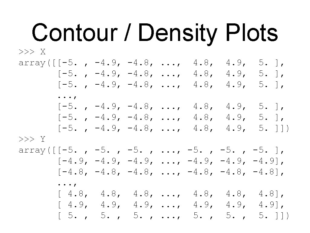
Contour / Density Plots • Contour plot • Need to create a grid • Easiest with meshgrid x = y = X, Y Z = np. linspace(-5, 5, 101) = np. meshgrid(x, y) f(X, Y)

Contour / Density Plots • Simple contour plot: dashed lines stand for neg. values plt. contour(X, Y, Z, colors='black')

Contour / Density Plots • Can specify the number of contour lines plt. contour(X, Y, Z, 20, colors='black')

Contour / Density Plots • Can use a color map plt. contour(X, Y, Z, 20, plt. colorbar() cmap = 'Rd. Gy')
- Slides: 68