Making Data Purdy GNUPLOT MATPLOTLIB DR GENEVIEVE BARTLETT

Making Data Purdy GNUPLOT & MATPLOTLIB DR. GENEVIEVE BARTLETT

General rules for visualizing data • Always, always label x and y in a plot & have a key—even for informal meetings! • Be thoughtful about your titles and captions • For more formal presentations/papers: ONLY plot/graph/map data if it shows you something interesting. • If you can use a simple description (e. g. “The growth is linear throughout”), think about what else might be worth visually representing in your data. • Sometimes you do need to show boring data displays, especially if a boring trend is surprising/backs your claim • If you show the data, ALWAYS call out (and investigate) interesting • trends • anomalies • specific points in the depiction that back or refute your hypothesis • Never use always and never, and always have just 3 main points per slide.

Tons of tools to help • Just some of many: • • • Excel (but… really… don’t. ) d 3: useful if you’re already doing web/javascript plotly lucidchart (online, good for system diagrams and data flow) Geo. Gebra or Xcas – good for doing math + viz • BUT – today, we’re just looking at • gnuplot • matplotlib

Gnuplot & MATPLOTLIB Gnuplot MATPLOTLIB Ready to go command line tool Needs python env Usually need awk, sed, uniq etc. to manipulate data You’re in python! Lots of easy manipulation libs

Gnuplot – quick! $ sudo tcpstat -s 10 1 | awk -F= '{print N++, $5}' > plot ^^ Use tcpstat to get 10 seconds of average bps from our default network interface. $ gnuplot ^^ Call gnuplot > plot 'plot' using 1: 2 with linespoints ^^ Tell gnuplot to plot the file we redirected to (named ‘plot’)
 > plot")
Gnuplot basics Set commands go here (e. g. set output file “blah”) > plot 'plot' using 1: 2 with linespoints • The plot command • What file we’re getting data from • Which fields (1…n) we want to plot, in this case the first and second fields. • ’with” indicates something about the style of the plot line and points.
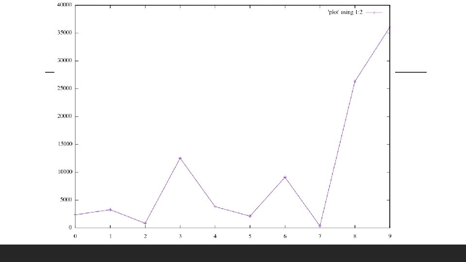

Not super pretty

OBJECTIVELY Not super pretty No x & y labels – ALWAYS have these!! Key is not informative No title, details.

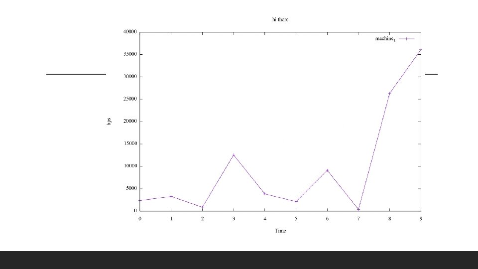
• X & Y labels: > set xlabel ”Time” Fixing things a bit > set ylabel “bps” • Title as well: > set title “hi there” • Key is derived from titles of plot lines in plot command > plot 'plot' using 1: 2 with linespoints title "machine_1”

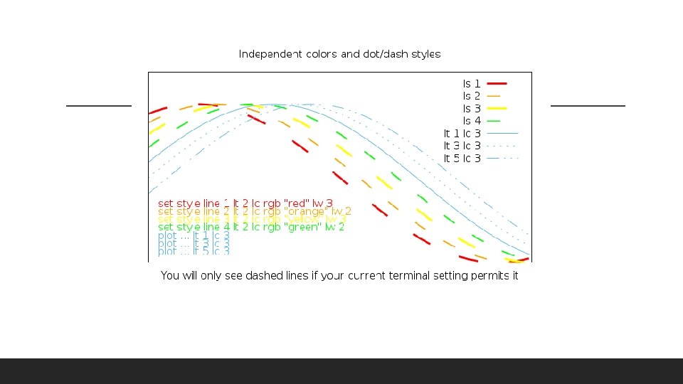
> plot 'plot' using 1: 2 with linespoints title "machine_1” lw 3 lc “red” lt 2 Lw – line width Ls – line style (e. g. dashed = 2 on some terminals) Making nicer line styles Lc – line color Better! Esp. when plotting multiple graphs you want a consistent style for, define (set) a line style and use the style in your plot line. > set style line 1 lt 2 lc rgb "red" lw 3 > plot 'plot' using 1: 2 with linespoints title "machine_1” ls 1

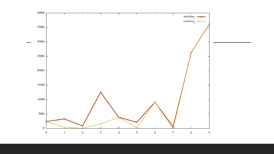
• Easy – just specify where and which fields you want to plot in the same plot command: Ok – but how do you get multiple lines? • From a different column, same file: > plot 'plot' using 1: 2 with linespoints ls 1 title "machine_1", ’’ u 1: 3 title "machine_2" w linespoints ls 2 • From a different file: > plot 'plot' using 1: 2 with linespoints ls 1 title "machine_1", ‘plot 2’ using 1: 2 title "machine_2" w linespoints ls 2

Gnuplot data manipulation & scripting • Simple manipulation can be done on fields within gnuplot: > plot ‘data. file’ u ($1*2): ($2/5 -50) ^ Plot 2 x the first field against the second field divided by 5, minus 50. • More complex – use those helper tools (cat, awk, sed etc. ) and use a shell script.
 #!/bin/bash #")
E. g. Gnuplot within bash (not the only way, but a way) #!/bin/bash # bash comment: below are some bash variables. minval=0 maxval=42 # Chance here to manipulate your data with other tools, e. g. a python script, sed, awk etc. # Call and feed in commands to gnuplot << EOF set title ”My graph’s title" font ", 14" textcolor rgbcolor "royalblue" set timefmt "%y/%m/%d" set yrange $minval: $maxval <- Note these are bash variables! set xdata time set pointsize 1 set term png set out “my_graph. png” plot “data. file" using 1: 2 with linespoints % gnuplot comment: using ($1 -5: $2 -$3) needs special quotes & escapes or else these are interpreted as bash vars EOF

Can do lots!! 3 d plots, histograms, maps etc.
:")
Matplotlib You’ll need (installs via pip, best to use a virt env, like pipenv): ◦ Jupyter (makes it easy to view graphs right away) ◦ Pandas & numpy (manipulate data) ◦ And of course, matplotlib

Matplotlib + friends quick! Import pandas # Pandas for reading and manipulating data=pandas. read_csv(”plot", delim_whitespace=True) # Do some fanciness so pandas glues together our date and time columns and sets this as an #index. data["timestamp"]=pandas. to_datetime(data["Date"] + " "+data["time"], infer_datetime_format=True, utc=True) data. set_index("timestamp", inplace=True)
")
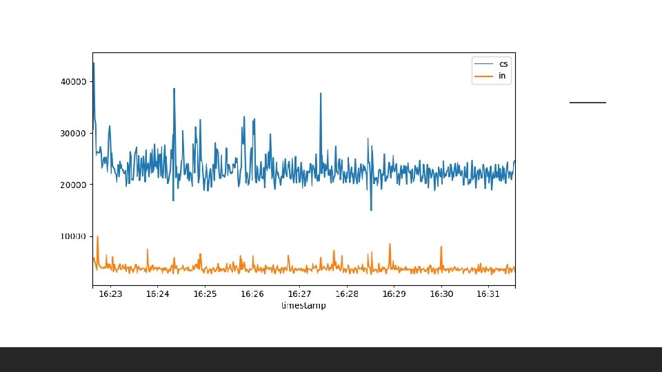
Matplotlib + friends quick! # Plot with matplotlib import matplotlib. pyplot as plt. figure() plt. plot(data["cs"]) plt. plot(data["in"]) plt. legend()

Can do lots!! 3 d plots, histograms, maps etc. *with matplot 3 d

Tutorials • Gnuplot http: //physics. ucsc. edu/~medling/programming/gnuplot_tutorial_1/index. html • Matplotlib https: //matplotlib. org/users/pyplot_tutorial. html
- Slides: 24