Science Visualization Taxonomy Terminology Scientific Visualization Field in


- Slides: 56

Science Visualization Taxonomy

Terminology ü Scientific Visualization ü Field in computer science that encompasses user interface, data representation and processing algorithms, visual representations, and other sensory presentation such as sound or touch (Mc. Cormick, 1987) Data Visualization More general than scientific visualization, since it implies treatment of data sources beyond the sciences and engineering, e. g. , financial, marketing, numerical data generally Includes application of statistical methods and other standard data analysis techniques (Rosenblum, 1994) ü Information Visualization Concerned typically with more abstract, often semantic, information, e. g. , hypertext documents, WWW, text documents From Shneiderman: ~ “use of interactive visual representations of abstract data to amplify cognition” (Ware, 2008; Card et al. , 1999) Sci. Vis 2013 - page 2

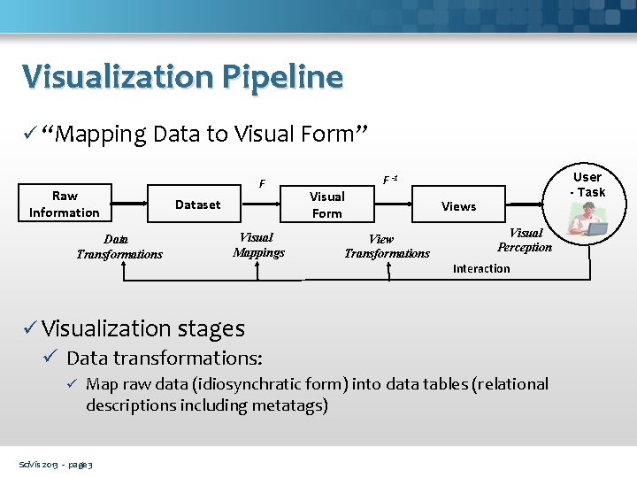
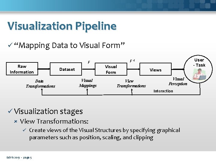
Visualization Pipeline ü “Mapping Data to Visual Form” Raw Information Data Transformations F Dataset Visual Mappings Visual Form User - Task F -1 View Transformations Views Visual Perception Interaction ü Visualization stages ü Data transformations: ü Map raw data (idiosynchratic form) into data tables (relational descriptions including metatags) Sci. Vis 2013 - page 3

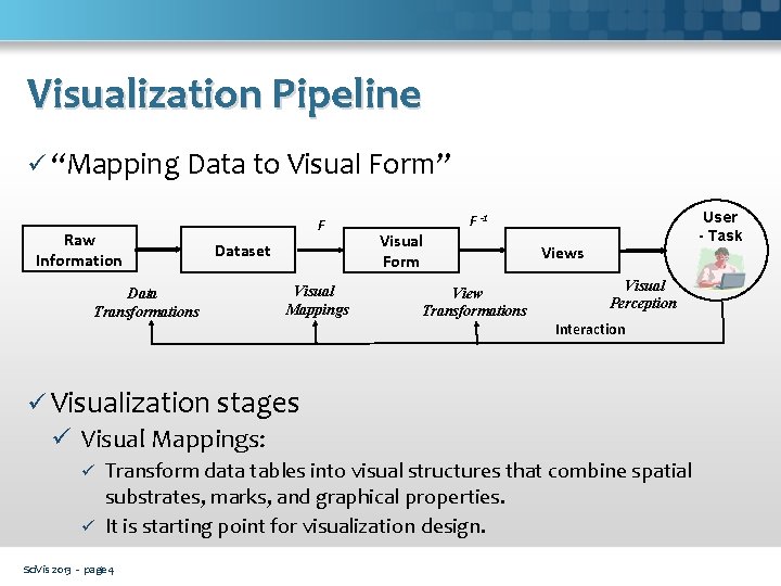
Visualization Pipeline ü “Mapping Data to Visual Form” Raw Information Data Transformations F Dataset Visual Mappings Visual Form User - Task F -1 View Transformations Views Visual Perception Interaction ü Visualization stages ü Visual Mappings: Transform data tables into visual structures that combine spatial substrates, marks, and graphical properties. ü It is starting point for visualization design. ü Sci. Vis 2013 - page 4

Visualization Pipeline ü “Mapping Data to Visual Form” Raw Information Data Transformations F Dataset Visual Mappings Visual Form User - Task F -1 View Transformations Views Visual Perception Interaction ü Visualization stages View Transformations: ü Create views of the Visual Structures by specifying graphical parameters such as position, scaling, and clipping Sci. Vis 2013 - page 5

Representing Data Graphically ü Data visualization comes from the convergence of computer science, statistics and design. The goal is to make data presentation interesting, aesthetically pleasing and hopefully informative. ü It is a marriage between science and art, between the left and right halves of the brain. Good data visualization goes further by revealing relationships in the data that might otherwise have gone unnoticed. With the absence of hypothesis tests it is easy to discount visualization as unscientific, but that would be a mistake. Sci. Vis 2013 - page 6

Representing Data Graphically ü There are many uses of data visualization, and the reality is hypothesis testing can bore the audience, if not completely surpass their level of understanding. Data visualization then is a means to an end for statisticians who want to be better communicators. And it’s a pathway to a better understanding of the data for the designers amongst us. Sci. Vis 2013 - page 7

Too Much Data ü The problem we now face is filtering the valuable data from the invaluable data and determining how we use it to inform business decisions or research. ü The main questions are: What type of media will you use to make your presentation? How long does your audience have to take in the data? ü The longer the audience has the more data dense the visualization can and should be. The less time and autonomy your audience has to peruse the data the more simplified the visualization should be. Sci. Vis 2013 - page 8

Selecting the Right Graph ü Selecting the appropriate display can be difficult because it involves a good understanding of the nature of your data, statistics, as well as a good understanding of design principles. There are many possibilities for a given variable or dataset, but you need a place to start. The challenge is that for any given data set the number of visual encodings – and thus the space of possible visualization designs – is extremely large. Sci. Vis 2013 - page 9

Visualization Taxonomy ü Many types of taxonomy Jeffrey Heer, Michael Bostock, and Vadim Ogievetsky (Stanford University) "A Tour Through the Visualization Zoo” Christian Behrens' A list of Design Pattern categories Edward Lee "A Taxonomy of Data Visualization" Sci. Vis 2013 - page 10

Visualization Taxonomy ü Many types of taxonomy Jeffrey Heer, Michael Bostock, and Vadim Ogievetsky (Stanford University) "A Tour Through the Visualization Zoo” Christian Behrens' A list of Design Pattern categories Edward Lee "A Taxonomy of Data Visualization" Sci. Vis 2013 - page 11

Visualization Taxonomy ü Commonsense taxonomy: Chart Map Network Time series Hierarchy Flow Matrix Infographic Sci. Vis 2013 - page 12

Chart ü It is a graphical representation of data, in which "the data is represented by symbols, such as bars in a bar chart, lines in a line chart, or slices in a pie chart". It can represent tabular numeric data, functions or some kinds of qualitative structure and provides different info. ü They are often used to ease understanding of large quantities of data and the relationships between parts of the data. They can usually be read more quickly than the raw data that they are produced from. Sci. Vis 2013 - page 13

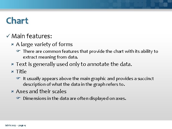
Chart ü Main features: A large variety of forms There are common features that provide the chart with its ability to extract meaning from data. Text is generally used only to annotate the data. Title It usually appears above the main graphic and provides a succinct description of what the data in the graph refers to. Axes and their scales Dimensions in the data are often displayed on axes. Sci. Vis 2013 - page 14

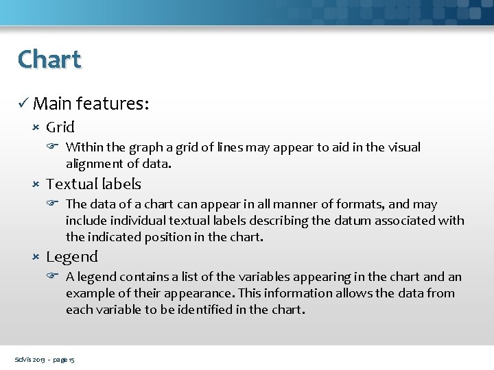
Chart ü Main features: Grid Within the graph a grid of lines may appear to aid in the visual alignment of data. Textual labels The data of a chart can appear in all manner of formats, and may include individual textual labels describing the datum associated with the indicated position in the chart. Legend A legend contains a list of the variables appearing in the chart and an example of their appearance. This information allows the data from each variable to be identified in the chart. Sci. Vis 2013 - page 15

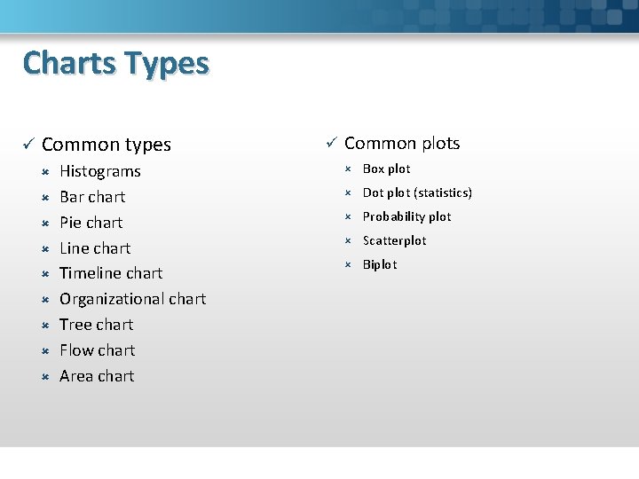
Charts Types ü Common types Histograms Bar chart Pie chart Line chart Timeline chart Organizational chart Tree chart Flow chart Area chart ü Common plots Box plot Dot plot (statistics) Probability plot Scatterplot Biplot

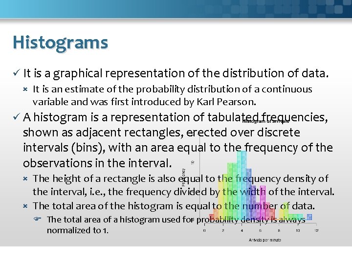
Histograms ü It is a graphical representation of the distribution of data. It is an estimate of the probability distribution of a continuous variable and was first introduced by Karl Pearson. ü A histogram is a representation of tabulated frequencies, shown as adjacent rectangles, erected over discrete intervals (bins), with an area equal to the frequency of the observations in the interval. The height of a rectangle is also equal to the frequency density of the interval, i. e. , the frequency divided by the width of the interval. The total area of the histogram is equal to the number of data. The total area of a histogram used for probability density is always normalized to 1.

Histograms ü The rectangles of a histogram are drawn so that they touch each other to indicate that the original variable is continuous. If the length of the intervals on the x-axis are all 1, then a histogram is identical to a relative frequency plot. ü A histogram may also be normalized displaying relative frequencies. It then shows the proportion of cases that fall into each of several categories, with the total area equaling. The categories are usually specified as consecutive, nonoverlapping intervals of a variable. The categories (intervals) must be adjacent, and often are chosen to be of the same size.

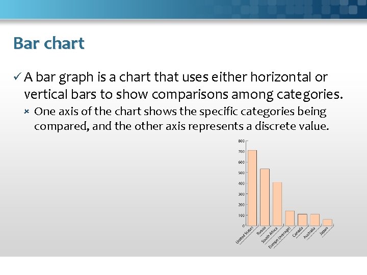
Bar chart ü A bar graph is a chart that uses either horizontal or vertical bars to show comparisons among categories. One axis of the chart shows the specific categories being compared, and the other axis represents a discrete value.

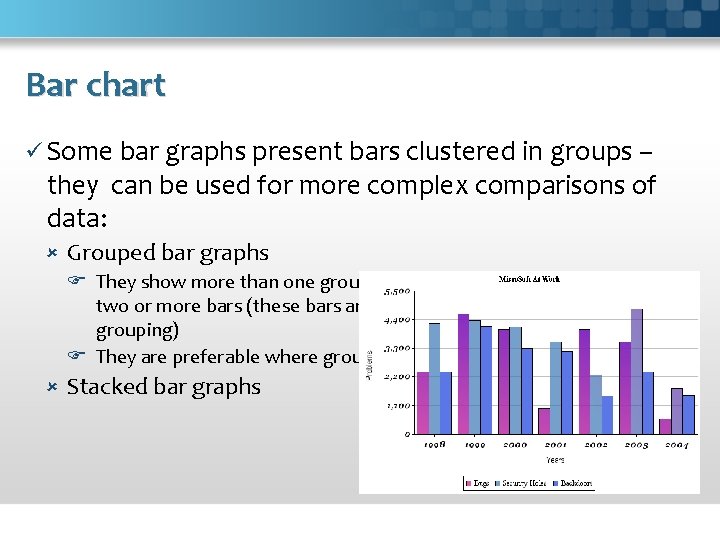
Bar chart ü Some bar graphs present bars clustered in groups – they can be used for more complex comparisons of data: Grouped bar graphs They show more than one group: for each categorical group there are two or more bars (these bars are color-coded to represent a particular grouping) They are preferable where groups have negative values Stacked bar graphs

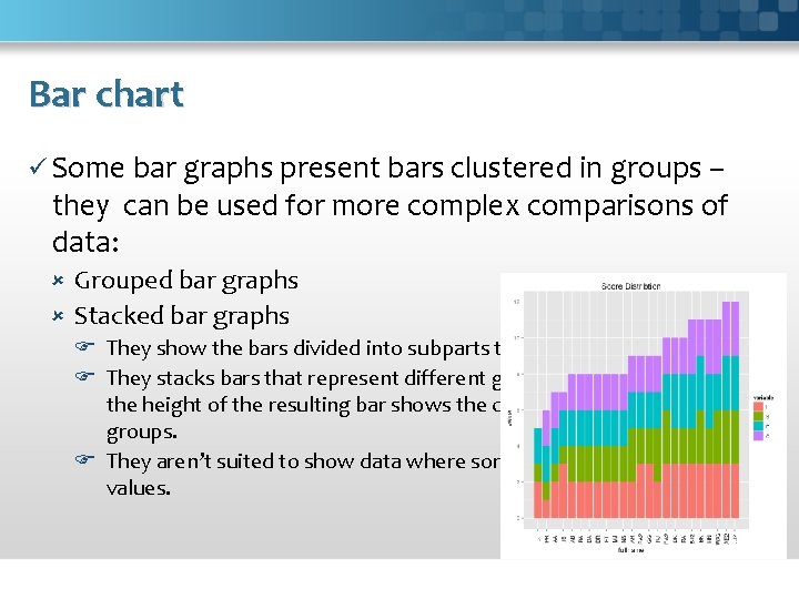
Bar chart ü Some bar graphs present bars clustered in groups – they can be used for more complex comparisons of data: Grouped bar graphs Stacked bar graphs They show the bars divided into subparts to show cumulate effect. They stacks bars that represent different groups on top of each other - the height of the resulting bar shows the combined result of the groups. They aren’t suited to show data where some groups have negative values.

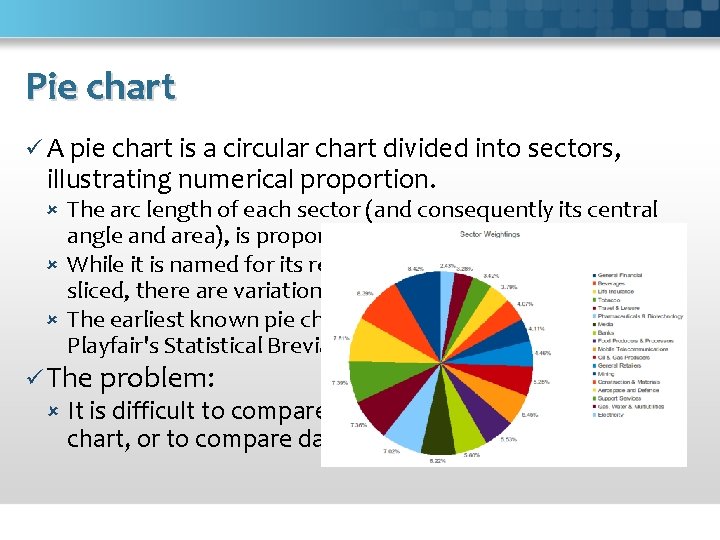
Pie chart ü A pie chart is a circular chart divided into sectors, illustrating numerical proportion. The arc length of each sector (and consequently its central angle and area), is proportional to the quantity it represents. While it is named for its resemblance to a pie which has been sliced, there are variations on the way it can be presented. The earliest known pie chart is generally credited to William Playfair's Statistical Breviary of 1801. ü The problem: It is difficult to compare different sections of a given pie chart, or to compare data across different pie charts.

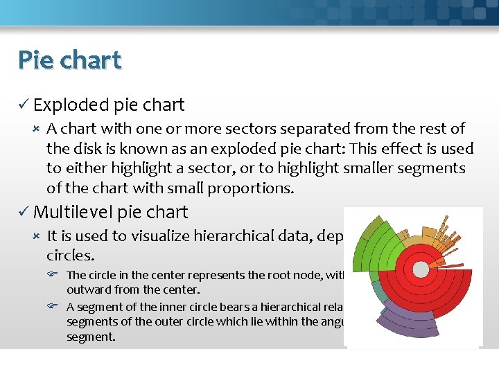
Pie chart ü Exploded pie chart A chart with one or more sectors separated from the rest of the disk is known as an exploded pie chart: This effect is used to either highlight a sector, or to highlight smaller segments of the chart with small proportions. ü Multilevel pie chart It is used to visualize hierarchical data, depicted by concentric circles. The circle in the center represents the root node, with the hierarchy moving outward from the center. A segment of the inner circle bears a hierarchical relationship to those segments of the outer circle which lie within the angular sweep of the parent segment.

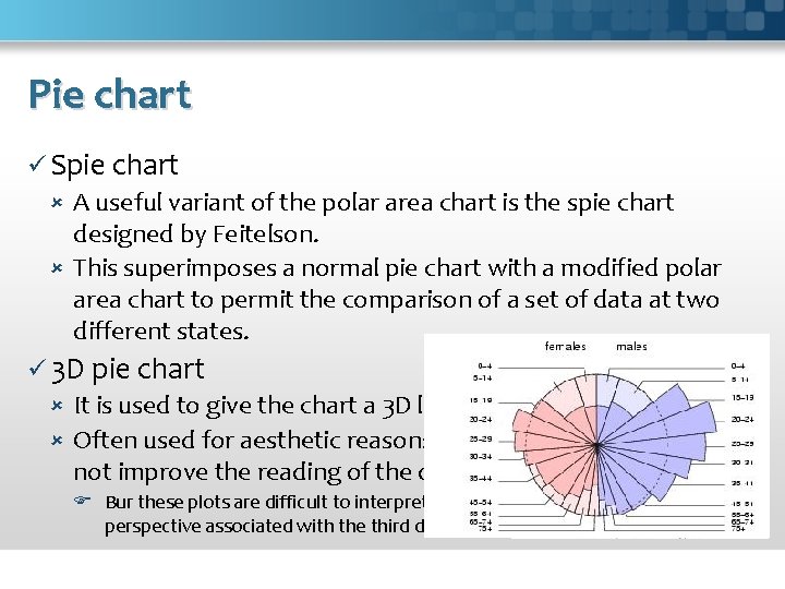
Pie chart ü Spie chart A useful variant of the polar area chart is the spie chart designed by Feitelson. This superimposes a normal pie chart with a modified polar area chart to permit the comparison of a set of data at two different states. ü 3 D pie chart It is used to give the chart a 3 D look. Often used for aesthetic reasons, the third dimension does not improve the reading of the data; Bur these plots are difficult to interpret because of the distorted effect of perspective associated with the third dimension.

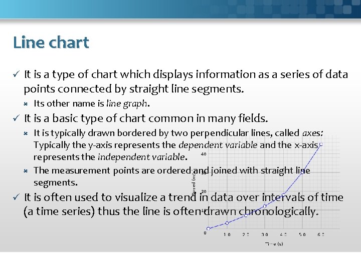
Line chart ü It is a type of chart which displays information as a series of data points connected by straight line segments. ü Its other name is line graph. It is a basic type of chart common in many fields. It is typically drawn bordered by two perpendicular lines, called axes: Typically the y-axis represents the dependent variable and the x-axis represents the independent variable. The measurement points are ordered and joined with straight line segments. ü It is often used to visualize a trend in data over intervals of time (a time series) thus the line is often drawn chronologically.

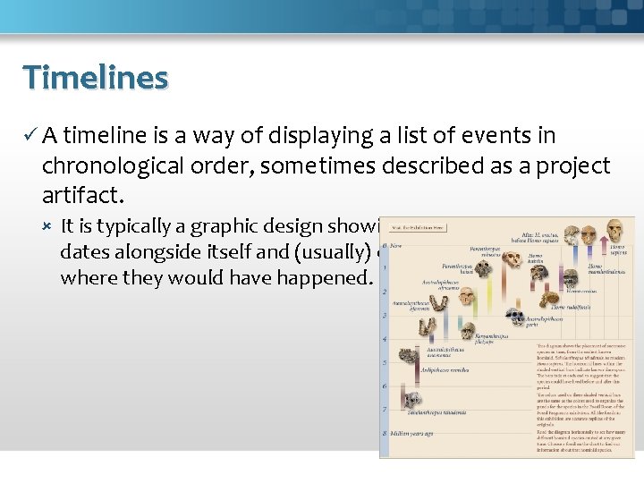
Timelines ü A timeline is a way of displaying a list of events in chronological order, sometimes described as a project artifact. It is typically a graphic design showing a long bar labelled with dates alongside itself and (usually) events labelled on points where they would have happened.

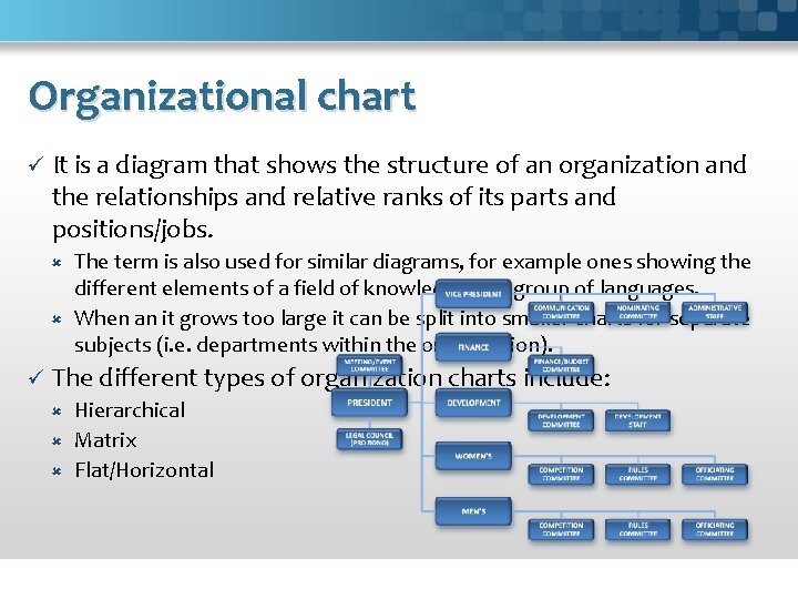
Organizational chart ü It is a diagram that shows the structure of an organization and the relationships and relative ranks of its parts and positions/jobs. The term is also used for similar diagrams, for example ones showing the different elements of a field of knowledge or a group of languages. When an it grows too large it can be split into smaller charts for separate subjects (i. e. departments within the organization). ü The different types of organization charts include: Hierarchical Matrix Flat/Horizontal

Organizational chart ü Limitations If updated manually, organizational charts can very quickly become out-of-date, especially in large organizations that change their staff regularly. They only show "formal relationships" and tell nothing of the pattern of human (social) relationships which develop. They also often do not show horizontal relationships. They provide little information about the managerial style adopted (e. g. "autocratic", "democratic" or an intermediate style) In some cases, it may be more appropriate, particularly if one wants to show non-linear, non-hierarchical relationships in an organization.

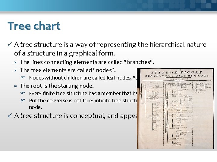
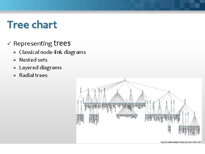
Tree chart ü A tree structure is a way of representing the hierarchical nature of a structure in a graphical form. The lines connecting elements are called "branches". The tree elements are called "nodes". Nodes without children are called leaf nodes, "end-nodes", or "leaves". The root is the starting node. Every finite tree structure has a member that has no superior. But the converse is not true: infinite tree structures may or may not have a root node. ü A tree structure is conceptual, and appears in several forms.

Tree chart ü Representing trees Classical node-link diagrams Nested sets Layered diagrams Radial trees

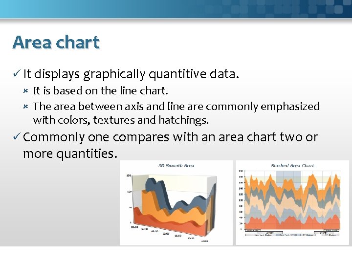
Area chart ü It displays graphically quantitive data. It is based on the line chart. The area between axis and line are commonly emphasized with colors, textures and hatchings. ü Commonly one compares with an area chart two or more quantities.

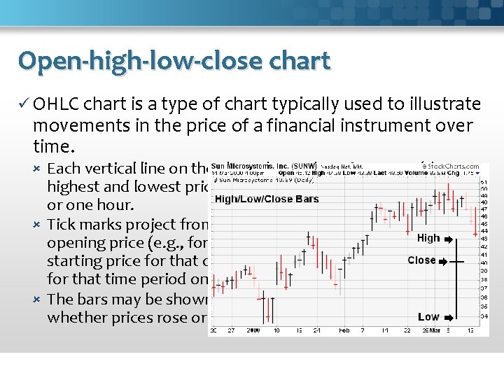
Open-high-low-close chart ü OHLC chart is a type of chart typically used to illustrate movements in the price of a financial instrument over time. Each vertical line on the chart shows the price range (the highest and lowest prices) over one unit of time, e. g. , one day or one hour. Tick marks project from each side of the line indicating the opening price (e. g. , for a daily bar chart this would be the starting price for that day) on the left, and the closing price for that time period on the right. The bars may be shown in different hues depending on whether prices rose or fell in that period.

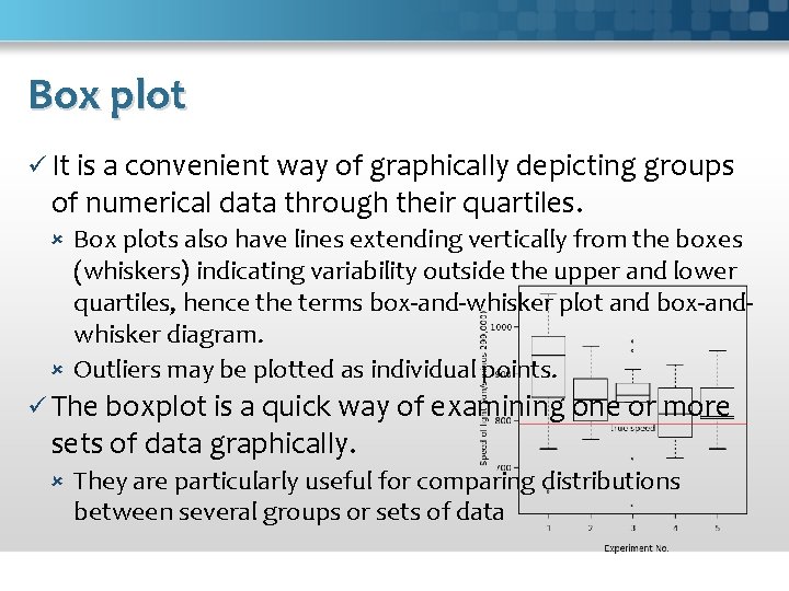
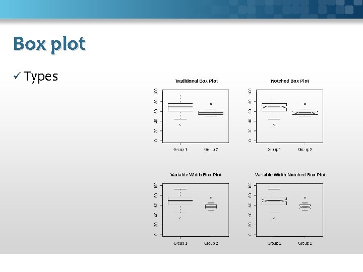
Box plot ü It is a convenient way of graphically depicting groups of numerical data through their quartiles. Box plots also have lines extending vertically from the boxes (whiskers) indicating variability outside the upper and lower quartiles, hence the terms box-and-whisker plot and box-andwhisker diagram. Outliers may be plotted as individual points. ü The boxplot is a quick way of examining one or more sets of data graphically. They are particularly useful for comparing distributions between several groups or sets of data

Box plot ü Types

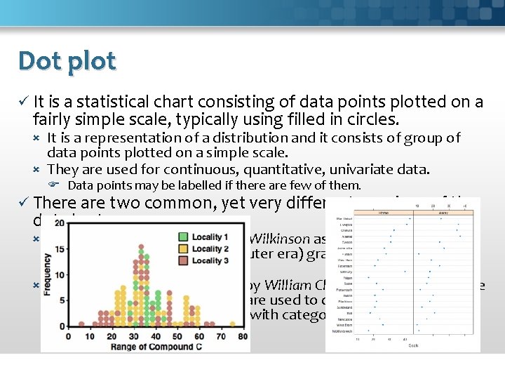
Dot plot ü It is a statistical chart consisting of data points plotted on a fairly simple scale, typically using filled in circles. It is a representation of a distribution and it consists of group of data points plotted on a simple scale. They are used for continuous, quantitative, univariate data. Data points may be labelled if there are few of them. ü There are two common, yet very different, versions of the dot chart. The first is described by Leland Wilkinson as a graph that has been used in hand-drawn (pre-computer era) graphs to depict distributions. The other version is described by William Cleveland as an alternative to the bar chart, in which dots are used to depict the quantitative values (e. g. counts) associated with categorical variables.

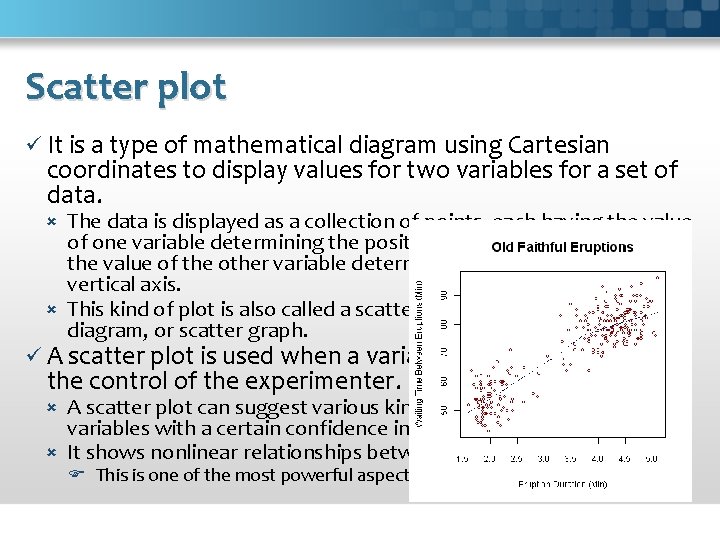
Scatter plot ü It is a type of mathematical diagram using Cartesian coordinates to display values for two variables for a set of data. The data is displayed as a collection of points, each having the value of one variable determining the position on the horizontal axis and the value of the other variable determining the position on the vertical axis. This kind of plot is also called a scatter chart, scattergram, scatter diagram, or scatter graph. ü A scatter plot is used when a variable exists that is below the control of the experimenter. A scatter plot can suggest various kinds of correlations between variables with a certain confidence interval. It shows nonlinear relationships between variables. This is one of the most powerful aspects of a scatter plot.

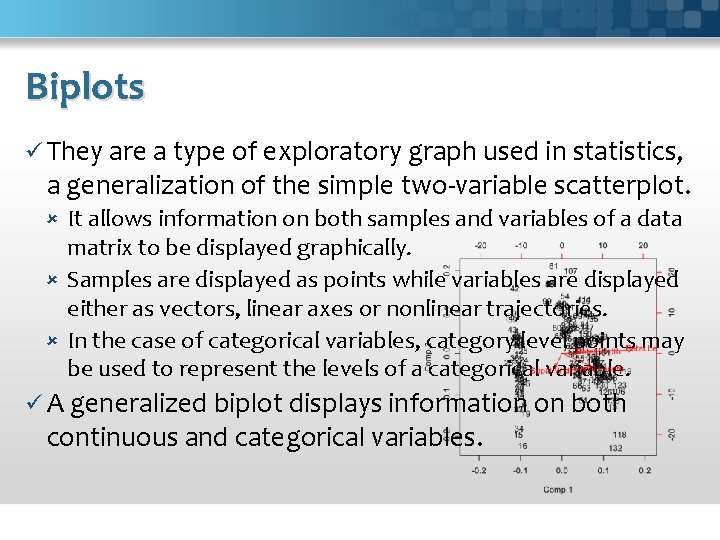
Biplots ü They are a type of exploratory graph used in statistics, a generalization of the simple two-variable scatterplot. It allows information on both samples and variables of a data matrix to be displayed graphically. Samples are displayed as points while variables are displayed either as vectors, linear axes or nonlinear trajectories. In the case of categorical variables, category level points may be used to represent the levels of a categorical variable. ü A generalized biplot displays information on both continuous and categorical variables.

Probability plot ü It is a graphical technique for comparing: two data sets, either two sets of empirical observations, one empirical set against a theoretical set, or (more rarely) two theoretical sets against each other. ü It commonly means one of: P–P plot; Q–Q plot: it is more commonly used; Normal probability plot.

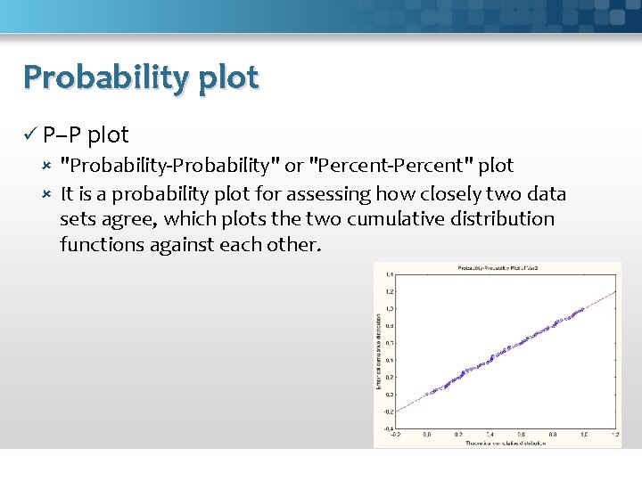
Probability plot ü P–P plot "Probability-Probability" or "Percent-Percent" plot It is a probability plot for assessing how closely two data sets agree, which plots the two cumulative distribution functions against each other.

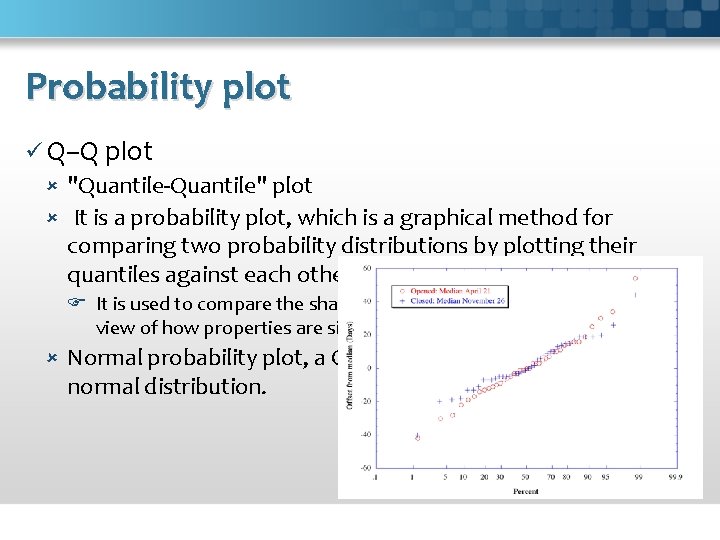
Probability plot ü Q–Q plot "Quantile-Quantile" plot It is a probability plot, which is a graphical method for comparing two probability distributions by plotting their quantiles against each other. It is used to compare the shapes of distributions, providing a graphical view of how properties are similar or different in the two distributions. Normal probability plot, a Q–Q plot against the standard normal distribution.

Maps ü While maps may seem a natural way to visualize geographical data, they have a long and rich history of design. Many maps are based upon a cartographic projection: a mathematical function that maps the 3 D geometry of the Earth to a 2 D image. Other maps knowingly distort or abstract geographic features to tell a richer story or highlight specific data. ü Types Flow Maps Choropleth Maps Graduated Symbol Maps Cartograms Sci. Vis 2013 - page 41

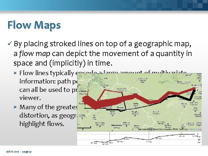
Flow Maps ü By placing stroked lines on top of a geographic map, a flow map can depict the movement of a quantity in space and (implicitly) in time. Flow lines typically encode a large amount of multivariate information: path points, direction, line thickness, and color can all be used to present dimensions of information to the viewer. Many of the greatest flow maps also involve subtle uses of distortion, as geography is bended to accommodate or highlight flows. Sci. Vis 2013 - page 42

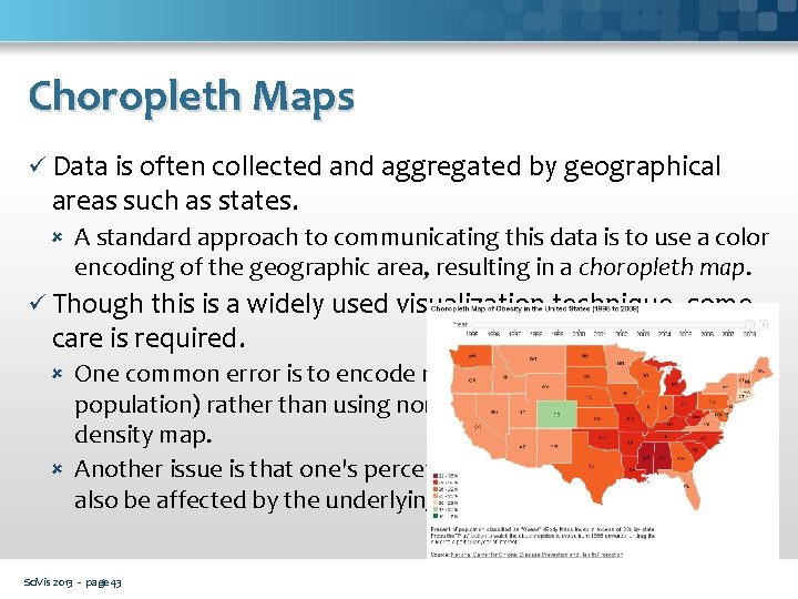
Choropleth Maps ü Data is often collected and aggregated by geographical areas such as states. A standard approach to communicating this data is to use a color encoding of the geographic area, resulting in a choropleth map. ü Though this is a widely used visualization technique, some care is required. One common error is to encode raw data values (such as population) rather than using normalized values to produce a density map. Another issue is that one's perception of the shaded value can also be affected by the underlying area of the geographic region. Sci. Vis 2013 - page 43

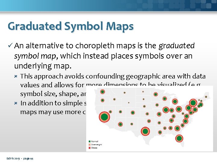
Graduated Symbol Maps ü An alternative to choropleth maps is the graduated symbol map, which instead places symbols over an underlying map. This approach avoids confounding geographic area with data values and allows for more dimensions to be visualized (e. g. , symbol size, shape, and color). In addition to simple shapes like circles, graduated symbol maps may use more complicated glyphs such as pie charts. . Sci. Vis 2013 - page 44

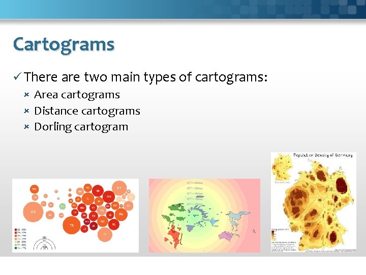
Cartogram ü It is a map in which some thematic mapping variable is substituted for land area or distance. The geometry or space of the map is distorted in order to convey the information of this alternate variable. ü Cartograms have a fairly long history, with examples from the mid-1800 s. Examples: GNP, population, etc.

Cartograms ü There are two main types of cartograms: Area cartograms Distance cartograms Dorling cartogram

Time Series ü Time-series (sets of values changing over time) are one of the most common forms of recorded data. One often needs to compare a large number of time-series simultaneously and can choose from a number of visualizations to do so. ü Time-varying phenomena are central to many domains: Finance (stock prices, exchange rates) Science (temperatures, pollution levels, electric potentials) Public policy (crime rates) etc. Sci. Vis 2013 - page 47

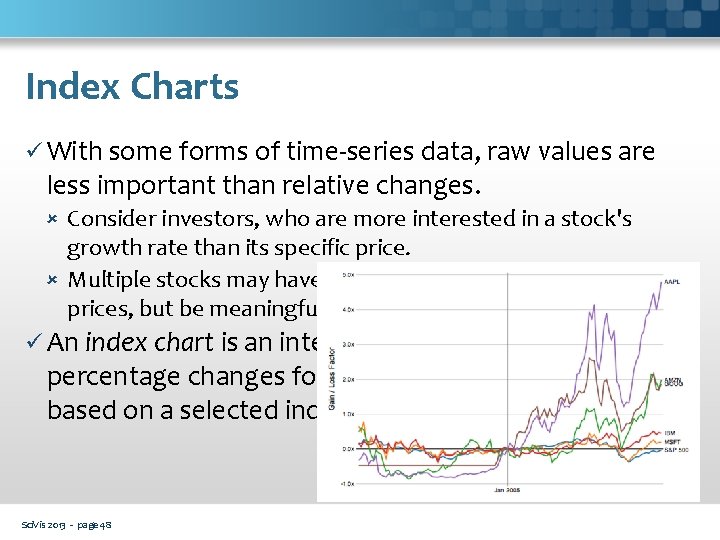
Index Charts ü With some forms of time-series data, raw values are less important than relative changes. Consider investors, who are more interested in a stock's growth rate than its specific price. Multiple stocks may have dramatically different baseline prices, but be meaningfully compared when normalized. ü An index chart is an interactive line chart that shows percentage changes for a collection of time-series based on a selected index point. Sci. Vis 2013 - page 48

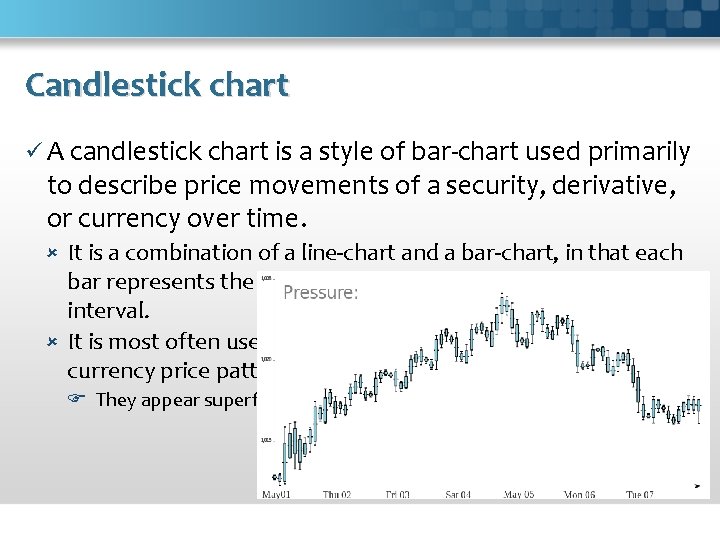
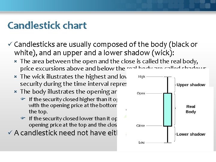
Candlestick chart ü A candlestick chart is a style of bar-chart used primarily to describe price movements of a security, derivative, or currency over time. It is a combination of a line-chart and a bar-chart, in that each bar represents the range of price movement over a given time interval. It is most often used in technical analysis of equity and currency price patterns. They appear superficially similar to box plots, but are unrelated.

Candlestick chart ü Candlesticks are usually composed of the body (black or white), and an upper and a lower shadow (wick): The area between the open and the close is called the real body, price excursions above and below the real body are called shadows. The wick illustrates the highest and lowest traded prices of a security during the time interval represented. The body illustrates the opening and closing trades. If the security closed higher than it opened, the body is white or unfilled, with the opening price at the bottom of the body and the closing price at the top. If the security closed lower than it opened, the body is black, with the opening price at the top and the closing price at the bottom. ü A candlestick need not have either a body or a wick.

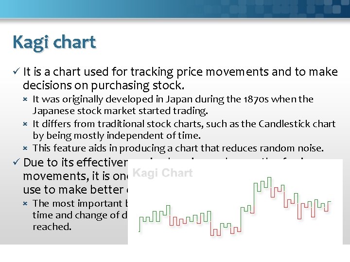
Kagi chart ü It is a chart used for tracking price movements and to make decisions on purchasing stock. It was originally developed in Japan during the 1870 s when the Japanese stock market started trading. It differs from traditional stock charts, such as the Candlestick chart by being mostly independent of time. This feature aids in producing a chart that reduces random noise. ü Due to its effectiveness in showing a clear path of price movements, it is one of the various charts that investors use to make better decisions about stocks. The most important benefit of this chart is that it is independent of time and change of direction occurs only when a specific amount is reached.

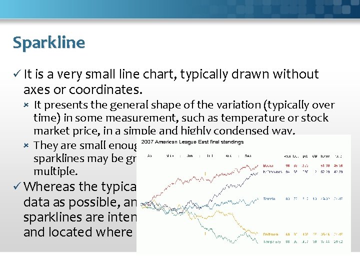
Sparkline ü It is a very small line chart, typically drawn without axes or coordinates. It presents the general shape of the variation (typically over time) in some measurement, such as temperature or stock market price, in a simple and highly condensed way. They are small enough to be embedded in text, or several sparklines may be grouped together as elements of a small multiple. ü Whereas the typical chart is designed to show as much data as possible, and is set off from the flow of text, sparklines are intended to be succinct, memorable, and located where they are discussed.

Networks One aspect of data that we may wish to explore through visualization is relationship. ü Mathematicians use the formal term "graph" to describe a network. ü A central challenge in graph visualization is computing an effective layout. Layout techniques typically seek to position closely-related nodes (in terms of graph distance, such as the number of links between nodes, or other metrics) close in the drawing; critically, unrelated nodes must also be placed far enough apart to differentiate relationships. ü Some techniques may seek to optimize other visual features, for example by minimizing the number of edge crossings. Sci. Vis 2013 - page 53

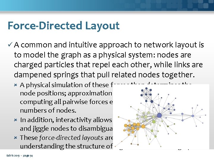
Force-Directed Layout ü A common and intuitive approach to network layout is to model the graph as a physical system: nodes are charged particles that repel each other, while links are dampened springs that pull related nodes together. A physical simulation of these forces then determines the node positions; approximation techniques that avoid computing all pairwise forces enable the layout of large numbers of nodes. In addition, interactivity allows the user to direct the layout and jiggle nodes to disambiguate links. These force-directed layouts are a good starting point for understanding the structure of a general undirected graph. Sci. Vis 2013 - page 54

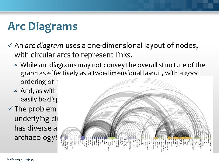
Arc Diagrams ü An arc diagram uses a one-dimensional layout of nodes, with circular arcs to represent links. While arc diagrams may not convey the overall structure of the graph as effectively as a two-dimensional layout, with a good ordering of nodes it is easy to identify cliques and bridges. And, as with the indented tree layout, multivariate data can easily be displayed alongside nodes. ü The problem of sorting the nodes in a manner that reveals underlying cluster structure is formally called seriation, and has diverse applications in visualization, statistics, and even archaeology! Sci. Vis 2013 - page 55

Questions ?