1 Overview and Descriptive Statistics Copyright Cengage Learning





- Slides: 52

1 Overview and Descriptive Statistics Copyright © Cengage Learning. All rights reserved.

1. 4 Measures of Variability Copyright © Cengage Learning. All rights reserved.

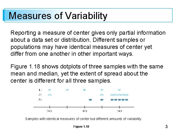
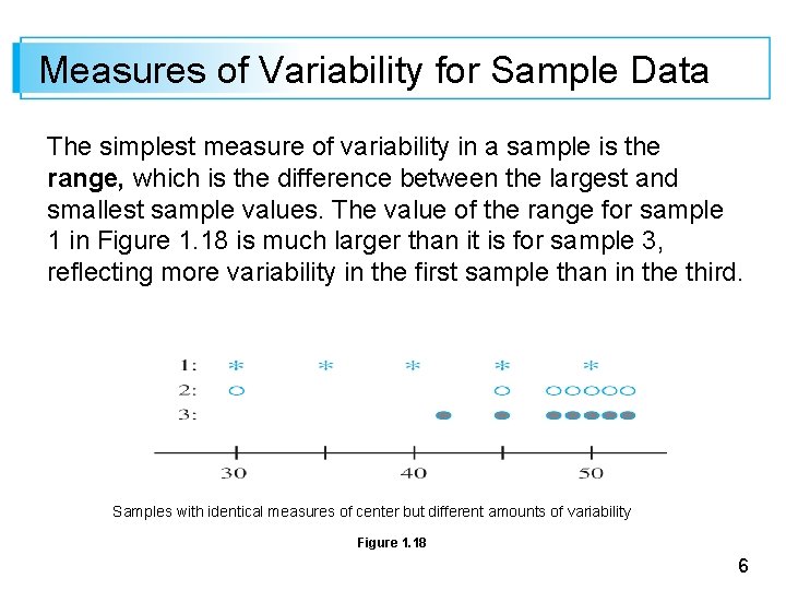
Measures of Variability Reporting a measure of center gives only partial information about a data set or distribution. Different samples or populations may have identical measures of center yet differ from one another in other important ways. Figure 1. 18 shows dotplots of three samples with the same mean and median, yet the extent of spread about the center is different for all three samples. Samples with identical measures of center but different amounts of variability Figure 1. 18 3

Measures of Variability The first sample has the largest amount of variability, the third has the smallest amount, and the second is intermediate to the other two in this respect. 4

Measures of Variability for Sample Data 5

Measures of Variability for Sample Data The simplest measure of variability in a sample is the range, which is the difference between the largest and smallest sample values. The value of the range for sample 1 in Figure 1. 18 is much larger than it is for sample 3, reflecting more variability in the first sample than in the third. Samples with identical measures of center but different amounts of variability Figure 1. 18 6

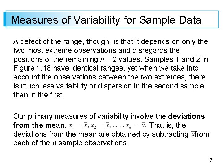
Measures of Variability for Sample Data A defect of the range, though, is that it depends on only the two most extreme observations and disregards the positions of the remaining n – 2 values. Samples 1 and 2 in Figure 1. 18 have identical ranges, yet when we take into account the observations between the two extremes, there is much less variability or dispersion in the second sample than in the first. Our primary measures of variability involve the deviations from the mean, That is, the deviations from the mean are obtained by subtracting from each of the n sample observations. 7

Measures of Variability for Sample Data A deviation will be positive if the observation is larger than the mean (to the right of the mean on the measurement axis) and negative if the observation is smaller than the mean. If all the deviations are small in magnitude, then all xis are close to the mean and there is little variability. Alternatively, if some of the deviations are large in magnitude, then some xis lie far from suggesting a greater amount of variability. A simple way to combine the deviations into a single quantity is to average them. 8

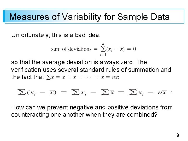
Measures of Variability for Sample Data Unfortunately, this is a bad idea: so that the average deviation is always zero. The verification uses several standard rules of summation and the fact that How can we prevent negative and positive deviations from counteracting one another when they are combined? 9

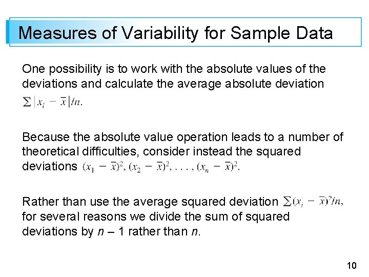
Measures of Variability for Sample Data One possibility is to work with the absolute values of the deviations and calculate the average absolute deviation Because the absolute value operation leads to a number of theoretical difficulties, consider instead the squared deviations Rather than use the average squared deviation for several reasons we divide the sum of squared deviations by n – 1 rather than n. 10

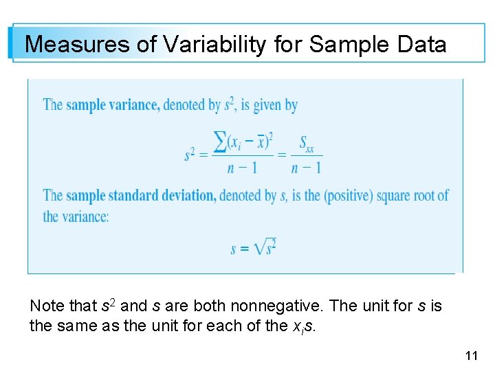
Measures of Variability for Sample Data Note that s 2 and s are both nonnegative. The unit for s is the same as the unit for each of the xis. 11

Measures of Variability for Sample Data If, for example, the observations are fuel efficiencies in miles per gallon, then we might have s = 2. 0 mpg. A rough interpretation of the sample standard deviation is that it is the size of a typical or representative deviation from the sample mean within the given sample. Thus if s = 2. 0 mpg, then some xi’s in the sample are closer than 2. 0 to whereas others are farther away; 2. 0 is a representative (or “standard”) deviation from the mean fuel efficiency. If s = 3. 0 for a second sample of cars of another type, a typical deviation in this sample is roughly 1. 5 times what it is in the first sample, an indication of more variability in the second sample. 12

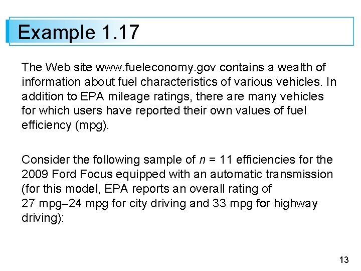
Example 1. 17 The Web site www. fueleconomy. gov contains a wealth of information about fuel characteristics of various vehicles. In addition to EPA mileage ratings, there are many vehicles for which users have reported their own values of fuel efficiency (mpg). Consider the following sample of n = 11 efficiencies for the 2009 Ford Focus equipped with an automatic transmission (for this model, EPA reports an overall rating of 27 mpg– 24 mpg for city driving and 33 mpg for highway driving): 13

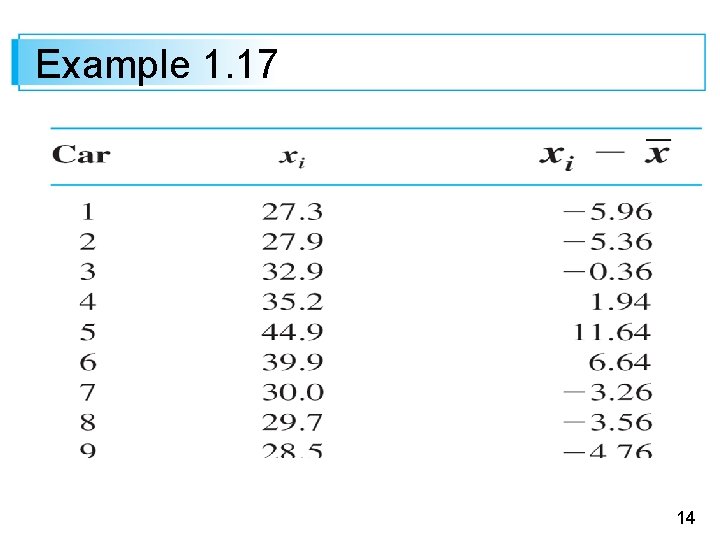
Example 1. 17 14

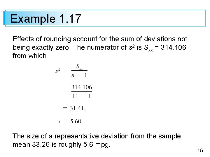
Example 1. 17 Effects of rounding account for the sum of deviations not being exactly zero. The numerator of s 2 is Sxx = 314. 106, from which The size of a representative deviation from the sample mean 33. 26 is roughly 5. 6 mpg. 15

Example 1. 17 Note: Of the nine people who also reported driving behavior, only three did more than 80% of their driving in highway mode; we bet you can guess which cars they drove. We haven’t a clue why all 11 reported values exceed the EPA figure—maybe only drivers with really good fuel efficiencies communicate their results. 16

Motivation for s 2 17

Motivation for s 2 To explain the rationale for the divisor n – 1 in s 2, note first that whereas s 2 measures sample variability, there is a measure of variability in the population called the population variance. We will use 2 (the square of the lowercase Greek letter sigma) to denote the population variance and to denote the population standard deviation (the square root of 2). 18

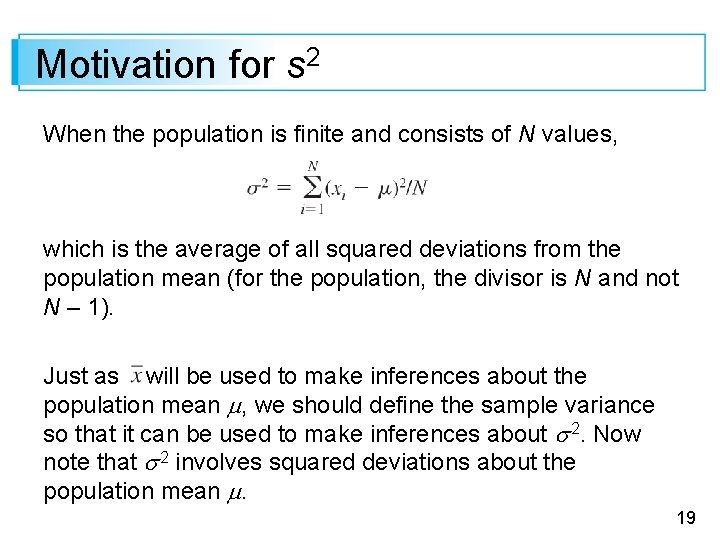
Motivation for s 2 When the population is finite and consists of N values, which is the average of all squared deviations from the population mean (for the population, the divisor is N and not N – 1). Just as will be used to make inferences about the population mean , we should define the sample variance so that it can be used to make inferences about 2. Now note that 2 involves squared deviations about the population mean . 19

Motivation for s 2 If we actually knew the value of , then we could define the sample variance as the average squared deviation of the sample xis about . However, the value of is almost never known, so the sum of squared deviations about must be used. But the xis tend to be closer to their average than to the population average , so to compensate for this the divisor n – 1 is used rather than n. 20

Motivation for s 2 In other words, if we used a divisor n in the sample variance, then the resulting quantity would tend to underestimate 2 (produce estimated values that are too small on the average), whereas dividing by the slightly smaller n – 1 corrects this underestimating. It is customary to refer to s 2 as being based on n – 1 degrees of freedom (df). This terminology reflects the fact that although s 2 is based on the n quantities these sum to 0, so specifying the values of any n – 1 of the quantities determines the remaining value. 21

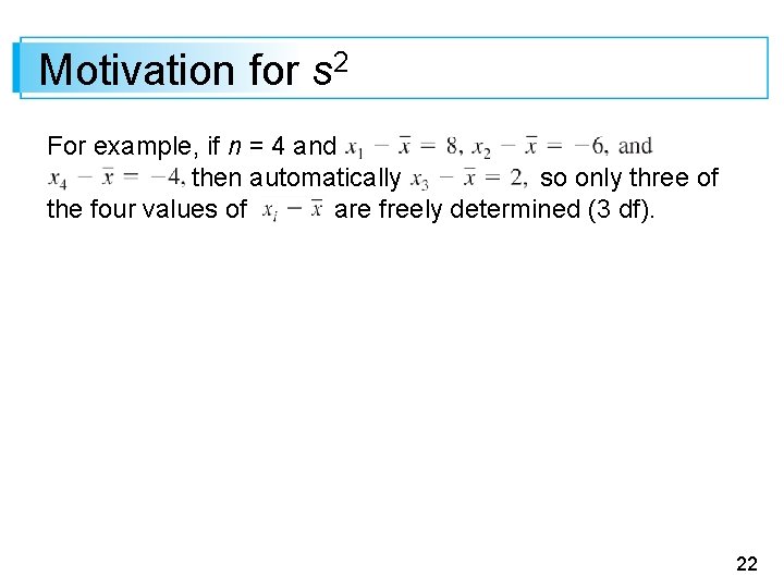
Motivation for s 2 For example, if n = 4 and then automatically so only three of the four values of are freely determined (3 df). 22

A Computing Formula for s 2 23

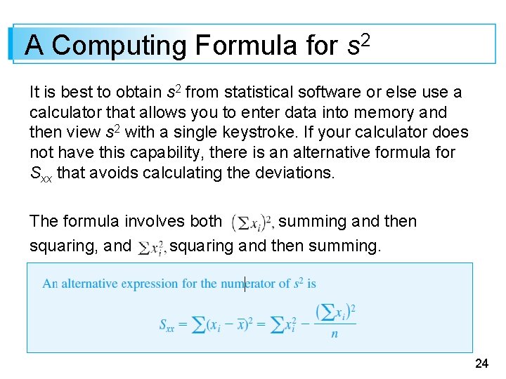
A Computing Formula for s 2 It is best to obtain s 2 from statistical software or else use a calculator that allows you to enter data into memory and then view s 2 with a single keystroke. If your calculator does not have this capability, there is an alternative formula for Sxx that avoids calculating the deviations. The formula involves both summing and then squaring, and squaring and then summing. 24

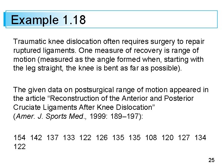
Example 1. 18 Traumatic knee dislocation often requires surgery to repair ruptured ligaments. One measure of recovery is range of motion (measured as the angle formed when, starting with the leg straight, the knee is bent as far as possible). The given data on postsurgical range of motion appeared in the article “Reconstruction of the Anterior and Posterior Cruciate Ligaments After Knee Dislocation” (Amer. J. Sports Med. , 1999: 189– 197): 154 142 137 133 122 126 135 108 120 127 134 122 25

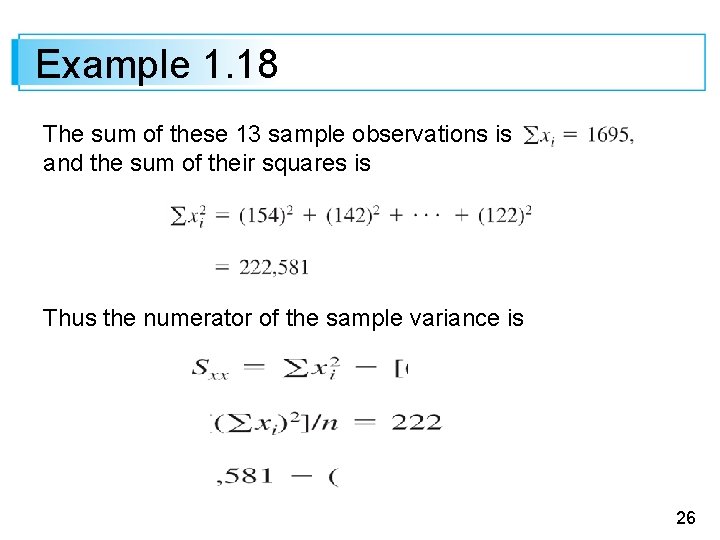
Example 1. 18 The sum of these 13 sample observations is and the sum of their squares is Thus the numerator of the sample variance is 26

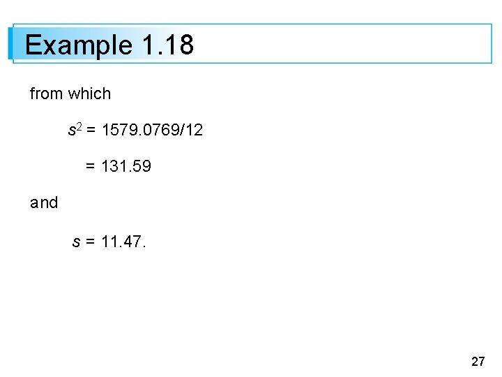
Example 1. 18 from which s 2 = 1579. 0769/12 = 131. 59 and s = 11. 47. 27

A Computing Formula for s 2 Both the defining formula and the computational formula for s 2 can be sensitive to rounding, so as much decimal accuracy as possible should be used in intermediate calculations. Several other properties of s 2 can enhance understanding and facilitate computation. 28

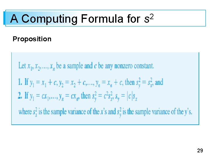
A Computing Formula for s 2 Proposition 29

A Computing Formula for s 2 In words, Result 1 says that if a constant c is added to (or subtracted from) each data value, the variance is unchanged. This is intuitive, since adding or subtracting c shifts the location of the data set but leaves distances between data values unchanged. According to Result 2, multiplication of each xi by c results in s 2 being multiplied by a factor of c 2. These properties can be proved by noting in Result 1 that and in Result 2 that 30

Boxplots 31

Boxplots Stem-and-leaf displays and histograms convey rather general impressions about a data set, whereas a single summary such as the mean or standard deviation focuses on just one aspect of the data. In recent years, a pictorial summary called a boxplot has been used successfully to describe several of a data set’s most prominent features. These features include (1) center, (2) spread, (3) the extent and nature of any departure from symmetry, and (4) identification of “outliers, ” observations that lie unusually far from the main body of the data. 32

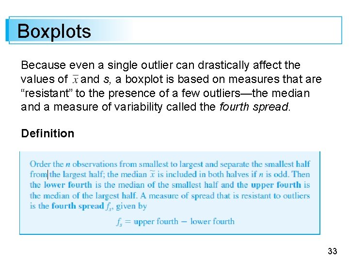
Boxplots Because even a single outlier can drastically affect the values of and s, a boxplot is based on measures that are “resistant” to the presence of a few outliers—the median and a measure of variability called the fourth spread. Definition 33

Boxplots Roughly speaking, the fourth spread is unaffected by the positions of those observations in the smallest 25% or the largest 25% of the data. Hence it is resistant to outliers. The simplest boxplot is based on the following five-number summary: smallest xi lower fourth median upper fourth largest xi First, draw a horizontal measurement scale. Then place a rectangle above this axis; the left edge of the rectangle is at the lower fourth, and the right edge is at the upper fourth (so box width = fs). 34

Boxplots Place a vertical line segment or some other symbol inside the rectangle at the location of the median; the position of the median symbol relative to the two edges conveys information about skewness in the middle 50% of the data. Finally, draw “whiskers” out from either end of the rectangle to the smallest and largest observations. A boxplot with a vertical orientation can also be drawn by making obvious modifications in the construction process. 35

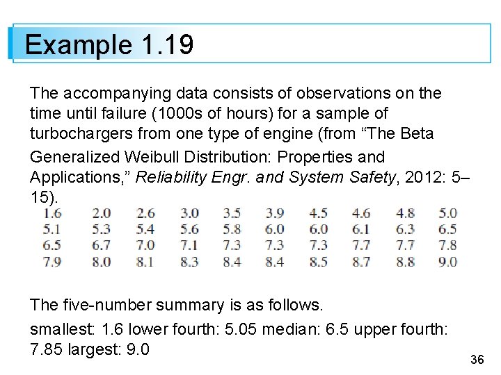
Example 1. 19 The accompanying data consists of observations on the time until failure (1000 s of hours) for a sample of turbochargers from one type of engine (from “The Beta Generalized Weibull Distribution: Properties and Applications, ” Reliability Engr. and System Safety, 2012: 5– 15). The five-number summary is as follows. smallest: 1. 6 lower fourth: 5. 05 median: 6. 5 upper fourth: 7. 85 largest: 9. 0 36

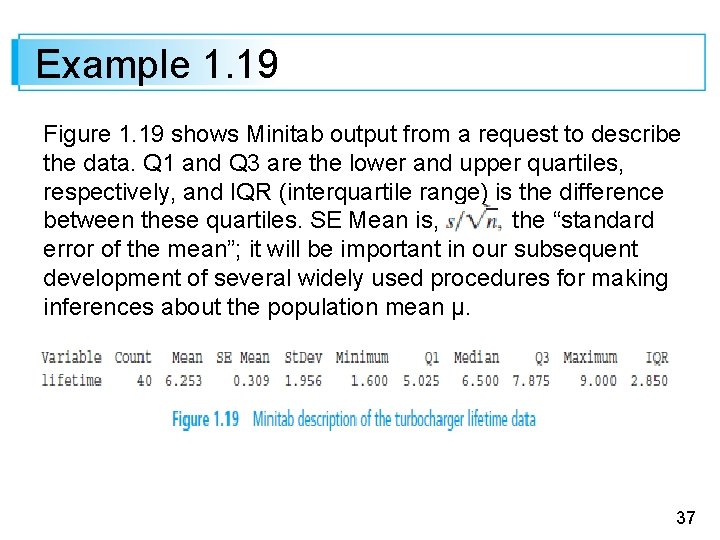
Example 1. 19 Figure 1. 19 shows Minitab output from a request to describe the data. Q 1 and Q 3 are the lower and upper quartiles, respectively, and IQR (interquartile range) is the difference between these quartiles. SE Mean is, the “standard error of the mean”; it will be important in our subsequent development of several widely used procedures for making inferences about the population mean µ. 37

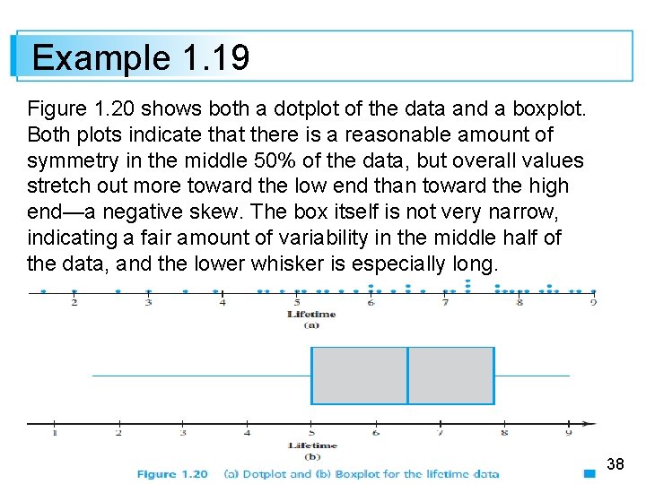
Example 1. 19 Figure 1. 20 shows both a dotplot of the data and a boxplot. Both plots indicate that there is a reasonable amount of symmetry in the middle 50% of the data, but overall values stretch out more toward the low end than toward the high end—a negative skew. The box itself is not very narrow, indicating a fair amount of variability in the middle half of the data, and the lower whisker is especially long. 38

Boxplots That Show Outliers 39

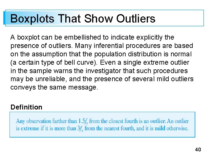
Boxplots That Show Outliers A boxplot can be embellished to indicate explicitly the presence of outliers. Many inferential procedures are based on the assumption that the population distribution is normal (a certain type of bell curve). Even a single extreme outlier in the sample warns the investigator that such procedures may be unreliable, and the presence of several mild outliers conveys the same message. Definition 40

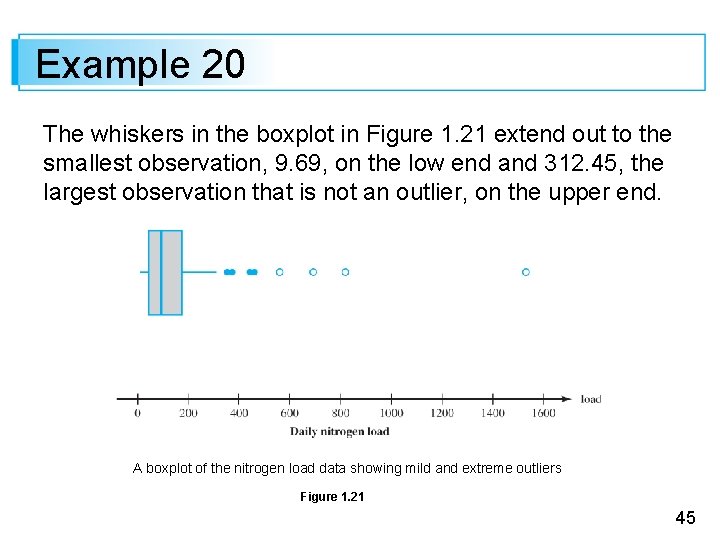
Boxplots That Show Outliers Let’s now modify our previous construction of a boxplot by drawing a whisker out from each end of the box to the smallest and largest observations that are not outliers. Now represent each mild outlier by a closed circle and each extreme outlier by an open circle. Some statistical computer packages do not distinguish between mild and extreme outliers. 41

Example 1. 20 The Clean Water Act and subsequent amendments require that all waters in the United States meet specific pollution reduction goals to ensure that water is “fishable and swimmable. ” The article “Spurious Correlation in the USEPA Rating Curve Method for Estimating Pollutant Loads” (J. of Environ. Engr. , 2008: 610– 618) investigated various techniques for estimating pollutant loads in watersheds; the authors “discuss the imperative need to use sound statistical methods” for this purpose. 42

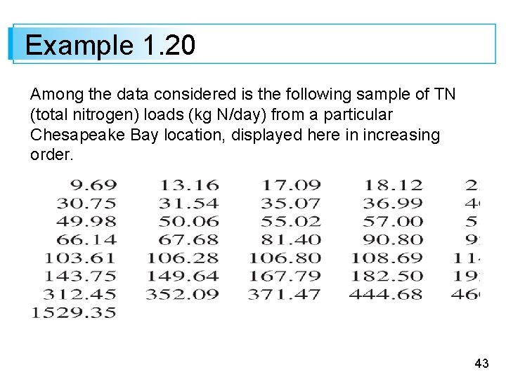
Example 1. 20 Among the data considered is the following sample of TN (total nitrogen) loads (kg N/day) from a particular Chesapeake Bay location, displayed here in increasing order. 43

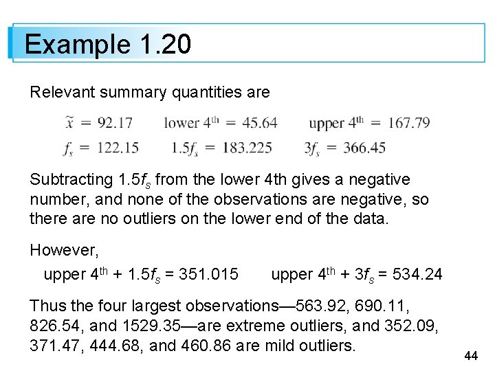
Example 1. 20 Relevant summary quantities are Subtracting 1. 5 fs from the lower 4 th gives a negative number, and none of the observations are negative, so there are no outliers on the lower end of the data. However, upper 4 th + 1. 5 fs = 351. 015 upper 4 th + 3 fs = 534. 24 Thus the four largest observations— 563. 92, 690. 11, 826. 54, and 1529. 35—are extreme outliers, and 352. 09, 371. 47, 444. 68, and 460. 86 are mild outliers. 44

Example 20 The whiskers in the boxplot in Figure 1. 21 extend out to the smallest observation, 9. 69, on the low end and 312. 45, the largest observation that is not an outlier, on the upper end. A boxplot of the nitrogen load data showing mild and extreme outliers Figure 1. 21 45

Example 1. 20 There is some positive skewness in the middle half of the data (the median line is somewhat closer to the left edge of the box than to the right edge) and a great deal of positive skewness overall. 46

Comparative Boxplots 47

Comparative Boxplots A comparative or side-by-side boxplot is a very effective way of revealing similarities and differences between two or more data sets consisting of observations on the same variable—fuel efficiency observations for four different types of automobiles, crop yields for three different varieties, and so on. 48

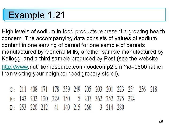
Example 1. 21 High levels of sodium in food products represent a growing health concern. The accompanying data consists of values of sodium content in one serving of cereal for one sample of cereals manufactured by General Mills, another sample manufactured by Kellogg, and a third sample produced by Post (see the website http: //www. nutritionresource. com/foodcomp 2. cfm? id=0800 rather than visiting your neighborhood grocery store!). 49

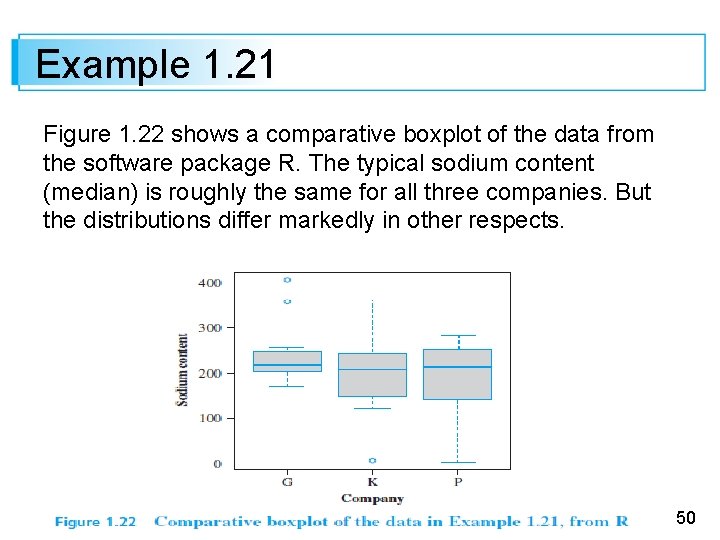
Example 1. 21 Figure 1. 22 shows a comparative boxplot of the data from the software package R. The typical sodium content (median) is roughly the same for all three companies. But the distributions differ markedly in other respects. 50

Example 1. 21 The General Mills data shows a substantial positive skew both in the middle 50% and overall, with two outliers at the upper end. The Kellogg data exhibits a negative skew in the middle 50% and a positive skew overall, except for the outlier at the low end (this outlier is not identified by Minitab). The Post data is negatively skewed both in the middle 50% and overall with no outliers. 51

Example 1. 21 52