1 Overview and Descriptive Statistics Copyright Cengage Learning
- Slides: 23

1 Overview and Descriptive Statistics Copyright © Cengage Learning. All rights reserved.

Populations, Samples and Variables Collections of facts, or data Population: all objects that are interested for a particular project. Eg. census. Sample: a subset of population Variable: a particular characteristic, measured 2

1. 2 Pictorial and Tabular Methods in Descriptive Statistics Copyright © Cengage Learning. All rights reserved.

Pictorial and Tabular Methods in Descriptive Statistics Two subject areas of descriptive statistics: visual vs numerical. Examples of familiar visual techniques: frequency tables, tally sheets, histograms, pie charts, bar graphs, scatter diagrams 4

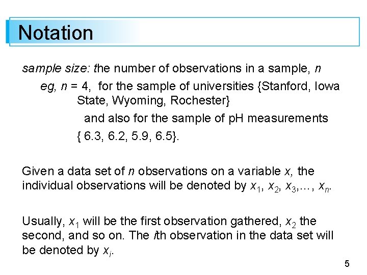
Notation sample size: the number of observations in a sample, n eg, n = 4, for the sample of universities {Stanford, Iowa State, Wyoming, Rochester} and also for the sample of p. H measurements { 6. 3, 6. 2, 5. 9, 6. 5}. Given a data set of n observations on a variable x, the individual observations will be denoted by x 1, x 2, x 3, …, xn. Usually, x 1 will be the first observation gathered, x 2 the second, and so on. The ith observation in the data set will be denoted by xi. 5

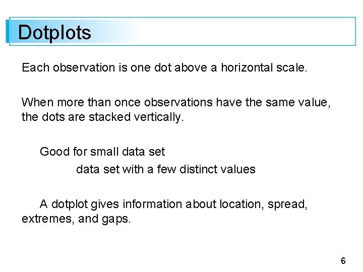
Dotplots Each observation is one dot above a horizontal scale. When more than once observations have the same value, the dots are stacked vertically. Good for small data set with a few distinct values A dotplot gives information about location, spread, extremes, and gaps. 6

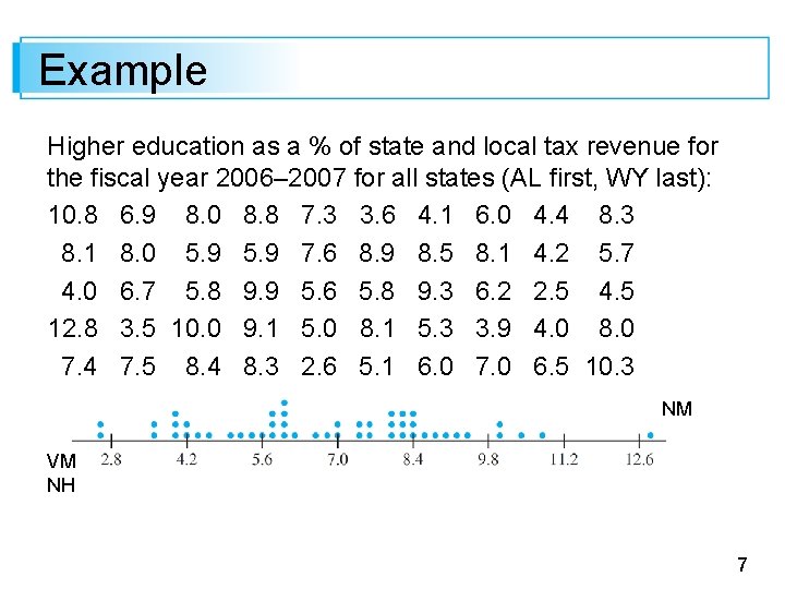
Example Higher education as a % of state and local tax revenue for the fiscal year 2006– 2007 for all states (AL first, WY last): 10. 8 6. 9 8. 0 8. 8 7. 3 3. 6 4. 1 6. 0 4. 4 8. 3 8. 1 8. 0 5. 9 7. 6 8. 9 8. 5 8. 1 4. 2 5. 7 4. 0 6. 7 5. 8 9. 9 5. 6 5. 8 9. 3 6. 2 2. 5 4. 5 12. 8 3. 5 10. 0 9. 1 5. 0 8. 1 5. 3 3. 9 4. 0 8. 0 7. 4 7. 5 8. 4 8. 3 2. 6 5. 1 6. 0 7. 0 6. 5 10. 3 NM VM NH 7

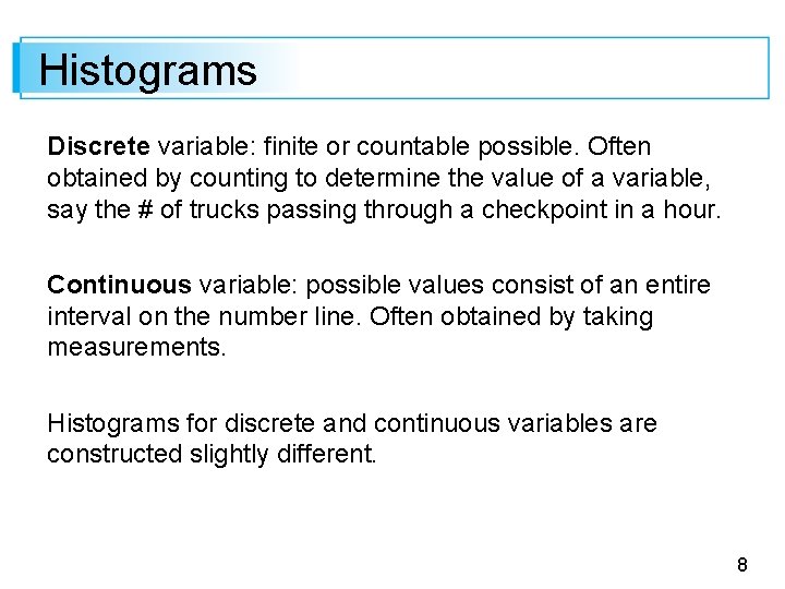
Histograms Discrete variable: finite or countable possible. Often obtained by counting to determine the value of a variable, say the # of trucks passing through a checkpoint in a hour. Continuous variable: possible values consist of an entire interval on the number line. Often obtained by taking measurements. Histograms for discrete and continuous variables are constructed slightly different. 8

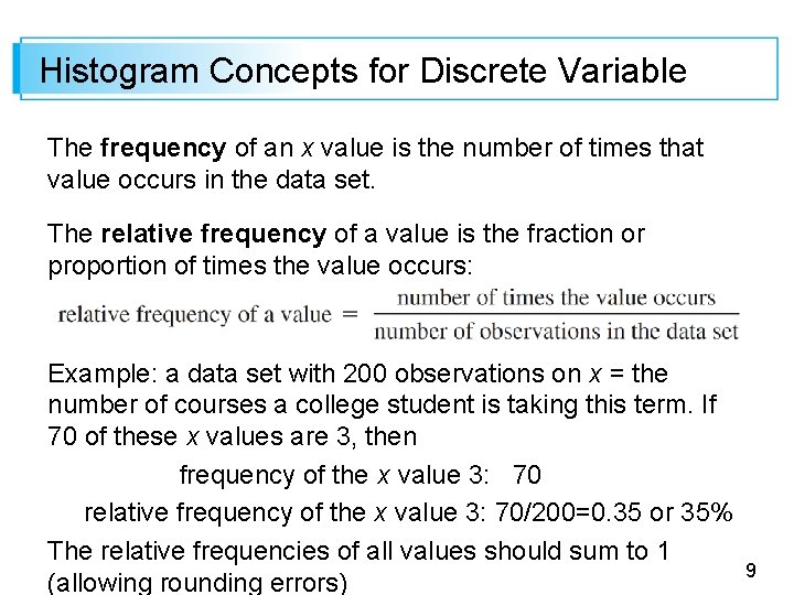
Histogram Concepts for Discrete Variable The frequency of an x value is the number of times that value occurs in the data set. The relative frequency of a value is the fraction or proportion of times the value occurs: Example: a data set with 200 observations on x = the number of courses a college student is taking this term. If 70 of these x values are 3, then frequency of the x value 3: 70 relative frequency of the x value 3: 70/200=0. 35 or 35% The relative frequencies of all values should sum to 1 (allowing rounding errors) 9

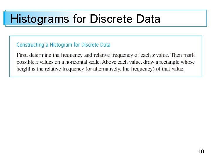
Histograms for Discrete Data 10

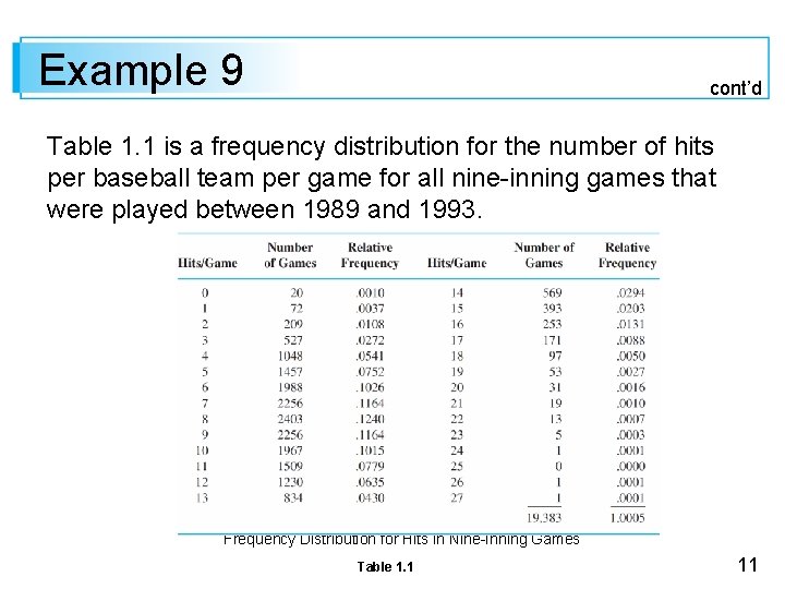
Example 9 cont’d Table 1. 1 is a frequency distribution for the number of hits per baseball team per game for all nine-inning games that were played between 1989 and 1993. Frequency Distribution for Hits in Nine-Inning Games Table 1. 1 11

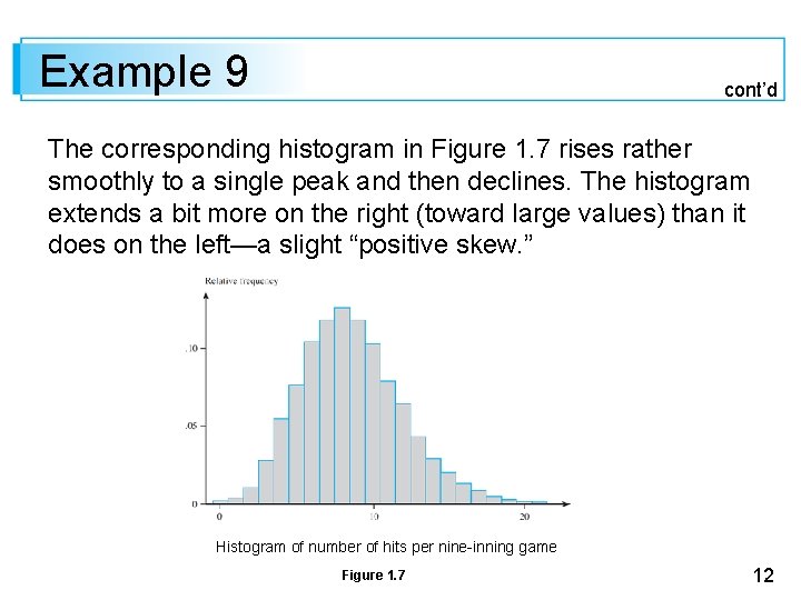
Example 9 cont’d The corresponding histogram in Figure 1. 7 rises rather smoothly to a single peak and then declines. The histogram extends a bit more on the right (toward large values) than it does on the left—a slight “positive skew. ” Histogram of number of hits per nine-inning game Figure 1. 7 12

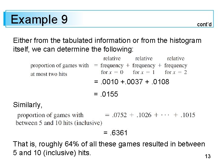
Example 9 cont’d Either from the tabulated information or from the histogram itself, we can determine the following: =. 0010 +. 0037 +. 0108 =. 0155 Similarly, =. 6361 That is, roughly 64% of all these games resulted in between 5 and 10 (inclusive) hits. 13

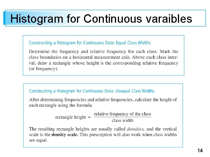
Histogram for Continuous varaibles 14

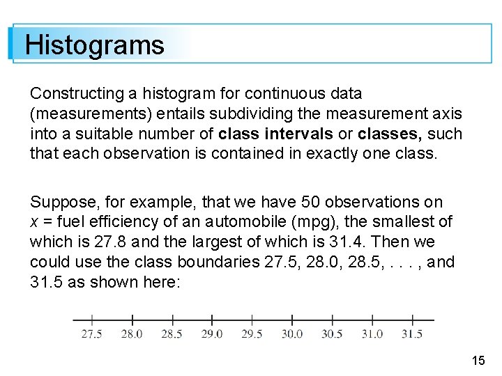
Histograms Constructing a histogram for continuous data (measurements) entails subdividing the measurement axis into a suitable number of class intervals or classes, such that each observation is contained in exactly one class. Suppose, for example, that we have 50 observations on x = fuel efficiency of an automobile (mpg), the smallest of which is 27. 8 and the largest of which is 31. 4. Then we could use the class boundaries 27. 5, 28. 0, 28. 5, . . . , and 31. 5 as shown here: 15

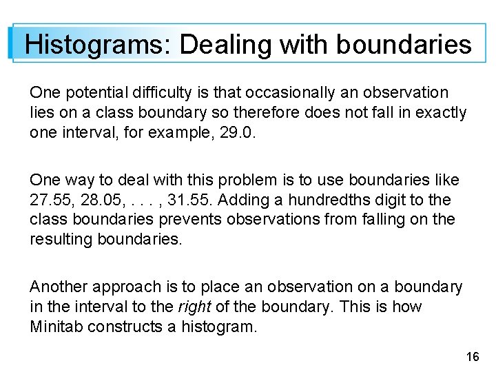
Histograms: Dealing with boundaries One potential difficulty is that occasionally an observation lies on a class boundary so therefore does not fall in exactly one interval, for example, 29. 0. One way to deal with this problem is to use boundaries like 27. 55, 28. 05, . . . , 31. 55. Adding a hundredths digit to the class boundaries prevents observations from falling on the resulting boundaries. Another approach is to place an observation on a boundary in the interval to the right of the boundary. This is how Minitab constructs a histogram. 16

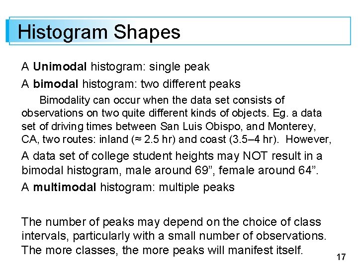
Histogram Shapes A Unimodal histogram: single peak A bimodal histogram: two different peaks Bimodality can occur when the data set consists of observations on two quite different kinds of objects. Eg. a data set of driving times between San Luis Obispo, and Monterey, CA, two routes: inland (≈ 2. 5 hr) and coast (3. 5– 4 hr). However, A data set of college student heights may NOT result in a bimodal histogram, male around 69”, female around 64”. A multimodal histogram: multiple peaks The number of peaks may depend on the choice of class intervals, particularly with a small number of observations. The more classes, the more peaks will manifest itself. 17

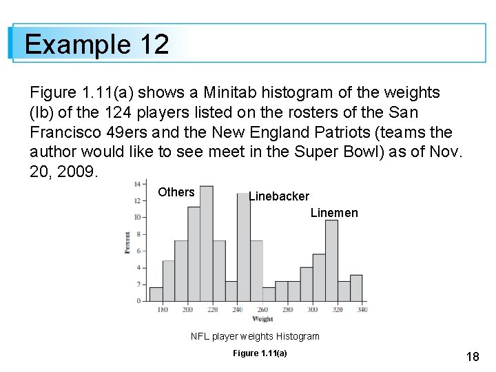
Example 12 Figure 1. 11(a) shows a Minitab histogram of the weights (lb) of the 124 players listed on the rosters of the San Francisco 49 ers and the New England Patriots (teams the author would like to see meet in the Super Bowl) as of Nov. 20, 2009. Others Linebacker Linemen NFL player weights Histogram Figure 1. 11(a) 18

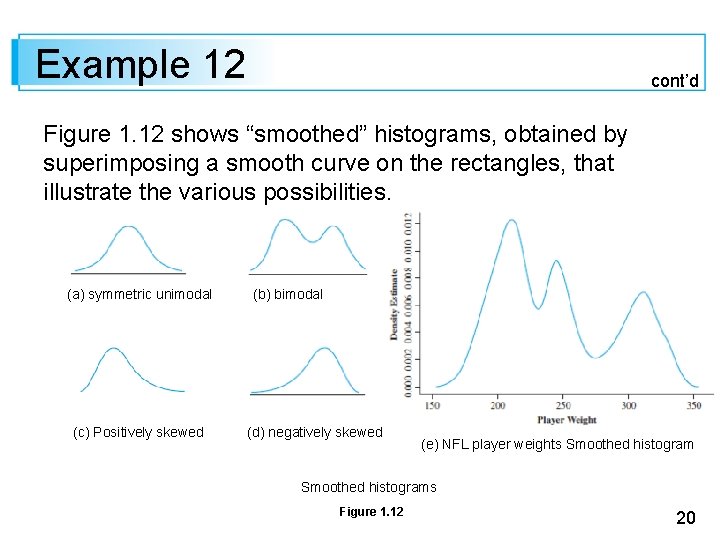
Histogram Shapes: symmetric or skewed A histogram is symmetric if the left half is a mirror image of the right half. A unimodal histogram is positively skewed if the right or upper tail is stretched out compared with the left or lower tail and negatively skewed if the stretching is to the left. 19

Example 12 cont’d Figure 1. 12 shows “smoothed” histograms, obtained by superimposing a smooth curve on the rectangles, that illustrate the various possibilities. (a) symmetric unimodal (c) Positively skewed (b) bimodal (d) negatively skewed (e) NFL player weights Smoothed histograms Figure 1. 12 20

Qualitative Data Both a frequency distribution and a histogram can be constructed when the data set is qualitative (categorical) in nature. Ordered: eg, freshmen, sophomores, juniors, seniors, graduate students Non-ordered: eg, Catholic, Jewish, Protestant, Muslim and the like. The intervals should have equal width. 21

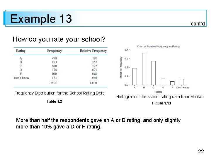
Example 13 cont’d How do you rate your school? Frequency Distribution for the School Rating Data Table 1. 2 Histogram of the school rating data from Minitab Figure 1. 13 More than half the respondents gave an A or B rating, and only slightly more than 10% gave a D or F rating. 22

Multivariate Data Multivariate data is generally rather difficult to describe visually. Several methods for doing so appear later in the book, notably scatter plots for bivariate numerical data. 23