Introduction to Data Science Lecture 11 Interactive Visualization








- Slides: 65

Introduction to Data Science Lecture 11 Interactive Visualization CS 194 Fall 2015 John Canny incorporating notes from Michael Franklin, Dan Bruckner, Evan Sparks, Shivaram Venkataraman, Maneesh Agrawala and Jeff Hamerbacher

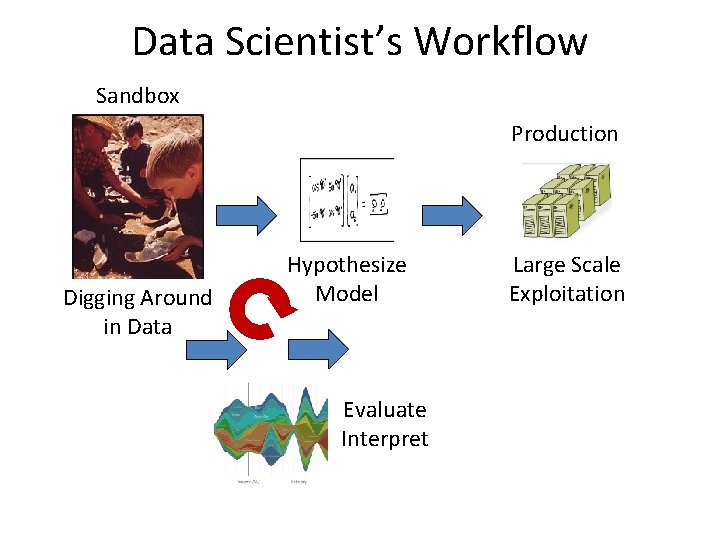
Data Scientist’s Workflow Sandbox Production Digging Around in Data Hypothesize Model Evaluate Interpret Large Scale Exploitation

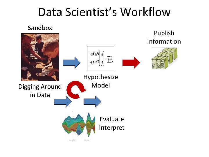
Data Scientist’s Workflow Sandbox Digging Around in Data Publish Information Hypothesize Model Evaluate Interpret

Outline Visualization: • Some great examples • Some counter-examples • Principles for Visualization Design • Visualization Toolkits preview

FIRST, A CLASSIC

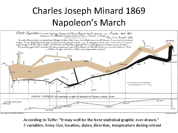
Charles Joseph Minard 1869 Napoleon’s March According to Tufte: “It may well be the best statistical graphic ever drawn. ” 5 variables: Army Size, location, dates, direction, temperature during retreat

Interactivity: Baby Names Voyager (Wattenberg et al. 2005) A modern classic with rich narrative quality (i. e. you can discover stories through the names). http: //www. babynamewizard. com/

From Interactivity to Participation: Many Eyes (Wattenberg et al. 2007) Participatory visualization and explanation site: http: //www. many-eyes. com

Interactivity to Educate • The famous Gapminder Video, Hans Rosling: 200 Countries, 200 Years, 4 Minutes • https: //www. youtube. com/watch? feature=player_embedded&v=jbk. SRLYSojo

The Future of Journalism? • NY Times Interactive Visualizations (recession/recovery 2014) http: //www. nytimes. com/interactive/2014/06/05/upshot/how-the-recession-reshaped-theeconomy-in-255 -charts. html • And 2014 “the year in interactive storytelling” • http: //www. nytimes. com/interactive/2014/12/29/us/year-in-interactive-storytelling. html? _r=0 • Note: NY Times graphics are a great source of best practices in visualization.

Outline Visualization: • Some great examples • Some counter-examples • Principles for Visualization Design • Visualization Toolkits preview

Some Anti-Examples • Courtesy of WTFViz. net

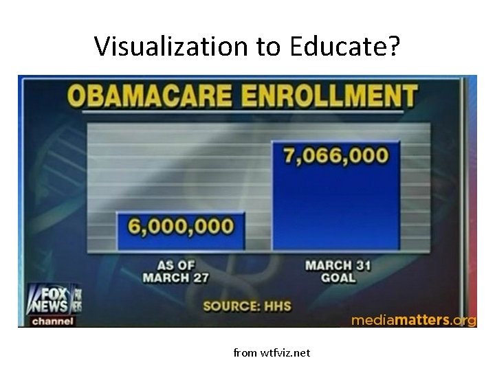
Visualization to Educate? from wtfviz. net

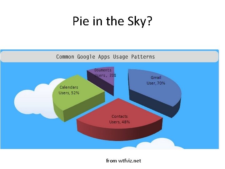
Pie in the Sky? from wtfviz. net

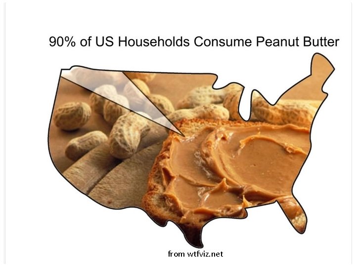
from wtfviz. net

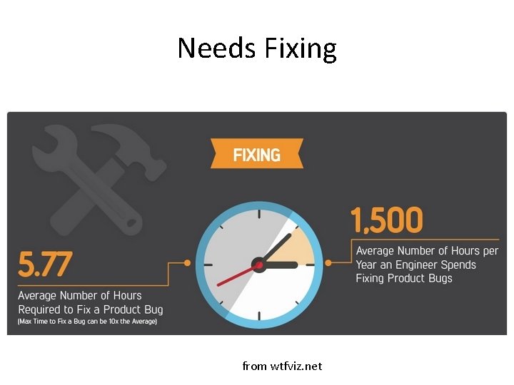
Needs Fixing from wtfviz. net

Outline Visualization: • Some great examples • Some counter-examples • Principles for Visualization Design • Visualization Toolkits preview

Visualization Definitions • “Transformation of the symbolic into the geometric” [Mc. Cormick et al. 1987] • “. . . finding the artificial memory that best supports our natural means of perception. ” [Bertin 1967] • “The use of computer-generated, interactive, visual representations of data to amplify cognition. ” [Card, Mackinlay, & Shneiderman 1999]

Uses for Data Viz A: Support reasoning about information (analysis) • • Finding relationships Discover structure Quantifying values and influences Should be part of a query/analyze cycle B: Inform and persuade others (communication) • Capture attention, engage • Tell a story visually • Focus on certain aspects, and omit others

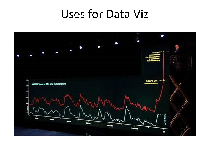
Uses for Data Viz

Principle 1 • Simplify ! 22

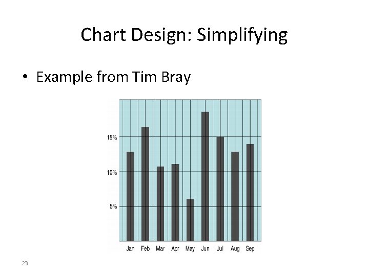
Chart Design: Simplifying • Example from Tim Bray 23

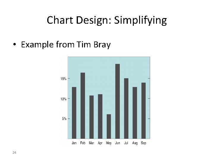
Chart Design: Simplifying • Example from Tim Bray 24

Chart Design: Simplifying • Example from Tim Bray 25

Chart Design: Simplifying • Example from Tim Bray 26

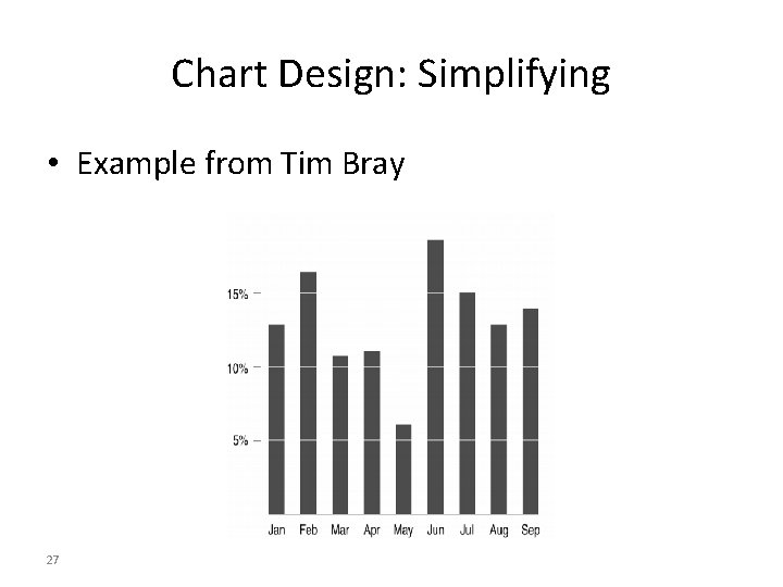
Chart Design: Simplifying • Example from Tim Bray 27

Chart Design: Simplifying • Example from Tim Bray 28

Principle 1: Simplify • Tables and charts • Reduce chartjunk/tablejunk; increase data-ink ratio • Lessons from perception: Limit the number of objects displayed at once • Beware: • Gratuitous 3 D • Shadows • Gratuitous animation • How do you tell if a feature is gratuitous? Ask whether using it reveals more information. 29

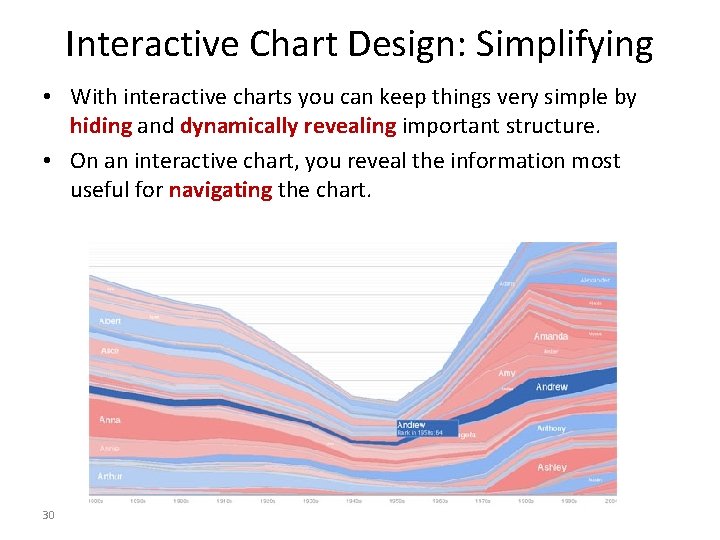
Interactive Chart Design: Simplifying • With interactive charts you can keep things very simple by hiding and dynamically revealing important structure. • On an interactive chart, you reveal the information most useful for navigating the chart. 30

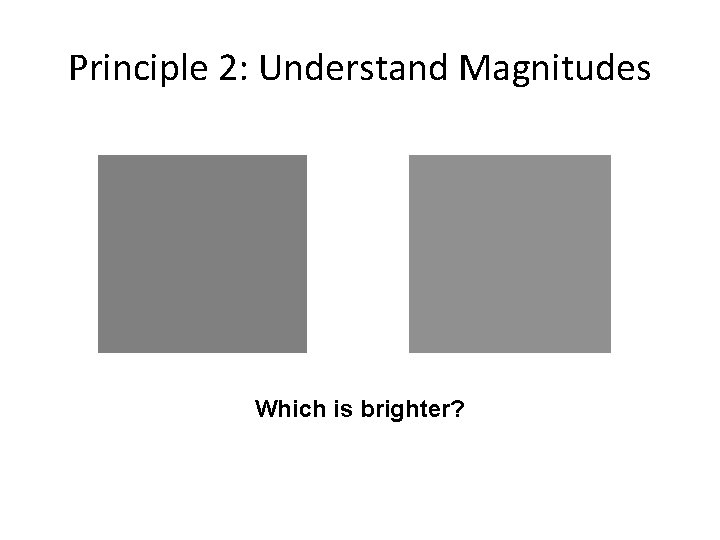
Principle 2: Understand Magnitudes Which is brighter?

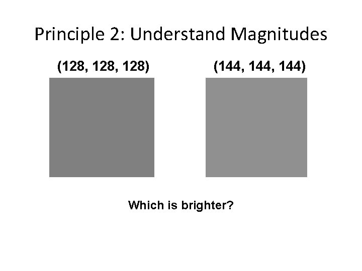
Principle 2: Understand Magnitudes (128, 128) (144, 144) Which is brighter?

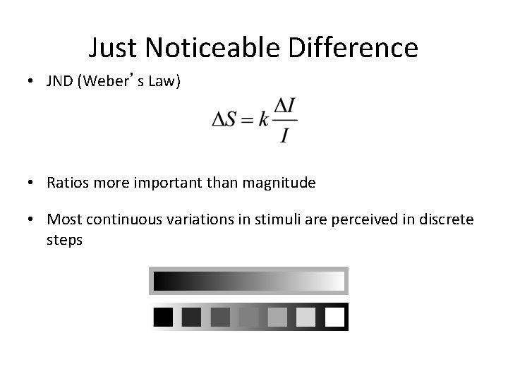
Just Noticeable Difference • JND (Weber’s Law) • Ratios more important than magnitude • Most continuous variations in stimuli are perceived in discrete steps

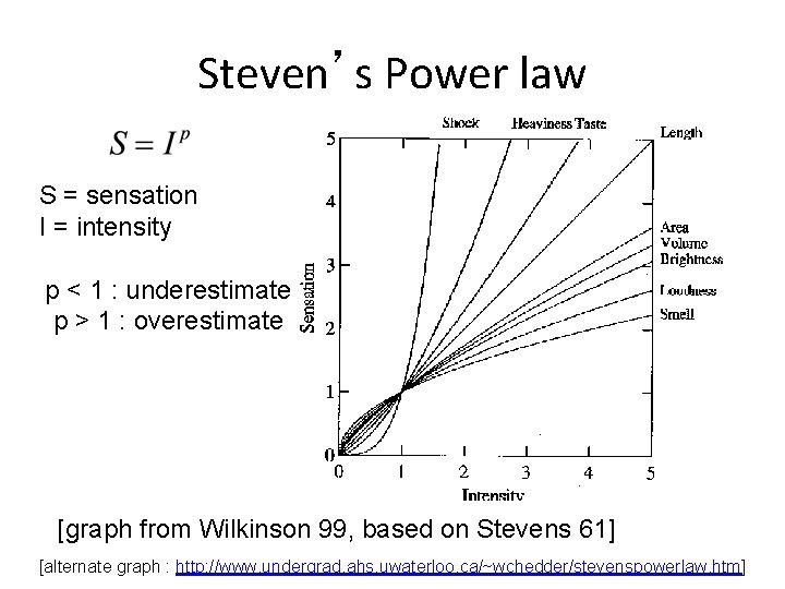
Steven’s Power law S = sensation I = intensity p < 1 : underestimate p > 1 : overestimate [graph from Wilkinson 99, based on Stevens 61] [alternate graph : http: //www. undergrad. ahs. uwaterloo. ca/~wchedder/stevenspowerlaw. htm]

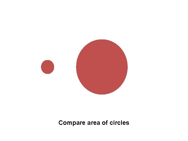
Compare area of circles

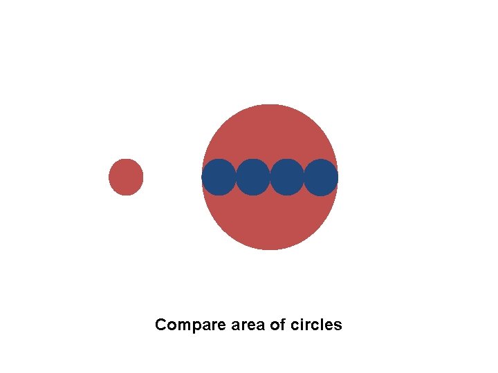
Compare area of circles

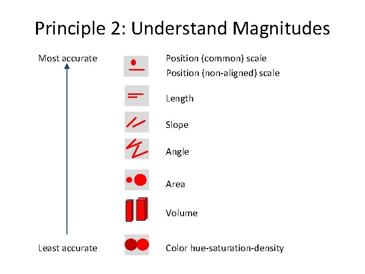
Principle 2: Understand Magnitudes Most accurate Position (common) scale Position (non-aligned) scale Length Slope Angle Area Volume Least accurate Color hue-saturation-density

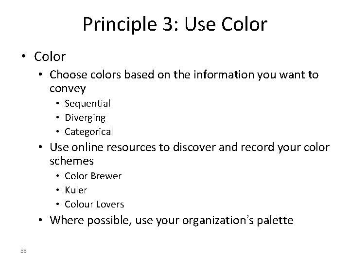
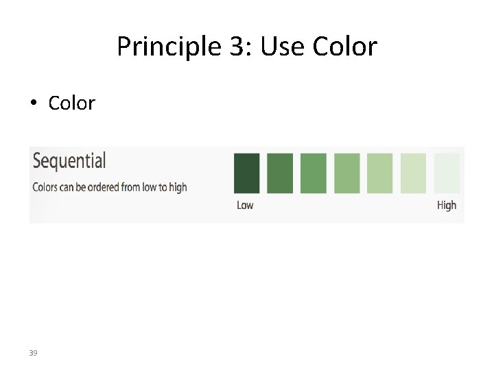
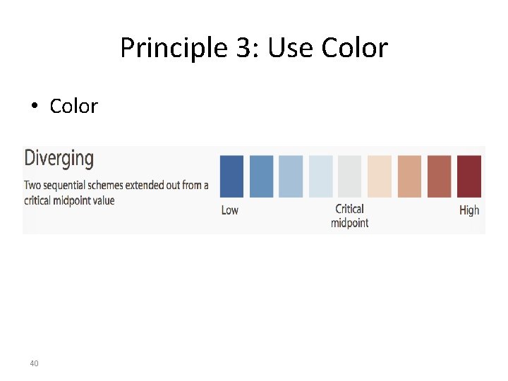
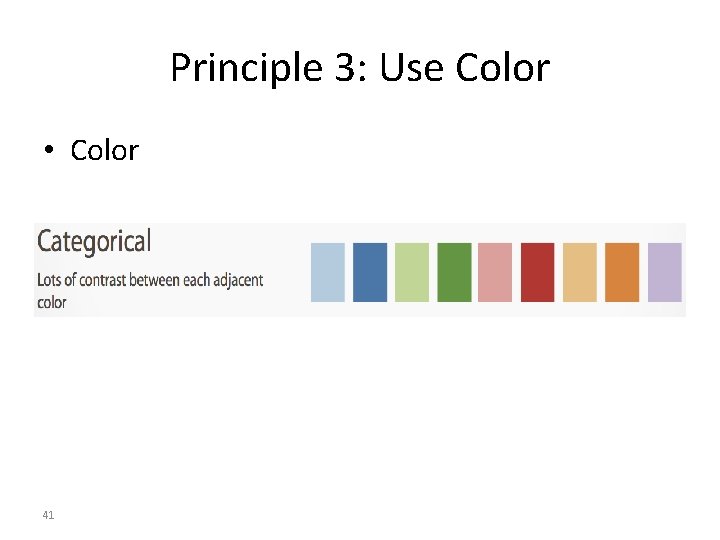
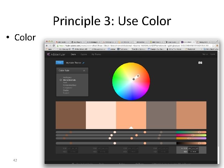
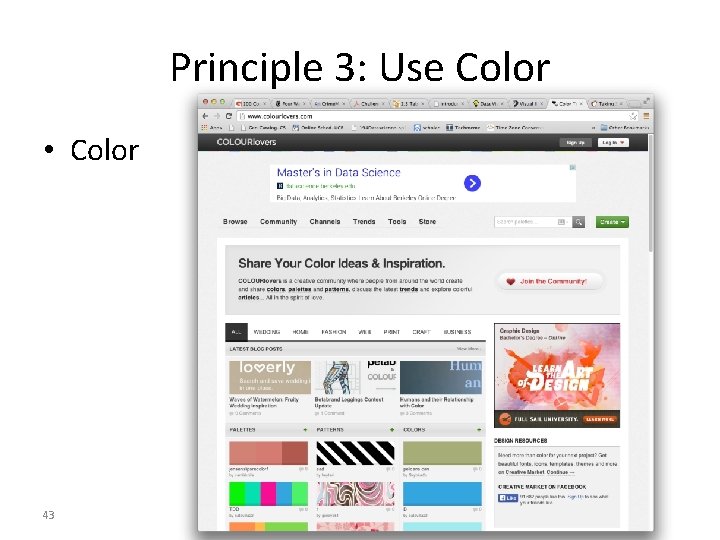
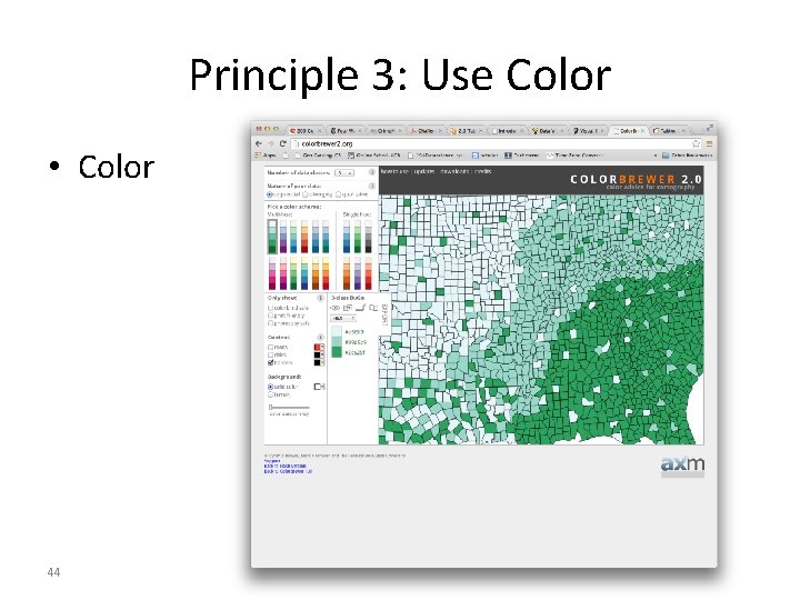
Principle 3: Use Color • Choose colors based on the information you want to convey • Sequential • Diverging • Categorical • Use online resources to discover and record your color schemes • Color Brewer • Kuler • Colour Lovers • Where possible, use your organization’s palette 38

Principle 3: Use Color • Color 39

Principle 3: Use Color • Color 40

Principle 3: Use Color • Color 41

Principle 3: Use Color • Color 42

Principle 3: Use Color • Color 43

Principle 3: Use Color • Color 44

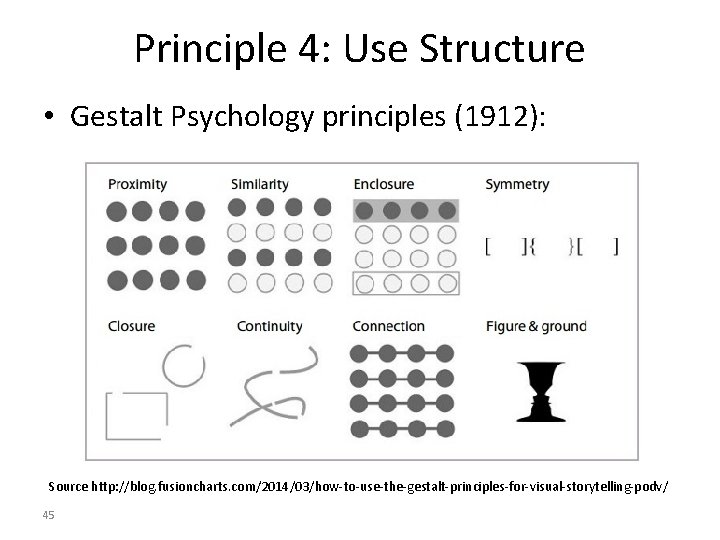
Principle 4: Use Structure • Gestalt Psychology principles (1912): Source http: //blog. fusioncharts. com/2014/03/how-to-use-the-gestalt-principles-for-visual-storytelling-podv/ 45

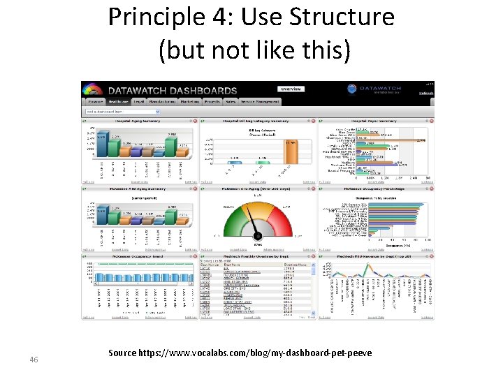
Principle 4: Use Structure (but not like this) 46 Source https: //www. vocalabs. com/blog/my-dashboard-pet-peeve

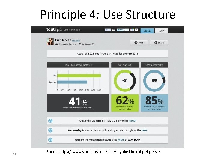
Principle 4: Use Structure 47 Source https: //www. vocalabs. com/blog/my-dashboard-pet-peeve

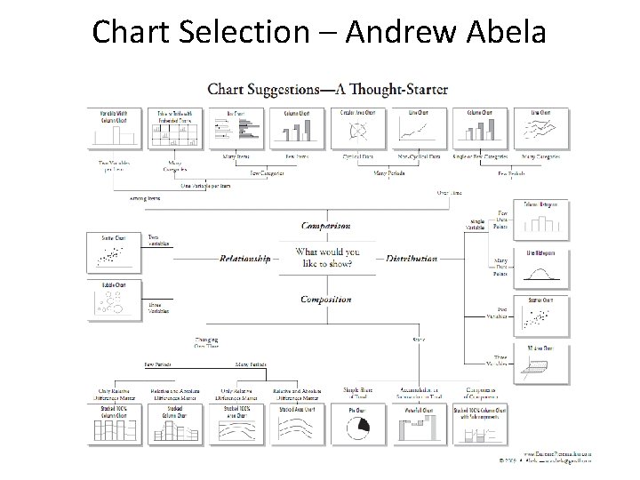
Chart Selection – Andrew Abela

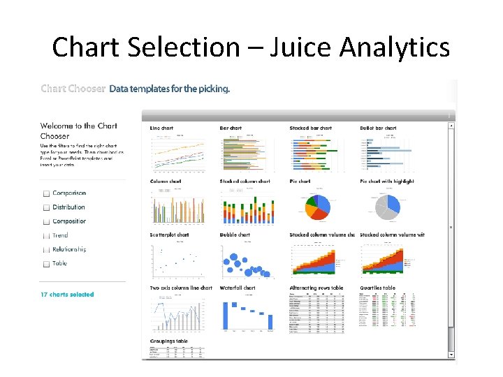
Chart Selection – Juice Analytics

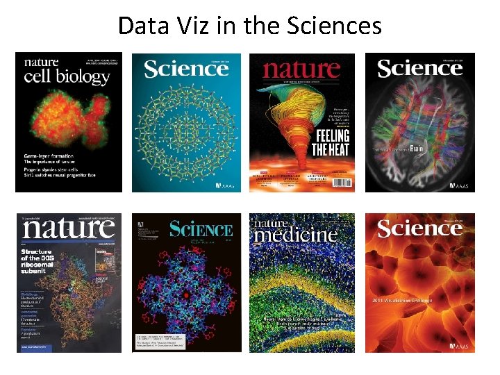
Data Viz in the Sciences

Uses for Data Viz

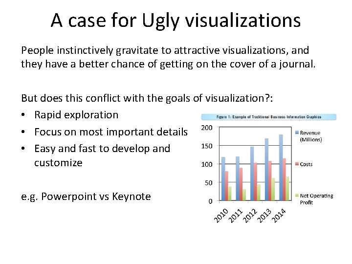
A case for Ugly visualizations People instinctively gravitate to attractive visualizations, and they have a better chance of getting on the cover of a journal. But does this conflict with the goals of visualization? : • Rapid exploration • Focus on most important details • Easy and fast to develop and customize e. g. Powerpoint vs Keynote

Outline Visualization: • Some great examples • Some counter-examples • Principles for Visualization Design • Visualization Toolkits preview

Interactive Toolkits: D 3 Without Doubt, the most widely used interactive visualization framework is D 3, developed around 2011 by Jeff Heer, Mike Bostock and Vadim Ogievetsky. Note from the authors: D 3 is intentionally a low-level system. During the early design of D 3, we even referred to it as a "visualization kernel" rather than a "toolkit" or "framework"

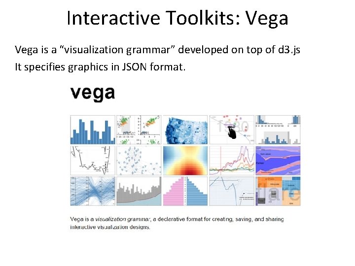
Interactive Toolkits: Vega is a “visualization grammar” developed on top of d 3. js It specifies graphics in JSON format.

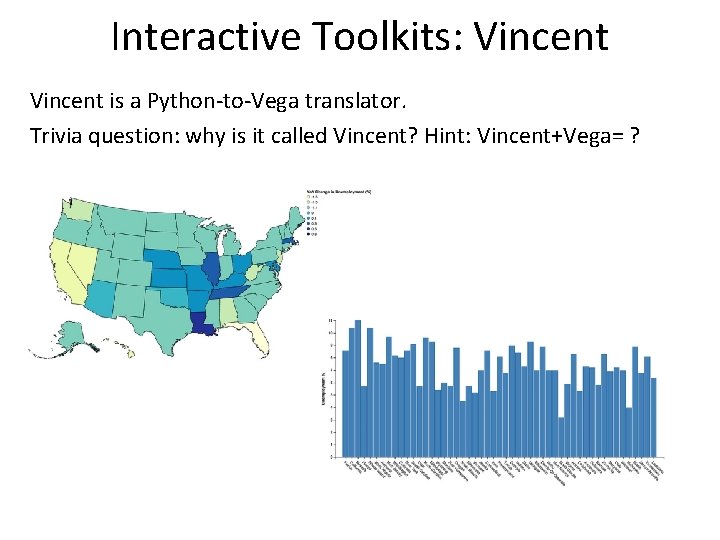
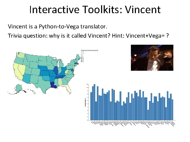
Interactive Toolkits: Vincent is a Python-to-Vega translator. Trivia question: why is it called Vincent? Hint: Vincent+Vega= ?

Interactive Toolkits: Vincent is a Python-to-Vega translator. Trivia question: why is it called Vincent? Hint: Vincent+Vega= ?

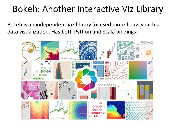
Bokeh: Another Interactive Viz Library Bokeh is an independent Viz library focused more heavily on big data visualization. Has both Python and Scala bindings.

Updates and Break Midterm is on 11/23, 5: 00 -6: 30 pm here. Sample midterm (Fall 2014) is online now. Project presentations on 11/30 and 12/2 (5 mins) Poster session on Wednesday 12/9 12: 30 -2: 30 pm, Here No lab this week (Veteran’s day). Viz lab next week. 5 min BREAK

Lecture Wrap-up One more lecture next week: Joey Gonzalez (co-developer of Graph. Lab at CMU and Graph. X at Berkeley) Midterm on Monday 11/23, Project presentations on 11/30.

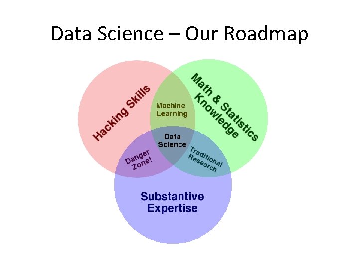
Data Science – Our Roadmap

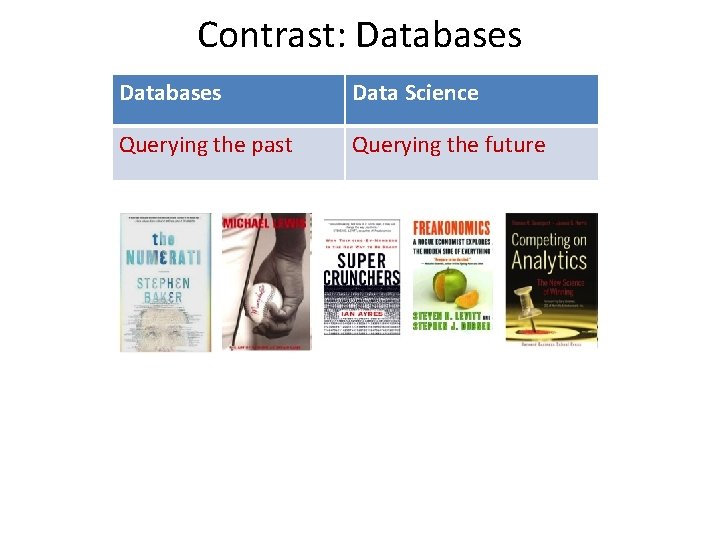
Contrast: Databases Data Science Querying the past Querying the future

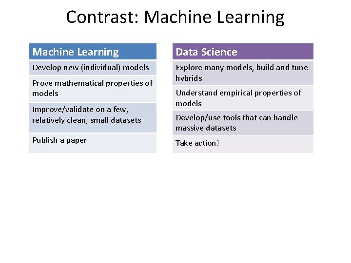
Contrast: Machine Learning Data Science Develop new (individual) models Explore many models, build and tune hybrids Prove mathematical properties of models Improve/validate on a few, relatively clean, small datasets Publish a paper Understand empirical properties of models Develop/use tools that can handle massive datasets Take action!

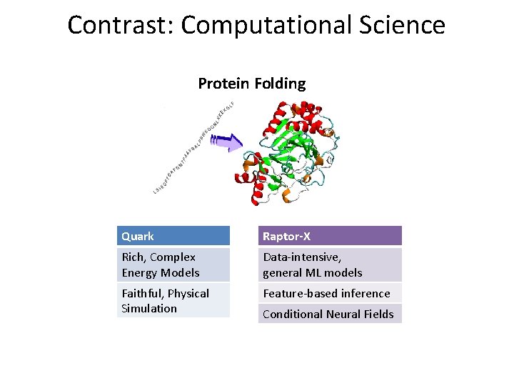
Contrast: Computational Science Protein Folding Quark Raptor-X Rich, Complex Energy Models Data-intensive, general ML models Faithful, Physical Simulation Feature-based inference Conditional Neural Fields

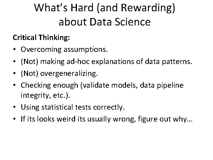
What’s Hard (and Rewarding) about Data Science Critical Thinking: • Overcoming assumptions. • (Not) making ad-hoc explanations of data patterns. • (Not) overgeneralizing. • Checking enough (validate models, data pipeline integrity, etc. ). • Using statistical tests correctly. • If its looks weird its usually wrong, figure out why…

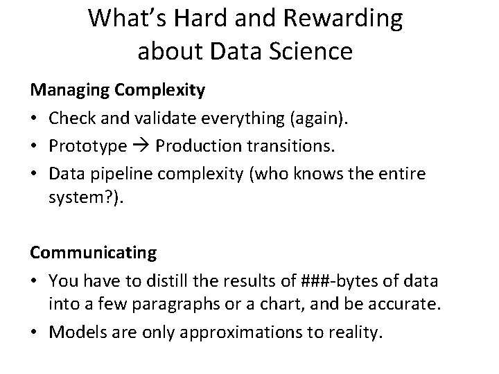
What’s Hard and Rewarding about Data Science Managing Complexity • Check and validate everything (again). • Prototype Production transitions. • Data pipeline complexity (who knows the entire system? ). Communicating • You have to distill the results of ###-bytes of data into a few paragraphs or a chart, and be accurate. • Models are only approximations to reality.