HTML 5 Intro Concepts HTML HTML Hyper Text

- Slides: 72

HTML 5 Intro Concepts

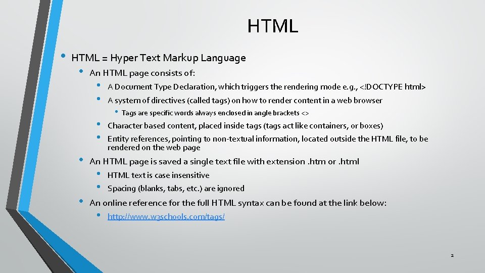
HTML • HTML = Hyper Text Markup Language • • • An HTML page consists of: • • A Document Type Declaration, which triggers the rendering mode e. g. , <!DOCTYPE html> • • Character based content, placed inside tags (tags act like containers, or boxes) A system of directives (called tags) on how to render content in a web browser • Tags are specific words always enclosed in angle brackets <> Entity references, pointing to non-textual information, located outside the HTML file, to be rendered on the web page An HTML page is saved a single text file with extension. htm or. html • • HTML text is case insensitive Spacing (blanks, tabs, etc. ) are ignored An online reference for the full HTML syntax can be found at the link below: • http: //www. w 3 schools. com/tags/ 2

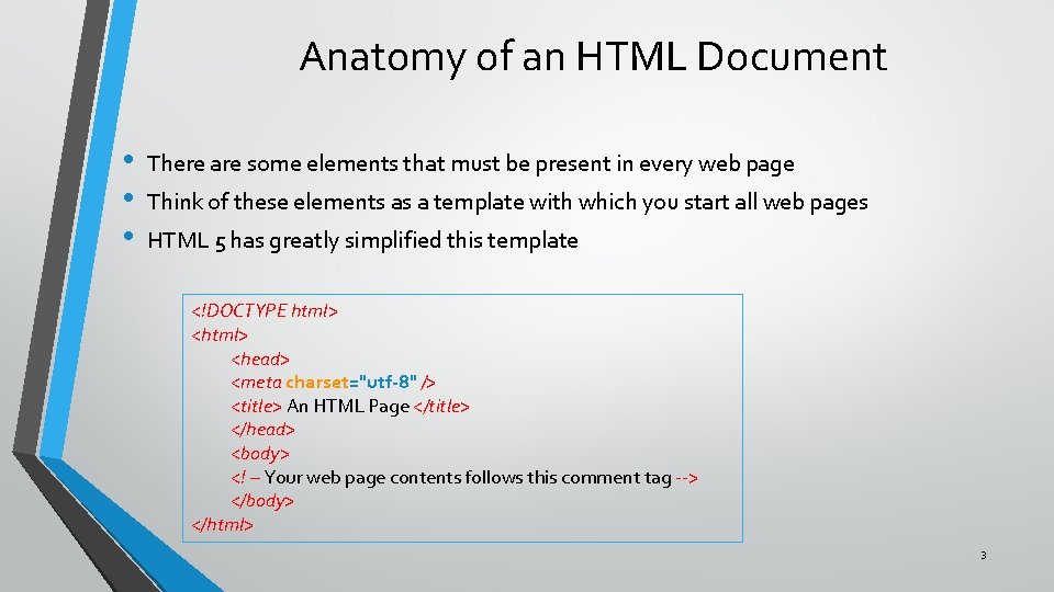
Anatomy of an HTML Document • • • There are some elements that must be present in every web page Think of these elements as a template with which you start all web pages HTML 5 has greatly simplified this template <!DOCTYPE html> <head> <meta charset="utf-8" /> <title> An HTML Page </title> </head> <body> <! – Your web page contents follows this comment tag --> </body> </html> 3

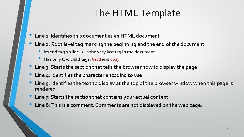
The HTML Template • • Line 1: Identifies this document as an HTML document Line 2: Root level tag marking the beginning and the end of the document • • Its end tag on line 10 is the very last tag in the document Has only two child tags: head and body Line 3: Starts the section that tells the browser how to display the page Line 4: Identifies the character encoding to use Line 5: identifies the text to display at the top of the browser window when this page is rendered Line 7: Starts the section that contains your actual content Line 8: This is a comment. Comments are not displayed on the web page. 4

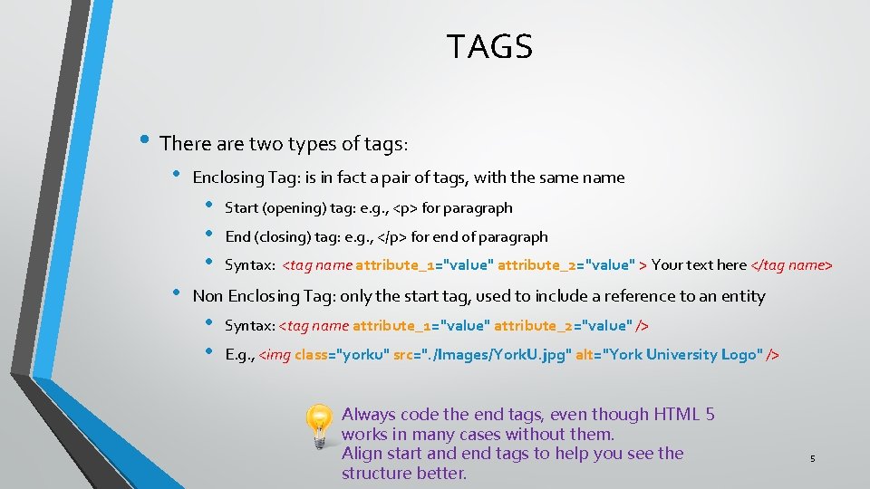
TAGS • There are two types of tags: • Enclosing Tag: is in fact a pair of tags, with the same name • • Start (opening) tag: e. g. , <p> for paragraph End (closing) tag: e. g. , </p> for end of paragraph Syntax: <tag name attribute_1="value" attribute_2="value" > Your text here </tag name> Non Enclosing Tag: only the start tag, used to include a reference to an entity • • Syntax: <tag name attribute_1="value" attribute_2="value" /> E. g. , <img class="yorku" src=". /Images/York. U. jpg" alt="York University Logo" /> Always code the end tags, even though HTML 5 works in many cases without them. Align start and end tags to help you see the structure better. 5

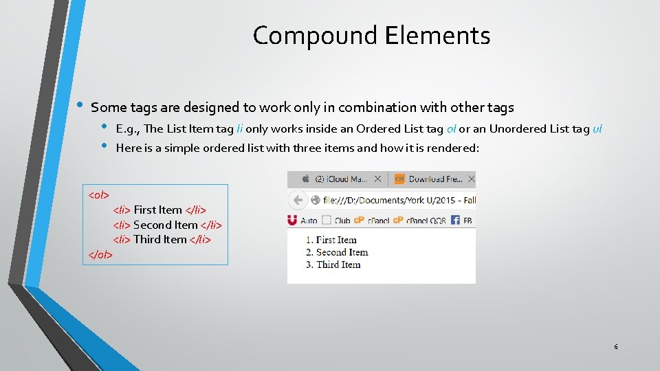
Compound Elements • Some tags are designed to work only in combination with other tags • • E. g. , The List Item tag li only works inside an Ordered List tag ol or an Unordered List tag ul Here is a simple ordered list with three items and how it is rendered: <ol> <li> First Item </li> <li> Second Item </li> <li> Third Item </li> </ol> 6

Nested Tags • In the previous example you can see that the <li> </li> pair of tags, including the text between them, appears in its entirety between the <ol> </ol> pair of tags • This approach is called nesting of tags • Nesting is not limited to compound elements (like lists) • Commonly used for grouping content (with structural tags) and for inserting external content inside text (with non enclosing tags) • In nesting tags you must place end tags in reverse order of the start tags (i. e. , the end tag of the most recent start tag must come first). • • Wrong: <p> That car is <em> fast </p>. </em> Right: <p> That car is <em> fast </em>. </p> 7

Attributes • Attributes provide the browser with additional information about the tag • • Where to find resources How to render (display) the information, including styles, colors, spacing, positioning • Attributes follow the syntax attribute-name="attribute-value" • Different tags accept different attributes • Multiple attributes can be specified for a single tag, separated by a space • Although sometimes certain attributes can be specified omitting the quotes, it is better to always use them Attention: both single and double quotes exist in two versions: straight (") and curved (“) HTML accepts only straight ones, so make sure you have the right kind. 8

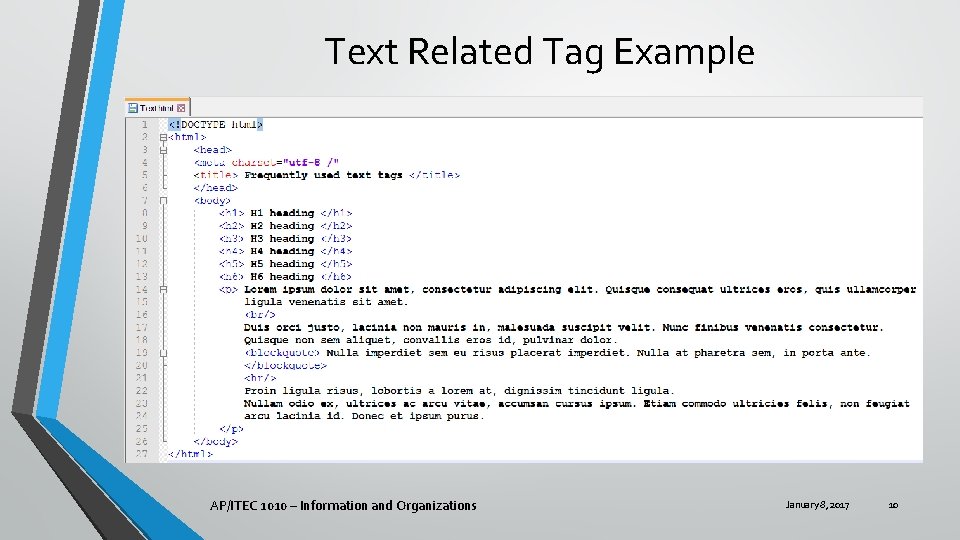
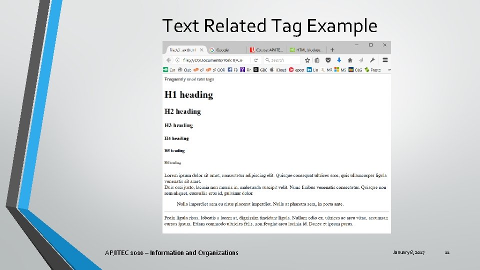
Frequently Used Tags • • Most of the information on a web page is text HTML 5 provides 6 levels of Headings • h 1, h 2, h 3, h 4, h 5, h 6 : Headings (h 1 being the highest level) Most text goes into paragraphs • p : Paragraph Lists can be ordered (numbered) or unordered (bulleted) • • • ol : Ordered List ul : Ordered List As you recall from compound tags, each list item uses the List Item tag li Quotations use the blockquote tag To place text on a new line inside a paragraph, use the non enclosing Break tag br To separate text with a horizontal line, use the Horizontal Rule non enclosing tag hr AP/ITEC 1010 – Information and Organizations January 8, 2017 9

Text Related Tag Example AP/ITEC 1010 – Information and Organizations January 8, 2017 10

Text Related Tag Example AP/ITEC 1010 – Information and Organizations January 8, 2017 11

Images • • Images are tags that provide the location of a graphic file, and insert the graphic into the page They use the img non enclosing tag with: • The src attribute that specifies the location of the image file • The location can be: • A URL for images located somewhere else on the web • A full local specification (in Windows full path, starting with drive letter, folders and subfolders, down to actual image fine name • A relative specification • • If only a file name is provided, the image file must be located in the same directory as the HTML file The file name can be preceded by. /folder/ indicating that the image file is located in the named subfolder located in the same folder as the HTML file The alt attribute that specifies what to display when the image is missing, or read out in voice rendering mode E. g. , <img src=". /Images/York. U. jpg" alt="York University Logo" /> Always code the alt attribute on any <img> tag. Otherwise audio rendering does not work well, nor does displaying when the file is missing. 12

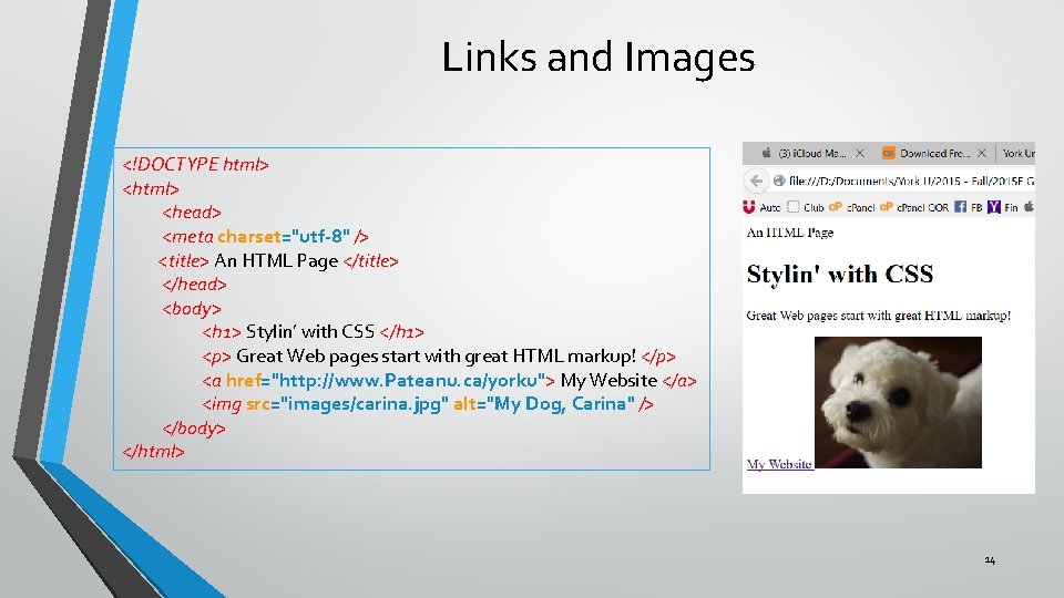
• • • Links are tags that provide a mechanism to navigate to another website, or another part of the same website, or to take some other action. They use the anchor a tag with: • • The href attribute that specifies the target place A text that will become the active link For navigating to another web page the href attribute takes a URL value • E. g. : <a href="http: //www. Pateanu. ca/yorku"> My Website </a> For navigating to another spot on the same web page • • • The href attribute specifies a location using the syntax "#location" The element we link to must specify the id attribute using the syntax id="location" E. g. : • • <a href="#intro"> Skip to Chapter 3 </a> <h 1 id="intro"> Chapter 3 </h 1> For sending an email the href attribute uses the syntax: • E. g. : <a href="mailto: somebody@mailserver. com"> E-mail Me </a> 13

Links and Images <!DOCTYPE html> <head> <meta charset="utf-8" /> <title> An HTML Page </title> </head> <body> <h 1> Stylin’ with CSS </h 1> <p> Great Web pages start with great HTML markup! </p> <a href="http: //www. Pateanu. ca/yorku"> My Website </a> <img src="images/carina. jpg" alt="My Dog, Carina" /> </body> </html> 14

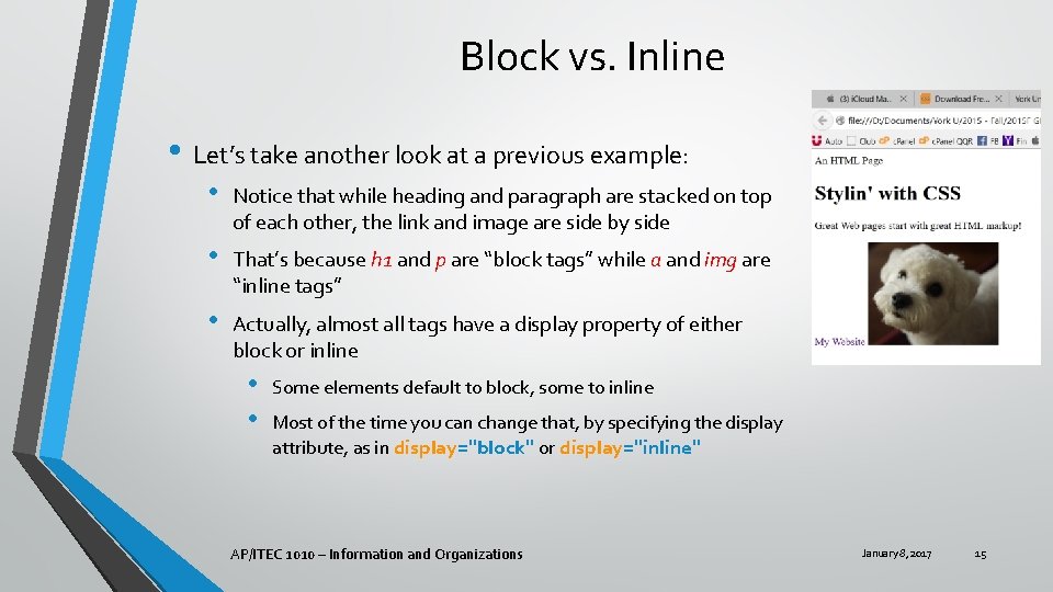
Block vs. Inline • Let’s take another look at a previous example: • Notice that while heading and paragraph are stacked on top of each other, the link and image are side by side • That’s because h 1 and p are “block tags” while a and img are “inline tags” • Actually, almost all tags have a display property of either block or inline • • Some elements default to block, some to inline Most of the time you can change that, by specifying the display attribute, as in display="block" or display="inline" AP/ITEC 1010 – Information and Organizations January 8, 2017 15

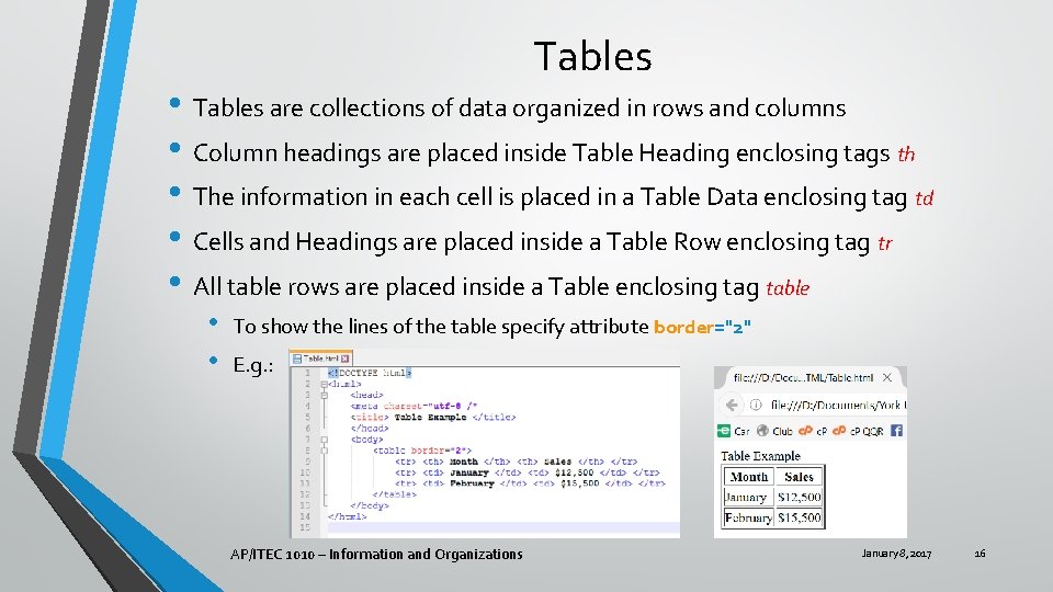
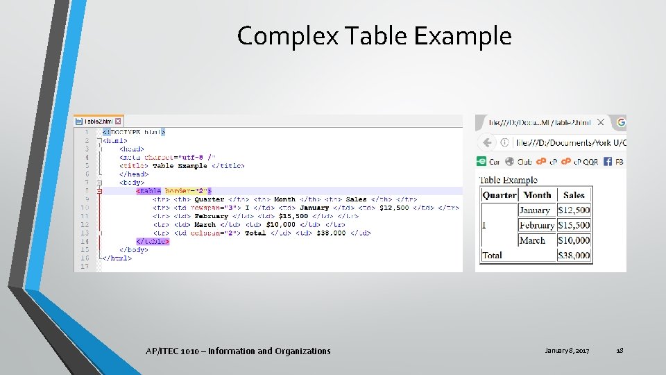
Tables • Tables are collections of data organized in rows and columns • Column headings are placed inside Table Heading enclosing tags th • The information in each cell is placed in a Table Data enclosing tag td • Cells and Headings are placed inside a Table Row enclosing tag tr • All table rows are placed inside a Table enclosing table • • To show the lines of the table specify attribute border="2" E. g. : AP/ITEC 1010 – Information and Organizations January 8, 2017 16

Spanning Rows and Columns • You can merge cells together: • • • On the same row, using the attribute colspan="2" • • The attribute is specified on the first cell (td tag) of the merged cells On the same column, using attribute rowspan="3" The number used as a value for the attributes above must be less or equal to the number of cells available on that row or column You must ensure the number of cells on the following rows or columns is reduced accordingly AP/ITEC 1010 – Information and Organizations January 8, 2017 17

Complex Table Example AP/ITEC 1010 – Information and Organizations January 8, 2017 18

Structural Tags • Most tags play a dual role: • • Be a container (box) for holding content Defining the content it holds • Other tags have no content, and are simply used to group other tags into a single identifiable container. These are called Structural Tags • Most of these tags also provide a semantic meaning to the content, although not enforced • This helps understand the structure of the web page • Structural tags are enclosing tags AP/ITEC 1010 – Information and Organizations January 8, 2017 19

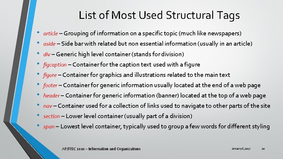
List of Most Used Structural Tags • • • article – Grouping of information on a specific topic (much like newspapers) aside – Side bar with related but non essential information (usually in an article) div – Generic high level container (stands for division) figcaption – Container for the caption text used with a figure – Container for graphics and illustrations related to the main text footer – Container for generic information usually located at the end of a web page header – Container for generic information (banner) located at the top of a web page nav – Container used for a collection of links used to navigate to other parts of the site section – Lower level container (usually part of a division) span – Lowest level container, typically used to group a few words for different styling AP/ITEC 1010 – Information and Organizations January 8, 2017 20

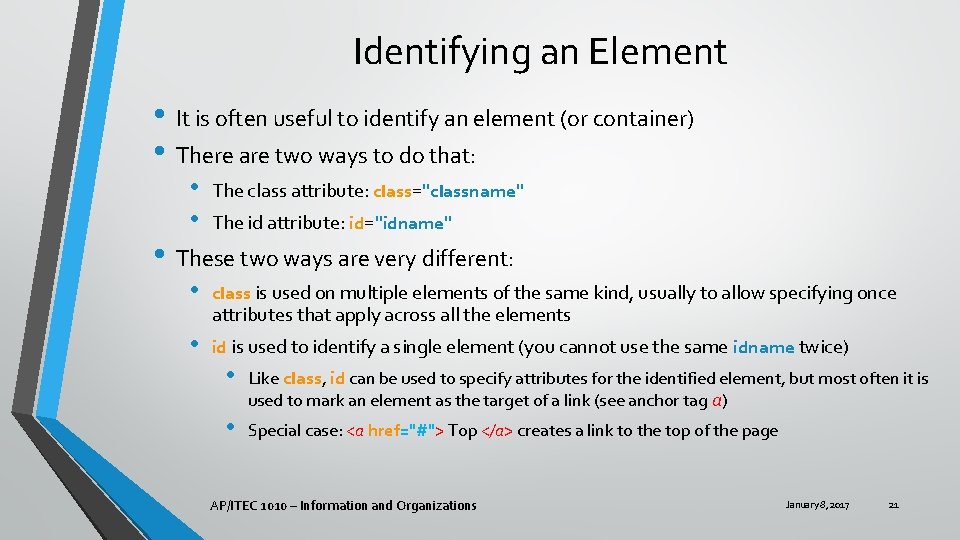
Identifying an Element • It is often useful to identify an element (or container) • There are two ways to do that: • • The class attribute: class="classname" • class is used on multiple elements of the same kind, usually to allow specifying once • id is used to identify a single element (you cannot use the same idname twice) The id attribute: id="idname" • These two ways are very different: attributes that apply across all the elements • Like class, id can be used to specify attributes for the identified element, but most often it is used to mark an element as the target of a link (see anchor tag a) • Special case: <a href="#"> Top </a> creates a link to the top of the page AP/ITEC 1010 – Information and Organizations January 8, 2017 21

Style • The examples of HTML we have seen are very plain looking • HTML has many attributes that allow you to change the style of an element • Style refers to the visual aspects of presenting the element on screen: • • • Position on screen Borders, margins and spacing Fonts Color and size … and much more… AP/ITEC 1010 – Information and Organizations January 8, 2017 22

Frequently Used Text Styling Tags • The following tags are enclosing tags, and are frequently used to style short segments of text: • • b – stands for bold (as in bold typeface) em – stands for emphasized, usually displayed as italics i – stands for italic s – stands for strikethrough strong – usually rendered as bold sub – stands for subscript sup – stands for superscript u – stands for underline AP/ITEC 1010 – Information and Organizations January 8, 2017 23

Specifying Style • Style attributes can be specified individually for each element • … but that is not a great idea, because: • • • It is repetitive Makes it harder to follow content when looking at an HTML file Makes it difficult to create a consistent style • The preferred way for styling is to use CSS (cascading Style Sheets) • CSS is a collection of rules for styling AP/ITEC 1010 – Information and Organizations January 8, 2017 24

CSS Rules • A CSS Rule is formed of two parts: • A selector (which identifies a specific HTML element) • There are four types of selectors • Tag selectors • Class selectors • ID selectors • Attribute selectors (we will not cover these) • A set of declarations (which associate styles with the selected element) • A declaration consists of a pair of items separated by a colon and ending with a semicolon • A property, identifying which aspect of style is being specified • A value to be attributed to the property • • The set of declarations is enclosed in curly brackets E. g. , p {color: red; } • The above syntax sets up the rule that paragraphs will have their text in red, using a tag selector ( p) 25

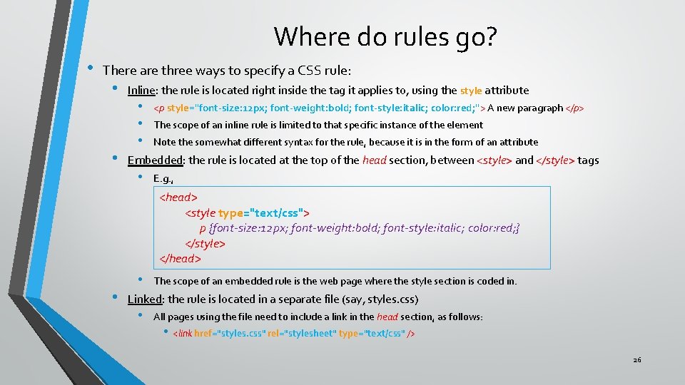
Where do rules go? • There are three ways to specify a CSS rule: • • Inline: the rule is located right inside the tag it applies to, using the style attribute • • • <p style="font-size: 12 px; font-weight: bold; font-style: italic; color: red; "> A new paragraph </p> The scope of an inline rule is limited to that specific instance of the element Note the somewhat different syntax for the rule, because it is in the form of an attribute Embedded: the rule is located at the top of the head section, between <style> and </style> tags • E. g. , <head> <style type="text/css"> p {font-size: 12 px; font-weight: bold; font-style: italic; color: red; } </style> </head> • • The scope of an embedded rule is the web page where the style section is coded in. Linked: the rule is located in a separate file (say, styles. css) • All pages using the file need to include a link in the head section, as follows: • <link href="styles. css" rel="stylesheet" type="text/css" /> 26

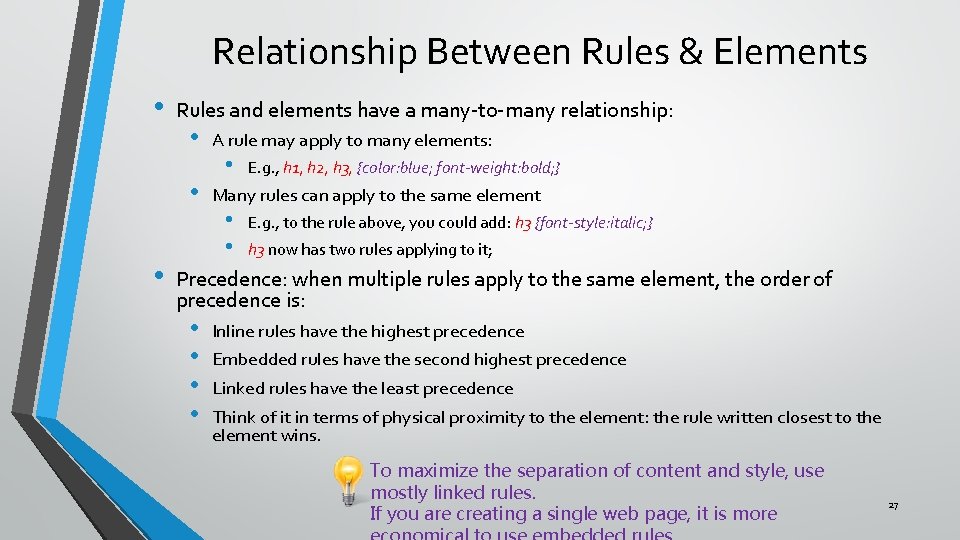
Relationship Between Rules & Elements • Rules and elements have a many-to-many relationship: • • • A rule may apply to many elements: • E. g. , h 1, h 2, h 3, {color: blue; font-weight: bold; } Many rules can apply to the same element • • E. g. , to the rule above, you could add: h 3 {font-style: italic; } h 3 now has two rules applying to it; Precedence: when multiple rules apply to the same element, the order of precedence is: • • Inline rules have the highest precedence Embedded rules have the second highest precedence Linked rules have the least precedence Think of it in terms of physical proximity to the element: the rule written closest to the element wins. To maximize the separation of content and style, use mostly linked rules. If you are creating a single web page, it is more 27

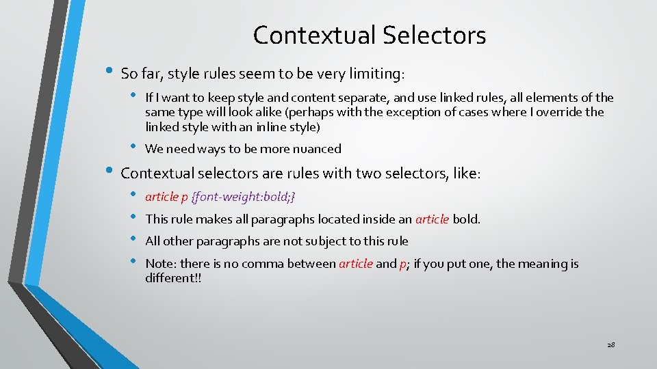
Contextual Selectors • So far, style rules seem to be very limiting: • If I want to keep style and content separate, and use linked rules, all elements of the same type will look alike (perhaps with the exception of cases where I override the linked style with an inline style) • We need ways to be more nuanced • • article p {font-weight: bold; } • Contextual selectors are rules with two selectors, like: This rule makes all paragraphs located inside an article bold. All other paragraphs are not subject to this rule Note: there is no comma between article and p; if you put one, the meaning is different!! 28

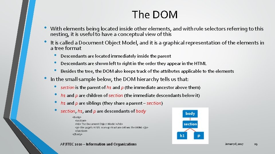
The DOM • • • With elements being located inside other elements, and with rule selectors referring to this nesting, it is useful to have a conceptual view of this It is called a Document Object Model, and it is a graphical representation of the elements in a tree format • • • Descendants are located immediately inside the parent Descendants are shown left to right in the order they appear in the HTML Besides the tree, the DOM also keeps track of the attributes applicable to the elements In the small sample below, the DOM hierarchy tells us that: • • section is the parent of h 1 and p (the immediate ancestor above them) h 1 and p are children of section (the immediate descendants below it) h 1 and p are siblings (they share a parent – section) section, h 1, and p are descendants of body AP/ITEC 1010 – Information and Organizations January 8, 2017 29

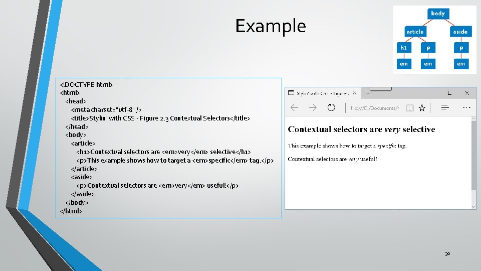
Example <!DOCTYPE html> <head> <meta charset="utf-8" /> <title>Stylin' with CSS - Figure 2. 3 Contextual Selectors</title> </head> <body> <article> <h 1>Contextual selectors are <em>very</em> selective</h 1> <p>This example shows how to target a <em>specific</em> tag. </p> </article> <aside> <p>Contextual selectors are <em>very</em> useful!</p> </aside> </body> </html> 30

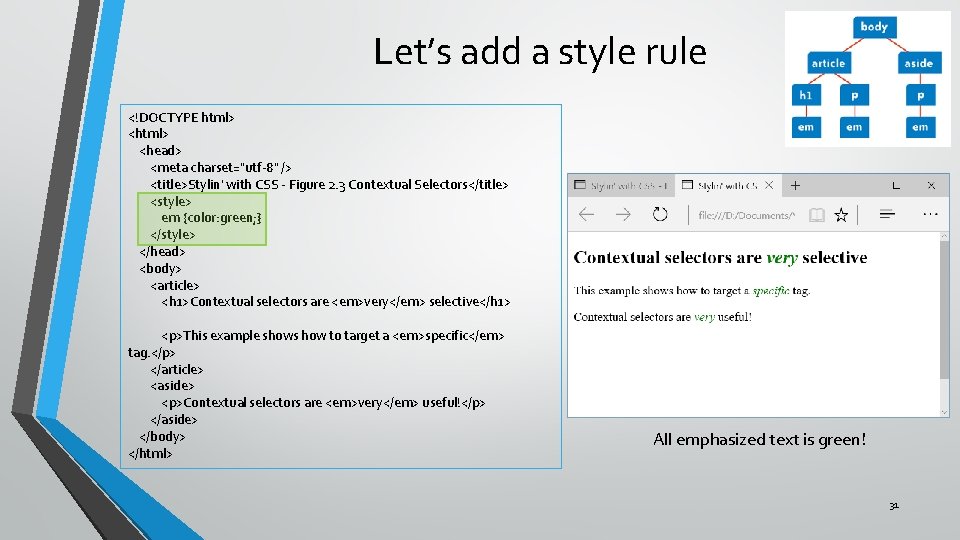
Let’s add a style rule <!DOCTYPE html> <head> <meta charset="utf-8" /> <title>Stylin' with CSS - Figure 2. 3 Contextual Selectors</title> <style> em {color: green; } </style> </head> <body> <article> <h 1>Contextual selectors are <em>very</em> selective</h 1> <p>This example shows how to target a <em>specific</em> tag. </p> </article> <aside> <p>Contextual selectors are <em>very</em> useful!</p> </aside> </body> </html> All emphasized text is green! 31

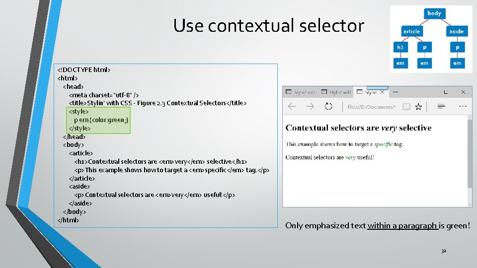
Use contextual selector <!DOCTYPE html> <head> <meta charset="utf-8" /> <title>Stylin' with CSS - Figure 2. 3 Contextual Selectors</title> <style> p em {color: green; } </style> </head> <body> <article> <h 1>Contextual selectors are <em>very</em> selective</h 1> <p>This example shows how to target a <em>specific</em> tag. </p> </article> <aside> <p>Contextual selectors are <em>very</em> useful!</p> </aside> </body> </html> Only emphasized text within a paragraph is green! 32

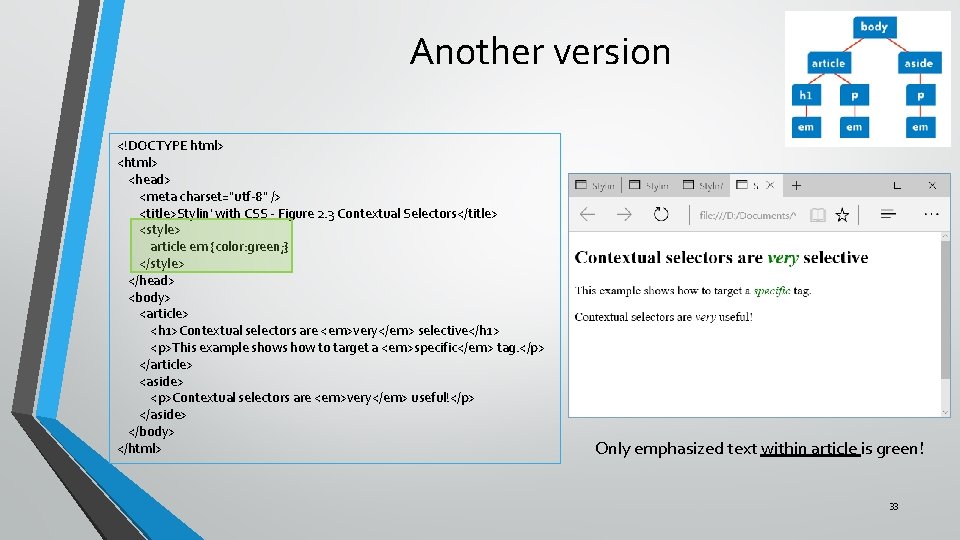
Another version <!DOCTYPE html> <head> <meta charset="utf-8" /> <title>Stylin' with CSS - Figure 2. 3 Contextual Selectors</title> <style> article em {color: green; } </style> </head> <body> <article> <h 1>Contextual selectors are <em>very</em> selective</h 1> <p>This example shows how to target a <em>specific</em> tag. </p> </article> <aside> <p>Contextual selectors are <em>very</em> useful!</p> </aside> </body> </html> Only emphasized text within article is green! 33

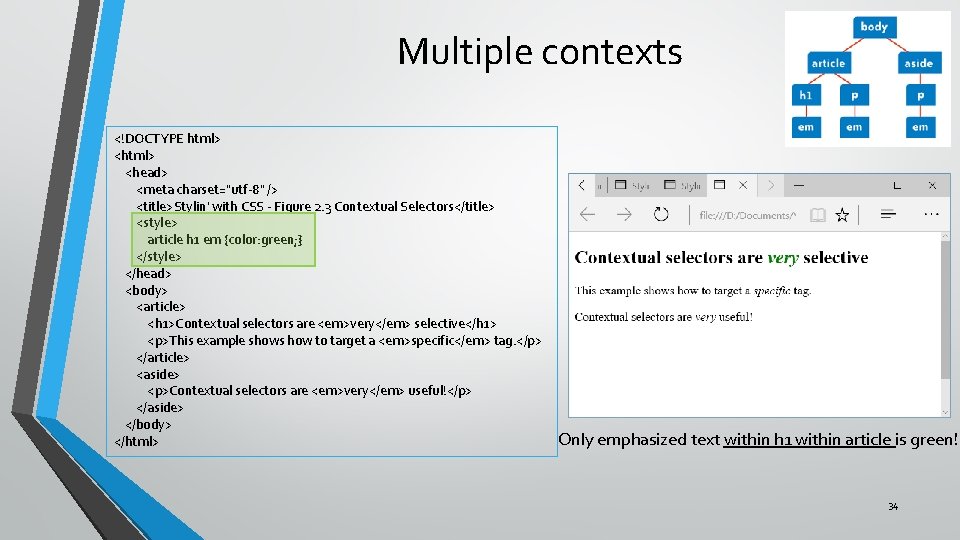
Multiple contexts <!DOCTYPE html> <head> <meta charset="utf-8" /> <title>Stylin' with CSS - Figure 2. 3 Contextual Selectors</title> <style> article h 1 em {color: green; } </style> </head> <body> <article> <h 1>Contextual selectors are <em>very</em> selective</h 1> <p>This example shows how to target a <em>specific</em> tag. </p> </article> <aside> <p>Contextual selectors are <em>very</em> useful!</p> </aside> </body> </html> Only emphasized text within h 1 within article is green! 34

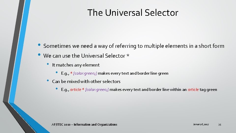
The Universal Selector • Sometimes we need a way of referring to multiple elements in a short form • We can use the Universal Selector * • It matches any element • • E. g. , * {color: green; } makes every text and border line green Can be mixed with other selectors • E. g. , article * {color: green; } makes every text and border line within an article tag green AP/ITEC 1010 – Information and Organizations January 8, 2017 35

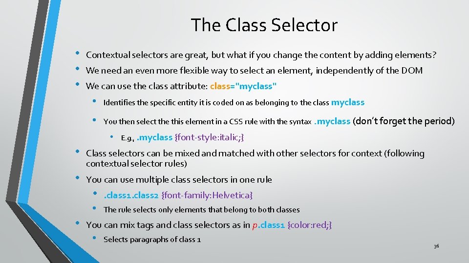
The Class Selector • • • Contextual selectors are great, but what if you change the content by adding elements? We need an even more flexible way to select an element, independently of the DOM We can use the class attribute: class="myclass" • Identifies the specific entity it is coded on as belonging to the class myclass • You then select the this element in a CSS rule with the syntax. myclass (don’t forget the period) • E. g. , . myclass {font-style: italic; } • Class selectors can be mixed and matched with other selectors for context (following contextual selector rules) • You can use multiple class selectors in one rule • • . class 1. class 2 {font-family: Helvetica} • The rule selects only elements that belong to both classes You can mix tags and class selectors as in p. class 1 {color: red; } • Selects paragraphs of class 1 36

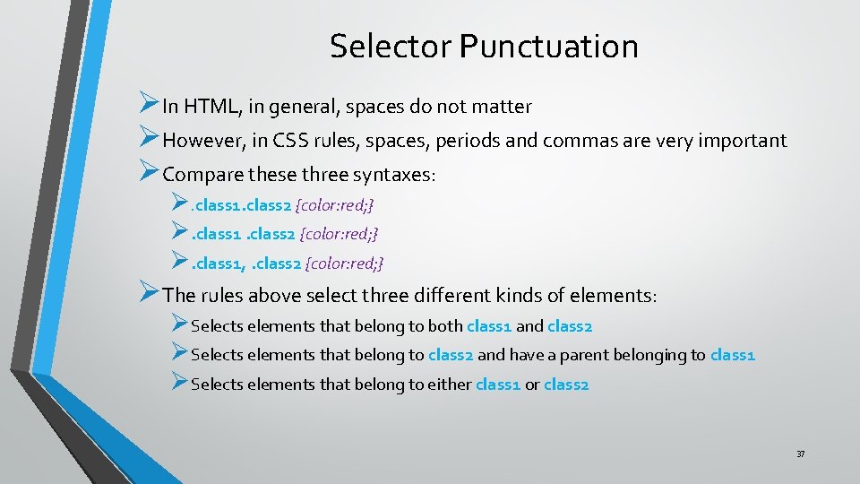
Selector Punctuation ØIn HTML, in general, spaces do not matter ØHowever, in CSS rules, spaces, periods and commas are very important ØCompare these three syntaxes: Ø. class 1. class 2 {color: red; } Ø. class 1, . class 2 {color: red; } ØThe rules above select three different kinds of elements: ØSelects elements that belong to both class 1 and class 2 ØSelects elements that belong to class 2 and have a parent belonging to class 1 ØSelects elements that belong to either class 1 or class 2 37

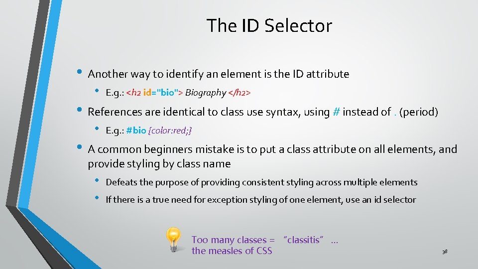
The ID Selector • Another way to identify an element is the ID attribute • E. g. : <h 2 id="bio"> Biography </h 2> • References are identical to class use syntax, using # instead of. (period) • E. g. : #bio {color: red; } • A common beginners mistake is to put a class attribute on all elements, and provide styling by class name • • Defeats the purpose of providing consistent styling across multiple elements If there is a true need for exception styling of one element, use an id selector Too many classes = “classitis” … the measles of CSS 38

Which rule applies • We already learned about how physical placement of a rule affects its scope • Still, with so many ways to create rules, it is easy to have conflicting rules • E. g. , a paragraph with a class attribute may have one rule set up using the tag and another using the class name… which one applies? • We have three mechanisms to determine precedence: • • • Inheritance Cascading Specificity (out of scope) 39

Inheritance • Inheritance is based on the principle that styling applied to an element, will also be applied to its children, as defined by the DOM • Not every style element can be inherited, due to common sense: • • • Color, font, size, etc. are inherited More generally, text related styles are inherited Position, margins, borders, padding, etc. cannot be inherited, because it does not make sense to do so • • Obviously, different elements need to be in different positions, or else they would overlap Just because a parent box has a border, it does not follow that you want boxes inside that box to also have a border 40

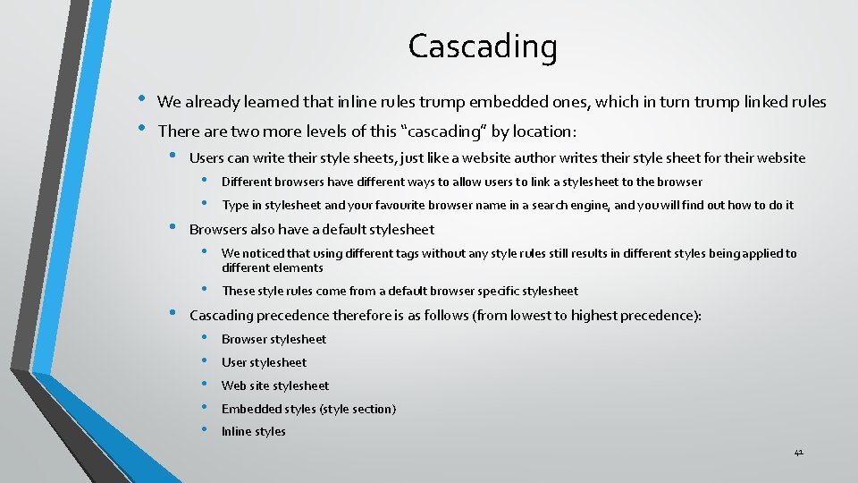
Cascading • • We already learned that inline rules trump embedded ones, which in turn trump linked rules There are two more levels of this “cascading” by location: • Users can write their style sheets, just like a website author writes their style sheet for their website • • Different browsers have different ways to allow users to link a stylesheet to the browser Type in stylesheet and your favourite browser name in a search engine, and you will find out how to do it Browsers also have a default stylesheet • We noticed that using different tags without any style rules still results in different styles being applied to different elements • These style rules come from a default browser specific stylesheet Cascading precedence therefore is as follows (from lowest to highest precedence): • • • Browser stylesheet User stylesheet Web site stylesheet Embedded styles (style section) Inline styles 41

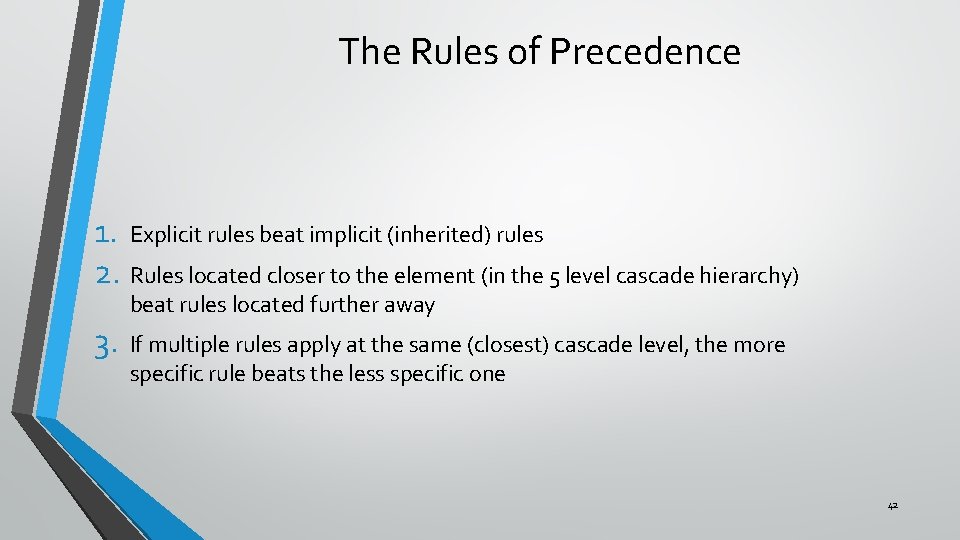
The Rules of Precedence 1. Explicit rules beat implicit (inherited) rules 2. Rules located closer to the element (in the 5 level cascade hierarchy) beat rules located further away 3. If multiple rules apply at the same (closest) cascade level, the more specific rule beats the less specific one 42

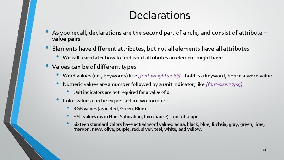
Declarations • • • As you recall, declarations are the second part of a rule, and consist of attribute – value pairs Elements have different attributes, but not all elements have all attributes • We will learn later how to find what attributes an element might have Values can be of different types: • • • Word values (i. e. , keywords) like {font-weight: bold; } - bold is a keyword, hence a word value Numeric values are a number followed by a unit indicator, like {font-size: 12 px; } • Unit indicators are not required for a value of 0 Color values can be expressed in two formats: • • • RGB values (as in Red, Green, Blue) HSL values (as in Hue, Saturation, Luminance) – out of scope Sixteen standard colors have actual word values: aqua, black, blue, fuchsia, gray, green, lime, maroon, navy, olive, purple, red, silver, teal, white, and yellow. 43

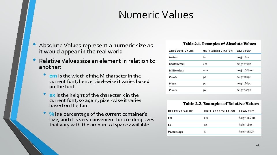
Numeric Values • • Absolute Values represent a numeric size as it would appear in the real world Relative Values size an element in relation to another: • em is the width of the M character in the • ex is the height of the character x in the • current font, hence pixel-wise it varies based on the font current font, so again, pixel-wise it varies based on the font % is a percentage of the current container’s size, and it is very convenient for creating sizes that vary with the amount of space available 44

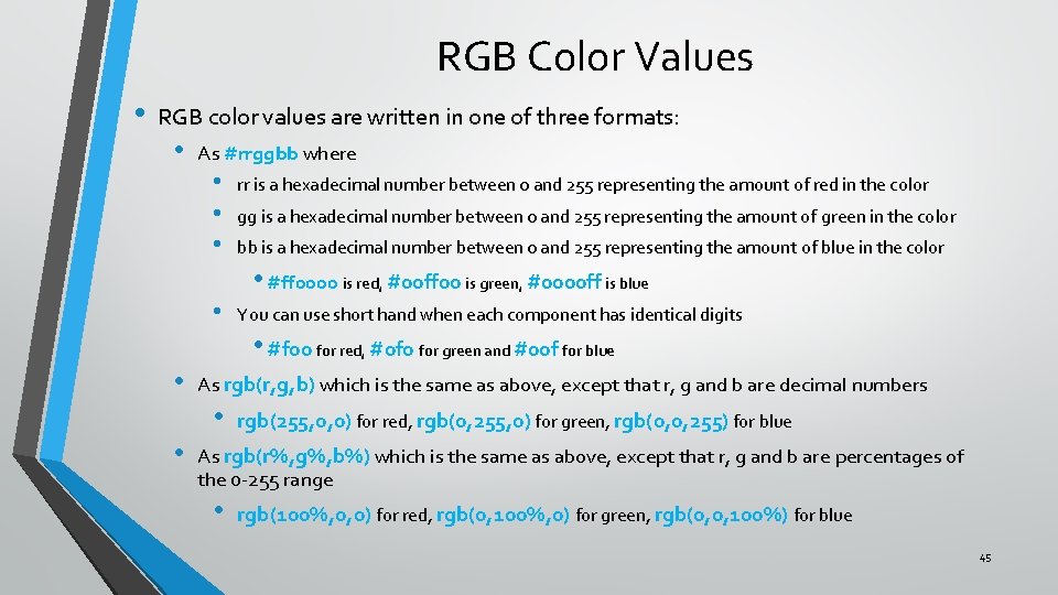
RGB Color Values • RGB color values are written in one of three formats: • As #rrggbb where • • • rr is a hexadecimal number between 0 and 255 representing the amount of red in the color gg is a hexadecimal number between 0 and 255 representing the amount of green in the color bb is a hexadecimal number between 0 and 255 representing the amount of blue in the color • #ff 0000 is red, #00 ff 00 is green, #0000 ff is blue • • • You can use short hand when each component has identical digits • #f 00 for red, #0 f 0 for green and #00 f for blue As rgb(r, g, b) which is the same as above, except that r, g and b are decimal numbers • rgb(255, 0, 0) for red, rgb(0, 255, 0) for green, rgb(0, 0, 255) for blue As rgb(r%, g%, b%) which is the same as above, except that r, g and b are percentages of the 0 -255 range • rgb(100%, 0, 0) for red, rgb(0, 100%, 0) for green, rgb(0, 0, 100%) for blue 45

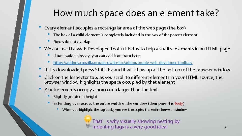
How much space does an element take? • • • Every element occupies a rectangular area of the web page (the box) • • The box of a child element is completely included in the box of the parent element Boxes do not overlap We can use the Web Developer Tool in Firefox to help visualize elements in an HTML page • • If not loaded already, you can add it on from here: https: //addons. mozilla. org/en-us/firefox/addon/toggle-web-developer-toolbar/ If it is downloaded press Shift+F 2 and it will show up at the bottom of the browser window Click on the Inspector tab; as you scroll to different elements in your HTML source, the browser window highlights the space occupied by that element Block elements occupy a box much larger than the text • • Slightly greater in height Extending over across the entire width of the window (their parent is body) • When you highlight the tag body, you see it occupies the entire browser window That’s why visually showing nesting by indenting tags is a very good idea! 46

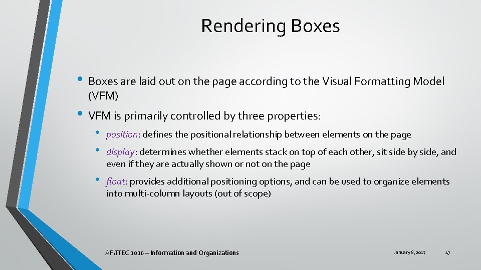
Rendering Boxes • Boxes are laid out on the page according to the Visual Formatting Model (VFM) • VFM is primarily controlled by three properties: • • position: defines the positional relationship between elements on the page • float: provides additional positioning options, and can be used to organize elements into multi-column layouts (out of scope) display: determines whether elements stack on top of each other, sit side by side, and even if they are actually shown or not on the page AP/ITEC 1010 – Information and Organizations January 8, 2017 47

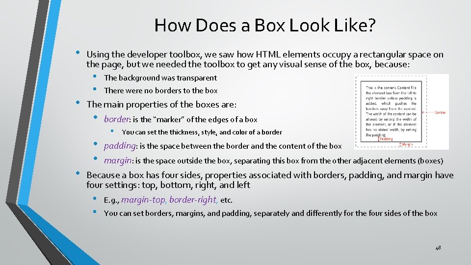
How Does a Box Look Like? • • • Using the developer toolbox, we saw how HTML elements occupy a rectangular space on the page, but we needed the toolbox to get any visual sense of the box, because: • • The background was transparent There were no borders to the box The main properties of the boxes are: • • • border: is the “marker” of the edges of a box • You can set the thickness, style, and color of a border padding: is the space between the border and the content of the box margin: is the space outside the box, separating this box from the other adjacent elements (boxes) Because a box has four sides, properties associated with borders, padding, and margin have four settings: top, bottom, right, and left • E. g. , margin-top, border-right, etc. • You can set borders, margins, and padding, separately and differently for the four sides of the box 48

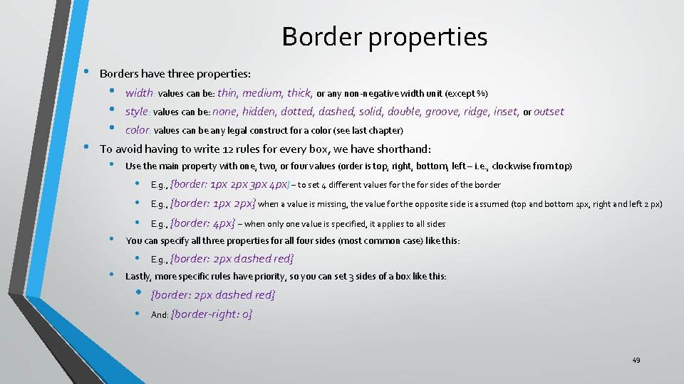
Border properties • • Borders have three properties: • • • width: values can be: thin, medium, thick, or any non-negative width unit (except %) style: values can be: none, hidden, dotted, dashed, solid, double, groove, ridge, inset, or outset color: values can be any legal construct for a color (see last chapter) To avoid having to write 12 rules for every box, we have shorthand: • Use the main property with one, two, or four values (order is top, right, bottom, left – i. e. , clockwise from top) • • E. g. , {border: 1 px 2 px} when a value is missing, the value for the opposite side is assumed (top and bottom 1 px, right and left 2 px) E. g. , {border: 4 px} – when only one value is specified, it applies to all sides You can specify all three properties for all four sides (most common case) like this: • • E. g. , {border: 1 px 2 px 3 px 4 px} – to set 4 different values for the for sides of the border E. g. , {border: 2 px dashed red} Lastly, more specific rules have priority, so you can set 3 sides of a box like this: • {border: 2 px dashed red} • And: {border-right: 0} 49

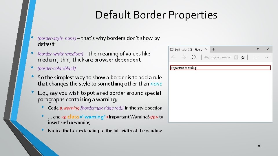
Default Border Properties • {border-style: none} – that’s why borders don’t show by • {border-width: medium} – the meaning of values like • {border-color: black} default medium, thin, thick are browser dependent • So the simplest way to show a border is to add a rule that changes the style to something other than none • E. g. , say you wish to put a red border around special paragraphs containing a warning; • • Code p. warning {border: 3 px ridge red; } in the style section • Notice the box extending to the full width of the window … and <p class="warning">Important Warning!</p> to insert such a warning 50

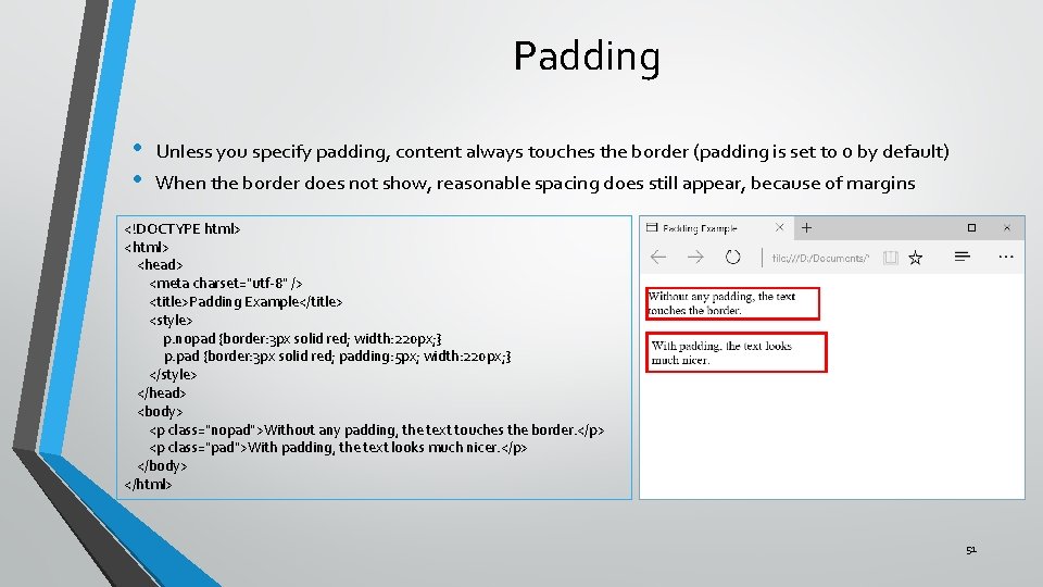
Padding • • Unless you specify padding, content always touches the border (padding is set to 0 by default) When the border does not show, reasonable spacing does still appear, because of margins <!DOCTYPE html> <head> <meta charset="utf-8" /> <title>Padding Example</title> <style> p. nopad {border: 3 px solid red; width: 220 px; } p. pad {border: 3 px solid red; padding: 5 px; width: 220 px; } </style> </head> <body> <p class="nopad">Without any padding, the text touches the border. </p> <p class="pad">With padding, the text looks much nicer. </p> </body> </html> 51

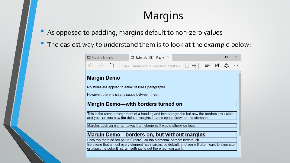
Margins • As opposed to padding, margins default to non-zero values • The easiest way to understand them is to look at the example below: 52

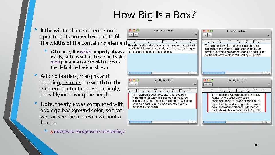
How Big Is a Box? • If the width of an element is not specified, its box will expand to fill the widths of the containing element. • Of course, the width property always exists, but it is set to the default value auto (for automatic) which gives us the default behaviour shown • Adding borders, margins and padding, reduces the width for the element content correspondingly, possibly increasing the height • Note: the style was completed with adding a background color, so that we can see the box even without a border • p {margin: 0; background-color: white; } 53

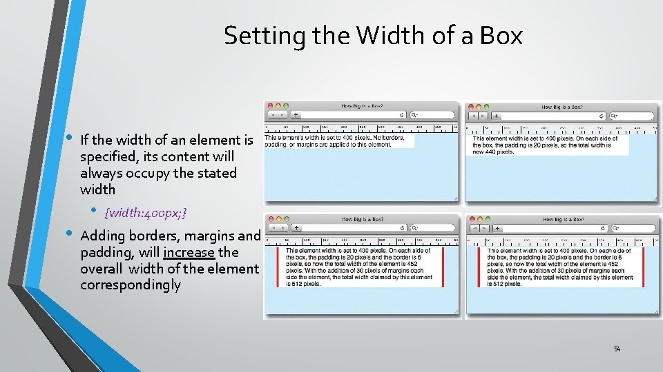
Setting the Width of a Box • • If the width of an element is specified, its content will always occupy the stated width • {width: 400 px; } Adding borders, margins and padding, will increase the overall width of the element correspondingly 54

Document Flow • So far, we learned that: • • • All elements are rendered in a box Boxes can stack on top of each other, or go side by side This is known as the document flow • Think of it as a conveyor belt delivering box after box the page creator, who simply places them in the space available according to the default rules for the type of box • Clearly we need some ways to arrange boxes in more flexible ways • Three ways to achieve that: • • • Floating (out of scope) Positioning The display property 55

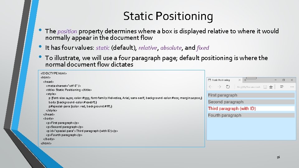
Static Positioning • • • The position property determines where a box is displayed relative to where it would normally appear in the document flow It has four values: static (default), relative, absolute, and fixed To illustrate, we will use a four paragraph page; default positioning is where the normal document flow dictates <!DOCTYPE html> <head> <meta charset="utf-8" /> <title> Static Positioning </title> <style> p {font-size: 24 px; color: #555; font-family: Helvetica, Arial, sans-serif; background-color: #ccc; margin: 10 px 0; } body {background-color: #caebff; } p#special-para {color: red; background: #fff; } </style> </head> <body> <p>First paragraph</p> <p>Second paragraph</p> <p id="special-para">Third paragraph (with ID)</p> <p>Fourth paragraph</p> </body> </html> 56

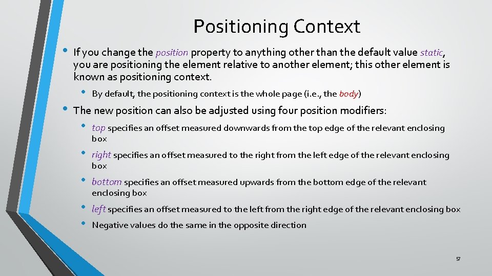
Positioning Context • • If you change the position property to anything other than the default value static, you are positioning the element relative to another element; this other element is known as positioning context. • By default, the positioning context is the whole page (i. e. , the body) The new position can also be adjusted using four position modifiers: • top specifies an offset measured downwards from the top edge of the relevant enclosing • right specifies an offset measured to the right from the left edge of the relevant enclosing • bottom specifies an offset measured upwards from the bottom edge of the relevant • • left specifies an offset measured to the left from the right edge of the relevant enclosing box box enclosing box Negative values do the same in the opposite direction 57

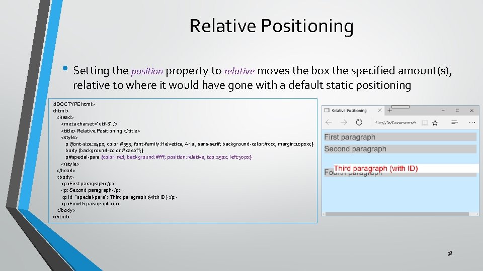
Relative Positioning • Setting the position property to relative moves the box the specified amount(s), relative to where it would have gone with a default static positioning <!DOCTYPE html> <head> <meta charset="utf-8" /> <title> Relative Positioning </title> <style> p {font-size: 24 px; color: #555; font-family: Helvetica, Arial, sans-serif; background-color: #ccc; margin: 10 px 0; } body {background-color: #caebff; } p#special-para {color: red; background: #fff; position: relative; top: 25 px; left: 30 px} </style> </head> <body> <p>First paragraph</p> <p>Second paragraph</p> <p id="special-para">Third paragraph (with ID)</p> <p>Fourth paragraph</p> </body> </html> 58

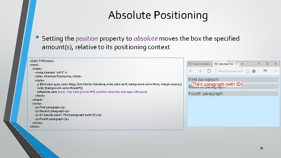
Absolute Positioning • Setting the position property to absolute moves the box the specified amount(s), relative to its positioning context <!DOCTYPE html> <head> <meta charset="utf-8" /> <title> Absolute Positioning </title> <style> p {font-size: 24 px; color: #555; font-family: Helvetica, Arial, sans-serif; background-color: #ccc; margin: 10 px 0; } body {background-color: #caebff; } p#special-para {color: red; background: #fff; position: absolute; top: 25 px; left: 30 px} </style> </head> <body> <p>First paragraph</p> <p>Second paragraph</p> <p id="special-para">Third paragraph (with ID)</p> <p>Fourth paragraph</p> </body> </html> 59

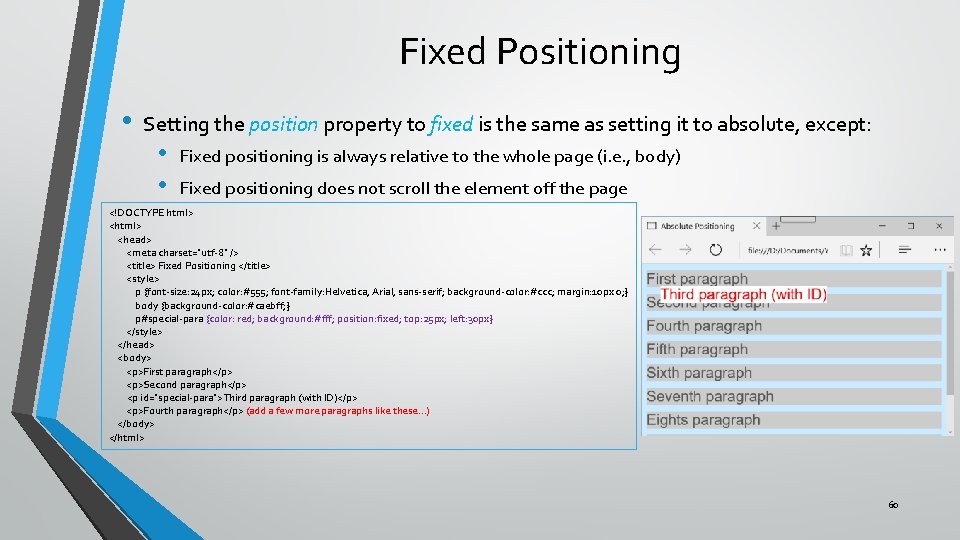
Fixed Positioning • Setting the position property to fixed is the same as setting it to absolute, except: • • Fixed positioning is always relative to the whole page (i. e. , body) Fixed positioning does not scroll the element off the page <!DOCTYPE html> <head> <meta charset="utf-8" /> <title> Fixed Positioning </title> <style> p {font-size: 24 px; color: #555; font-family: Helvetica, Arial, sans-serif; background-color: #ccc; margin: 10 px 0; } body {background-color: #caebff; } p#special-para {color: red; background: #fff; position: fixed; top: 25 px; left: 30 px} </style> </head> <body> <p>First paragraph</p> <p>Second paragraph</p> <p id="special-para">Third paragraph (with ID)</p> <p>Fourth paragraph</p> (add a few more paragraphs like these…) </body> </html> 60

The display Property • We learned earlier that elements can be classified as: • • Block elements, which stack on top of each other vertically and use up the entire width of their parent Inline elements, which line up horizontally one after the other as long as there is space on the current “line” of elements This is known as the display property Default values depend on the element: • • p, blockquote, section, etc. have the default display property value of block img, a, span, etc. have the default display property value of inline • • You can change the value of the display property • Another property, {visibility: hidden; } achieves a similar outcome, except that in this case the space is maintained Another value you can use is none – making this element, and all its children to be removed from the display, together with the space they occupy (as if they never existed in the HTML). 61

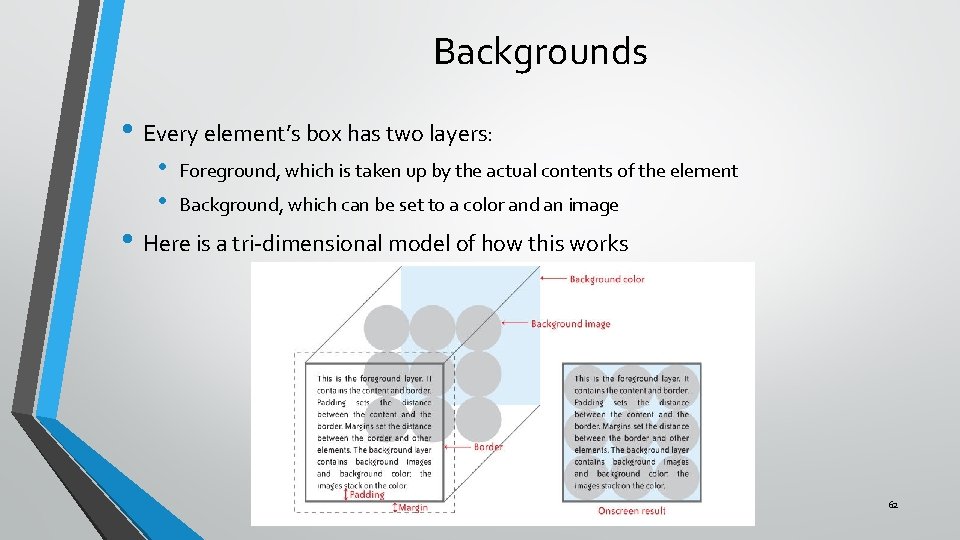
Backgrounds • Every element’s box has two layers: • • Foreground, which is taken up by the actual contents of the element Background, which can be set to a color and an image • Here is a tri-dimensional model of how this works 62

Background Styling • • • {background-color: red; } – sets the background of the box to the specified color {background-image: url(photo. jpg); } – lays the photo specified on top of the background color • If the photo is smaller than the box, the image is repeated left to right, then down, to fill the box, very much like tiling a wall • • If the photo is larger than box, the image is truncated There are many ways to change this behavior, but we won’t get into this {background-attachment; fixed; } will keep the image in place while you are scrolling the contents • It probably makes sense for the background of the entire body (it may look funny for a smaller box) 63

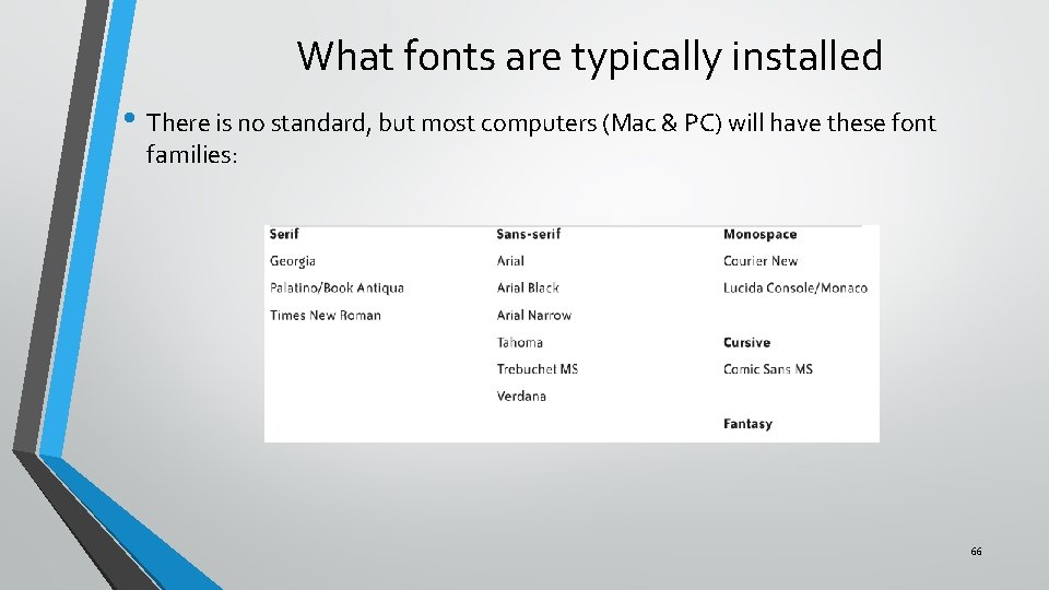
Fonts • Most of the content of a web page is text, so typography (fonts) are very important • There are three sources of fonts: • • • Fonts loaded on the user’s computer (we will limit ourselves to these ones) Fonts retrieved dynamically from dedicated font sites Fonts that are downloaded with the page • These guarantee that a user will see the exact typography you had in mind • Fonts are organized in: • Collections, containing fonts with similar graphic characteristics (serif, monospace, etc. ) • • Collections are made up of several Families (Helvetica, Times Roman, Calibry, etc. ) Family members are distinguished by their typeface (graphic characteristics that offer a variance on the base family type, like Bold, Oblique, Narrow, Condensed, etc. ) 64

font-family Property • Specifies one or more font families in order of precedence • Multiple values can be specified, to cover cases where a specific font is not installed on the user’s computer. • Font family names with two or more words must be enclosed in quotes • • Usually, a very generic font family, is specified last, just in case… • • {font-family : "trebuchet ms"; } There are five generic font families: serif, sans-serif, monospace, cursive, fantasy Other commonly used font families are: verdana, arial, helvetica, tahoma 65

What fonts are typically installed • There is no standard, but most computers (Mac & PC) will have these font families: 66

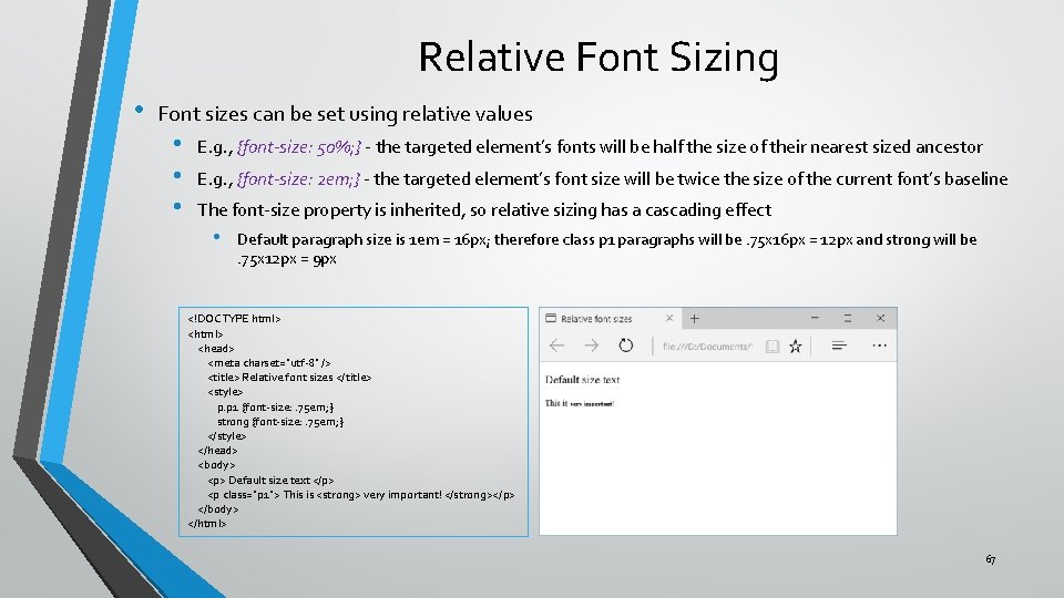
Relative Font Sizing • Font sizes can be set using relative values • • • E. g. , {font-size: 50%; } - the targeted element’s fonts will be half the size of their nearest sized ancestor E. g. , {font-size: 2 em; } - the targeted element’s font size will be twice the size of the current font’s baseline The font-size property is inherited, so relative sizing has a cascading effect • Default paragraph size is 1 em = 16 px; therefore class p 1 paragraphs will be. 75 x 16 px = 12 px and strong will be. 75 x 12 px = 9 px <!DOCTYPE html> <head> <meta charset="utf-8" /> <title> Relative font sizes </title> <style> p. p 1 {font-size: . 75 em; } strong {font-size: . 75 em; } </style> </head> <body> <p> Default size text </p> <p class="p 1"> This is <strong> very important! </strong></p> </body> </html> 67

Absolute Font Sizing • • • Font sizes can be set using absolute values • i. e. , numeric sizes with units such as pixels (px), picas (pc) or inches (in) (px is the most common) Another size setting considered absolute is using words: • • x-small, medium, large, x-large (medium is the same as the baseline size of the current font) These are not widely used Font size rules • • Default font sizes are set in the browser stylesheet in relative units The font-size property is inherited Therefore: • • Any element with an absolute font size will take the size specified All other elements will we sized proportionally to the ones with an absolute size E. g. , if you set the rule body {font-size: 20 px; } • • h 1 headings will be 40 px (because they are sized by default to 2 em, and no other rule applies) h 2 headings will be 30 px (because they are sized by default to 1. 5 em, and no other rule applies) 68

• • • Absolute or Relative? Relative sizing makes it easy to maintain the proportional relationship of fonts when you make a change, because it affects all descendants • • That’s why default font sizes in the browser stylesheet are relative Can create unexpected consequences Absolute sizing is simple and direct, but you then need to specify sizes for every descendant There is a new way, not widely supported yet, which is the best of both worlds: • • Specify sizes in rem (from root em) Same as em, but it is relative only to and directly to the size set for the html element (which is the root element of the DOM) • • Set an absolute size for the root, using html {font-size: 20 px; } (for example) Then set element level sizes like this: p {font-size: . 8 rem; } Careful… only IE 9 or newer support rem; other browsers do support it You can shorthand the styling of a font like this: • {font: 16 px Verdana; } 69

Text Properties • • • While font properties style each and every individual character in text, we also need to style the appearance of entire blocks of text There are many text properties: • • text-indent: sets the start position of the text block in relation to the containing element letter-spacing: increases or decreases the space between letters word-spacing: increases or decreases the space between words text-decoration: sets visual distinctions to text (underline, overline, blink, etc) text-align: sets the alignment style (left, right, center, or justify) line-height: increases or decreases the space between lines of text-transform: changes capitalization vertical-align: moves text up or down with respect to baseline (like subscripts or superscripts) We will limit ourselves to two : text-indent and text-align 70

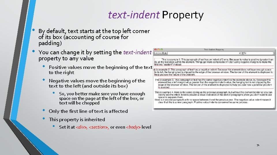
text-indent Property • • By default, text starts at the top left corner of its box (accounting of course for padding) You can change it by setting the text-indent property to any value • • Positive values move the beginning of the text to the right Negative values move the beginning of the text to the left (and outside its box) • • • So, you better make sure you have enough space on the page at the left of the box, or text will be chopped Only the first line of text is affected This property is inherited • Set it at <div>, <section>, or even <body> level 71

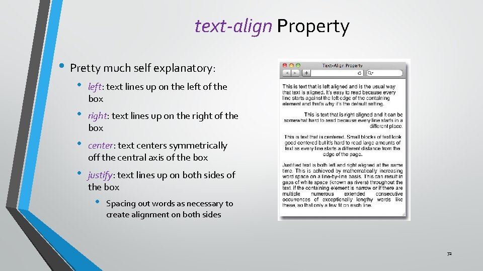
text-align Property • Pretty much self explanatory: • left: text lines up on the left of the box • right: text lines up on the right of the box • center: text centers symmetrically off the central axis of the box • justify: text lines up on both sides of the box • Spacing out words as necessary to create alignment on both sides 72