Chapter 9 Regression Wisdom math 2200 Sifting residuals


 • Researchers recorded about 77 breakfast cereals, including")
 • It is a good idea to look")
 • An examination of residuals often leads us")
 • Regression lines fit to calories and sugar for each of")

 • The curved relationship between fuel efficiency and weight")


 • A regression of mean age at first marriage for men")


 • A point with high leverage has the")


 • The following scatterplot shows that the average")
 • This new scatterplot shows that the average")


 • There is a strong, positive, linear association")
 • If instead of data on individuals we")
 • Means vary less than individual values. •")

 • Look for unusual points. – Unusual points")
 • Treat unusual points honestly. – Don’t just")

 • Even a good regression doesn’t mean we")
- Slides: 40
Chapter 9 Regression Wisdom math 2200
Sifting residuals for groups • Residuals: ‘left over’ after the model • How to examine residuals? – Residual plot: residuals against fitted values or residuals against x variable. – Histogram
Sifting Residuals for Groups (cont. ) • Researchers recorded about 77 breakfast cereals, including Calories and Sugar content (in grams) of a serving. • The linear regression gives the intercept 89. 6, the slope 2. 5 and Rsquared 0. 3182.
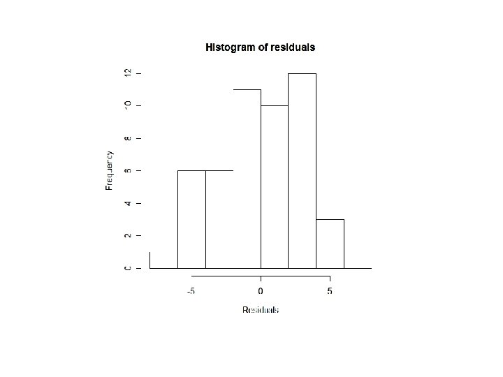
Sifting Residuals for Groups (cont. ) • It is a good idea to look at both a histogram of the residuals and a scatterplot of the residuals vs. predicted values: • The small modes in the histogram are marked with different colors and symbols in the residual plot above. What do you see?
Sifting Residuals for Groups (cont. ) • An examination of residuals often leads us to discover groups of observations that are different from the rest. • When we discover that there is more than one group in a regression, we may decide to analyze the groups separately, using a different model for each group. – All the data must come from the same group. – E. g. , models for men are different from models for female
Subsets (cont. ) • Regression lines fit to calories and sugar for each of the three cereal shelves in a supermarket:
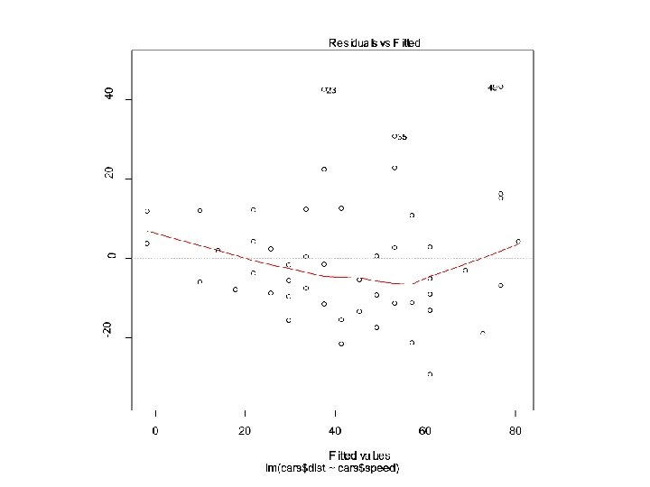
Getting the “bends” • Linear regression is used to model linear relationship! – Sounds obvious? – Many people make such mistakes. – Reasons • People take it for granted • Sometimes hard to tell from the scatterplot of the data – What to do? • Look at residual plots
Getting the “Bends” (cont. ) • The curved relationship between fuel efficiency and weight is more obvious in the plot of the residuals than in the original scatterplot:
Extrapolation • Extrapolation – make a prediction at a x-value beyond the range of the data – Be careful! – It is only valid when you assume that the relationship does not change even at extreme values of x – Extrapolations can get you into deep trouble. You’re better off not making extrapolations.
Example • • Y: age at first marriage X: year of the century (1900 is 0) From 1900 to 1940 Regression line – Age = 25. 7 - 0. 04 * year • R^2 = 0. 926 • Slope = -0. 04 – First marriage for men was falling at a rate of about 4 years per century • Intercept = 25. 7 – Mean age of men at first marriage at 1900 • Make a prediction at year 2000? – Predicted age = 21. 7 – Reality is almost 27 years – What’s wrong?
Extrapolation (cont. ) • A regression of mean age at first marriage for men vs. year fit to the years from 1890 - 1998 does not hold for later years: n After 1950, linearity did not hold.
Predicting the future • Who does this? – Seers, oracles, wizards – Mediums, fortune-tellers, Tarot card readers – Scientists, e. g. , statisticians, economists
Prediction is difficult, especially about the future Here’s some more realistic advice: If you must extrapolate into the future, at least don’t believe that the prediction will come true.
Example • Mid 1970’s, in the midst of an energy crisis – – Oil price surged $3 a barrel in 1970 $15 a barrel a few years later Using 15 top econometric forecasting models (built by groups that included Nobel winners) – Prediction at 1985 is $50 to $200 a barrel – What is the reality? • Price in 1985 is even lower than in 1975 (after accounting for inflation) • In year 2000, oil price is about $7 in 1975 dollars – Why wrong? • All models assumed that oil prices would continue to rise at the same rate or even faster
Example: presidential election in Florida • 2000 U. S. presidential election – – George W. Bush Al Gore Pat Buchanan Ralph Nader • Generally, Nader earns more votes than Buchanan • Regression model – Y: Buchanan’s votes – X: Nader’s votes • Regression model – Buchanan = 50. 3 + 0. 14 Nadar – R^2 = 0. 428
Example • Regression model – Y: Buchanan’s votes – X: Nader’s votes • Regression model – Buchanan = 50. 3 + 0. 14 Nadar – R^2 = 0. 428
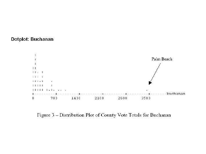
Outliers • The following scatterplot shows that something was awry in Palm Beach County, Florida, during the 2000 presidential election…
Outliers • The red line shows the effects that one unusual point can have on a regression:
Outliers • Palm Beach County • Butterfly ballot may confuse the voters • If we remove Palm Beach County – R^2 = 0. 821 – Slope = 0. 1 • Outliers: data point with a large residual
Butterfly ballot
Leverage • Points extraordinary in x can especially influence a regression model, we say they have high leverage.
High leverage points • • Has the potential to change the regression line Does not always influnece the slope Removing a high-leverage point decrease R^2 High leverage points can hide in residual plots – Better use to scatter plot of the data the find it out
Outliers, Leverage, and Influence (cont. ) • A point with high leverage has the potential to change the regression line. • We say that a point is influential if omitting it from the analysis gives a very different model. • How to identify influential points? – High-leverage points + model outliers – By finding a regression model with and without the points.
Influential points • Example: IQ and Shoe Size – Y = IQ – X = shoe size – With the influential point • Y=93. 3265 + 2. 08318 * X • R^2 = 0. 248 – Without the influential point • Y=105. 458 + 0. 460194 * X • R^2 = 0. 007
Lurking Variables and Causation • Once again! • People often interpret a regression line by – A change of 1 unit in x results in a change of b 1 units in y – This often gives an impression of causation – But NOT true! • With observational data, as opposed to data from a designed experiment, there is no way to be sure that a lurking variable is not the cause of any apparent association.
Lurking Variables and Causation (cont. ) • The following scatterplot shows that the average life expectancy for a country is related to the number of doctors person in that country. There is a strong positive association (R-squared = 62. 4%) between the two variables.
Lurking Variables and Causation (cont. ) • This new scatterplot shows that the average life expectancy for a country is related to the number of televisions person in that country. The positive association here is even stronger (R-squared = 72. 3%)
Lurking Variables and Causation • Since televisions are cheaper than doctors, send TVs to countries with low life expectancies in order to extend lifetimes. Right? • How about considering a lurking variable? That makes more sense… – Countries with higher standards of living have both longer life expectancies and more doctors (and TVs!). – If higher living standards cause changes in these other variables, improving living standards might be expected to prolong lives and increase the numbers of doctors and TVs.
Working With Summary Values • Usually, summary statistics vary less than the data on the individuals do. • For example, – If we use the group means as x instead of the original data – Then we see less variation – Hence a stronger association – But this is not the truth – We are overestimating R^2
Working With Summary Values (cont. ) • There is a strong, positive, linear association between weight (in pounds) and height (in inches) for men:
Working With Summary Values (cont. ) • If instead of data on individuals we only had the mean weight for each height value, we would see an even stronger association:
Working With Summary Values (cont. ) • Means vary less than individual values. • Scatterplots of summary statistics show less scatter than the baseline data on individuals. – This can give a false impression of how well a line summarizes the data. • There is no simple correction for this phenomenon. – Once we have summary data, there’s no simple way to get the original values back.
What Can Go Wrong? • Make sure the relationship is straight. – Check the Straight Enough Condition. • Be on guard for different groups in your regression. – If you find subsets that behave differently, consider fitting a different linear model to each subset. • Beware of extrapolating. • Beware especially of extrapolating into the future!
What Can Go Wrong? (cont. ) • Look for unusual points. – Unusual points always deserve attention and that may well reveal more about your data than the rest of the points combined. • Beware of high leverage points, and especially those that are influential. – Such points can alter the regression model a great deal. • Consider comparing two regressions. – Run regressions with extraordinary points and without and then compare the results.
What Can Go Wrong? (cont. ) • Treat unusual points honestly. – Don’t just remove unusual points to get a model that fits better. • Beware of lurking variables—and don’t assume that association is causation. • Watch out when dealing with data that are summaries. – Summary data tend to inflate the impression of the strength of a relationship.
What have we learned? • There are many ways in which a data set may be unsuitable for a regression analysis: – Watch out for subsets in the data. – Examine the residuals to re-check the Straight Enough Condition. – Consider Does the Plot Thicken? Condition. – The Outlier Condition means two things: • Points with large residuals or high leverage (especially both) can influence the regression model significantly.
What have we learned? (cont. ) • Even a good regression doesn’t mean we should believe the model completely: – Extrapolation far from the mean can lead to silly and useless predictions. – An R 2 value near 100% doesn’t indicate that there is a causal relationship between x and y. • Watch out for lurking variables. – Watch out for regressions based on summaries of the data sets. • These regressions tend to look stronger than the regression on the original data.