Unit 2 Exploratory data analysis Detective Chong Ho
 Yu")


: Residual analysis Re expression (data transformation) Resistant")

 Proposed that the earth and other planets orbit around the")
 The founder of modern genetics Physical properties of species are")
 Substantiated Einstein’s theory of general relativity by observing the positions")


 10 raises power to")


 DV: yield IV:")


 Quadratic = 2 turns Cubic = 3 turns Quartic =")


 advises that transformation should be used appropriately; Many")


 USA and East Asian students")


- Slides: 69
Unit 2: Exploratory data analysis Detective Chong Ho (Alex) Yu
What isn't EDA does not mean lack of planning or messy planning. “I don't know what I am doing; just ask as many questions as possible in the survey; I don't need a well conceptualized research question or a well planned research design. Just explore. ” EDA is not fishing or p hacking EDA is not opposed to confirmatory data factor (CDA) e. g. check assumptions, residual analysis, model diagnosis.
What is EDA? A philosophy about how data analysis should be carried out, rather than being a fixed set of techniques. Pattern seeking Skepticism (detective spirit) Abductive reasoning John Tukey (not Turkey): Explore the data in as many ways as possible until a plausible story of the data emerges (Like a detective). The precursor of data mining
Abduction Introduced by Charles Sanders Pierce. The surprising phenomenon, X, is observed. Among hypotheses A, B, and C, A is capable of explaining X. Hence, there is a reason to pursue A
Abduction At most, abduction could provide a conjecture or a potential hypothesis A to pursue, but it would not confirm or disconfirm A Inference to the best explanation (IBE): similar to abduction, modified by Harmon. But it is not the same. After inquiry, we found multiple competing theories that can explain the phenomenon. Pick the best one! Criterion: most explanatory power
IBE: Pick the best! It is like that you interviewed ten persons from e harmony or Christian Mingle, and then you pick the best one to be your wife/husband.
Elements of EDA Velleman & Hoaglin (1981): Residual analysis Re expression (data transformation) Resistant Display (revelation, data visualization)
Residual Data = fit + residual Data = model + error Data = signal + noise Residual is a modern concept. In the past many scientists ignored it. They reported the “fit” only Johannes Kepler Gregor Mendel Arthur Eddington
Johnannes Kepler (1571 1630) Proposed that the earth and other planets orbit around the sun in an elliptical fashion. Kepler worked under another well known astronomer, Brahe, who collected a huge database of planetary orbits. Using Brahe's data, Kepler found data to fit into the elliptical hypothesis. Almost 400 years later when William Donahue redid Kepler's calculation and found that the orbit data and the elliptical model do not fit each other as claimed.
Gregor Mendel (1824 1884) The founder of modern genetics Physical properties of species are subject to heredity. Mendel conducted a fertilization experiment to confirm his belief. R. A. Fisher (1936) questioned the validity of Mendel's study. Fisher pointed out that Mendel's data seemed "too good to be true. " Using Chi square tests, Fisher found that Mendel's results were so close to what would be expected that such agreement could happen by chance less than once in 10, 000 times.
Arthur Eddington (1882 1944) Substantiated Einstein’s theory of general relativity by observing the positions of stars during the 1919 solar eclipse. In the 1980 s scholars found that Eddington did collect sufficient data to reach a conclusion. Rather, he distorted the result to make it fit theory. Did they falsify data? Not necessary. They might not understand every model could have residuals.
Random residual plot Ideally speaking, no systematic pattern Normal distribution The mean of residuals is close to zero.
Strange residual patterns Non random, systematic Check the data!
Robust residual Robust regression in SAS The residual plot tags the influential points (less severe) and outliers (more severe).
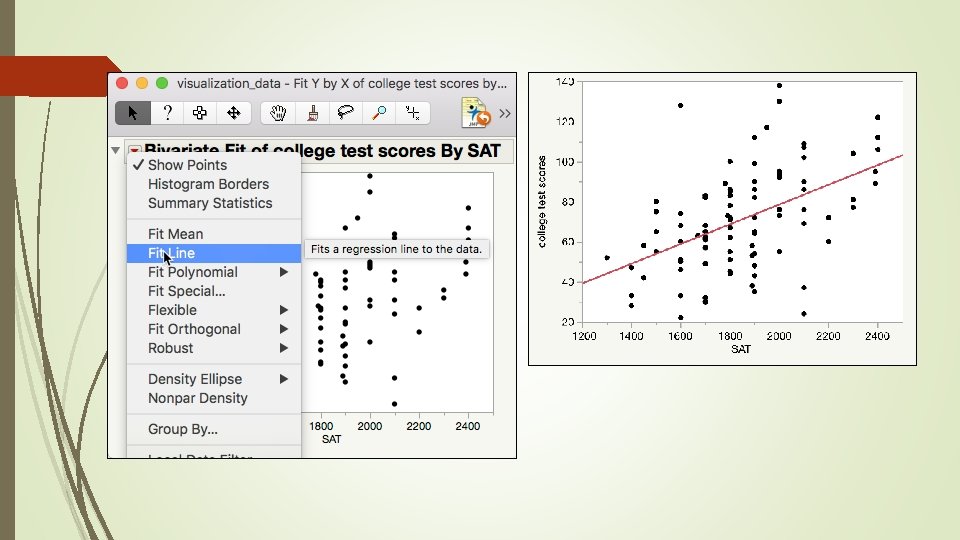
Example Download and open “visualization_data. jmp” Can SAT predict college academic performance? Open Analyze from the pull down menu Put SAT into X and college test scores into Y, Press OK Until SPSS, SAS/JMP shows the scatterplot: It forces you to check the data pattern. Contextual menu
95% density ellipse: Assume bivariate normality, stretching from the centroid the ellipse covers 95% of the data. The data points outside the coverage are considered outliers.
Example Click on the extreme case. Hold down the control key and select all three one by one. Right click on the extreme cases, select Row Hide and Exclude. Choose Fit Line again from the reversed red triangle.
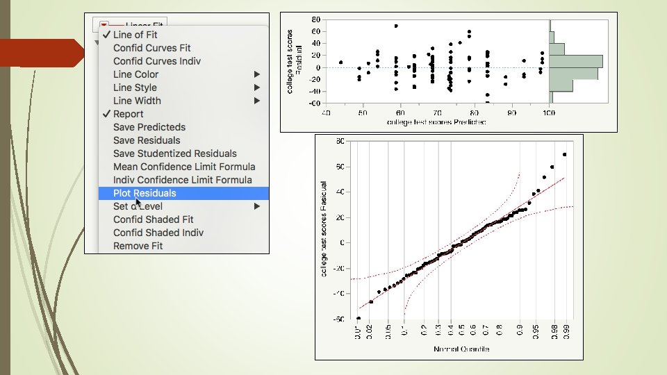
Example Choose Plot Residuals from the Second Linear Fit. Now are the residuals better?
Example The normal quantile plot should be sufficient. But if you are a perfectionist, you can output the residuals from the two linear fits into data columns Select both residuals, choose Distribution from Analyze, and press OK. SAS. JMP use the e notation. The mean of the second residuals is closer to zero.
Assignment 1 Download and open visualization_data. jmp Choose Fit Y from X from the pull down menu Analyze Put SAT into X and college test scores into Y Press OK From the inversed red triangle choose Density Ellipse: . 99 How many outlier(s) is/are identified? Remove the outlier(s) and run a regression model by choosing Fit Line Run a residual diagnosis by choosing Plot Residuals from Linear Fit. Save the result by choosing Save script to data table from the reversed red triangle. Is this one better than the previous two models?
Re expression or transformation Parametric tests require certain assumptions e. g. normality, homogeneity of variances, linearity. . . etc. When your data structure cannot meet the requirements, you need a transformer (ask Autobots, not Deceptions)!
Transformers! Normalize the distribution: log transformation or inverse probability Stabilize the variance: square root transformation: y* = sqrt(y) Linearize the trend = log transformation (but sometime it is better to use nonlinear fit, will be discussed later)
Log transformation Logarithm is the inverse of exponential (raise power) 10 raises power to 3 is 103: 10 X 10 = 1, 000 The log base can be any integer. It could be log 2, log 5, log 10. Log 2(64) = 6 because 64 = 26 = 2 X 2 X 2 X 2 Log() is called natural log Log 10 is called common log
Skewed distribution Open Worldbank_data. I want to know whether publication of scientific studies and patents can predict GDP per worker. The distributions of publication of scientific studies and patents are skewed. A few countries (e. g. US, Japan, Korea) have the most. But I cannot remove these “outliers” because they are major nations.
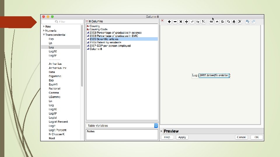
Solution: Data transformation You can create the transformed variable while doing analysis by right clicking the original variable. Faster, but will not store the new variable. You cannot preview the distribution.
JMP Create a permanent new variable for re analysis later. Double click on a new column. Choose Formula in Column properties. Click Edit formula.
Explore different transformation options The key of exploratory data analysis is: Explore! I tried both log and log 10 transformation Log 10 is better
Before and after Regression with transformed variables makes much more sense!
Assignment 2 Use the same data set “Wordlbank_data. jmp” Try different transformation options for 2005 patents by residents. Pick the best transformed variable to predict 2007 GDP person employed. Log, log 10, or something else?
Before and after Regression with transformed variables makes much more sense!
Example from JMP Sample data set “Corn. jmp” (under Nonlinear modeling) DV: yield IV: nitrate
Skewed distributions Both DV and IV distributions are skewed. What regression result would you expect?
Remove outliers? § § Three observations are located outside the boundary of the 99% density ellipse (the majority of the data) Only one is considered an outlier.
Remove outliers? Removing the two observations at the lower left will not make things better. They fall along the nonlinear path.
Transform yield only Remove the outlier at the far right. It didn't look any better.
Transform nitrate only The regression model looks linear. It is acceptable, but the underlying pattern is really nonlinear.
Graph Builder: Interactive nonlinear fit
Linear model is too simplistic and underfit
Overfit and complicated model
Smooth things out: Almost right • Lambda: Smoothing parameter • Not a bad model, but the data points at the lower left are neglected.
Fit polynomial (nonlinear fit) Quadratic = 2 turns Cubic = 3 turns Quartic = 4 turns Quintic = 5 turns, take the lower left into account, but too complicated (too many turns)
Fit spline Flexible: Fit Spline Like Graph Builder, in Fit Spline you can control the curve interactively. It shows you the R square (variance explained), too. It still does not take the lower left data into account.
Kernel Smoother Local smoother: take localized variations and patterns into account. Interactive, too But the line still does not go towards the data points at the lower left.
No data points left behind!
Fit Curve Specialized modeling: Fit curve MM has the lowest AICc and it takes the data points at the lower left into account. Should we take it? MM is a specific model of enzyme kinetics in biochemistry.
Fit nonlinear Specialized modeling: Nonlinear Custom made formula for data transformation. You need prior research to support it. You cannot makeup a transformation or an equation.
Fit special It works! Now the line passes through all data points! Yeah!
I am the best transformer!
Assignment Transform yourself into a Pink Volkswagen or a GMC truck.
Caution! Different to interpret Osborne (2002) advises that transformation should be used appropriately; Many transformations reduce non normality by changing the spacing between data points, but this raises issues in data interpretation. If transformations are done correctly, all data points should remain in the same relative order as prior to the transformation. In this way the interpretation of the scores is not affected. It might be problematic if the original variables were meant to be interpreted directly, such as annual income and age. After the transformations, the new variables may become significantly more complex to interpret.
Resistance is not the same as robustness. Resistance: Immune to outliers Robustness: immune to parametric assumption violations Use median, trimean, winsorized mean, trimmed mean to countermeasure outliers, but it is less important today (will be explained next).
Data visualization: Revelation Today some people still refuse to use graphing methods. Data visualization is the primary tool of EDA. Without “seeing” the data pattern, . . . how can you know whether the residuals are random or not? how can you spot the skewed distribution, nonlinear relationship, and decide whether transformation is needed? how can you detect outliers and decide whether you need resistance or robust procedures? DV will be explained in detail in the next unit.
Data visualization One of the great inventions of graphical techniques by John Tukey is the boxplot. It is resistant against extreme cases (use the median) It can easily spot outliers. It can check distributional assumption using a quick 5 point summary.
Data visualization Boxplot can be used in median smoothing when there are too any data. These are 14, 819 responses to the Consideration of Future Consequences Scale (CFCS). When the n is huge, even random numbers might appear to be good. To demonstrate the problem, Q 13 and Q 14 are randomly generated. The Cronbach Alpha looks good! No bad items!
Data visualization can distinguish patterns from noise. Open Graph Builder I want to know whether Q 1 is strongly correlated with the total scale (Q 2 Q 14). Q 1 is not included into total because Q 1 is correlated with itself. Put Total without Q 1 into Y Put Q 1 into X Too many data points!
Data visualization Change the display option to Boxplot. Now the median of the total by each category of Q 1 is shown. There is a positive relationship between Q 1 and all other items.
Data visualization When I use median – smoothing to check the association between Q 13 and total without Q 13. , it was found that there is no relationship.
Assignment 3 Download and open the data set “CFCS. jmp” Open Graph Builder Put Total without Q 2 into Y Put Q 2 into X Change the display to boxplot Is there a strong relationship between Q 2 and all other items (Total without Q 2)? Do the same to Total without Q 14 and Q 14 s there a strong relationship between Q 14 and all other items (Total without Q 14)? Save both scripts to data tables
NIST Semantech’s Taxonomy of EDA Some are overlapped and some are vague Maximizing insight Uncovering underlying structure Extracting important variables Detecting outliers and anomalies Testing underlying assumptions Developing parsimonious models Determining optimal factor settings
Issues of classical EDA taxonomies Some classical EDA techniques are less important because today many new procedures. . . do not require parametric assumptions or are robust against the violations (e. g. decision tree, generalized regression). Are immune against outliers (e. g. decision tree, two step clustering). Can handle strange data structure or perform transformation during the process (e. g. artificial neural networks).
Issues of classical EDA taxonomies The classical taxonomy of is tied to both the attributes of the data (e. g. , distribution, linearity, outliers, measurement scales, etc. ) and the final goals (e. g. , detecting clusters, patterns, and relationships). However, understanding the attributes of the data is just the means instead of the ends.
Goal oriented taxonomy of EDA Detecting data clusters (the detail will be explained in the unit “Cluster analysis”) Screening variables : e. g. Predictor screening (will be explained in the units about generalized regression, decision tree, bagging, and boosting) Recognizing patterns and relationships (will be discussed in the unit about data mining: neural networks)
Predictor screening 2015 Programme for International Student Assessment (PISA) USA and East Asian students only (n = 54978) I want to know what factors can predict math performance There are too many variables. I need preliminary screening (variable selection). With this large sample size, running regression is problematic. Analyze Screening Predictor Screening
Predictor screening
Predictor screening
EDA and data mining Same: Data mining is an extension of EDA: it inherits the exploratory spirit; don't start with a preconceived hypothesis. Both heavily rely on data visualization. Difference: DM: Use machine learning and resampling DM: More robust DM: Deal with much bigger sample size