Graphing Make sure you are viewing this power
- Slides: 29

Graphing Make sure you are viewing this power point in SLIDE SHOW mode!

WHAT YOU WILL NEED! You are going to need either graph paper or the ability to print out the Graph paper document we have on our Website under MATH. You will need several copies of this graph paper because you will be creating several graphs. If you can, it would helpful to print out the document called “Steps to Creating a Graph!” You can have this document as reference as you create each graph.

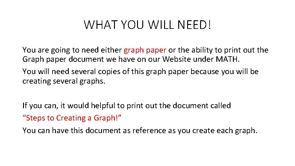
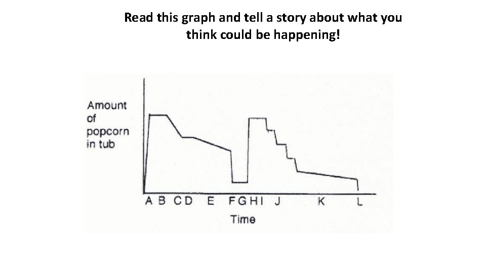
Read this graph and tell a story about what you think could be happening!

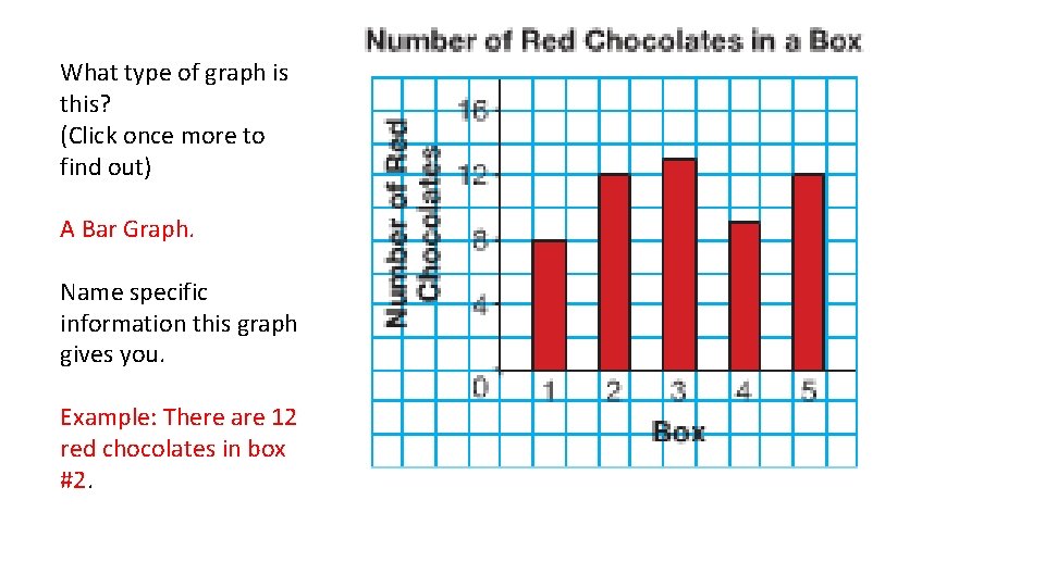
What type of graph is this? (Click once more to find out) A Bar Graph. Name specific information this graph gives you. Example: There are 12 red chocolates in box #2.

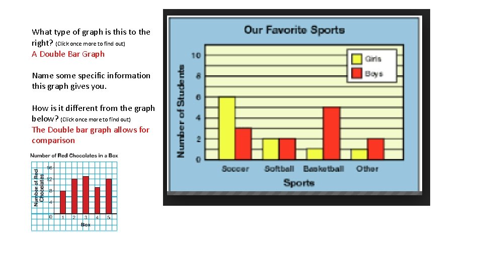
What type of graph is this to the right? (Click once more to find out) A Double Bar Graph Name some specific information this graph gives you. How is it different from the graph below? (Click once more to find out) The Double bar graph allows for comparison

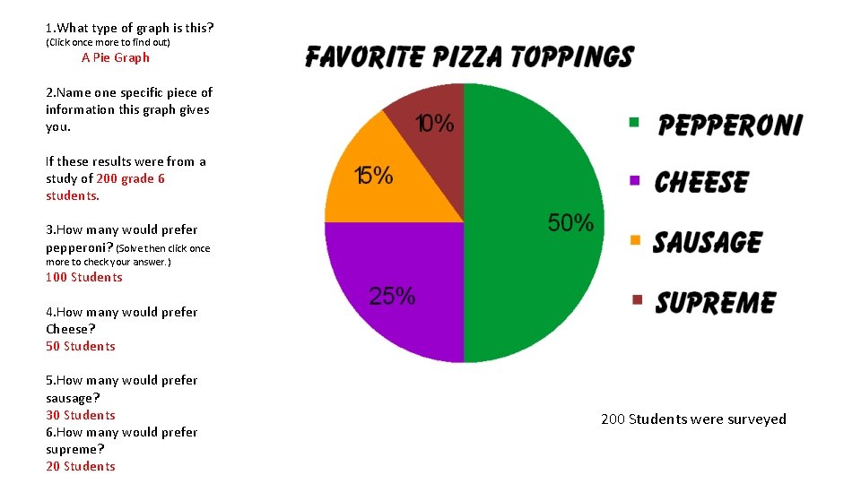
1. What type of graph is this? (Click once more to find out) A Pie Graph 2. Name one specific piece of information this graph gives you. If these results were from a study of 200 grade 6 students. 3. How many would prefer pepperoni? (Solve then click once more to check your answer. ) 100 Students 4. How many would prefer Cheese? 50 Students 5. How many would prefer sausage? 30 Students 6. How many would prefer supreme? 20 Students 200 Students were surveyed

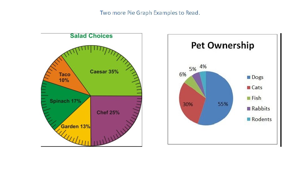
Two more Pie Graph Examples to Read.

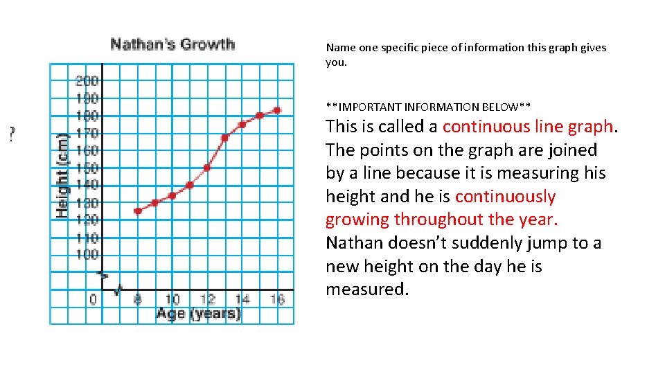
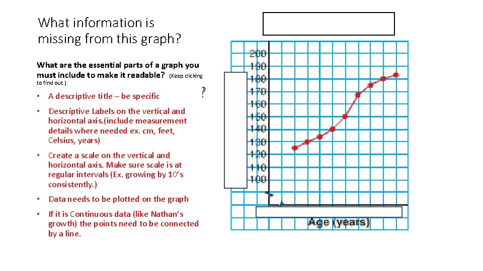
Name one specific piece of information this graph gives you. **IMPORTANT INFORMATION BELOW** This is called a continuous line graph. The points on the graph are joined by a line because it is measuring his height and he is continuously growing throughout the year. Nathan doesn’t suddenly jump to a new height on the day he is measured.

What information is missing from this graph? What are the essential parts of a graph you must include to make it readable? (Keep clicking to find out. ) • A descriptive title – be specific • Descriptive Labels on the vertical and horizontal axis. (include measurement details where needed ex. cm, feet, Celsius, years) • Create a scale on the vertical and horizontal axis. Make sure scale is at regular intervals (Ex. growing by 10’s consistently. ) • Data needs to be plotted on the graph • If it is Continuous data (like Nathan’s growth) the points need to be connected by a line.

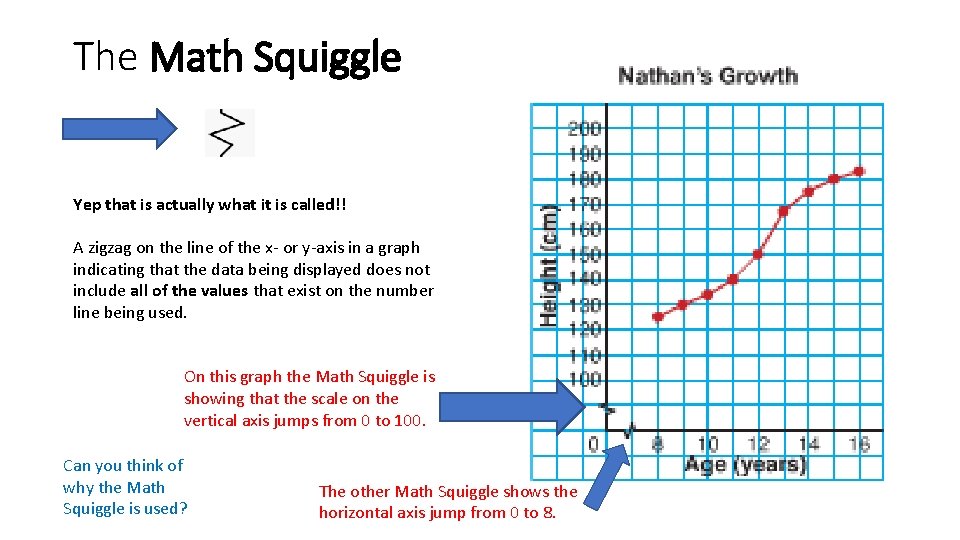
The Math Squiggle Yep that is actually what it is called!! A zigzag on the line of the x- or y-axis in a graph indicating that the data being displayed does not include all of the values that exist on the number line being used. On this graph the Math Squiggle is showing that the scale on the vertical axis jumps from 0 to 100. Can you think of why the Math Squiggle is used? The other Math Squiggle shows the horizontal axis jump from 0 to 8.

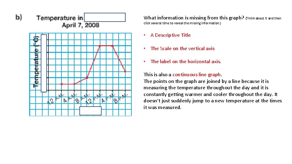
What information is missing from this graph? (Think about it and then click several time to reveal the missing information. ) • A Descriptive Title • The Scale on the vertical axis • The label on the horizontal axis. This is also a continuous line graph. The points on the graph are joined by a line because it is measuring the temperature throughout the day and it is constantly getting warmer and cooler throughout the day. It doesn’t just suddenly jump to a new temperature at the times it was measured.

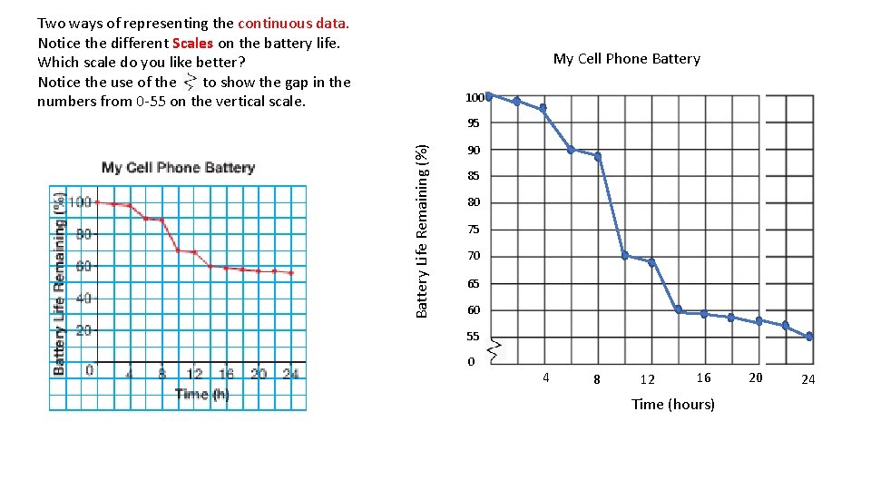
Two ways of representing the continuous data. Notice the different Scales on the battery life. Which scale do you like better? Notice the use of the to show the gap in the numbers from 0 -55 on the vertical scale. My Cell Phone Battery 100 Battery Life Remaining (%) 95 90 85 80 75 70 65 60 55 0 4 8 12 16 Time (hours) 20 24

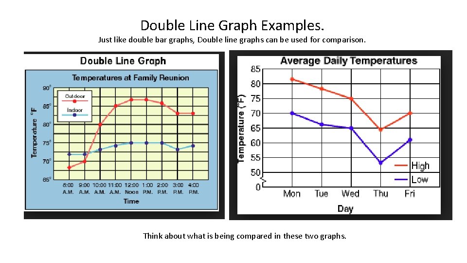
Double Line Graph Examples. Just like double bar graphs, Double line graphs can be used for comparison. Think about what is being compared in these two graphs.

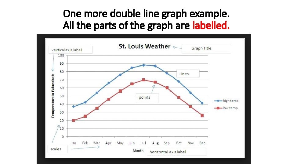
One more double line graph example. All the parts of the graph are labelled.

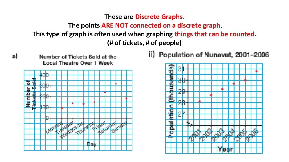
These are Discrete Graphs. The points ARE NOT connected on a discrete graph. This type of graph is often used when graphing things that can be counted. (# of tickets, # of people)

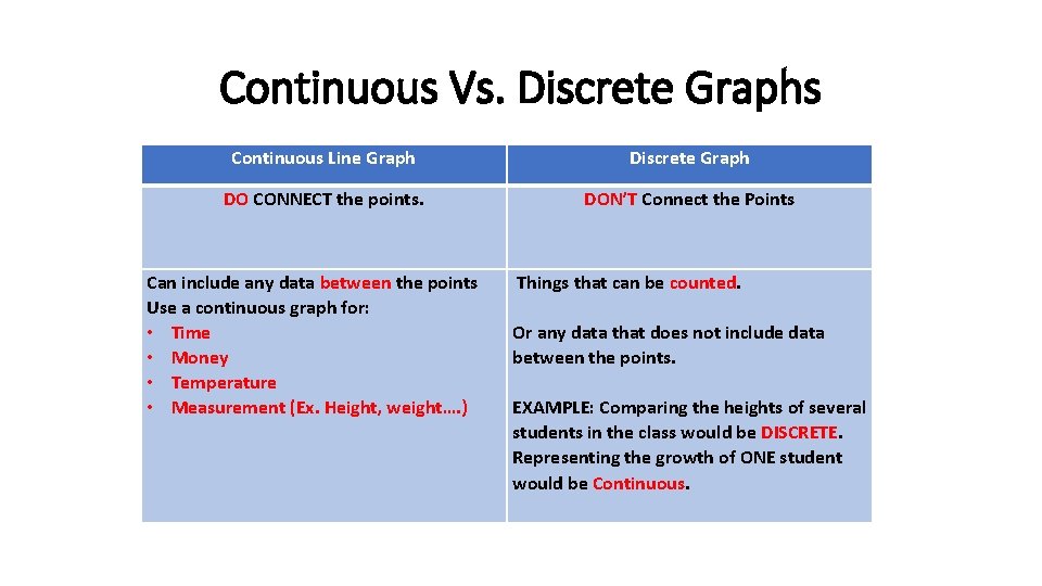
Continuous Vs. Discrete Graphs Continuous Line Graph Discrete Graph DO CONNECT the points. DON’T Connect the Points Can include any data between the points Use a continuous graph for: • Time • Money • Temperature • Measurement (Ex. Height, weight…. ) Things that can be counted. Or any data that does not include data between the points. EXAMPLE: Comparing the heights of several students in the class would be DISCRETE. Representing the growth of ONE student would be Continuous.

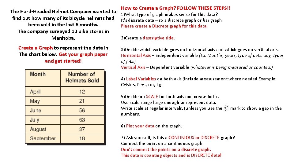
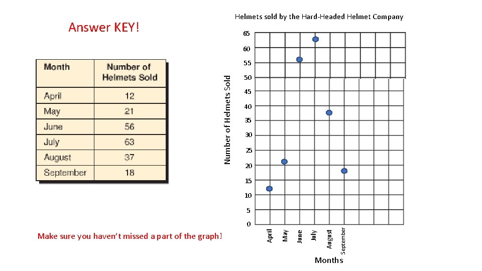
The Hard-Headed Helmet Company wanted to find out how many of its bicycle helmets had been sold in the last 6 months. The company surveyed 10 bike stores in Manitoba. Create a Graph to represent the data in The chart below. Get your graph paper and get started! How to Create a Graph? FOLLOW THESE STEPS!! 1)What type of graph makes sense for this data? It’s discrete data – so a discrete graph or bar graph Please create a Discrete graph for this data. 2)Create a descriptive title. 3)Decide which variable goes on horizontal axis and which goes on vertical axis. Horizontal Axis – independent variable (Ex. Months, years, type of pets, day, types of jobs) Vertical Axis – Dependent variable (whatever is being measured or counted. ) 4) Label Variables on both axis (include measurement where needed Example: Celsius, Feet, cm, kg) 5)Decide on SCALE for both axis and create both. Use scale range large enough to represent data. Write scale at regular intervals. (unless you use the numbers. mark to show a gap in the 6) Plot your data on the graph. 7) Ask yourself, is this a CONTINIOUS or DISCRETE graph? Connect the point on a continuous graph. Don’t connect the points on a discrete graph. This data is counting objects and is DISCRETE data!

Helmets sold by the Hard-Headed Helmet Company Answer KEY! 65 60 Number of Helmets Sold 55 50 45 40 35 30 25 20 15 10 August July June May Make sure you haven’t missed a part of the graph! April 0 September 5 Months

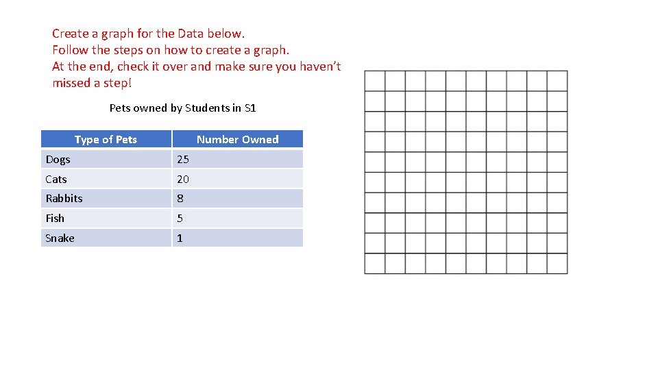
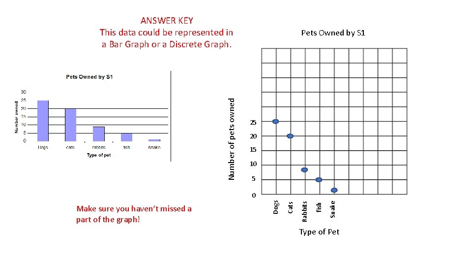
Create a graph for the Data below. Follow the steps on how to create a graph. At the end, check it over and make sure you haven’t missed a step! Pets owned by Students in S 1 Type of Pets Number Owned Dogs 25 Cats 20 Rabbits 8 Fish 5 Snake 1

Number of pets owned ANSWER KEY This data could be represented in a Bar Graph or a Discrete Graph. Pets Owned by S 1 25 20 15 10 5 Snake fish Rabbits Cats Make sure you haven’t missed a part of the graph! Dogs 0 Type of Pet

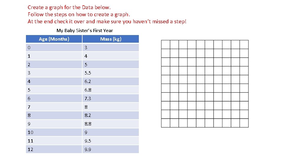
Create a graph for the Data below. Follow the steps on how to create a graph. At the end check it over and make sure you haven’t missed a step! My Baby Sister’s First Year Age (Months) Mass (kg) 0 3 1 4 2 5 3 5. 5 4 6. 2 5 6. 8 6 7. 3 7 8 8 8. 2 9 8. 8 10 9 11 9. 5 12 9. 9

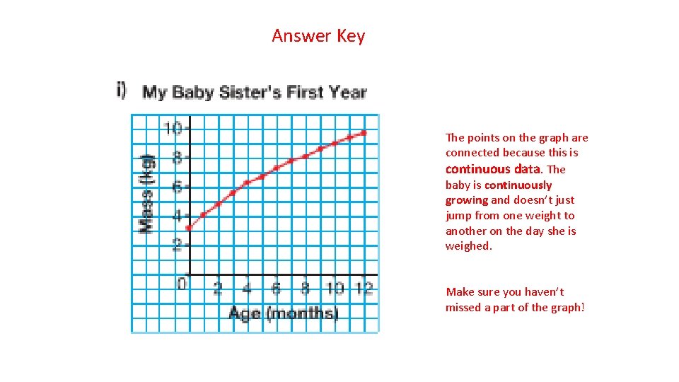
Answer Key The points on the graph are connected because this is continuous data. The baby is continuously growing and doesn’t just jump from one weight to another on the day she is weighed. Make sure you haven’t missed a part of the graph!

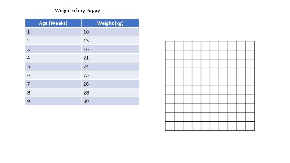
Weight of my Puppy Age (Weeks) Weight (kg) 1 10 2 13 3 16 4 21 5 24 6 25 7 26 8 28 9 30

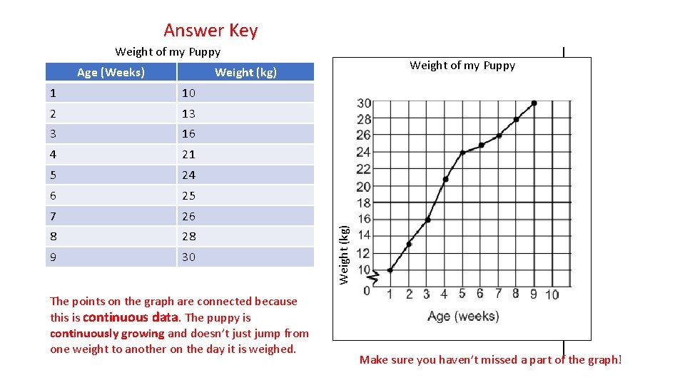
Answer Key Weight of my Puppy Weight (kg) 1 10 2 13 3 16 4 21 5 24 6 25 7 26 8 28 9 30 The points on the graph are connected because this is continuous data. The puppy is continuously growing and doesn’t just jump from one weight to another on the day it is weighed. Weight (kg) Age (Weeks) Make sure you haven’t missed a part of the graph!

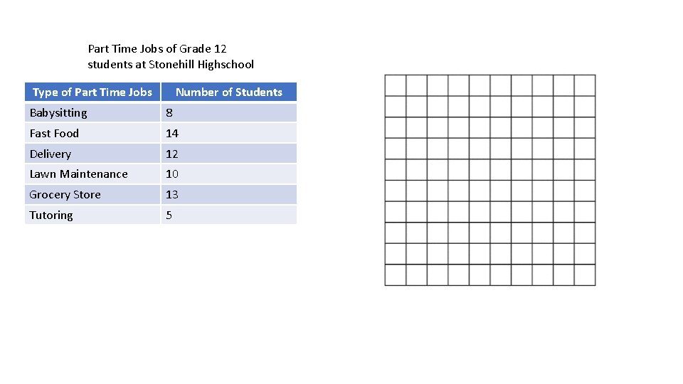
Part Time Jobs of Grade 12 students at Stonehill Highschool Type of Part Time Jobs Number of Students Babysitting 8 Fast Food 14 Delivery 12 Lawn Maintenance 10 Grocery Store 13 Tutoring 5

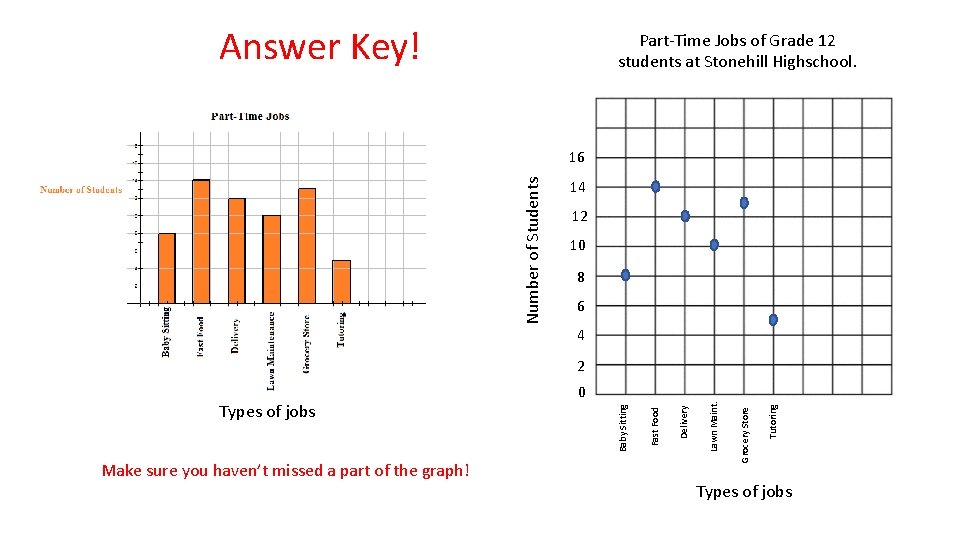
Answer Key! Part-Time Jobs of Grade 12 students at Stonehill Highschool. Number of Students 16 14 12 10 8 6 4 2 Tutoring Lawn Maint. Delivery Fast Food Grocery Store Make sure you haven’t missed a part of the graph! Baby Sitting Types of jobs 0 Types of jobs

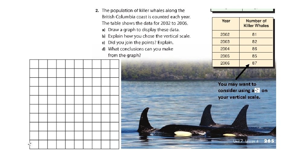
You may want to consider using a on your vertical scale.

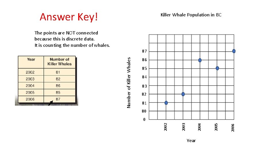
Answer Key! Killer Whale Population in BC The points are NOT connected because this is discrete data. It is counting the number of whales. 86 85 84 83 82 81 80 Year 2006 2005 2004 2003 0 2002 Number of Killer Whales 87

Print and Complete the Graphing Practice Pages posted on our Website under Math. (or complete the work on loose leaf/graph paper if you don’t have access to a printer) Take a picture of your completed pages and send them in using Seesaw! The Answer Key is provided so you can check your work as you go to make sure you are on the right track. If you make and error, take the time to figure out why.