Chapter 4 Part 1 Displaying and Summarizing Quantitative













- Slides: 83

Chapter 4 Part 1 Displaying and Summarizing Quantitative Data

Objectives • Histogram • Stem-and-leaf plot • Dotplot • Shape • Center • Spread • Outliers • Mean • Median • Range • Interquartile range (IQR) • Percentile • 5 -Number summary* • Resistant • Variance • Standard Deviation

Dealing With a Lot of Numbers… • Summarize the data, that will help us when we look at large sets of quantitative data, to grasp what data tell us – make a quantitative frequency table. • Display the summarized data. The best thing to do is to make a picture… • We can’t use bar charts or pie charts for quantitative data, since those displays are for categorical variables. • Therefore, display quantitative data using …

• Histograms or stem-and-leaf plots These are summary graphs for a single variable. They are very useful to understand the pattern of variability in the data. • Line graphs: time plots Use when there is a meaningful sequence, like time. The line connecting the points helps emphasize any change over time. • Other graphs to reflect numerical summaries are Dotplots and Cumulative Frequency Curves

Quantitative Data HISTOGRAM

Histogram • To make a histogram we first need to organize the data using a quantitative frequency table. • Two types of quantitative data 1. Discrete – use ungrouped frequency table to organize. 2. Continuous – use grouped frequency table to organize.

Quantitative Frequency Tables – Ungrouped • An ungrouped frequency table simply lists the data values with the corresponding frequency counts with which each value occurs. • Commonly used with discrete quantitative data.

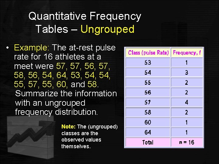
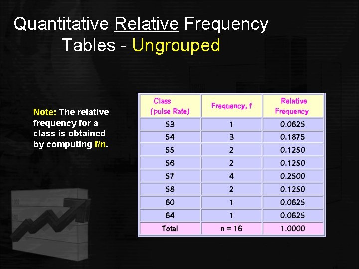
Quantitative Frequency Tables – Ungrouped • Example: The at-rest pulse rate for 16 athletes at a meet were 57, 56, 57, 58, 56, 54, 64, 53, 54, 55, 57, 55, 60, and 58. 58 Summarize the information with an ungrouped frequency distribution. Note: The (ungrouped) classes are the observed values themselves.

Quantitative Relative Frequency Tables - Ungrouped Note: The relative frequency for a class is obtained by computing f/n.

Quantitative Frequency Tables – Grouped • A grouped frequency table is obtained by constructing classes (or intervals) for the data, and then listing the corresponding number of values (frequency counts) in each interval. • Commonly used with continuous quantitative data. • Grouped frequency tables are used to construct histograms.

Quantitative Frequency Tables – Grouped There are several procedures that one can use to construct a grouped frequency tables. • A frequency table should have a minimum of 5 classes and a maximum of 20 classes. • For small data sets, one can use between 5 and 10 classes. • For large data sets, one can use up to 20 classes.

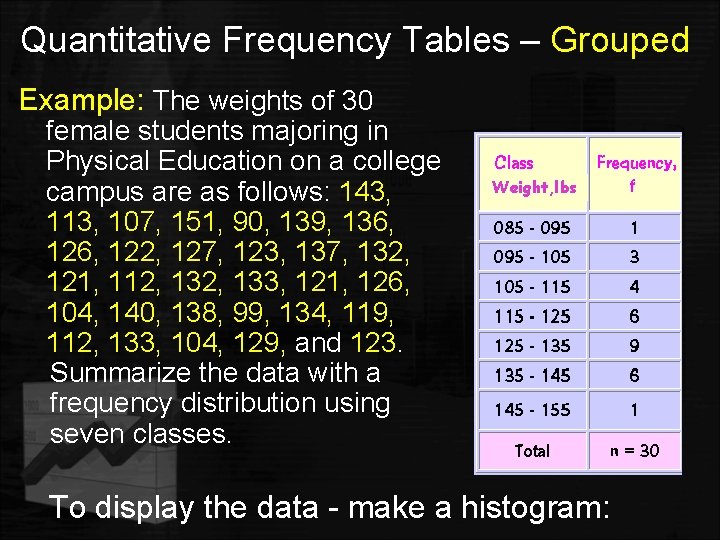
Quantitative Frequency Tables – Grouped Example: The weights of 30 female students majoring in Physical Education on a college campus are as follows: 143, 113, 107, 151, 90, 139, 136, 122, 127, 123, 137, 132, 121, 112, 133, 121, 126, 104, 140, 138, 99, 134, 119, 112, 133, 104, 129, and 123 Summarize the data with a frequency distribution using seven classes. Weight, lbs To display the data - make a histogram:

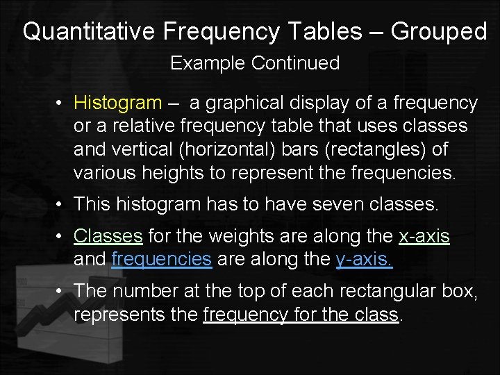
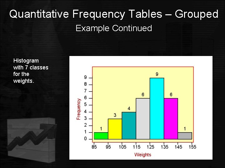
Quantitative Frequency Tables – Grouped Example Continued • Histogram – a graphical display of a frequency or a relative frequency table that uses classes and vertical (horizontal) bars (rectangles) of various heights to represent the frequencies. • This histogram has to have seven classes. • Classes for the weights are along the x-axis and frequencies are along the y-axis. • The number at the top of each rectangular box, represents the frequency for the class.

Quantitative Frequency Tables – Grouped Example Continued Histogram with 7 classes for the weights.

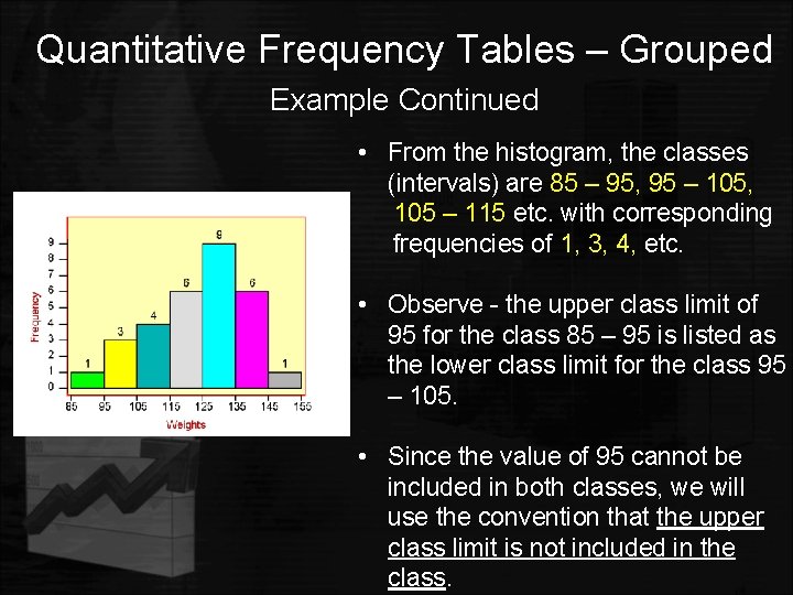
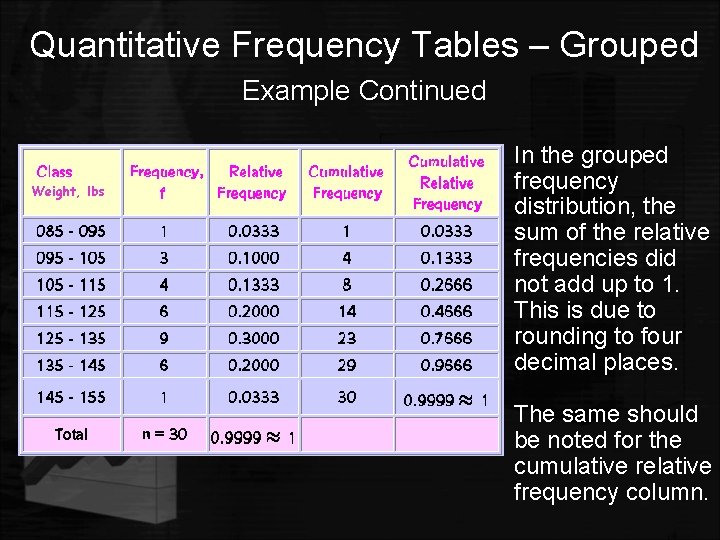
Quantitative Frequency Tables – Grouped Example Continued • From the histogram, the classes (intervals) are 85 – 95, 95 95 – 105, 105 – 115 etc. with corresponding frequencies of 1, 3, 4, etc. • Observe - the upper class limit of 95 for the class 85 – 95 is listed as the lower class limit for the class 95 – 105. • Since the value of 95 cannot be included in both classes, we will use the convention that the upper class limit is not included in the class.

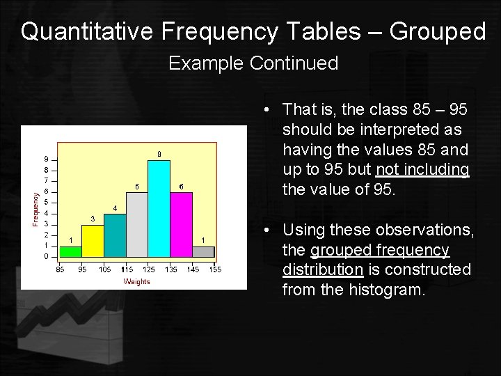
Quantitative Frequency Tables – Grouped Example Continued • That is, the class 85 – 95 should be interpreted as having the values 85 and up to 95 but not including the value of 95. • Using these observations, the grouped frequency distribution is constructed from the histogram.

Quantitative Frequency Tables – Grouped Example Continued Weight, lbs • In the grouped frequency distribution, the sum of the relative frequencies did not add up to 1. This is due to rounding to four decimal places. • The same should be noted for the cumulative relative frequency column.

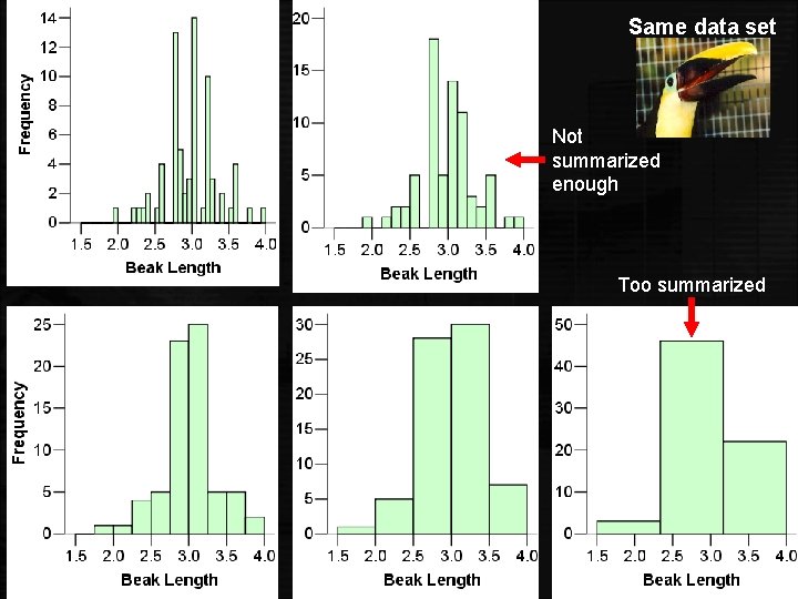
Creating a Histogram It is an iterative process—try and try again. What bin size should you use? • Not too many bins with either 0 or 1 counts • Not overly summarized that you lose all the information • Not so detailed that it is no longer summary Rule of thumb: Start with 5 to 10 bins. Look at the distribution and refine your bins. (There isn’t a unique or “perfect” solution. )

Same data set Not summarized enough Too summarized

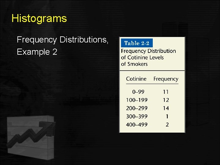
Histograms Frequency Distributions, Example 2

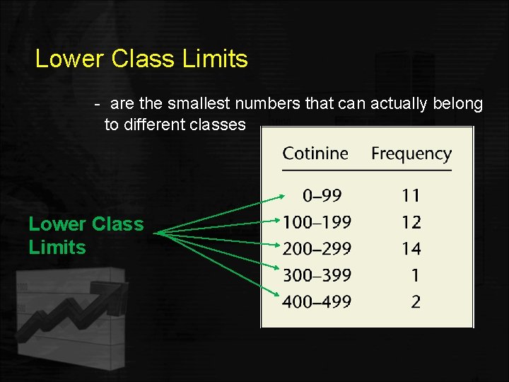
Lower Class Limits - are the smallest numbers that can actually belong to different classes Lower Class Limits

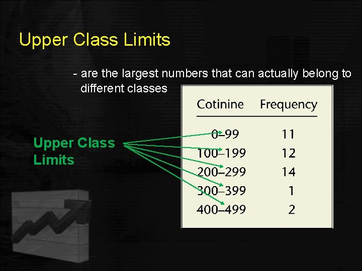
Upper Class Limits - are the largest numbers that can actually belong to different classes Upper Class Limits

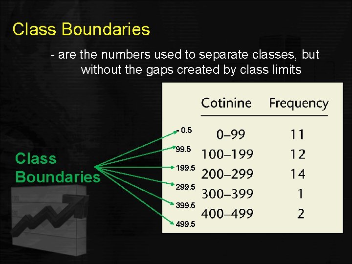
Class Boundaries - are the numbers used to separate classes, but without the gaps created by class limits - 0. 5 Class Boundaries 99. 5 199. 5 299. 5 399. 5 499. 5

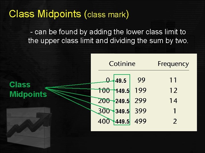
Class Midpoints (class mark) - can be found by adding the lower class limit to the upper class limit and dividing the sum by two. Class Midpoints 49. 5 149. 5 249. 5 349. 5 449. 5

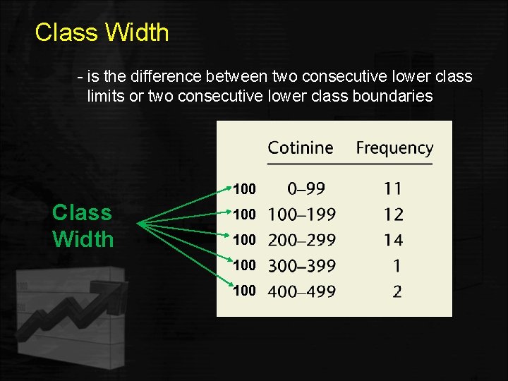
Class Width - is the difference between two consecutive lower class limits or two consecutive lower class boundaries 100 Class Width 100 100

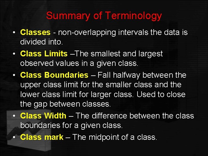
Summary of Terminology • Classes - non-overlapping intervals the data is divided into. • Class Limits –The smallest and largest observed values in a given class. • Class Boundaries – Fall halfway between the upper class limit for the smaller class and the lower class limit for larger class. Used to close the gap between classes. • Class Width – The difference between the class boundaries for a given class. • Class mark – The midpoint of a class.

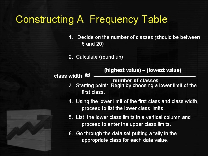
Constructing A Frequency Table 1. Decide on the number of classes (should be between 5 and 20). 2. Calculate (round up). class width (highest value) – (lowest value) number of classes 3. Starting point: Begin by choosing a lower limit of the first class. 4. Using the lower limit of the first class and class width, proceed to list the lower class limits. 5. List the lower class limits in a vertical column and proceed to enter the upper class limits. 6. Go through the data set putting a tally in the appropriate class for each data value.

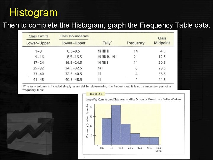
Histogram Then to complete the Histogram, graph the Frequency Table data.

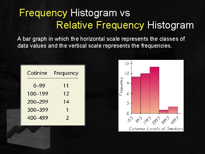
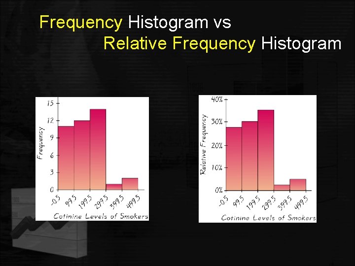
Frequency Histogram vs Relative Frequency Histogram A bar graph in which the horizontal scale represents the classes of data values and the vertical scale represents the frequencies.

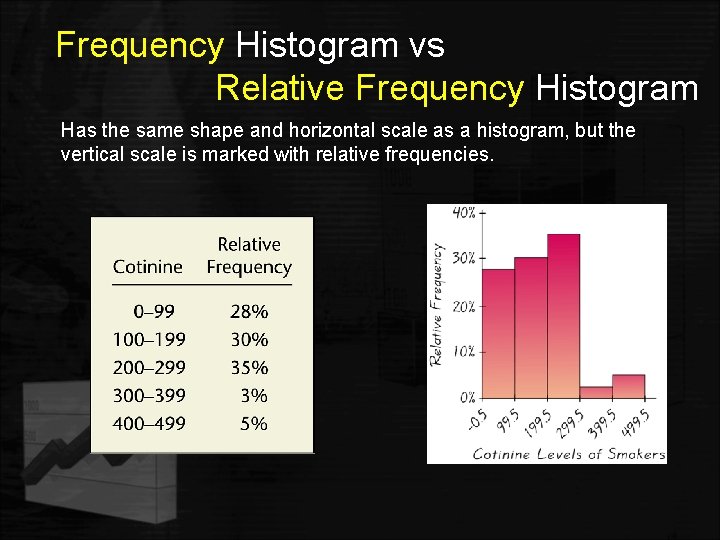
Frequency Histogram vs Relative Frequency Histogram Has the same shape and horizontal scale as a histogram, but the vertical scale is marked with relative frequencies.

Frequency Histogram vs Relative Frequency Histogram

Histograms - Facts • Histograms are useful when the data values are quantitative. • A histogram gives an estimate of the shape of the distribution of the population from which the sample was taken. • If the relative frequencies were plotted along the vertical axis to produce the histogram, the shape will be the same as when the frequencies are used.

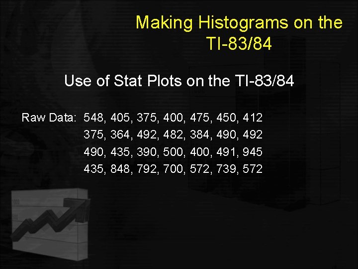
Making Histograms on the TI-83/84 Use of Stat Plots on the TI-83/84 Raw Data: 548, 405, 375, 400, 475, 450, 412 375, 364, 492, 482, 384, 490, 492 490, 435, 390, 500, 491, 945 435, 848, 792, 700, 572, 739, 572

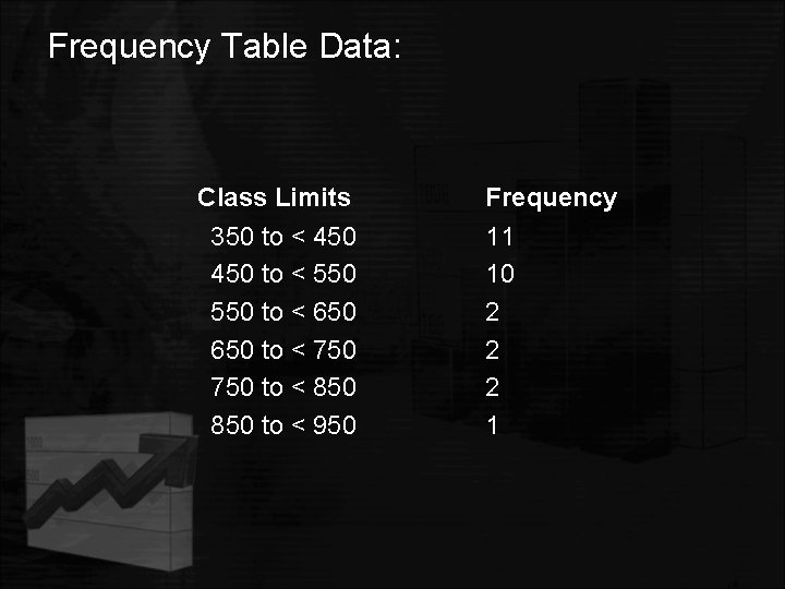
Frequency Table Data: Class Limits 350 to < 450 to < 550 to < 650 to < 750 to < 850 to < 950 Frequency 11 10 2 2 2 1

Quantitative Data STEM AND LEAF PLOT

Stem-and-Leaf Plots • What is a stem-and-leaf plot? A stem-and-leaf plot is a data plot that uses part of a data value as the stem to form groups or classes and part of the data value as the leaf. • When is it used? Most often used for small or medium sized data sets. For larger data sets, histograms do a better job. • Note!: A stem-and-leaf plot has an advantage over a grouped frequency table or histogram, since a stem-and-leaf plot retains the actual data by showing them in graphic form.

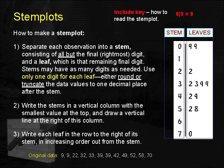
Stemplots Include key – how to read the stemplot. How to make a stemplot: 1) Separate each observation into a stem, consisting of all but the final (rightmost) digit, and a leaf, which is that remaining final digit. Stems may have as many digits as needed. Use only one digit for each leaf—either round or truncate the data values to one decimal place after the stem. 2) Write the stems in a vertical column with the smallest value at the top, and draw a vertical line at the right of this column. 3) Write each leaf in the row to the right of its stem, in increasing order out from the stem. Original data: 9, 9, 22, 33, 39, 42, 49, 52, 58, 70 0|9 = 9 STEM LEAVES

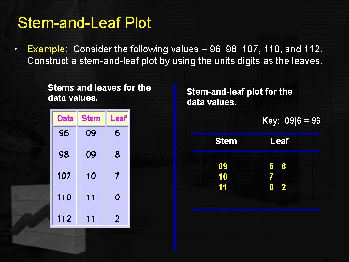
Stem-and-Leaf Plot • Example: Consider the following values – 96, 98, 107, 110, and 112. Construct a stem-and-leaf plot by using the units digits as the leaves. Stems and leaves for the data values. Stem-and-leaf plot for the data values. Key: 09|6 = 96 Stem 09 10 11 Leaf 6 8 7 0 2

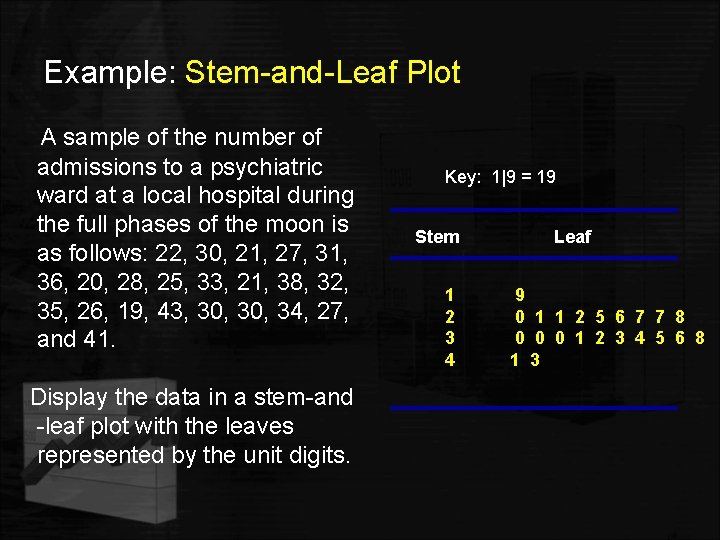
Example: Stem-and-Leaf Plot A sample of the number of admissions to a psychiatric ward at a local hospital during the full phases of the moon is as follows: 22, 30, 21, 27, 31, 36, 20, 28, 25, 33, 21, 38, 32, 35, 26, 19, 43, 30, 34, 27, and 41. Display the data in a stem-and -leaf plot with the leaves represented by the unit digits. Key: 1|9 = 19 Stem 1 2 3 4 Leaf 9 0 1 1 2 5 6 7 7 8 0 0 0 1 2 3 4 5 6 8 1 3

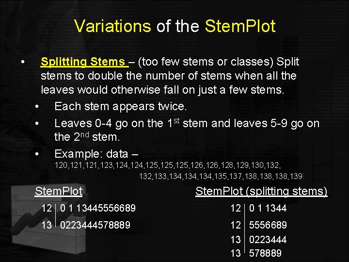
Variations of the Stem. Plot • Splitting Stems – (too few stems or classes) Split stems to double the number of stems when all the leaves would otherwise fall on just a few stems. • Each stem appears twice. • Leaves 0 -4 go on the 1 st stem and leaves 5 -9 go on the 2 nd stem. • Example: data – 120, 121, 123, 124, 125, 126, 128, 129, 130, 132, 133, 134, 135, 137, 138, 139 Stem. Plot (splitting stems) 12 0 1 13445556689 12 0 1 1344 13 0223444578889 12 5556689 13 0223444 13 578889

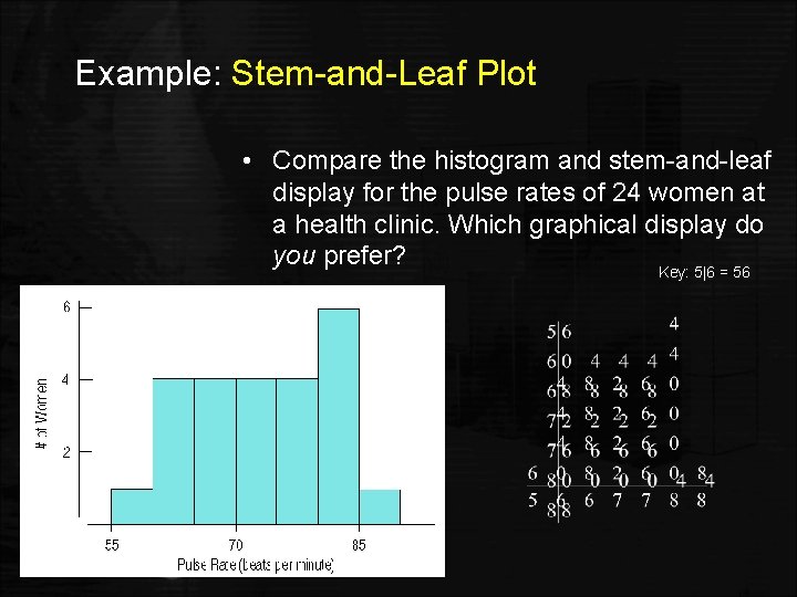
Stem-and-Leaf plots versus Histograms • Stem-and-leaf displays show the distribution of a quantitative variable, like histograms do, while preserving the individual values. • Stem-and-leaf displays contain all the information found in a histogram and, when carefully drawn, satisfy the area principle and show the distribution.

Example: Stem-and-Leaf Plot • Compare the histogram and stem-and-leaf display for the pulse rates of 24 women at a health clinic. Which graphical display do you prefer? Key: 5|6 = 56 Slide 4 - 42

Quantitative Data DOTPLOTS

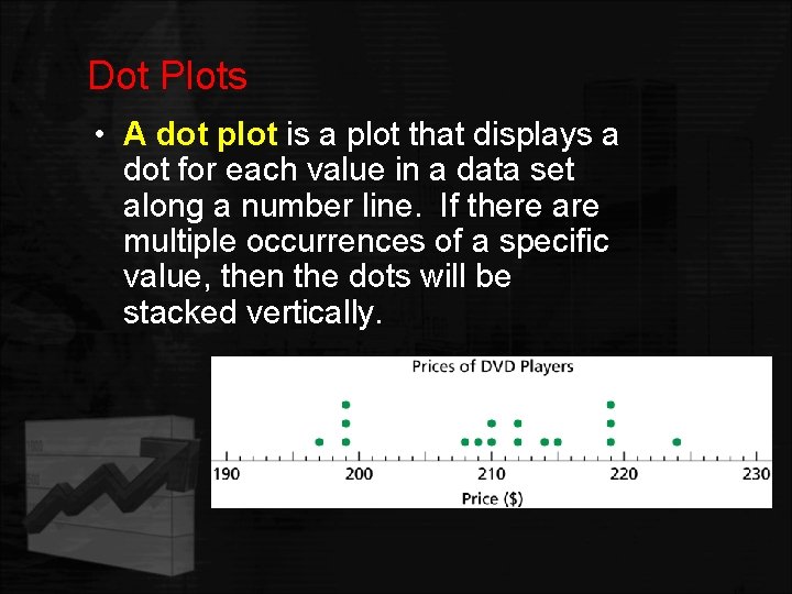
Dot Plots • A dot plot is a plot that displays a dot for each value in a data set along a number line. If there are multiple occurrences of a specific value, then the dots will be stacked vertically.

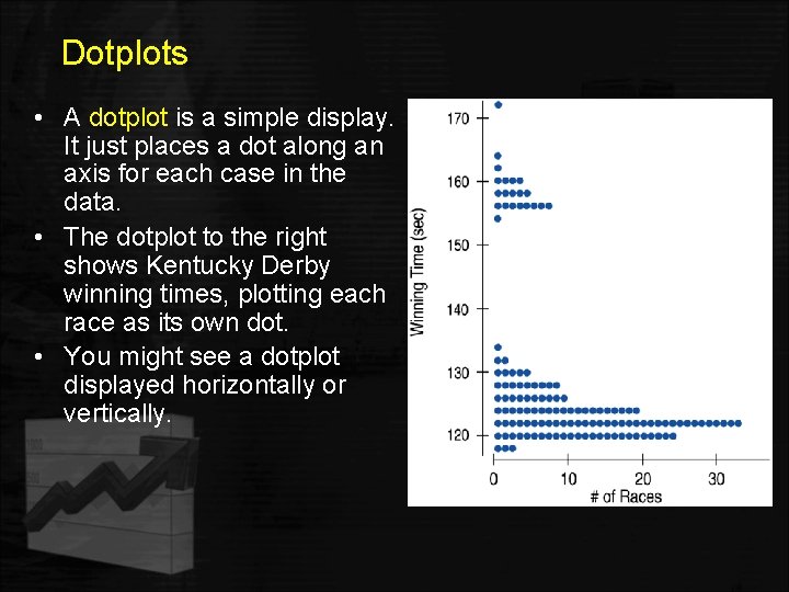
Dotplots • A dotplot is a simple display. It just places a dot along an axis for each case in the data. • The dotplot to the right shows Kentucky Derby winning times, plotting each race as its own dot. • You might see a dotplot displayed horizontally or vertically.

Shape, Center, and Spread When describing a distribution, make sure to always tell about : Ø shape Ø center Ø spread

What is the Shape of the Distribution? 1. Does the histogram have a single, central hump or several separated bumps (discuss possible modes)? 2. Is the histogram symmetric or skewed? 3. Does it have any unusual features?

1. Humps Does the histogram have a single, central hump or several separated bumps? • • Humps in a histogram are called modes or peaks. A histogram with one main peak is considered unimodal; histograms with two peaks are bimodal; histograms with three or more peaks are called multimodal.

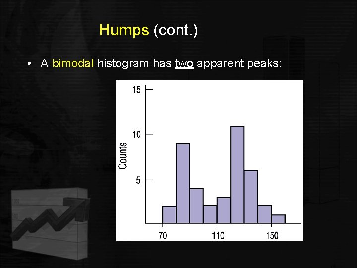
Humps (cont. ) • A bimodal histogram has two apparent peaks:

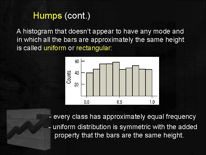
Humps (cont. ) A histogram that doesn’t appear to have any mode and in which all the bars are approximately the same height is called uniform or rectangular: - every class has approximately equal frequency - uniform distribution is symmetric with the added property that the bars are the same height.

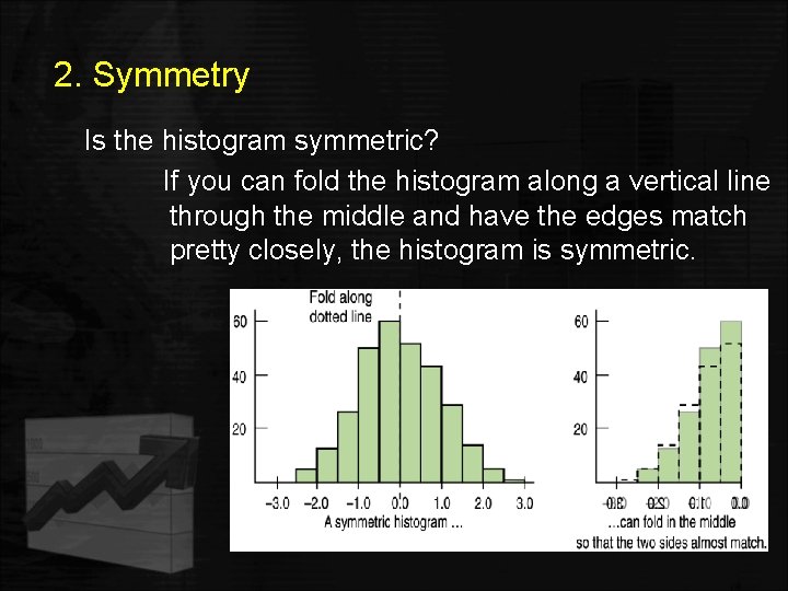
2. Symmetry Is the histogram symmetric? If you can fold the histogram along a vertical line through the middle and have the edges match pretty closely, the histogram is symmetric.

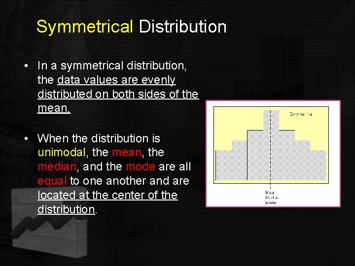
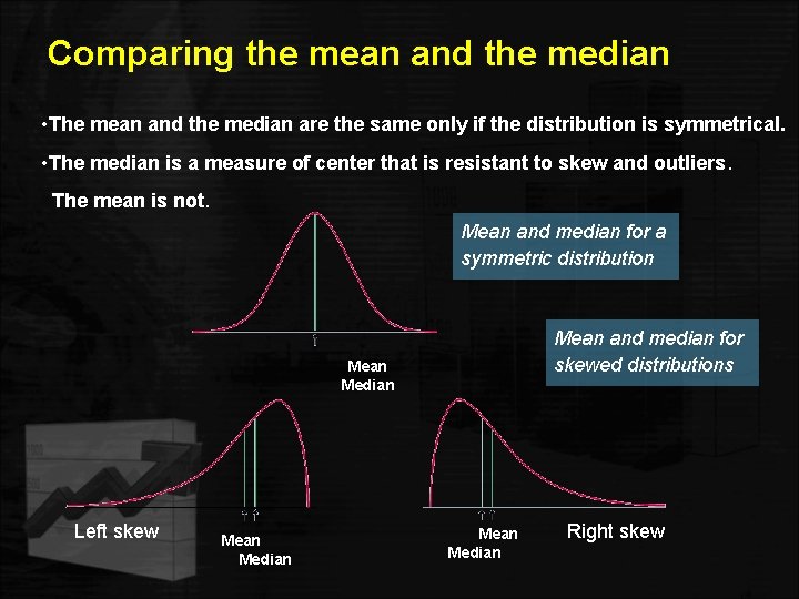
Symmetrical Distribution • In a symmetrical distribution, the data values are evenly distributed on both sides of the mean. • When the distribution is unimodal, the mean, the median, and the mode are all equal to one another and are located at the center of the distribution.

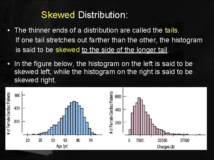
Skewed Distribution: • The thinner ends of a distribution are called the tails. If one tail stretches out farther than the other, the histogram is said to be skewed to the side of the longer tail. • In the figure below, the histogram on the left is said to be skewed left, while the histogram on the right is said to be skewed right.

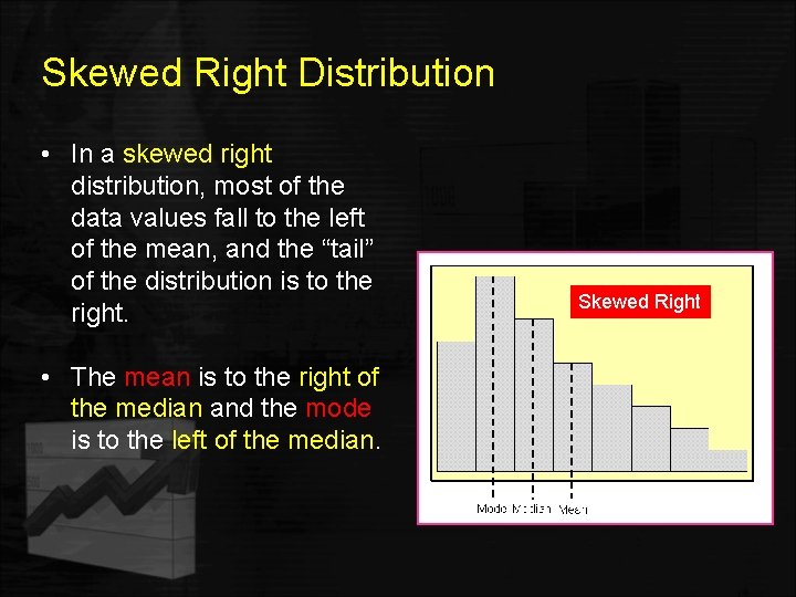
Skewed Right Distribution • In a skewed right distribution, most of the data values fall to the left of the mean, and the “tail” of the distribution is to the right. • The mean is to the right of the median and the mode is to the left of the median. Skewed Right

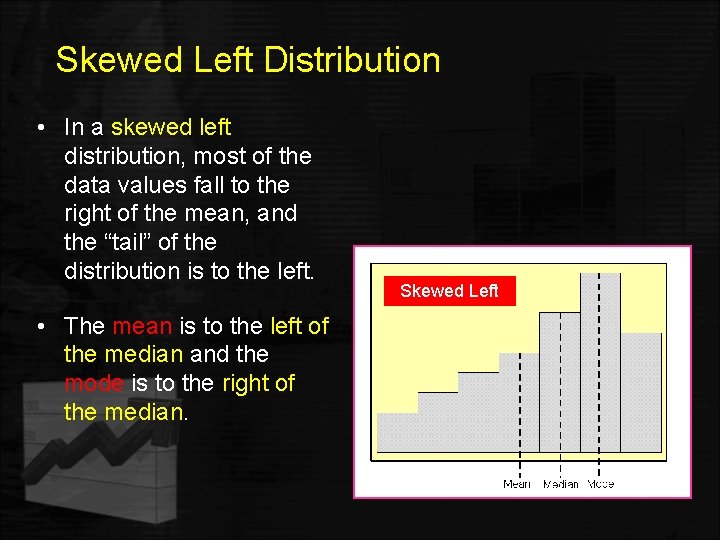
Skewed Left Distribution • In a skewed left distribution, most of the data values fall to the right of the mean, and the “tail” of the distribution is to the left. • The mean is to the left of the median and the mode is to the right of the median. Skewed Left

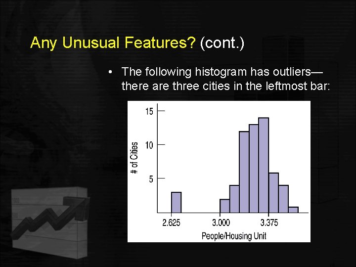
3. Any Unusual Features? • Sometimes it’s the unusual features that tell us something interesting or exciting about the data. • You should always mention any stragglers, or outliers, that stand off away from the body of the distribution. • Are there any gaps in the distribution? If so, we might have data from more than one group.

Any Unusual Features? (cont. ) • The following histogram has outliers— there are three cities in the leftmost bar:

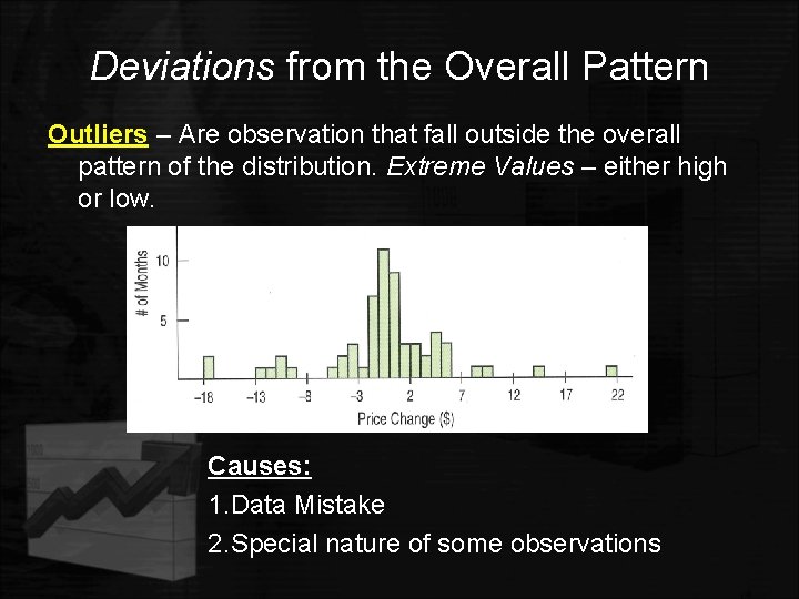
Deviations from the Overall Pattern Outliers – Are observation that fall outside the overall pattern of the distribution. Extreme Values – either high or low. Causes: 1. Data Mistake 2. Special nature of some observations

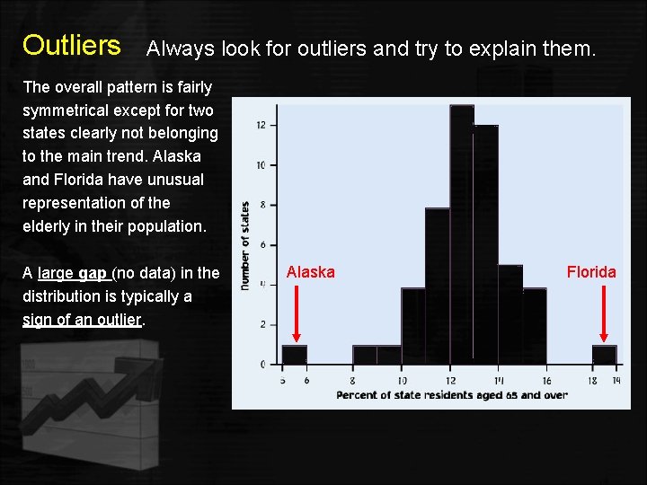
Outliers Always look for outliers and try to explain them. The overall pattern is fairly symmetrical except for two states clearly not belonging to the main trend. Alaska and Florida have unusual representation of the elderly in their population. A large gap (no data) in the distribution is typically a sign of an outlier. Alaska Florida

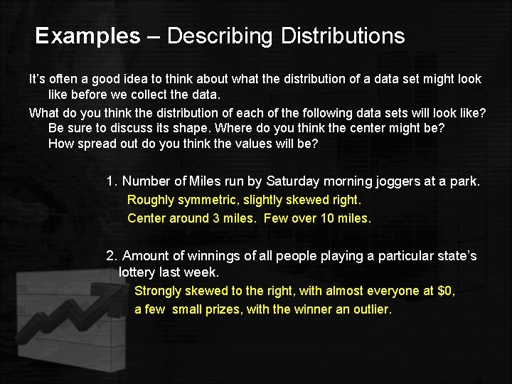
Examples – Describing Distributions It’s often a good idea to think about what the distribution of a data set might look like before we collect the data. What do you think the distribution of each of the following data sets will look like? Be sure to discuss its shape. Where do you think the center might be? How spread out do you think the values will be? 1. Number of Miles run by Saturday morning joggers at a park. Roughly symmetric, slightly skewed right. Center around 3 miles. Few over 10 miles. 2. Amount of winnings of all people playing a particular state’s lottery last week. Strongly skewed to the right, with almost everyone at $0, a few small prizes, with the winner an outlier.

Where is the Center of a Distribution? • If you had to pick a single number to describe all the data what would you pick? • It’s easy to find the center when a histogram is unimodal and symmetric—it’s right in the middle. • On the other hand, it’s not so easy to find the center of a skewed histogram or a histogram with more than one mode.

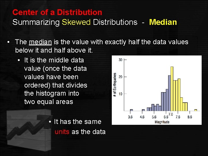
Center of a Distribution Summarizing Skewed Distributions - Median • The median is the value with exactly half the data values below it and half above it. • It is the middle data value (once the data values have been ordered) that divides the histogram into two equal areas • It has the same units as the data

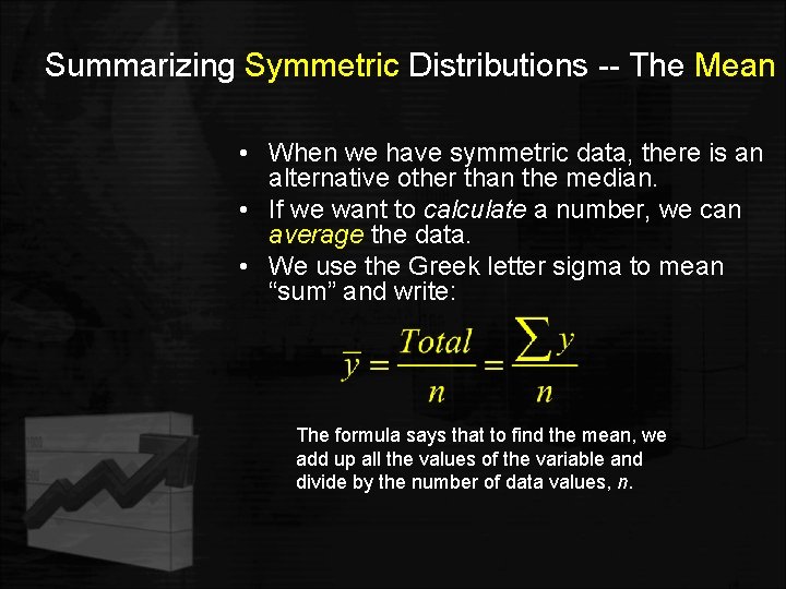
Summarizing Symmetric Distributions -- The Mean • When we have symmetric data, there is an alternative other than the median. • If we want to calculate a number, we can average the data. • We use the Greek letter sigma to mean “sum” and write: The formula says that to find the mean, we add up all the values of the variable and divide by the number of data values, n.

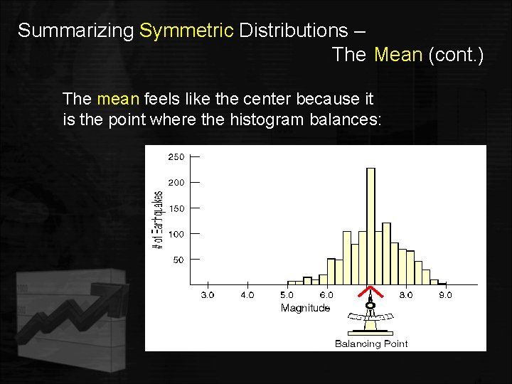
Summarizing Symmetric Distributions – The Mean (cont. ) The mean feels like the center because it is the point where the histogram balances:

Mean or Median? • Because the median considers only the order of values, it is resistant to values that are extraordinarily large or small; it simply notes that they are one of the “big ones” or “small ones” and ignores their distance from center. • To choose between the mean and median, start by looking at the data. • If the histogram is symmetric and there are no outliers, use the mean. • If the histogram is skewed or with outliers, you are better off with the median.

Comparing the mean and the median • The mean and the median are the same only if the distribution is symmetrical. • The median is a measure of center that is resistant to skew and outliers. The mean is not. Mean and median for a symmetric distribution Mean and median for skewed distributions Mean Median Left skew Mean Median Right skew

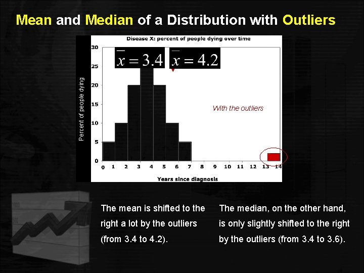
Percent of people dying Mean and Median of a Distribution with Outliers Without the outliers With the outliers The mean is shifted to the The median, on the other hand, right a lot by the outliers is only slightly shifted to the right (from 3. 4 to 4. 2). by the outliers (from 3. 4 to 3. 6).

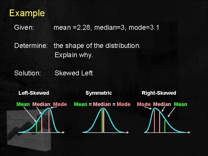
Example Given: mean =2. 28, median=3, mode=3. 1 Determine: the shape of the distribution. Explain why. Solution: Skewed Left-Skewed Mean Median Mode Symmetric Mean = Median = Mode Right-Skewed Mode Median Mean

Conclusion – Mean or Median? • Mean – use with symmetrical distributions (no outliers), because it is nonresistant. • Median – use with skewed distribution or distribution with outliers, because it is resistant.

How Spread Out is the Distribution? • Are the values of the distribution tightly clustered around the center or more spread out? • Always report a measure of spread along with a measure of center when describing a distribution numerically. • The most commonly used measures of variability (spread) for sample data are the: Ørange Øinterquartile range Øvariance or standard deviation

Spread: The Range • The range of the data is the difference between the maximum and minimum values: Range = max – min • A disadvantage of the range is that a single extreme value can make it very large and, thus, not representative of the data overall. • Therefore, the range is affected by outliers (large or small values relative to the rest of the data set). • The range does not utilize all the information in the data set, only the largest and smallest values. • Thus, it is not a very useful measure of spread or variation.

Spread: The Interquartile Range • A better way to describe the spread of a set of data • The interquartile range (IQR) lets us ignore extreme data values and concentrate on the middle of the data

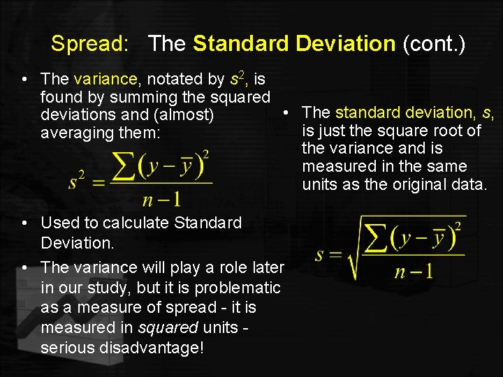
Spread: The Standard Deviation • A more powerful measure of spread than the IQR is the standard deviation, which takes into account how far each data value is from the mean. • A deviation is the distance that a data value is from the mean. • Since adding all deviations together would total zero, we square each deviation and find an average of sorts for the deviations.

Spread: The Standard Deviation (cont. ) • The variance, notated by s 2, is found by summing the squared • The standard deviation, s, deviations and (almost) is just the square root of averaging them: the variance and is measured in the same units as the original data. • Used to calculate Standard Deviation. • The variance will play a role later in our study, but it is problematic as a measure of spread - it is measured in squared units serious disadvantage!

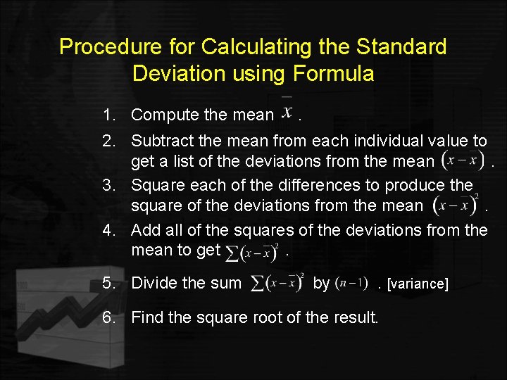
Procedure for Calculating the Standard Deviation using Formula 1. Compute the mean . 2. Subtract the mean from each individual value to get a list of the deviations from the mean. 3. Square each of the differences to produce the square of the deviations from the mean. 4. Add all of the squares of the deviations from the mean to get. 5. Divide the sum by . [variance] 6. Find the square root of the result.

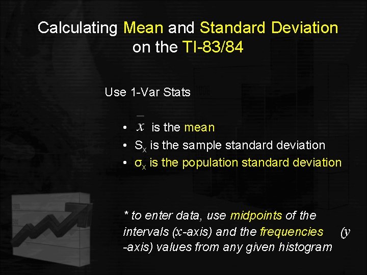
Calculating Mean and Standard Deviation on the TI-83/84 Use 1 -Var Stats • is the mean • Sx is the sample standard deviation • σx is the population standard deviation * to enter data, use midpoints of the intervals (x-axis) and the frequencies (y -axis) values from any given histogram

Properties of Standard Deviation • Measures spread about the mean and should only be used to describe the spread of a distribution when the mean is used to describe the center (ie. symmetrical distributions). • The value of s is positive. It is zero only when all of the data values are the same number. Larger values of s indicate greater amounts of variation. • Nonresistant, s can increase dramatically due to extreme values or outliers. • The units of s are the same as the units of the original data. One reason s is preferred to s 2.

Spread and Variation • When the data values are tightly clustered around the center of the distribution, the IQR and standard deviation will be small. • When the data values are scattered far from the center, the IQR and standard deviation will be large. Lets summarize…

Steps: 1. Draw a Picture • When telling about quantitative variables, start by making a histogram or stem-and-leaf display and discuss the shape of the distribution.

Steps: 2. Shape, Center, and Spread Next, always report the shape (mode, symmetry, unusual features) of its distribution, along with a center and a spread. • If the shape is skewed, report the median to describe the center and IQR to describe the spread. • If the shape is symmetric, report the mean to describe the center and standard deviation to describe the spread, and possibly the median and IQR as well.

Steps: 3. Unusual Features • If there are multiple modes, try to understand why. If you identify a reason for the separate modes, it may be good to split the data into two groups. • If there any clear outliers and you are reporting the mean and standard deviation, report them with the outliers present and with the outliers removed. The differences may be quite revealing. • Note: The median and IQR are not likely to be affected by the outliers.

What Can Go Wrong? • Don’t forget to do a reality check – don’t let the calculator do the thinking for you (use appropriate bin size, etc. ) • Do not mix between bar graphs and histograms; do not make histograms of categorical data. • Don’t compute numerical summaries of a categorical variable. • Don’t forget to sort the values before finding the median or percentiles. • Don’t worry about small differences when using different methods. • Don’t report too many decimal places. • Don’t round in the middle of a calculation. • Watch out for multiple modes • Beware of outliers • Make a picture!

What have we learned? • How to make a picture for quantitative data to analyze the data. • How to display the distribution of quantitative data with a histogram, stem-and-leaf display, dotplot or timeplot. • How to summarize distributions of quantitative variables numerically. • Measures of center for a distribution include the median and mean. • Measures of spread include the range, IQR, and standard deviation. • Use the median and IQR when the distribution is skewed. Use the mean and standard deviation if the distribution is symmetric.