Lesson 1 2 Displaying Quantitative Data with Graphs


- Slides: 41

Lesson 1 - 2 Displaying Quantitative Data with Graphs

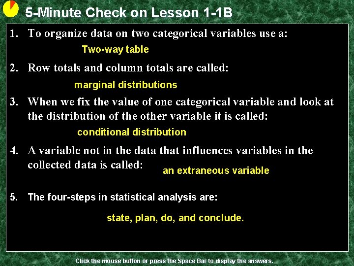
5 -Minute Check on Lesson 1 -1 B 1. To organize data on two categorical variables use a: Two-way table 2. Row totals and column totals are called: marginal distributions 3. When we fix the value of one categorical variable and look at the distribution of the other variable it is called: conditional distribution 4. A variable not in the data that influences variables in the collected data is called: an extraneous variable 5. The four-steps in statistical analysis are: state, plan, do, and conclude. Click the mouse button or press the Space Bar to display the answers.

Objectives • Make a dotplot or stemplot to display small sets of data • Describe the overall pattern (shape, outliers – major departures from the pattern, center, and spread) of a distribution • Make a histogram with a reasonable choice of classes • Identify the shape of a distribution from a dotplot, stemplot or histogram (roughly symmetric or skewed – right/left) • Identify the number of modes of a distribution • Interpret histograms

Vocabulary • Back-to-back stemplot – two distributions plotted with a common stem • Bimodal – a distribution whose shape has two peaks (modes) • Dotplot – each data point is marked as a dot above a number line • Histogram – breaks range of values into classes and displays their frequencies • Frequency – counts of data in a class • Frequency table – table of frequencies • Modes – major peaks in a distribution • Ogive – relative cumulative frequency graph

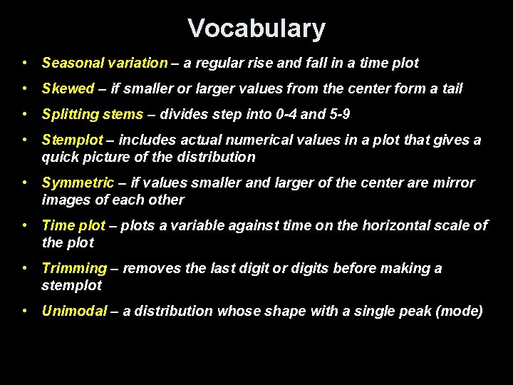
Vocabulary • Seasonal variation – a regular rise and fall in a time plot • Skewed – if smaller or larger values from the center form a tail • Splitting stems – divides step into 0 -4 and 5 -9 • Stemplot – includes actual numerical values in a plot that gives a quick picture of the distribution • Symmetric – if values smaller and larger of the center are mirror images of each other • Time plot – plots a variable against time on the horizontal scale of the plot • Trimming – removes the last digit or digits before making a stemplot • Unimodal – a distribution whose shape with a single peak (mode)

Quantitative Data • Quantitative Variable: – Values are numeric - arithmetic computation makes sense (average, etc. ) – Distributions list the values and number of times the variable takes on that value • Displays: – Dotplots – Stemplots – Histograms – Boxplots

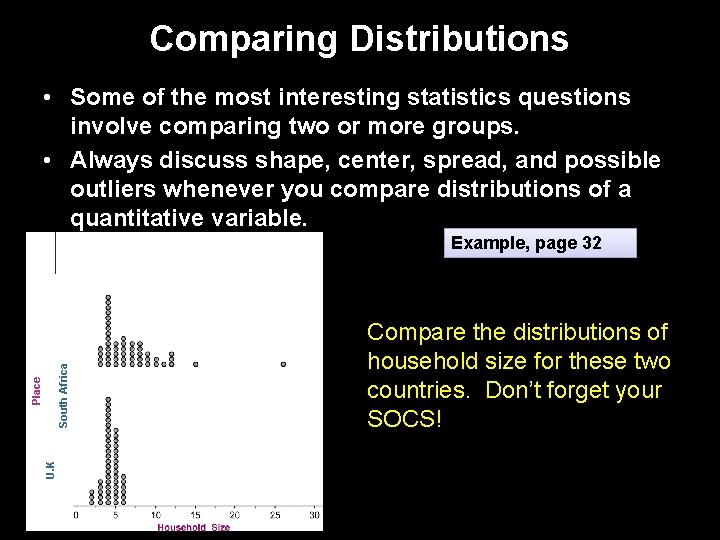
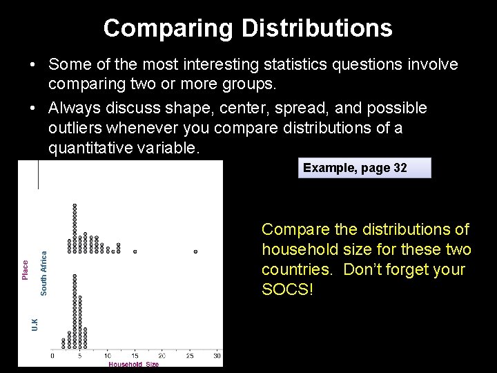
Comparing Distributions • Some of the most interesting statistics questions involve comparing two or more groups. • Always discuss shape, center, spread, and possible outliers whenever you compare distributions of a quantitative variable. U. K Place South Africa Example, page 32 Compare the distributions of household size for these two countries. Don’t forget your SOCS!

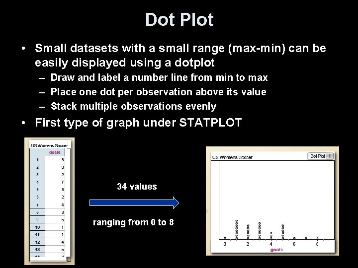
Dot Plot • Small datasets with a small range (max-min) can be easily displayed using a dotplot – Draw and label a number line from min to max – Place one dot per observation above its value – Stack multiple observations evenly • First type of graph under STATPLOT 34 values ranging from 0 to 8

Stem Plots • A stemplot gives a quick picture of the shape of a distribution while including the numerical values – Separate each observation into a stem and a leaf eg. 14 g -> 1|4 256 -> 25|6 32. 9 oz -> 32|9 – Write stems in a vertical column and draw a vertical line to the right of the column – Write each leaf to the right of its stem • Note: – Stemplots do not work well for large data sets – Not available on calculator

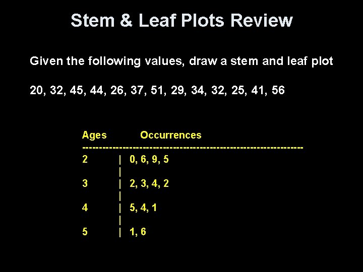
Stem & Leaf Plots Review Given the following values, draw a stem and leaf plot 20, 32, 45, 44, 26, 37, 51, 29, 34, 32, 25, 41, 56 Ages Occurrences ---------------------------------2 | 0, 6, 9, 5 | 3 | 2, 3, 4, 2 | 4 | 5, 4, 1 | 5 | 1, 6

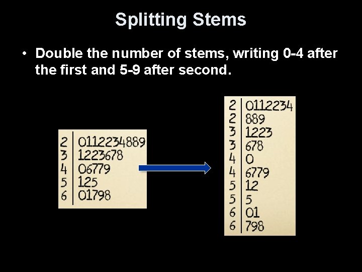
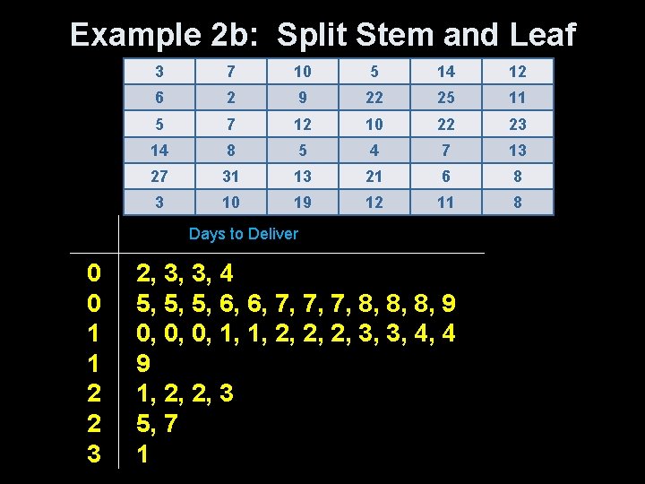
Splitting Stems • Double the number of stems, writing 0 -4 after the first and 5 -9 after second.

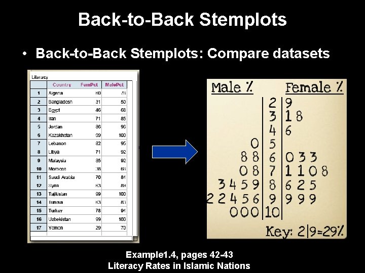
Back-to-Back Stemplots • Back-to-Back Stemplots: Compare datasets Example 1. 4, pages 42 -43 Literacy Rates in Islamic Nations

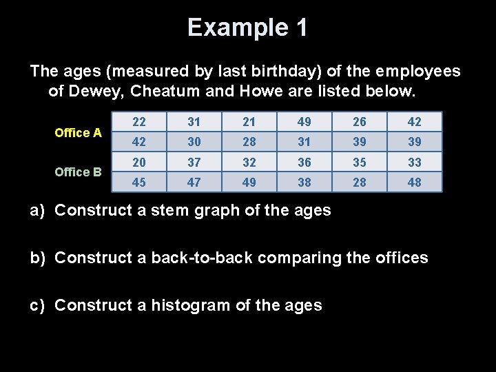
Example 1 The ages (measured by last birthday) of the employees of Dewey, Cheatum and Howe are listed below. Office A Office B 22 31 21 49 26 42 42 30 28 31 39 39 20 37 32 36 35 33 45 47 49 38 28 48 a) Construct a stem graph of the ages b) Construct a back-to-back comparing the offices c) Construct a histogram of the ages

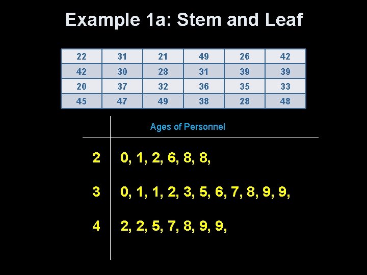
Example 1 a: Stem and Leaf 22 31 21 49 26 42 42 30 28 31 39 39 20 37 32 36 35 33 45 47 49 38 28 48 Ages of Personnel 2 0, 1, 2, 6, 8, 8, 3 0, 1, 1, 2, 3, 5, 6, 7, 8, 9, 9, 4 2, 2, 5, 7, 8, 9, 9,

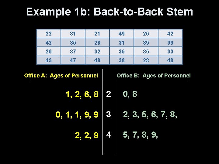
Example 1 b: Back-to-Back Stem 22 31 21 49 26 42 42 30 28 31 39 39 20 37 32 36 35 33 45 47 49 38 28 48 Office A: Ages of Personnel Office B: Ages of Personnel 1, 2, 6, 8 2 0, 8 0, 1, 1, 9, 9 3 2, 3, 5, 6, 7, 8, 2, 2, 9 4 5, 7, 8, 9,

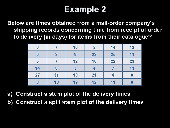
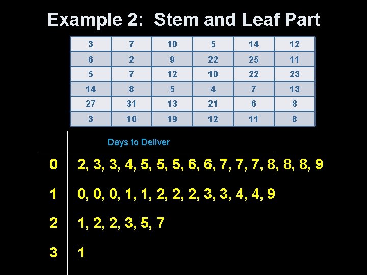
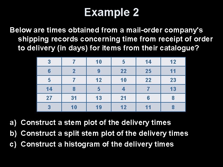
Example 2 Below are times obtained from a mail-order company's shipping records concerning time from receipt of order to delivery (in days) for items from their catalogue? 3 7 10 5 14 12 6 2 9 22 25 11 5 7 12 10 22 23 14 8 5 4 7 13 27 31 13 21 6 8 3 10 19 12 11 8 a) Construct a stem plot of the delivery times b) Construct a split stem plot of the delivery times

Example 2: Stem and Leaf Part 3 7 10 5 14 12 6 2 9 22 25 11 5 7 12 10 22 23 14 8 5 4 7 13 27 31 13 21 6 8 3 10 19 12 11 8 Days to Deliver 0 2, 3, 3, 4, 5, 5, 5, 6, 6, 7, 7, 7, 8, 8, 8, 9 1 0, 0, 0, 1, 1, 2, 2, 2, 3, 3, 4, 4, 9 2 1, 2, 2, 3, 5, 7 3 1

Example 2 b: Split Stem and Leaf 3 7 10 5 14 12 6 2 9 22 25 11 5 7 12 10 22 23 14 8 5 4 7 13 27 31 13 21 6 8 3 10 19 12 11 8 Days to Deliver 0 2, 3, 3, 4 0 5, 5, 5, 6, 6, 7, 7, 7, 8, 8, 8, 9 1 0, 0, 0, 1, 1, 2, 2, 2, 3, 3, 4, 4 1 9 2 1, 2, 2, 3 2 5, 7 3 1

Vocabulary is Important To speak the language, you got to know what the words really mean!

Summary and Homework • Summary ü When comparing distributions, be sure to discuss shape, center, spread, and possible outliers. ü Histograms are for quantitative data, bar graphs are for categorical data. Use relative frequency histograms when comparing data sets of different sizes. • Homework – pg 42 -50; prob 37, 39, 41, 43, 45, 47

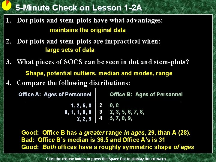
5 -Minute Check on Lesson 1 -2 A 1. Dot plots and stem-plots have what advantages: maintains the original data 2. Dot plots and stem-plots are impractical when: large sets of data 3. What pieces of SOCS can be seen in dot and stem-plots? Shape, potential outliers, median and modes, range 4. Compare the following distributions: Office A: Ages of Personnel 1, 2, 6, 8 0, 1, 1, 9, 9 2, 2, 9 Office B: Ages of Personnel 2 0, 8 3 2, 3, 5, 6, 7, 8, 4 5, 7, 8, 9, Good: Office B has a greater range in ages, 29, than A (28). Bad: Office B’s median is 36. 5 and Office A’s is 31 Good: Both offices have a roughly symmetric shape of ages Click the mouse button or press the Space Bar to display the answers.

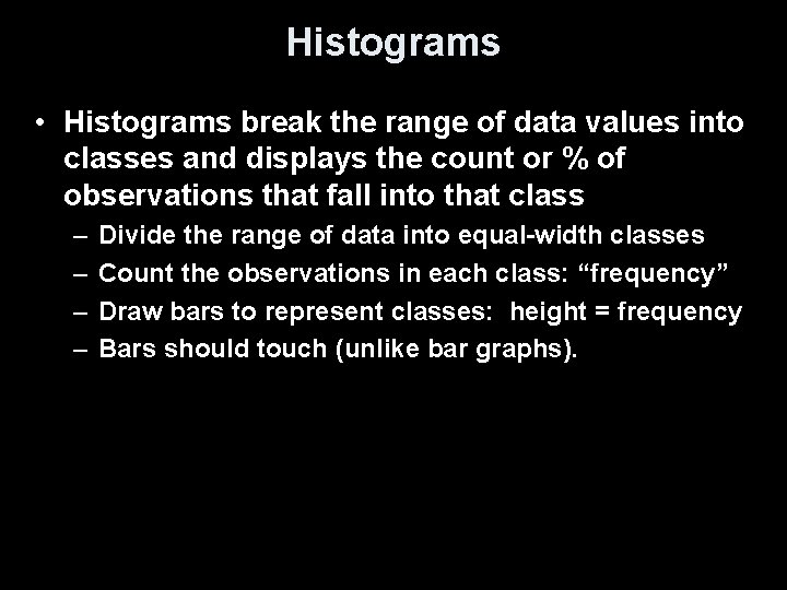
Histograms • Histograms break the range of data values into classes and displays the count or % of observations that fall into that class – – Divide the range of data into equal-width classes Count the observations in each class: “frequency” Draw bars to represent classes: height = frequency Bars should touch (unlike bar graphs).

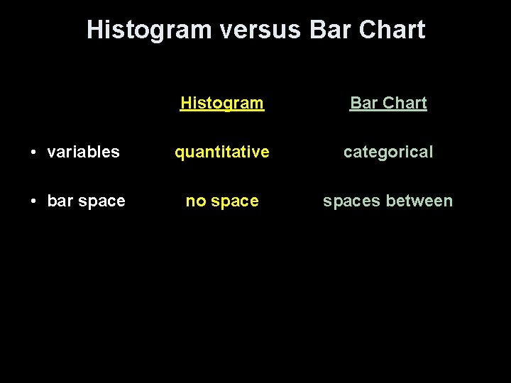
Histogram versus Bar Chart Histogram Bar Chart • variables quantitative categorical • bar space no spaces between

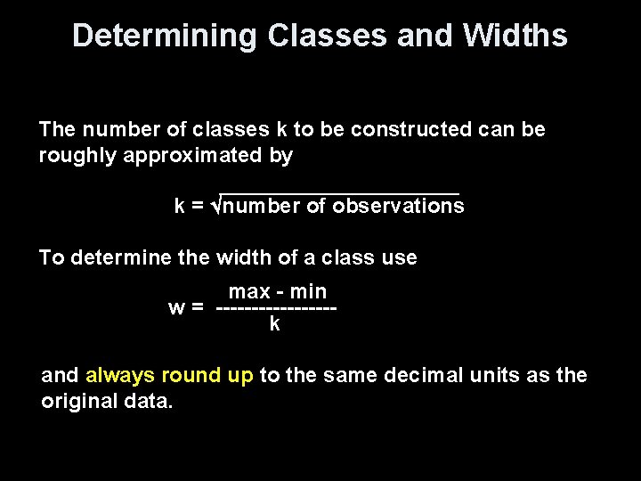
Determining Classes and Widths The number of classes k to be constructed can be roughly approximated by k = number of observations To determine the width of a class use max - min w = -------- k and always round up to the same decimal units as the original data.

Example 1 The ages (measured by last birthday) of the employees of Dewey, Cheatum and Howe are listed below. Office A Office B 22 31 21 49 26 42 42 30 28 31 39 39 20 37 32 36 35 33 45 47 49 38 28 48 a) Construct a stem graph of the ages b) Construct a back-to-back comparing the offices c) Construct a histogram of the ages

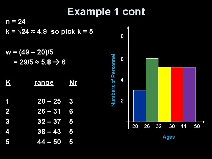
Example 1 cont n = 24 k = √ 24 ≈ 4. 9 so pick k = 5 K range Nr 1 2 3 4 5 3 6 5 5 5 20 – 25 26 – 31 32 – 37 38 – 43 44 – 50 Numbers of Personnel w = (49 – 20)/5 = 29/5 ≈ 5. 8 6 8 6 4 2 20 -25 32 -37 44 -50 26 -31 38 -43 Ages

Example 1 cont n = 24 k = √ 24 ≈ 4. 9 so pick k = 5 K range Nr 1 2 3 4 5 3 6 5 5 5 20 – 25 26 – 31 32 – 37 38 – 43 44 – 50 Numbers of Personnel w = (49 – 20)/5 = 29/5 ≈ 5. 8 6 8 6 4 2 20 26 32 38 Ages 44 50

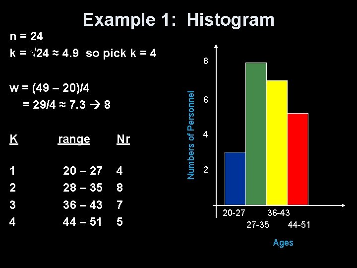
Example 1: Histogram n = 24 k = √ 24 ≈ 4. 9 so pick k = 4 K range Nr 1 2 3 4 4 8 7 5 20 – 27 28 – 35 36 – 43 44 – 51 Numbers of Personnel w = (49 – 20)/4 = 29/4 ≈ 7. 3 8 8 6 4 2 20 -27 36 -43 27 -35 44 -51 Ages

Example 2 Below are times obtained from a mail-order company's shipping records concerning time from receipt of order to delivery (in days) for items from their catalogue? 3 7 10 5 14 12 6 2 9 22 25 11 5 7 12 10 22 23 14 8 5 4 7 13 27 31 13 21 6 8 3 10 19 12 11 8 a) Construct a stem plot of the delivery times b) Construct a split stem plot of the delivery times c) Construct a histogram of the delivery times

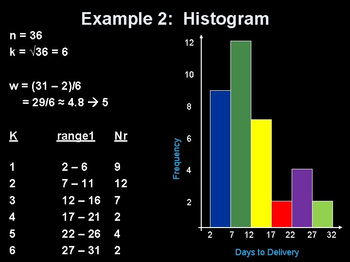
Example 2: Histogram n = 36 k = √ 36 = 6 12 10 w = (31 – 2)/6 = 29/6 ≈ 4. 8 5 K range 1 Nr 1 2 3 4 5 6 9 12 7 2 4 2 2 – 6 7 – 11 12 – 16 17 – 21 22 – 26 27 – 31 Frequency 8 6 4 2 2 7 12 17 22 Days to Delivery 27 32

Describing Distributions Overall patterns of a distribution should be described by anything unusual and: – Shape of its graph • symmetric, skewed, • unimodal, bimodal, etc – Center • Quantitative: mean (symmetric data) median (skewed data) • Categorical: mode – Spread • Quantitative: range, standard deviation, IQR

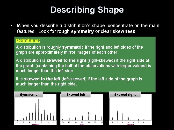
Describing Shape • When you describe a distribution’s shape, concentrate on the main features. Look for rough symmetry or clear skewness. Definitions: A distribution is roughly symmetric if the right and left sides of the graph are approximately mirror images of each other. A distribution is skewed to the right (right-skewed) if the right side of the graph (containing the half of the observations with larger values) is much longer than the left side. It is skewed to the left (left-skewed) if the left side of the graph is much longer than the right side. Symmetric Skewed-left Skewed-right

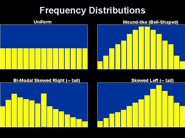
Frequency Distributions Uniform Bi-Modal Skewed Right (-- tail) Mound-like (Bell-Shaped) Skewed Left (-- tail)

Exploratory Data Analysis Summary • The purpose of an EDA is to organize data and identify patterns/departures. • PLOT YOUR DATA – Choose an appropriate graph • Look for overall pattern and departures from pattern – – Shape {mound, bimodal, skewed, uniform} Outliers {points clearly away from body of data} Center {What number “typifies” the data? } Spread {How “variable” are the data values? }

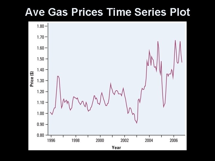
Time Series Plot • Time on the x-axis • Interested values on the y-axis • Look for seasonal (periodic) trends in data – What seasonal trends do you expect in the following chart?

Ave Gas Prices Time Series Plot

Seasonal Trends • Gas prices go up during the summer – Memorial Day to Labor Day • Sharp increases with Hurricane activity – Hurricane season generally July – October • Major supply issues cause sharp increases • Positive general increase (due to inflation)

Cautions • Label all axeses and title all graphs • Histogram rectangles touch each other; rectangles in bar graphs do not touch. • Can’t have class widths that overlap • Raw data can be retrieved from the stem-and-leaf plot; but a frequency distribution of histogram of continuous data summarizes the raw data • Only quantitative data can be described as skewed left, skewed right or symmetric (uniform or bellshaped)

Comparing Distributions • Some of the most interesting statistics questions involve comparing two or more groups. • Always discuss shape, center, spread, and possible outliers whenever you compare distributions of a quantitative variable. U. K Place South Africa Example, page 32 Compare the distributions of household size for these two countries. Don’t forget your SOCS!

Summary and Homework • Summary ü You can use a dotplot, stemplot, or histogram to show the distribution of a quantitative variable. ü When examining any graph, look for an overall pattern and for notable departures from that pattern. Describe the shape, center, spread, and any outliers. Don’t forget your SOCS! ü Some distributions have simple shapes, such as symmetric or skewed. The number of modes (major peaks) is another aspect of overall shape.

Summary and Homework • Summary cont ü When comparing distributions, be sure to discuss shape, center, spread, and possible outliers. ü Histograms are for quantitative data, bar graphs are for categorical data. Use relative frequency histograms when comparing data sets of different sizes. • Homework – pg 42 -50; prob 53, 55, 57, 59, 60, 69 -74