Chapter 3 Displaying and Summarizing Quantitative Data Copyright
- Slides: 54

Chapter 3 Displaying and Summarizing Quantitative Data Copyright © 2015, 2010, 2007 Pearson Education, Inc. Chapter 3, Slide 1 -11

Dealing With a Lot of Numbers… n n Summarizing the data will help us when we look at large sets of quantitative data. Without summaries of the data, it’s hard to grasp what the data tell us. The best thing to do is to make a picture… We can’t use bar charts or pie charts for quantitative data, since those displays are for categorical variables. Copyright © 2015, 2010, 2007 Pearson Education, Inc. Chapter 3, Slide 1 -22

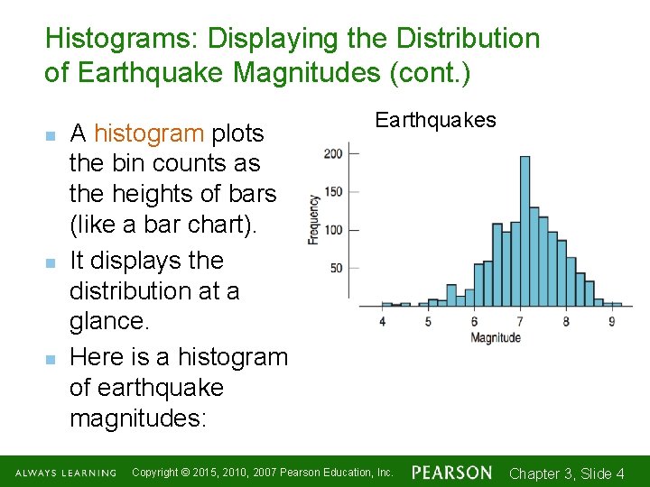
Histograms: Displaying the Distribution of Earthquake Magnitudes n n n The chapter example discusses earthquake magnitudes. First, slice up the entire span of values covered by the quantitative variable into equal-width piles called bins. The bins and the counts in each bin give the distribution of the quantitative variable. Copyright © 2015, 2010, 2007 Pearson Education, Inc. Chapter 3, Slide 1 -33

Histograms: Displaying the Distribution of Earthquake Magnitudes (cont. ) n n n A histogram plots the bin counts as the heights of bars (like a bar chart). It displays the distribution at a glance. Here is a histogram of earthquake magnitudes: Earthquakes Copyright © 2015, 2010, 2007 Pearson Education, Inc. Chapter 3, Slide 1 -44

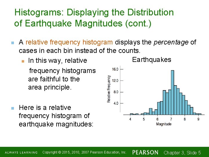
Histograms: Displaying the Distribution of Earthquake Magnitudes (cont. ) n n A relative frequency histogram displays the percentage of cases in each bin instead of the counts. Earthquakes n In this way, relative frequency histograms are faithful to the area principle. Here is a relative frequency histogram of earthquake magnitudes: Copyright © 2015, 2010, 2007 Pearson Education, Inc. Chapter 3, Slide 1 -55

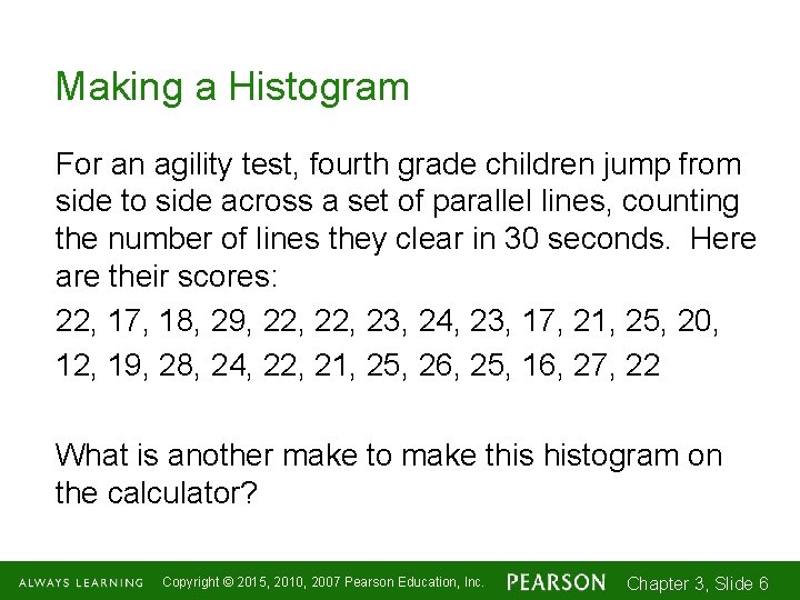
Making a Histogram For an agility test, fourth grade children jump from side to side across a set of parallel lines, counting the number of lines they clear in 30 seconds. Here are their scores: 22, 17, 18, 29, 22, 23, 24, 23, 17, 21, 25, 20, 12, 19, 28, 24, 22, 21, 25, 26, 25, 16, 27, 22 What is another make to make this histogram on the calculator? Copyright © 2015, 2010, 2007 Pearson Education, Inc. Chapter 3, Slide 1 -66

Tech tip n n n Your calculator will make a fine histogram and will choose a bin width for you. Use 9: Zoomstat most of the time. But you should be able to go into the Window settings and adjust the bin width. Experimenting with different bin widths on your calculator will give you a good feel for how the same data can be presented differently. Xmin = lowest, Xmax = highest, Xscl = bin width Copyright © 2015, 2010, 2007 Pearson Education, Inc. Chapter 3, Slide 1 -77

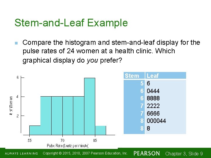
Stem-and-Leaf Displays n n Stem-and-leaf displays show the distribution of a quantitative variable, like histograms do, while preserving the individual values. Stem-and-leaf displays contain all the information found in a histogram and, when carefully drawn, satisfy the area principle and show the distribution. Copyright © 2015, 2010, 2007 Pearson Education, Inc. Chapter 3, Slide 1 -88

Stem-and-Leaf Example n Compare the histogram and stem-and-leaf display for the pulse rates of 24 women at a health clinic. Which graphical display do you prefer? Stem 5 6 6 7 7 8 8 Copyright © 2015, 2010, 2007 Pearson Education, Inc. Leaf 6 0444 8888 2222 6666 000044 8 Chapter 3, Slide 1 -99

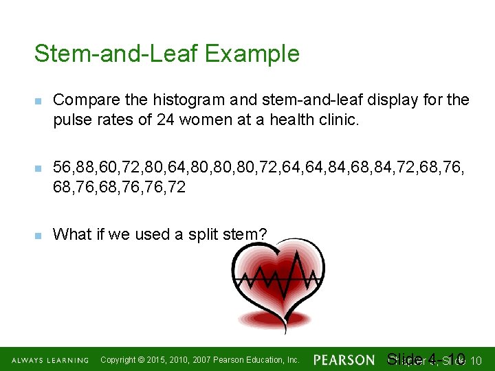
Stem-and-Leaf Example n n n Compare the histogram and stem-and-leaf display for the pulse rates of 24 women at a health clinic. 56, 88, 60, 72, 80, 64, 80, 80, 72, 64, 84, 68, 84, 72, 68, 76, 72 What if we used a split stem? Copyright © 2015, 2010, 2007 Pearson Education, Inc. Chapter 43, Slide 10 1 -1010

Constructing a Stem-and-Leaf Display n n First, cut each data value into leading digits (“stems”) and trailing digits (“leaves”). Use the stems to label the bins. Use only one digit for each leaf—either round or truncate the data values to one decimal place after the stem. Don’t forget a key so the reader knows the values of the stems and leaves! Copyright © 2015, 2010, 2007 Pearson Education, Inc. Chapter 3, Slide 1 -1111

Creating Stem-and-Leaf Plots, pg. 79 #44 The Cornell Lab of Ornithology holds an annual Christmas Bird Count, in which birdwatchers at various locations around the country see how many different species of birds they can spot. Here are some of the counts reported from sites in Texas during the 1999 event. 228 178 186 162 206 163 181 206 177 175 167 162 160 157 156 153 152 Create a stem-and-leaf display for these data. Copyright © 2015, 2010, 2007 Pearson Education, Inc. Chapter 43, Slide 12 1 -1212

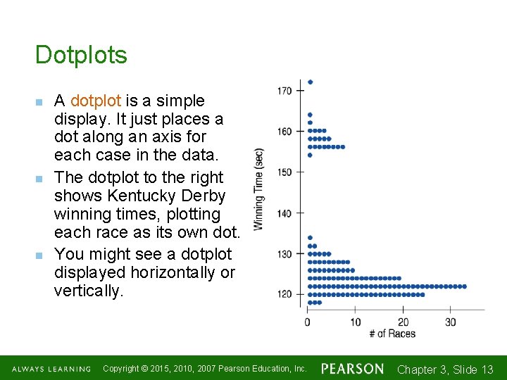
Dotplots n n n A dotplot is a simple display. It just places a dot along an axis for each case in the data. The dotplot to the right shows Kentucky Derby winning times, plotting each race as its own dot. You might see a dotplot displayed horizontally or vertically. Copyright © 2015, 2010, 2007 Pearson Education, Inc. Chapter 3, Slide 1 -1313

Distribution Activity with Dotplots Follow directions carefully!! Do NOT waste time!! Work quickly!! Copyright © 2015, 2010, 2007 Pearson Education, Inc. Chapter 43, Slide 14 1 -1414

Think Before You Draw, Again n Remember the “Make a picture” rule? Now that we have options for data displays, you need to Think carefully about which type of display to make. Before making a stem-and-leaf display, a histogram, or a dotplot, check the n Quantitative Data Condition: The data are values of a quantitative variable whose units are known. Copyright © 2015, 2010, 2007 Pearson Education, Inc. Chapter 3, Slide 1 -1515

Shape, Center, and Spread n When describing a distribution, make sure to always tell about three things: shape, center, and spread, and anything unusual you see… CUSS –You are allowed to CUSS in statistics…. . at least when you are asked to DESCRIBE a distribution. Copyright © 2015, 2010, 2007 Pearson Education, Inc. Chapter 3, Slide 1 -1616

What is the Shape of the Distribution? 1. Does the histogram have a single, central hump or several separated humps? 2. Is the histogram symmetric or skewed? 3. Do any unusual features stick out? Outliers? Gaps? Copyright © 2015, 2010, 2007 Pearson Education, Inc. Chapter 3, Slide 1 -1717

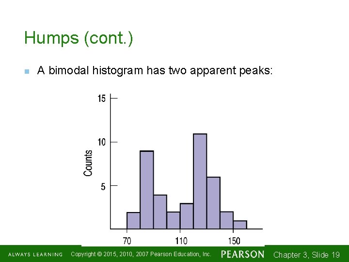
Humps 1. Does the histogram have a single, central hump or several separated bumps? n Humps in a histogram are called modes. n A histogram with one main peak is dubbed unimodal; histograms with two peaks are bimodal; histograms with three or more peaks are called multimodal. Copyright © 2015, 2010, 2007 Pearson Education, Inc. Chapter 3, Slide 1 -1818

Humps (cont. ) n A bimodal histogram has two apparent peaks: Copyright © 2015, 2010, 2007 Pearson Education, Inc. Chapter 3, Slide 1 -1919

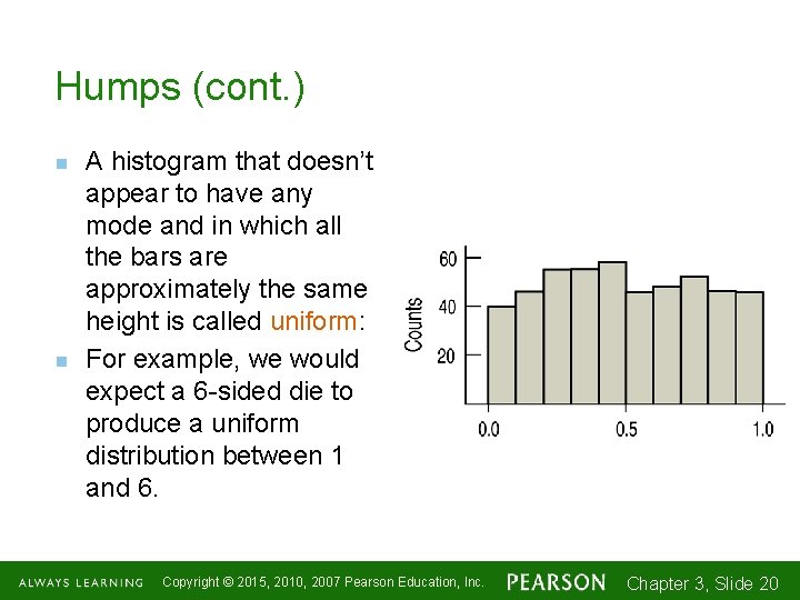
Humps (cont. ) n n A histogram that doesn’t appear to have any mode and in which all the bars are approximately the same height is called uniform: For example, we would expect a 6 -sided die to produce a uniform distribution between 1 and 6. Copyright © 2015, 2010, 2007 Pearson Education, Inc. Chapter 3, Slide 1 -2020

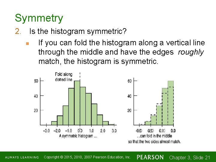
Symmetry 2. Is the histogram symmetric? n If you can fold the histogram along a vertical line through the middle and have the edges roughly match, the histogram is symmetric. Copyright © 2015, 2010, 2007 Pearson Education, Inc. Chapter 3, Slide 1 -2121

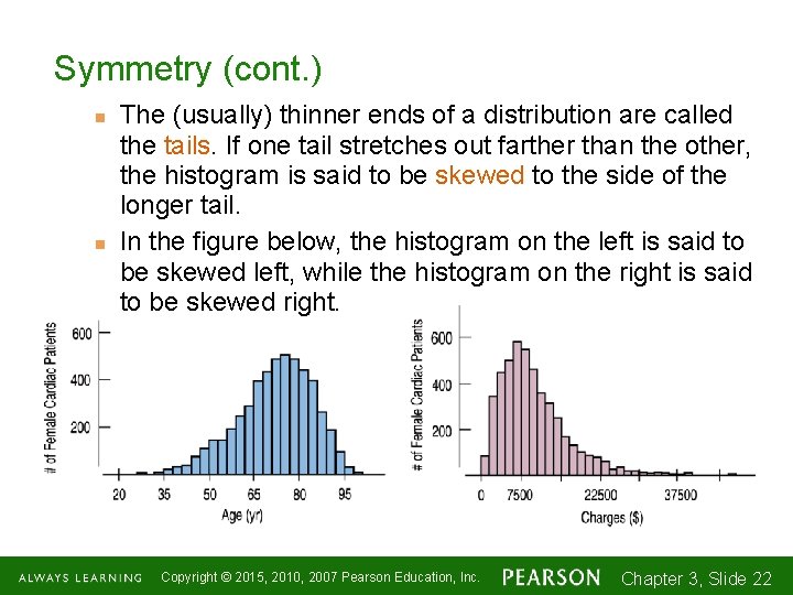
Symmetry (cont. ) n n The (usually) thinner ends of a distribution are called the tails. If one tail stretches out farther than the other, the histogram is said to be skewed to the side of the longer tail. In the figure below, the histogram on the left is said to be skewed left, while the histogram on the right is said to be skewed right. Copyright © 2015, 2010, 2007 Pearson Education, Inc. Chapter 3, Slide 1 -2222

Anything Unusual? 3. Do any unusual features stick out? n Sometimes it’s the unusual features that tell us something interesting or exciting about the data. n You should always mention any stragglers, or outliers, that stand off away from the body of the distribution. n Are there any gaps in the distribution? If so, we might have data from more than one group. Copyright © 2015, 2010, 2007 Pearson Education, Inc. Chapter 3, Slide 1 -2323

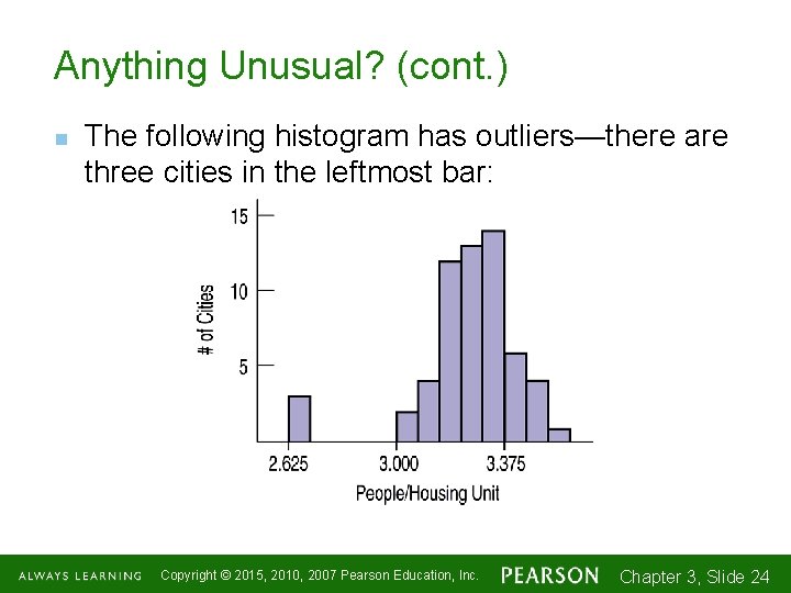
Anything Unusual? (cont. ) n The following histogram has outliers—there are three cities in the leftmost bar: Copyright © 2015, 2010, 2007 Pearson Education, Inc. Chapter 3, Slide 1 -2424

Where is the Center of the Distribution? n n n If you had to pick a single number to describe all the data what would you pick? It’s easy to find the center when a histogram is unimodal and symmetric—it’s right in the middle. On the other hand, it’s not so easy to find the center of a skewed histogram or a histogram with more than one mode. Copyright © 2015, 2010, 2007 Pearson Education, Inc. Chapter 3, Slide 1 -2525

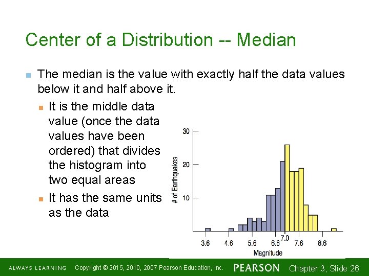
Center of a Distribution -- Median n The median is the value with exactly half the data values below it and half above it. n It is the middle data value (once the data values have been ordered) that divides the histogram into two equal areas n It has the same units as the data Copyright © 2015, 2010, 2007 Pearson Education, Inc. Chapter 3, Slide 1 -2626

How Spread Out is the Distribution? n n n Variation matters, and Statistics is about variation. Are the values of the distribution tightly clustered around the center or more spread out? Always report a measure of spread along with a measure of center when describing a distribution numerically. Copyright © 2015, 2010, 2007 Pearson Education, Inc. Chapter 3, Slide 1 -2727

Spread: Home on the Range n n The range of the data is the difference between the maximum and minimum values: Range = max – min A disadvantage of the range is that a single extreme value can make it very large and, thus, not representative of the data overall. Copyright © 2015, 2010, 2007 Pearson Education, Inc. Chapter 3, Slide 1 -2828

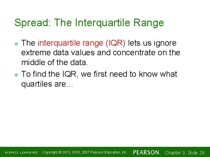
Spread: The Interquartile Range n n The interquartile range (IQR) lets us ignore extreme data values and concentrate on the middle of the data. To find the IQR, we first need to know what quartiles are… Copyright © 2015, 2010, 2007 Pearson Education, Inc. Chapter 3, Slide 1 -2929

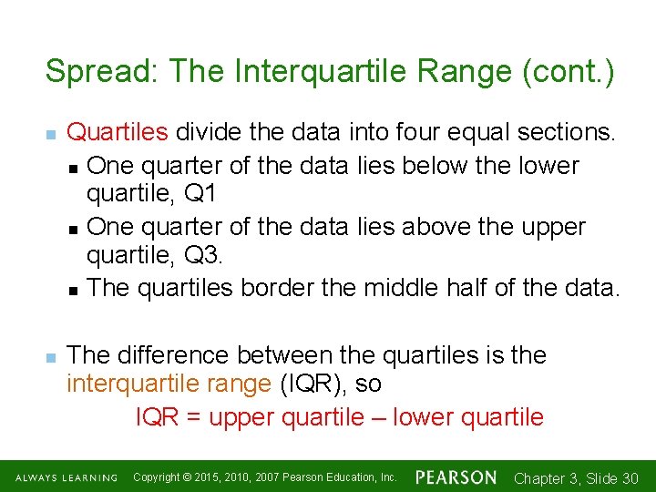
Spread: The Interquartile Range (cont. ) n n Quartiles divide the data into four equal sections. n One quarter of the data lies below the lower quartile, Q 1 n One quarter of the data lies above the upper quartile, Q 3. n The quartiles border the middle half of the data. The difference between the quartiles is the interquartile range (IQR), so IQR = upper quartile – lower quartile Copyright © 2015, 2010, 2007 Pearson Education, Inc. Chapter 3, Slide 1 -3030

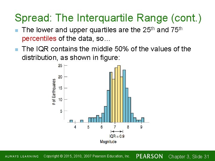
Spread: The Interquartile Range (cont. ) n n The lower and upper quartiles are the 25 th and 75 th percentiles of the data, so… The IQR contains the middle 50% of the values of the distribution, as shown in figure: Copyright © 2015, 2010, 2007 Pearson Education, Inc. Chapter 3, Slide 1 -3131

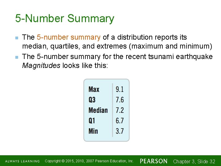
5 -Number Summary n n The 5 -number summary of a distribution reports its median, quartiles, and extremes (maximum and minimum) The 5 -number summary for the recent tsunami earthquake Magnitudes looks like this: Copyright © 2015, 2010, 2007 Pearson Education, Inc. Chapter 3, Slide 1 -3232

Making Boxplots n n A boxplot is a graphical display of the five-number summary. Boxplots are useful when comparing groups. Boxplots are particularly good at pointing outliers. Boxplot Powerpoint time!!!!! Copyright © 2015, 2010, 2007 Pearson Education, Inc. Chapter 3, Slide 1 -3333

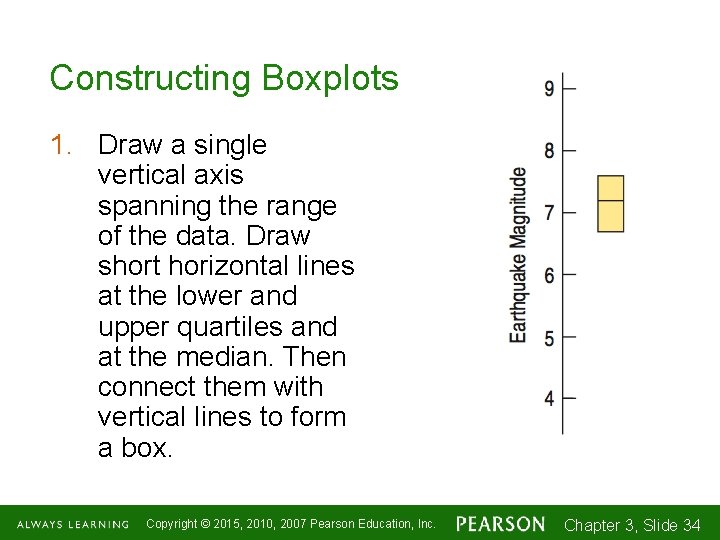
Constructing Boxplots 1. Draw a single vertical axis spanning the range of the data. Draw short horizontal lines at the lower and upper quartiles and at the median. Then connect them with vertical lines to form a box. Copyright © 2015, 2010, 2007 Pearson Education, Inc. Chapter 3, Slide 1 -3434

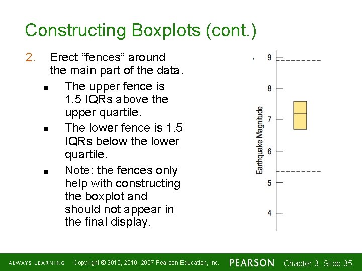
Constructing Boxplots (cont. ) 2. Erect “fences” around the main part of the data. n The upper fence is 1. 5 IQRs above the upper quartile. n The lower fence is 1. 5 IQRs below the lower quartile. n Note: the fences only help with constructing the boxplot and should not appear in the final display. Copyright © 2015, 2010, 2007 Pearson Education, Inc. Chapter 3, Slide 1 -3535

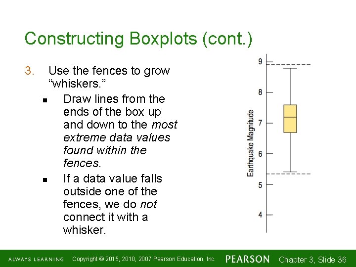
Constructing Boxplots (cont. ) 3. Use the fences to grow “whiskers. ” n Draw lines from the ends of the box up and down to the most extreme data values found within the fences. n If a data value falls outside one of the fences, we do not connect it with a whisker. Copyright © 2015, 2010, 2007 Pearson Education, Inc. Chapter 3, Slide 1 -3636

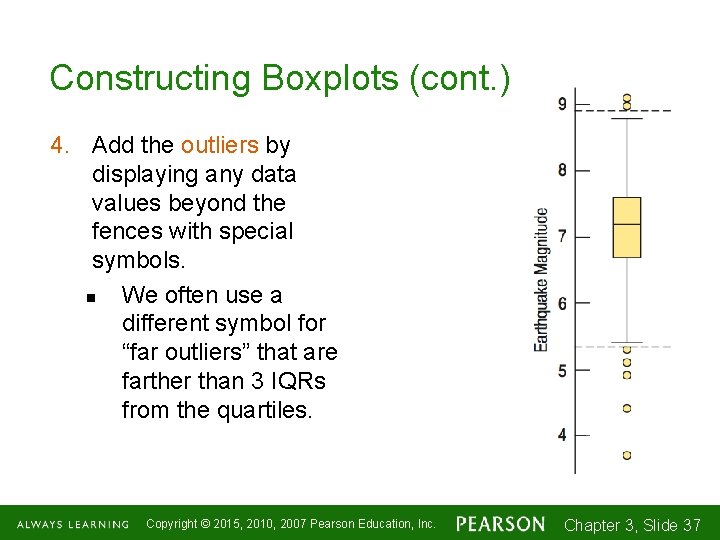
Constructing Boxplots (cont. ) 4. Add the outliers by displaying any data values beyond the fences with special symbols. n We often use a different symbol for “far outliers” that are farther than 3 IQRs from the quartiles. Copyright © 2015, 2010, 2007 Pearson Education, Inc. Chapter 3, Slide 1 -3737

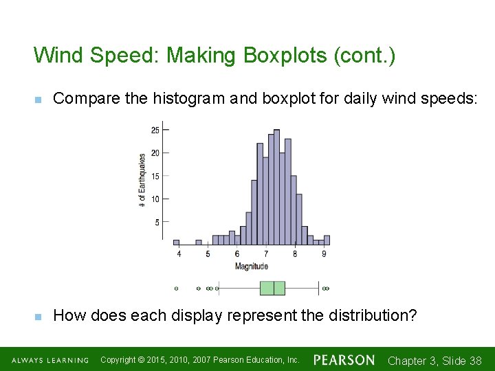
Wind Speed: Making Boxplots (cont. ) n Compare the histogram and boxplot for daily wind speeds: n How does each display represent the distribution? Copyright © 2015, 2010, 2007 Pearson Education, Inc. Chapter 3, Slide 1 -3838

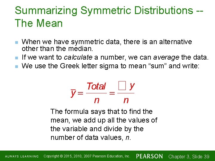
Summarizing Symmetric Distributions -The Mean n When we have symmetric data, there is an alternative other than the median. If we want to calculate a number, we can average the data. We use the Greek letter sigma to mean “sum” and write: The formula says that to find the mean, we add up all the values of the variable and divide by the number of data values, n. Copyright © 2015, 2010, 2007 Pearson Education, Inc. Chapter 3, Slide 1 -3939

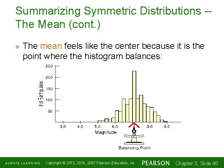
Summarizing Symmetric Distributions -The Mean (cont. ) n The mean feels like the center because it is the point where the histogram balances: Copyright © 2015, 2010, 2007 Pearson Education, Inc. Chapter 3, Slide 1 -4040

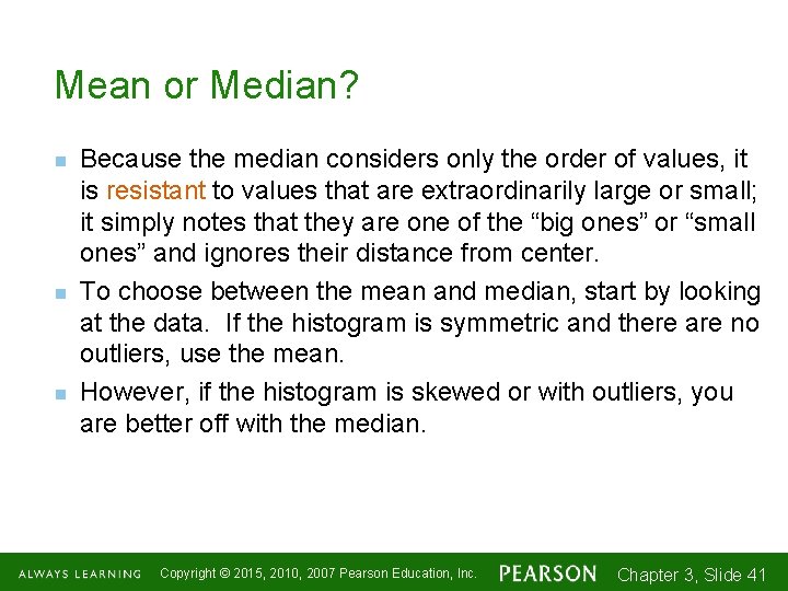
Mean or Median? n n n Because the median considers only the order of values, it is resistant to values that are extraordinarily large or small; it simply notes that they are one of the “big ones” or “small ones” and ignores their distance from center. To choose between the mean and median, start by looking at the data. If the histogram is symmetric and there are no outliers, use the mean. However, if the histogram is skewed or with outliers, you are better off with the median. Copyright © 2015, 2010, 2007 Pearson Education, Inc. Chapter 3, Slide 1 -4141

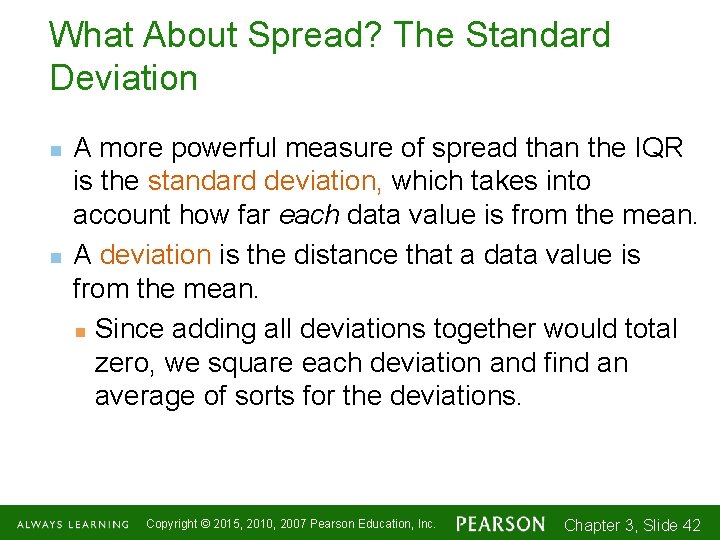
What About Spread? The Standard Deviation n n A more powerful measure of spread than the IQR is the standard deviation, which takes into account how far each data value is from the mean. A deviation is the distance that a data value is from the mean. n Since adding all deviations together would total zero, we square each deviation and find an average of sorts for the deviations. Copyright © 2015, 2010, 2007 Pearson Education, Inc. Chapter 3, Slide 1 -4242

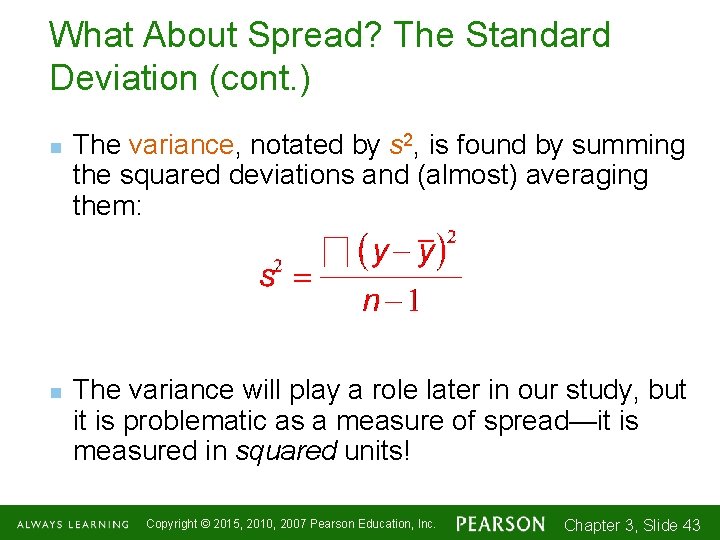
What About Spread? The Standard Deviation (cont. ) n n The variance, notated by s 2, is found by summing the squared deviations and (almost) averaging them: The variance will play a role later in our study, but it is problematic as a measure of spread—it is measured in squared units! Copyright © 2015, 2010, 2007 Pearson Education, Inc. Chapter 3, Slide 1 -4343

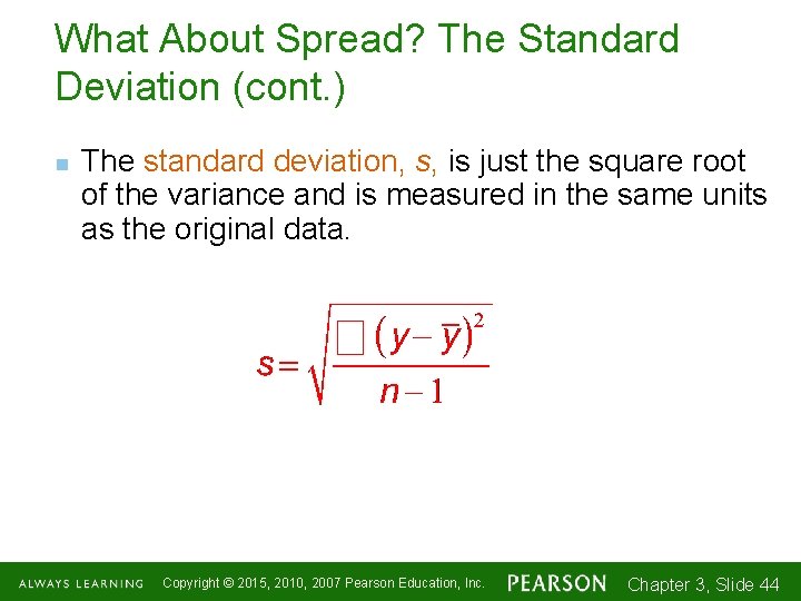
What About Spread? The Standard Deviation (cont. ) n The standard deviation, s, is just the square root of the variance and is measured in the same units as the original data. Copyright © 2015, 2010, 2007 Pearson Education, Inc. Chapter 3, Slide 1 -4444

Thinking About Variation n n Since Statistics is about variation, spread is an important fundamental concept of Statistics. Measures of spread help us talk about what we don’t know. When the data values are tightly clustered around the center of the distribution, the IQR and standard deviation will be small. When the data values are scattered far from the center, the IQR and standard deviation will be large. Copyright © 2015, 2010, 2007 Pearson Education, Inc. Chapter 3, Slide 1 -4545

Tell -- Draw a Picture n When telling about quantitative variables, start by making a histogram, dotplot, or stem-and-leaf display and discuss the shape of the distribution. Copyright © 2015, 2010, 2007 Pearson Education, Inc. Chapter 3, Slide 1 -4646

Tell -- Shape, Center, and Spread n Next, always report the shape of its distribution, along with a center and a spread. n If the shape is skewed, report the median and IQR. n If the shape is symmetric, report the mean and standard deviation and possibly the median and IQR as well. Copyright © 2015, 2010, 2007 Pearson Education, Inc. Chapter 3, Slide 1 -4747

Tell -- What About Unusual Features? n n If there are multiple modes, try to understand why. If you identify a reason for the separate modes, it may be good to split the data into two groups. If there any clear outliers and you are reporting the mean and standard deviation, report them with the outliers present and with the outliers removed. The differences may be quite revealing. n Note: The median and IQR are not likely to be affected by the outliers. Copyright © 2015, 2010, 2007 Pearson Education, Inc. Chapter 3, Slide 1 -4848

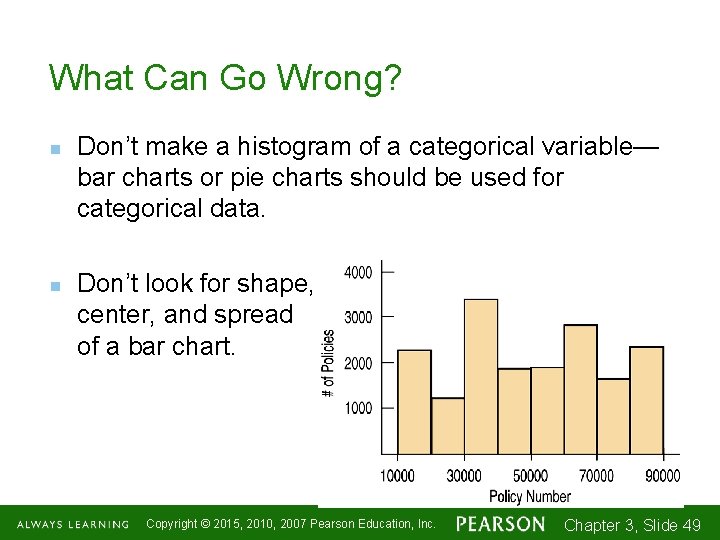
What Can Go Wrong? n n Don’t make a histogram of a categorical variable— bar charts or pie charts should be used for categorical data. Don’t look for shape, center, and spread of a bar chart. Copyright © 2015, 2010, 2007 Pearson Education, Inc. Chapter 3, Slide 1 -4949

What Can Go Wrong? (cont. ) n n n n n Don’t forget to do a reality check – don’t let the calculator do the thinking for you. Don’t forget to sort the values before finding the median or percentiles. Don’t worry about small differences when using different methods. Don’t compute numerical summaries of a categorical variable. Don’t report too many decimal places. Don’t round in the middle of a calculation. Watch out for multiple modes Beware of outliers Make a picture … make a picture. . . make a picture !!! Copyright © 2015, 2010, 2007 Pearson Education, Inc. Chapter 3, Slide 1 -5050

What have we learned? n n n We’ve learned how to make a picture for quantitative data to help us see the story the data have to Tell. We can display the distribution of quantitative data with a histogram, stem-and-leaf display, dotplot, or boxplot. We’ve learned how to summarize distributions of quantitative variables numerically. n Measures of center for a distribution include the median and mean. n Measures of spread include the range, IQR, and standard deviation. n Use the median and IQR when the distribution is skewed. Use the mean and standard deviation if the distribution is symmetric. Copyright © 2015, 2010, 2007 Pearson Education, Inc. Chapter 3, Slide 1 -5151

What have we learned? (cont. ) n We’ve learned to Think about the type of variable we are summarizing. n All methods of this chapter assume the data are quantitative. n The Quantitative Data Condition serves as a check that the data are, in fact, quantitative. Copyright © 2015, 2010, 2007 Pearson Education, Inc. Chapter 3, Slide 1 -5252

AP Tips n n Again, scales and labels on all graphs are required for full credit. Don’t lose easy points! Describe center, shape, spread, and unusual. All four! And be specific. Is there a gap? Where? Is there an outlier? What is it? Read carefully. Have you been given the data set or just the summary statistics? Copyright © 2015, 2010, 2007 Pearson Education, Inc. Chapter 3, Slide 1 -5353

AP Tips, cont. n n n Your calculator can find all the summary statistics and make great graphs. Make sure you can do this quickly and efficiently. But also be on the lookout for problems where the summary statistics and/or graphs have already been given to you! Sometimes you won’t use your calculator, but you will need to use your analyzing and describing skills. Copyright © 2015, 2010, 2007 Pearson Education, Inc. Chapter 3, Slide 1 -5454