1 2 Displaying Quantitative Data with Graphs HW




- Slides: 26

1. 2 Displaying Quantitative Data with Graphs HW: P. 42 (37 -47 ODD, 53 -59 ODD, 60, 69 -74)

Introduction • Last section, you learned how to display categorical data. In this section, you will learn how to display quantitative data. • We will be looking to describe the distribution of this data. • We will you dotplots, stemplots, and histograms to help. • Make sure you master these plots…. they will be used throughout the course!!

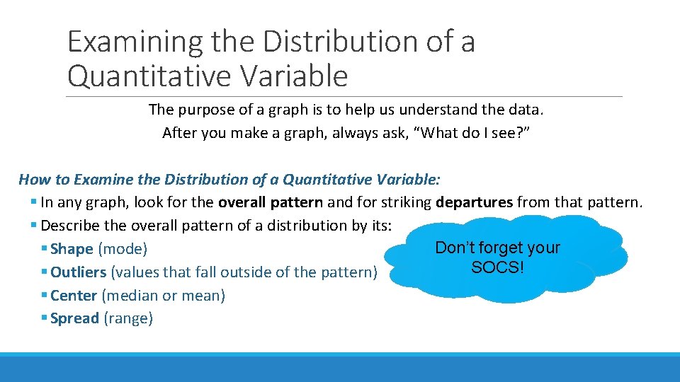
Examining the Distribution of a Quantitative Variable The purpose of a graph is to help us understand the data. After you make a graph, always ask, “What do I see? ” How to Examine the Distribution of a Quantitative Variable: § In any graph, look for the overall pattern and for striking departures from that pattern. § Describe the overall pattern of a distribution by its: Don’t forget your § Shape (mode) SOCS! § Outliers (values that fall outside of the pattern) § Center (median or mean) § Spread (range)

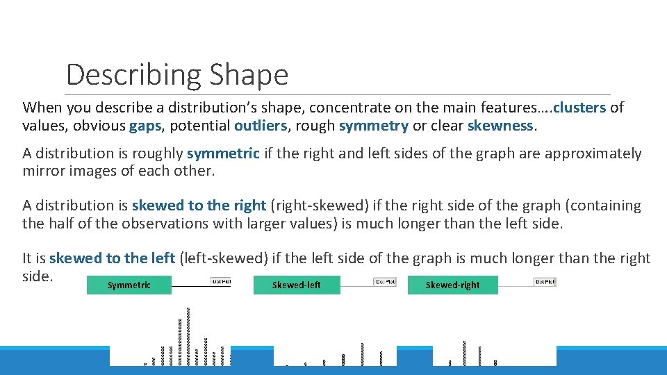
Describing Shape When you describe a distribution’s shape, concentrate on the main features…. clusters of values, obvious gaps, potential outliers, rough symmetry or clear skewness. A distribution is roughly symmetric if the right and left sides of the graph are approximately mirror images of each other. A distribution is skewed to the right (right-skewed) if the right side of the graph (containing the half of the observations with larger values) is much longer than the left side. It is skewed to the left (left-skewed) if the left side of the graph is much longer than the right side. Symmetric Skewed-left Skewed-right

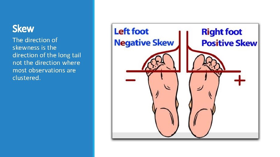
Skew The direction of skewness is the direction of the long tail not the direction where most observations are clustered.

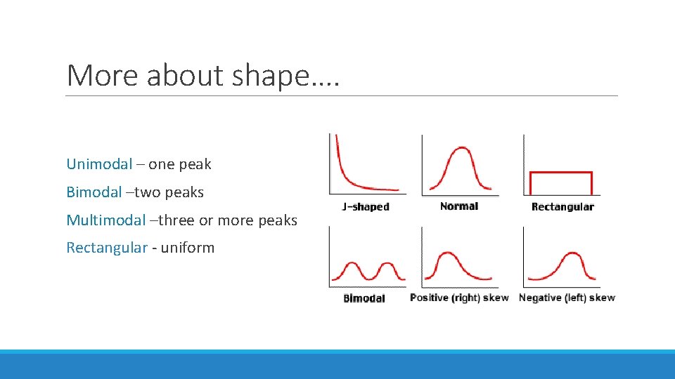
More about shape…. Unimodal – one peak Bimodal –two peaks Multimodal –three or more peaks Rectangular - uniform


Dotplots One of the simplest graphs to construct and interpret is a dotplot. Each data value is shown as a dot above its location on a number line. How to Make a Dotplot: 1)Draw a horizontal axis (a number line) and label it with the variable name. 2)Scale the axis from the minimum to the maximum value. 3)Mark a dot above the location on the horizontal axis corresponding to each data value. Number of Goals Scored Per Game by the 2004 US Women’s Soccer Team 3 0 2 7 8 2 4 3 5 1 1 4 5 3 1 1 3 3 3 2 1 2 2 2 4 3 5 6 1 5 5 1 1 5

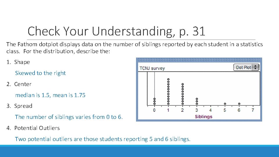
Check Your Understanding, p. 31 The Fathom dotplot displays data on the number of siblings reported by each student in a statistics class. For the distribution, describe the: 1. Shape Skewed to the right 2. Center median is 1. 5, mean is 1. 75 3. Spread The number of siblings varies from 0 to 6. 4. Potential Outliers Two potential outliers are those students reporting 5 and 6 siblings.

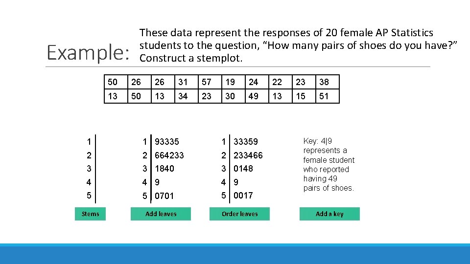
Stemplots (Stem-and-Leaf Plots) Stemplots give us a quick picture of the distribution while including the actual numerical values. How to Make a Stemplot: 1)Separate each observation into a stem (all but the final digit) and a leaf (the final digit). 2)Write all possible stems from the smallest to the largest in a vertical column and draw a vertical line to the right of the column. 3)Write each leaf in the row to the right of its stem. 4)Arrange the leaves in increasing order out from the stem. 5)Provide a key that explains in context what the stems and leaves represent.

Example: These data represent the responses of 20 female AP Statistics students to the question, “How many pairs of shoes do you have? ” Construct a stemplot. 50 26 26 31 57 19 24 22 23 38 13 50 13 34 23 30 49 13 15 51 1 1 93335 1 33359 2 2 664233 2 233466 3 3 1840 3 0148 4 4 9 5 5 0701 5 0017 Stems Add leaves Order leaves Key: 4|9 represents a female student who reported having 49 pairs of shoes. Add a key

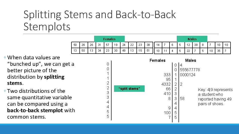
Splitting Stems and Back-to-Back Stemplots Females Males 50 26 26 31 57 19 24 22 23 38 14 7 6 5 12 38 8 7 10 10 13 50 13 34 23 30 49 13 15 51 10 11 4 5 22 7 5 10 35 7 ◦ When data values are “bunched up”, we can get a better picture of the distribution by splitting stems. ◦ Two distributions of the same quantitative variable can be compared using a back-to-back stemplot with common stems. 0 0 1 1 2 2 3 3 4 4 5 5 Females “split stems” 333 95 4332 66 410 8 9 100 7 Males 0 0 1 1 2 2 3 3 4 4 5 5 4 555677778 0000124 2 58 Key: 4|9 represents a student who reported having 49 pairs of shoes.

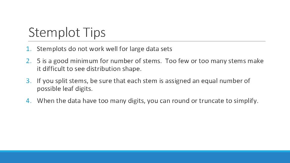
Stemplot Tips 1. Stemplots do not work well for large data sets 2. 5 is a good minimum for number of stems. Too few or too many stems make it difficult to see distribution shape. 3. If you split stems, be sure that each stem is assigned an equal number of possible leaf digits. 4. When the data have too many digits, you can round or truncate to simplify.

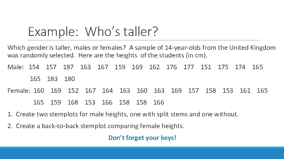
Example: Who’s taller? Which gender is taller, males or females? A sample of 14 -year-olds from the United Kingdom was randomly selected. Here are the heights of the students (in cm). Male: 154 157 187 163 167 159 162 176 177 151 175 174 165 165 183 180 Female: 160 169 152 167 164 163 160 163 169 157 158 153 161 165 159 168 153 166 158 166 1. Create two stemplots for male heights, one with split stems and one without. 2. Create a back-to-back stemplot comparing female heights. Don’t forget your keys!

Comparing Distributions § Some of the most interesting statistics questions involve comparing two or more groups. § Always discuss shape, center, spread, and possible outliers whenever you compare distributions of a quantitative variable.

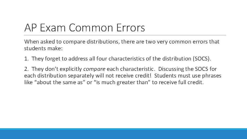
AP Exam Common Errors When asked to compare distributions, there are two very common errors that students make: 1. They forget to address all four characteristics of the distribution (SOCS). 2. They don’t explicitly compare each characteristic. Discussing the SOCS for each distribution separately will not receive credit! Students must use phrases like “about the same as” or “is much greater than” to receive full credit.

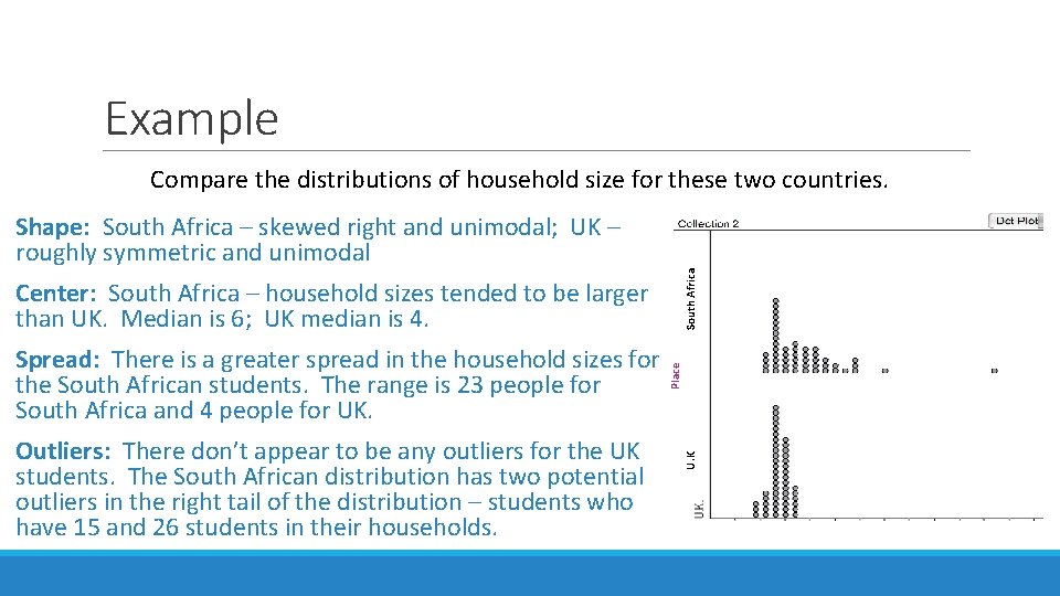
Example Compare the distributions of household size for these two countries. Outliers: There don’t appear to be any outliers for the UK students. The South African distribution has two potential outliers in the right tail of the distribution – students who have 15 and 26 students in their households. U. K Spread: There is a greater spread in the household sizes for the South African students. The range is 23 people for South Africa and 4 people for UK. Place Center: South Africa – household sizes tended to be larger than UK. Median is 6; UK median is 4. South Africa Shape: South Africa – skewed right and unimodal; UK – roughly symmetric and unimodal

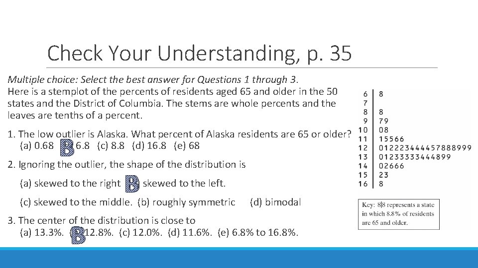
Check Your Understanding, p. 35 Multiple choice: Select the best answer for Questions 1 through 3. Here is a stemplot of the percents of residents aged 65 and older in the 50 states and the District of Columbia. The stems are whole percents and the leaves are tenths of a percent. 1. The low outlier is Alaska. What percent of Alaska residents are 65 or older? (a) 0. 68 (b) 6. 8 (c) 8. 8 (d) 16. 8 (e) 68 B 2. Ignoring the outlier, the shape of the distribution is (a) skewed to the right (b) skewed to the left. B (c) skewed to the middle. (b) roughly symmetric (d) bimodal 3. The center of the distribution is close to (a) 13. 3%. (b) 12. 8%. (c) 12. 0%. (d) 11. 6%. (e) 6. 8% to 16. 8%. B

Histograms When dealing with larger sets of data, dotplots and stemplots can be a bit cumbersome and time-consuming. In these cases, we usually construct a histogram instead. A histogram displays the frequency of values that fall within equal-width classes. *Be sure not to confuse histograms with bar graphs! (Histograms describe quantitative data while bar graphs describe categorical data. ) How to Make a Histogram: 1)Divide the range of data into classes of equal width. 2)Find the count (frequency) or percent (relative frequency) of individuals in each class. 3)Label and scale your axes and draw the histogram. The height of the bar equals its frequency. Adjacent bars should touch, unless a class contains no individuals.

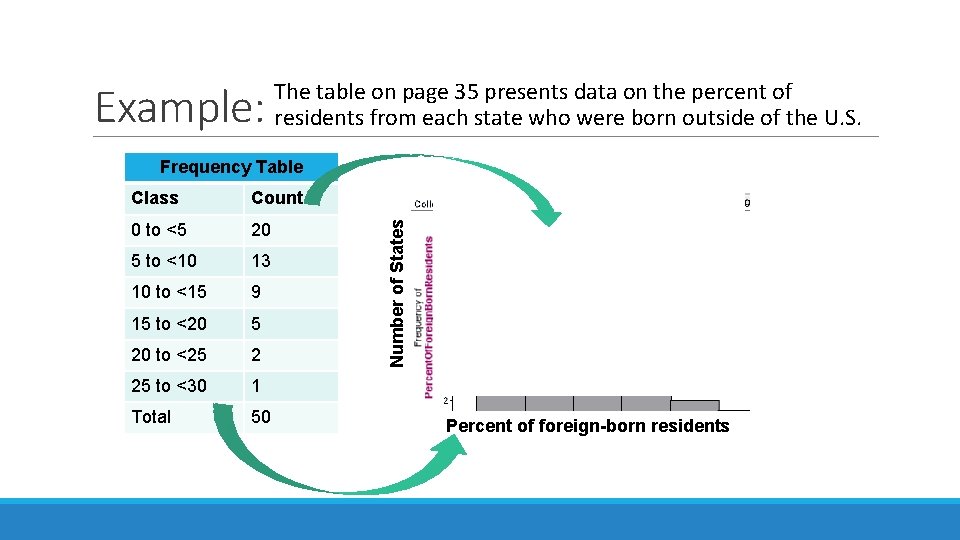
Example: The table on page 35 presents data on the percent of residents from each state who were born outside of the U. S. Class Count 0 to <5 20 5 to <10 13 10 to <15 9 15 to <20 5 20 to <25 2 25 to <30 1 Total 50 Number of States Frequency Table Percent of foreign-born residents

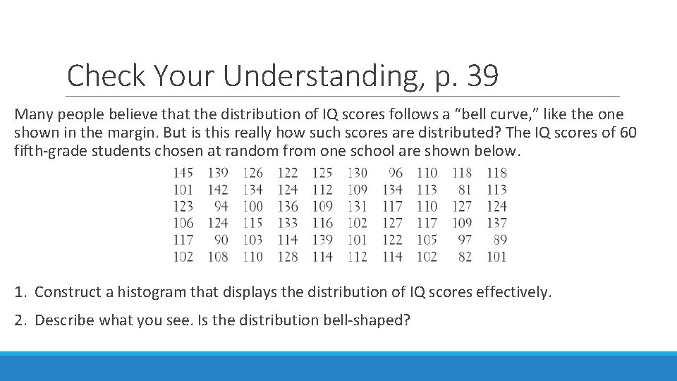
Check Your Understanding, p. 39 Many people believe that the distribution of IQ scores follows a “bell curve, ” like the one shown in the margin. But is this really how such scores are distributed? The IQ scores of 60 fifth-grade students chosen at random from one school are shown below. 1. Construct a histogram that displays the distribution of IQ scores effectively. 2. Describe what you see. Is the distribution bell-shaped?

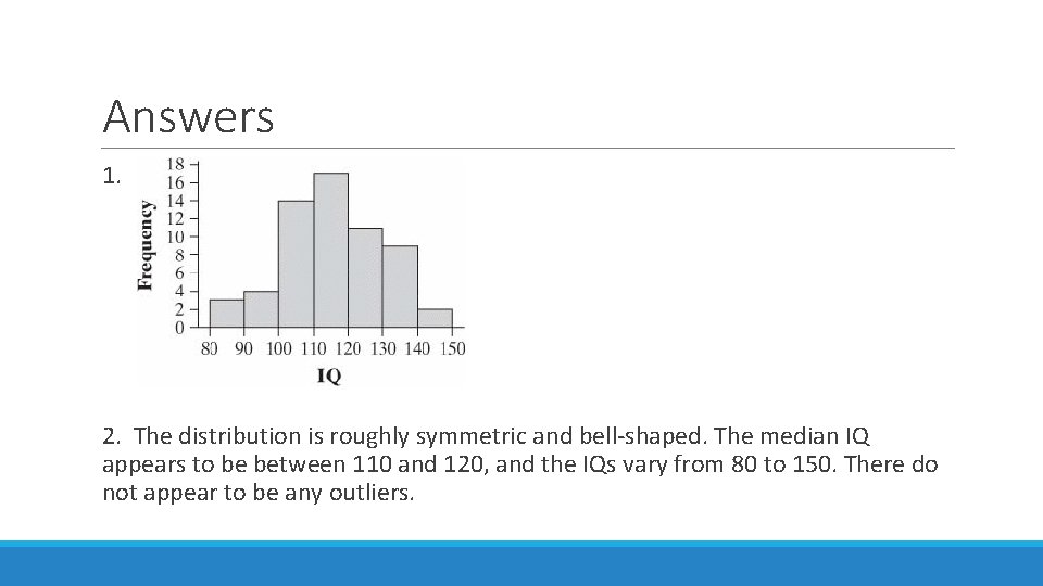
Answers 1. 2. The distribution is roughly symmetric and bell-shaped. The median IQ appears to be between 110 and 120, and the IQs vary from 80 to 150. There do not appear to be any outliers.

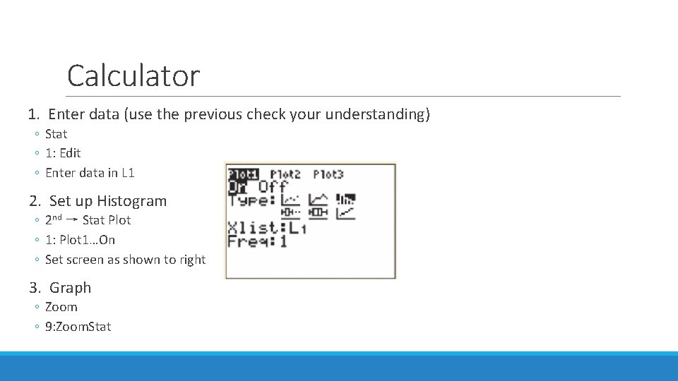
Calculator 1. Enter data (use the previous check your understanding) ◦ Stat ◦ 1: Edit ◦ Enter data in L 1 2. Set up Histogram ◦ 2 nd → Stat Plot ◦ 1: Plot 1…On ◦ Set screen as shown to right 3. Graph ◦ Zoom ◦ 9: Zoom. Stat

Using Histograms Wisely Here are several cautions based on common mistakes students make when using histograms. 1)Don’t confuse histograms and bar graphs. 2)Use percents instead of counts on the vertical axis when comparing distributions with different numbers of observations. 3)Just because a graph looks nice, it’s not necessarily a meaningful display of data. 4)Make sure to choose classes that are all the same width. 5)Five classes is a good minimum…. too many classes will produce a “pancake” graph and too few classes will give a “skyscraper” graph.

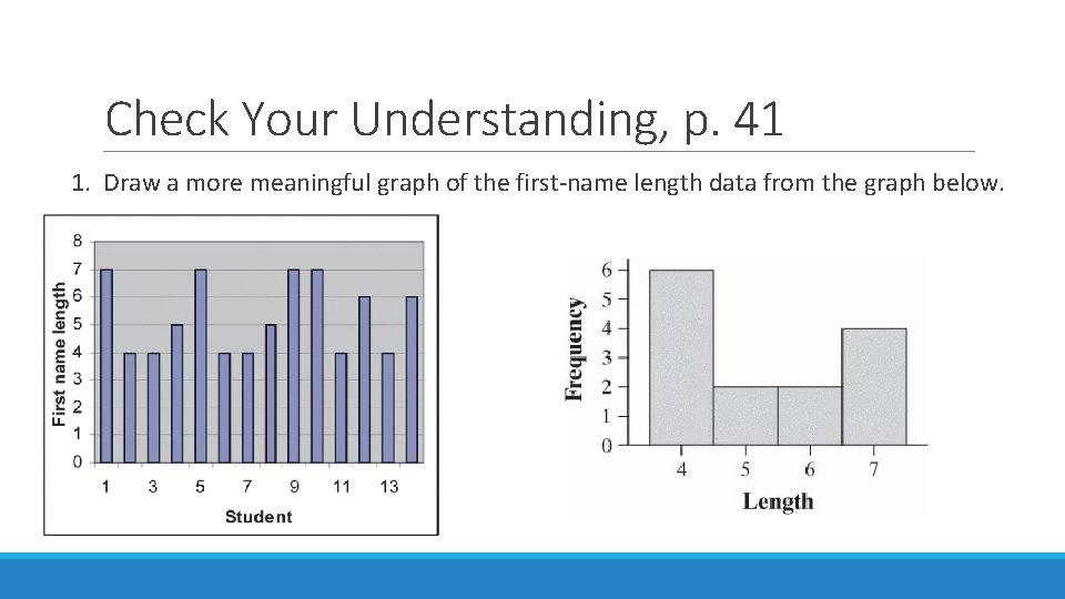
Check Your Understanding, p. 41 1. Draw a more meaningful graph of the first-name length data from the graph below.

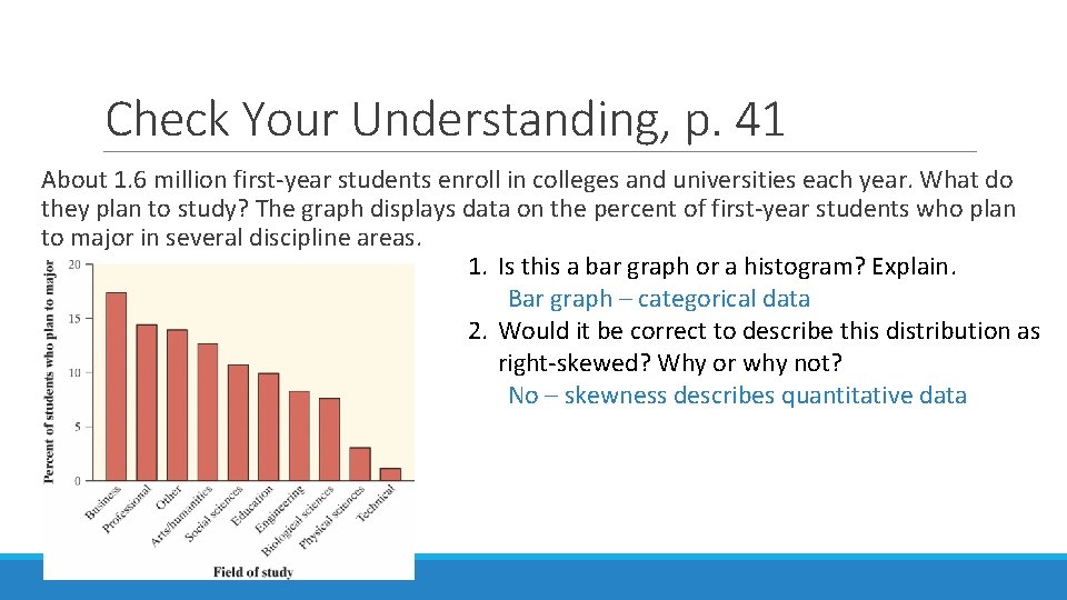
Check Your Understanding, p. 41 About 1. 6 million first-year students enroll in colleges and universities each year. What do they plan to study? The graph displays data on the percent of first-year students who plan to major in several discipline areas. 1. Is this a bar graph or a histogram? Explain. Bar graph – categorical data 2. Would it be correct to describe this distribution as right-skewed? Why or why not? No – skewness describes quantitative data