Chapter 4 Collecting Displaying and Analyzing Data Regular
- Slides: 42

Chapter 4: Collecting, Displaying, and Analyzing Data Regular Math

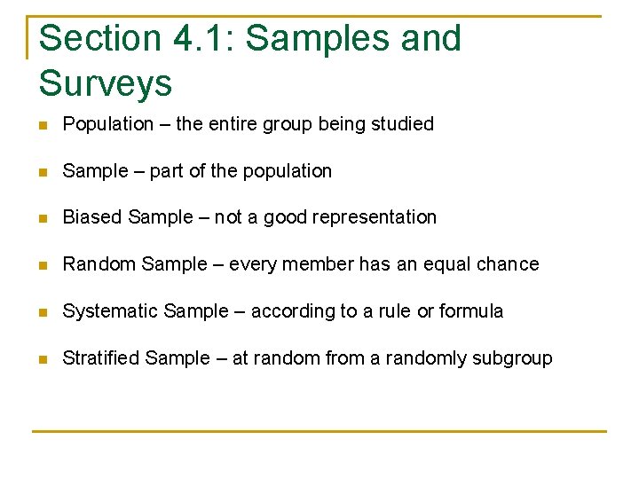
Section 4. 1: Samples and Surveys n Population – the entire group being studied n Sample – part of the population n Biased Sample – not a good representation n Random Sample – every member has an equal chance n Systematic Sample – according to a rule or formula n Stratified Sample – at random from a randomly subgroup

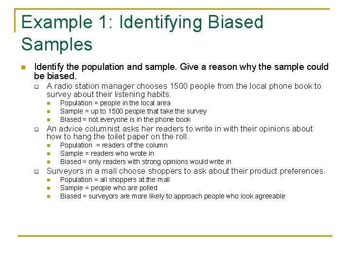
Example 1: Identifying Biased Samples n Identify the population and sample. Give a reason why the sample could be biased. q A radio station manager chooses 1500 people from the local phone book to survey about their listening habits. n n n q An advice columnist asks her readers to write in with their opinions about how to hang the toilet paper on the roll. n n n q Population = people in the local area Sample = up to 1500 people that take the survey Biased = not everyone is in the phone book Population = readers of the column Sample = readers who wrote in Biased = only readers with strong opinions would write in Surveyors in a mall choose shoppers to ask about their product preferences. n n n Population = all shoppers at the mall Sample = people who are polled Biased = surveyors are more likely to approach people who look agreeable

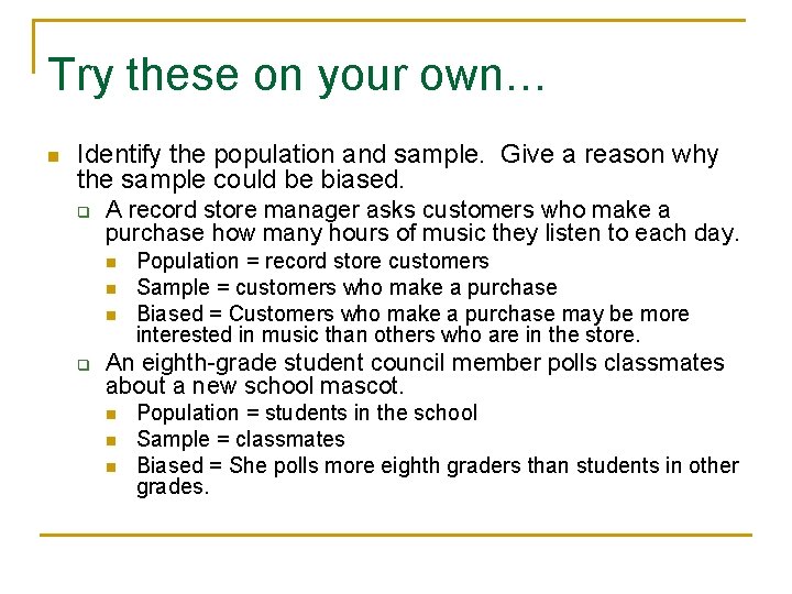
Try these on your own… n Identify the population and sample. Give a reason why the sample could be biased. q A record store manager asks customers who make a purchase how many hours of music they listen to each day. n n n q Population = record store customers Sample = customers who make a purchase Biased = Customers who make a purchase may be more interested in music than others who are in the store. An eighth-grade student council member polls classmates about a new school mascot. n n n Population = students in the school Sample = classmates Biased = She polls more eighth graders than students in other grades.

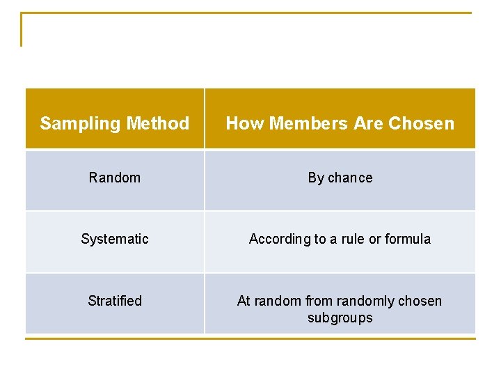
Sampling Method How Members Are Chosen Random By chance Systematic According to a rule or formula Stratified At random from randomly chosen subgroups

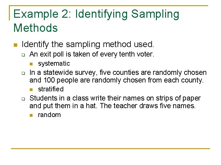
Example 2: Identifying Sampling Methods n Identify the sampling method used. q q q An exit poll is taken of every tenth voter. n systematic In a statewide survey, five counties are randomly chosen and 100 people are randomly chosen from each county. n stratified Students in a class write their names on strips of paper and put them in a hat. The teacher draws five names. n random

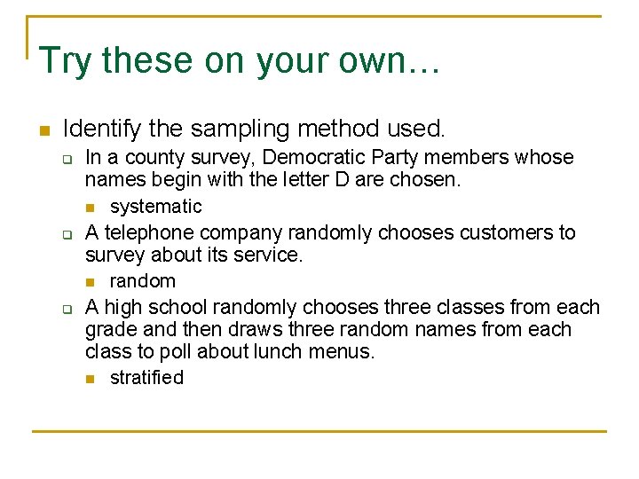
Try these on your own… n Identify the sampling method used. q q q In a county survey, Democratic Party members whose names begin with the letter D are chosen. n systematic A telephone company randomly chooses customers to survey about its service. n random A high school randomly chooses three classes from each grade and then draws three random names from each class to poll about lunch menus. n stratified

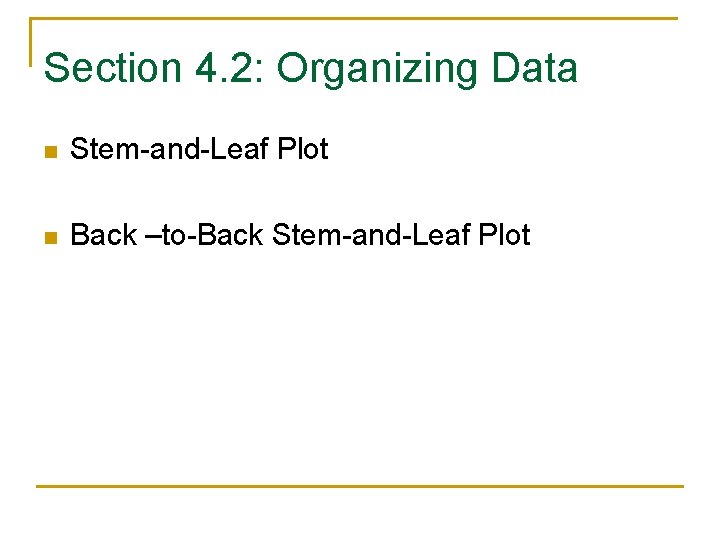
Section 4. 2: Organizing Data n Stem-and-Leaf Plot n Back –to-Back Stem-and-Leaf Plot

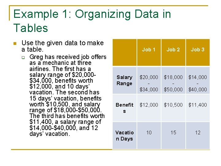
Example 1: Organizing Data in Tables n Use the given data to make a table. q Greg has received job offers as a mechanic at three airlines. The first has a salary range of $20, 000$34, 000, benefits worth $12, 000, and 10 days’ vacation. The second has 15 days’ vacation, benefits worth $10, 500, and salary range of $18, 000 -$50, 000. The third has benefits worth $11, 400, a salary range of $14, 000 -$40, 000, and 12 days’ vacation. Job 1 Job 2 Job 3 Salary Range $20, 000 $34, 000 $18, 000 $50, 000 $14, 000 $40, 000 Benefit s $12, 000 $10, 500 $11, 400 Vacatio n Days 10 15 12

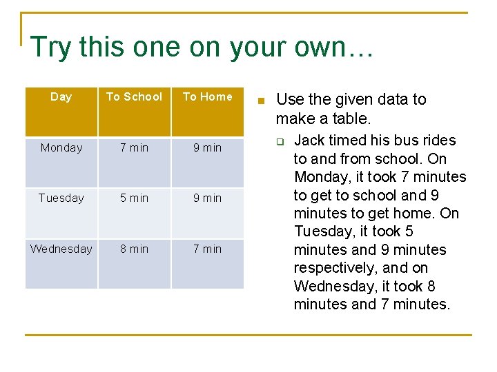
Try this one on your own… Day To School To Home Monday 7 min 9 min Tuesday 5 min 9 min Wednesday 8 min 7 min n Use the given data to make a table. q Jack timed his bus rides to and from school. On Monday, it took 7 minutes to get to school and 9 minutes to get home. On Tuesday, it took 5 minutes and 9 minutes respectively, and on Wednesday, it took 8 minutes and 7 minutes.

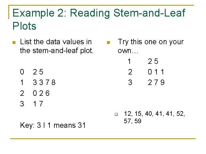
Example 2: Reading Stem-and-Leaf Plots n List the data values in the stem-and-leaf plot. 0 1 2 3 25 3378 026 17 n Try this one on your own… 1 25 2 011 3 279 q Key: 3 I 1 means 31 12, 15, 40, 41, 52, 57, 59

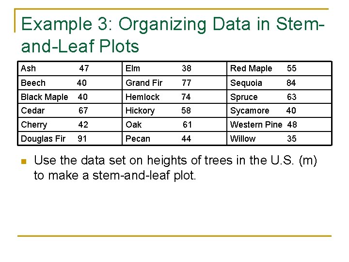
Example 3: Organizing Data in Stemand-Leaf Plots Ash 47 Elm 38 Red Maple 55 Beech 40 Grand Fir 77 Sequoia 84 Black Maple 40 Hemlock 74 Spruce 63 Cedar 67 Hickory 58 Sycamore 40 Cherry 42 Oak 61 Western Pine 48 Douglas Fir 91 Pecan 44 Willow n 35 Use the data set on heights of trees in the U. S. (m) to make a stem-and-leaf plot.

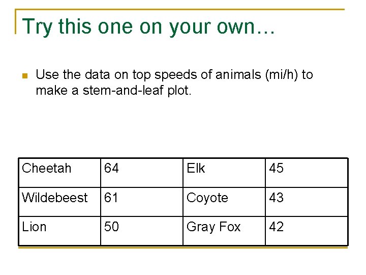
Try this one on your own… n Use the data on top speeds of animals (mi/h) to make a stem-and-leaf plot. Cheetah 64 Elk 45 Wildebeest 61 Coyote 43 Lion 50 Gray Fox 42

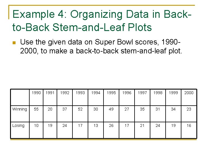
Example 4: Organizing Data in Backto-Back Stem-and-Leaf Plots n Use the given data on Super Bowl scores, 19902000, to make a back-to-back stem-and-leaf plot. 1990 1991 1992 1993 1994 1995 1996 1997 1998 1999 2000 Winning 55 20 37 52 30 49 27 35 31 34 23 Losing 10 19 24 17 13 26 17 21 24 19 16

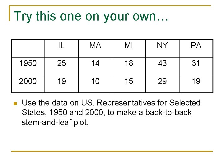
Try this one on your own… n IL MA MI NY PA 1950 25 14 18 43 31 2000 19 10 15 29 19 Use the data on US. Representatives for Selected States, 1950 and 2000, to make a back-to-back stem-and-leaf plot.

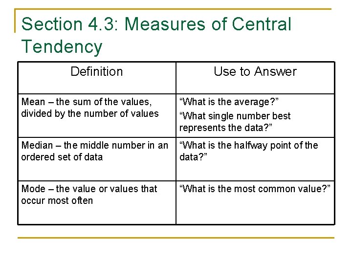
Section 4. 3: Measures of Central Tendency Definition Use to Answer Mean – the sum of the values, divided by the number of values “What is the average? ” “What single number best represents the data? ” Median – the middle number in an ordered set of data “What is the halfway point of the data? ” Mode – the value or values that occur most often “What is the most common value? ”

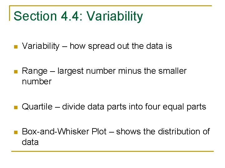
Section 4. 4: Variability n Variability – how spread out the data is n Range – largest number minus the smaller number n Quartile – divide data parts into four equal parts n Box-and-Whisker Plot – shows the distribution of data

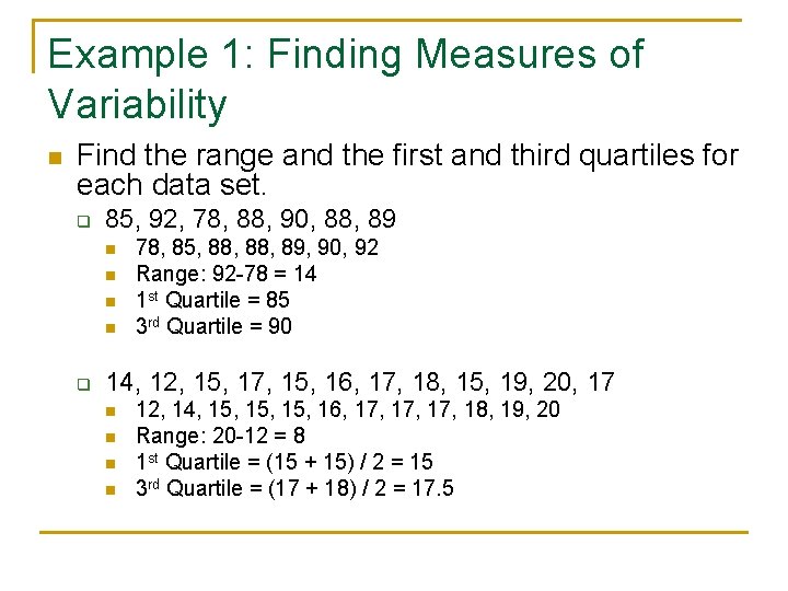
Example 1: Finding Measures of Variability n Find the range and the first and third quartiles for each data set. q 85, 92, 78, 88, 90, 88, 89 n n q 78, 85, 88, 89, 90, 92 Range: 92 -78 = 14 1 st Quartile = 85 3 rd Quartile = 90 14, 12, 15, 17, 15, 16, 17, 18, 15, 19, 20, 17 n n 12, 14, 15, 15, 16, 17, 17, 18, 19, 20 Range: 20 -12 = 8 1 st Quartile = (15 + 15) / 2 = 15 3 rd Quartile = (17 + 18) / 2 = 17. 5

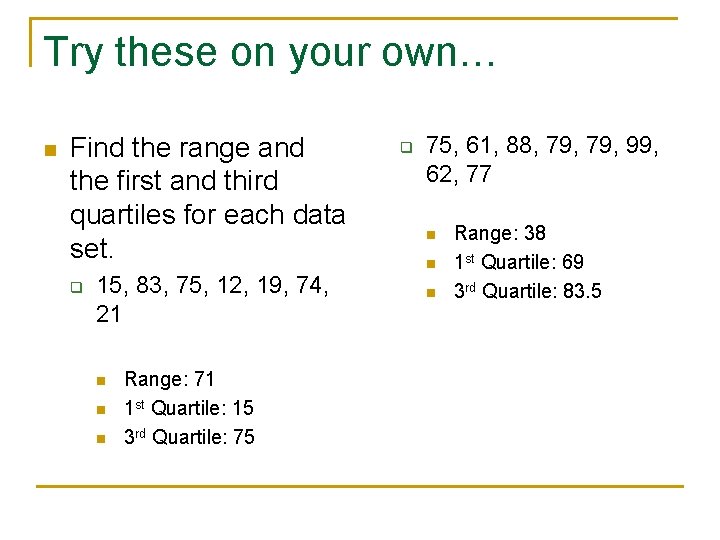
Try these on your own… n Find the range and the first and third quartiles for each data set. q 15, 83, 75, 12, 19, 74, 21 n n n Range: 71 1 st Quartile: 15 3 rd Quartile: 75 q 75, 61, 88, 79, 99, 62, 77 n n n Range: 38 1 st Quartile: 69 3 rd Quartile: 83. 5

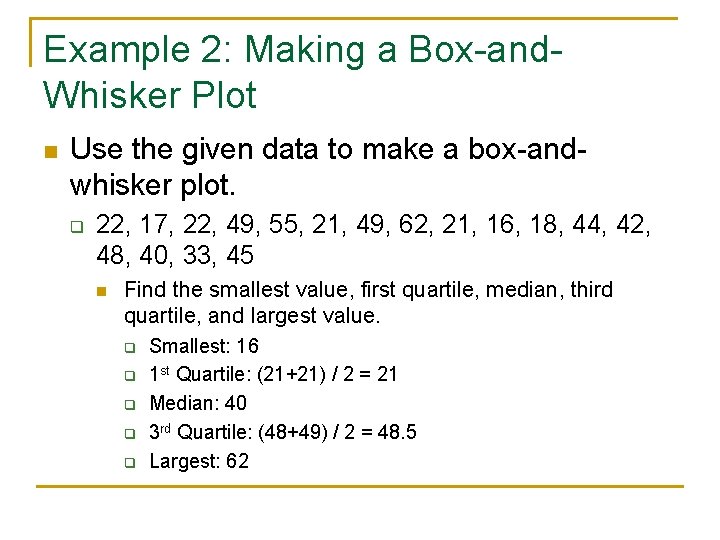
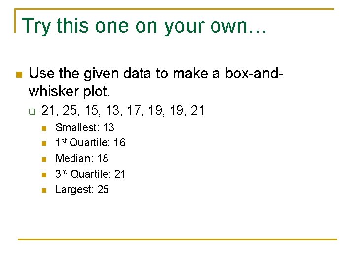
Example 2: Making a Box-and. Whisker Plot n Use the given data to make a box-andwhisker plot. q 22, 17, 22, 49, 55, 21, 49, 62, 21, 16, 18, 44, 42, 48, 40, 33, 45 n Find the smallest value, first quartile, median, third quartile, and largest value. q q q Smallest: 16 1 st Quartile: (21+21) / 2 = 21 Median: 40 3 rd Quartile: (48+49) / 2 = 48. 5 Largest: 62

Try this one on your own… n Use the given data to make a box-andwhisker plot. q 21, 25, 13, 17, 19, 21 n n n Smallest: 13 1 st Quartile: 16 Median: 18 3 rd Quartile: 21 Largest: 25

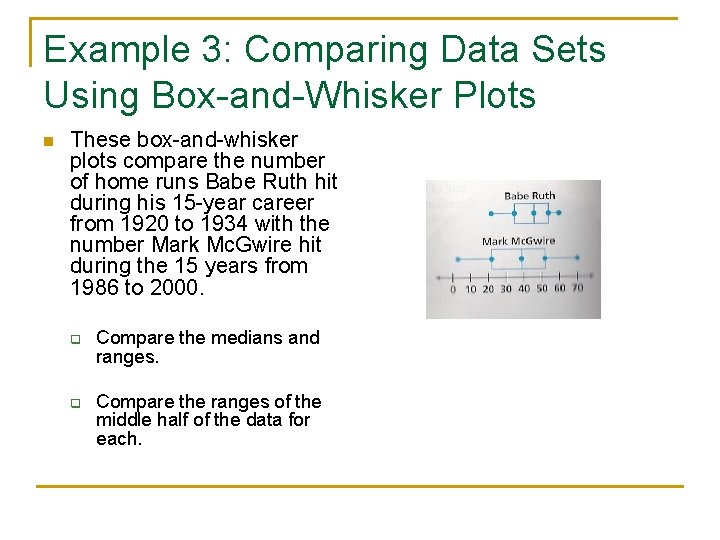
Example 3: Comparing Data Sets Using Box-and-Whisker Plots n These box-and-whisker plots compare the number of home runs Babe Ruth hit during his 15 -year career from 1920 to 1934 with the number Mark Mc. Gwire hit during the 15 years from 1986 to 2000. q q Compare the medians and ranges. Compare the ranges of the middle half of the data for each.

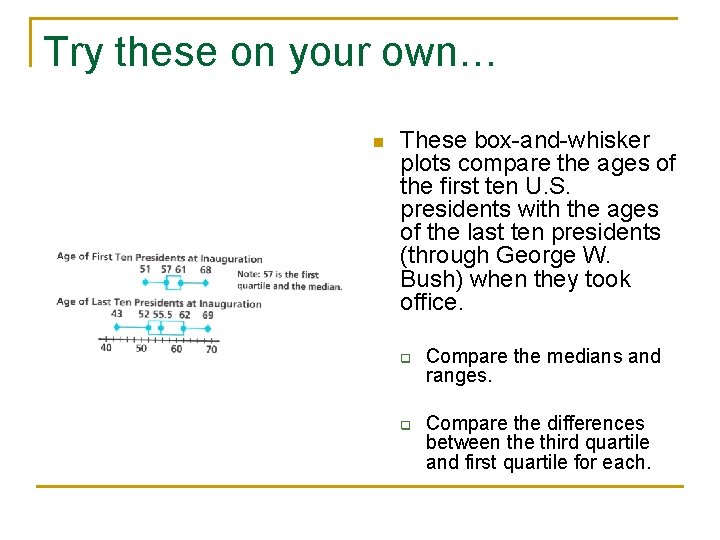
Try these on your own… n These box-and-whisker plots compare the ages of the first ten U. S. presidents with the ages of the last ten presidents (through George W. Bush) when they took office. q q Compare the medians and ranges. Compare the differences between the third quartile and first quartile for each.

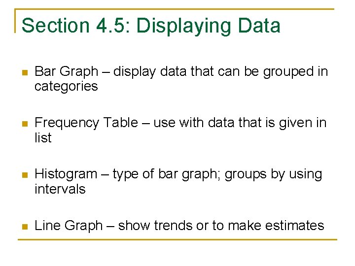
Section 4. 5: Displaying Data n Bar Graph – display data that can be grouped in categories n Frequency Table – use with data that is given in list n Histogram – type of bar graph; groups by using intervals n Line Graph – show trends or to make estimates

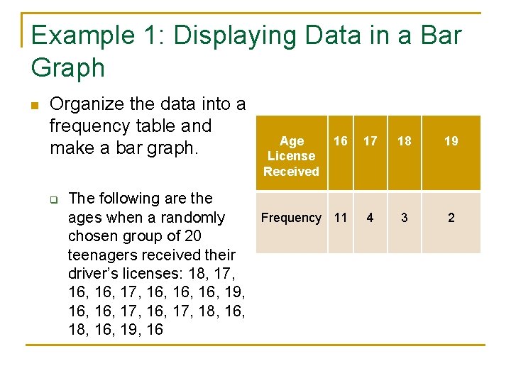
Example 1: Displaying Data in a Bar Graph n Organize the data into a frequency table and make a bar graph. q The following are the ages when a randomly chosen group of 20 teenagers received their driver’s licenses: 18, 17, 16, 16, 16, 19, 16, 17, 18, 16, 19, 16 Age License Received 16 17 18 19 Frequency 11 4 3 2

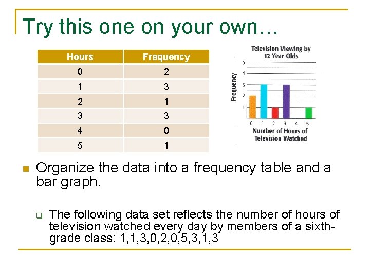
Try this one on your own… n Hours Frequency 0 2 1 3 3 4 0 5 1 Organize the data into a frequency table and a bar graph. q The following data set reflects the number of hours of television watched every day by members of a sixthgrade class: 1, 1, 3, 0, 2, 0, 5, 3, 1, 3

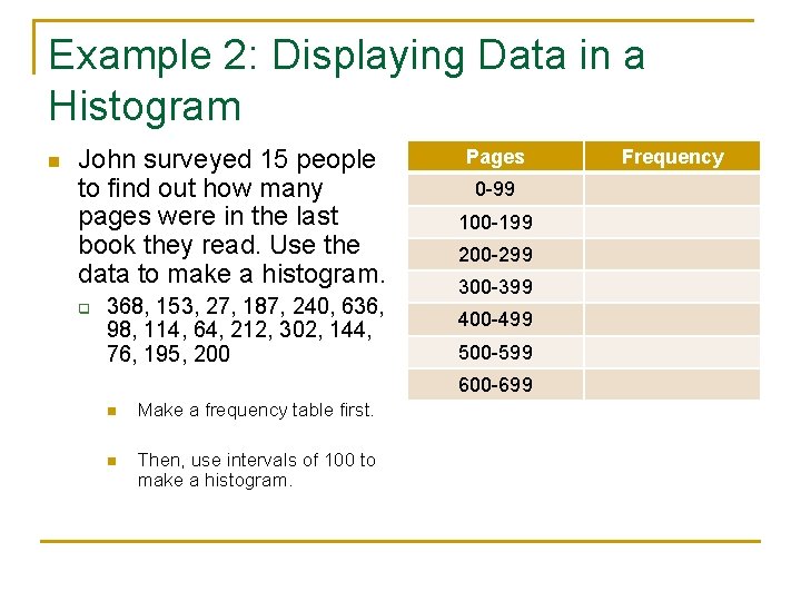
Example 2: Displaying Data in a Histogram n John surveyed 15 people to find out how many pages were in the last book they read. Use the data to make a histogram. q 368, 153, 27, 187, 240, 636, 98, 114, 64, 212, 302, 144, 76, 195, 200 Pages 0 -99 100 -199 200 -299 300 -399 400 -499 500 -599 600 -699 n Make a frequency table first. n Then, use intervals of 100 to make a histogram. Frequency

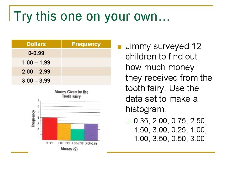
Try this one on your own… Dollars 0 -0. 99 1. 00 – 1. 99 2. 00 – 2. 99 3. 00 – 3. 99 Frequency n Jimmy surveyed 12 children to find out how much money they received from the tooth fairy. Use the data set to make a histogram. q 0. 35, 2. 00, 0. 75, 2. 50, 1. 50, 3. 00, 0. 25, 1. 00, 3. 50, 0. 50, 3. 00

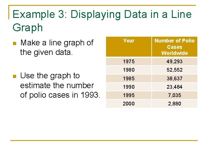
Example 3: Displaying Data in a Line Graph n n Make a line graph of the given data. Use the graph to estimate the number of polio cases in 1993. Year Number of Polio Cases Worldwide 1975 49, 293 1980 52, 552 1985 38, 637 1990 23, 484 1995 7, 035 2000 2, 880

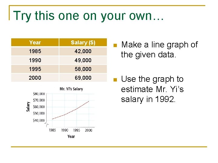
Try this one on your own… Year Salary ($) 1985 42, 000 1990 49, 000 1995 58, 000 2000 69, 000 n Make a line graph of the given data. n Use the graph to estimate Mr. Yi’s salary in 1992.

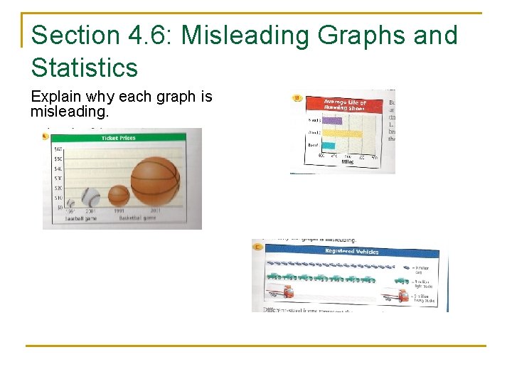
Section 4. 6: Misleading Graphs and Statistics Explain why each graph is misleading.

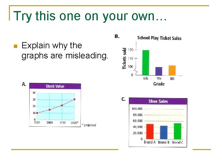
Try this one on your own… n Explain why the graphs are misleading.

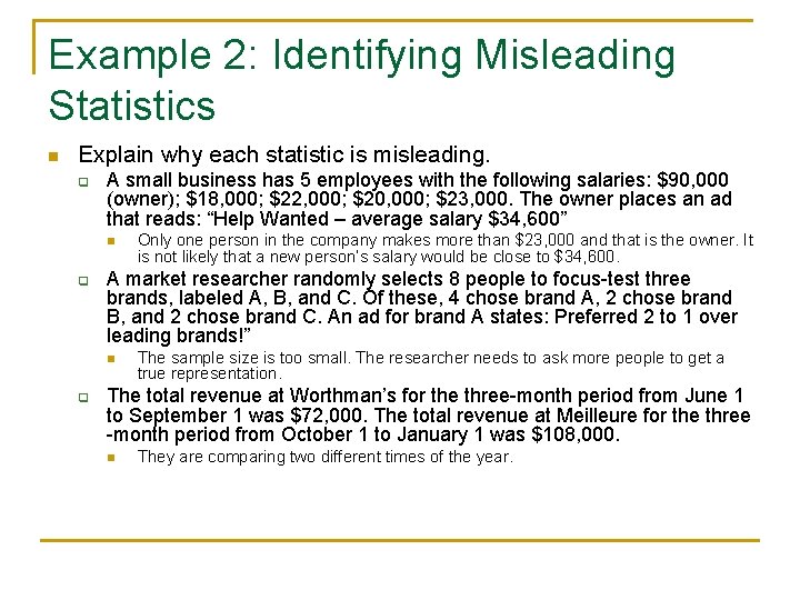
Example 2: Identifying Misleading Statistics n Explain why each statistic is misleading. q A small business has 5 employees with the following salaries: $90, 000 (owner); $18, 000; $22, 000; $20, 000; $23, 000. The owner places an ad that reads: “Help Wanted – average salary $34, 600” n q A market researcher randomly selects 8 people to focus-test three brands, labeled A, B, and C. Of these, 4 chose brand A, 2 chose brand B, and 2 chose brand C. An ad for brand A states: Preferred 2 to 1 over leading brands!” n q Only one person in the company makes more than $23, 000 and that is the owner. It is not likely that a new person’s salary would be close to $34, 600. The sample size is too small. The researcher needs to ask more people to get a true representation. The total revenue at Worthman’s for the three-month period from June 1 to September 1 was $72, 000. The total revenue at Meilleure for the three -month period from October 1 to January 1 was $108, 000. n They are comparing two different times of the year.

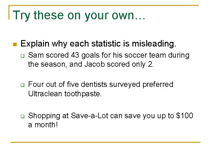
Try these on your own… n Explain why each statistic is misleading. q q q Sam scored 43 goals for his soccer team during the season, and Jacob scored only 2. Four out of five dentists surveyed preferred Ultraclean toothpaste. Shopping at Save-a-Lot can save you up to $100 a month!

Section 4. 7: Scatter Plots n Scatter Plots – show relationships between two data sets

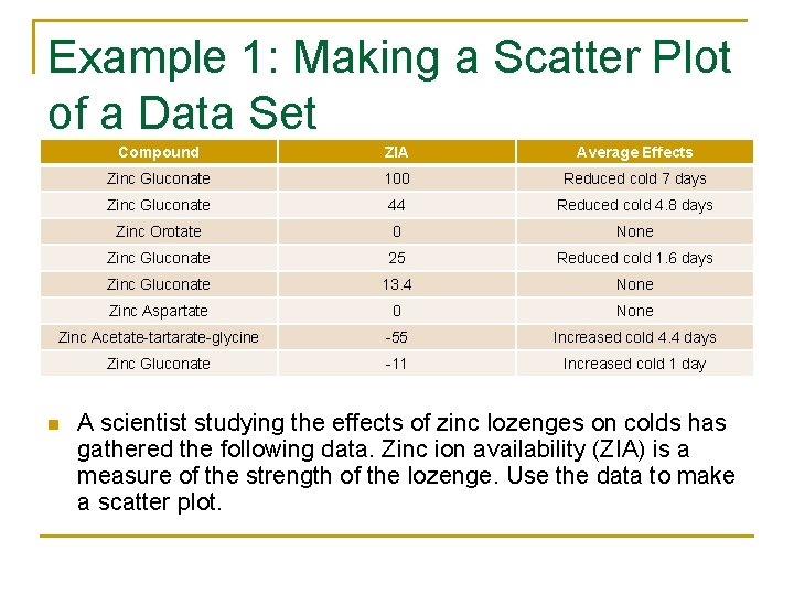
Example 1: Making a Scatter Plot of a Data Set Compound ZIA Average Effects Zinc Gluconate 100 Reduced cold 7 days Zinc Gluconate 44 Reduced cold 4. 8 days Zinc Orotate 0 None Zinc Gluconate 25 Reduced cold 1. 6 days Zinc Gluconate 13. 4 None Zinc Aspartate 0 None Zinc Acetate-tartarate-glycine -55 Increased cold 4. 4 days Zinc Gluconate -11 Increased cold 1 day n A scientist studying the effects of zinc lozenges on colds has gathered the following data. Zinc ion availability (ZIA) is a measure of the strength of the lozenge. Use the data to make a scatter plot.

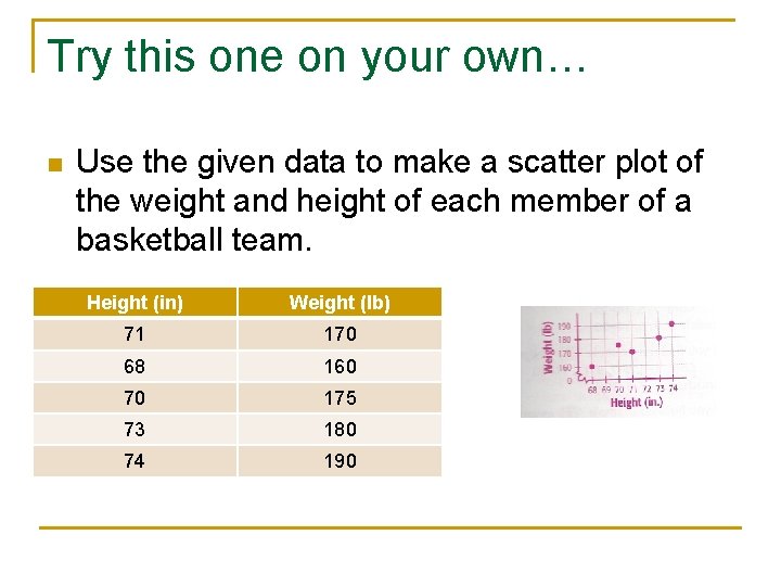
Try this one on your own… n Use the given data to make a scatter plot of the weight and height of each member of a basketball team. Height (in) Weight (lb) 71 170 68 160 70 175 73 180 74 190

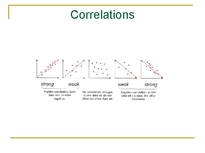
Correlations

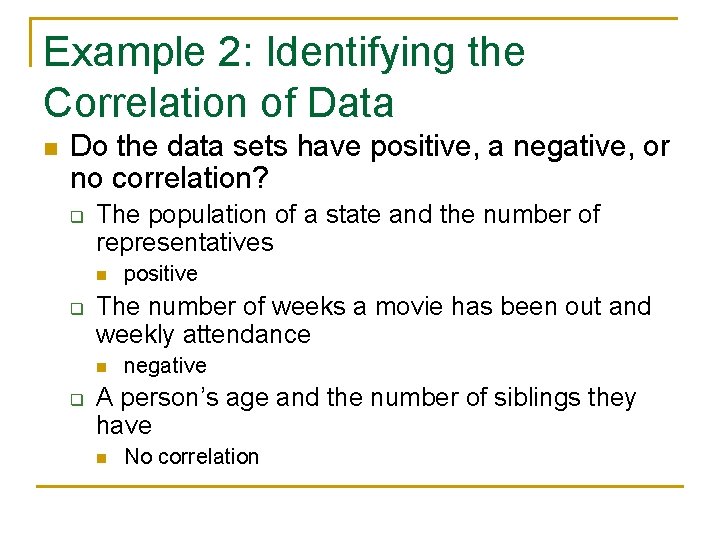
Example 2: Identifying the Correlation of Data n Do the data sets have positive, a negative, or no correlation? q The population of a state and the number of representatives n q The number of weeks a movie has been out and weekly attendance n q positive negative A person’s age and the number of siblings they have n No correlation

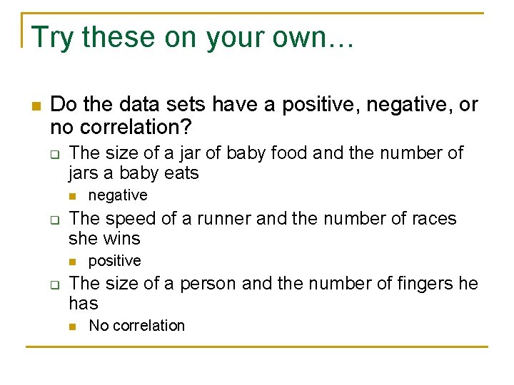
Try these on your own… n Do the data sets have a positive, negative, or no correlation? q The size of a jar of baby food and the number of jars a baby eats n q The speed of a runner and the number of races she wins n q negative positive The size of a person and the number of fingers he has n No correlation

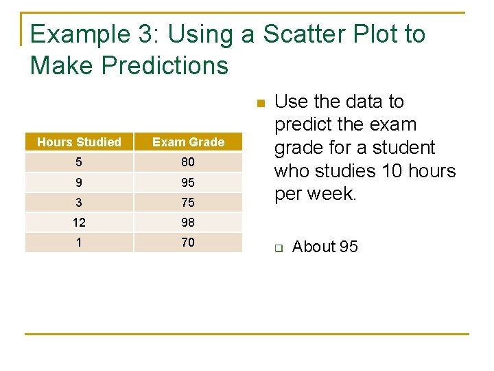
Example 3: Using a Scatter Plot to Make Predictions n Hours Studied Exam Grade 5 80 9 95 3 75 12 98 1 70 Use the data to predict the exam grade for a student who studies 10 hours per week. q About 95

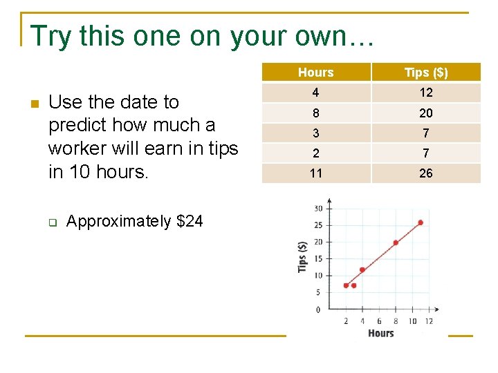
Try this one on your own… n Use the date to predict how much a worker will earn in tips in 10 hours. q Approximately $24 Hours Tips ($) 4 12 8 20 3 7 2 7 11 26