Chapter 4 Displaying and Summarizing Quantitative Data Copyright

- Slides: 52

Chapter 4 Displaying and Summarizing Quantitative Data Copyright © 2010 Pearson Education, Inc.

Dealing With a Lot of Numbers… n n Summarizing the data will help us when we look at large sets of quantitative data. Without summaries of the data, it’s hard to grasp what the data tell us. The best thing to do is to make a picture… We can’t use bar charts or pie charts for quantitative data, since those displays are for categorical variables. Copyright © 2010 Pearson Education, Inc.

Histograms: Displaying the Distribution of Earthquake Magnitudes n n n The chapter example discusses earthquake magnitudes. First, slice up the entire span of values covered by the quantitative variable into equal-width piles called bins. The bins and the counts in each bin give the distribution of the quantitative variable. Copyright © 2010 Pearson Education, Inc.

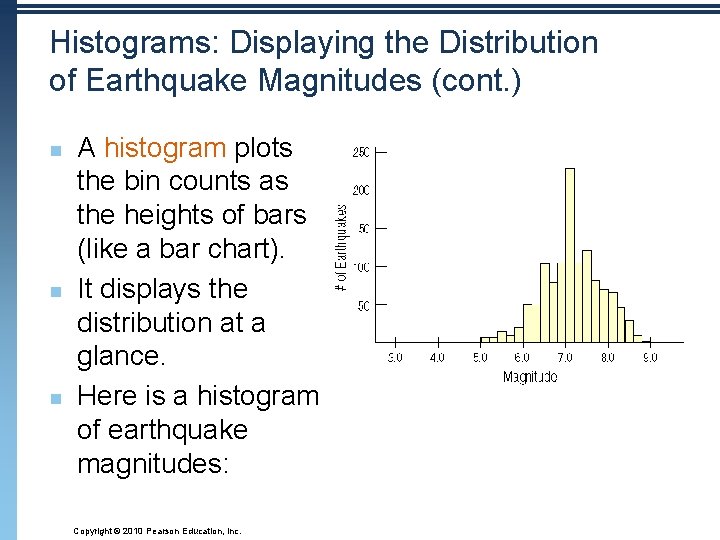
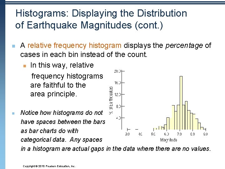
Histograms: Displaying the Distribution of Earthquake Magnitudes (cont. ) n n n A histogram plots the bin counts as the heights of bars (like a bar chart). It displays the distribution at a glance. Here is a histogram of earthquake magnitudes: Copyright © 2010 Pearson Education, Inc.

Histograms: Displaying the Distribution of Earthquake Magnitudes (cont. ) n n A relative frequency histogram displays the percentage of cases in each bin instead of the count. n In this way, relative frequency histograms are faithful to the area principle. Notice how histograms do not have spaces between the bars as bar charts do with categorical data. Any spaces in a histogram are actual gaps in the data where there are no values. Copyright © 2010 Pearson Education, Inc.

Copyright © 2010 Pearson Education, Inc.

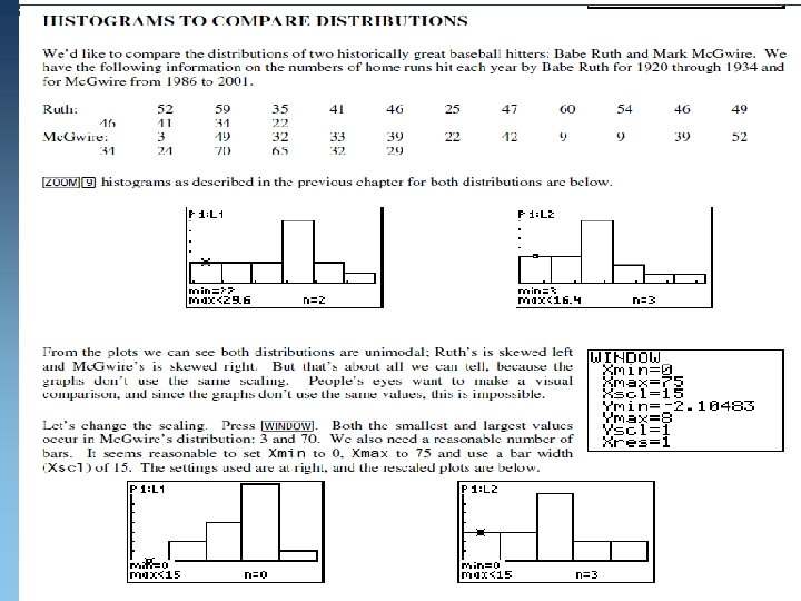
Results n From these graphs it is easy to see that Ruth was the more prolific hitter. While Mc. Gwire had four years in which he hit more than 45 home runs, Ruth had 9. Mc. Gwire also had three seasons with fewer than 15 homeruns (due either to injury, strike, or his first, partial season). On this scaling, we still see Ruth’s distribution as left-skewed, but Mc. Gwire’s is fairly symmetric (even around the peak). Ruth’s distribution has a smaller range (spread from low to high), and a higher center (visually about 60) than Mc. Gwire, whose center is between 45 and 60. Copyright © 2010 Pearson Education, Inc.

Stem-and-Leaf Displays n n Stem-and-leaf displays show the distribution of a quantitative variable, like histograms do, while preserving the individual values. Stem-and-leaf displays contain all the information found in a histogram and, when carefully drawn, satisfy the area principle and show the distribution. Copyright © 2010 Pearson Education, Inc.

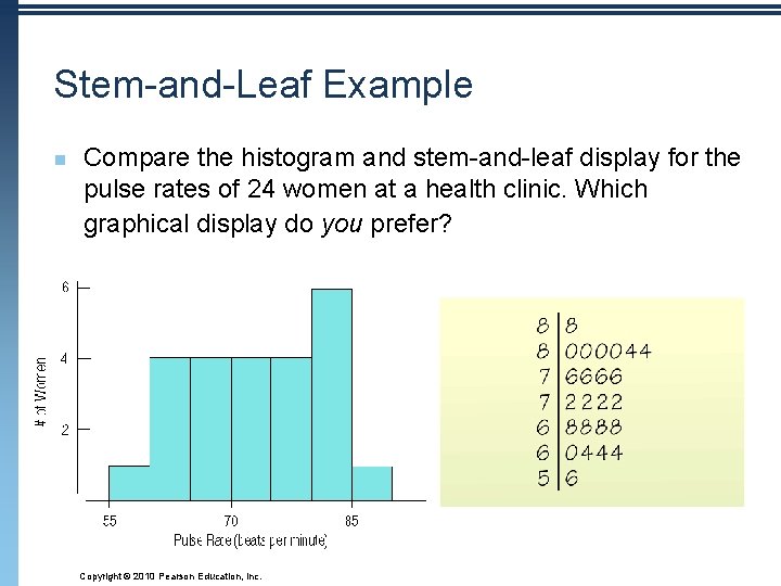
Stem-and-Leaf Example n Compare the histogram and stem-and-leaf display for the pulse rates of 24 women at a health clinic. Which graphical display do you prefer? Copyright © 2010 Pearson Education, Inc.

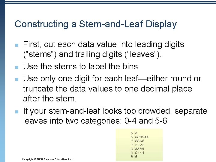
Constructing a Stem-and-Leaf Display n n First, cut each data value into leading digits (“stems”) and trailing digits (“leaves”). Use the stems to label the bins. Use only one digit for each leaf—either round or truncate the data values to one decimal place after the stem. If your stem-and-leaf looks too crowded, separate leaves into two categories: 0 -4 and 5 -6 Copyright © 2010 Pearson Education, Inc.

Example: Stem-and-Leaf Displays n Listed is the weight of 30 cattle (in pounds) on a local farm. Create a stem-and-leaf plot to display these data: 1367 1455 1233 1432 1520 1496 1123 1026 1977 1399 1488 1874 Copyright © 2010 Pearson Education, Inc. 1997 1855 1321 1543 1722 1943 1876 1396 1190 1643 1675 1865 1224 1245 1064 1023 1397 1674

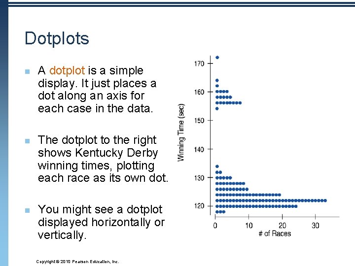
Dotplots n n n A dotplot is a simple display. It just places a dot along an axis for each case in the data. The dotplot to the right shows Kentucky Derby winning times, plotting each race as its own dot. You might see a dotplot displayed horizontally or vertically. Copyright © 2010 Pearson Education, Inc.

Think Before You Draw, Again n Remember the “Make a picture” rule? Now that we have options for data displays, you need to Think carefully about which type of display to make. Before making a stem-and-leaf display, a histogram, or a dotplot, check the Quantitative Data Condition: The data are values of a quantitative variable whose units are known. When describing a distribution, make sure to always tell about three things: shape, center, and spread… n n DAY 2 Copyright © 2010 Pearson Education, Inc.

What is the Shape of the Distribution? 1. Does the histogram have a single, central hump or several separated humps? 2. Is the histogram symmetric? 3. Do any unusual features stick out? Copyright © 2010 Pearson Education, Inc.

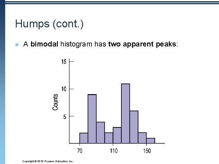
Humps Does the histogram have a single, central hump or several separated bumps? 1. n n Humps in a histogram are called modes. A histogram with one main peak is dubbed unimodal; histograms with two peaks are bimodal; histograms with three or more peaks are called multimodal. Copyright © 2010 Pearson Education, Inc.

Humps (cont. ) n A bimodal histogram has two apparent peaks: Copyright © 2010 Pearson Education, Inc.

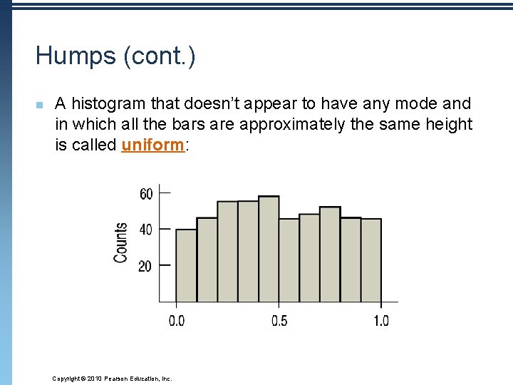
Humps (cont. ) n A histogram that doesn’t appear to have any mode and in which all the bars are approximately the same height is called uniform: Copyright © 2010 Pearson Education, Inc.

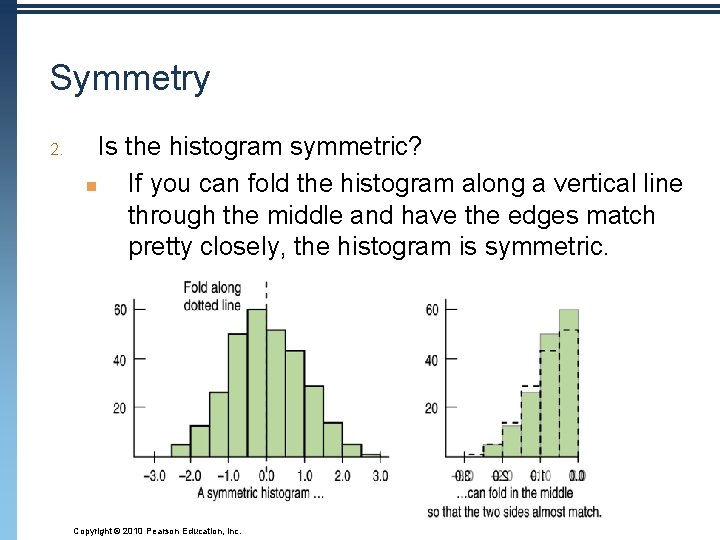
Symmetry 2. Is the histogram symmetric? n If you can fold the histogram along a vertical line through the middle and have the edges match pretty closely, the histogram is symmetric. Copyright © 2010 Pearson Education, Inc.

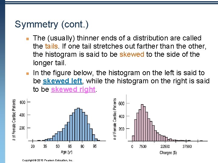
Symmetry (cont. ) n n The (usually) thinner ends of a distribution are called the tails. If one tail stretches out farther than the other, the histogram is said to be skewed to the side of the longer tail. In the figure below, the histogram on the left is said to be skewed left, while the histogram on the right is said to be skewed right. Copyright © 2010 Pearson Education, Inc.

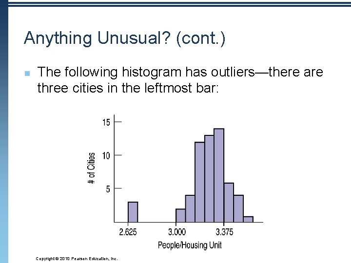
Anything Unusual? 3. Do any unusual features stick out? n Sometimes it’s the unusual features that tell us something interesting or exciting about the data. n n You should always mention any stragglers, or outliers, that stand off away from the body of the distribution. Are there any gaps in the distribution? If so, we might have data from more than one group. Copyright © 2010 Pearson Education, Inc.

Anything Unusual? (cont. ) n The following histogram has outliers—there are three cities in the leftmost bar: Copyright © 2010 Pearson Education, Inc.

Where is the Center of the Distribution? n n n If you had to pick a single number to describe all the data what would you pick? It’s easy to find the center when a histogram is unimodal and symmetric—it’s right in the middle. On the other hand, it’s not so easy to find the center of a skewed histogram or a histogram with more than one mode. Copyright © 2010 Pearson Education, Inc.

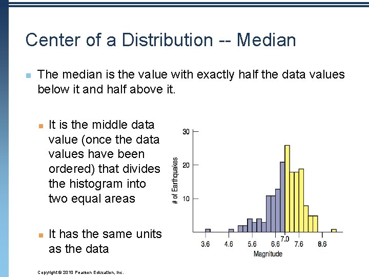
Center of a Distribution -- Median n The median is the value with exactly half the data values below it and half above it. n n It is the middle data value (once the data values have been ordered) that divides the histogram into two equal areas It has the same units as the data Copyright © 2010 Pearson Education, Inc.

How Spread Out is the Distribution? n n n Variation matters, and Statistics is about variation. Are the values of the distribution tightly clustered around the center or more spread out? Always report a measure of spread along with a measure of center when describing a distribution numerically. Copyright © 2010 Pearson Education, Inc.

Spread: Range n The range of the data is the difference between the maximum and minimum values: Range = max – min n A disadvantage of the range is that a single extreme value/outlier can make it very large and, thus, not representative of the data overall. Copyright © 2010 Pearson Education, Inc.

Spread: The Interquartile Range n n The interquartile range (IQR) lets us ignore extreme data values and concentrate on the middle of the data. To find the IQR, we first need to know what quartiles are… Copyright © 2010 Pearson Education, Inc.

Spread: The Interquartile Range (cont. ) n n Quartiles divide the data into four equal sections. n One quarter of the data lies below the lower quartile, Q 1 n One quarter of the data lies above the upper quartile, Q 3. n The quartiles border the middle half of the data. The difference between the quartiles is the interquartile range (IQR), so IQR = upper quartile – lower quartile Copyright © 2010 Pearson Education, Inc.

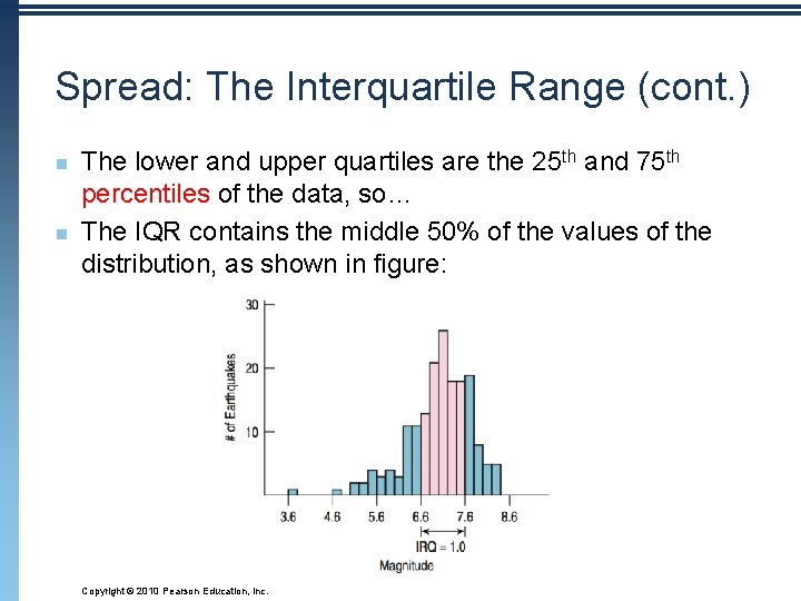
Spread: The Interquartile Range (cont. ) n n The lower and upper quartiles are the 25 th and 75 th percentiles of the data, so… The IQR contains the middle 50% of the values of the distribution, as shown in figure: Copyright © 2010 Pearson Education, Inc.

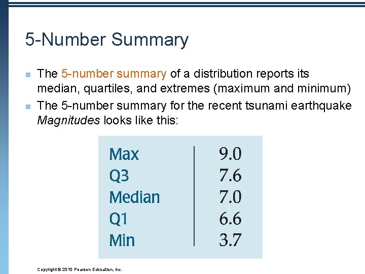
5 -Number Summary n n The 5 -number summary of a distribution reports its median, quartiles, and extremes (maximum and minimum) The 5 -number summary for the recent tsunami earthquake Magnitudes looks like this: Copyright © 2010 Pearson Education, Inc.

5 -Number Summary on Calculator: n n n Enter your data into L 1 (Stat Edit) To clear data, be sure to highlight the title (L 1) and press CLEAR Enter (DO NOT PRESS DELETE) Once your data is entered, press STAT CALC 1 -Variable Stat Copyright © 2010 Pearson Education, Inc.

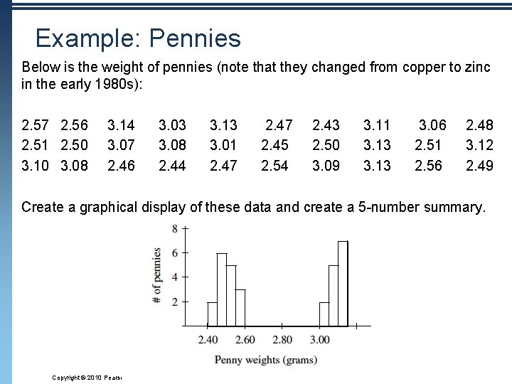
Example: Pennies Below is the weight of pennies (note that they changed from copper to zinc in the early 1980 s): 2. 57 2. 56 2. 51 2. 50 3. 10 3. 08 3. 14 3. 07 2. 46 3. 03 3. 08 2. 44 3. 13 3. 01 2. 47 2. 45 2. 54 2. 43 2. 50 3. 09 3. 11 3. 13 3. 06 2. 51 2. 56 2. 48 3. 12 2. 49 Create a graphical display of these data and create a 5 -number summary. Copyright © 2010 Pearson Education, Inc.

Example: Pennies (continued) n 5 -Number Summaries: n What can you TELL about these data? Copyright © 2010 Pearson Education, Inc.

Part 2 -Assignment: n pp. 72 – 79 n Read pp. 58 – 71 Copyright © 2010 Pearson Education, Inc.

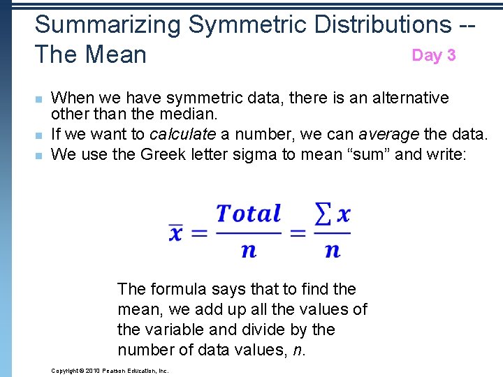
Summarizing Symmetric Distributions -Day 3 The Mean n When we have symmetric data, there is an alternative other than the median. If we want to calculate a number, we can average the data. We use the Greek letter sigma to mean “sum” and write: The formula says that to find the mean, we add up all the values of the variable and divide by the number of data values, n. Copyright © 2010 Pearson Education, Inc.

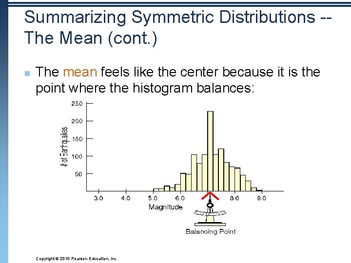
Summarizing Symmetric Distributions -The Mean (cont. ) n The mean feels like the center because it is the point where the histogram balances: Copyright © 2010 Pearson Education, Inc.

Mean or Median? n n n Because the median considers only the order of values, it is resistant to values that are extraordinarily large or small; it simply notes that they are one of the “big ones” or “small ones” and ignores their distance from center. To choose between the mean and median, start by looking at the data. If the histogram is symmetric and there are no outliers, use the mean. However, if the histogram is skewed or with outliers, you are better off with the median. Copyright © 2010 Pearson Education, Inc.

What About Spread? The Standard Deviation n n A more powerful measure of spread than the IQR is the standard deviation, which takes into account how far each data value is from the mean. A deviation is the distance that a data value is from the mean. n Since adding all deviations together would total zero (because the positives and negatives would cancel each other out), we square each deviation and find an average of sorts for the deviations. Copyright © 2010 Pearson Education, Inc.

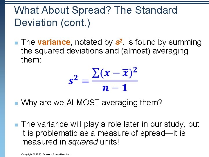
What About Spread? The Standard Deviation (cont. ) n n n The variance, notated by s 2, is found by summing the squared deviations and (almost) averaging them: Why are we ALMOST averaging them? The variance will play a role later in our study, but it is problematic as a measure of spread—it is measured in squared units! Copyright © 2010 Pearson Education, Inc.

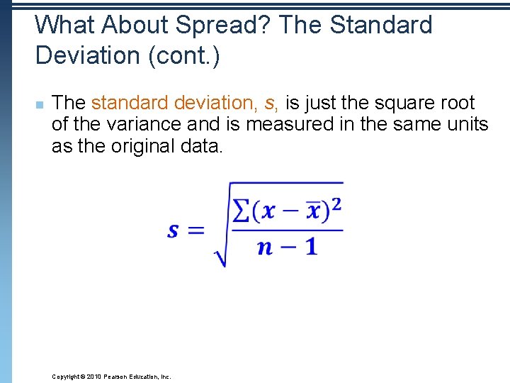
What About Spread? The Standard Deviation (cont. ) n The standard deviation, s, is just the square root of the variance and is measured in the same units as the original data. Copyright © 2010 Pearson Education, Inc.

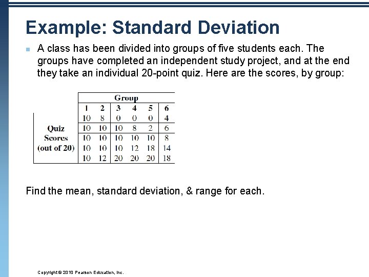
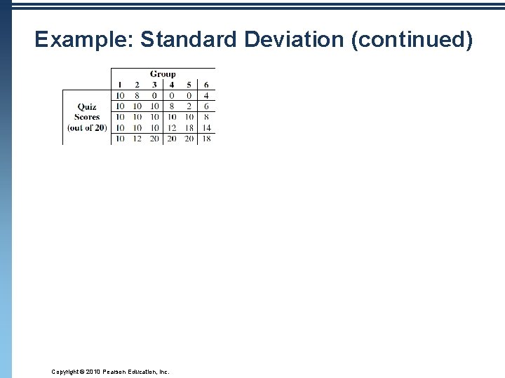
Example: Standard Deviation n A class has been divided into groups of five students each. The groups have completed an independent study project, and at the end they take an individual 20 -point quiz. Here are the scores, by group: Find the mean, standard deviation, & range for each. Copyright © 2010 Pearson Education, Inc.

Example: Standard Deviation (continued) Copyright © 2010 Pearson Education, Inc.

Thinking About Variation n n Since Statistics is about variation, spread is an important fundamental concept of Statistics. Measures of spread help us talk about what we don’t know. When the data values are tightly clustered around the center of the distribution, the IQR and standard deviation will be small. When the data values are scattered far from the center, the IQR and standard deviation will be large. Copyright © 2010 Pearson Education, Inc.

Tell -- Draw a Picture n When telling about quantitative variables, start by making a histogram or stem-and-leaf display and discuss the shape of the distribution. Copyright © 2010 Pearson Education, Inc.

Tell -- Shape, Center, and Spread n Next, always report the shape of its distribution, along with a center and a spread. n n If the shape is skewed, report the median and IQR. If the shape is symmetric, report the mean and standard deviation and possibly the median and IQR as well. Copyright © 2010 Pearson Education, Inc.

Tell -- What About Unusual Features? n n If there are multiple modes, try to understand why. If you identify a reason for the separate modes, it may be good to split the data into two groups. If there any clear outliers and you are reporting the mean and standard deviation, report them with the outliers present and with the outliers removed. The differences may be quite revealing. n Note: The median and IQR are not likely to be affected by the outliers. Copyright © 2010 Pearson Education, Inc.

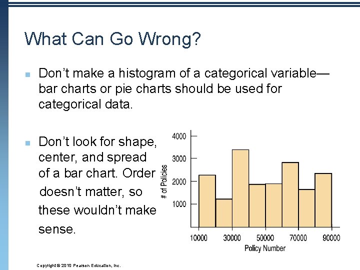
What Can Go Wrong? n n Don’t make a histogram of a categorical variable— bar charts or pie charts should be used for categorical data. Don’t look for shape, center, and spread of a bar chart. Order doesn’t matter, so these wouldn’t make sense. Copyright © 2010 Pearson Education, Inc.

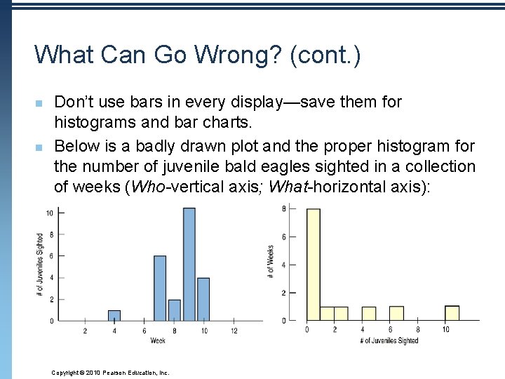
What Can Go Wrong? (cont. ) n n Don’t use bars in every display—save them for histograms and bar charts. Below is a badly drawn plot and the proper histogram for the number of juvenile bald eagles sighted in a collection of weeks (Who-vertical axis; What-horizontal axis): Copyright © 2010 Pearson Education, Inc.

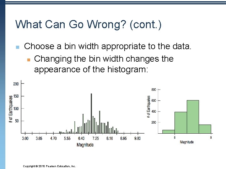
What Can Go Wrong? (cont. ) n Choose a bin width appropriate to the data. n Changing the bin width changes the appearance of the histogram: Copyright © 2010 Pearson Education, Inc.

What Can Go Wrong? (cont. ) n n n n n Don’t forget to do a reality check – don’t let the calculator do the thinking for you. Don’t forget to sort the values before finding the median or percentiles. Don’t worry about small differences when using different methods. Don’t compute numerical summaries of a categorical variable. Don’t report too many decimal places. Don’t round in the middle of a calculation. Watch out for multiple modes Beware of outliers Make a picture … make a picture. . . make a picture !!! Copyright © 2010 Pearson Education, Inc.

What have we learned? n n n We’ve learned how to make a picture for quantitative data to help us see the story the data have to Tell. We can display the distribution of quantitative data with a histogram, stem-and-leaf display, or dotplot. We’ve learned how to summarize distributions of quantitative variables numerically. n Measures of center for a distribution include the median and mean. n Measures of spread include the range, IQR, and standard deviation. n Use the median and IQR when the distribution is skewed. Use the mean and standard deviation if the distribution is symmetric. Copyright © 2010 Pearson Education, Inc.

What have we learned? (cont. ) n We’ve learned to Think about the type of variable we are summarizing. n n All methods of this chapter assume the data are quantitative. The Quantitative Data Condition serves as a check that the data are, in fact, quantitative. Copyright © 2010 Pearson Education, Inc.

Assignments: pp. 72 – 79 n Day 1: #9 A, 31 A, 37 A, 39 Day 2: # 5 – 9 B, 10, 13 (by hand/show work), 14 (calculator), 31 B-C, 32, 33 Day 3: #11, 12, 16 (by hand), 17, 30 (calculator), Day 4: #19, 21, 22, 24, 25, 29, Day 5: # 36, 44, 47, 49 n Reading: Chapter 5 n n Copyright © 2010 Pearson Education, Inc.