DATA HANDLING Recap Displaying Ungrouped Data Recap Displaying
- Slides: 34

DATA HANDLING • • • Recap: Displaying Ungrouped Data Recap: Displaying Grouped Data Measures of Central Tendency in Ungrouped Data Measures of Central Tendency in Grouped Data Measures of Dispersion Five Number Summary 1

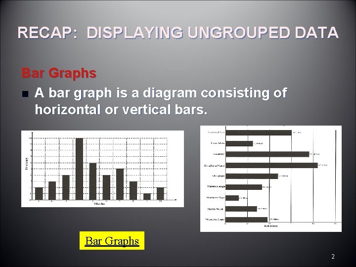
RECAP: DISPLAYING UNGROUPED DATA Bar Graphs n A bar graph is a diagram consisting of horizontal or vertical bars. Bar Graphs 2

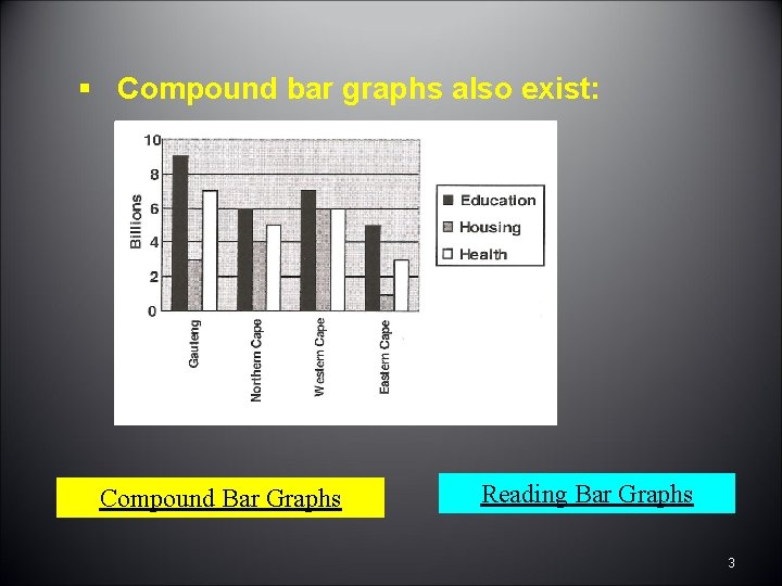
§ Compound bar graphs also exist: Compound Bar Graphs Reading Bar Graphs 3

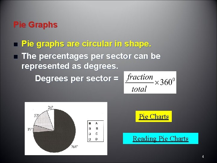
Pie Graphs n n Pie graphs are circular in shape. The percentages per sector can be represented as degrees. Degrees per sector = Pie Charts Reading Pie Charts 4

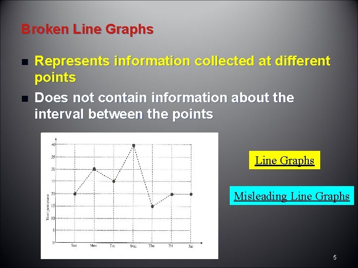
Broken Line Graphs n n Represents information collected at different points Does not contain information about the interval between the points Line Graphs Misleading Line Graphs 5

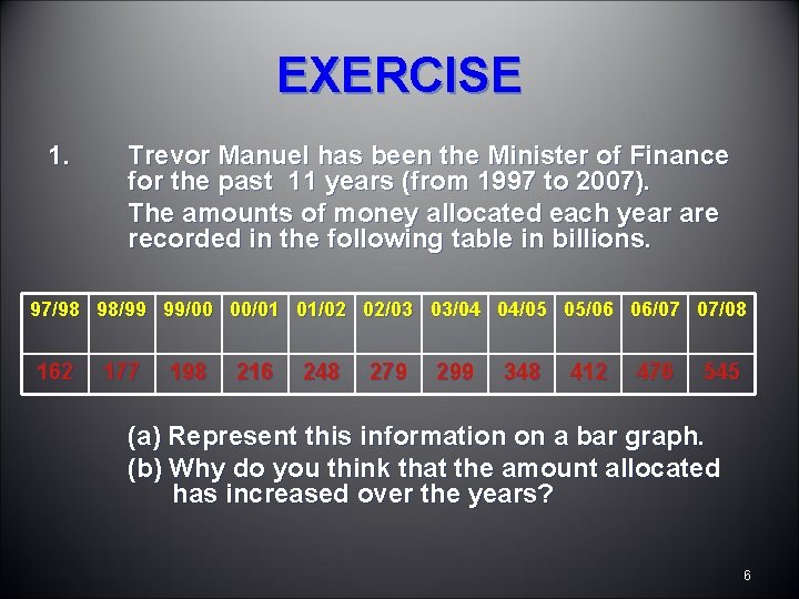
EXERCISE 1. Trevor Manuel has been the Minister of Finance for the past 11 years (from 1997 to 2007). The amounts of money allocated each year are recorded in the following table in billions. 97/98 98/99 99/00 00/01 01/02 02/03 03/04 04/05 05/06 06/07 07/08 162 177 198 216 248 279 299 348 412 476 545 (a) Represent this information on a bar graph. (b) Why do you think that the amount allocated has increased over the years? 6

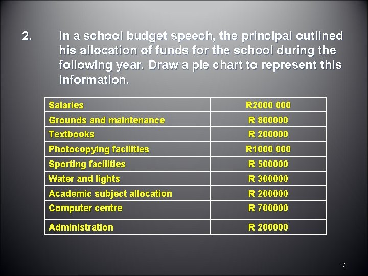
2. In a school budget speech, the principal outlined his allocation of funds for the school during the following year. Draw a pie chart to represent this information. Salaries R 2000 Grounds and maintenance R 800000 Textbooks R 200000 Photocopying facilities R 1000 Sporting facilities R 500000 Water and lights R 300000 Academic subject allocation R 200000 Computer centre R 700000 Administration R 200000 7

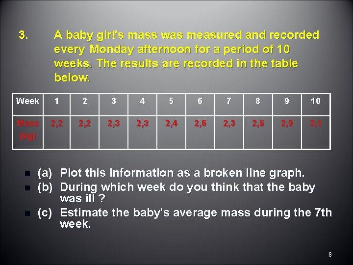
3. A baby girl's mass was measured and recorded every Monday afternoon for a period of 10 weeks. The results are recorded in the table below. Week 1 2 3 4 5 6 7 8 9 10 Mass (kg) 2, 2 2, 3 2, 4 2, 6 2, 3 2, 6 2, 9 3, 1 n n n (a) Plot this information as a broken line graph. (b) During which week do you think that the baby was ill ? (c) Estimate the baby's average mass during the 7 th week. 8

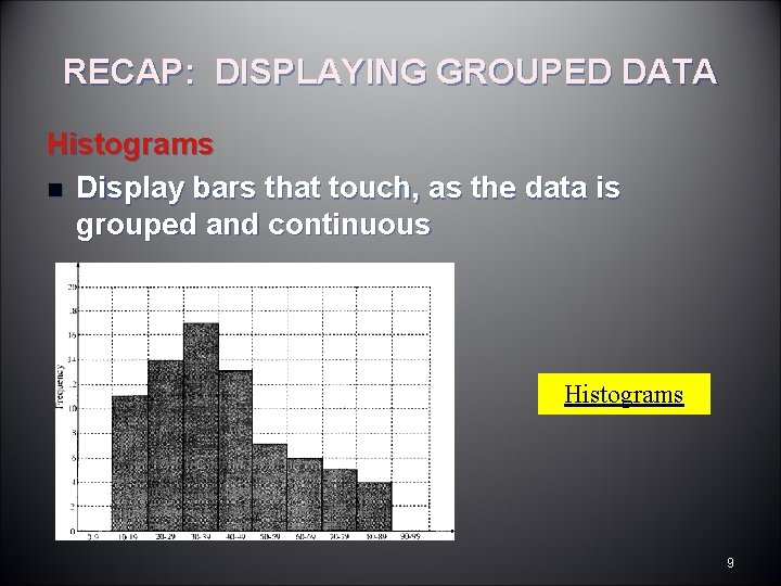
RECAP: DISPLAYING GROUPED DATA Histograms n Display bars that touch, as the data is grouped and continuous Histograms 9

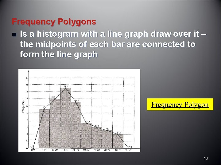
Frequency Polygons n Is a histogram with a line graph draw over it – the midpoints of each bar are connected to form the line graph Frequency Polygon 10

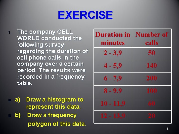
EXERCISE 1. n n The company CELL WORLD conducted the following survey regarding the duration of cell phone calls in the company over a certain period. The results were recorded in a frequency table. a) Draw a histogram to represent this data. b) Draw a frequency polygon of this data. Duration in Number of minutes calls 2 - 3, 9 50 4 - 5, 9 140 6 - 7, 9 200 8 - 9. 9 100 10 - 11, 9 60 12 - 13, 9 20 11

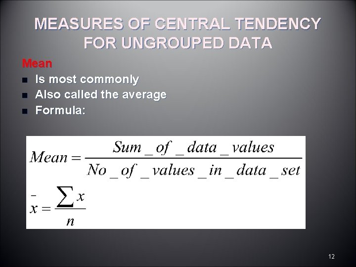
MEASURES OF CENTRAL TENDENCY FOR UNGROUPED DATA Mean n Is most commonly n Also called the average n Formula: 12

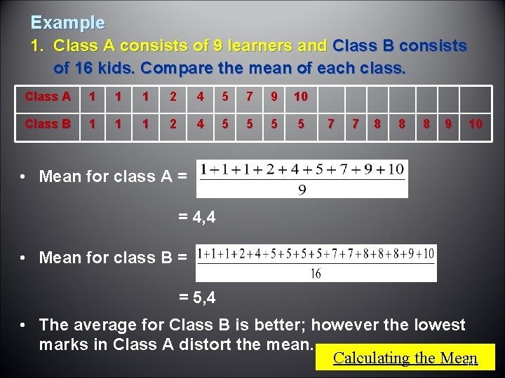
Example 1. Class A consists of 9 learners and Class B consists of 16 kids. Compare the mean of each class. Class A 1 1 1 2 4 5 7 9 10 Class B 1 1 1 2 4 5 5 7 7 8 8 8 9 10 • Mean for class A = = 4, 4 • Mean for class B = = 5, 4 • The average for Class B is better; however the lowest marks in Class A distort the mean. Calculating the Mean 13

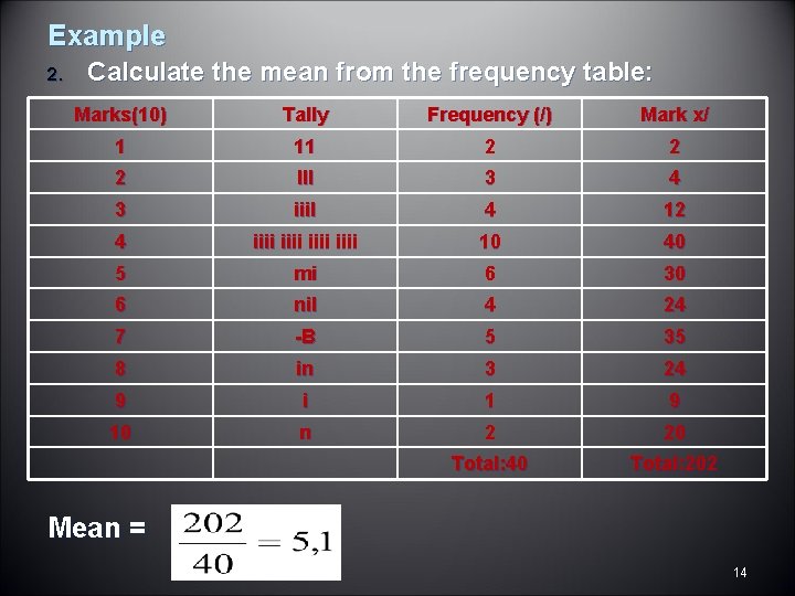
Example 2. Calculate the mean from the frequency table: Marks(10) Tally Frequency (/) Mark x/ 1 11 2 2 2 III 3 4 3 iiil 4 12 4 iiii 10 40 5 mi 6 30 6 nil 4 24 7 -B 5 35 8 in 3 24 9 i 1 9 10 n 2 20 Total: 40 Total: 202 Mean = 14

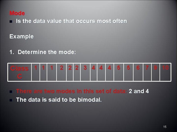
Mode n Is the data value that occurs most often Example 1. Determine the mode: Class 1 1 1 2 2 2 3 4 4 4 5 5 6 7 9 10 C n n There are two modes in this set of data: 2 and 4 The data is said to be bimodal. 15

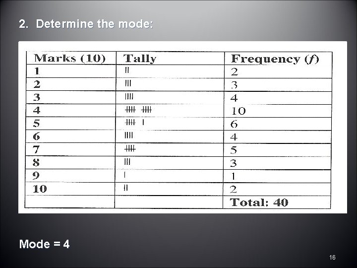
2. Determine the mode: Mode = 4 16

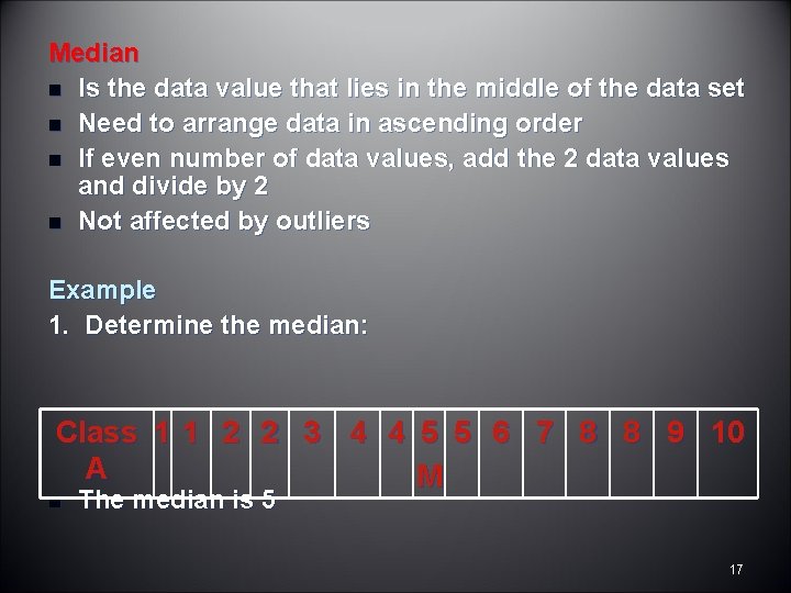
Median n Is the data value that lies in the middle of the data set n Need to arrange data in ascending order n If even number of data values, add the 2 data values and divide by 2 n Not affected by outliers Example 1. Determine the median: Class 1 1 2 2 3 4 4 5 5 6 7 8 8 9 10 A M n The median is 5 17

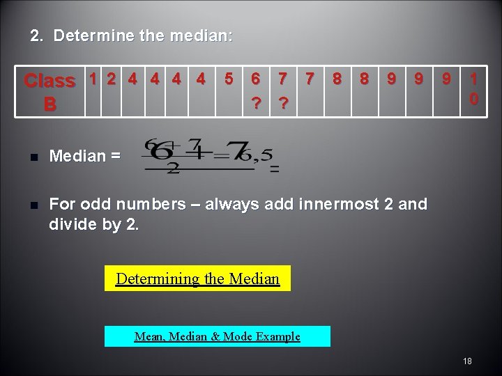
2. Determine the median: Class 1 2 4 4 5 6 7 7 8 8 9 9 9 1 0 ? ? B n Median = n For odd numbers – always add innermost 2 and divide by 2. Determining the Median Mean, Median & Mode Example 18

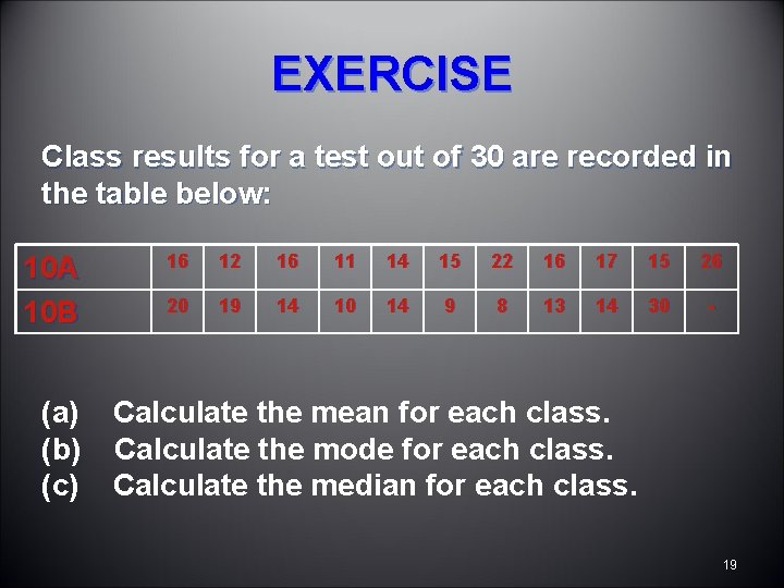
EXERCISE Class results for a test out of 30 are recorded in the table below: 10 A 10 B (a) (b) (c) 16 12 16 11 14 15 22 16 17 15 26 20 19 14 10 14 9 8 13 14 30 - Calculate the mean for each class. Calculate the mode for each class. Calculate the median for each class. 19

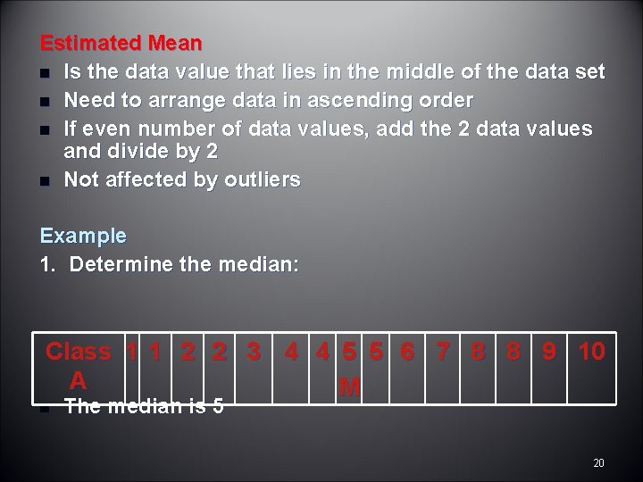
Estimated Mean n Is the data value that lies in the middle of the data set n Need to arrange data in ascending order n If even number of data values, add the 2 data values and divide by 2 n Not affected by outliers Example 1. Determine the median: Class 1 1 2 2 3 4 4 5 5 6 7 8 8 9 10 A M n The median is 5 20

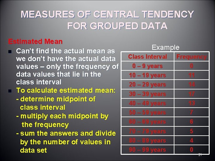
MEASURES OF CENTRAL TENDENCY FOR GROUPED DATA Estimated Mean n Can’t find the actual mean as we don’t have the actual data values – only the frequency of data values that lie in the class interval n To calculate estimated mean: - determine midpoint of class interval - multiply each midpoint by the frequency - sum the answers and divide by the number of values in data set Example Class Interval Frequency 0 – 9 years 0 10 – 19 years 11 20 – 29 years 14 30 – 39 years 17 40 – 49 years 13 50 – 59 years 7 60 – 69 years 6 70 – 79 years 5 80 – 89 years 4 90 – 99 years 0 21

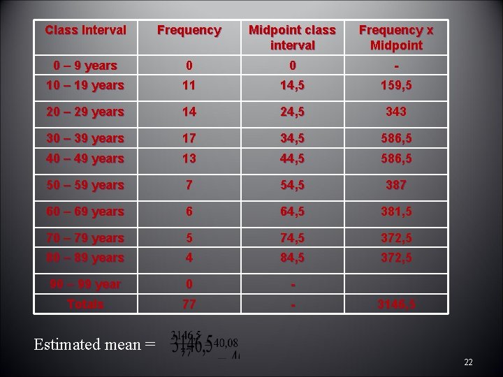
Class Interval Frequency Midpoint class interval Frequency x Midpoint 0 – 9 years 0 0 - 10 – 19 years 11 14, 5 159, 5 20 – 29 years 14 24, 5 343 30 – 39 years 17 34, 5 586, 5 40 – 49 years 13 44, 5 586, 5 50 – 59 years 7 54, 5 387 60 – 69 years 6 64, 5 381, 5 70 – 79 years 5 74, 5 372, 5 80 – 89 years 4 84, 5 372, 5 90 – 99 year 0 - Totals 77 - 3146, 5 Estimated mean = 22

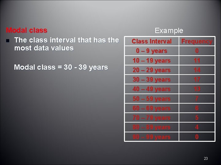
Modal class n The class interval that has the most data values Modal class = 30 - 39 years Example Class Interval Frequency 0 – 9 years 0 10 – 19 years 11 20 – 29 years 14 30 – 39 years 17 40 – 49 years 13 50 – 59 years 7 60 – 69 years 6 70 – 79 years 5 80 – 89 years 4 90 – 99 years 0 23

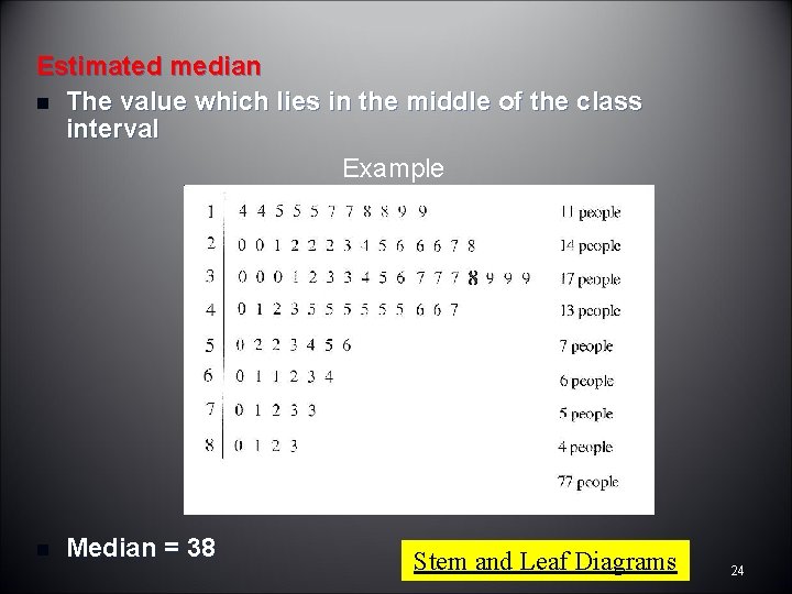
Estimated median n The value which lies in the middle of the class interval Example n Median = 38 Stem and Leaf Diagrams 24

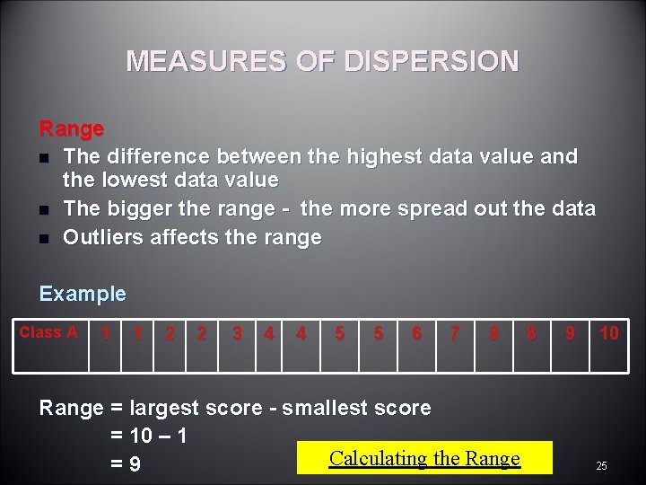
MEASURES OF DISPERSION Range n The difference between the highest data value and the lowest data value n The bigger the range - the more spread out the data n Outliers affects the range Example Class A 1 1 2 2 3 4 4 5 5 6 7 8 Range = largest score - smallest score = 10 – 1 Calculating the Range =9 8 9 10 25

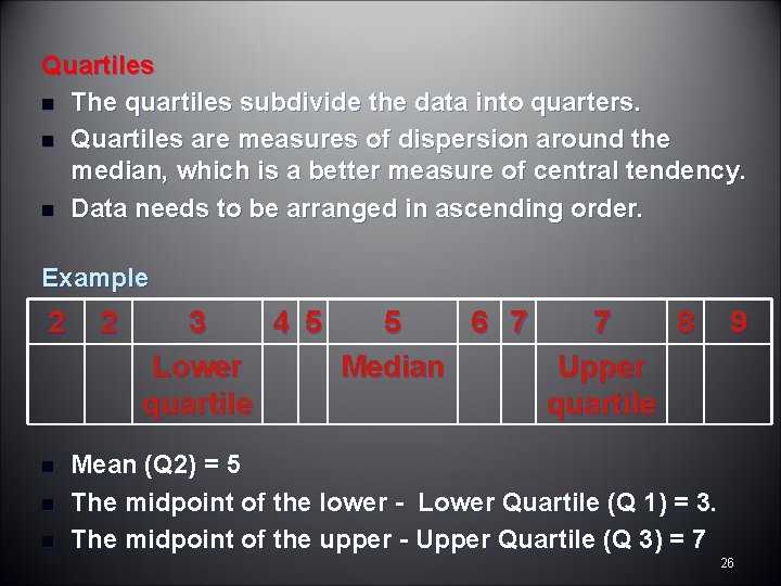
Quartiles n The quartiles subdivide the data into quarters. n Quartiles are measures of dispersion around the median, which is a better measure of central tendency. n Data needs to be arranged in ascending order. Example 2 n n n 2 3 4 5 5 6 7 7 8 Lower Median Upper quartile 9 Mean (Q 2) = 5 The midpoint of the lower - Lower Quartile (Q 1) = 3. The midpoint of the upper - Upper Quartile (Q 3) = 7 26

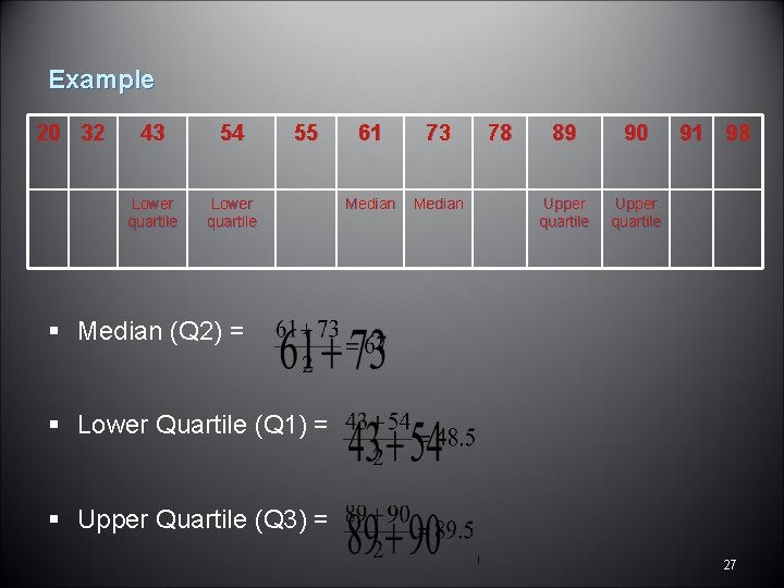
Example 20 32 43 54 Lower quartile 55 61 73 Median 78 89 90 Upper quartile 91 98 § Median (Q 2) = § Lower Quartile (Q 1) = § Upper Quartile (Q 3) = 27

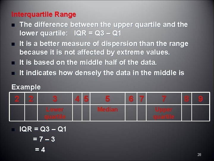
Interquartile Range n The difference between the upper quartile and the lower quartile: IQR = Q 3 – Q 1 n It is a better measure of dispersion than the range because it is not affected by extreme values. n It is based on the middle half of the data. n It indicates how densely the data in the middle is Example 2 2 3 Lower quartile n IQR = Q 3 – Q 1 =7– 3 =4 4 5 5 Median 6 7 7 8 9 Upper quartile 28

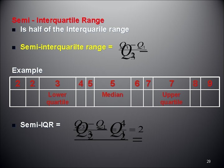
Semi - Interquartile Range n Is half of the Interquarile range n Semi-interquarilte range = Example 2 2 3 Lower quartile n 4 5 5 Median 6 7 7 8 9 Upper quartile Semi-IQR = 29

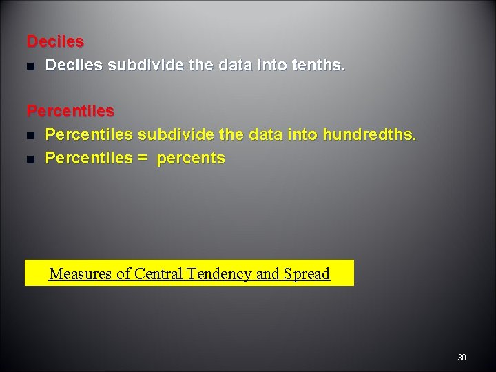
Deciles n Deciles subdivide the data into tenths. Percentiles n Percentiles subdivide the data into hundredths. n Percentiles = percents Measures of Central Tendency and Spread 30

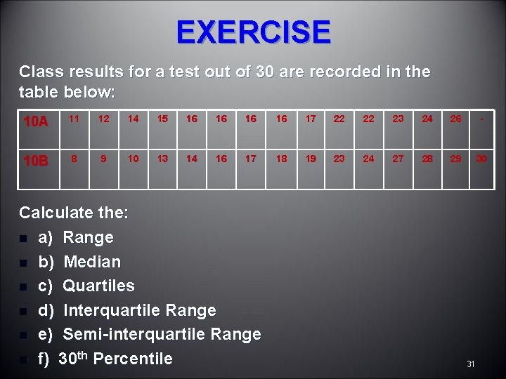
EXERCISE Class results for a test out of 30 are recorded in the table below: 10 A 11 12 14 15 16 16 17 22 22 23 24 26 - 10 B 8 9 10 13 14 16 17 18 19 23 24 27 28 29 30 Calculate the: n a) Range n b) Median n c) Quartiles n d) Interquartile Range n e) Semi-interquartile Range n f) 30 th Percentile 31

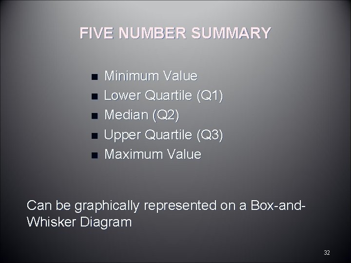
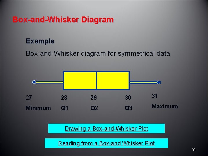
FIVE NUMBER SUMMARY n n n Minimum Value Lower Quartile (Q 1) Median (Q 2) Upper Quartile (Q 3) Maximum Value Can be graphically represented on a Box-and. Whisker Diagram 32

Box-and-Whisker Diagram Example Box-and-Whisker diagram for symmetrical data 27 28 29 30 31 Minimum Q 1 Q 2 Q 3 Maximum Drawing a Box-and-Whisker Plot Reading from a Box-and Whisker Plot 33

Analyzing Box-and-Whisker Diagrams Playing with Box-and-Whisker Plots Histograms & Box-and-Whisker Plots Interpreting Box-and-Whisker Plots 34